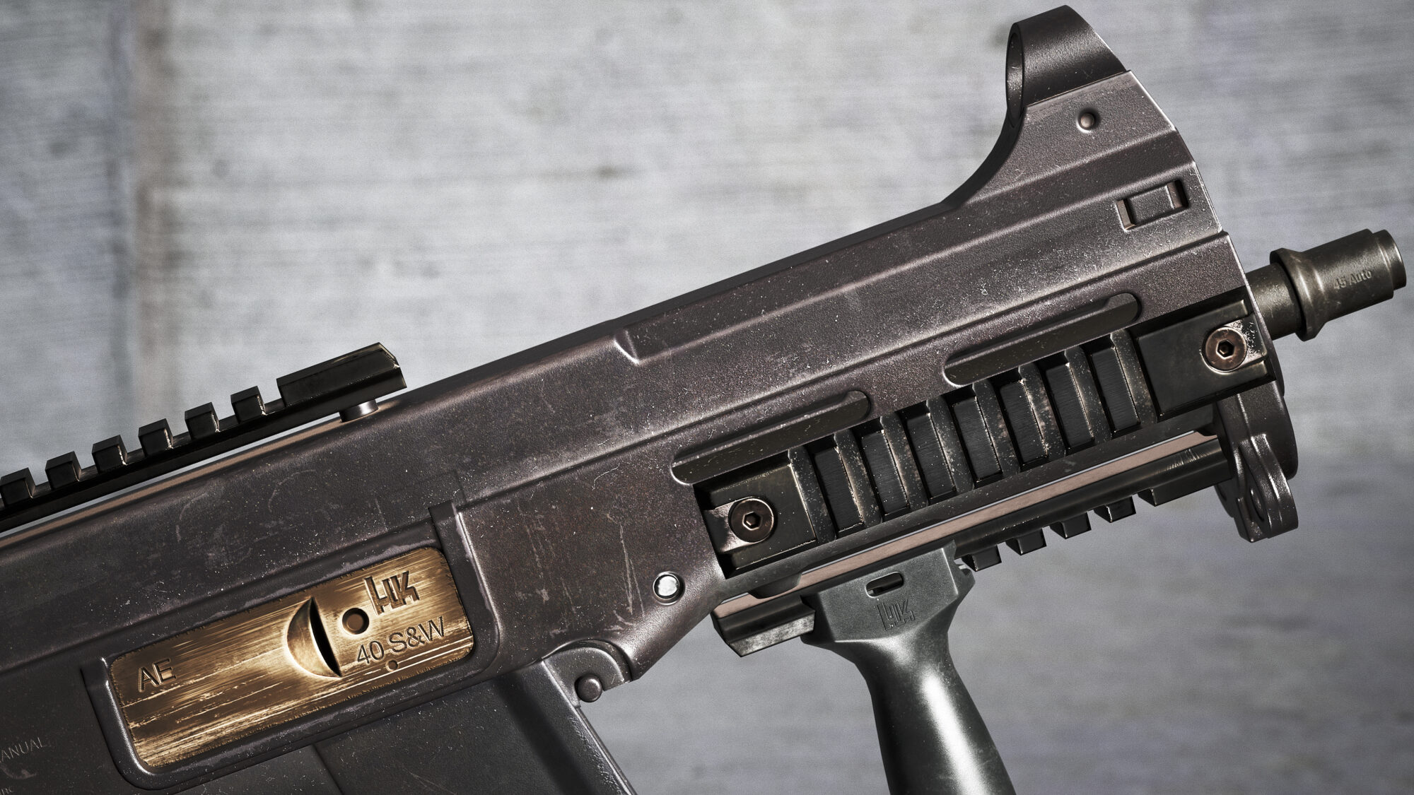
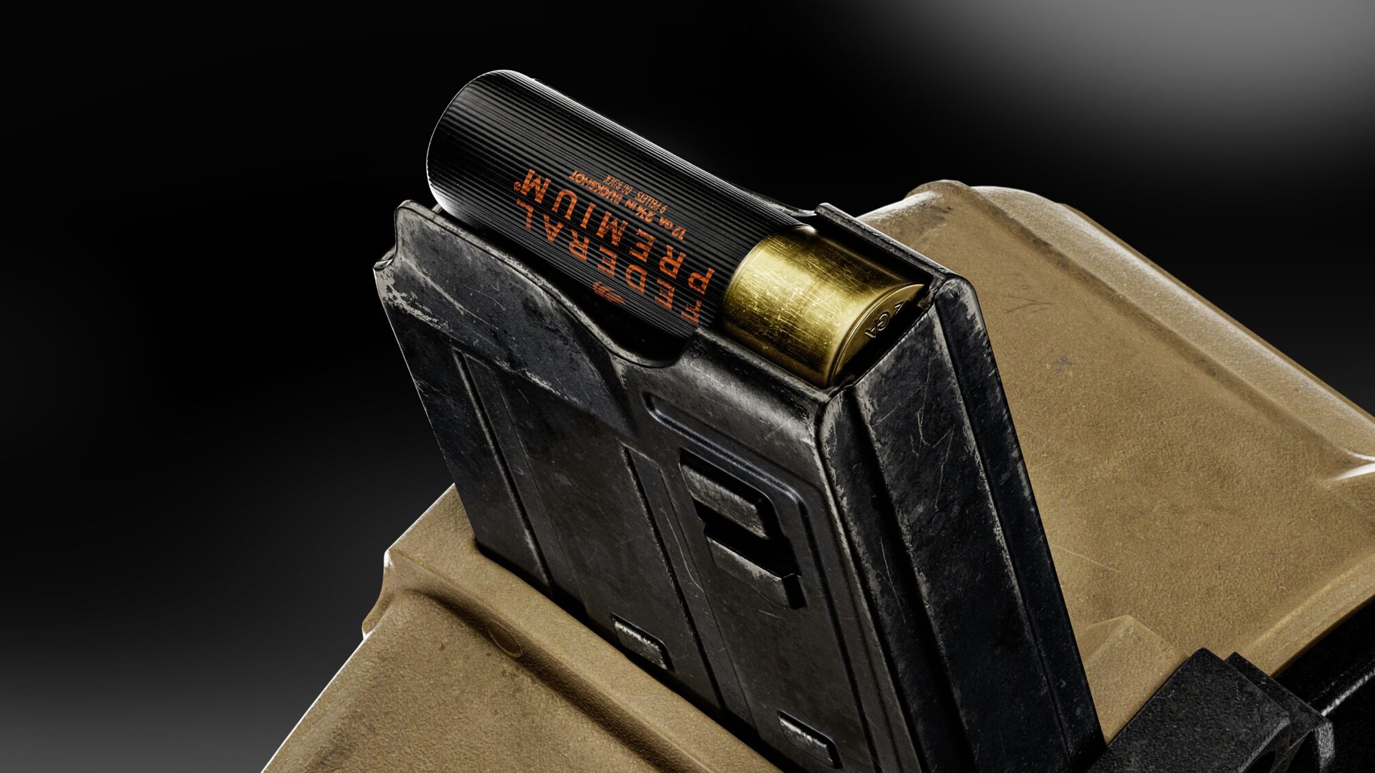
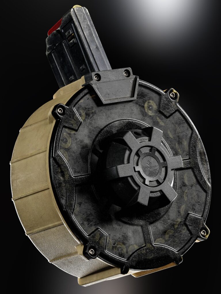
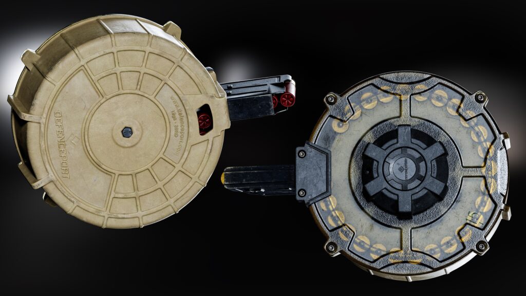
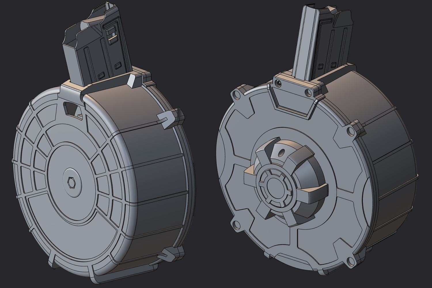
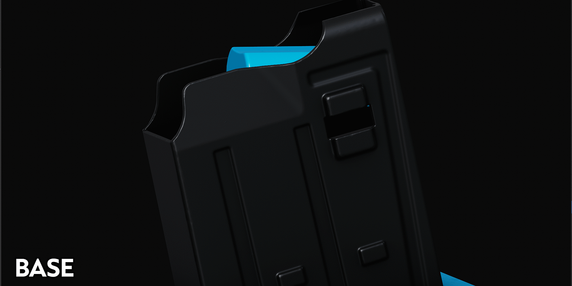
Drum Magazine
Introduction
Howdy! My name is Eric Correia, and I am a Senior/Lead 3D Artist.
I first picked up 3D 10 years ago and have been in the industry for just about 7. Throughout those years, I’ve always enjoyed mentoring, teaching, and especially discovering tips and tricks, so when I completed this mini-project and was offered the opportunity to write about my process, it was an easy decision.
I’ve always been an enormous FPS-genre enjoyer, along with shooting and handling actual firearms, which leaves little doubt as to what led me into specializing in weapon art. Weapon art will almost always pose some new challenges and is naturally a very technical specialization, both things that I enjoy involving myself with.
And of course, guns are cool as hell; this platitude has always stuck with me since a young age.

Project
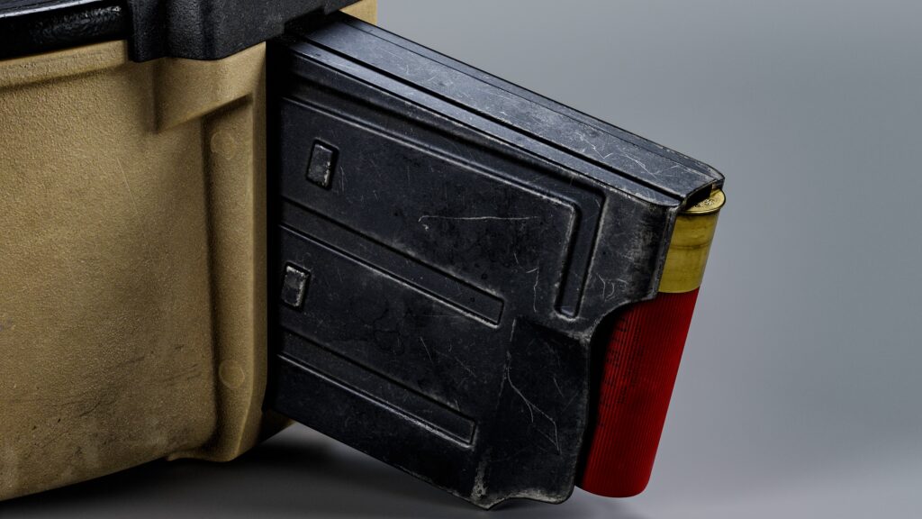
What even provoked me to start this project? Well, I always loved shotguns—their power, their intimidation factor, their many different platforms, the variety and flexibility of their rounds, their many usage scenarios… Hell, I even love the way ejected shells sound when they hit the floor.
I wanted to make something that invokes the power and intimidation that a shotgun platform typically would. Due to the size of this entire project, this magazine would naturally serve as a sub-project, simply an element of a larger firearm project in the future.
With that in mind, I wanted to get as much bang for my buck (couldn’t resist).
I had to make sure that I wasn’t producing this asset in my comfortable and familiar pipeline; instead, I was certain to present myself with some new goals and challenges to strongly ensure maximum gains, namely:
- Learning Spec-Gloss texturing: I’ve always used the Metal-Rough workflow and still do while at work, but I couldn’t help notice the nice benefits specular-gloss offers when in the right hands. As well, many weapon artists have adopted using this workflow.
- Deeper understanding of CAD/Direct Modeling: I was initially comfortable with parametric and non-destructive CAD modeling such as F360, but Plasticity seemed really attractive to leverage and learn, especially with this project being on the simpler side. Plus, any excuse to get away from Autodesk’s enterprise and cloud is a win for me. Plasticity is a direct-modeller, not parametric at all, as one would initially think. If you’re coming from parametric modeling, you have to approach things a bit differently than what you’re used to.
- Achieving an attractive texel density: This is especially challenging due to the unforgiving large surface areas of this magazine. It’s easy to make things super pretty by splitting them up into several 4k texture sets, but part of the enjoyment for me is being conscious and sensible with portfolio work: demonstrating that your high-fidelity visuals would translate perfectly well into a real-time production environment is a feat.
- Texturing colored/tan polymer surfaces: This might sound silly, but I’ve found that colored materials, especially polymer, are much more difficult to balance than darker/black polymers. Ever wipe your hands on your pants while eating on the go? Usually, one would if their pants are dark, but (hopefully) never on lighter-colored ones. My point is that darker/black materials generally hide and subdue details quite well, so choosing a brighter, more prominent color means I have to be quite delicate and deliberate with my applications.
The goal of this article is not only to walk through my thought processes and workflows—I feel like there is a whole ton of that—but instead, I’d like to try my best to touch on some techniques and bits of information that aren’t out there (or not out there enough).
I’m a big advocate of succinct writing, especially if informative, so a lot of this will be point-formed rather than straight-up blocks of text. Let’s get into it!
Tools
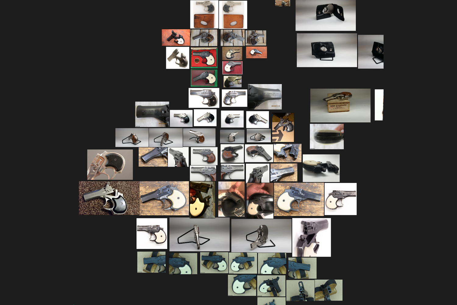
- Gathering reference for your project is arguably one of, if not, the most important stages of your project. I would be lying if I said it was exciting, though. It is a huge drag to not only gather enough high-resolution imagery but to also comb through your reference board for one particular detail or part when modeling or texturing. To help with this, I like to search for and include references of other subject matter than firearms for similar, if not better, demonstrated details.
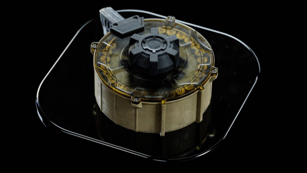
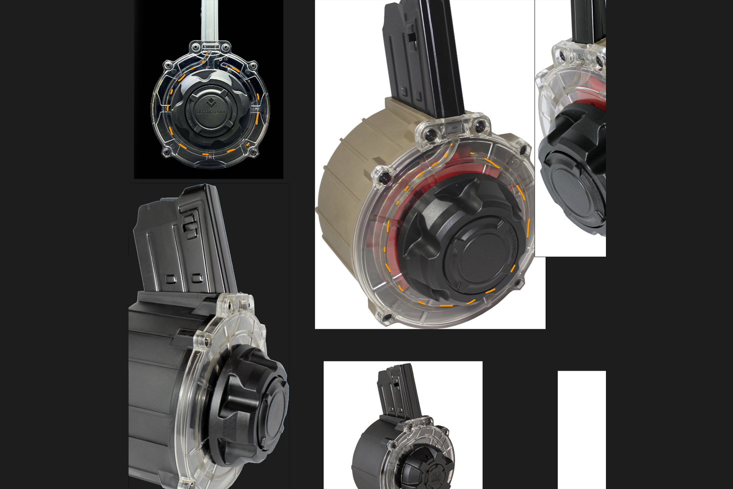
- Texturing and rendering refractive materials, such as the lid: I always love seeing when weapon artists render transparent components, especially magazines. A lot of reference had opaque lids, but I was certain to keep that transparent detail (and challenge).
- 3DS MAX for blocking things out, LP cleanup, and UVs. RizomUV is an incredible UV application as well, but wasn’t necessary for me in this project. The simpler elements, like the shotgun shells and bolts, I handled with traditional sub-d modeling.
- Plasticity (highly recommended) for modeling everything else.
- zBrush for dynameshing, polishing, and sculpted details.
- PiXYZ for processing the CAD into something much cleaner and workable for the low poly.
- Substance Painter for texturing.
- Baking, lighting, and renders were all done in Marmoset Toolbag 4.
- A small amount of post and render touch-ups were done in Photoshop.
- Use PureRef if you aren’t already. References shouldn’t only be static imagery; try to find videos and other media demonstrating/firing your asset—not only will you find additional ref, but also may discover some details that weren’t noticeable in static photographs.
- Pro-tip: If you find helpful YouTube links, paste that link into your PureRef board so you can always revisit it.
References
Finding particular modeling references can be very time-consuming and possibly even demoralizing before the project even starts.
Training your brain to understand perspective distortion and have strong shape language can get you out of a lot of situations when reference is lacking. Be okay with “this is good enough” with certain details.
Most of the time, it is impossible to find a reference to that one obscure part, so if it’s inaccurate, how could anyone tell?
Unless they’re a savant and/or own the weapon, of course. Besides, it’s game art; no one truly should care unless it is towards a hyper-realistic field-stripping simulation game. I’ve noticed that it is common for some artists to gather references strictly for modeling, but not textures.
Find some texture references along the way that also pique your interest for details that you know you will want to include and apply to your materials! Compartmentalize your reference on your PureRef board—your texturing phase will thank you!
Organize, organize, organize your ref. You’ll spend a lot less time looking around for particular parts if you don’t scatter them everywhere. Try to keep all directional-facing references together.
Keep right facing/ejection port-sided reference together, top-down reference together, etc. It makes identifying and analyzing details a breeze.
Trying to find interesting texture reference of your weapon or exact asset, however, is an even worse battle. Usually, auction websites are key (if your gun is even listed) since you’ll almost always get some worn/used reference from previous owners, which is exactly what we are looking for.
However, combing through dozens, if not, hundreds of references to find any visual interest in textures is grueling.
Once you understand how generally all firearms function, make surface contact, and build up/wear, you can alternatively find texture references of similar materials in different applications.
This greatly opens the doors to the amount of valid references you can use.
Instead of trying to find particular reference of how the slide on your FNX-45 wears, search up worn finished metals in household items, general machinery, or even power tools to get a more accurate and appropriate visual.
As mentioned, finding references should be inspirational: try to find references of other similar guns that could influence some details/designs in your project.
Recreating guns to be ultra 1:1 is boring, art is supposed to be creative and liberating, and this planning stage is your chance.
In game development, large-scale production especially, it is very common to deviate some details from the main reference anyway to avoid infringements and legalities; so treat this as an added benefit to your projects.
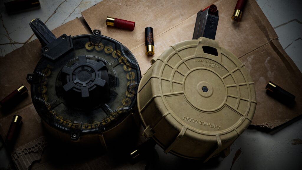
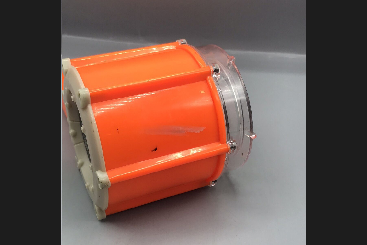
Here’s an example: this reference to a different drum mag the lid had a transparent lid that I wanted to include, even if the Defenceport didn’t have this, it doesn’t matter. It also reinforced the small initial idea of doing a transparent material to really appreciate that detail.
Adding some bump/grippy texture to some of the outer parts was also something I added, as I knew it would break up the surface very nicely when I got to that stage.
This all made the asset unique, interesting, and not infringing, all at once.
Modelling
The modeling process was quite straightforward. I first start out by taking whatever information I’ve scoured and begin blocking the asset out in 3DS MAX.
I like to block things out in polygons first since I find it much faster and less restrictive than it would be in CAD.
Blockout is just as important as reference-gathering.
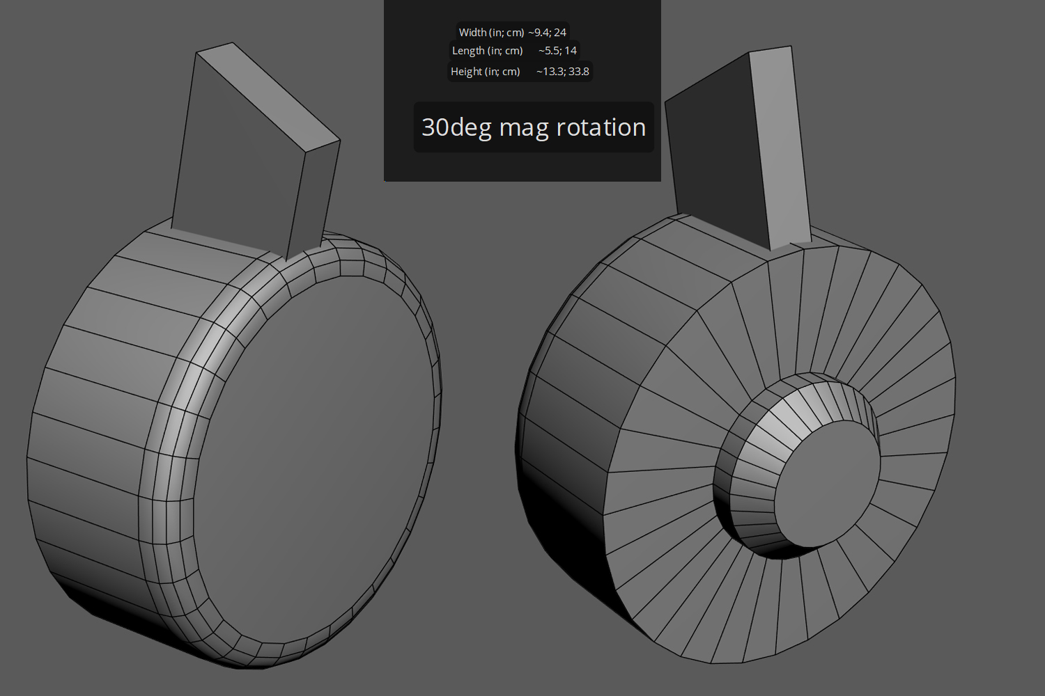
Ask yourself if you have some more known information that isn’t just visual reference, such as platform type, magazine size (single stack, double stack), caliber used, etc. These will all help guide you to finding dimensions and other useful information to get an accurate blockout.
If you know your gun shoots 9mm, then look up 9mm bullet dimensions, which then help build your magazine, which then helps build your magwell/chamber, and lastly your barrel.
All other exterior components should fit in much easier once this is established.
I tend to call this the “skeleton” of the blockout since it is objective and can be used to compare against gathered references.
Certainly beats eyeballing everything and dealing with perspective distortion.
Manufacturing websites are dual-opportunity: they will often provide “known” information such as the size and dimensions of the asset, as well as the high-resolution reference you were searching for.
Once the blockout was complete, I headed into Plasticity. Using the blockout, I overlaid new shapes and modeled the asset with a high-low-detail mindset.
Model just the large shapes and forms first, then move on to medium-sized, and finally fi ne/small details. This will prevent issues, revisiting, and all around just a more fluid workflow.
If you are having trouble identifying these shapes, take some time to colorize these shapes in a few reference images to help break down and train your brain on proportions and shape language.
It’s completely natural, and most of the time expected, to revisit a detail after realizing something doesn’t fit or look right after modeling some other details.
I used to primarily use sub-d modeling, so it still sticks with me when I see an opportunity arise for it. Sub-d still has its place; a very useful fundamental that every artist should at least know their way around.
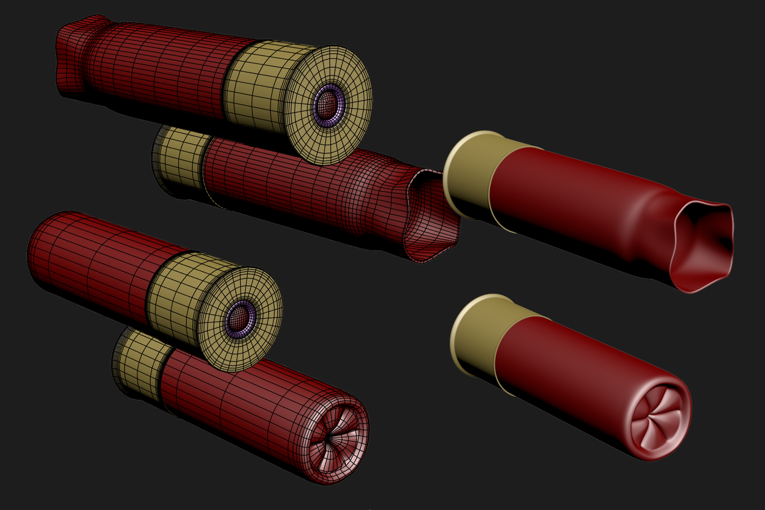
The shells, for example, are simply cylinders; it’s so much simpler and faster to create this in Sub-D.
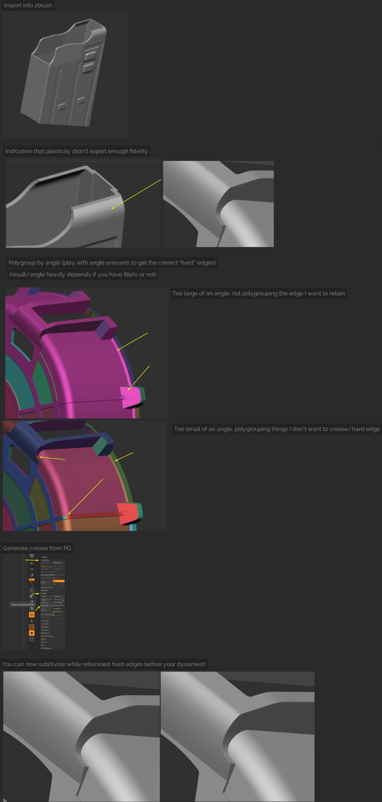
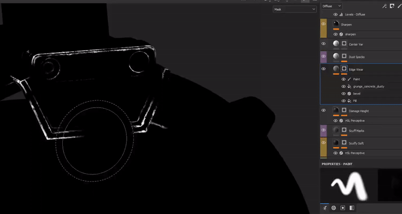
The high poly stage was handled by importing and dynameshing the exported OBJ from Plasticity in ZBrush. It’s very important to have as much density as comfortably possible on your export to prevent any faceting.
It’s possible for some areas of your export to have some noticeable faceting still; I’ve come up with a full solution in ZBrush. Using polygroups to our advantage, we can assign polygroups to all of our “hard edges”, then crease by polygroup, then finally subdivide a few times.
This will remove the faceting while nearly perfectly preserving our shapes, ready for dynamesh and polish. The graphic below should explain and illustrate this better.
Using morph states and morph brushes to bring back different stages of polish is handy. I’ve found this to be faster and easier than masking edges out.
For example, I could polish everything to a certain amount of sharpness, save that morph state, polish some more to get a softer edge highlight, and then finally use a morph brush to paint back the previous state of sharper edges.
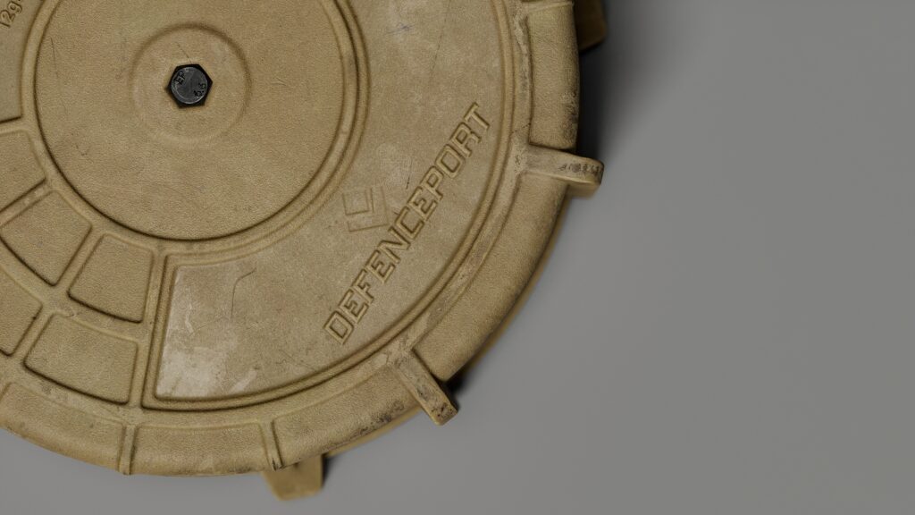
Once dynameshed and polished nicely, now would be a good opportunity to add any sort of sculpted or embossing details to get baked down.
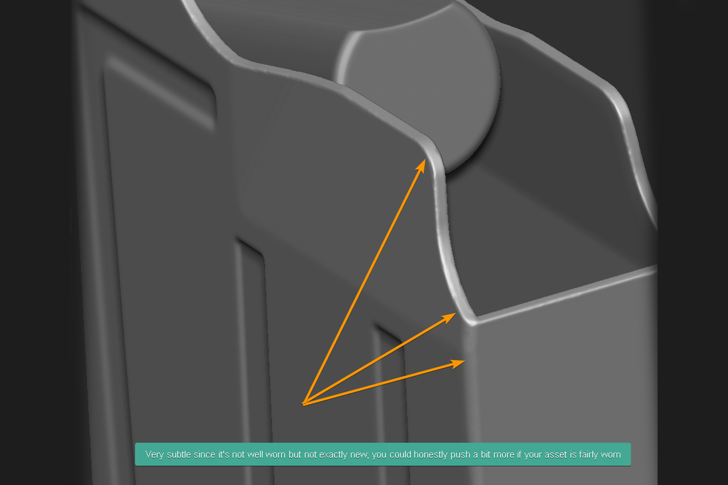
If your asset isn’t fairly new, consider a damage and wear pass of just beating up the edges to get some nice irregularity and worn edges to be baked down.
Details like text and finer details are typically best handled in Painter, but I felt in this instance, the logo and text details were fat and large enough to warrant being in the highpoly.
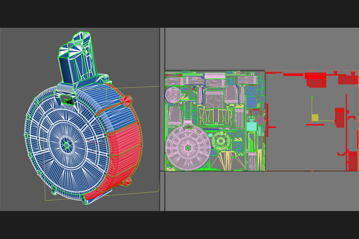
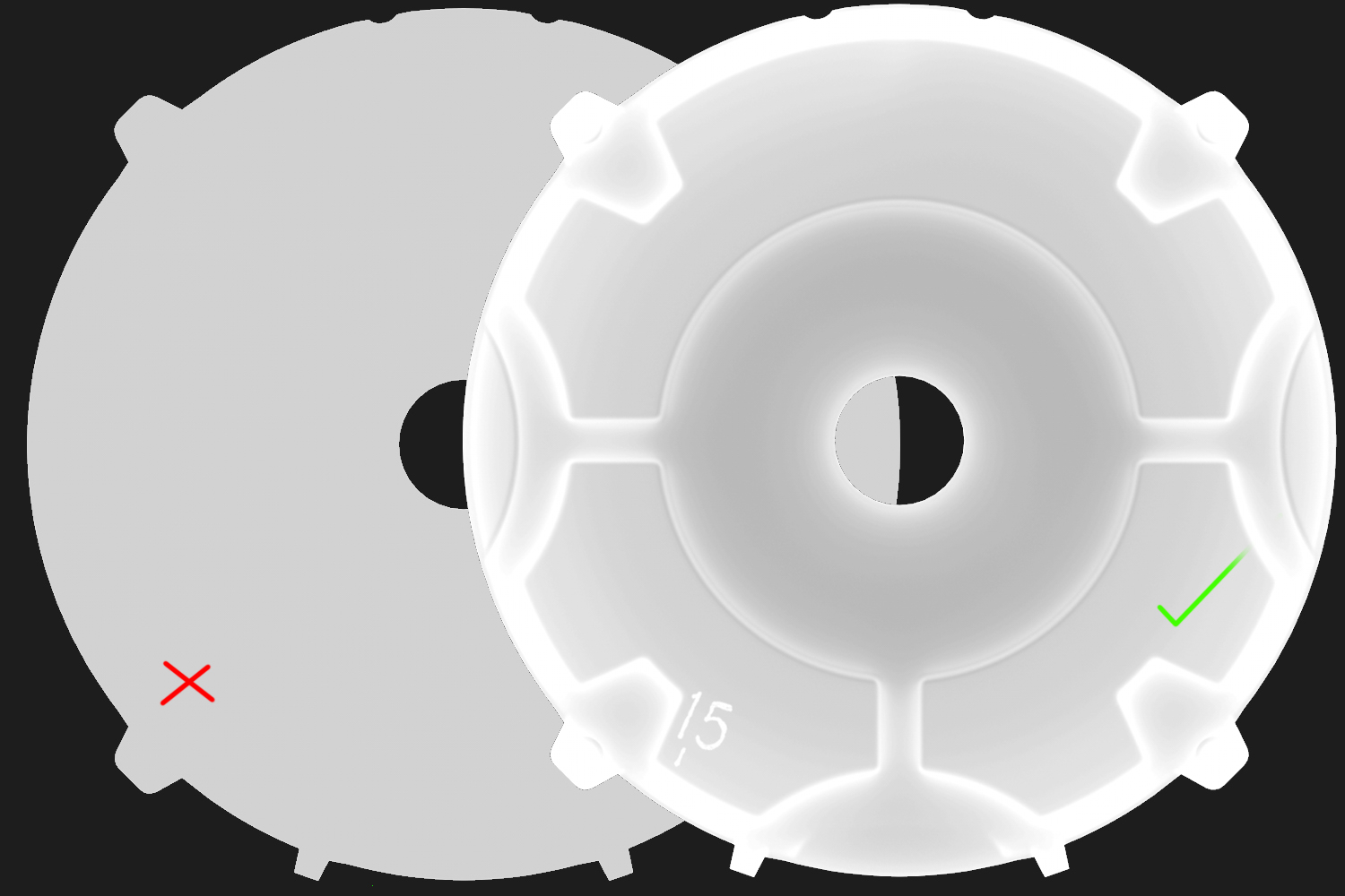
The low-poly process with CAD is certainly its weakest and most sluggish area.
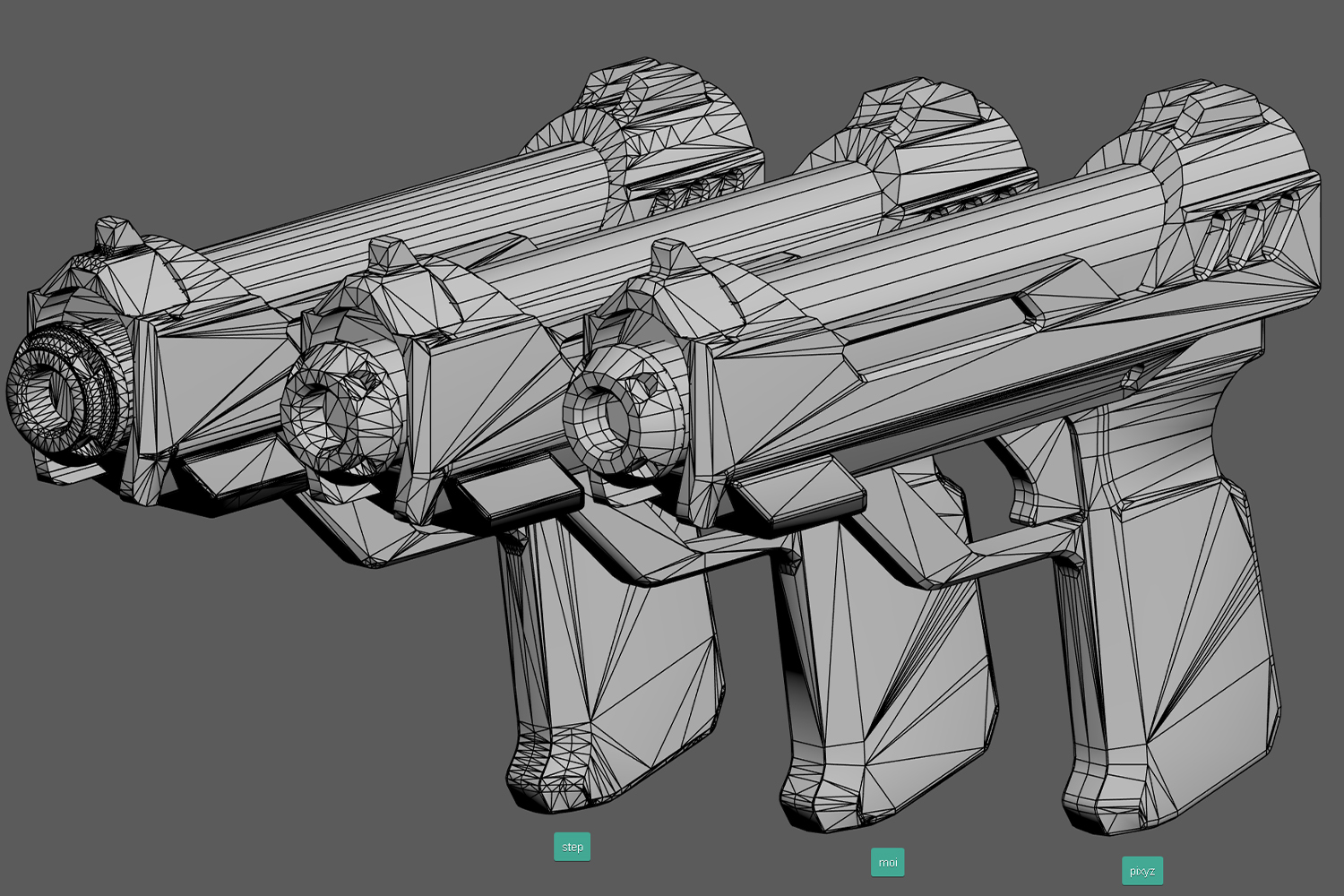
Thankfully, using MOI, or in my case, PiXYZ to process the exported .stl/.step files into a much better-starting base makes this stage so much easier.
Check out this graphic below demonstrating the topology and amount of clean-up work each exporter produces. Note the cleanliness and general tidiness of the PiXYZ export!
Anyway, here are the basic steps and thought processes I run through when creating my final LP.
Upon importing the exported mesh from PiXYZ, fi first order of business is analyzing and cleaning up errant vertices. There aren’t too many, but they still occur.
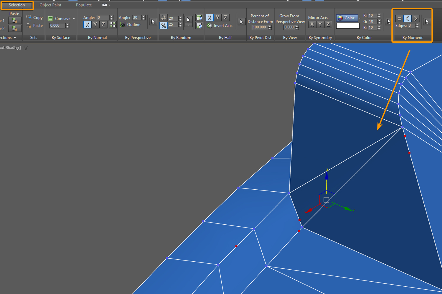
In these cases, I always research or explore tools that make this much easier. I found this setting in 3DS MAX to select all vertices that are < 3 edge valence (meaning, a vertice sitting on an edge with nothing else connected to it).
Next, I would start removing topology that I know would either get in the way of future steps or are just totally not needed at all.
At this point, I would start evening out edge distances, especially for curved/organic areas like grips. Not only does this keep the shading nice and consistent, but it helps with keeping your geometry density in control.
Not to mention it also offers a nice and tidy topology.

Especially for larger forms and shapes, I now analyze the silhouette and judge the fidelity of my model, piece by piece, frequently from many angles to judge if I need to add or remove loops.
Context is important here, if parts of the model are obscured/obstructed, or far away, then it can likely receive less geometry
Despite this work being for a portfolio, I still wanted to be sensible and demonstrate control with a budget.
I classify this as “art muscle memory”: the rules and boundaries that I normally set in production scenarios. I wouldn’t want to undo that, even periodically, and become comfortable with limitless production for the sake of my portfolio.
I feel much more accomplished developing high-quality art with most of the typical limitations and boundaries in place — it feels much more rewarding and validating making things look great with what you’ve got.
Anything can look great with several 4k texture sets slapped onto it, skyrocketing its texel density… Is that ever acceptable in production? Never.
The molded polymer rib details are a great example of stretching this boundary while remaining practical. In most situations, these ribs would be baked down; however, this asset is LARGE, and could potentially be pretty close to the player’s FPV, so that warrants modelling them in.
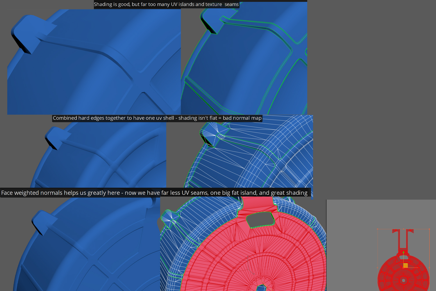
The first problem encountered with this is that there would be a lot of hard edges and UV islands, which would also mean many texture seams that could be a problem in masks.
We can remove all of the hard edges so that we can have one big contiguous UV island which is very ideal. However, removing the hard edges would mean the shading would be completely unacceptable.
Leveraging face-weighted normals along with some additional edges to control the shading brings this to an acceptable stage.
When the geometry placement and fidelity are at a place that I’m content with, the last phase of this stage is to analyze the shading on all parts of the model.
I try to do this as I go through all of the above steps, but it’s always good to do this as a final sweep at the end.
As I’m analyzing for any strange shading, I’m also looking out to see if I can potentially remove some hard edges without introducing shading issues, as this would mean I could have fewer UV/Texture seams, which is very beneficial to my masks.
It’s also important to make sure your shading and hard edge placement are really solid at this stage due to the fact that you can leverage the hard edges to immediately give you a jump start on your UVs, abiding by the golden UV rule below.
Unwrapping
UVs are straight forward – most of the work is done by leveraging my hard edge placement as I start by splitting everything by their hard edges.

Next is just a matter of ensuring everything is properly relaxed, straightened and aligned edges, and finally adding seams to any UV shells that further require it such as cylinders or really long UVs that harm the packing.
This stage also involves identifying your texel density and splitting up your asset accordingly to fit it. I have found that most artists will just assign 4k to everything, which is not only irresponsible but can offer a lot of inconsistencies in your visuals.
Knowing that FPV assets/weapons generally are a TD of 50px/cm, and a lot of portfolio work exceeds 100px/cm, I wanted to aim for somewhere around 75px/cm since I knew anything above that would not be feasible resolution-wise.
What I like to do before continuing is to first ask myself “What parts would most realistically and practically be split up material-wise in production?”.
Well, I know that I’m going to use a different shader for the lid, so that can be split off. The shells themselves could be packed into the magazine UVs, but because I plan on creating color variations and a spent shell variation, I may as well have them be on their sheets as well, totaling three texture sets.
Next up, I identify what parts of my model can be stacked/re-used. The front and the back of the follower gear is a great examples, along with the left and right sides of the drum since they won’t be seen at the same time ever.
I delete them to get them out of the way of my other UVs, so I can focus on the main UVs to mirror, weld, and offset them at the end.
This saves quite a lot of precious resolution.
I begin sizing unimportant/obstructed UVs down significantly (like the interior of the drum), and important UV islands up slightly. I like to also thicken up skinny UVs.
Finally, everything becomes packed. I must figure out what resolutions would best fit these materials, given the range of texel density I want.
I start this by identifying my largest, most contiguous surface, which is either the lid or the front of the drum, and seeing what its TD is at certain resolutions.
Texturing
At 1024 for starters and it was around 20px/cm – far too low, of course. Texel density doubles each time you go up a texture resolution, so in order to hit my goal of 75px/cm, I must use a 4k.
I did the same for the shells: 512 resolution gave me a texel density of 66.8px/cm. Close enough, since if I were to go 1024, then my texel density would be around 130px/cm, double what the shell is.
Texel density is not a hard and fast rule to follow– you can flip around the values within reason and it won’t be noticeable. 66px next to 80px isn’t an extremely noticeable visual difference.
This is how I resulted with three texture sets, 4k, 1k, and 512.
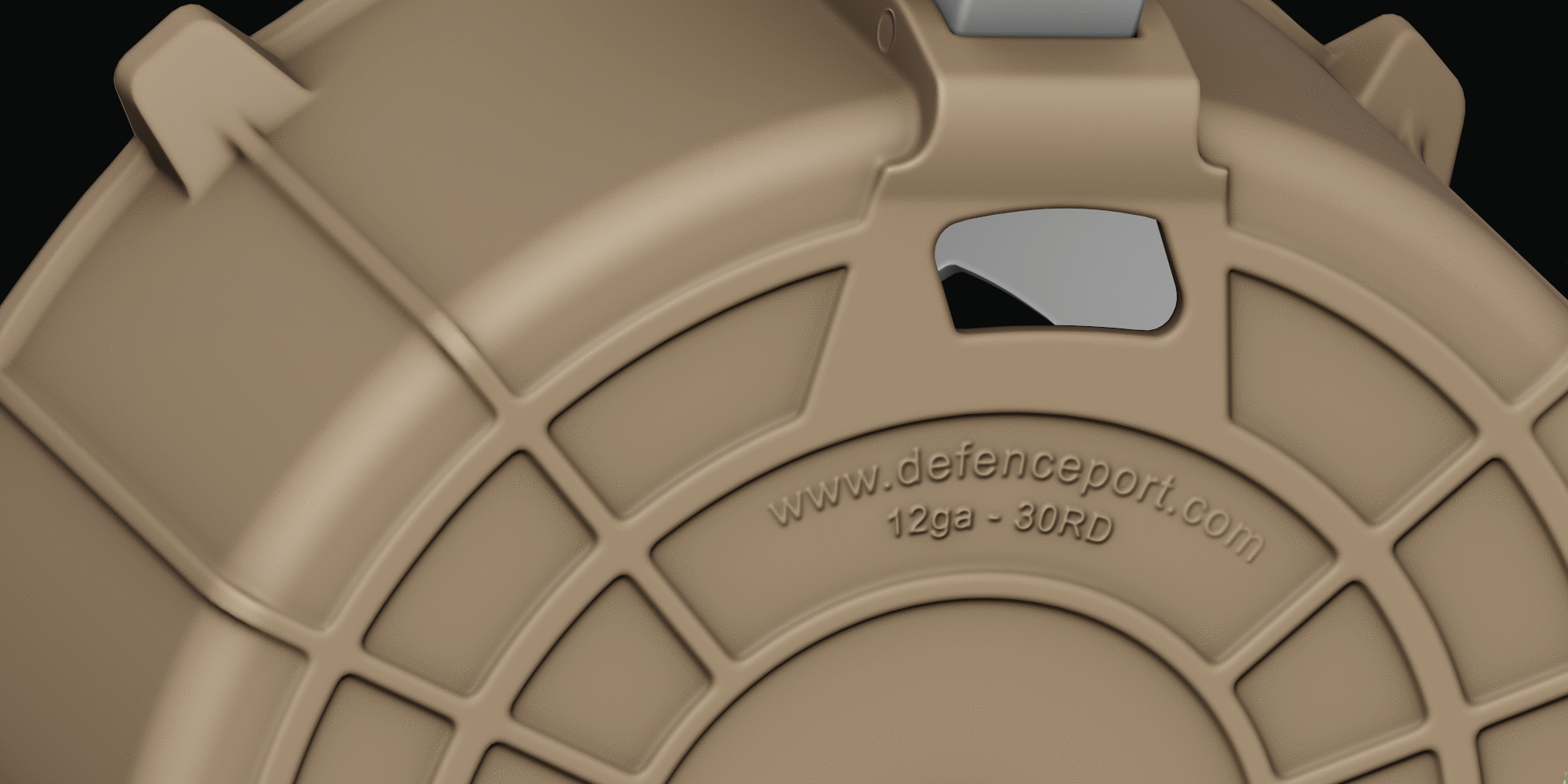
Material definition is vital, especially since this asset is primarily polymer. I spent a good amount of time assessing and revisiting my values to ensure the polymer reads well from a good range.
I tend to treat materials in the exact same manner as modeling – starting from large (macro), to medium, to fine (micro) details.
Study your reference, and don’t be afraid to include references to other weapons/components/subject matter – so long as the details read well and are interesting enough, include them!
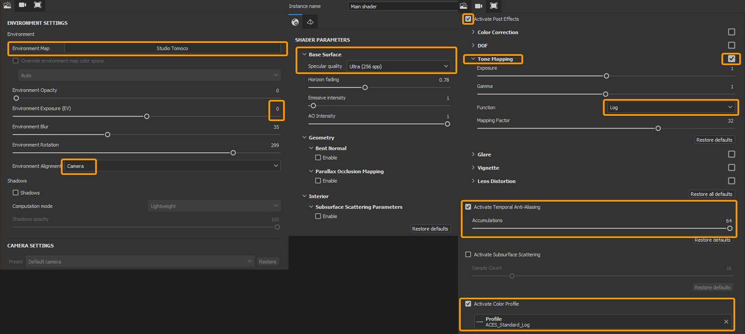
Before starting, I always make sure to texture with ACES, a neutral HDR to not influence any sort of colored lighting like Tomoco Studio, and other viewport settings.
This ensures that my visuals and renders will be a matter of WYSIWYG (What you see, is what you get).
Build up layers similar to how they would in real life:
- Base material.
- Tone and color variation.
- Gloss variation.
- Scuff s, scrapes, colors rubbed off from other materials (gives interesting micro sized color accents).
- Dirt/dust build up in cavities.
- Grease, oil, smudges, leaks, stains.
- Heavier damage (if any).
- Global dust/specks/fibers.
Be deliberate with your details; utilize stencils where possible.
Distinct details like large wear should not be just one stage/one fill layer; think of it as multiple layers built up.
The scraped polymer likely had much lighter, fainter scrapes before it was deeply scratched – be sure to include those details to ground it and make it feel much more natural!
Keep things as procedural as possible, but with intentions to paint them away/back in with multiply layers.
This helps break up the natural uniformity of procedural masks while keeping it even further procedural by having a non-destructive paint layer set to multiply.
- Avoid tunnel vision – analyze your details from many distances and angles, take frequent breaks and get second opinions.
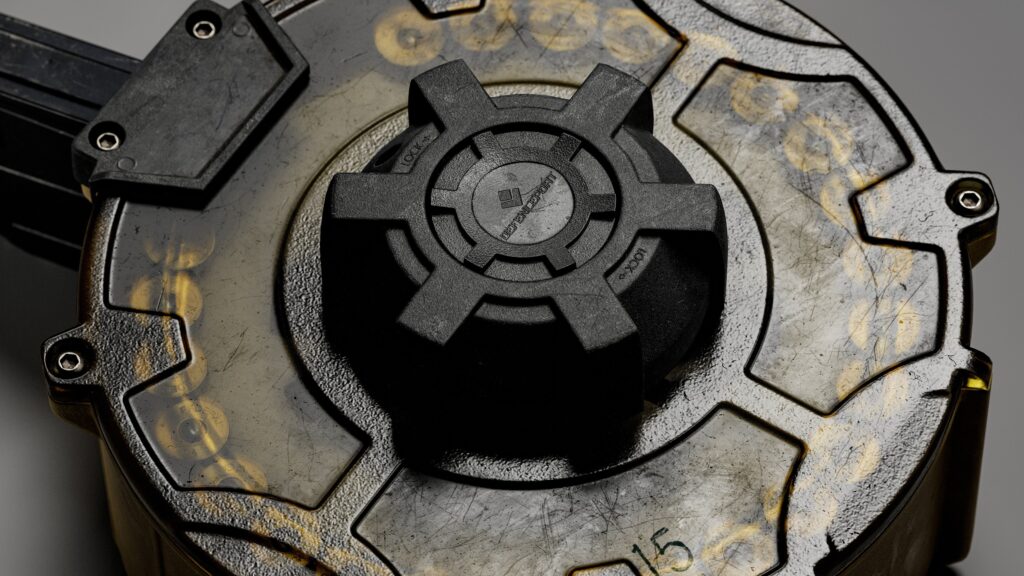
- Being able to see large details on the other side of the glass, like the follower track, is an extremely cool and interesting detail that I was glad was able to come through with this shader.
- Dragging the alpha down was far too uniform and flat, and using an opacity map on a standard shader didn’t give me the result I wanted at all.
- Using the “Glass” material found in Marmoset’s library was great as it offered refraction and transmission components with already preset settings. These are the only two features that I needed, otherwise, it would’ve been just the same as a standard shader, nothing crazy is going on.
- Finally, it was just a matter of plugging in my textures and dialing in the opacity and transmission values to get a nice semi-opaque result.
- Utilizing my baked textures as masks is a trick I enjoy experimenting with. I used AO and Thickness blended together with a levels here to get me a very nice opacity map; something with nice soft falloffs from near-opaque edges to semi-opaque centers.
For my final pass and polish, I would often take a break for several hours, even a full day (the luxury of this being a personal project, not production) to rest, recharge, and return with fresh thoughts and eyes.
Asking and receiving feedback was invaluable.
There were things that my tunnel-visioned eyes didn’t notice and were brought to light with others’ helpful analysis and feedback.
Adjusting, manipulating, and tidying up values and some areas of the textures were all.
Lighting and rendering was one of the aforementioned challenges for me since it has been admittedly quite a while since I’ve lit and rendered an asset.
I’ve always understood basic lighting principles and set-ups, but getting your hands dirty, messing around with angles and compositions, and just trying things out was, while frustrating at times, quite rewarding.
It absolutely helps to have a proper foundation first, proper settings that is.
Rendering
Rendering in the same color space as we textured in, ACES.
Using ray-tracing (hopefully you have at least a 2060 GPU?) along with denoising.
Careful not to crank de-noising, as it can reduce and blur out the finer details in your renders.
Keeping perspective lens to a minimum – we aren’t going full orthographic, but we want to capture the entirety of our asset without any depth/perspective distortions. Something like 200mm – 300mm.
Real photography would use this lens anyway.
Some presentation styles could call for a lower mm/more perspective – it is entirely up to you, but presentations often shine with a high mm lens.
Lighting
I largely used dir Omni/spotlights could be used sparingly, but they are tricky to blend in with the other lights as they unintentionally light up other areas.
Use the Safe Frames feature under your camera settings, as this greatly helps set up proper composition and ensures nothing would be cut off from your render since it’s quite misleading to eyeball it from a regular viewport.
Post-Processing
Be easy on the post-processing! Try to keep things as natural as possible. It is entirely too easy to crank up some sliders, render, and post-process additionally in Photoshop, resulting in renders that look far too “fake” and over-processed.
All of your hard work is essentially being tarnished.
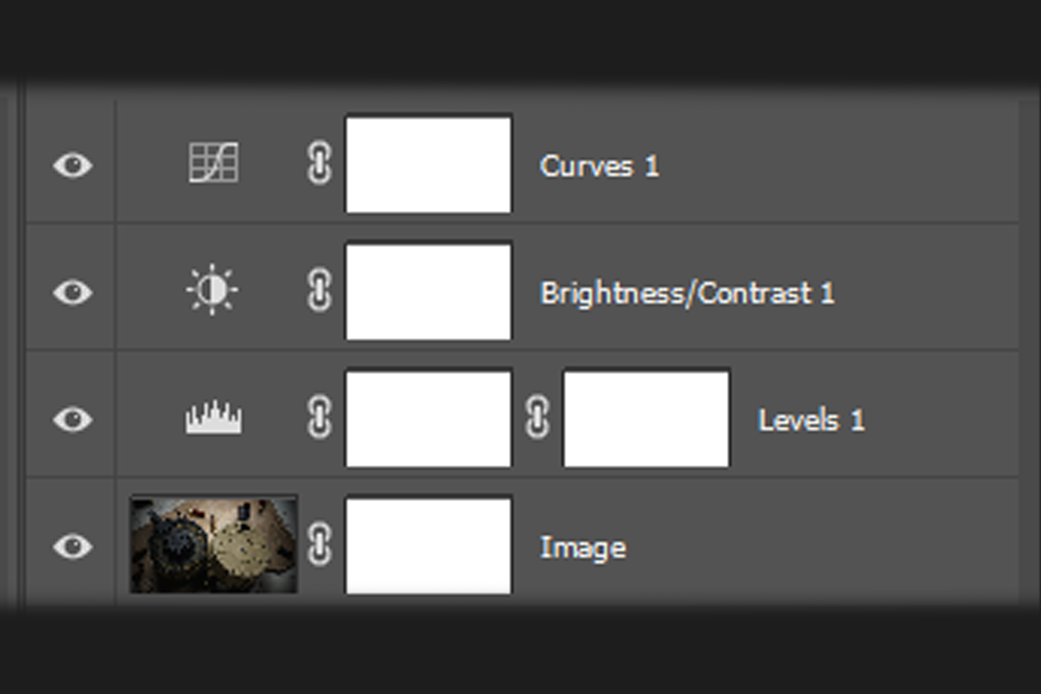
I personally export/render as PSD, since this would be completely lossless in quality, allowing me to add adjustment layers non-destructively if I ever need to revisit and tweak a setting, and save out file formats properly for publishing.
Conclusion
If you’ve come this far, a sincere thanks for giving this a read! I hope you were able to take away something useful and informative from this write-up!
It was entirely relieving to finally get back into portfolio weapon artwork and to also learn and overcome a bunch of new things along the way, not to mention finalizing & publishing a project.
I hope to have demonstrated the importance and rewards of thoughtfully planning challenges and goals for yourself as you start out a project. If you found this at all informative or helpful, please be sure to check out my blog which continues to grow on my ArtStation.
I hope you will come across something informative and/or helpful there as well!
One more piece of advice: if you really want to grow as an artist, be sure to involve yourself with like-minded communities.
The Weapon Room is a fantastic example of a great community of artists with professional feedback for hard surface art (though, all artists are welcome of course). I never thought I’d ever be a mod, but I’ve turned to the dark side… Hope to see you there!
Thank you Games Artist for this opportunity! I enjoyed putting this all together in hopes of offering some information that has yet to be touched on.
Best!
Read more articles
You might also like these articles.