
Vintage Tin Canister

Introduction
Hi everyone, my name is Hosun, and I’m a 3D Environment Artist specializing in Props & Textures.
I’m currently open to new opportunities as a 3D Environment Artist.
Project
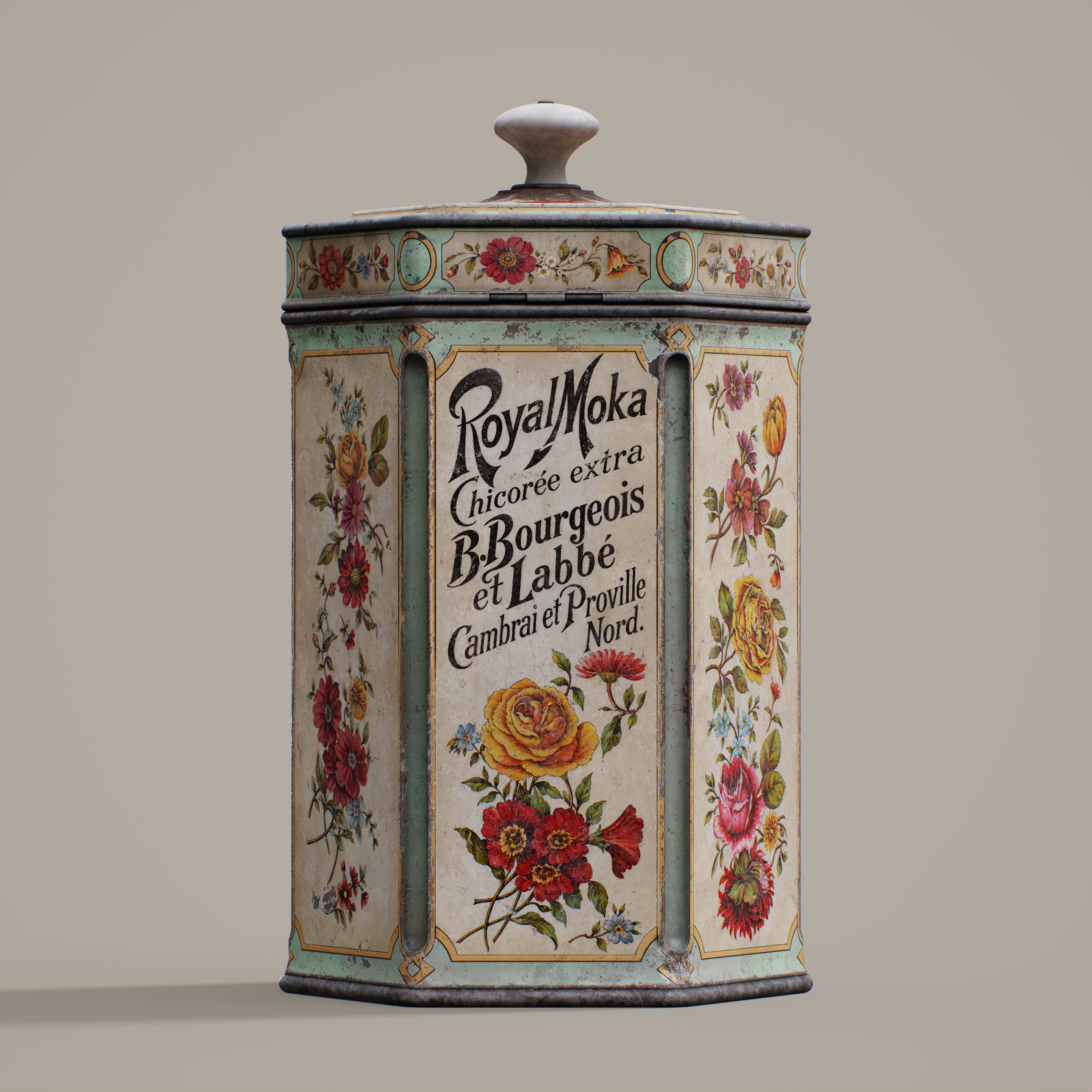
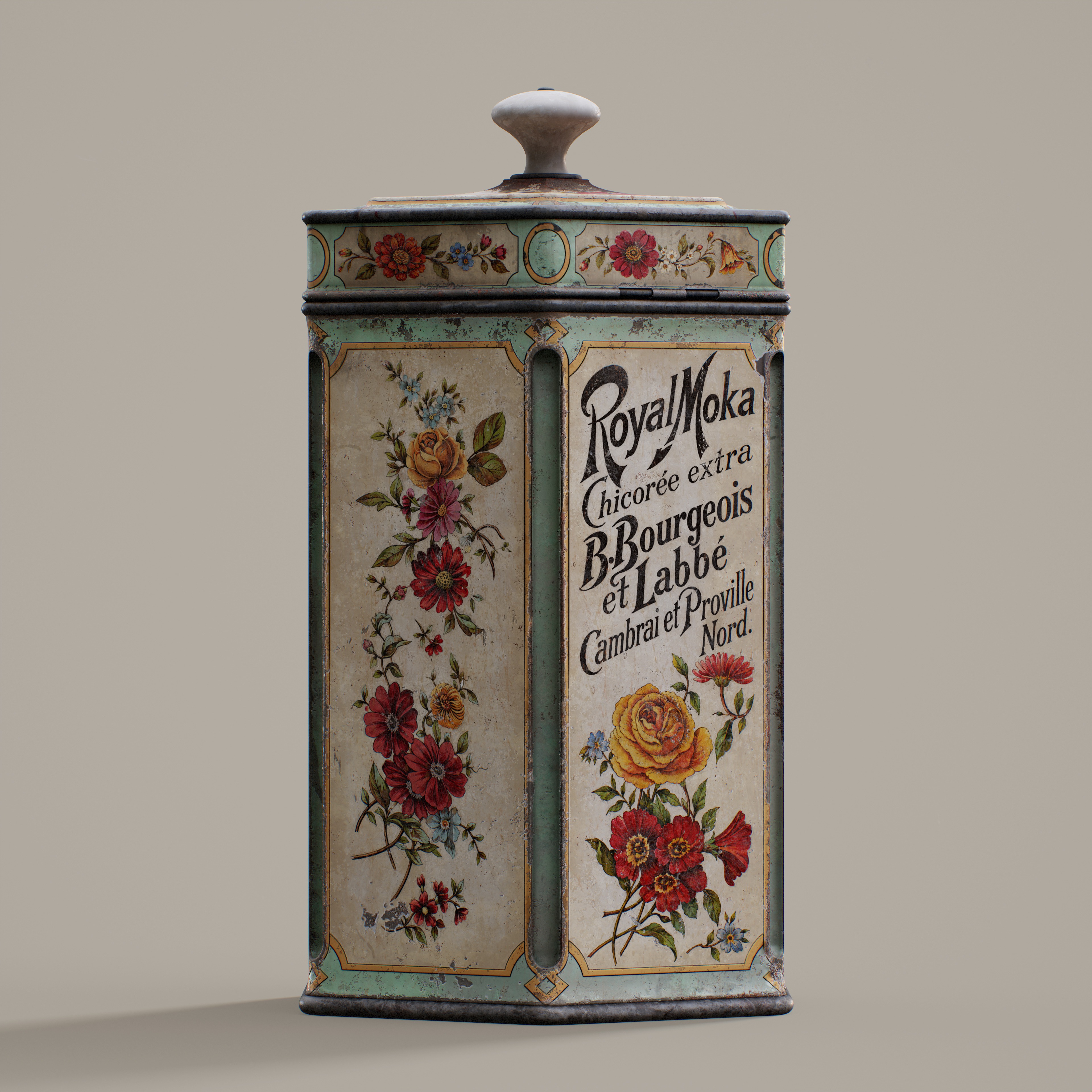
I wanted to create a prop with broad surfaces that would allow me to explore different material finishes and surface details through texturing.
While browsing Pinterest, I came across a vintage tin canister and decided to recreate it. Its combination of painted metal, printed designs, and worn areas offered the variety I was looking for.
Software
- PureRef – Reference gathering
- 3ds Max – Modelling
- ZBrush – High-poly
- RizomUV – UV unwrapping
- Substance Painter – Texturing
- Substance Designer – Masks, filters, and generators
- Marmoset – Rendering
References
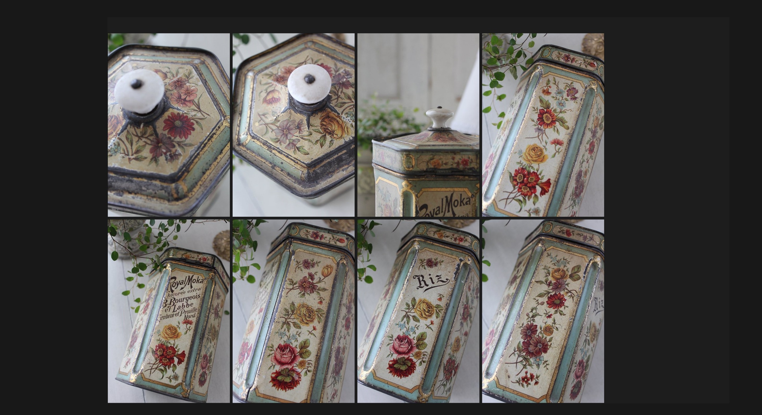
I gathered my references from Pinterest, where I was able to easily find images of the canister from different angles. I used PureRef to organise them into a reference board.
One feature I find particularly useful is the ability to view images in greyscale. This helps me study surface details without being distracted by colour.
High-Poly
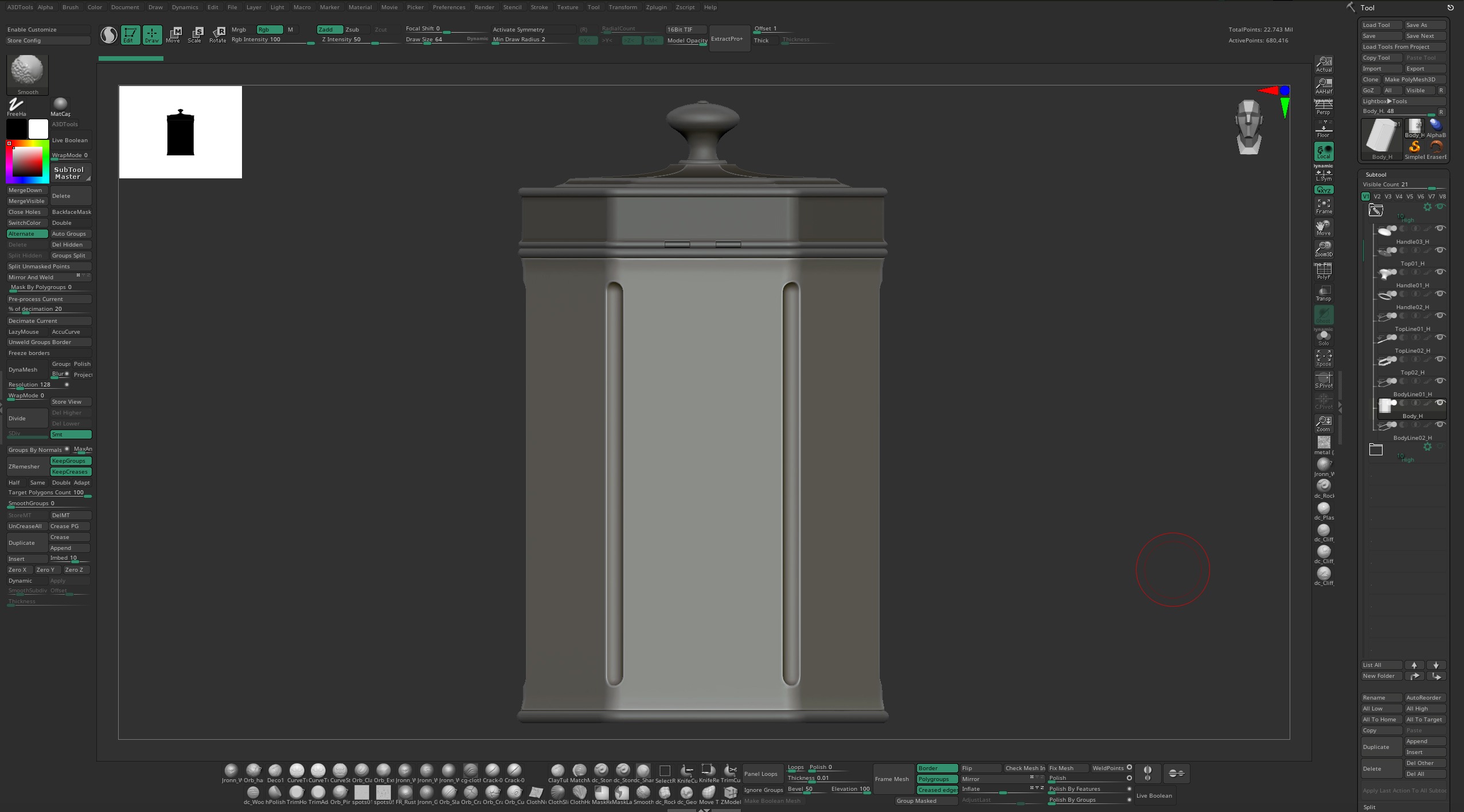
I created the high-poly model in ZBrush using only ZRemesher and Divide, without any sculpting.
Low-Poly
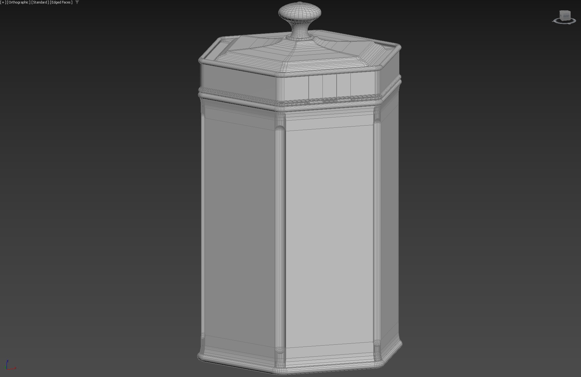
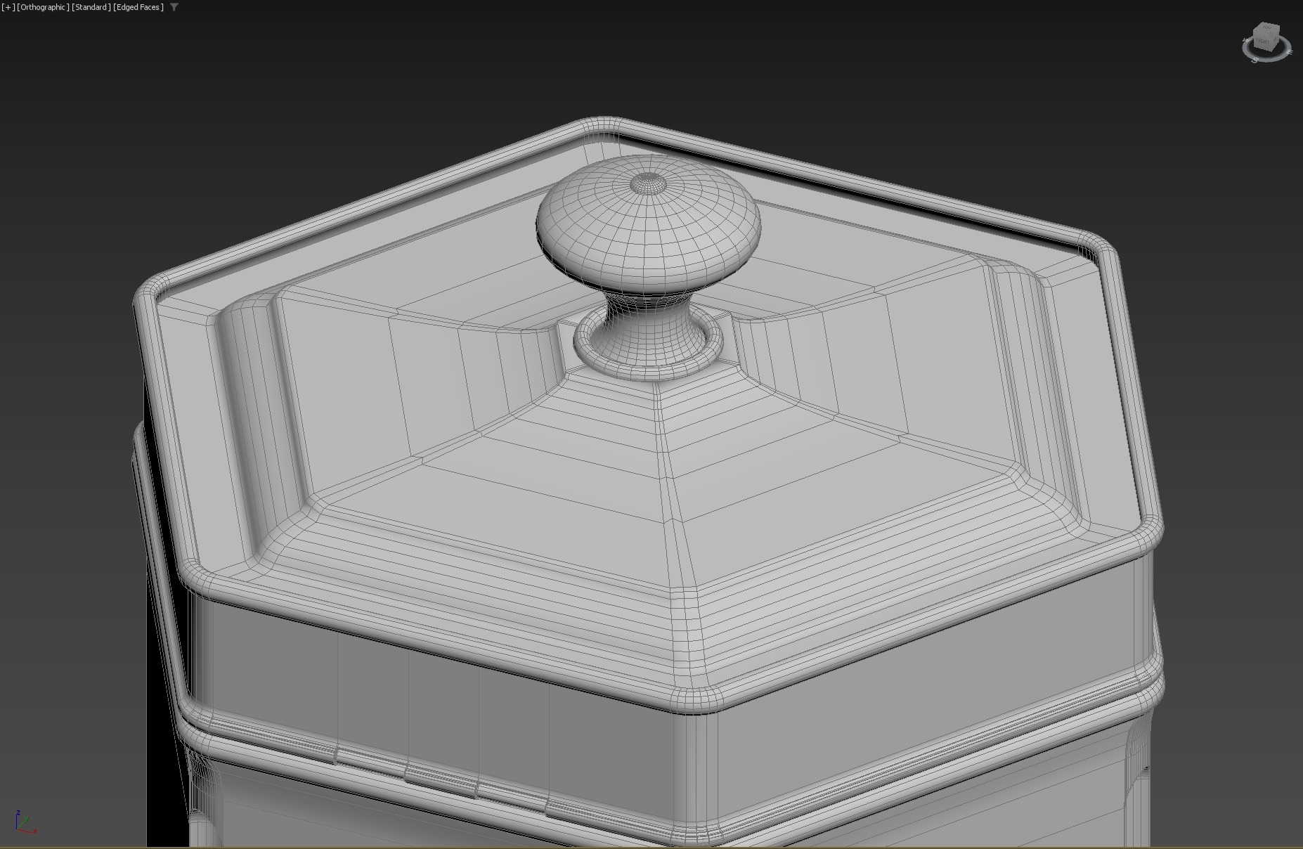
Since this project was intended for texturing practice, I didn’t focus on topology or polygon count.
UVs & Baking
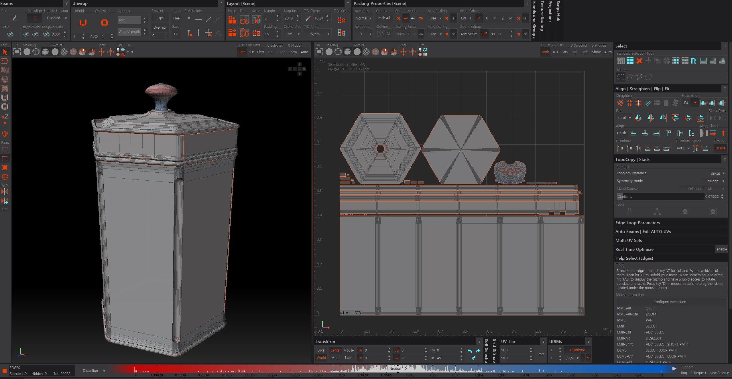
I unwrapped the UVs in RizomUV and baked the mesh maps in Substance 3D Painter.
Texturing
In my experience, checking the histograms of the base colour and roughness maps is the most important part of texturing.
In particular, I pay attention to how light and dark values are distributed in the base colour map, so I regularly check my work in greyscale throughout the process.
Before starting the texturing in Substance 3D Painter, I first imported the FBX model into Substance 3D Designer and created the masks I needed.
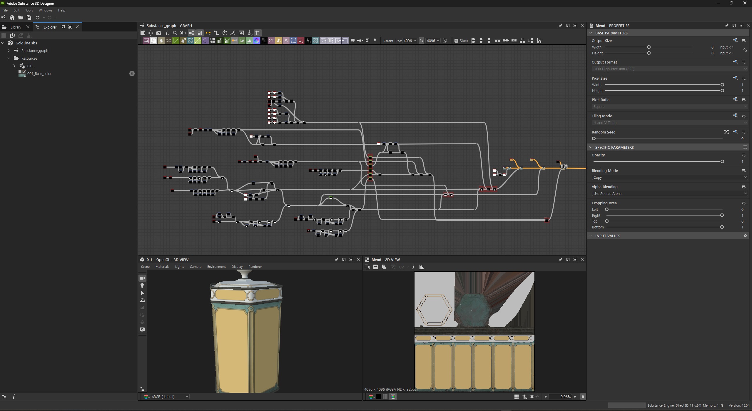
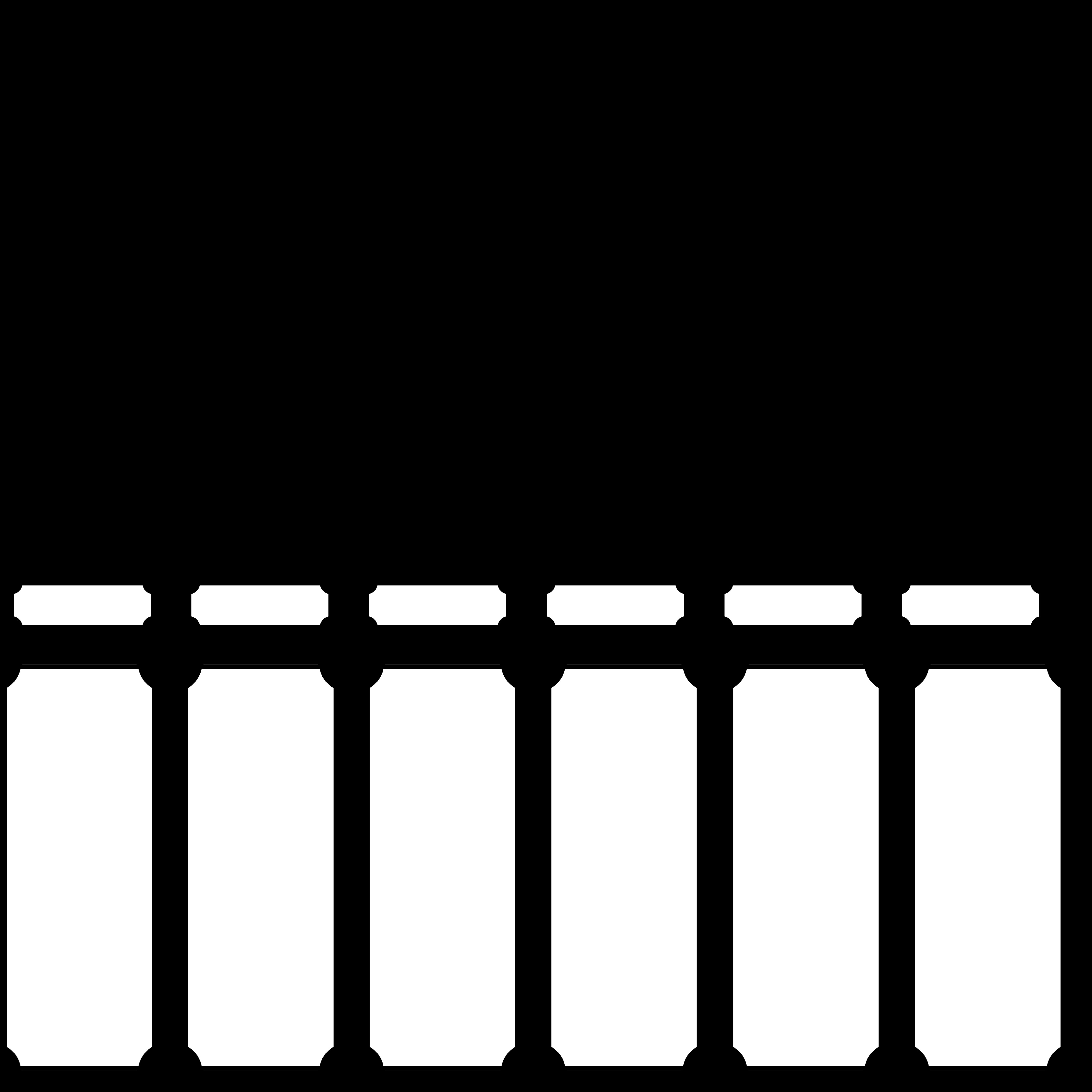
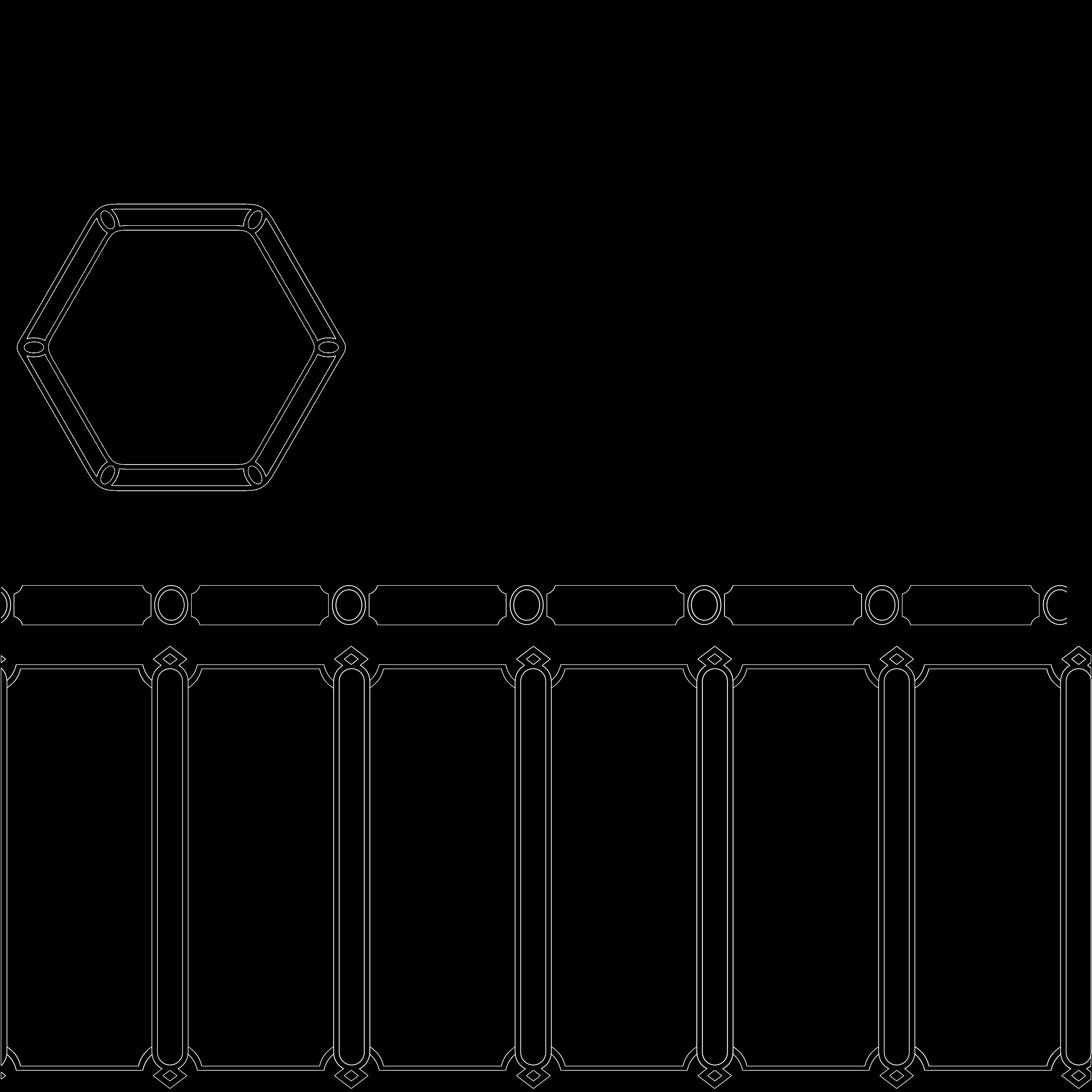
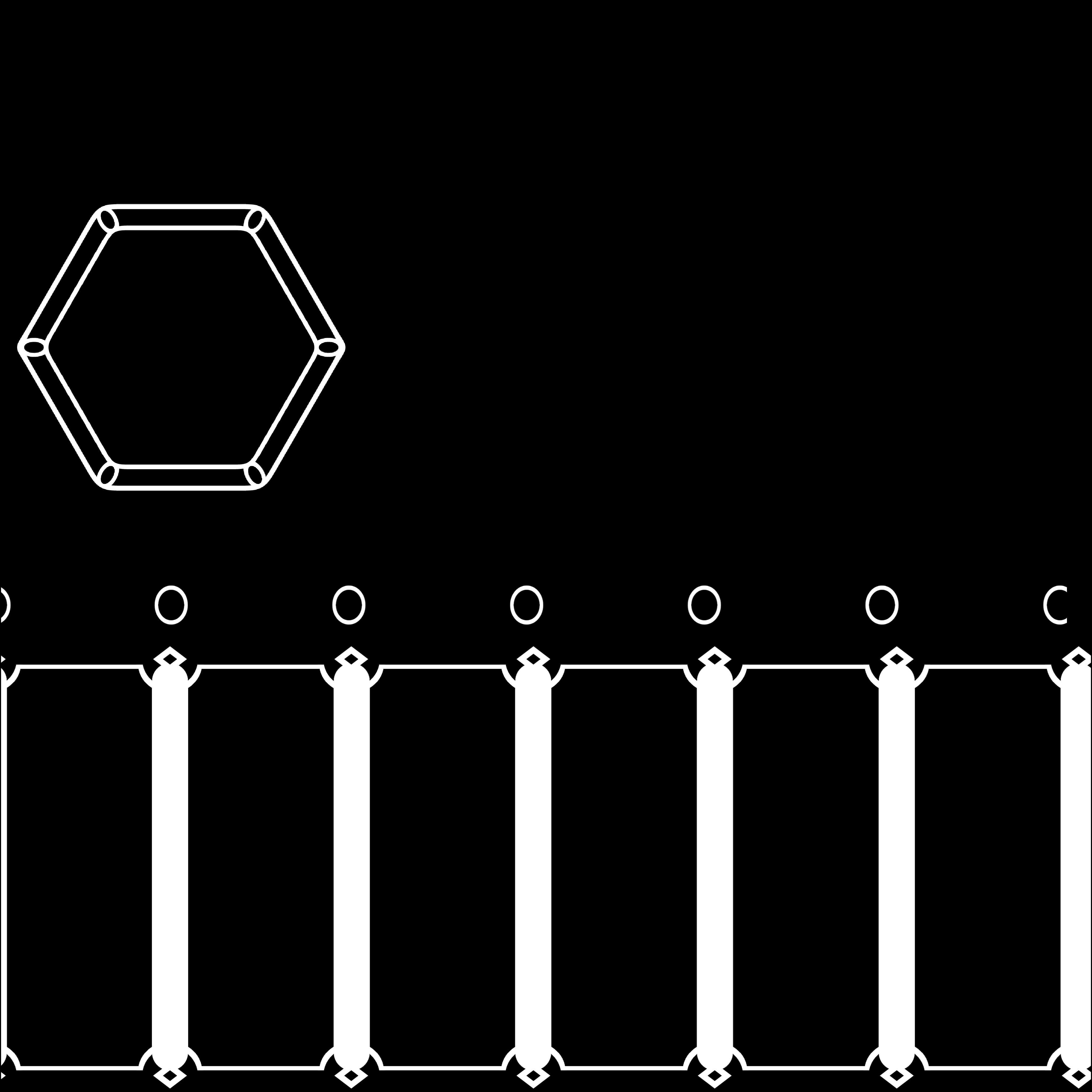
I first learned texturing in Substance Designer rather than Substance Painter, so I’m used to working with DOT nodes.
This makes using Anchor Points in Painter feel familiar to me, and I use them frequently throughout my texturing workflow.
Base Material
I started by setting up the base material, then added some subtle colour variation. I find grunge maps with leak patterns useful when setting up the base colour and roughness.
Printed Designs
I added new layers and applied the images using projection.
I then added Anchor Points and used them to create additional details.
Details
For the edges, I started with the Edge Wear generator because it makes it easy to set up the base wear.
I combined Anchor Point references with grunge maps using Multiply, then used the results to add variation to the base colour, roughness, metallic, and height.
When adding details, I think it’s important to avoid a repetitive look. Whenever I add grunge, I also add a paint layer to break up the repetition.
When adding colour to grunge or edge wear, I usually blend at least three colours to keep the surface from looking flat.
Finally, I added a colour and roughness pass across the entire prop using leak and fingerprint grunge maps to tie everything together.
Lighting & Rendering
I used a skylight and added two directional lights for rim lighting. I then added a shadow catcher to capture the shadows on the ground.
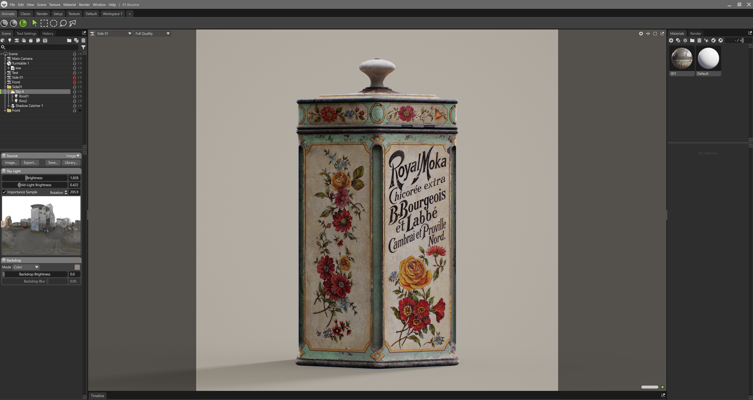
I think a good base colour does most of the work, and lighting helps bring out the best in it.
Conclusion
This project was a chance to focus on texturing, especially colour, roughness, and surface wear.
Whenever I finish a project, I always ask a friend for feedback. They don’t work in art, but they love games.
I find their perspective as a gamer helpful because it gives me a different way of looking at my work.
Thank you for reading my breakdown. I hope you found a few useful ideas to try in your own texturing workflow.
Read more articles
You might also like these articles.


