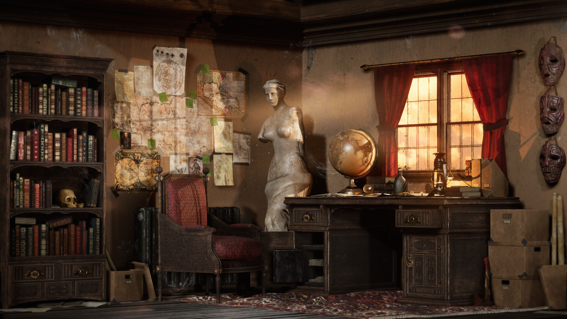
Adventure Study Room

Introduction
Hey, I’m Joe Burt, an aspiring 3D Environment/Prop Artist based in Nottingham. I am a 23-year-old postgraduate in Game Art, which I studied at De Montfort University in Leicester. Since graduating in July last year, I have been focusing on remaking my entire portfolio in order to hit a higher standard before pursuing my dream job.
Project
For this breakdown interview, I will be providing a step-by-step for my latest project titled: Adventures Study Room. Which focused on realistic material representation in a room cut away inside of Unreal. I would also be heavily focusing on composition and lighting.
Inspiration
The inspiration for this project stemmed from my love of typical adventurer archetypes, such as Nathan Drake, Indiana Jones and Lara Croft. And in particular there often messy and chaotic living areas where they prepare for their next big adventure. I thought this would make for an excellent theme for an environment to make, filled with lots of antiques and little details from across their past travels, all helping to provide different story elements.
So, to kick this off I started gathering a collection of solid reference of key elements I wanted to include in my scene. This reference included both real-life examples and images from games and films.

I cannot stress enough the importance of gathering good reference of specifically what you want to make. Every aspect should have some form of real-life counterpart or concept it’s influenced by or based off. After gathering my references, I knew I wanted to incorporate some key elements, including a cluttered work desk, a bookcase filled with antique books and an area of wall filled with pinned up maps, charters and research.
I thought all these elements would fit well together and help sell the story of the room.
With this decided, I started on a block out in 3ds Max, making sure to include a UE4 mannequin for accurate scale reference, as well as giving me an idea of how a character would interact with the scene.

Modelling
With a block out made and a firm idea of what props I wanted to include I started modelling the final assets for the scene. There were no complicated techniques here, just basic Max modelling using simple modifiers to help along the way.
I didn’t stress too much about polycount as optimisation was not something I was focusing on. Instead, I just made sure to model in the physical details of an object without going so far as to make it overly complicated for myself.

For any fabric materials such as the large rug and curtains, I decided to use 3ds Max’s built-in cloth simulation modifier.
This was pretty tricky to get right and took some time to get the desired creases and ripples in the fabric.
If I was to redo this project again, I think I would take the time to install and learn Marvellous Designer, as it probably would have taken the same amount of time but would give better results. Regardless here’s a link to the tutorial I used on 3ds Max’s cloth modifier:
UVs
Like with my modelling, I was pretty liberal when unwrapping my models making sure everything had a generous and consistent texel density.
To do this I used a simple texel density plug in and applied it to my unwrapped UV islands so that they were all to scale. I was also able to visibly see this as I applied a checker modo texture to all of the meshes. I then paired objects that packed well together or stacked UV’s to make the most out of my texture space. Below you can see the main groups of assets that I paired together to share texture sets.

Texturing
Once unwrapped I exported the assets 2 groups at a time rather than altogether to keep the workload in Substance painter down. In the past I have tried to just texture everything in one Substance painter file, only to have it crash and lag a lot. So, to save time I would opt to have a few separate painter files and share smart materials between them to maintain constancy when texturing.
Once in Painter, I start baking mesh maps. For the majority of assets, I didn’t use any high poly mesh as I spent the extra polys to actually model in the details. Or I relied on using a weighted normals plugin which edits normals of a mesh in order to make edges look smooth and higher res than they really are.
For these models, I just checked the “use low poly mesh as high poly mesh” option in painter and baked. A good example of what meshes I did this for would be the collection of small props, which didn’t require any sculpted normal details.

As for the few props, I did have a high poly version for, I used Zbrush to sculpt natural details or damages that I couldn’t otherwise model or texture in Painter. As I had already modelled and unwrapped the low poly versions of these assets, I only sculpt surface details and damages rather than making changes to the actual shape of meshes.
But for the purposes of this project making the low poly first and high poly after was fine. Usually, I would go high to low in other circumstances.
Examples of these assets that had a high poly bake included; the wooden desk, bookcase, the creased maps and pages and the damaged statue.

With all of my meshes baked down, I was able to start texturing. I don’t really have any strict workflow when using Painter, just a few general habits I follow. First, I usually just grab and apply the most accurate pre-made smart materials for each prop. I made sure to refer back to my reference for this, so I have a firm idea of the specific materials that make up each object.
When applying pretty much any material in Painter I also make sure to always use a fill layer with a mask to define what areas that material is present. This helps to maintain a non-destructive workflow, where I can easily go back and edit masks.
Finally, once materials have been applied and masked off correctly, I go into each smart material and rework each element to my desire. This can include deleting and adding elements or tweaking values. Once you’ve put some time and effort into making a good material you can then save it as a custom smart material and use it in other painter files to maintain material consistency across the project.
For this project one of the materials I focused on a lot was the oak for the desk and bookcase, in particular the edge wear which I wouldn’t have been able to achieve with a tiled designer material.

For the ornate carved details in the wood, instead of sculpting these in Zbrush I created masks in photoshop and imported these into painter and applied them to the mask of a fill layer which had hight applied. I could have sculpted these using Zbrush, but for the purpose of this project I preferred to use this method.

I used the same method to add a lot of Base Colour details, such as the spines of the books and the open sketches which otherwise I would have to paint by hand in Painter.


Material Set Ups
Now in Unreal, I import the meshes and textures in specific labeled folders to keep organised. At this point, I start making my master material which will be instanced and used across the majority of my assets.
I have worked with this master material across a few projects now, and have added to it considerably. With a lot of custom parameter nodes, I can easily swap out textures and tweak their values across lots of material instances. This helped a lot when fine-tuning different elements of the environment to gain consistency.
To make your own, I suggest like me, you start off with the Quixel base material that gets imported with any Quixel mega scan mesh.

For more specialised materials that require a translucent blend mode rather than just masked, I just duplicated and edited another master material specifically for translucent materials such as glass or subsurface materials like the curtains.
Constructing the Room
Now all my assets had correct material instances assigned, I was ready to start placing props and construct the room. Instead of just chucking all of these props into the view port, I first made a few different Blueprint actors, which contained collections of assets that would be placed together. This not only made my world outliner much more organised; it was also a big-time saver compared to dealing with each individual asset by hand in the view port.

Here you can see selected the desk, book case and wall research Blueprints which all act as once easy to place object in the scene.

With a general build of the room now made based on my original block out, I started homing in on some of the smaller elements like the placement of objects on the desk. I also started adding cameras at this point to define my best shots and angles of the room early on. I could then work the composition of the room around these key shots.
I always use CineCameras as they give a lot more options in comparison to the regular cameras which are mostly used for in-game purposes. I also often use the cinematics viewport, which allows me to drop various composition overlays to help compose the scene.

Tillable Materials
Before moving onto lighting the scene, I had to deal with texturing the larger surfaces of the scene which would rely on tillable materials. As I only needed a few very basic materials, rather than make these in Designer I decided to import these from Quixels mega scan library. This included the Painted plaster wall, wooden beam and wooden plank flooring materials.

Dress up
Whilst in Quixel Bridge I decided to gather some dress up assets as well, to help break up my scene and give some further detailing and story elements. These included a variety of decals and 3D assets. Once imported I applied these to blank or open areas that I felt needed more interest, and to blend them in I would again tweak values in their material instances.

The final dress up element I added was the cob webs which I made myself. These where super simple and just consisted of me making cob web masks in photoshop, and using this in a masked material in Unreal on some basic plain meshes. I then placed these around areas where it made sense for cob webs to grow over time.

Lighting
With my scene pretty much constructed now, I was able to move onto focusing on the scenes overall lighting. Lighting has a whole science behind it and is something that I am still practicing at, which is why it’s something I focused on heavily for in this project. I wanted to make a warm well-lit day time lighting set up, as I thought this would fit the atmosphere I wanted to create. If I went for anything darker, I think I would run the risk of creating a horror atmosphere in an abandoned old house, which wasn’t what I was going for.
To keep things simple, and to avoid having to bake any lighting, I opted to make all of my lighting dynamic for this scene. To start I placed a Directional Light which would act as my main source of light for the scene. From here I added other smaller lights around this main source in order to light up areas of interest that I wanted to capture the viewer’s eye.
I always made sure when adding these lights to think of their natural source if they where to exist in real life, which held me back from over lighting the room. I wanted to keep strong areas of contract to really push the final renders.
Window Lighting
The main example of natural light in the scene is the window that I designed to light up across the wall where the maps and charters are, along with the face of the statue which where both areas of interest I wanted to exploit. To make this I used a spot light angled to hit these areas and cast nice smooth shadows of the window frame. This also lit up the subsurface elements of the curtain material.

I also used one of Unreal’s new Rect Lights which is effectively a flat surface of light across the window, to give a general spread of bounce light from the outside word and light up the desk surface directly in front. For this light I also increased its volumetric scattering value, which paired with the scenes Exponential Height Fog created a nice warm glow from the outside world.

Finally, to complete the window light I added some bonus effects to really emphasize this crucial element of the scene. First, I used a God Ray Blueprint that I took from the free to download particle effects cave on the Epic marketplace. I angled this in the same direction as the windows spot light to match up with the light being cased onto the wall. I increased its intensity and tweaked its colour to match that of my warm morning sun colour scheme.

I wanted this important beam of natural light to stand out even more so decided to also add a faint firefly particle effect which would act as dust being lit up in the old room. To make this I followed this quick tutorial on YouTube.
And decreased the emissive intensity of the particles so that they looked more like dust rather than fireflies.
After Effects
The final stage of this project was the after-effects which mostly came from a post-process volume which I had set to infinite extent to cover the whole scene. There are a whole host of different effects in the post process volume I used to do some colour correction and grading. However, as I spent a lot of time focusing on the lighting of the scene, I was pretty happy with the result I already had so these were very minor tweaks.
Instead, I mostly riled on the post process volume for its dirt mask, lens flare and vignette effects. All of these where simple to set up, and for the dirt mask I downloaded a pack of different lens effects which I added on top for different shots of the room.

Beyond this the final few touch ups and post effects I did to the final Unreal renders using Photoshop. These where very minor changes and mostly focused on any colour balance, light tweaking and adjustment layers.
Conclusion
Having set out to do this project with the goal of improving some key skill sets such as lighting, material definition and general prop quality, I feel I have learned much about each different subject along with a whole host of other subskills along the way. This to me deems this project a success as I have further improved these skills and as a result pushed my portfolio one step further in terms of its quality and range.
I hope readers of this step by step breakdown have hopefully learned a thing or two of their own, either technical or just general. And I would like to thank anyone for taking the time to read this interview.
Please feel free to check out the entire finished project here on my portfolio:
Read more articles
You might also like these articles.