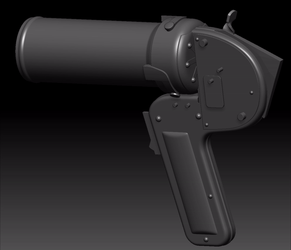
Fire Extinguisher Pistol


Introduction
Hello, my name is Lily and I’m a 3D Hard Surface Artist from Wales, UK. I’ve been working professionally in the games industry for over 4 years on a range of titles at 3 different studios.
I started my career as an Environment Artist and then pursued Hard Surface, which has been my focus for the last 2 years.


Project
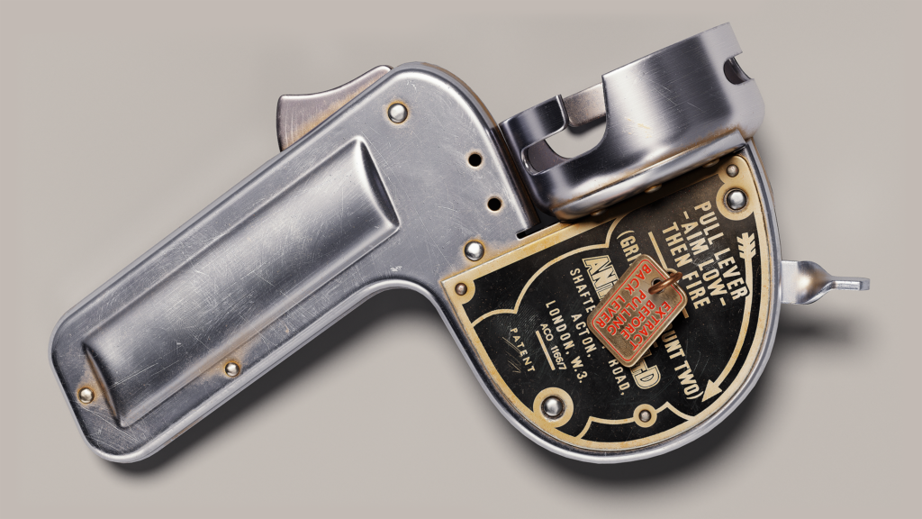
When I was researching online, looking for good ideas for a portfolio piece, I came across this antique fire extinguisher pistol on a second-hand antique site. It was love at first sight, such a unique and strange-looking thing; I had never seen or heard of one before.
When picking something to do in your own time, I would definitely recommend making something that you are truly interested in, something you’d enjoy. I bought one on eBay that was worn and interesting, and that’s the one I modeled and textured.
Having on-hand reference is a game-changer, especially for accuracy in the model and texture. This project was primarily texture practice for me since the model is very basic.

Software
- Blender
- ZBrush
- RizomUV
- Substance Painter
- Marmoset Toolbag
- Photoshop
Modelling
I create my blockouts in Blender, primarily using Booleans. To create my high-poly model, I import the blockout meshes to ZBrush and apply the booleans. After using DynaMesh, I sculpt any details like welds or dents, and then polish & decimate.
You might want to polish a bit before the sculpting, and a final light polish after adding sculpted detail – so as not to totally polish out your sculpt detail.
The low-poly is then created from the blockout and adjusted to match the high-poly.
Blockout
I create my blockouts in Blender, primarily using Booleans. When blocking out, it’s best to start with real-life measurements, whatever information you can gather online, or if you have the real thing in front of you, then you’re lucky enough to measure it yourself.
It also helps to find an orthographic side image of your subject and import that into your scene as a guide (but make sure you size it to the correct scale as close as possible).

Highpoly
To create my high-poly model, I import the blockout meshes to ZBrush and apply the booleans. I then use DynaMesh, and afterward, I sculpt any details like welds or dents and then polish & decimate (sometimes I polish a bit before the sculpting, and a final light polish after adding sculpted detail – so as not to totally polish out the details of the sculpt).
I sculpted some dents and bumps in various areas; the most obvious marks looked like they were from the manufacturing process of the extinguisher.
For the weld sculpt, I started by using a very handy ‘Cut metal and welding’ brush pack for ZBrush made by fruit-cake on Gumroad. I then adjusted it a bit to match my reference.


Lowpoly
The low-poly is created from the blockout and adjusted to match the high-poly. For portfolio pieces, you don’t really need to optimize your low-poly that much unless you are specifically trying to show your optimization skills.
I made sure that the edges weren’t too faceted, so up-close renders would still look nice. Make sure that your UVs are nice and straight; it will make clean bakes and give you more texel density.


Baking
I use Marmoset Toolbag to bake. A short and easy step so long as the low-poly and UVs have no mistakes. I adjust the cage offset & paint skew when necessary.
With parts intended to animate, it is best practice to separate them from the other parts of meshes so that when the AO is baked down, they’re excluded from other objects that may cast AO shadows on them.
This way, animated parts don’t show occlusion, but you get to keep all your nice combined AO on the areas that don’t animate. This can be done by exploding your model in the scene or alternatively by checking the ‘Exclude When Ignoring Groups’ checkbox.


Texturing
For this asset, I textured in metal/roughness on one 4k texture sheet.
I find it best to do my texturing in stages:
- Alpha imports
- Height stamps
- Base materials
- Damage, grunge, and dirt
- Final touches and adjustments.
I won’t go into too much detail about the stages; instead, I’ll focus on the main areas of interest in my texture and a bit about how I approached them.
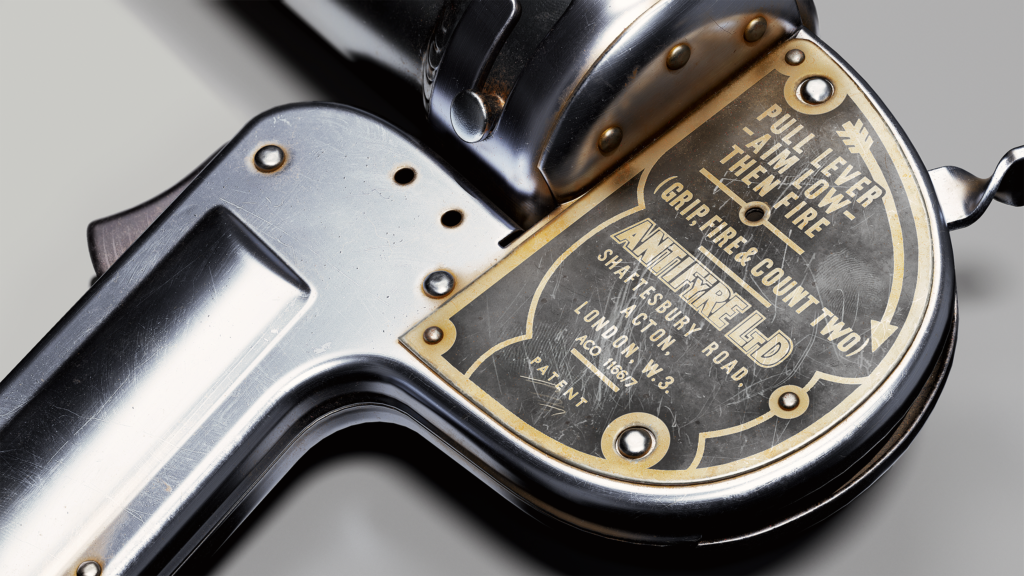
To start my process, I import any alphas I need for the texture. For my fire extinguisher pistol, that included the sticker label on the canister and the instructions on the metal parts. I also created alphas for the scratched-off sticker areas.
To make my work more unique, I create scratch/damage alphas from my own photos or textures I’ve found online. I manipulate the images in Photoshop, muting the hue and using levels or curves to push them to pure black and white, before importing them into Substance Painter.
For text stamps, I frequently use free font websites to search for visually similar fonts for anything I’m working on. This is a good method if the original photo reference is not high quality enough to make a stamp from.

After importing all my alphas, I focus on the base details of my subject, ensuring I capture the defining features accurately early on. I usually use 2-3 layers for roughness, color, and height variation.
To add more depth to the texture, I included my AO map in my base color. I tone down the intensity so it doesn’t look too fake.
I also want the color differences to be subtle but still noticeable. I used a subtle gradient for the canister, which works really well in the final renders.

I hand-painted some small details from manufacturing on the height map. It’s these little details that really make an asset stand out.
If I have the time, I like to focus on imperfections and try to recreate them.


The metal is covered in micro-scratches, so I built up many layers of subtle scratches and added stronger scratches where the item had been exposed to more wear and tear.
Later on, I increased the intensity of the scratches so they were more visible in the renders. I use imported scratch textures instead of the scratch generators available in Painter.
You get much more realistic results when using masks of real scratches, as well as more control over where they are placed.


Some scratch layers predominantly affected roughness rather than height.
The instruction label has a layer of grime, scratches, and fingerprints, and I wanted to emphasize these details in my version.


There were many areas to add a buildup of dirt. My reference had really aged dirt and weathering from wherever this item was stored.
This was good practice for me to mimic the different kinds of dirt and grime all over, so I used many layers and different masks.

The red-painted end of the extinguisher’s canister had unique details that were difficult to mimic with only the default library in Painter. So, in addition to using base layers and dirt layers, I also took a photo of my reference and created an alpha mask to fake the details on the height and roughness.
I didn’t make the mask entirely black and white because I wanted those fainter details to be included.


The canister has different base details on the two parts that were welded together, and there are also little flecks from the welding work.
I think another canister was welded together right next to this one, and this one got splattered.
These small details all tell their own story, as cheesy as it sounds.

Another subtle detail I observed was the sticky residue that had spilled out from the sticker, catching more dust and grime along with it.
I kept this detail quite subtle. Sometimes I go back to layers like this and adjust the intensity until the whole asset comes together well.

How dirty is this old sticker? Quite dirty. There are little splatters of paint, scratches, tears, smudges, dirt, and fingerprints.
To achieve a realistic look, you need to collect good photo references of old stickers and really study your subject.
Replicate it by building up layers of the main differences you see.

On text stamps that have height, I always have a few layers and masks that make it look more natural and realistic.
Even one simple grunge map on the height channel can improve it a lot.


Presenting Final Work
For my final presentation in my portfolio, I created a selection of renders, including a few “fun” ones, and also a vintage-style poster.
Vintage Poster
After seeing the original paper adverts for the Antifyre Pistole, I couldn’t resist the urge to make my own poster.
I took what was in the original adverts and fused them together, using a modern gun magazine for ideas on how to arrange it, and took a random vintage poster background pattern from a web search for inspiration.
I picked a color palette that wouldn’t distract from the Antifyre Pistole. For final touches, I used some Photoshop filters and masks to make it look more like a vintage printed poster, and then added grunge textures on multiply with low opacity.


Renders
I did my renders in Marmoset Toolbag 4. I used ray tracing for most renders but not all.
For lighting, I mainly used very subtle HDRI packs to highlight edges and 2-3 directional or spotlights.

This is a stage where I really spent some time to make sure I was doing the work justice by presenting it properly.
Each of my final shots focuses on something that the other shots don’t.
On the close-up renders, I used lighting and depth of field to focus on the areas that I wanted to highlight.
At this stage, it’s great to have a few friends to lend you a second pair of eyes and get some feedback.
To finalize the chosen renders, I adjusted the contrast and sharpness and added a few LUTs to adjust the color very subtly.

Outro
Thanks for taking the time to read my breakdown; I hope it was informative.
Also, thank you to the team at GamesArtist.co.uk for taking an interest in my work and giving me the opportunity to share my asset breakdown.
Here is a link to my ArtStation post: https://www.artstation.com/artwork/lDLQJJ
Read more articles
You might also like these articles.