Wooden Floor

Introduction
Hi, my names Daniil and I'm a 3D Environment, Material & Level Artist.
Project
Basic materials such as wood, stone, or concrete often come in handy in a material artist’s work, as these surfaces are among the most common in environments. That’s why understanding how they’re built and created is so important.
While working on my portfolio, I decided to create several variations of wooden flooring — and immediately realized how complex and deep this topic is.
In this article, I’ll share the approach that helped me achieve a believable and expressive result in Substance Designer, as well as talk about technical techniques, reference research, and the importance of artistic choices.
Why Wood Is Challenging
Wood is not just one simple pattern. It consists of dozens of nuances: age, grain structure, species, deformation, moisture, and of course, surface treatment (varnish, oil, etc.).
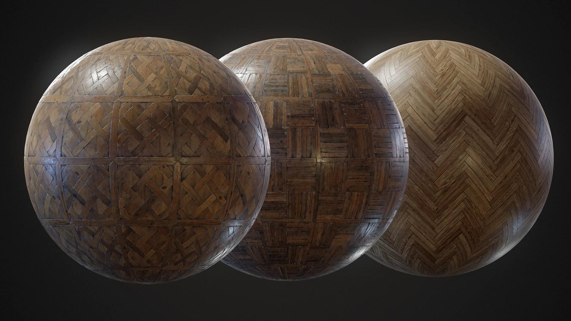
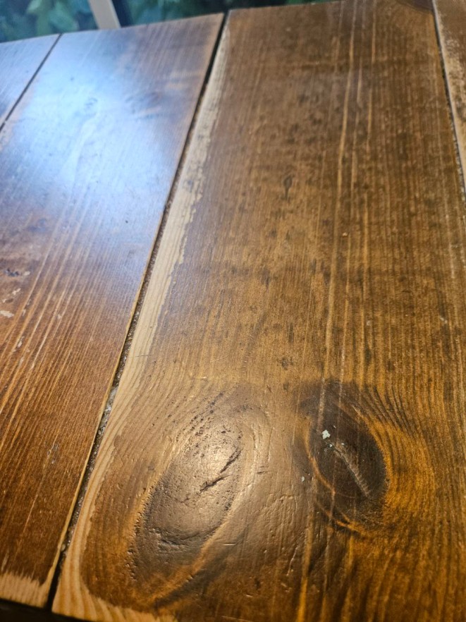
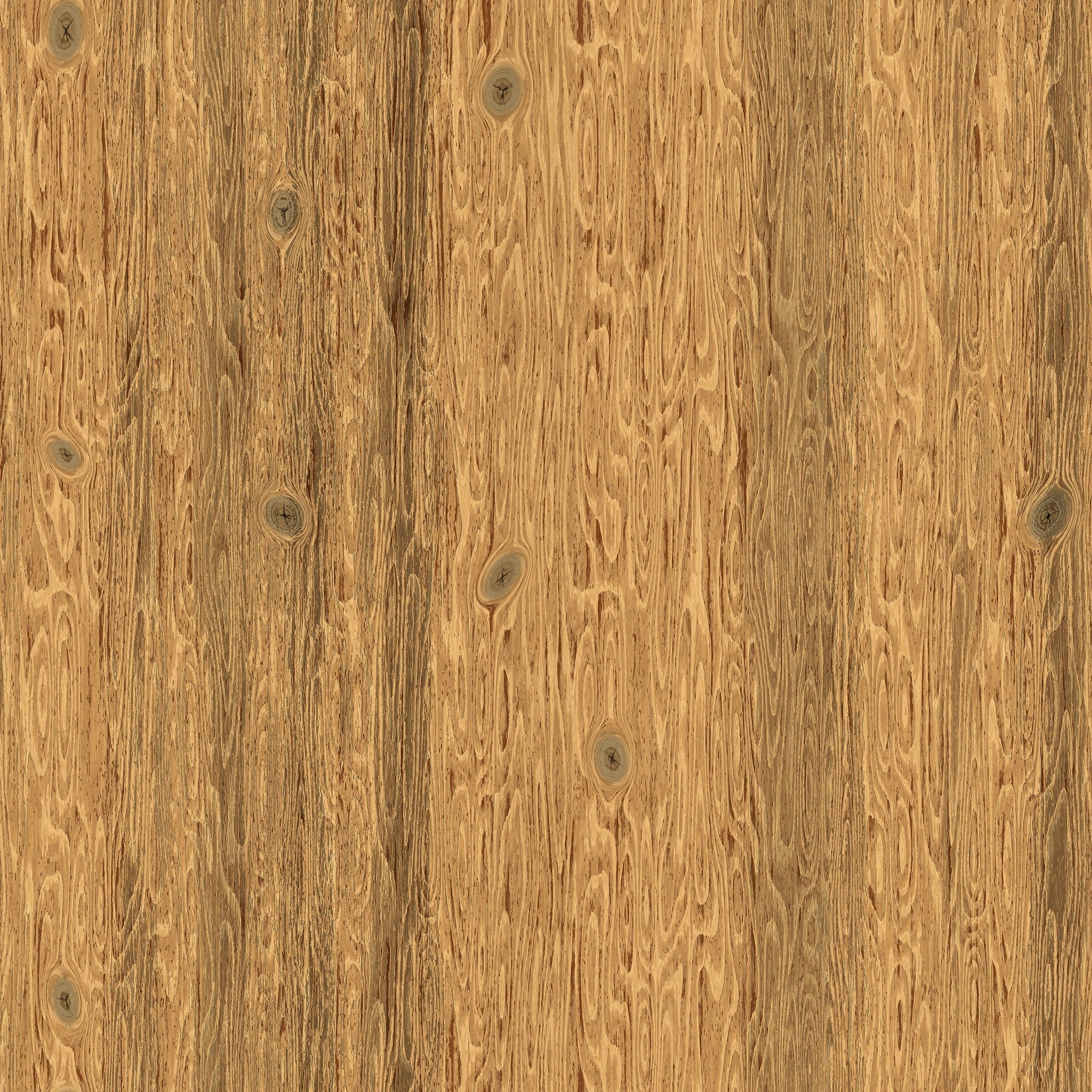
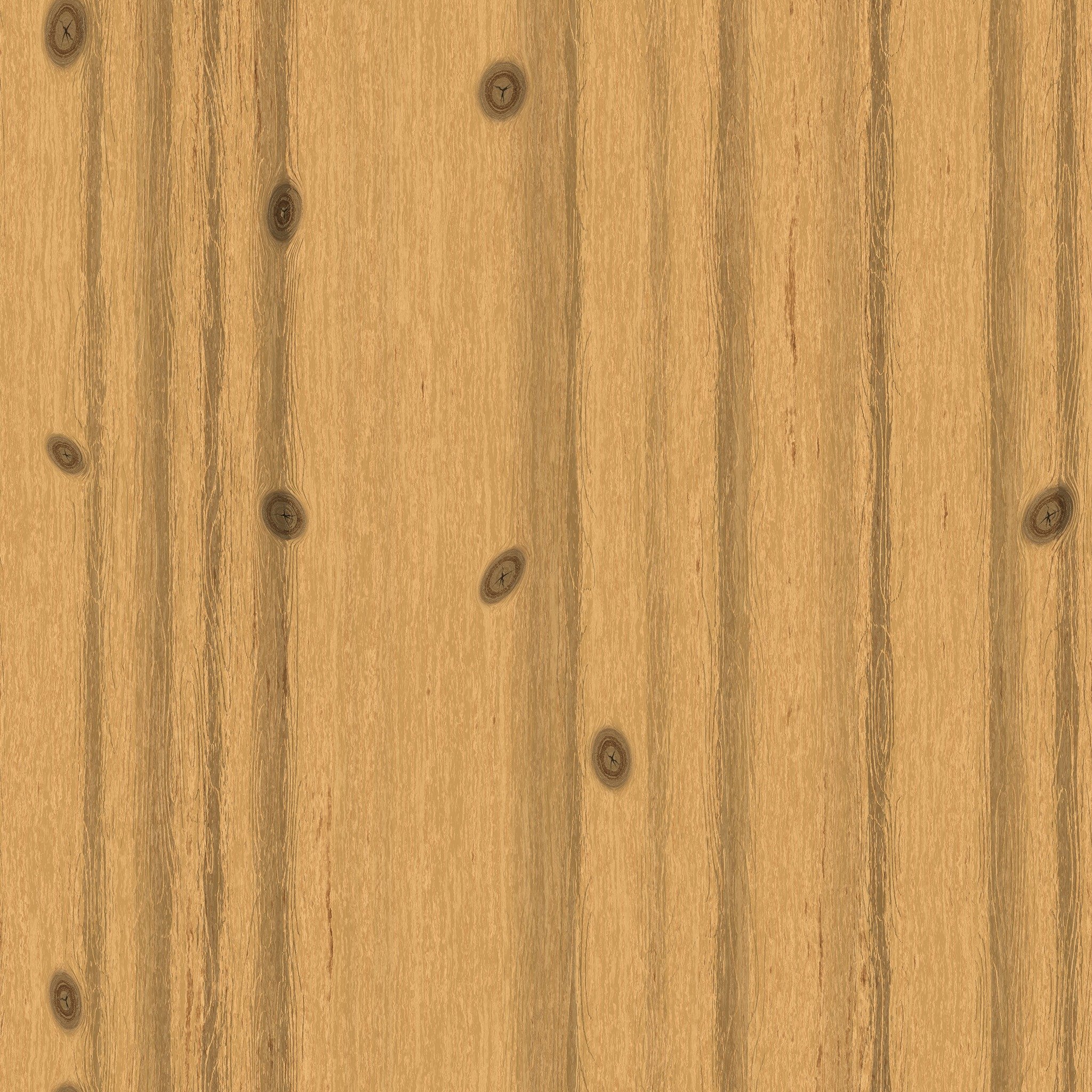
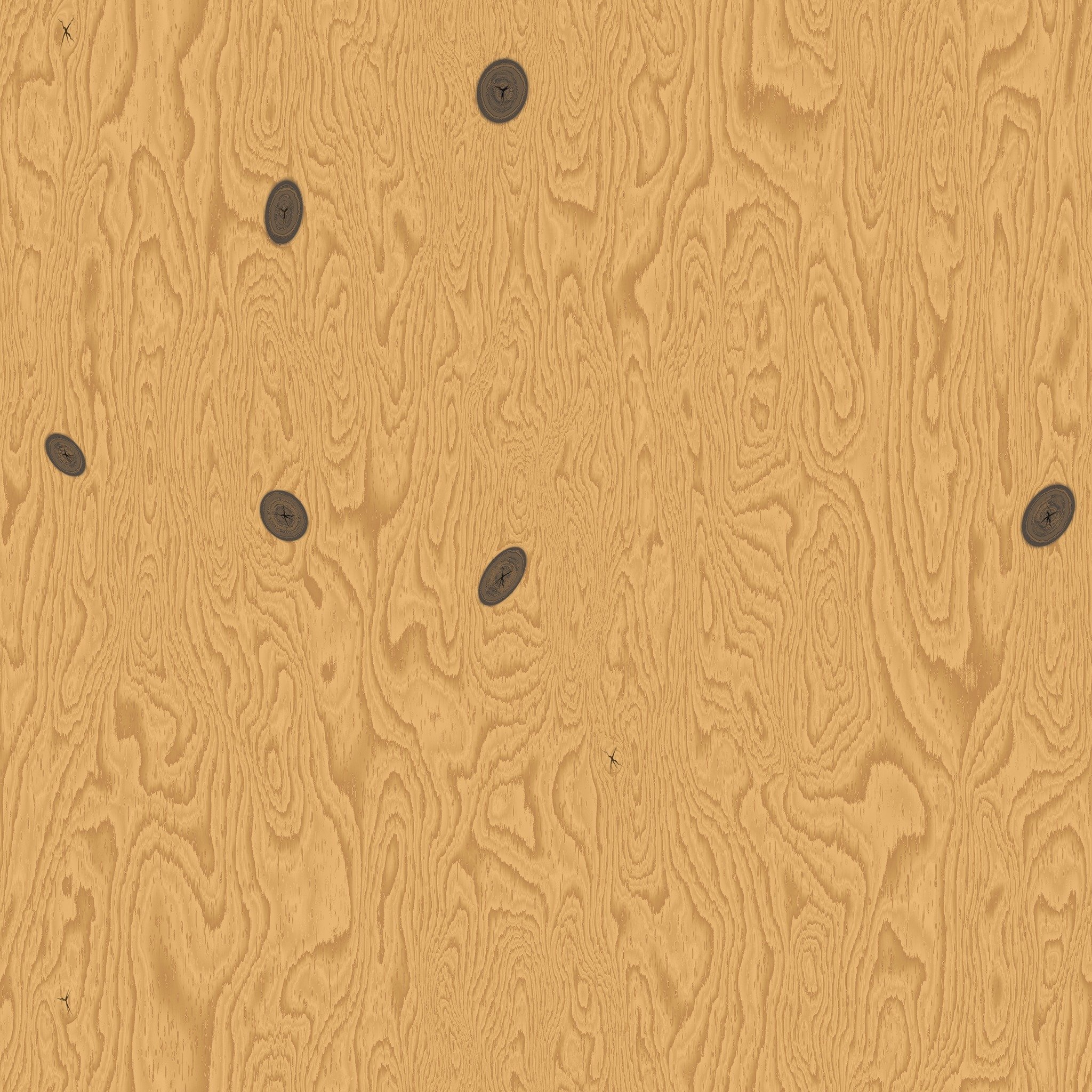
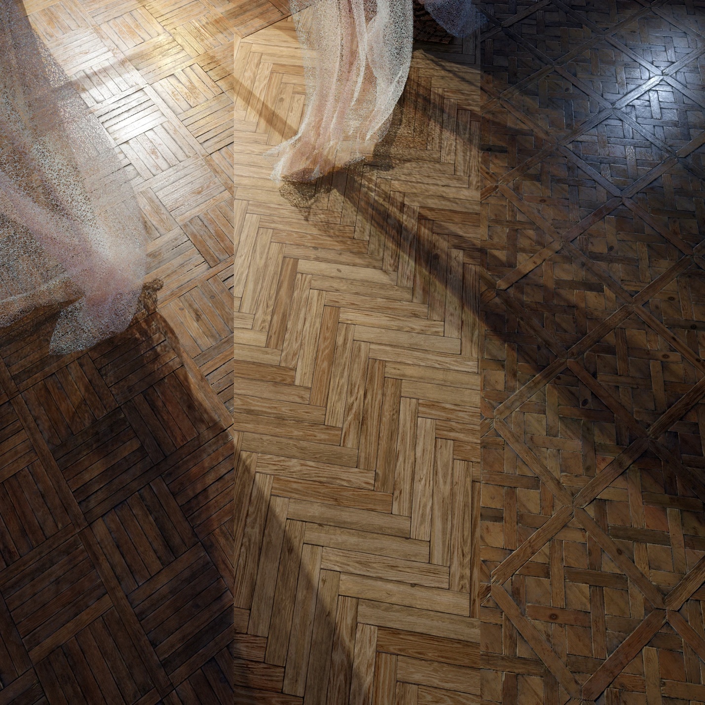
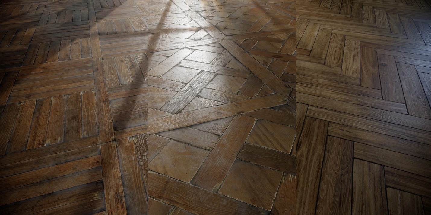
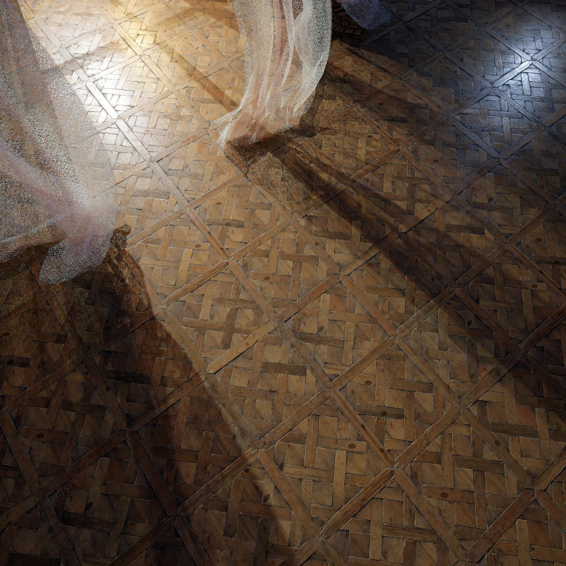
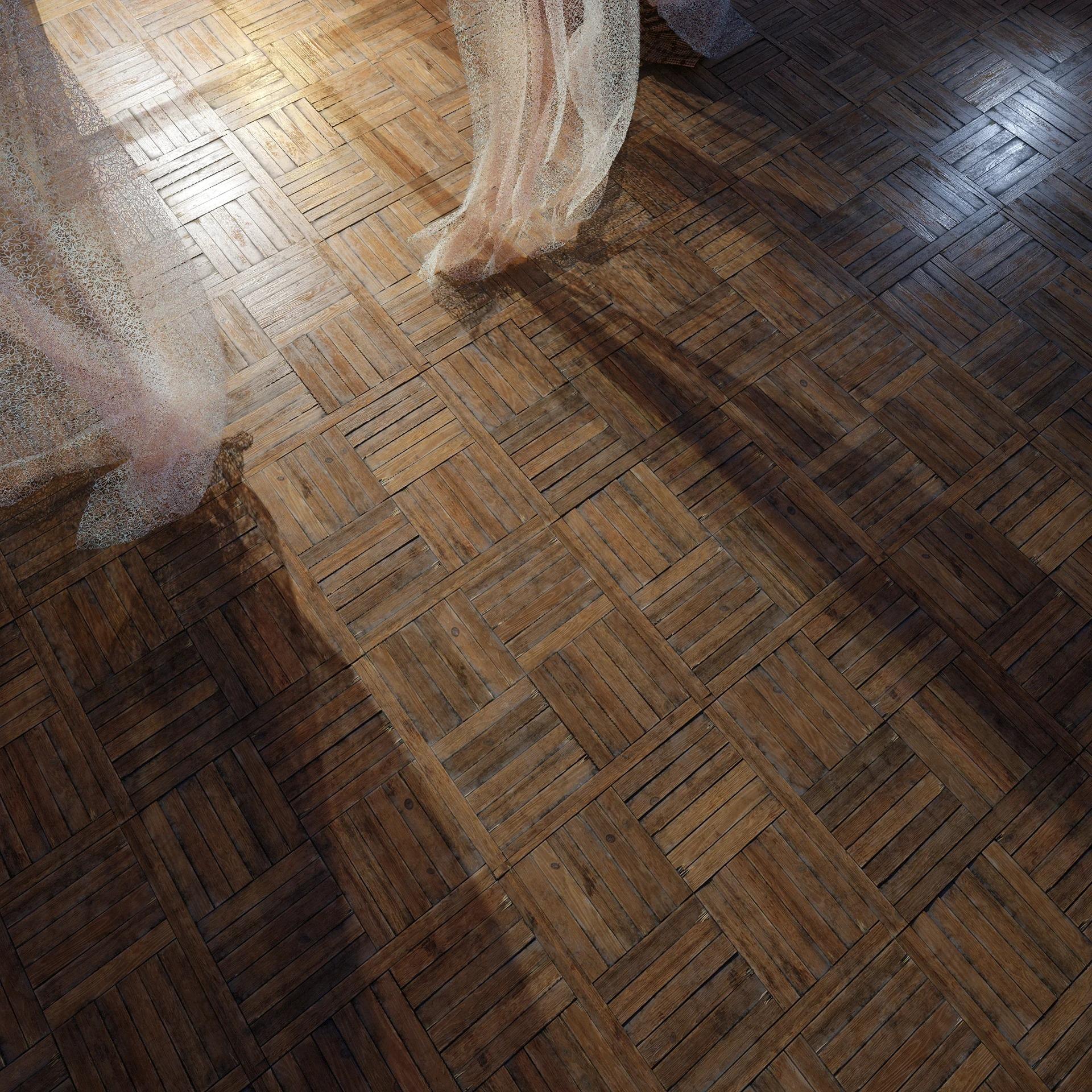
To get a real feel for this, I decided to make three variations of wooden planks — differing in layout pattern, color, and degree of wear.
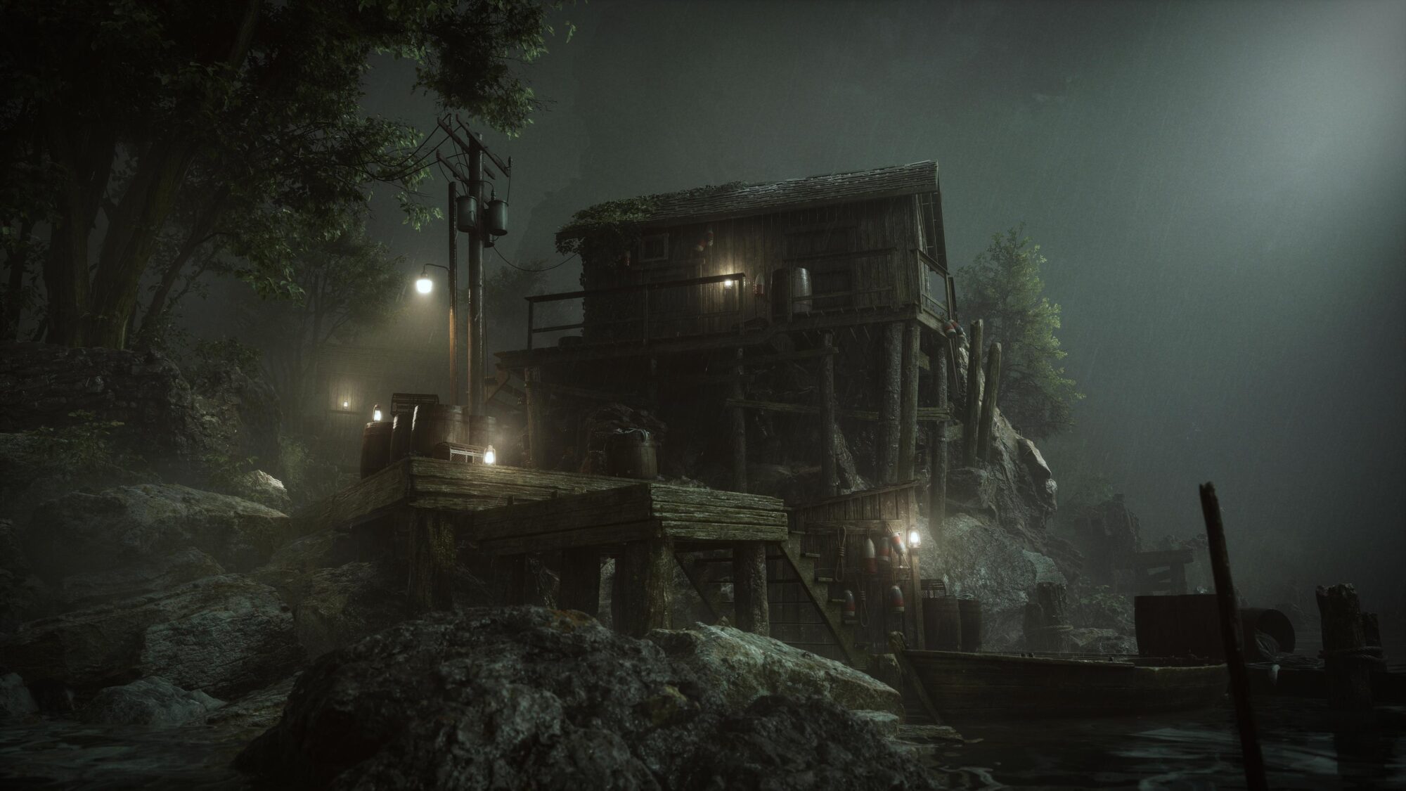
Here are some references I took in various places:
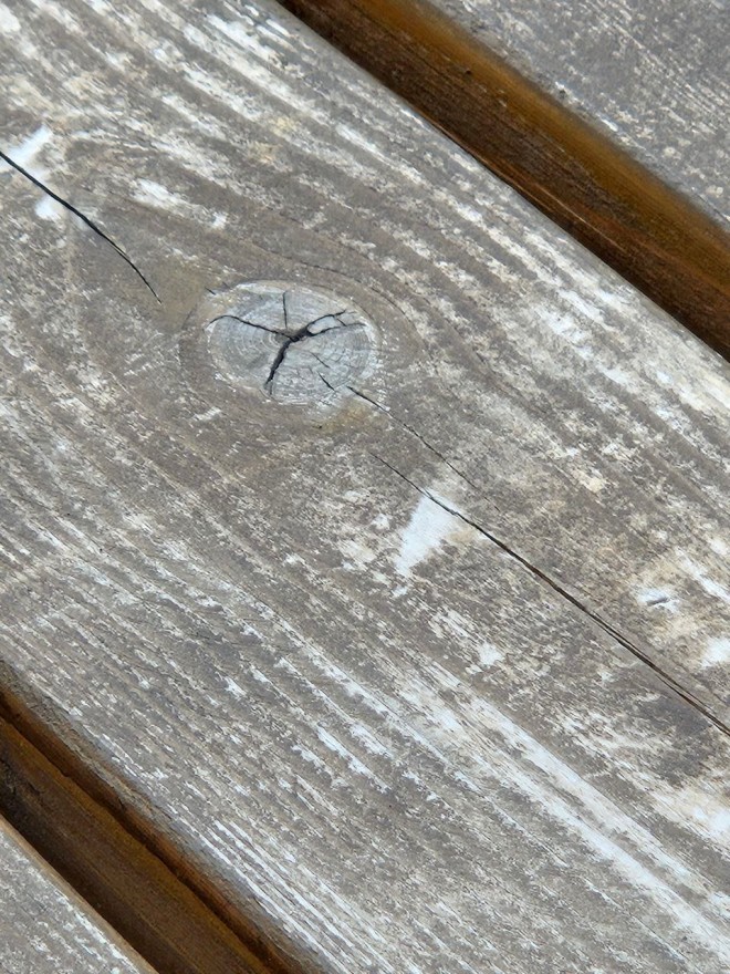
This helped me understand how different wood properties affect the final result.
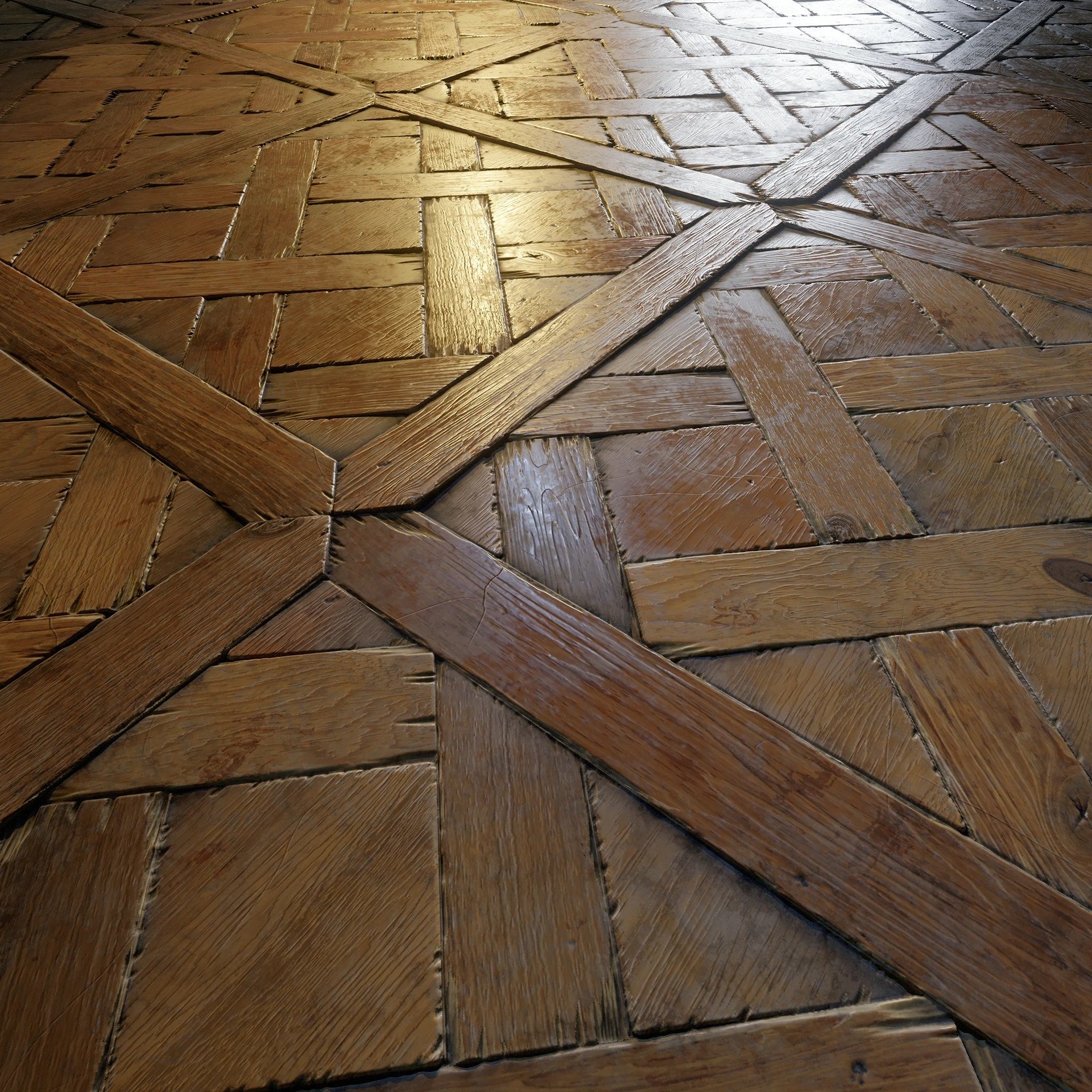
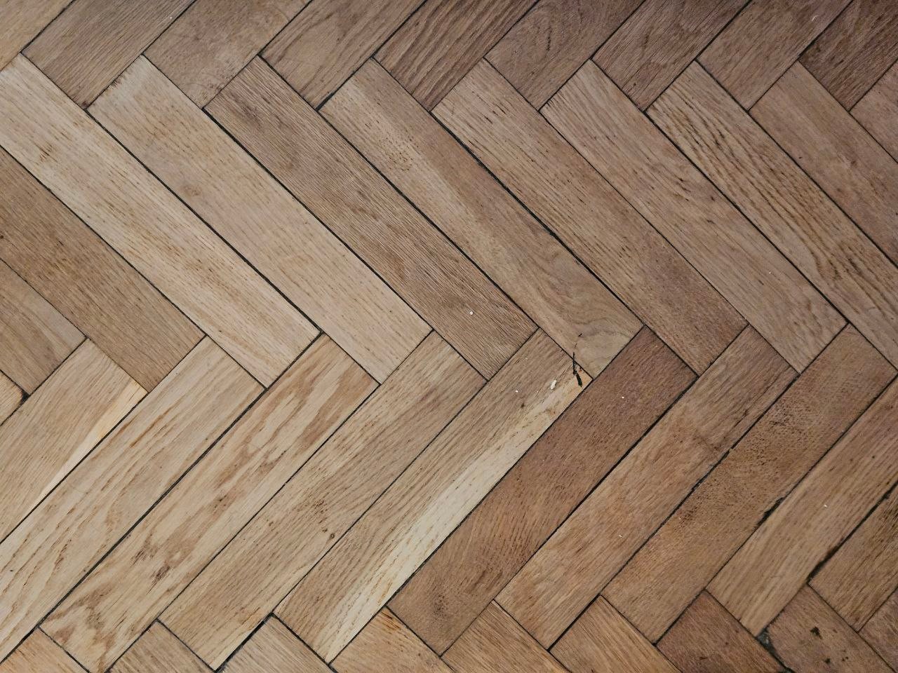
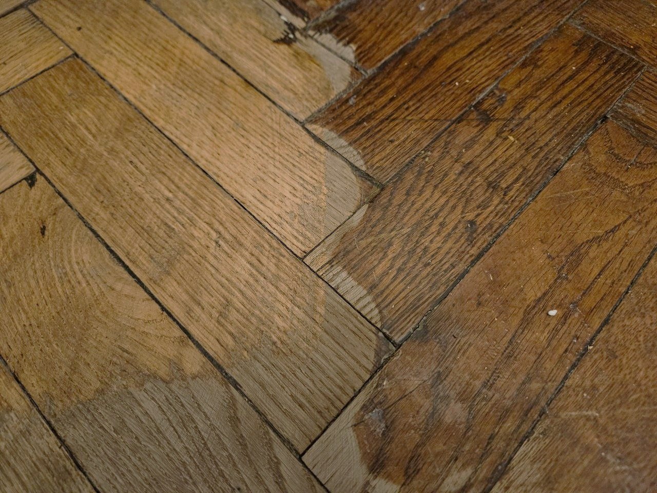
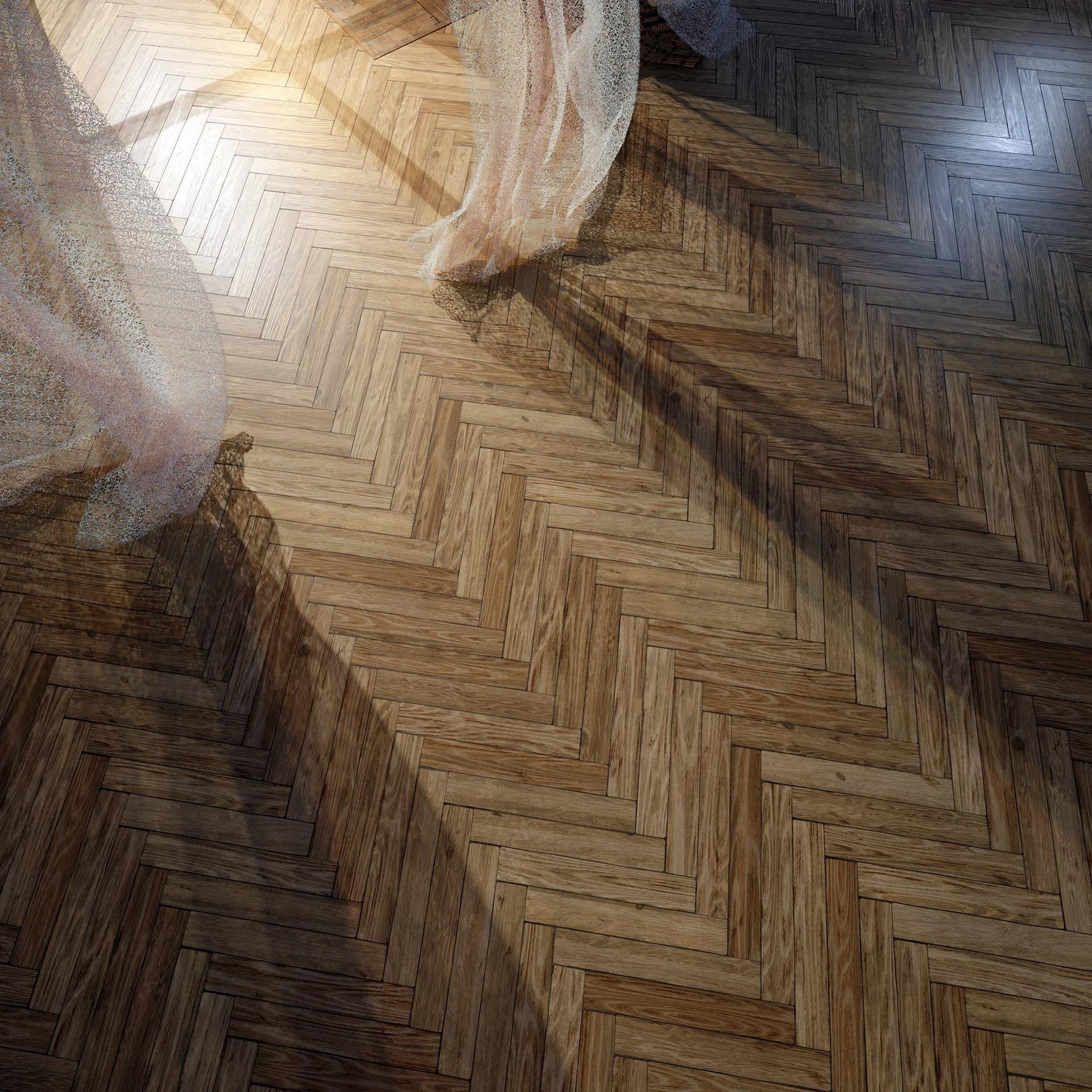
I started with the most accessible and familiar version — Soviet-era herringbone parquet, which I still have in my room.
The best references are right under your feet!
Research as a Path to Quality
Before and during production, I gathered information about wooden flooring:
- Studied how it’s cut, the different species, and installation methods.
- Learned which woods wear out faster over time.
- Paid attention to damage patterns: softwoods (like birch) often show dents, while hardwoods (like oak) tend to have chipped edges.
This knowledge proved crucial in creating secondary and tertiary details. Visual literacy and research are powerful tools that help build a logical workflow and make materials more convincing.
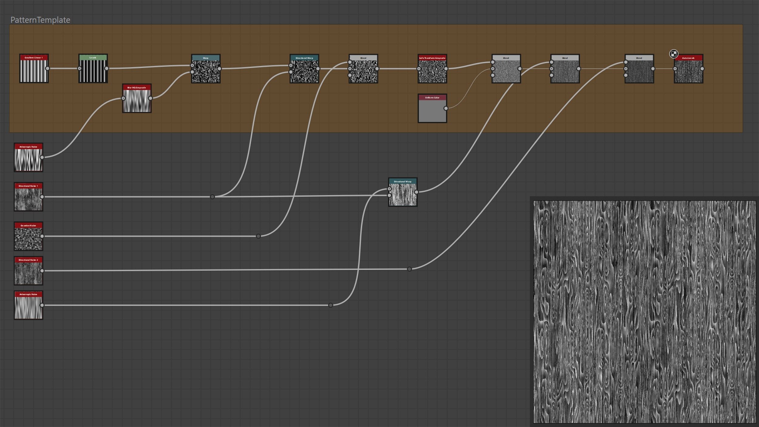
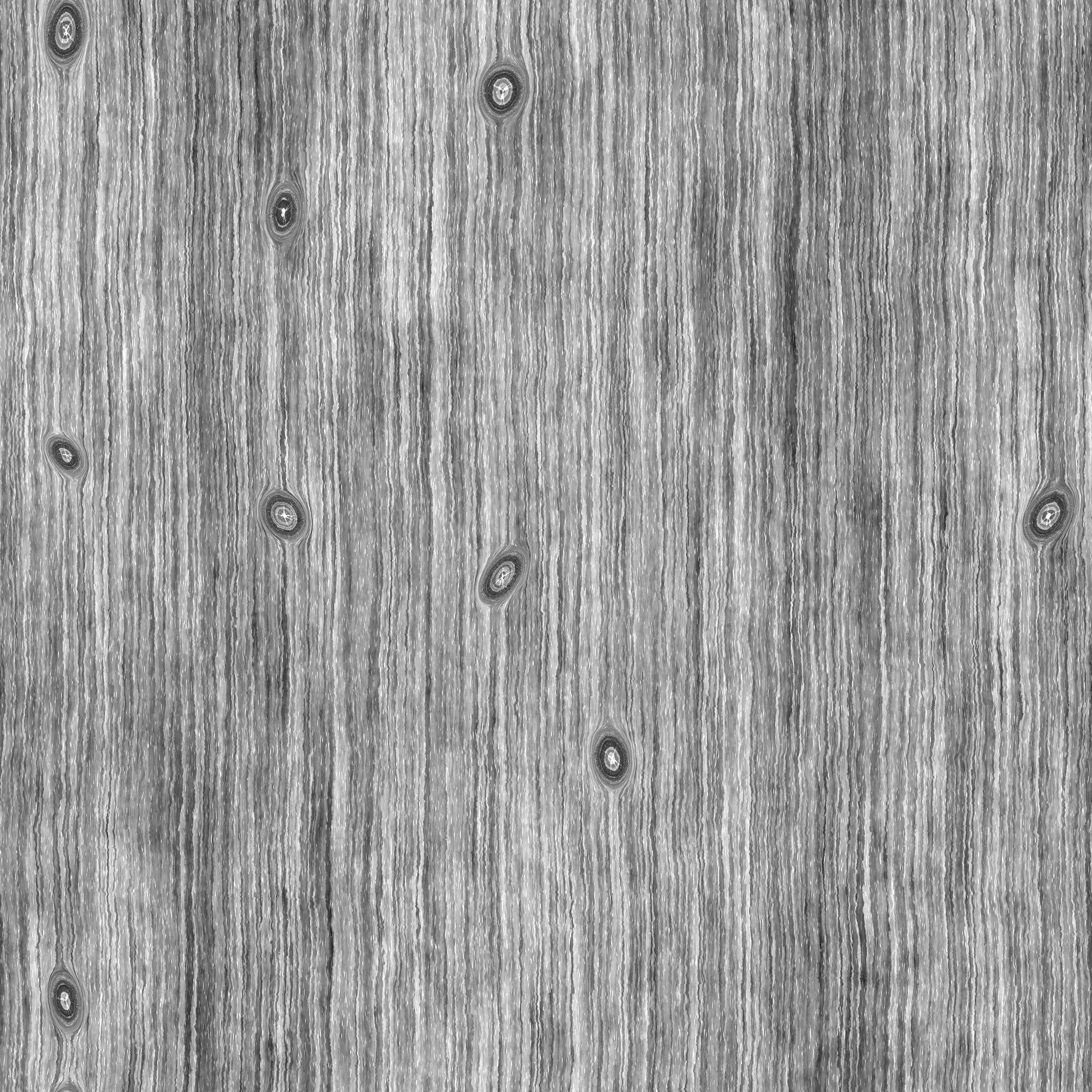
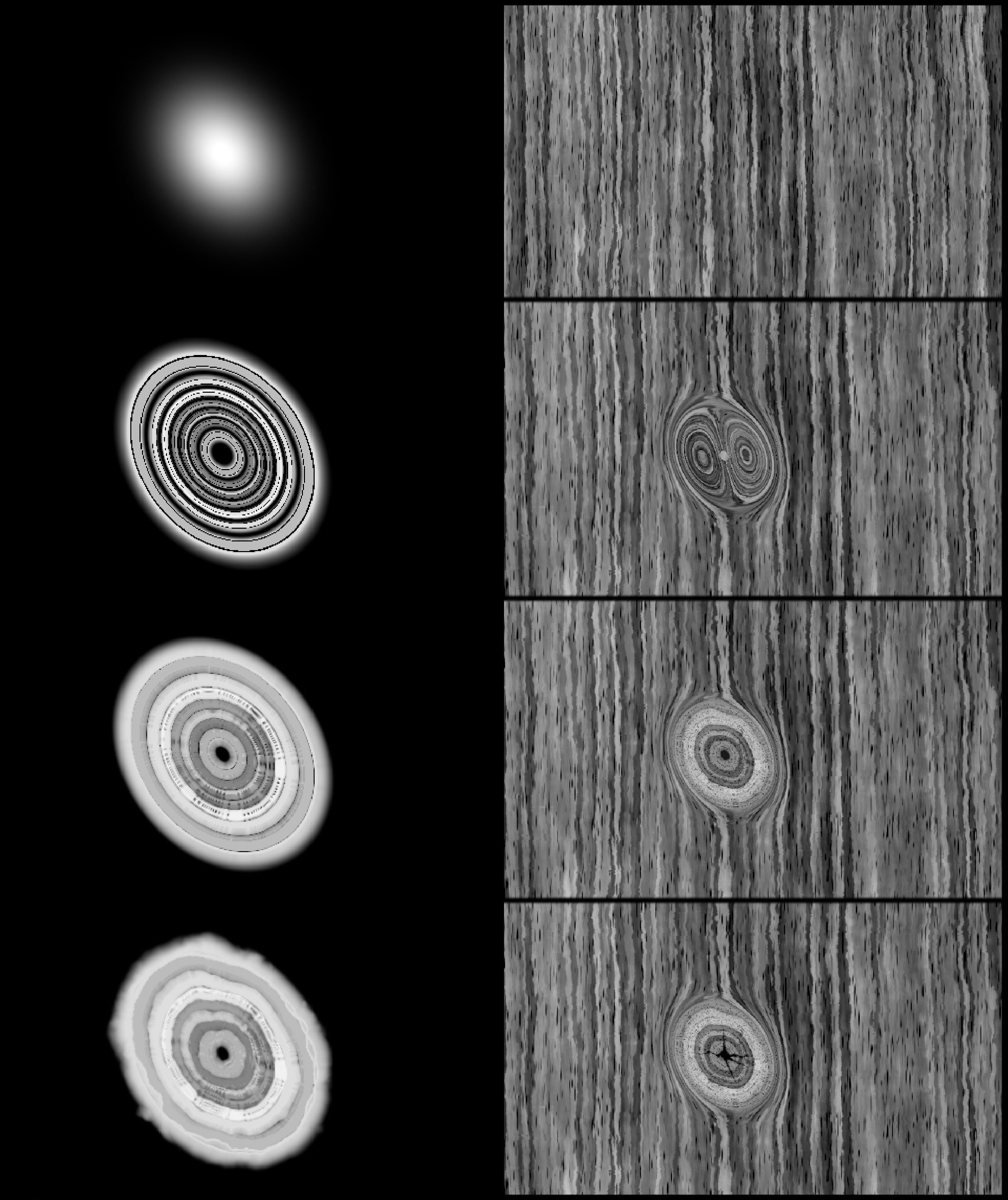
Grain, Noise & Multi-Level Detailing
The key to a good wood material is deep grain sculpting. I follow a personal rule: for every expressive element, add three levels of detail. For wood fibers, that looked like this:
- Base noise (Perlin Noise) for overall grain shape.
- Directional Warp to give the grain vertical flow.
- Micro-warping using fine noise to create subtle fibers and texture.
Only after that did I add anisotropic noise to break up the pattern and make it feel natural.
I also added grooves — thin longitudinal lines that resemble wood pores. They’re common in aged floors and add “life” to the surface:

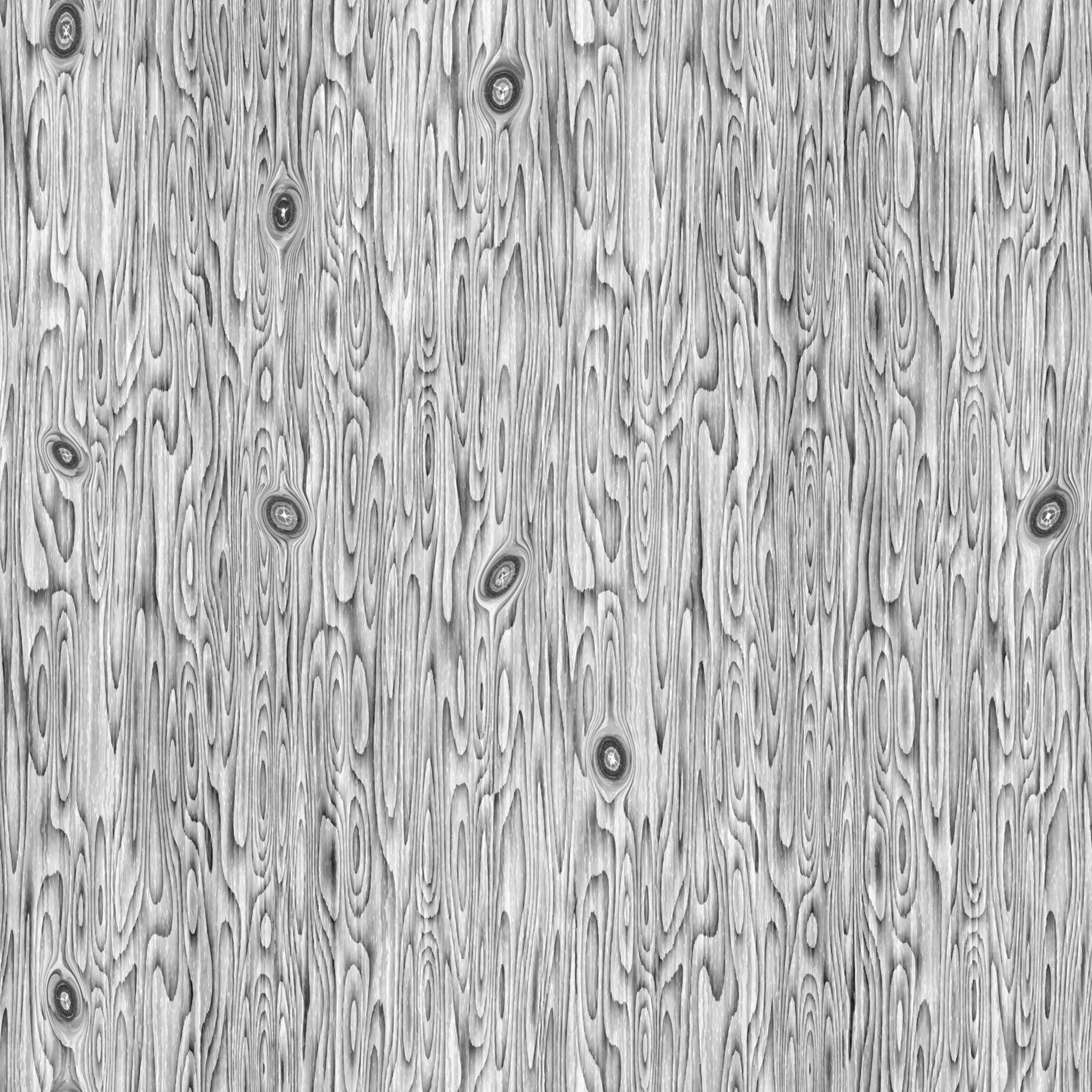
The overall logic behind building the base pattern stays the same, and by deviating from it, we get many variations in fiber behavior.
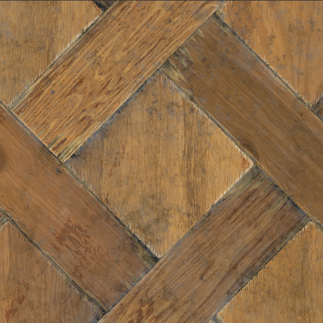
Here’s an example of a starting wood pattern:
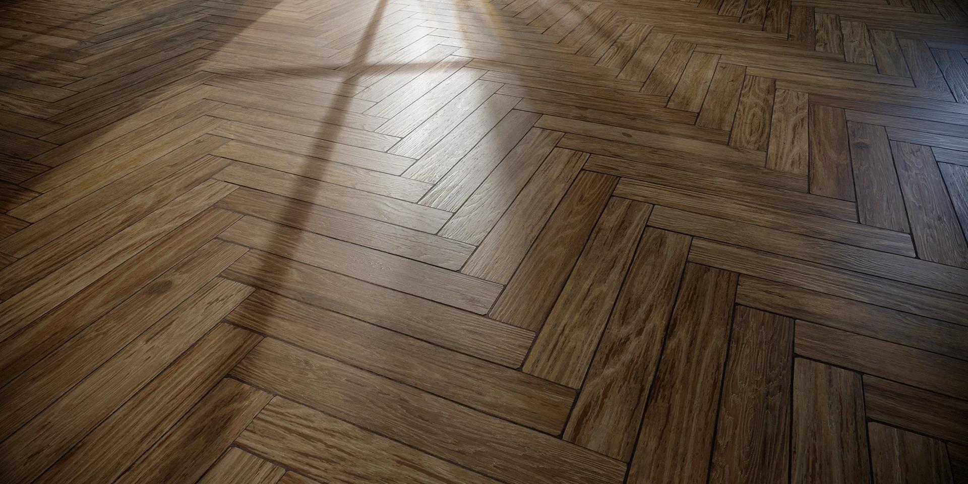
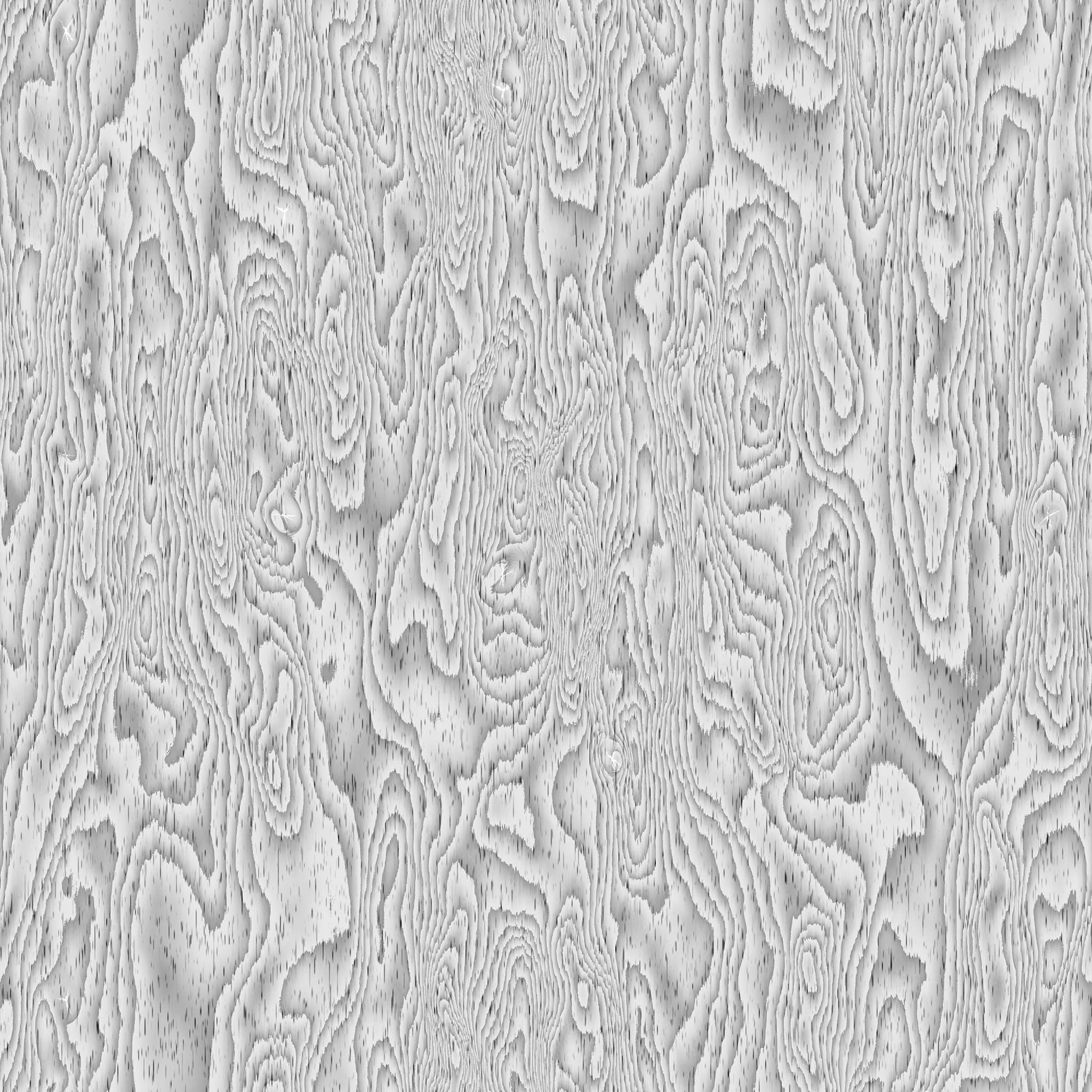
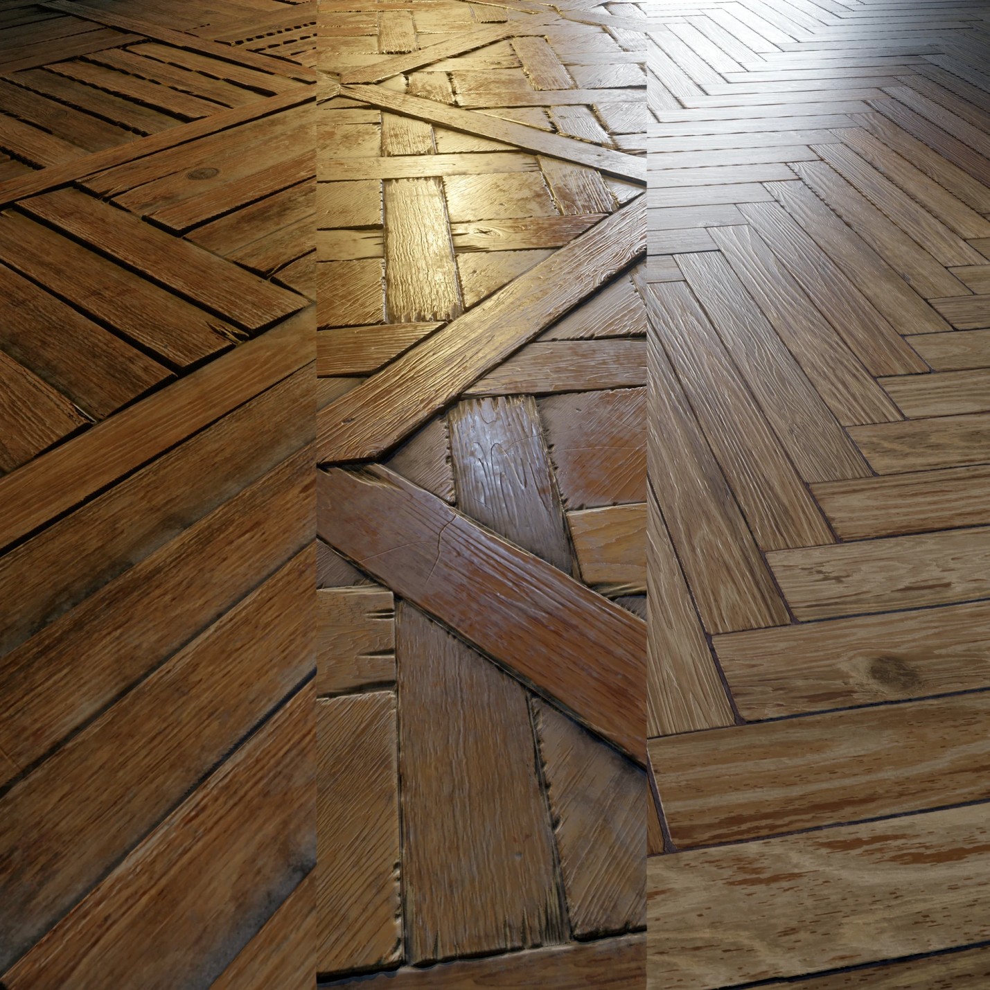
Textures & Patterns: Three Wood Types
To achieve variety while maintaining believability, I created three types of wood with distinct grain shapes:
- Straight grain — classic, clean look.
- Slight waviness — adds natural variation.
- Stronger curves with unique fine details.
It’s important that the differences between them aren’t too harsh — otherwise, the material loses realism. This approach allows one material to work across multiple tasks while staying grounded in realism.
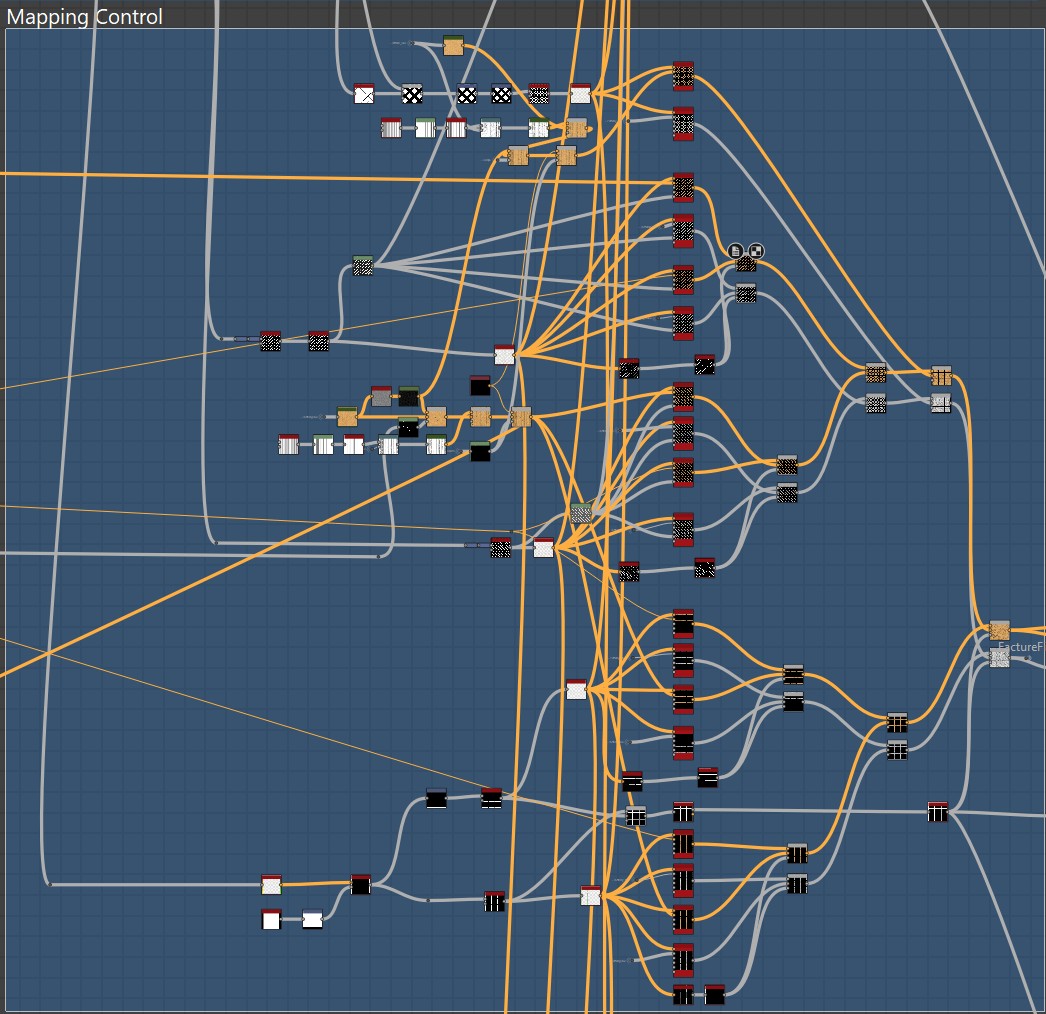
The pattern mixing structure was based on using two types of Flood Fill Mapper — for color and grayscale — and randomly blending patterns via masks.
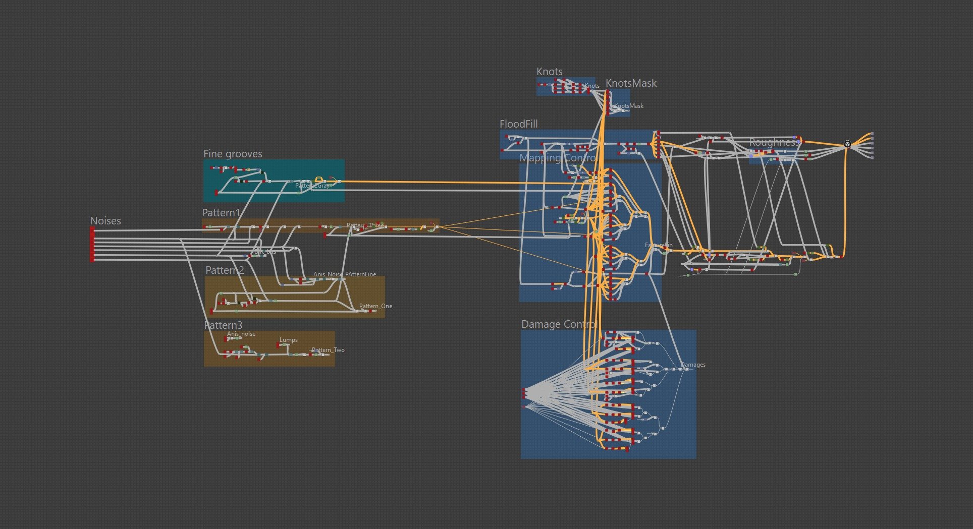
The screenshot shows how much I relied on Flood Fill Mapper:
Three wood types and three plank sizes meant a total of 9 Flood Fill Mapper Color and 9 Flood Fill Mapper Grayscale.
Packing of one of the patterns:
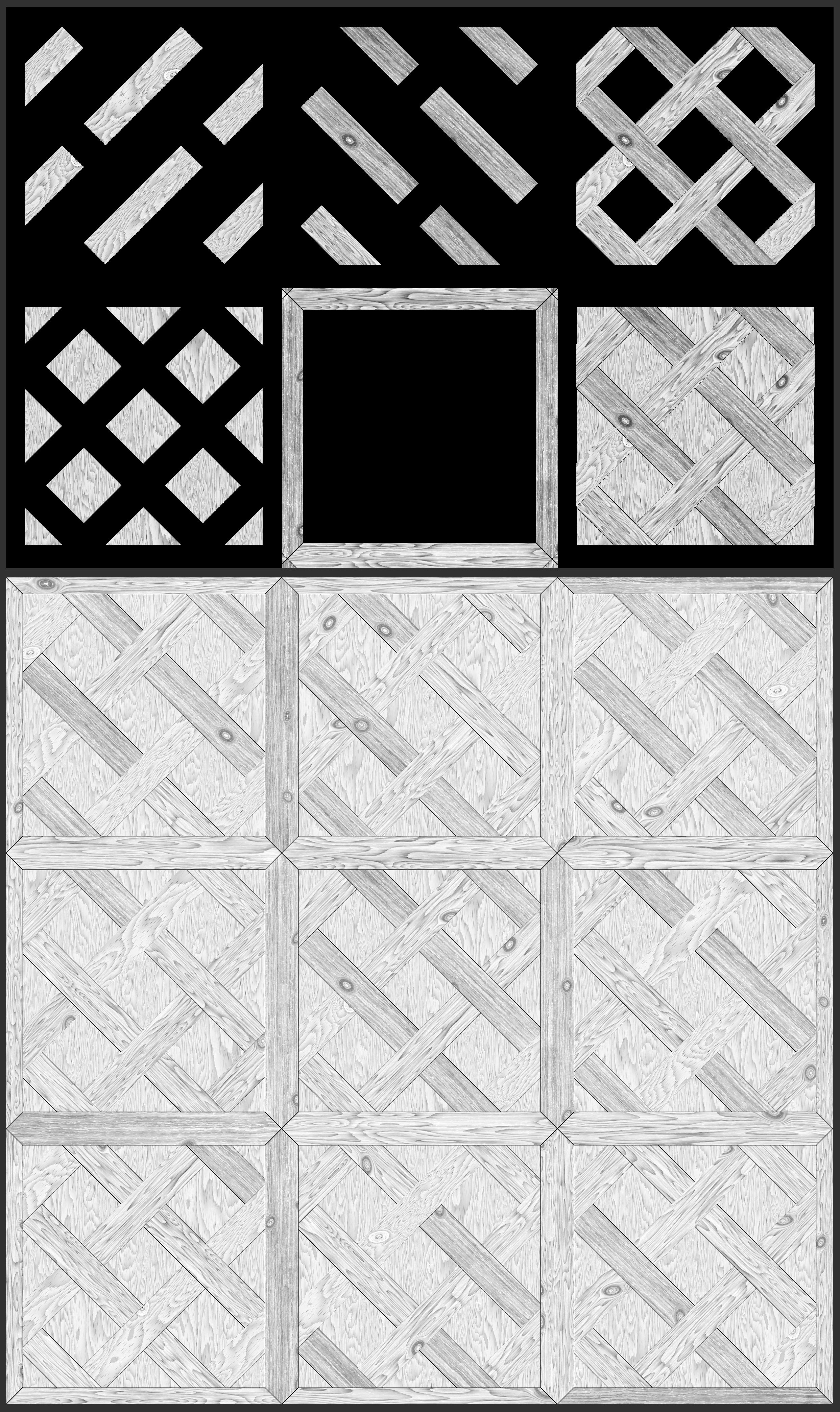
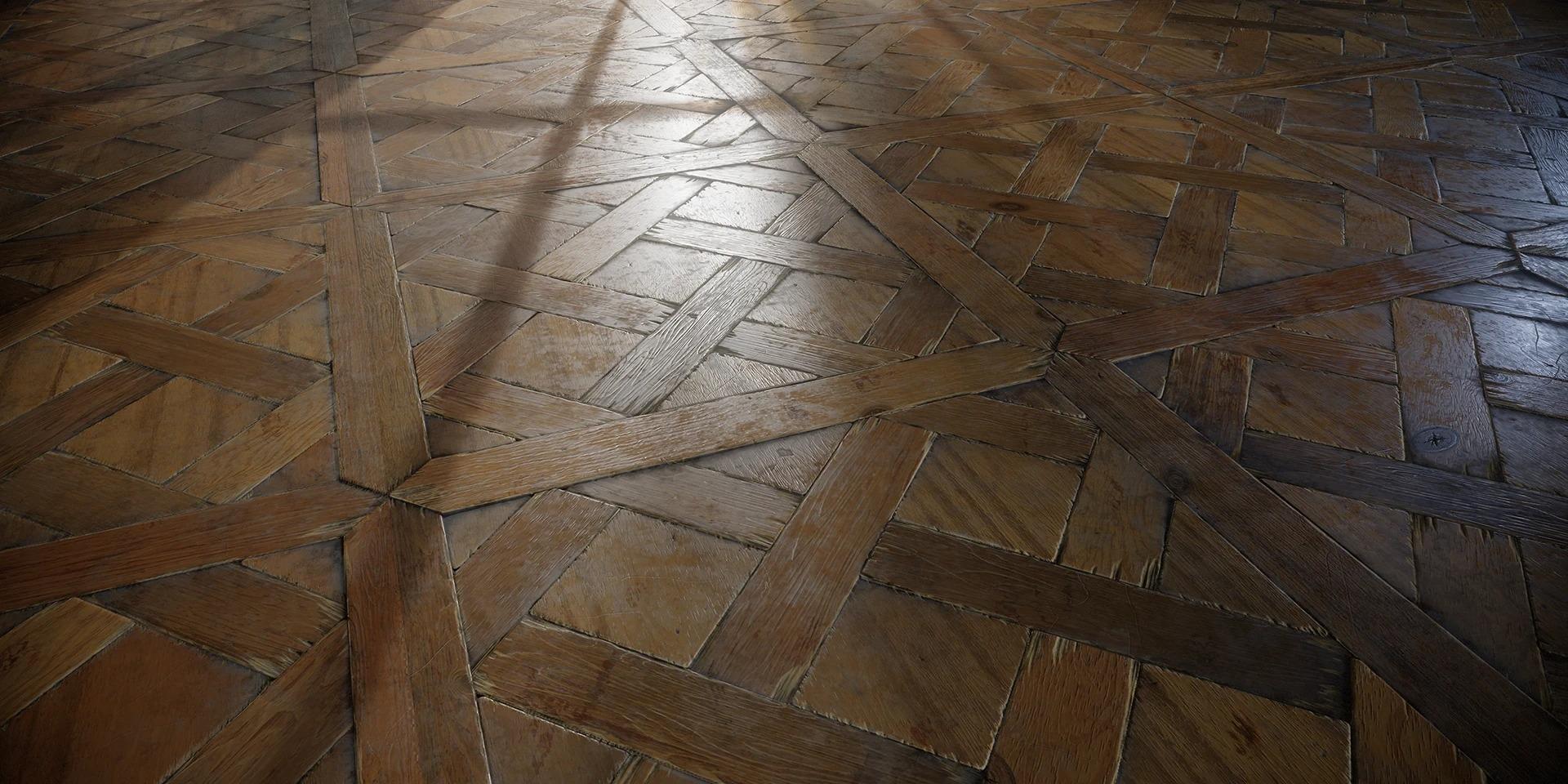
Pattern Composition
I used planks of varying sizes but deliberately avoided adding major chips to the smallest ones. This helps direct viewer focus to the larger elements in the composition.
It may not be the most logical decision, but sometimes it’s okay to sacrifice a bit of realism in favor of artistic composition.
Knots
Knots were added using a Tile Sampler, where I scattered shapes using a Bell pattern.
Then I deformed the base pattern with Warp and used a mask to blend in detailed, layered knots at the deformation points.
Essentially, it’s the same Bell shape blended with Gradient Dynamic, followed by Slope Blur and Warp.
Important: I added cracks in the knots using the same Tile Sampler and settings, with a crack pattern as the input shape.
Color
The main challenge when working with color was the structure of the material. Since I had already scattered three wood patterns via Flood Fill Mapper, simply coloring them would look boring.
So I created duplicate logic with Flood Fill Mapper Color and spread out a color pattern that I fine-tuned separately.
After that, I randomized the colors within the tiles — something I always do, even with uniform materials.
Even microscopic differences help prevent visual monotony — another small deviation from logic that enhances realism.
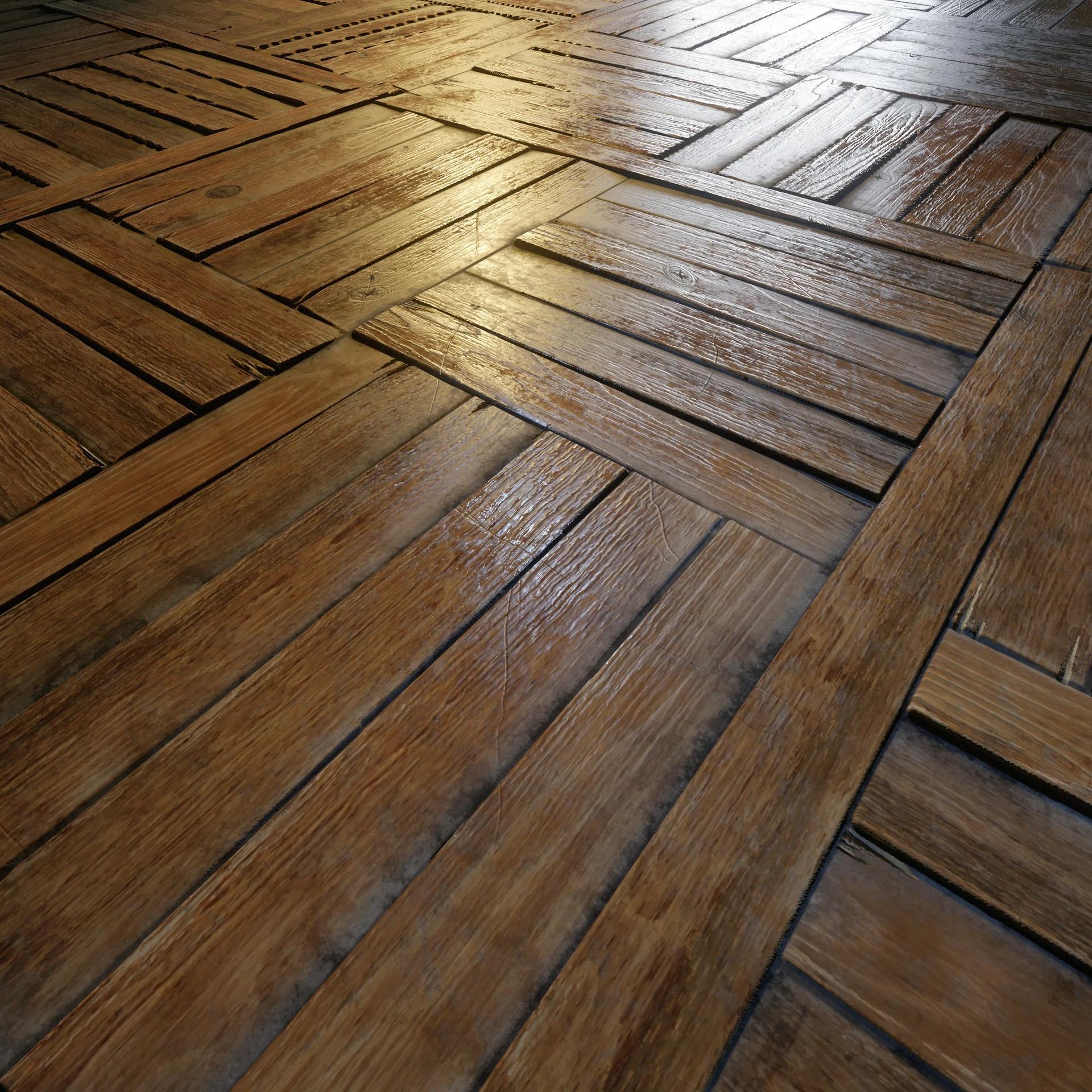
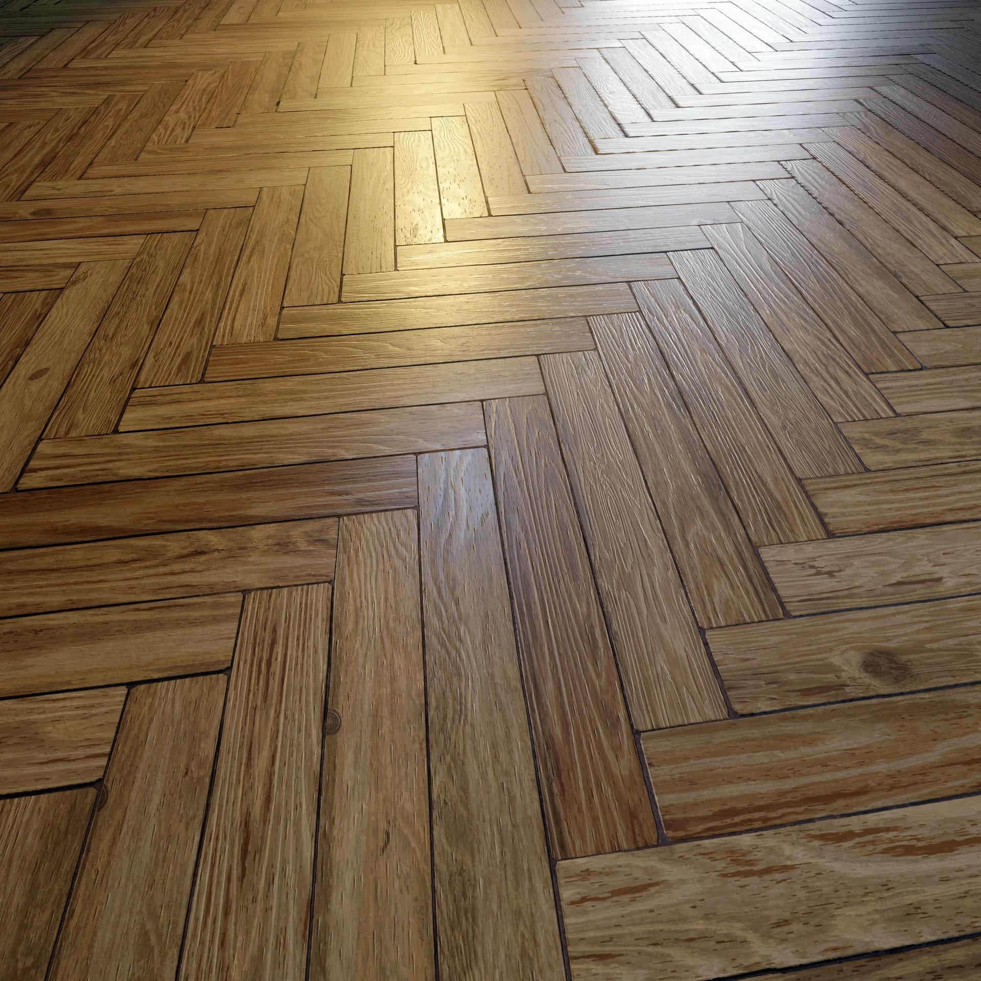
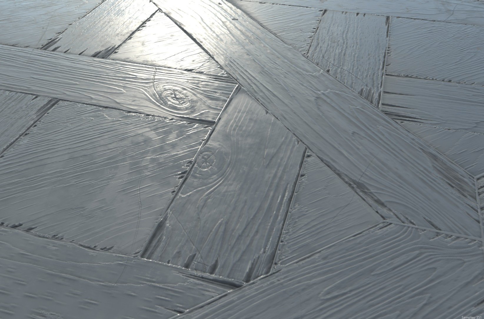
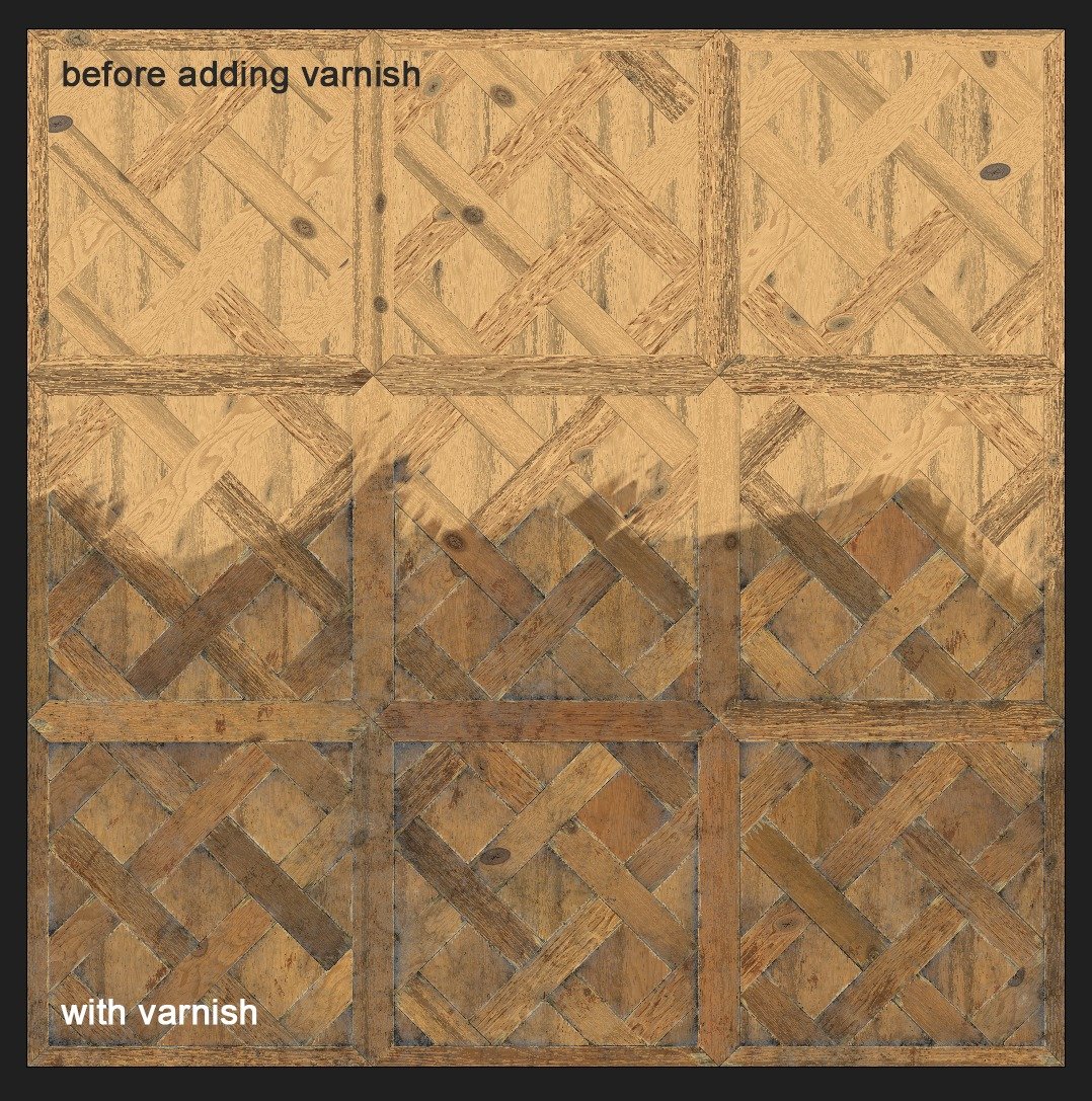
Varnish: Reflections & Storytelling
Varnish is one of the most expressive elements of a wood material. It not only affects reflections and roughness but also tells a story:
- Fresh, even varnish — brand new floor.
- Worn, matte with glossy patches — lived-in space.
- Partially worn — tells of foot traffic, age, and the room’s character.
I paid close attention to the reflective layer to capture these nuances.
I imagined how the floor is cleaned — dirt collects in low spots, water evaporates, and so on; how varnish stains and darkens the wood; how chips reveal lighter raw wood beneath, often cleaner due to recent damage.
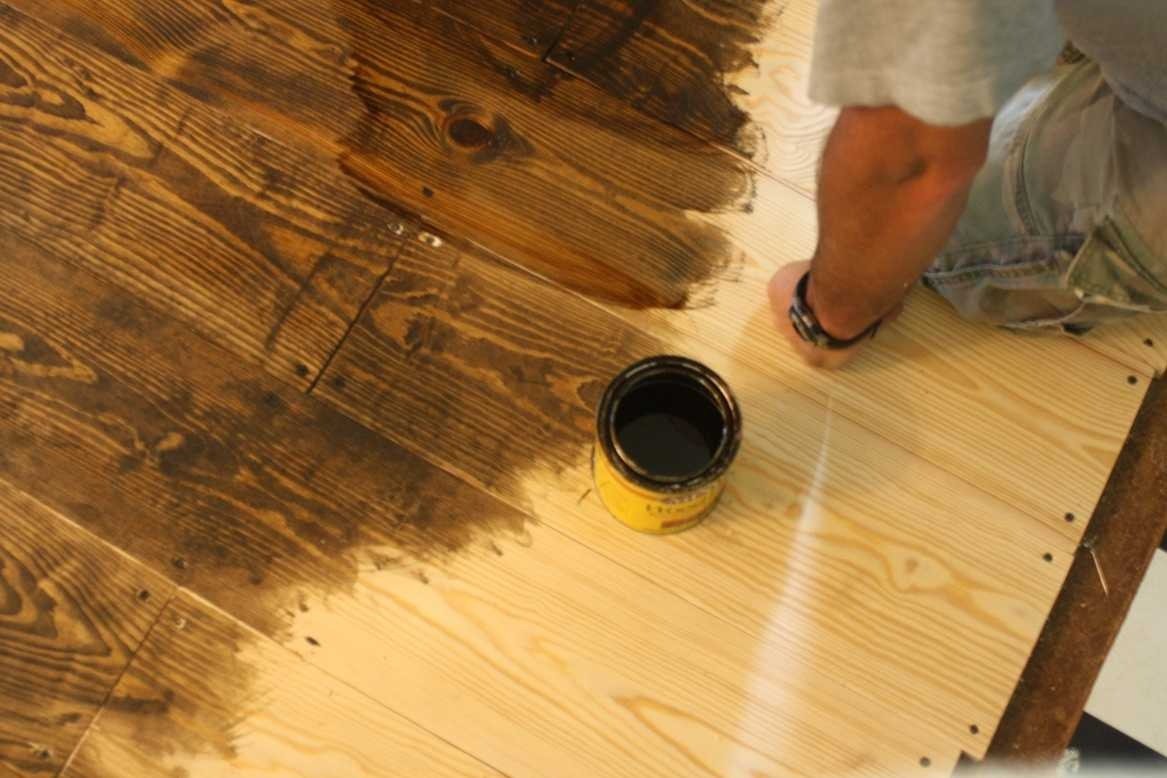
Many great references can be found on websites for floor refinishing services. Initial wood tone is also crucial — it helps calibrate your material with real-world before-and-after photos.
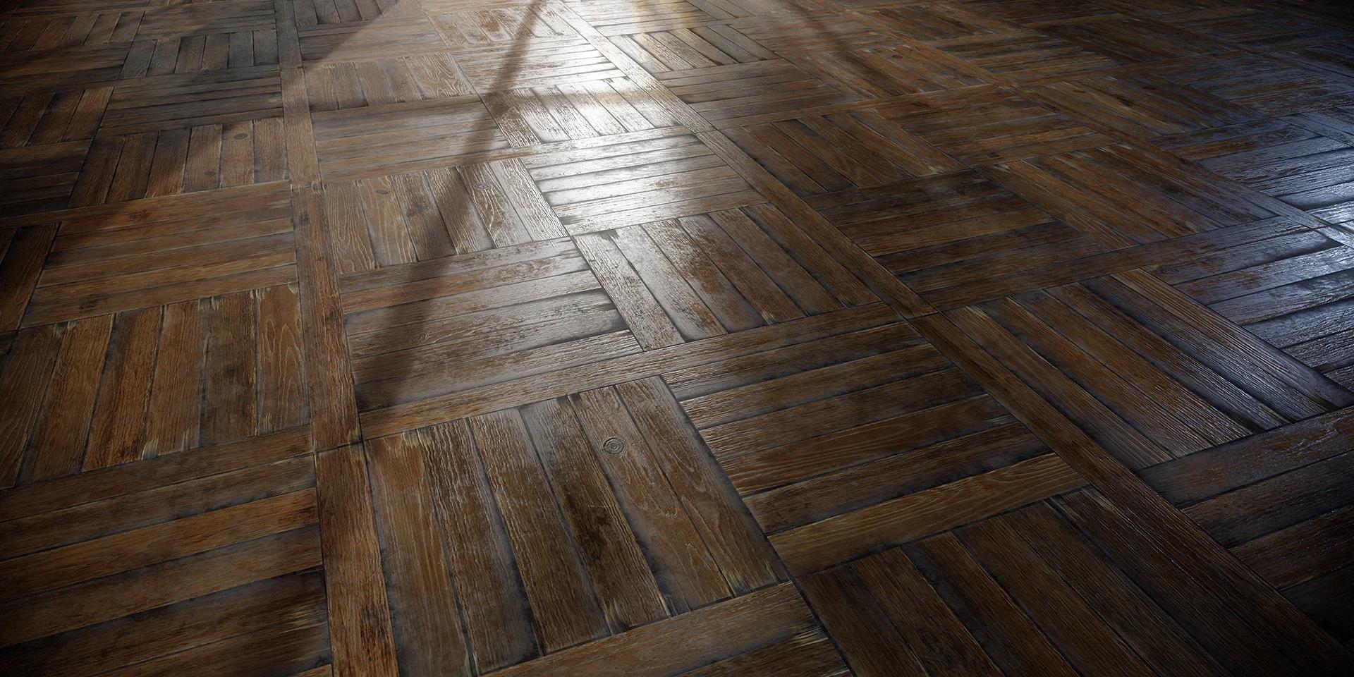
I knew the material would shine best under uneven gloss, and I aimed to capture lighting that would emphasize this. Which brings me to presentation.
Rendering
For renders, I typically use a mix of warm and cool light sources. This makes the material’s full color palette come alive in transitions.
I wanted to show context for the material, so I added curtains for ambiance and angled the light through a window to create a morning-like atmosphere.
This helped highlight many details naturally — and allowed me to render all three materials in one scene, showing how they behave under the same lighting.
Now the Most Interesting Part: Damage
Here’s the graph section responsible for damage:

But to simplify: it’s just three shape variations for chips, scattered along splines that follow the plank borders. A template like this was made for each plank variation.
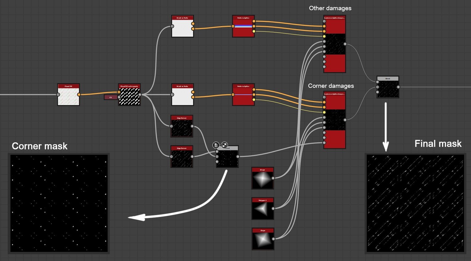
In the end, I got a unified damage mask where I could control the size of each crack group.
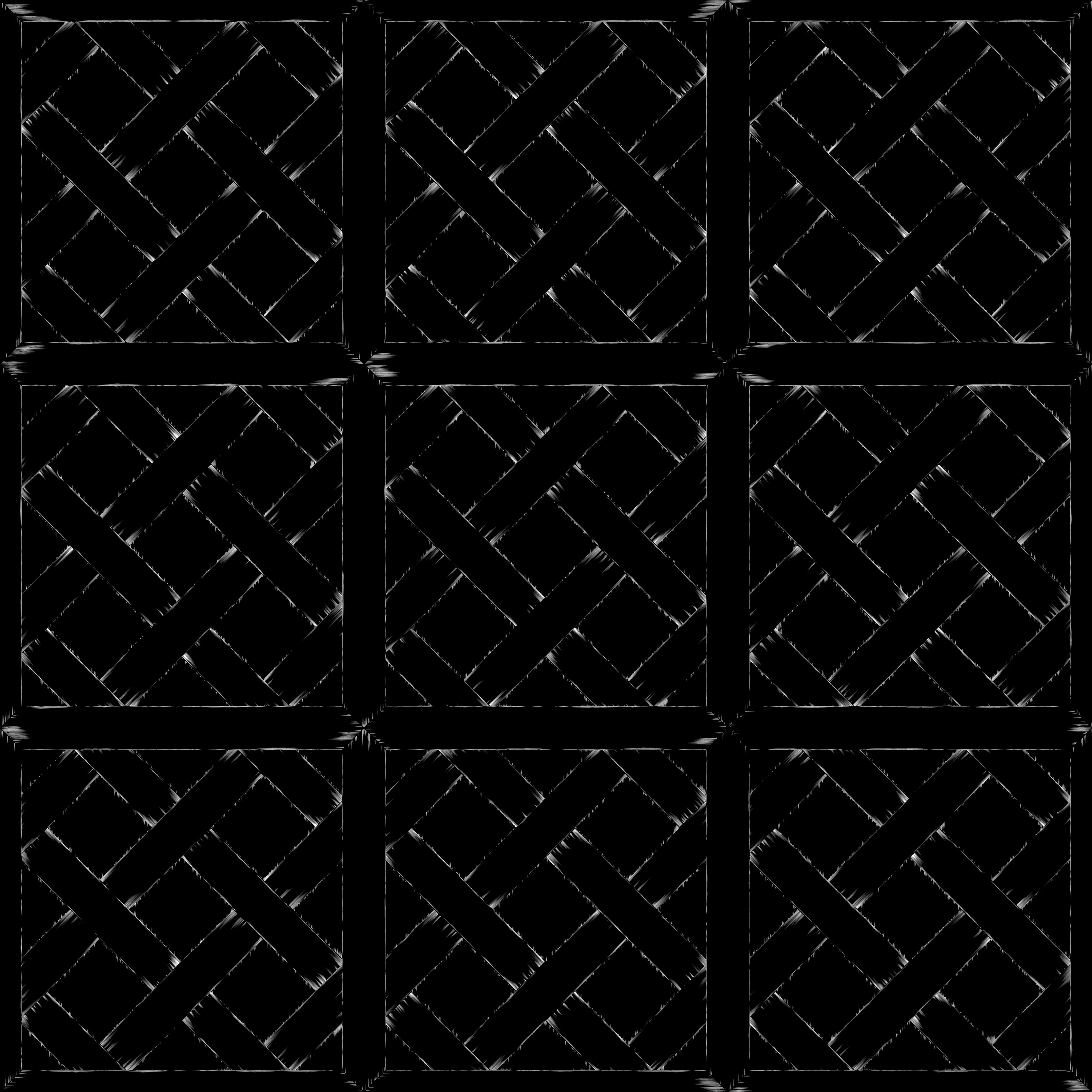
Here’s what the overall graph looks like:
Conclusion & Reflection
I thought I knew how to make materials — until I failed a material test for a major studio. That moment was a turning point: I revisited my approach and started focusing not just on technique, but on quality and intentionality in every decision.
Creating materials is about observation, research, composition, and a bit of boldness to break the rules when it leads to better results.
I hope this breakdown is useful for anyone, like me, who’s looking to level up their material art skills.
Thanks for reading — and see you in the next project!
Read more articles
You might also like these articles.