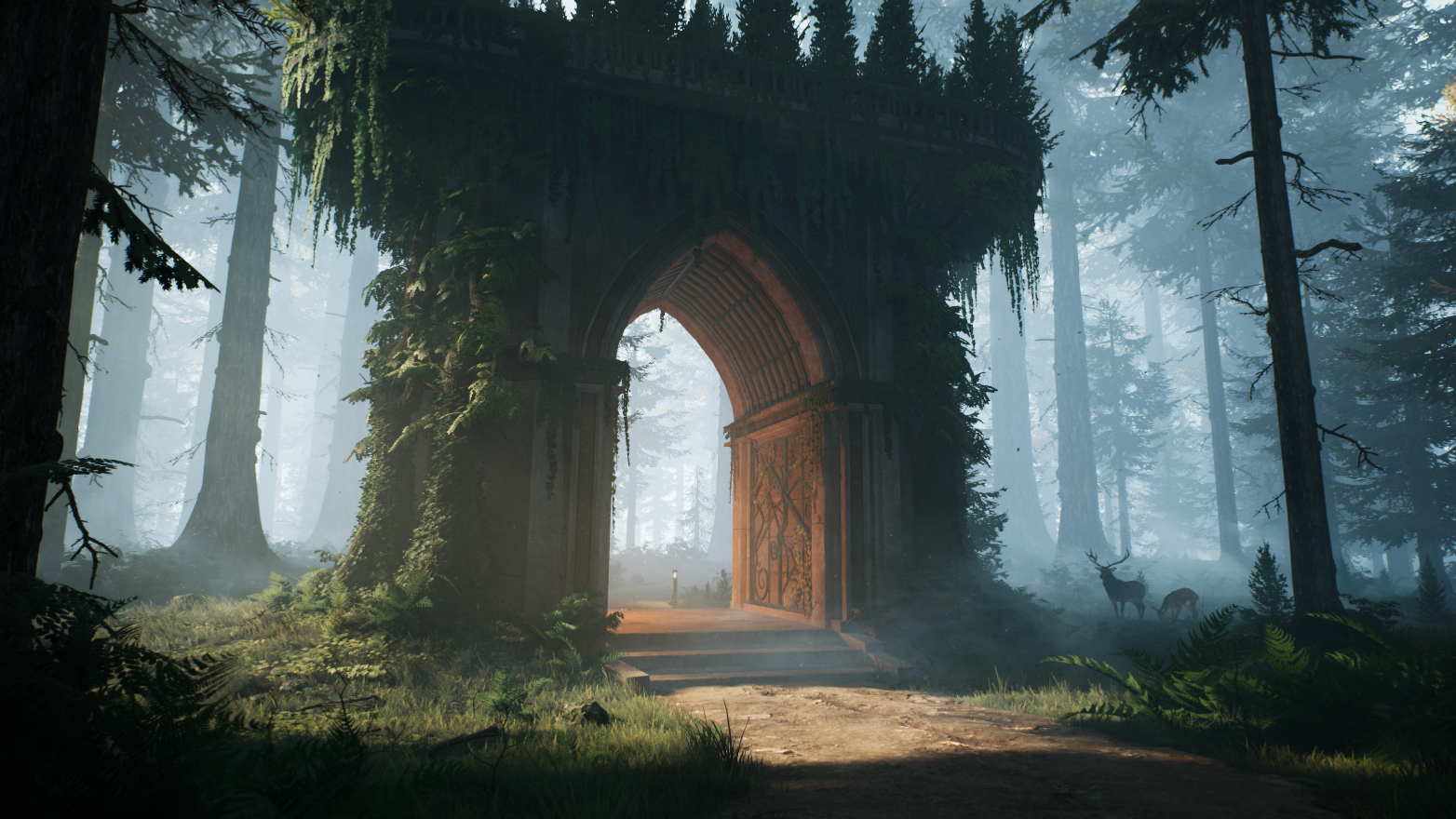
Overwatch Lisbon Streets


Introduction
Hi there! My name is Georg Klein and I am about to graduate as a Game Artist at SAE Institute Cologne.
Project & Goals
I am quite passionate about stylized environments as well as handpainted art, which is why the Overwatch style appeals to me.
Since the announcement of Overwatch 2, I was inspired to create my own version of an Overwatch map set in a city that is unique and not part of the game. I wanted to use the sequel’s Omnic city attack theme to ensure that environmental storytelling was the center of this project.
Imitating a rich style like this was a very challenging task that required a lot of patience and multiple iterations to get it right. This article will help you better understand the art style and potentially help you avoid mistakes in your own projects.
Planning
Having visited Lisbon once I already knew from the beginning what kind of scenery I wanted to convey. The streets should feel colorful, warm, and have hilly terrain just like the real streets of Lisbon. I wanted to keep everything that makes the streets of the city unique like the trams, the overhead wires and the balconies, then translate it into the Overwatch style.
The most important thing was to gather references from the original game and then constantly compare them to your own work. I assembled a mood board with real life references from the streets of Lisbon as well as screenshots of Overwatch maps which were similar in composition or color scheme. The most useful references were the Rio de Janeiro map references since they are similar in their mood.

In order to translate your real life references into the Overwatch style you have to limit your color palette to the most important colors and try to make the scene not too busy in terms of details and the look of your materials. In my case it was important to keep in mind that the terrain in the game is usually very flat for gameplay purposes but the hilly landscape of the Lisbon streets are unique so I had to adapt them while trying not to overdo it.
Even though you should spend most of your time looking at the original references it is helpful to take a look at some well made fanart. One significant inspiration to me was the works of Shua Llorente who has made multiple fanart maps with Unreal Engine. These usually have some additional behind the scene breakdowns, which give a lot of information about how they solved the same kind of issues you may potentially face in Unreal Engine.

When I made the blockout in Unreal Engine 4 I was still very new to the engine, so it was pretty simple. Nevertheless, I successfully set the principle layout of the environment and got a feeling for the composition by placing blockout buildings on the terrain. The layout was inspired by the Overwatch 2 game mode “Push,” which has a symmetrical layout and allows the map to be mirrored at both ends. To make sure that the symmetry was not too noticeable, I created the street with a curved shape that never allows the player to see the end of the other side of the street.

The scene during its early phases looked very different from the final version because it was my first environment in Unreal Engine and I had to figure out a bunch of stuff. In the middle of the project I decided to redo most of the existing elements. The biggest reason was that I had to improve my composition. You can see in the old screenshot that the buildings were way too small and not exaggerated enough in their proportions, which is important for stylized environments.
Another important aspect is the skyline, which is iconic for Overwatch environments. They had to feel futuristic and be much larger than the rest of the buildings. Most importantly, there needed to be a clear separation between the giant modern buildings and the more traditional ones. This allowed the scene to feel closer to the real world, but still feel connected to the futuristic setting of Overwatch. For the other shots I wanted to have a clearer sky to give the eyes some more space to rest.

It was also essential to plan storytelling elements into the composition. The houses needed to have shop signs, windows with plants and clothing hanging on the balconies to make it look like people actually lived there. I also needed to show the destruction of the Omnic attack by adding destroyed areas. To block the view of the back streets I added some fire and smoke effects, then placed wreckage and some Omnic scrap parts. This strategy allowed me to not only show the destruction but also save on development time.
Lighting
Lighting is a critical part of stylized art especially when it comes to an environment. I went through various iterations on the lighting in order to get it as close as possible to my references. If you are making a scene like this you should make sure that the lighting is stylized and readable, which means that it needs to avoid harsh contrast and use rather soft shadows. One misconception I previously had is that the Overwatch style needs a lot of Ambient Occlusion but by drastically reducing it, it made the scene much more pleasant to view.
My setup is quite simple, start with a Sky Light and a single Directional Light as well as a few Point Lights for the lamps and the areas with fire. While working on the lighting I found using the “Detail Lighting” view to be very useful when needing to adjust the values. I also recommend applying subtle Volumetric Fog to blend everything together and some background fog with fog sheets to add depth to your scene.

While I was trying to figure out the lighting I constantly came back to this Overwatch-style Visuals with UE4 article, which gave me a solid starting point for my lighting setup. It taught me about indirect lighting and the importance of baked lighting to get the result I was looking for. Being able to see which values the author used for his settings saved me a lot of time. That is why I want to share my settings here as well with the hope that it is useful to someone who wants to achieve the same look:

Modelling

For the houses I created a set of buildings that could be varied in their materials and rotated so that one single house could be reused dozens of times. I know that it is not the best way to do it but at the time I started this project I knew very little about modular environment creation or trim sheets. The advantage I got by doing it this way is that I could quickly copy and place the buildings without worrying if everything fits perfectly together.

I did not have any limits in terms of polygon budget but I tried more or less to optimize the geometry for the sake of performance and simplicity. I created the windows, doors and all the other elements so that they could be reused on all the buildings. When modeling I made sure to keep the shapes simple but also followed the typical guidelines of stylized art like curvy silhouettes and exaggerated shapes with pronounced bevels which are typical to the Overwatch style.

In the process of making the props I grouped them in sets for specific purposes like “street props” or “wreckage” which allowed them to share one material. My workflow is to model the lowpoly and midpoly in Maya and then use the midpoly to create a nice, smooth highpoly version in ZBrush. It was important to keep the geometry mostly clean and simple which let the materials do the rest of the work.
Texturing
Like I mentioned, when I started this project I did not know much about trimsheets, which is why all my wall assets are uniquely textured. This did not prevent me from achieving the quality I was going for and I was able to create different color variants for every texture set. To achieve the stylized look, I made sure that the colors were saturated and did not have too many micro details.

The tricky part for me was to find good roughness and metalness values to produce the kind of reflections that you can see in the game. I found out that it was beneficial to reduce the metalness value to 0.75 and roughness to 0.5 to imitate the look of metals in Overwatch even if these are not correct PBR values. For the glass reflections I went with a metalness value of 0.9 and a roughness value of 0.1 and it was beneficial to pick a neutral grey Base Color (0.5/0.5/0.5) to get reflections which look similar to the ones in the original game.

My philosophy for stylized texturing is always that it needs to look good in the Base Color view before getting to work on the other maps. To help with that I relied on the SoMuchMaterials plugin for Substance Painter which essentially works like baked lighting but with many more parameters to adjust. While I wanted to keep the textures simple I like to use blurred grunge maps to get some color and roughness variation. I think many people have the misconception that stylized texturing means only having flat colors. However, by observing the textures in Overwatch I noticed that these kinds of variations bring additional richness.
Materials

Most of the tileable materials were made in Substance Designer because I wanted to challenge myself to imitate the style with this nodes system even though the textures in Overwatch tend to be more painterly. To get the right look I constantly compared my materials to the references but I also had to keep in mind that they make sense in the context of my scene. For example the ground textures were too eye-catching at first so I made sure to reduce the contrast so that they are less of a distraction.

My Substance Designer workflow is to create the height map first and then to create subtle variations in the pattern. Then I use gradients as well as Ambient Occlusion and Curvature to create the base color. For this style it is important that the contrast and the Normal Map are not too strong, especially the AO map should be less intense because it will create very strong shadows in Unreal Engine. I usually create the roughness map by inverting the height map and adjusting the levels. As a final step I always added one kind of grunge map to get the roughness and color variation similar to my texturing in Substance Painter. The best way to do that is to choose a grunge map which looks more painterly and to blur it out a bit to keep it nicely stylized.

I set up my houses in a way such that I had access to a lot of variations through their materials. First of all, there is the base wall material which has a few color variations accompanied by their associated tiles when I chose to have them on a specific building. The windows and doors of every wall had a different material which made it possible to have different color combinations for all the houses. Lastly, I added a dirt material for the walls that I could apply through vertex painting to imitate the Overwatch walls which usually have some dirt on top and bottom.
Background

The background of the scene consists of four main elements: The skyscraper buildings, the castle, the Omnic attack ship and the Skybox. I tried to spend as little time on them as possible since most of the details would not be visible from afar anyway. Like in the Overwatch 2: Gameplay Trailer I wanted to have an attack ship dominating the sky to display the Omnic threat in a dramatic way. Therefore I spent most of the time on the bottom side of the ship since it is the only perspective the player would ever be able to see it in the scene.
For the buildings I just created three different meshes and two materials to be reused everywhere. If you model the buildings in a unique way from every perspective then you can manage with just a few by rotating them around which gives you variations to create a whole skyline.

The castle I made was inspired by the Castelo de São Jorge which is one of the famous landmarks of Lisbon. My version is a very simplified one with one tileable material and the flags on top. Again, I did not spend much time on the castle, but it was important to have at least one famous sight from the city in the background. Perhaps you noticed that the Overwatch maps tend to have most of the recognizable landmarks of a particular city in the background to make the player feel like they are on a journey to another part of the world.

Lastly I painted a simple skybox with clouds in Photoshop to emphasize the stylized and painterly look that Overwatch environments have. My advice would be to keep it as simple as possible so that it does not distract the viewer from the main motives.
Final Tips
To understand the style I always like to think of Overwatch environments as theme parks similar to Disneyland. In every area of a theme park some specific setting is conveyed through recognizable structures and props that are iconic to the represented theme and take you on a journey to a fantastical world. These elements are displayed in a colorful and exaggerated way similar to stylized games like Overwatch to make you feel welcome and cheerful. This is what I enjoy the most about these kinds of environments and that is what I would keep in mind when making them.
My final advice could be summarized by two things: Compare with the references all the time and get constant feedback from other artists. When you are sticking to your references you will get close to the style eventually but receiving feedback will help you to spot things that you overlooked or never thought about and push your art to the next level.
I highly recommend joining Discord communities where you can share your progress and get feedback from people who are familiar with the artstyle you are pursuing.
- Stylized Station is a game art community specializing in stylized art and the members there constantly pointed out things in my project that could be improved and ultimately lead me to the right path.
- Experience Points is an environment art focused community and their feedback helped me improve the scene in the final stages.
Hopefully you learned something interesting in this article about how to make an Overwatch style environment.
You can reach me on my ArtStation Profile if you have any questions or you can find me as well in the Discord servers mentioned above as I hang out there regularly. Cheers!
Read more articles
You might also like these articles.