
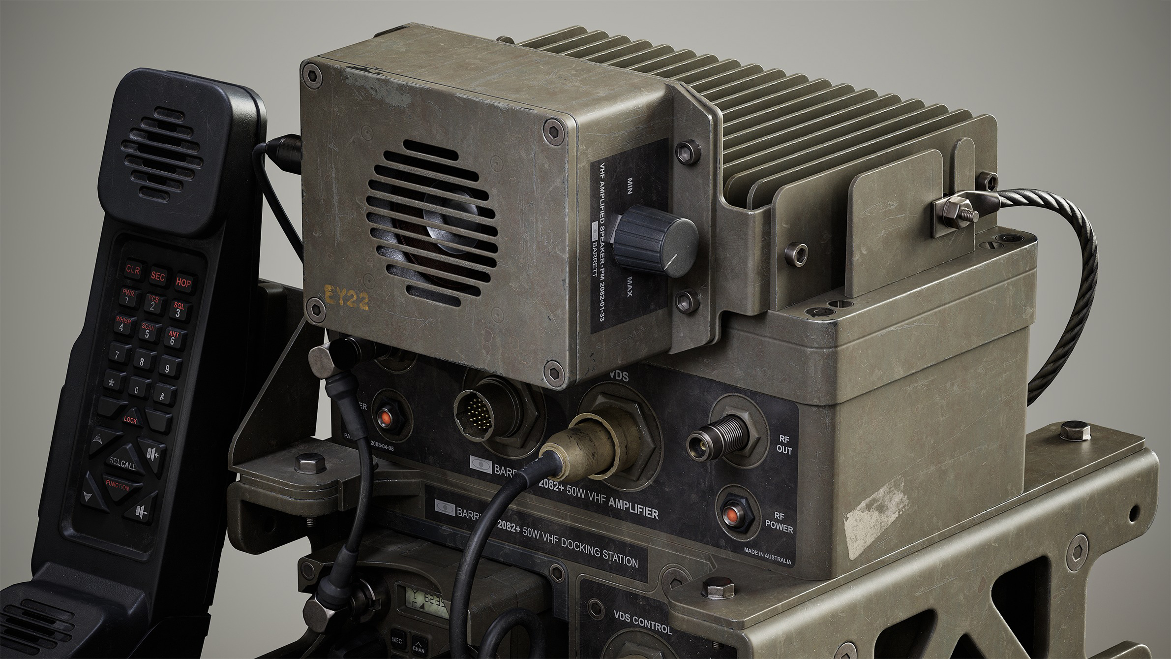
Military Radio Barrett PRC 2082


Introduction
Hi! I’m Harry Amatt, a recent Games BA graduate from Escape Studios University in London.
I am currently building my portfolio and actively seeking opportunities as a prop or environment artist in the games industry.
Project Goals
This project started as my final specialism assignment for my university course. My primary goal was to create a high-quality AAA prop that would ultimately improve my texturing skills.
With this in mind, I made the decision that I would re-create a prop with multiple materials and use higher-than-average polygon counts so my prop would look good up close to really showcase detail-oriented texture work.


Software
- References – PureRef
- Modelling – Blender & ZBrush
- UVs – RizomUV & Blender
- Baking & Rendering – Marmoset Toolbag, Post-Processing in Photoshop
- Texturing – Substance Painter
Inspiration
I wanted to select an object that would offer both texturing complexity and also involve modelling precision. The Barrett PRC-2082 is a military radio that meets both of these criteria – it features both machined parts and areas of more organic complexity, including a handset and cables that pose a challenge for achieving hyper-realism.
It would also create ample opportunity for some interesting texture story-telling.
I owe a lot of credit to Nadya Pal for my decision in choosing this radio. It was her original ArtStation post of the same prop that really inspired me to re-create it.
She has also written a fantastic article here on Games Artist about her processes, so I highly recommend checking hers out too.
Reference Gathering
This is a crucial step; it’s really important to find as much material about the prop as possible, both visually and mechanically, before jumping into any 3D work.
For this prop, I managed to find some line drawings on the manufacturer’s website, which helped immensely as I then had real dimensions to work from.
All the references I found were gathered on PureRef. It’s easily the best software for gathering large volumes of reference as it’s extremely easy to lay out images and have references available at a glance.
Understanding the real-world functionality of a prop informs many aspects of the modelling and texturing processes. I sought out references that actually show its function, assembly and manufacturing processes.
For instance, I discovered a portable section of the radio that docks in the main chassis and can be taken out and carried along with the handset.
Sometimes, props have limited reference material available due to various factors like rarity. With this prop, there wasn’t any available reference of the back, so I knew I’d have to take some artistic licence with this area.
I really recommend broadening your search to auction sites like eBay as there are often plenty of worn-looking versions of a prop that you are trying to create.
I managed to find some listings of the portable section of this radio, whereby observing the physical and real-life wear it had was extremely useful to keeping the texturing processes realistically grounded later on.
Unfortunately, this was really the only area of the prop I was able to find this kind of wear reference, so I relied on finding other similarly worn military objects for reference as well.
How you lay out your references is completely up to you. I try to segment my reference boards into categories. First by understanding the technical details of a model, any drawings and different parts it’s made up of in construction.
I also find it helpful to see if any other artists have attempted the same model – while it’s important not to use these as strong influences, it can sometimes give fresh ideas of how to approach certain aspects of a prop.

Blockout & Mid-poly
Once a healthy amount of reference has been gathered, creating a blockout is absolutely key for getting a feel for the prop in 3D.
Blocking out is a personal process. In Blender, I prefer a detailed approach, leveraging non-destructive modifiers to maintain maximum flexibility. It’s really just like sketching in 3D.
Pay attention to the overall size of the prop you’re creating and really think and prioritise realistic proportions. Getting this wrong will lead to massive consequences in the rest of the creation pipeline from this step onwards.
A great way to easily ground your prop is to add a human in your scene for scale.

High-poly
I used a varied approach to high-poly creation: some parts were created using traditional sub-division methods and others using a re-mesh ZBrush workflow.
The ZBrush workflow was employed as a time-saving measure; it involves importing a section into ZBrush, remeshing with DynaMesh, polishing edges and then decimating the result.
There’s usually a lot of trial and error with this approach, and it can be destructive and also taxing on hardware.
With these caveats in mind, I used the workflow quite sparingly, but it definitely saved a lot of time in areas where a lot of tricky topological work would have been needed for a clean sub-division result.
For the subdivision approach, I wasn’t too concerned about terminating every single n-gon or triangle; as long as they are used with logical intent and the prop shades correctly with no visible pinching, then it’s an unnecessary time-sink to stick to having perfect quad topology everywhere.
A key piece of feedback I received during this stage from Lewis Thompson was to exaggerate the bevels of the high-poly.
It’s really important for the baking stage as any bevels will decrease in size once baked, meaning too small a bevel won’t be visible. It also is very useful for the texturing phase as it allows the curvature map to be more easily used for paint wear generation.

Low-poly
I knew during this stage that I wanted to keep my low-poly fairly dense as I wanted close camera angles for presentation, which meant the silhouette needed to support this. In the context of a real game pipeline, I would have approached this stage differently.
Using my mid-poly blockout as a base, I was able to quite quickly create a low-poly mesh by lowering bevel modifier counts and triangulating.
Above all, silhouette is key – if an edge loop didn’t contribute to the silhouette of the prop, I terminated it.
I also tried to keep a consistent topology count around circles; when you have a circle with a large number of edges, the inner radius should drop in vertex count to try and equal that of the outer radius.
To help with optimisation and to save UV space during the UV unwrapping stage, I made sure to delete areas of the model that are never seen, such as the bottom of the prop.

UV Mapping
This stage mostly revolved around following a simple rule: every hard edge must be a seam, but not every seam needs to be a hard edge.
This generally means any edge angle greater than 90 degrees should be a hard edge and thus must be marked as a seam in the UV. Not following this rule will lead to obvious gradients in your normal maps and will make LOD creation in a game pipeline a nightmare.
Consistent texel density is crucial for props that will be inspected this closely; any visible contrast with sharp to blurry textures will kill the realism.
This is why I opted to use three different texture sets for this prop, as I wanted to hit a ballpark figure of 80 px/cm for each part, which, at this level of detail, was only possible through segmentation.
I did, however, also employ a few optimisation tricks in my UVs to ensure I hit this texel density figure:
- I lowered UV island sizes of areas that wouldn’t be easily seen, such as the inside of the chassis, to increase space for more important islands.
- I straightened UV islands where possible and ensured there were no off-angle islands as these will both decrease room on the UV grid and also decrease your island resolution. Tilted islands will halve the number of pixels available compared to straight ones.
- I made use of stacked UVs and mirrored UV islands that wouldn’t show obvious repetition.
When it came to packing my islands, I made use of UV Packmaster 4, which is an add-on in Blender. It has an extremely powerful algorithm for laying out UV islands.
You can define a texel density range and make use of holistic search to allow you to really squeeze every pixel out of the UV layout for the maximum density.
Once the pack is complete, I then grab my stacked islands, which I flagged in another add-on called ZenUV for easy management, and offset them by 1 UV grid to avoid any baking errors.
Baking
I opted to use Marmoset Toolbag 5 for the baking process of this prop; it’s super fast and offers the most flexibility compared to Substance Painter.
Ensure the high- and low-poly are aligned as close to the same position as possible for the best possible bake results and have good naming conventions with _low and _high so you can make use of the Quick Loader feature and generally just keep things organised.
Making use of the skew map feature in Marmoset can be incredibly helpful for a prop like this that has many baked-down areas like screws where slight perspective warping can occur, which this corrects.
I baked out an ID map from my high-poly for the screws and sticker positions so I could easily pick them in Substance Painter in the texturing phase.

A clean bake is really important to achieving realistic results, so it’s really worth spending time refining it and inspecting thoroughly for any artefacting issues.
I bake out all the maps inside of Marmoset Toolbag apart from “World Space Normal” and “Position”, which I bake inside of Substance Painter in the next step.
I find baking these in Marmoset gave me strange issues when trying to use tri-planar projections on generators.
Texturing
Texturing was one of my biggest goals with this project. I’d highly recommend checking out this insightful tutorial by Jason Ord on ArtStation.
I learned an incredible amount about creating really photo-realistic materials inside of Substance Painter.
The methodology really starts around creating base materials and then slowly working up complexity with layers of detail.
Make sure you utilise tri-planar projections to avoid texturing obvious seams in your prop and always ensure that every layer added serves a meaningful purpose and has logical meaning behind it.
Once the groundwork is in place, it’s really important that you don’t rely too heavily on generators; start bringing in paint layers to remove uniformity created by these and start painting in manual stencil masks; this is something I’ll talk about more in the next section.
One of the biggest tips for metal material creation I learned from Jason’s tutorial was to focus heavily on base colour variation.
Many artists focus solely on roughness for metal materials, which can leave them feeling flat and unrealistic when there’s no contrast in the lighting around the prop.
Don’t be afraid to seek out texture real-world scans of materials on websites like www.textures.com and merge them into your layer stacks; these can really enhance the believability of your materials with subtle details if done tastefully.
Try not to overload your texturing with high-contrast detail; this can make the prop start to appear muddy, and the readability of the prop can be lost. It’s so important to be intentional about each layer you add.
It’s extremely useful near the beginning of this stage to get a basic version of your rendering software like Marmoset Toolbag or Blender.
This will basically allow a level of look-dev as you texture and will instantly be able to check the results of your texturing in a real-time environment.
Stencils
Something I’ve learned from other artists is the importance of using stencils in your textures.
Stencils allow you to paint in areas of a texture like scratches or text to areas that make logical sense and are really what allow you as an artist to start creating story-led textures and enter the realm of hyper-realism.
I’d strongly urge this tutorial by Rick Greeve, who goes into great depth about how stencils can be created, sourced and used to enhance your textures.
This is where gathering references that not only show texture definition but also how a prop is actually put together can help tell the story of an asset.
For example, from earlier research, I know that part of the radio can be undocked, meaning you may expect to see wear in this area where it’s been constantly docked and undocked, creating friction scratches.
Furthermore, any area that could potentially be exposed to movement, like the top of the radio, corners or sides, should also be given similar, yet more subtle wear treatment.
Using images sourced from www.textures.com, I used Photoshop to create custom stencil masks from various sources, isolating areas of detail I felt would allow the most flexibility of its usage and create unique and interesting forms.
I created some text and vector stencils to add in various text and logos to the prop that I’ve highlighted in the reference.
Sourcing the fonts and re-creating vector images manually if necessary to get as close to the prop as possible.

If Photoshop isn’t freely available to you, I recommend these free alternatives created by Thomas Butters.
They allow you to quickly create alpha textures for logos or stickers and also alpha textures from images, without having to own Photoshop.
Rendering & Lighting
Presenting your models is such an important part of the process. Getting this wrong can really end up harming your work. A great model will always look terrible if the presentation falls flat.
I used Marmoset Toolbag for this stage as I find it offers the fastest and easiest setups for this kind of process.
For my camera angles, I aim for a high focal length and add a slight amount of depth of field as this really gives the subject a realistic and cinematic feel.
For lighting, I start with an HDRI and then I complement this with a 3-point lighting setup – adding spotlights that will accentuate the model.
For instance, I wanted to highlight the textures of the handset, so I made sure to add a spotlight above this to bring out the details of the normal map.
Post-Processing
Once I’ve rendered my shots in Marmoset, I’ll always bring them into Photoshop, making them a smart object so the process isn’t destructive, and then I’ll apply a Camera Raw filter.
Using this, I can then fine-tune the contrast and detail sliders of the shot to really make the renders pop.
Conclusion
This was a transformative piece for me. In many ways, it felt as though it was a milestone where I really levelled up my texturing skills.
I’d like to thank Games Artist for graciously giving me the opportunity to write this article and share my processes.
I’m always happy for people to get in contact with me through my socials for questions or opportunities:
My ArtStation and My LinkedIn.
Feedback is an extremely important aspect of being a 3D artist, so on that note, I’d like to thank some key people who really pushed me to make this project what it is, notably:
- My peer Samuel Baker, who acted as a second pair of eyes throughout this project to bounce ideas off of.
- Lewis Thompson, who gave some incredible mentor sessions over Teams and a kind email full of useful feedback.
- Jason Ord, Thomas Butters and Rick Greeve, whose tutorials on ArtStation and YouTube were all immensely helpful in helping me push my texturing ability forward in general.
Read more articles
You might also like these articles.


