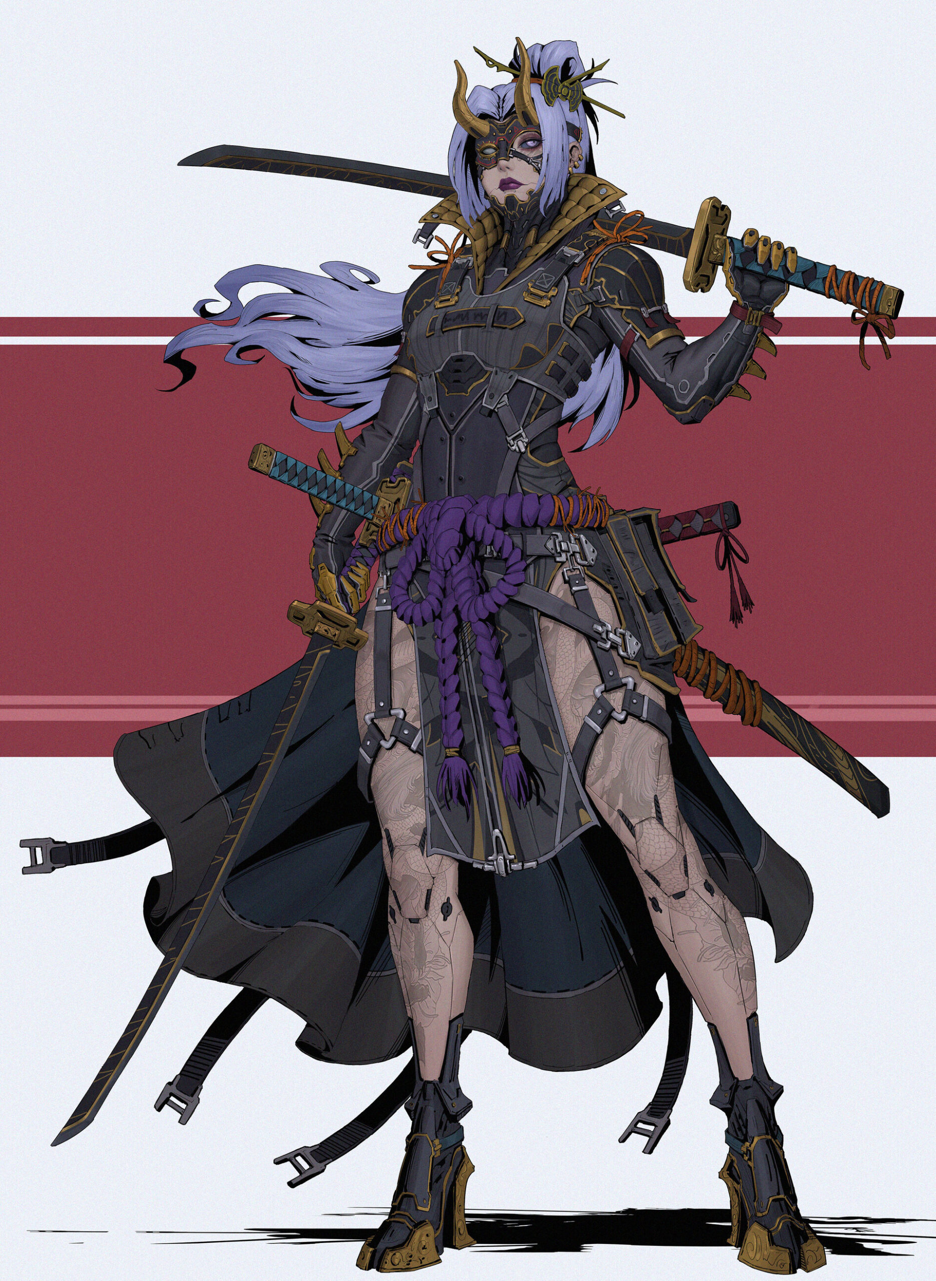
Kunoichi


Introduction
Hi, I’m Yoav, a Character Artist for games and a Graduate of Think Tank Training Center.


Goals
In this article, I’m going to show how I created my project ‘Kunoichi’ based on the concept of a female Ninja’ by Lee Kimsan.
My goal with this project was to test my abilities on a complex design with many moving parts, as well as improve in sculpting and texturing.
Analysis
The first thing I wanted to do was determine the most important aspects of the concept—what should be the main focus of the piece?
In any finished project, there will always be sections that are stronger than others, so I wanted to push where it matters most.
Personally, I love vibrant colors and the first thing I noticed was the darker palette of the character, with interjections of vibrant shades in the hair and the belt. I also noted that the “skin” is paler than average, so while it is relatively bright, it’s still not very colorful. In either case, the torso at least is quite dark.
This informed my points of interest. I paid special attention to the face, the hair, the hard-surface armor around the face, as well as the waist area.
In addition, I knew a large challenge would be making all the overlapping clothes and armor feel distinct and letting the complexity be easily visible.
References
The first thing I did was look for inspiration both in other finished works and real-life equivalents.
While I looked at many references, one of my bigger sources was Cyberpunk 2077.
By finding different pieces and artists with the aesthetic I was aiming for, I was also able to set a benchmark for the type of quality I was looking to achieve.
The next part was pretty straightforward. I searched for real-world equivalents to what I thought the individual materials could look like. Since there are also several ways of interpreting the concept, I included different possibilities in my reference board.
Through this research, I learned a lot about traditional garbs and weapons that were referenced during this process, like the sumo’s Yokozuna or the Kusarigama.

Sculpting
General approach:
Normally I’d say there are two distinct stages of ‘block out’ and ‘polishing’, but that wasn’t exactly the case here. I tested many workflows on individual objects to see how I’d approach other similar ones (the armor and buckles in particular). This essentially means I had a back-and-forth, slowly moving from ‘block out’ to ‘block out 2.0’ to ‘polish’. I’m optimistic that one day I’ll be more organized than that.
There are around 160 sub-tools in the final sculpt (at one point it was 190) which for me at least is a lot. This stemmed from items made of separate parts that I wanted to maintain flexibility with. (Buckles and armor, I’m looking at you again).


Proportions
A big part, in the beginning, was making sure my proportions were correct.
Having started from a basemesh, I wanted to make sure she had an elegant feel and wouldn’t be too bulky with all those layers on top.

Armour
Once the proportions were in place, my workflow for the armor consisted of masking the different planes, poly grouping them, and then polishing their shape using the ‘polish by features’ function. After that, I used zRemesh to get a lower polycount that was easier to manage.
Then I creased the edges by polygroups and used ‘dynamic subdiv’ to get a good idea of how it would look. This allowed me to make any changes while keeping things light. I only finalized the subdivision when it came time to export.


Cloth
Much of the cloth was made by masking and extruding out of the basemesh. I believe only the ‘cape’ was made using Marvelous Designer, after which polishing was also done in Zbrush.
For much of the cloth sculpting, I used mainly the Standard and DamStandard brushes. Like with the armor, I framed most of the cloth by creating a separate rim.
Collar
I started the collar by sculpting the base and then moving it into Maya to retopologize and give it base UVs. After that, I brought it back into Zbrush where I poly grouped by UVs and masked everything except for the “pillow area”.
With only that area unmasked, I went to the ‘surface’ tab and created a grid noise, then hit the ‘mask by noise’ button. This gave me a grid in that specific UV shell that I could use. I used that grid to create the pillowy effect by going under ‘deformation’ and clicking ‘inflate balloon’ twice. To finish it off, I used a bit of Standard brush on the pillows and damStandard for the outside creases on the leather.

Pouches
The pouches on the sides of the body were done as 4 different pieces: the back, the main body, the mid covering, and the Lip/Main Cover.
I masked and extruded to create rims over the corners, then added seams with an IMM. I used some brushes with fold alpha’s to add breakup to the rims.
I made sure to give these some polypaint so I could create a polypaint mask for texturing later on. Lastly, the ‘velcro’ was done by masking and adding a surface noise to that specific area.


Sash
The sash (Yokozuna) was a point of contention for me. I chose a workflow I didn’t think I’d do again, even though I liked the result.
I took 3 cylinders in Zbrush and used a twist modifier to get the initial shape of the ‘rope’. Then I subdivided and sculpted the details I wanted onto the mesh. After that, I used ctrl + gizmo to drag up, copying the mesh twice upward, before dynameshing and merging the pieces with clay buildup.
This resulted in a 3-part rope with many mid-res details. I took this and wrapped it into the shapes I needed using a ‘bend curve’ deformer. Unfortunately, this made creating a low res harder. In retrospect, I would have tried to find a way of keeping it all with base-level topology and subdivisions.

Items
Katana and Short Sword (Kodachi)- A great source I used for the Katana was the great tutorial from a YouTuber called ‘Omassyx’.
The Katana handle’s braid (tsuka-maki) was accomplished by taking the base of the handle and duplicating one poly loop, then repeating that loop again and having the two criss-cross in a diagonal pattern. Using zModeller I added poly-loops, separating the two meshes into 8 loops.
The final touch was using the Dynamesh Micropoly function with the pattern ‘wire02’. I had to change its orientation, then finalize the dynamesh.
Once that was done, all that was left was to drag and duplicate several times up the handle.
The braid of the Short Sword (Kodachi) was basically the same workflow, without the smaller poly-loops and Micropoly function.

The Handguard (Tsuba) of the Katana was created using Booleans. (I also used booleans when creating the buckles)
For the Collar of the blade (Habaki), I masked a circle on the side, creating a surface noise all around it. Then inverting the circle, I took a picture of waves from traditional Japanese art and created an alpha out of it. I applied it under the standard brush.
This was the same workflow I used for the boots.


For the Kusarigama, the blade section was made connecting several simple objs that I modified.
The chain was an IMM and the base weight was originally a cylinder that I augmented to get the silhouette before sculpting on.

Face
I wanted a specific reference for the face so it wouldn’t feel generic.
The concept could have lent itself to a standard ‘Final Fantasy’ or anime-esque look which I wanted to avoid. I mostly took reference elements from the actress HoYeon Jung, as I thought her lips and jawline matched the concept quite well. While I didn’t go for a complete likeness, I feel I was able to make the character feel ‘specific’.

I used wrap 4d to match a scanned head with proper topology to my sculpt. This gave me both a decent displacement and a base texture to start from.
I augmented the displacement and did some final fixes and cleanup on layers in Zbrush to keep things tidy.
The cuts in the face were done using the Slash3Line brush mostly, as it helped me keep things straight.


Retopology & UVs
I Retopologized in Maya using the ‘quadraw’ tool. There were a few objects that already had decent topology in Zbrush on their lowest subdivision and those I kept (while getting rid of excess faces).
I did make sure to retopologize each whole object separately, instead of making one continuous mesh. This was purposeful and was done from a theoretical standpoint – if this were part of a larger game then I could swap out sections of the armor or clothing If I chose to do so.
When creating the texture sets I also initially had this idea in mind, however, I abandoned it quickly, realizing it was enough to separate the objects.
I spent time in Maya optimizing the UV sets of the cloth in particular. Any place where I knew I would use a tileable texture had to be oriented to take advantage of the x and y-axis.

Baking
Baking was done in Marmoset Toolbag. This was mainly due to the ‘baking groups’ function, which allowed me to separate meshes that connected together or layered on top of one another.
While it’s possible to achieve a similar result with naming conventions, I had trouble with that workflow.
This allowed for more direct control.
Texturing (Substance Painter)
General approach:
I think my most significant shift in thinking with this project was my approach to texturing and shading.
There were several key points I learned during the process:
- Macro to micro – the first aspects I focused on were each material’s color, roughness and general height breakup. These would give me a decent idea of the overall balance of the character. This was especially useful since there were so many objects.
Once a decent stage had been achieved, I moved on to a secondary texturing pass, where I added more detail and break up. Eventually a third as well.
- Nothing beats real-life – For most of the textures I used a mixture of procedural masks and hand painting. There were several instances where I learned to use raw texture data and extract quite a bit of information from them.
- After the first pass of textures, I made sure to jump into Unreal to check that the values were similar to what I intended while in Substance Painter.
- Tutorials are your friend – once I knew what material I was trying to achieve, I spent much of my time watching tutorials on youtube and taking what tips I thought would help.
Metals
For all my metals I overlaid several effects I wanted almost everywhere.
- Cavity grime – an AO base map to give a feeling of use.
- Anisotropic Noise – a roughness map to create a brushed industrial feel to the metal.
- Dust Specks – this wasn’t on every metal but on most.
There are 3 main types of metal being used throughout the project.
Steel – This one has a base metal with several layers of grunge overlaid in the color channel. There are also a few grunge in the roughness channel that are tiled up. I gave some fractal noises a bit of height to have a general sense of uneven surface, as well as some scratches here and there.
Bronze- This was based on a smart material. I took the ‘Iron Forged Old’ and tweaked it for my needs, overlaying a gold tint, and changing some grunge values. Since this is meant to be sporadically used in the design I didn’t want it to be too shiny or stand out too much. I wanted a more used and factory-made feel, even brass-like.
Gun Metal – This is the best way I know how to describe it. I based my reference on m16 rifles. To achieve this, I started with a base metal and turned its color dark (not completely black). I then added a darker layer with higher roughness (BNW spots mask) for some breakup.
The 3rd most important layer was light grayish with a ‘grunge dusty scratch’ mask. I tiled it up, gave it a high roughness value and took off some height (-0.05). This, along with the 3 macro effects above gave it the look I wanted.


Fabrics
I interpreted the concept to have 2 main categories of fabrics – cotton and synthetics.
The cotton material is pretty straightforward. I found a base cotton tileable. Using an HSL I tweaked the color—gray for the arms and dark blue for the waist fabrics. I then added large-scale darkening and lightening layers using a mask with a Clouds or Spots fill.
I added 2 or 3 passes, getting more minor details each time, mostly blending on Overlay. Be careful to be subtle with the discoloration though or you’ll lose the feeling of the base material.
Synthetics
Arm – The concept didn’t communicate to me a specific material, so I decided to have some fun. I used a brick generator and some height with low roughness. On top of that, I layered several roughness ‘grunge’ and scratches. I took away some height on 1 or 2 of them, which gave the impression that the material was being scrapped off in places from use.
Kevlar – The large plates of armor on the torso also felt open to interpretation. I decided to go with a kevlar tileable texture for the base. This was my first attempt at working from a single texture. I inserted the black and white kevlar pattern into the color, height and roughness channels and began to tweak from there, first adding an HSL for the color and levels for the height.
I added two layers of scuffs with a directional noise mask. Over this I added a layer of scratches that was relatively intense, using ‘grunge scratches fine’ as a mask. The torso moves and twists a lot so the scratches and scuffs helped to break up that central area.
Finally, I added a mid-brown layer with higher roughness under a curvature mask for dirt and an empty layer with only roughness under an inverted curvature mask. The end result was globally a much rougher material than the base, but there was more control over each aspect this way.


Synthetic Bra – The techy material was made of a simple dark gray material with height, masked with an arrow alpha tiled up.
I duplicated the material, inverted the mask, darkened the color even more and took away height to get the creases in between. This accentuated the pattern. Last were several layers of dirt.
Synthetic Swimsuit – I started out with the carbon fiber base material, over which I overlaid the texture pattern that I extracted from the concept through photoshop.
A layer of dirt was added, after which, a gold rim was. I approached the collar’s fabric in a similar fashion.

Faux Leather
This was my least ‘defined’ texture. My goal with it was to feel like highly processed or fake leather. To create that I started with an initial leather grain and then I added dust and scratches. It was most important that from afar, you could differentiate this texture from the materials adjacent to it. The dust and roughness were a big help here I think.
For each version of fake leather, I made variations on the size of the grain or the amount of dust/scratches.


Legs
The concept had clean legs with tattoos on top, and clear separations indicating ‘plates’.
My interpretation was to make this a type of painted metal, allowing me to add more detail by chipping away at the edges of the paint. There is a height value on the paint, and the edges of the mask are sharpened to create a clear height difference.
The base texture was a plaster image from textures.com, used as input for the color, roughness and height. I used ‘levels’ to augment both the roughness and height, as I knew inputting the texture directly would yield chaotic results on its own. I also used an HSL for the color. I overlaid several tattoos projected with triplanar, as well as differing grunge to affect the roughness values.


Items
For both the Katana and the Kusarigama, I decided to use the same gun metal used for the armor, as a way of creating continuity. However, as the character is a cyborg of sorts, I felt there needed to be some changes. I added an emissive material with the tech design on top, as well as keeping the theme of gold on top of black for the added Kusarigama.
I didn’t want to go crazy with emissives on this character (even though I love them), so I kept it minimal.


Face
The first thing I did was clean up the base texture from my scan. I cleaned it using the clone stamp and projection tools, leaving some imperfections to keep it more realistic.
Using an HSL I took away some of the colors in her face, as the concept is quite pale. I added a bit of red artificially through a cavity map. I then went around color-correcting the eyelids and eyebrows. I darkened the scalp in case something in the hair would slip, as well as coloring in the eyebrow area for the same reason. The makeup had to have a gradient to it so it would be affected by the subsurface in the shader, but not completely.
The metal all over is a base metal I created for general-purpose use. Several layers of grunge and discoloration are overlaid, as well as the brushed metal used on the gunMetal. I’m not sure how visible any of this is as there isn’t much space on the face to take advantage of this, but it is there.

In Unreal engine, I created a custom shader, following a tutorial by Jhill.
This allowed the incorporation of micro normals, a more specific roughness, and a spec map. I also incorporated a scatter map that masked out the metals on the face.
The eyes were imported from metahumans and repurposed.


Hair
This was my first attempt at Xgen for a full head of hair (instead of hair cards). I found Jhill’s tutorial on the subject extremely helpful.
I separated the hair into 3 sections
- Bangs and gathered hair (and eyebrows)
- Ponytail and Bun
- Sweeping long hair (for extra density in the back)
When making the pose, I had to be very careful moving the guides. This was especially difficult with the bun, as it continued in one piece into the ponytail. If I would do this over, they would have been separate descriptions.
As it was though, region maps were critical to making the hair act as it did, especially around the bangs.
I made 2 versions, a base hair, and a ‘windy’ hair. For the pose, I simply moved the guides into position. It was not a 2-second change.


For the shader in Unreal, I once again followed Jhill’s excellent tutorial on the subject.
The Hair color threw me off a bit, because of how the concept was drawn. Faded Purple? Light blue? I ended up creating a gradient between the two to get the final color.

Lighting & Rendering
My lighting setup started simple. My key, fill, and rim light was rectangular lights, giving me slightly soft shadows.
I added several spotlights to highlight the feet and extra items, as well as extra sharp rim lights.


The cameras used were 16:9 Digital Film presets.
No effects were done through the camera. Instead, I used a post-processing volume.
Mostly a bit of bloom and a tiny bit of chromatic aberration.
To get high-quality pictures out of Unreal I used the movie render queue, following a great tutorial by William Faucher on youtube.
The ‘anti-aliasing’ and ‘High Resolution’ functions were very helpful, especially when coupled with exporting at 4k. The results can be quite impressive.

The background was prepared in photoshop in the post. I originally wanted the red and white from the concept but opted for something simpler that would let the character shine a bit more.
I did add the original background in for 2 pictures for fun though.


Conclusion:
I learned so much in doing this project. In my previous work on a simpler concept, I focused on polishing every aspect of the character I could, resulting in solid improvement. Here, I took that ethic and applied it to a very challenging and complex concept, getting feedback from friends and mentors along the way. If nothing else I feel I improved as a result.
If you have any questions regarding the pipeline, feel free to reach out on Artstation, or LinkedIn.
Thanks for reading!
Read more articles
You might also like these articles.