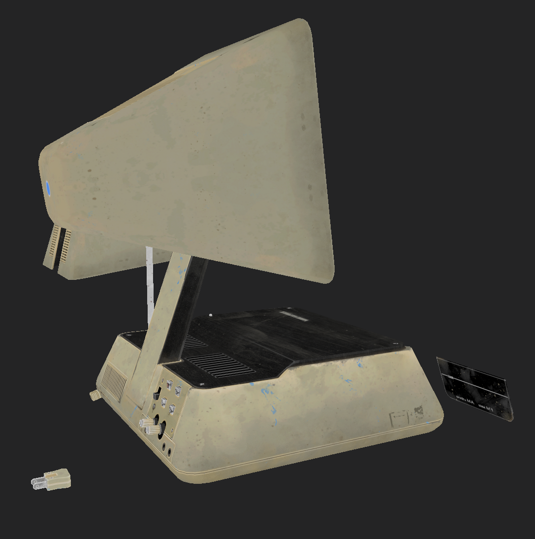
JVC 3100R


Introduction
Hi everyone, my name is Piotr Mucha and I’m a Junior 3D Artist at Techland, where I work on the upcoming Dying Light 2.

I’ve been fond of video games since I can remember, and being able to work with something that has been embedded in my life so much is very gratifying. Besides games, I also like retro product designs. I feel that way back then designers had a much tougher job hiding technical limitations (such as the size of CRT screen) and yet, they could do something that had a unique and distinctive look. That’s why for my following project I had chosen to create a model of an antique TV made by JVC.
Searching for ideal prop
Before I settled for JVC-3100, I was looking for that “ideal” prop, here are some key features that I wanted for my prop to have:
- Simplicity – so I will not spend half a year on one project.
- Small dimensions
- Switches – I wanted to animate something, nothing much, just flipping a switch.
- Screen – to have an opportunity to play around with UE flipbooks
I have a tendency to waste a lot of time on research, what works for me is setting deadlines and being strict with them. Usually, the research period is something I could do in a day or two (about 3hrs).
If you’ll find yourself in a situation where you need to search for some antique props, I recommend visiting:
- eBay (or any auction site equivalent) – the best place to search for this kind of stuff and its natural wear and tear
- Restoration/ renovation videos on YouTube (it’s almost as good as watching puppies, almost 🙂 )
- https://www.future-forms.com/
Handling references
I used to be that one guy that was saying “I can easily do my ref boards in Photoshop, why install another software just to keep pictures”, but after forcing myself to try it out I must say: If you have never used PureRef. Just try it.

Prototype
With this project, I wanted to implement a “proper” asset creation workflow and that’s why I started with making a simple prototype.
Again keeping the ~3hr/ day of the deadline.
The goal of my prototype was to map reference pictures to geometry while not worrying too much about its topology.
By doing that I wanted to understand how this model would function and to check if it looks good in UE. At this stage I also did a simple parenting hierarchy just to have proper screen folding, to make sure that closing/ opening would not create any mesh issues.

High Poly
On a day-to-day basis, I use Blender with HeavyPoly setup (coming to Blender 2.8 from 3ds Max and Maya). The only add-on that I use regularly is Texel Density Checker.
With this project, I wanted to test how much complexity Blender can handle while working on a pretty normal work scenario.
Starting from the standard box, I started applying modifier after modifier just to see how stable the app was at that version (2.92). And I have to admit I was surprised by how much it could handle, as some of the booleans had nested booleans inside of them. At the point shown on the screen below, Blender started to slow down, but all in all, I could create almost the whole base with just a modifier and for my taste, it’s not bad.

Also, the weighted normal modifier is a godsend. It allowed me to spend much less time on fixing issues with topology after applying booleans (there were some small manual fixes required, but nothing very time consuming)
While talking about HP, one thing that I want to point out is to do a bigger bevel than the one you can see in the reference. It’s Important to remember that your model will be placed somewhere in a game environment, and most of the time it won’t be very close to the player, so it has to look good from afar. Also, bigger bevels bake easier so that’s another plus.
For a visual explanation of what I’m talking about you can check this image on polycount.
To summarize my paragraph about bevels. Functional is better than realistic.

I know that my HP creation process is pretty basic, but after all, so is the mesh, and while I could import this mesh to ZBrush for further refinement and detailing, I had figured out that it would be pretty much pointless for this model because:
- All the detail that would be added there, could end up messing my bakes by adding noise to them
- I didn’t want to commit to the scale of detail, just in case that I would need to change them later
LP & UV
While doing low poly mesh, I did not want to have super optimized mesh. I knew that this was going to be purely a portfolio piece. The final mesh exported to UE4 had little less than 4.6k triangles. It could be optimized much more, but to be frank, I did not want to sacrifice more time and quality of final renders.
While working on UV’s most important thing for me was to mirror as many uv’s as I could while avoiding texture butterflying. By using a texel density checker I was sure that my mesh had an even texel density (the exception being the bottom part, I knew that I did not want to show this part so I deliberately halved it’s texture density and mirrored it 8 times
Final texel density at 1 x 4k was 58.5px/cm.


As you can see on the screens above. Both LP and UV’s could be done better. But to be honest I didn’t want to spend a few hours to get a bit better TD. I think that when working with texel this high, an additional 5% won’t be very noticeable.
Bakes
I exploded my mesh before baking. Reason being that some elements were hidden behind glass, and it would be a bit tricky to paint behind some elements (I know that I could paint on uv’s, but somehow i don’t find it as relaxing as painting on mesh).

Texturing
I start every SP project with three layers:
- UE4_ColourTweaks with “passthrough” blending mode on diffuse and roughness channel. It’s a layer that I tweak to get final diff and roughness values (SP viewport displays colour a bit differently than UE)
- Sharpen, Also has “PTHR” mode. I sharpen every channel except height and normal. For me ranges between 0.15-0.3 seem to be good enough to get that extra crispness.
- Curvature Overlay layer is exactly what you think it is. A curvature texture with “overlay” blending at about 30% intensity. It gives a nice definition to edges whilst not overdoing it. Often I tweak the curvature map with levels to get a better edge definition

SP feature that I use pretty extensively in my work are anchor points.
In short, It’s a really, really handy tool that allows you to “store” values and “recall” them for later use. Mainly I use them for masks, but you could also feed them into channel slots.
To get more info about them, I recommend checking the Substance YT channel https://www.youtube.com/c/Substance3D/videos. Their videos are worth watching to learn more about SP features.
Another important thing for me is Naming your layers. I know that it’s tedious and boring, but when working on something more complicated, it’s very easy to get lost in that “fill layer XYZ” chaos.
Now onto the texturing process.
I wanted to achieve the “used, lazily wiped but still functional old prop that someone had found in their grandparent’s attic, and wanted to sell it on eBay” look.
I started with defining base materials for my model. They were:
- Black plastic (Rough and bumpy)
- White plastic (Smooth. Red and Blue plastic. I wanted to make them different in diff hues only)
- Glass
- Metal (antenna, screws, and rings)
- Emissive text (for radio frequency)
- Cables
- Stickers
- TV screen (to be made in UE)
As you can see it’s not a long list. Most of the materials were simple and nonmetallic.
I started texturing with metalness and transparency channels, as their final versions wouldn’t change much, and it would be easy to find them on the bottom of my layer stack for later changes.
Next, I worked on materials in order from the list above
Black Plastic – To achieve that old but functional look I used some stencils of wiped dirt found on the internet and filled masks with tri-planar mapping. For height, I used a texture from textures.com with some basic plastic noise. One thing worth noting is the discoloration of elements in diffuse texture. I’ve deliberately made different colour hues to every part of the model, to highlight the aging of the elements (It’s more apparent in the yellowish parts of the model though.)
At that point, I was pretty satisfied with the dark plastic, so I started working on the light one.


Light Plastic – was more tricky. The biggest hurdle for me was finding the right colour for my plastic. I wanted an old yellowish plastic that looked like someone had left it in the sun for too long.
I’m very glad that I found some references of how white paint changes when it is left in the sun (table below) It helped a ton with finding proper colour value.

After adjusting my main colour, time came for darkening areas that were more often touched (I also did them more glossy, because oils from hand would merge into plastic) On the screen above you can see that the area near switches is darker than the side part.
Next, I started adding some chip-ins. They were placed in areas more prone to bumping like the corners, or in the seam between the bottom and top part of the case (like someone shoved a screwdriver there). I feel that it’s easy to overdo this kind of detail. And in retrospect, I would probably use it less often. Mask for those spots was all done by hand
After that, old paint spots were added. Lastly, I did a colour and roughness gradient. Adding gradients helps to “sell” your model, as things tend to gather dust more on the bottom. It’s also a very good way to break the monotony of colour in your diffuse texture.
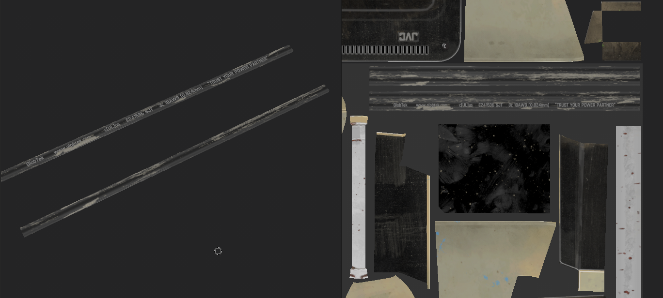
Cables were done in a Trim sheet manner, with looping pieces of texture that I could tile as long as I would like to.
The rest of the materials came pretty similar to those above, so I won’t waste your time by writing about them 🙂
In the end, I did some overall wear and tear passes in addition to the wear that every material had in their respective folders. This gave all materials a more cohesive look.
One thing that is necessary to improve your skillset is getting feedback. After I got to a place where I didn’t know what to improve further. I wrote to some artists I know asking for a critique, and also I’ve posted screens of my work on exp-points discord which I really recommend for everyone.
Animated screen material creation in UE
In this chapter, you will read about the creation of my animated master material inside UE4. The final effect can be checked here
I knew right from the beginning of this project that my usual UE4 master material won’t work for this specific case. It required creating material that used flipbooks.

I didn’t want to create photoreal, fully procedural material, as this would take too much time, and frankly, I think it’s way out of my league. Just like with SP first came to the list of things I wanted for my material to have, they were:
- Working flipbook
- Screen flickering
- Old VCR distortions
- Glitches
- Vignette
- Bad viewing angle (simulated by using fresnel)
- Controls for Emissive power, roughness, normal, and metalnessScalar Off switch to control it easily from the sequencer
I’ve started by creating a random flicker function. It’s as simple as useful.
Sine defines the time interval between cycles of 1 and -1. By adding and dividing those functions by 3 I’ve got a pretty satisfying random oscillation of screen brightness. Max node at the end, was used to output only the highest value, by that, I could get quick flashes that had a nice dynamic.

Next, I worked on flipbooks (ignore the second flipbook node for a minute. I will write about it later)

Working with flipbooks was way easier than I thought. It just needs some basic info that you have to plug into it. Flipbook speed is multiplied by the time node from a previous screen (As you can see it’s on -0.5. It’s because I’ve assembled my Flipbook Texture backward)
Next, you have to define how many rows and columns your texture has. I used a 16×16 grid, so I had 256 frames of animation. To fill in that amount of frames I have downloaded gameplay from old school game “ducks” and split it into frames.
I came upon a pretty handy PS script that basically does the job of aligning frames for you. Check it out at: https://jesshiderue4.wordpress.com/materials/flipbook-node-creating-an-animated-texture/
Next – old VCR tape flipbook distortion and this was my main reference.
That’s why I created a copy of the flipbook node. Everything was the same except the UV’s. For them, I’ve made a simple stripe multiplied with some generic noise.


I’ve been lerping between flipbooks using output from flicker as alpha. To have an effect that when distortions occur the screen gets a bit darker I’ve done a simple lerp between two scalar parameters.
The next step was to create VCR noise (reference).
For it, I almost redid my steps with flipbook creation. I did a simple noise animation in PS and I’ve multiplied it on top of the distortions shown above.

My next goal was to create a vignette. A mask was created in PS – I drew a white square with rounded corners, and blurred the devil out of it – and multiplied it on the screen.

Next, I wanted to recreate the poor viewing angle that old CRT tv’s had. I did it by using fresnel node, multiplied it, and plugged it as alpha input in lerp. To input A I plugged output of the last lerp, To B input I plugged in a flat black value.


One of the last things I wanted was an off switch. It was a very simple lerp, A = all that you saw above. B = 0 and scalar parameter as alpha. The reason for doing it this way was the fact that after flicking the switch, I wanted to have a moment when the screen is not warm enough and emits a very dim picture.
The last setup in this material was some standard nodes shown below :
- Roughness
- Metallic
- Normal
- Emissive power

Using master material, allowed me to use material instances, and tweak values live. It was pretty easy to achieve the results I wanted, while not overcomplicating stuff in the “noodles”.
Below are the final settings of my material instance.

Rendering
For rendering, I used settings from NikonD810 – 36x24mm filmback, 85mm F2.4 lens. Using real-world dimensions is the easiest way to get a good-looking render. The reason why I chose that model of camera is simple – my friend has it and I like the photos he makes with it.
To be honest I don’t know much about the theory of lightning. So please take my lightning and rendering workflow with a grain of salt 🙂
Instead of writing about what I did. I made a gif illustrating the whole process

In this project, I didn’t care about the framerate, and I had RT turned on (although my old rtx2060 did its best, it was not enough to have a stable framerate I recommend using DLSS. It’s great!) That’s why I could use a lot more lights than I would normally use. It took “only” 24 lights to get the final results.
In a game environment, it would be overkill. But aren’t all personal projects supposed to be something that is too much to use in a real-world scenario? 🙂


Summary
I’m very happy that gamesartist.co.uk gave me the opportunity to write about the creation process of my latest prop. I genuinely had fun writing, and I think this is the reason why this article is so long (I hope that it wasn’t too long though.) While writing this text I did my best not to repeat what’s been already written in other articles. But You’ll be the judge of that.
Be sure to let me know, did you find this article helpful? Or something could be written better? (it would be lovely to hear from You. I might write another article someday, and every feedback is like the smile of the cute puppy)
If you have any more questions that you want to ask You can reach me on linked in: https://www.linkedin.com/in/piotr-mucha-25834413b/
and through Artstation: https://www.artstation.com/muszka_pietruszka
Cheers!
Thanks to Piotr for allowing us to have such an in-depth look at her process. If you liked this prop breakdown and want to see more like it from other inspiring artist’s make sure to follow us on :
https://www.artstation.com/gamesartist
Read more articles
You might also like these articles.


