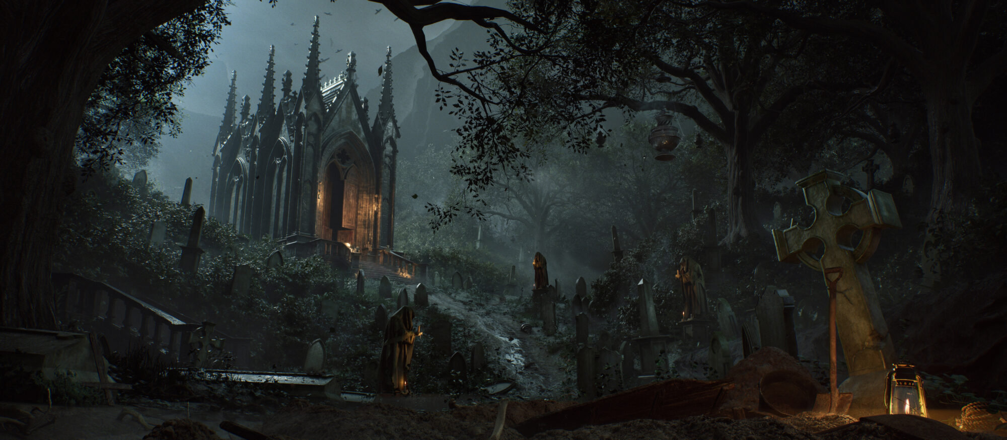
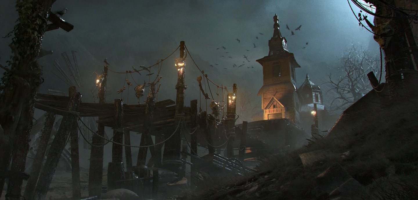
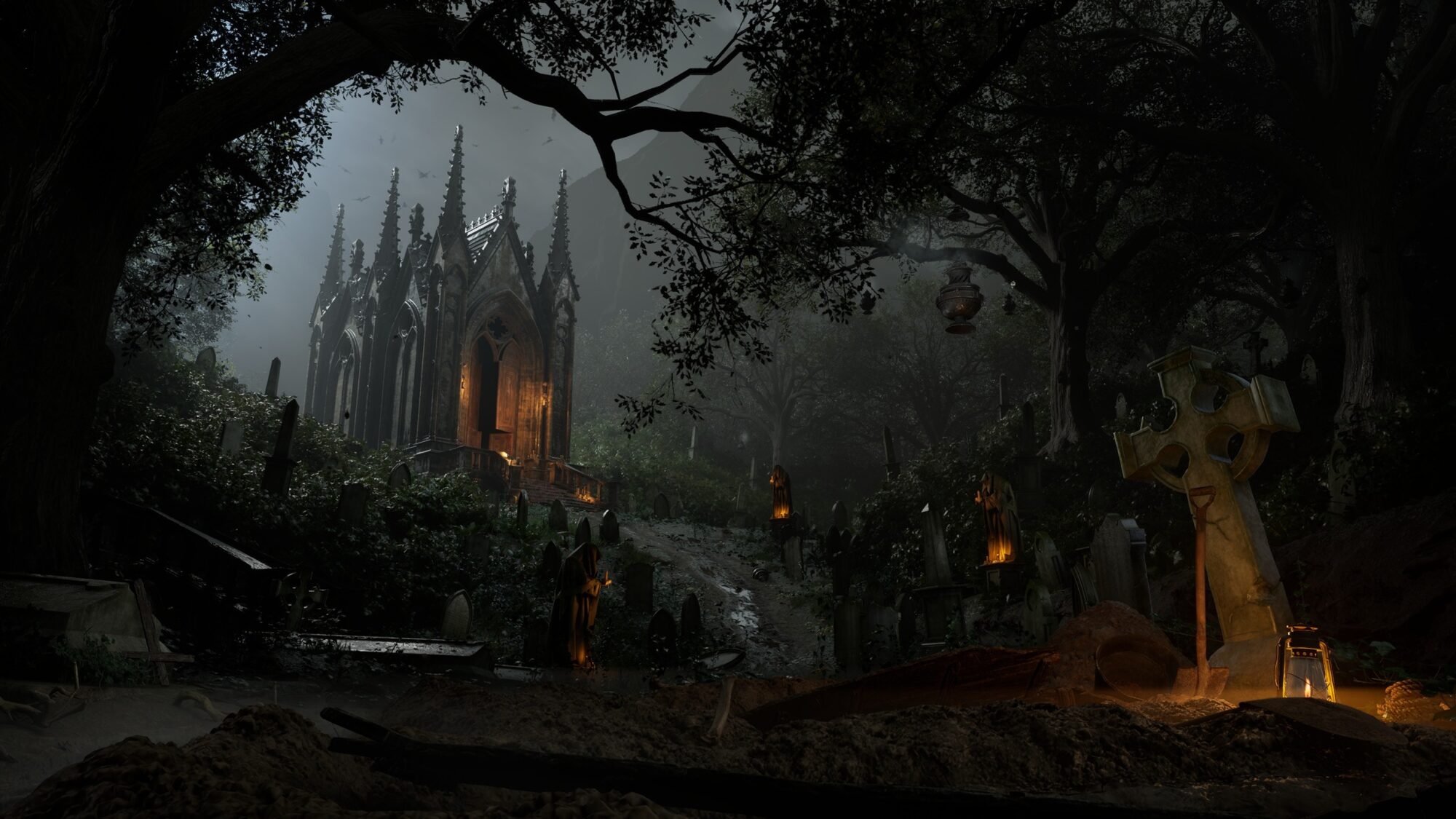
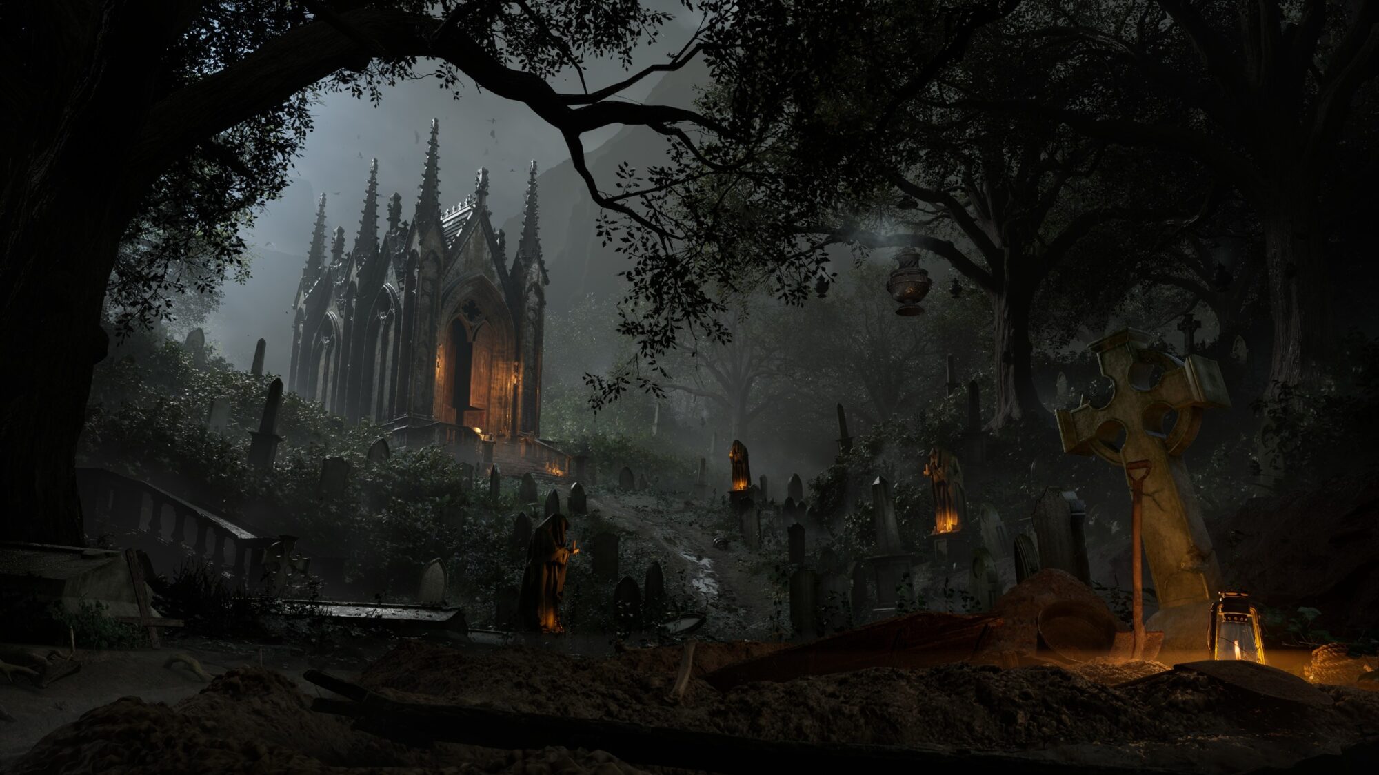
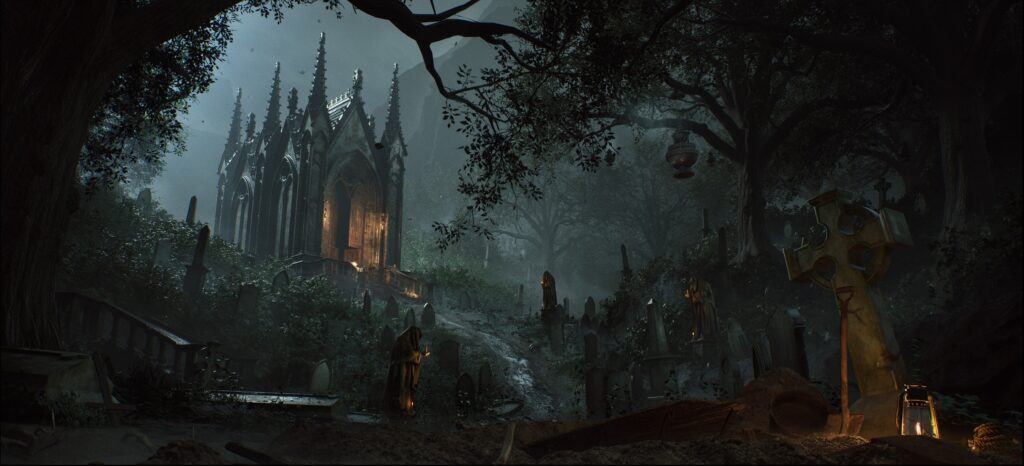
Hassled Churchyard

Introduction
Hi! My name is Jacopo, and I'm an Environment Artist for games.
After earning a degree in architecture, I decided to pursue a career in the 3D world.
At first, I got into video games purely out of passion, but over time, I became more and more fascinated by what happens behind the scenes: Things like optimization, technical constraints, modular workflows, and the balance between artistic vision and performance.
Discovering this complex and structured world made me realize that this was the right path for me. And here I am!
Goals
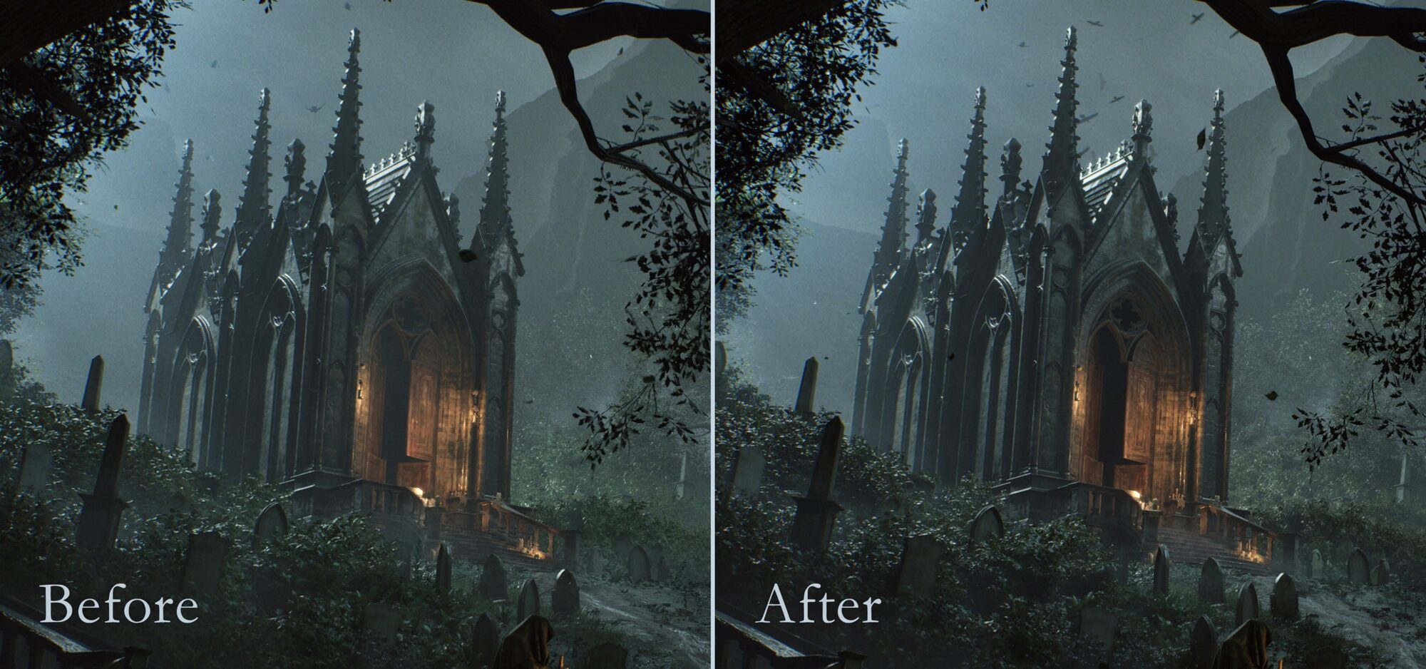
The main challenge of this project was dedicating most of my efforts to studying composition, storytelling and lighting.
My goal was to create a sense of unease. An eerie atmosphere that raises questions and hints at something unsettling lurking beneath the surface.
At the same time, driven by my curiosity, I took this opportunity to explore new techniques and workflows to expand my personal skill set.
Tools
Maya, ZBrush, SpeedTree, Substance Painter, Substance Designer, Unreal Engine, RizomUV, After Effects, Media Encoder, Photoshop & Marvelous Designer.
UE Plugins: HDRI Backdrop, Color Correction Region (CCR), Spline Tool.
References
I usually prefer not to rely too heavily on reference images for composition, as I enjoy exploring and experimenting to sharpen my eye and improve my skills.
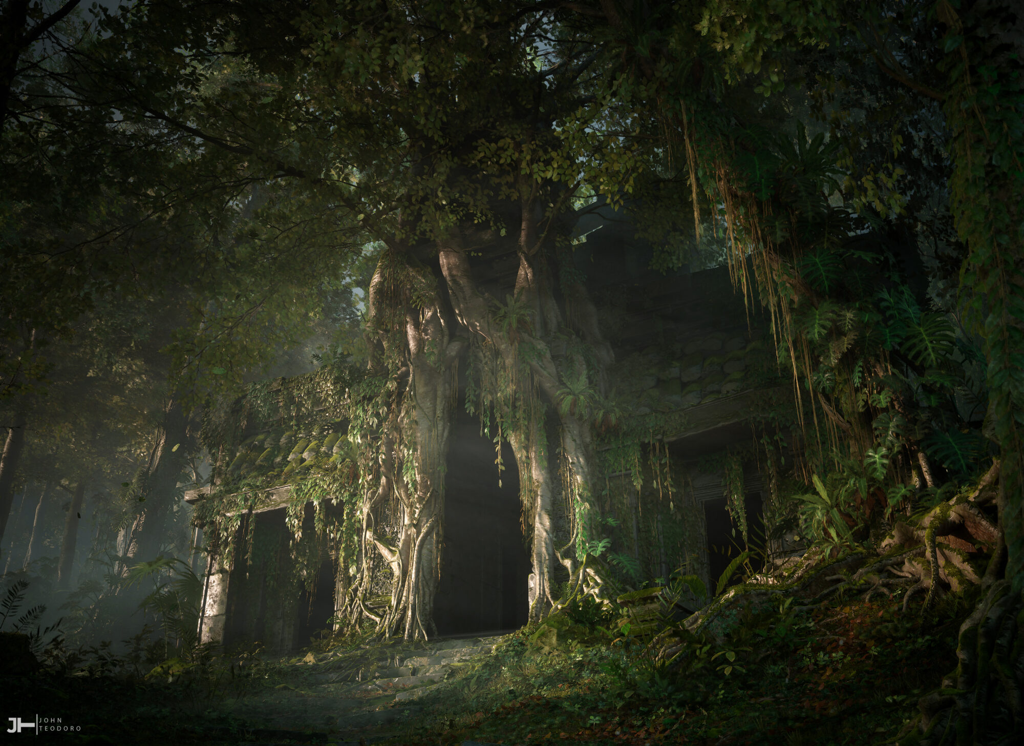
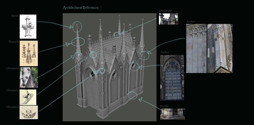
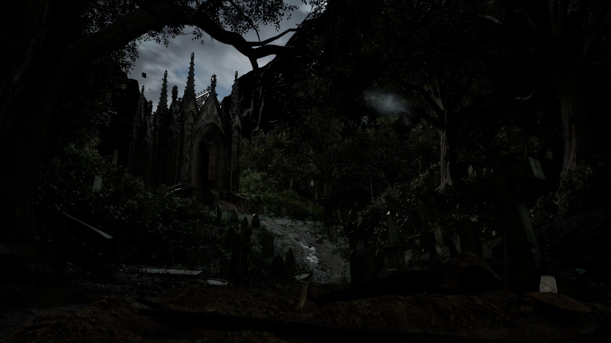
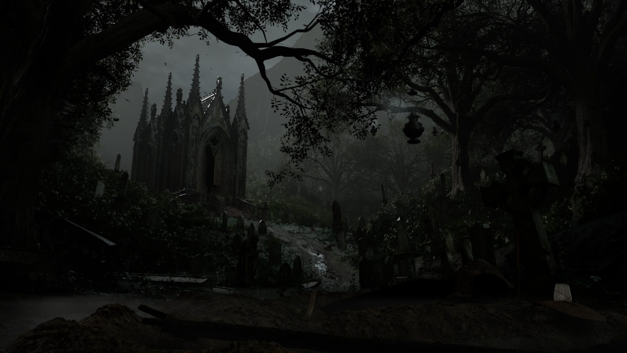
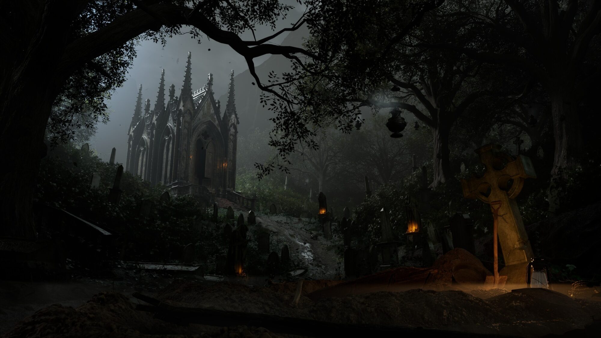
That said, I drew a lot of inspiration from Highgate Cemetery in London for the overall layout and from the Cologne Cathedral for the design of the mausoleum.
What I loved about Highgate is how certain areas of the path are nestled in sunken ground, surrounded by tombs on higher ground—something quite unusual, as cemeteries are typically flat.
I decided to exaggerate this trait in my environment, creating a more dynamic and layered composition that feels both more immersive and “alive.”
For the chapel, I looked to the Cologne Cathedral for its pure presence and grandeur. Made of black stone and marble, it feels more imposing and ominous than welcoming.
I liked the idea of taking something relatively small, like a mausoleum, and turning it into a large, threatening, and monumental structure.
Tip: Avoid using too many reference images at once; staying organized is key. Otherwise, you risk ending up with a messy or inconsistent result that lacks believability.
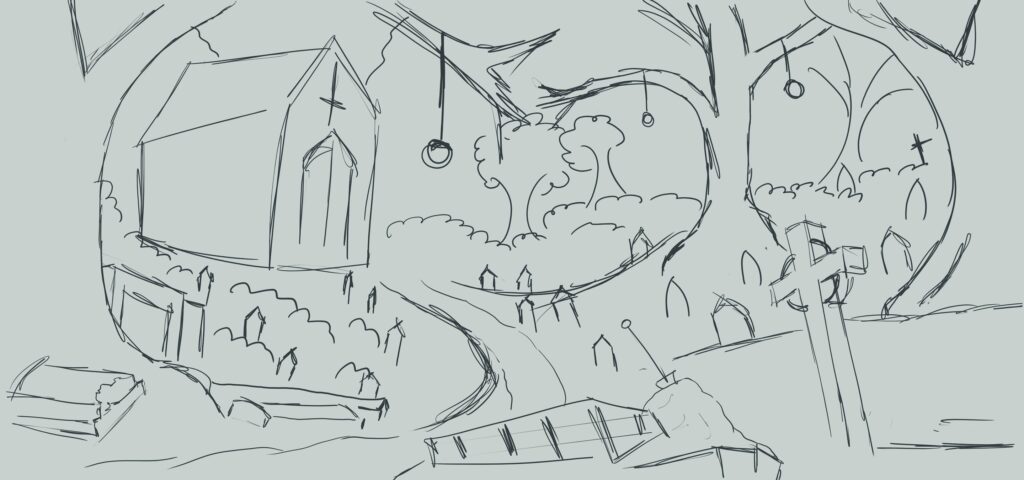
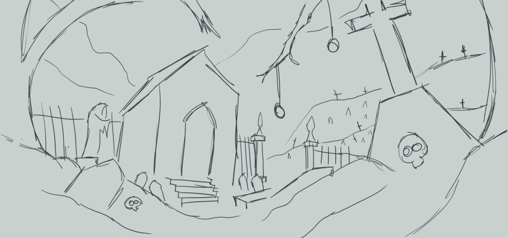
Sketching
After selecting the right references, I find it very useful to sketch by hand, from the smallest details to the possible final composition.
This process allows me to explore different solutions more freely and flexibly, making it easier to manage the various parts at the prototyping stage before moving on to actual production.
Blockout
The blockout phase was definitely the most challenging part of this project. It’s a crucial step when it comes to composition, so I took it as an opportunity to experiment with different solutions and iterate as much as I needed.
One thing I found extremely helpful was setting up the camera as early as possible.
Doing so gave me a clear idea of how to structure the scene from the start. Once the framing was in place, I could begin shaping the environment, adjusting forms, distances, and the placement of focal points.
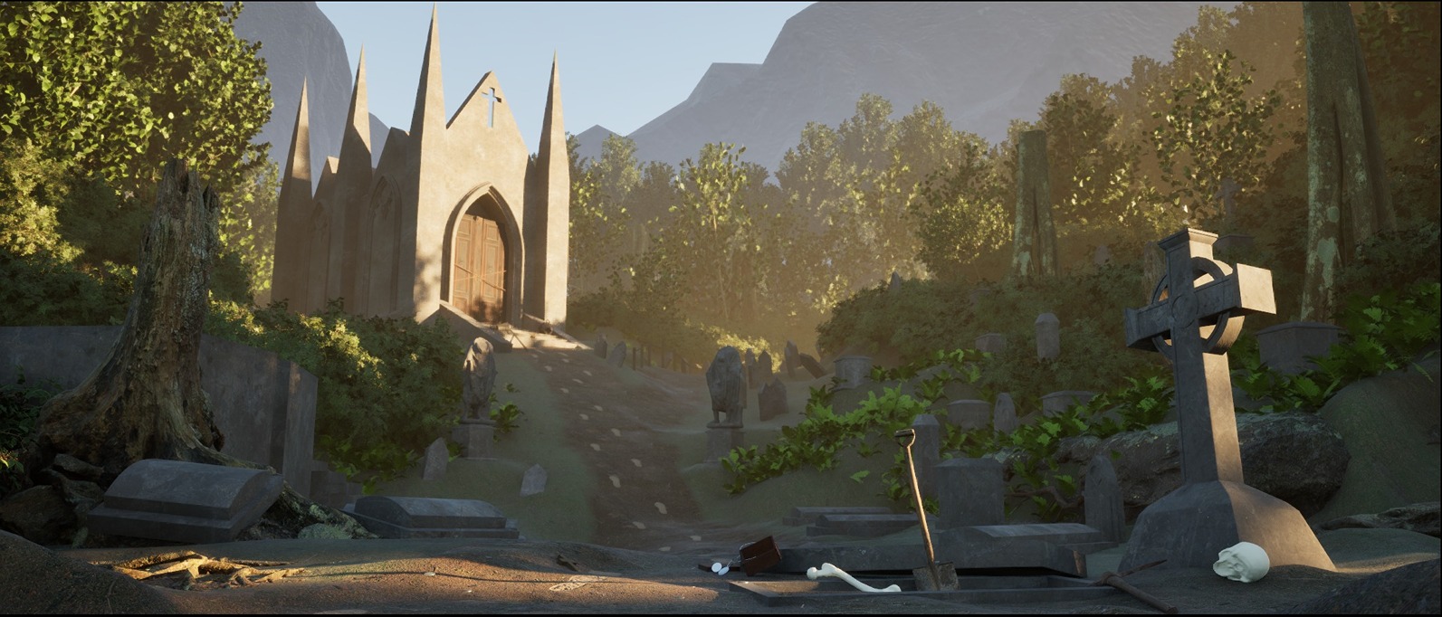
In my case, I went for a low-angle shot, close to the ground.
This choice helped make the focal point, the chapel, feel much more imposing and unsettling, while also giving more presence to the storytelling elements in the foreground.
The blockout is also a great time to test visual flow, that is, how the eye moves within the image.
You can ask yourself:
- Where does the eye go as soon as you enter the scene?
- Are there natural guidelines?
- Are the volumes balancing the weight of the composition well?
At this stage, I wasn’t too focused on lighting or atmosphere.
My goal was simply to get all the elements in place to establish the first strong composition in order to clearly define the three layers of depth:
- Foreground: where the viewer’s eye should immediately go to understand where they are and what might be happening.
- Midground: which serves to connect the two areas of interest and guide the viewer’s gaze.
- Background: dominated by the focal point, the chapel.
- Tip 1: It’s always useful to place all the props in the scene early on, even if they’re just simple cubes. This gives you a solid sense of scale, layout, and the amount of work ahead right from the beginning.
- Tip 2: Don’t fall in love too early. It’s easy to get attached to a layout idea too early, but blockout is the time to get it wrong quickly. If something doesn’t work, change it.It’s all still in the “clay” stage, and the more you iterate now, the fewer problems you’ll have later.
Modelling
Once I had established the two main shots, I created a list of the main assets I would need to create and established each one in its order of importance to avoid overextending myself and wasting potentially useful time.
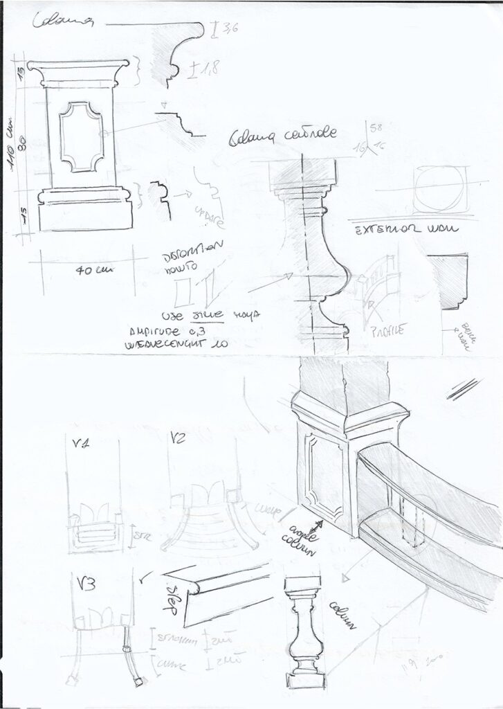
Stairs
As mentioned above, I always start sketching the asset even before the blockout.
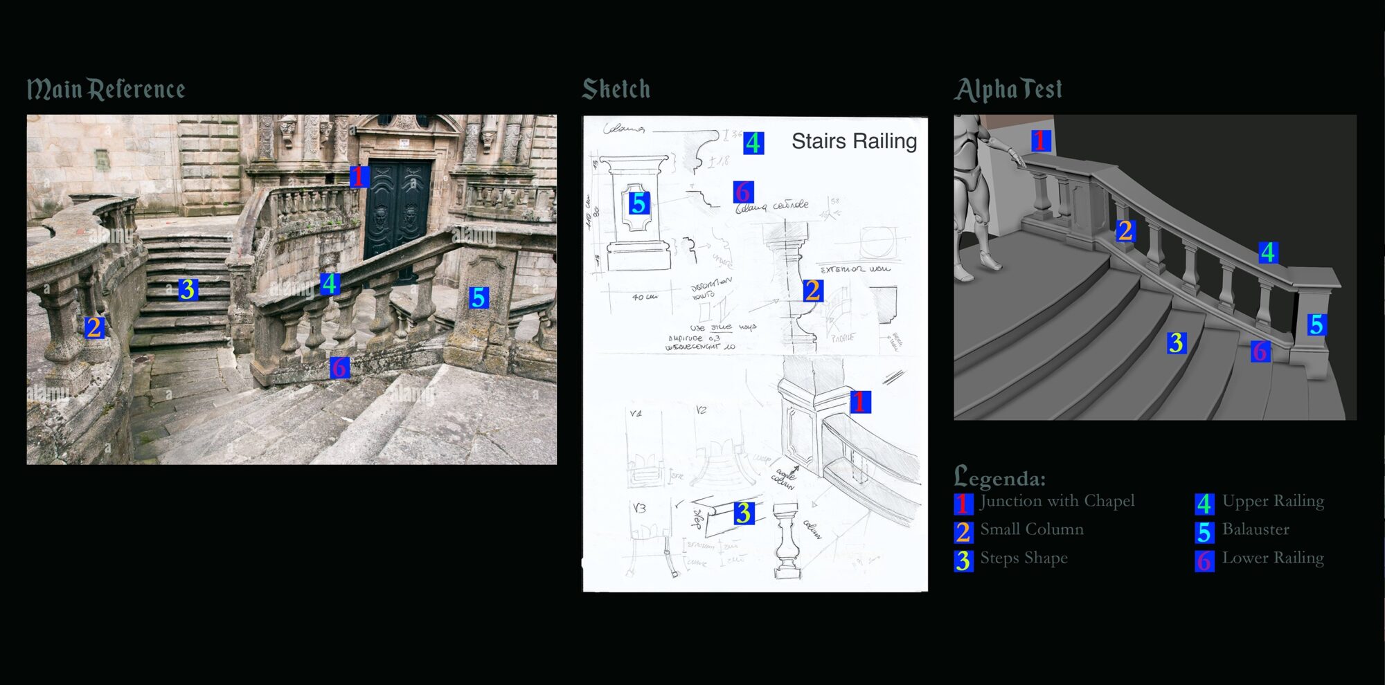
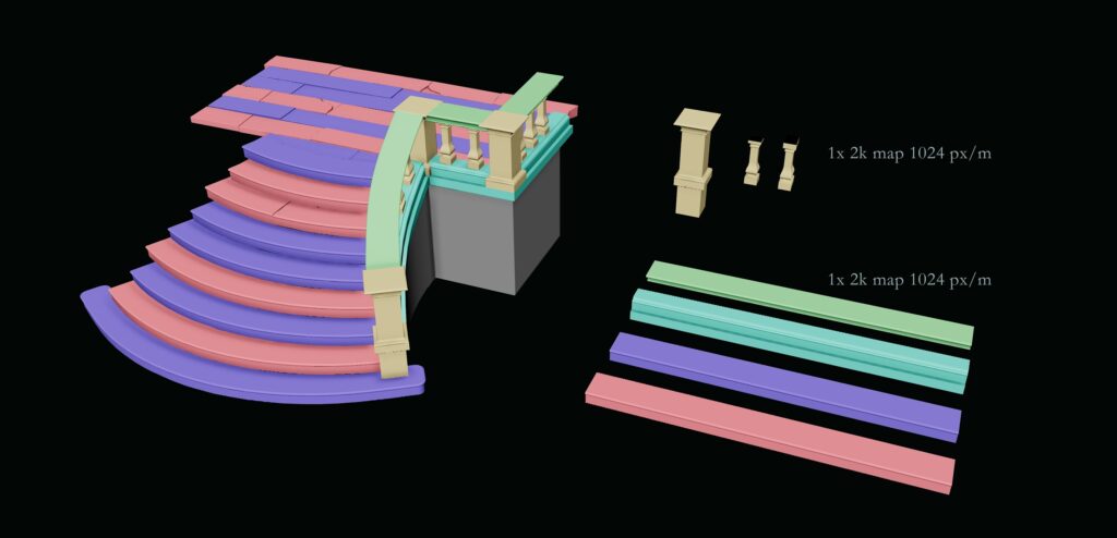
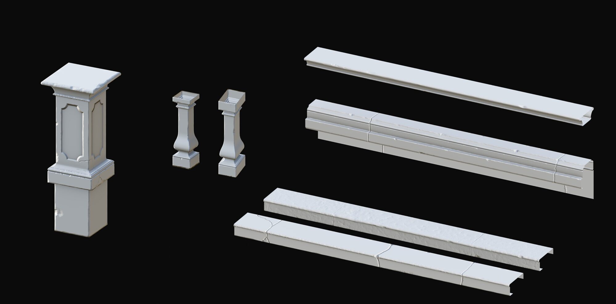
For the staircase, I decided to create a trim sheet that includes the top and bottom balustrade elements, along with two different types of steps.
In a separate texture set, I baked three distinct balusters: one structural, one small angled, and one small straight.
After finalizing the trim sheet, I rebuilt the entire staircase according to the original reference and sketch, ensuring modularity and texture consistency across the whole asset.
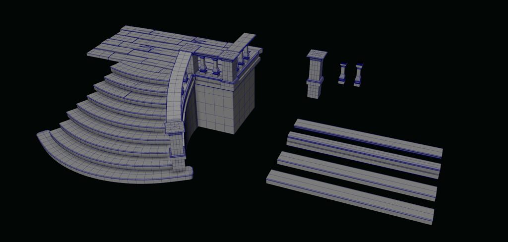
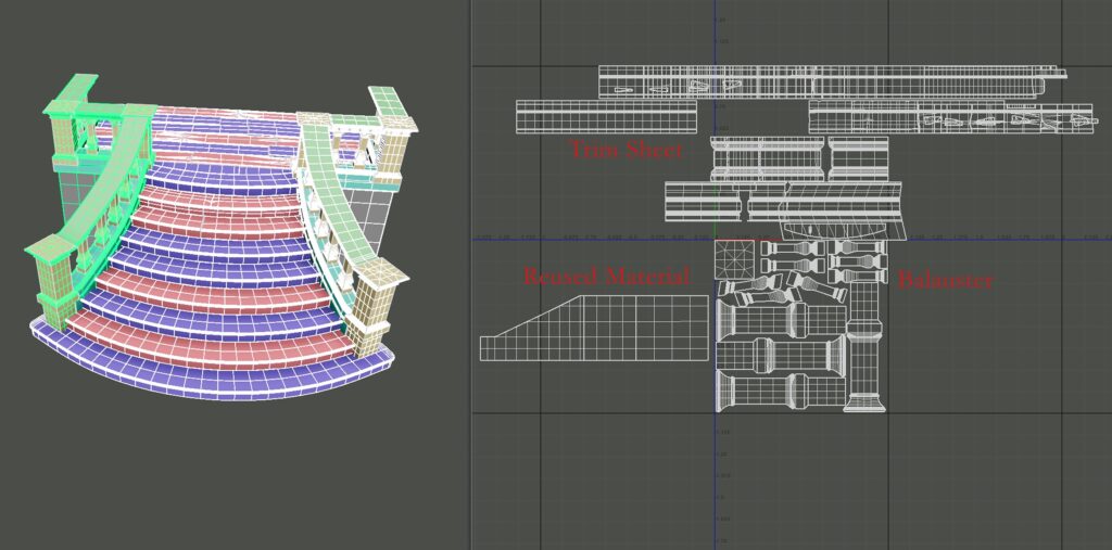
I sculpted all the components needed for the trim sheet, including both the stair elements and the individual balusters.
Once the high-poly sculpts were ready, I baked them and tested the trim sheet.
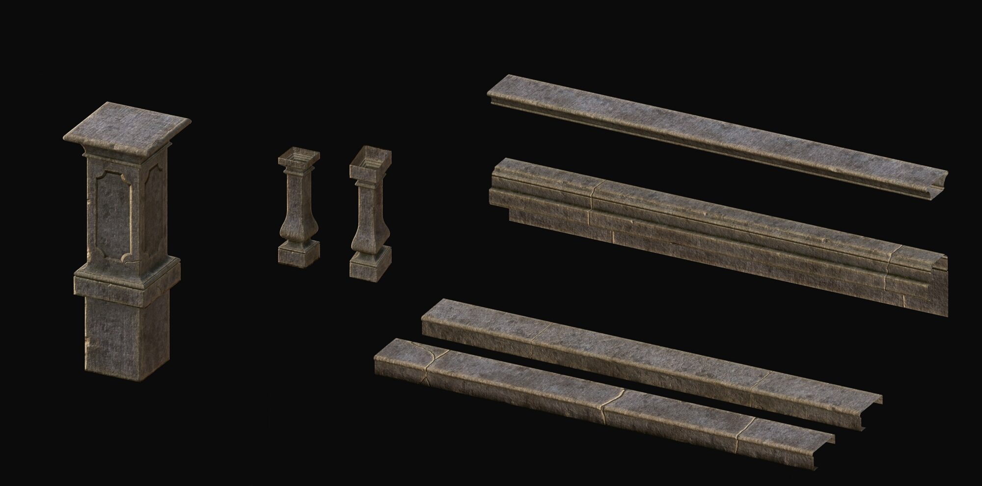
Finally, I created the materials in Substance Painter, including a few variations for vertex painting directly in-engine.
Tip: If you have two symmetrical elements in your environment, it’s often unnecessary to import both as separate static meshes.
Since Unreal Engine supports negative scaling in the scene, you can import just one mesh and use scale -1 on the appropriate axis to mirror it.
This reduces asset redundancy, saves memory, and keeps your scene cleaner and more optimized.
Mausoleum
This time, I didn’t start with full architectural sketches for the chapel, as I already had a strong vision in mind and a solid blockout to build upon.
Instead, I focused on refining smaller design elements and ornamental details through quick sketches and notes.
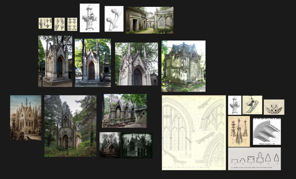
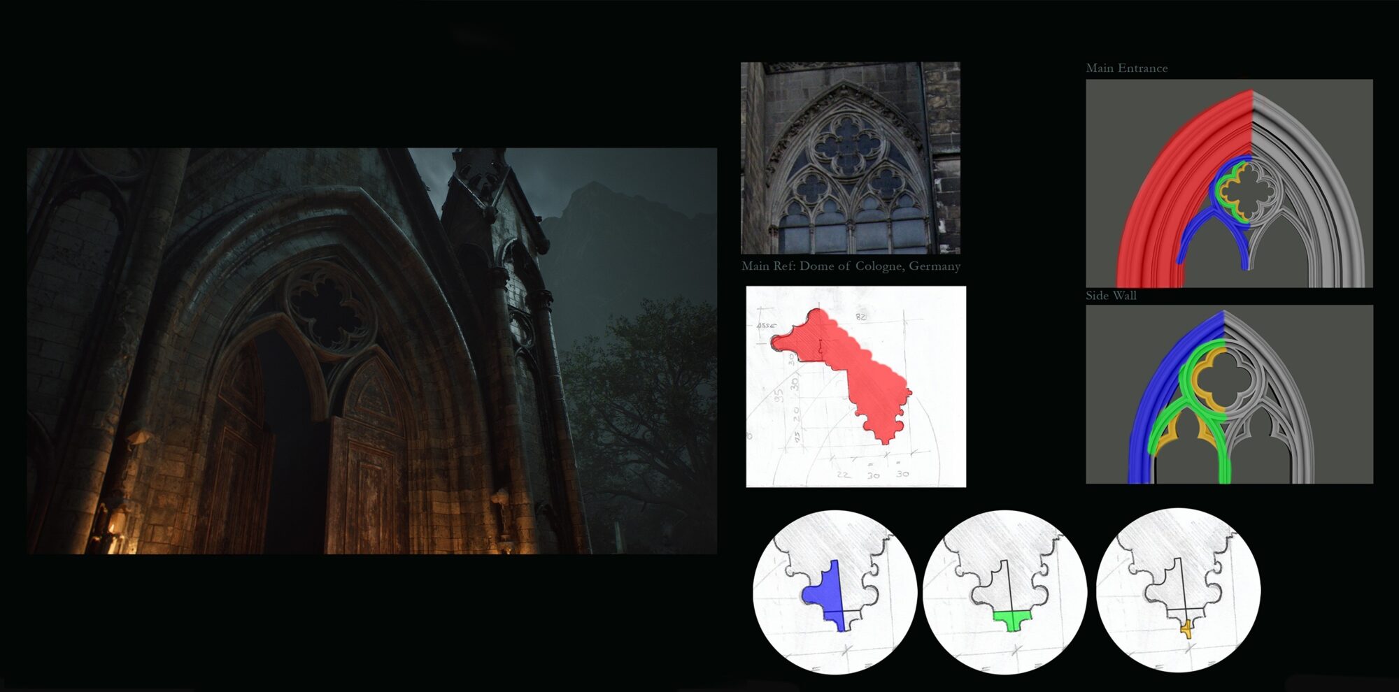
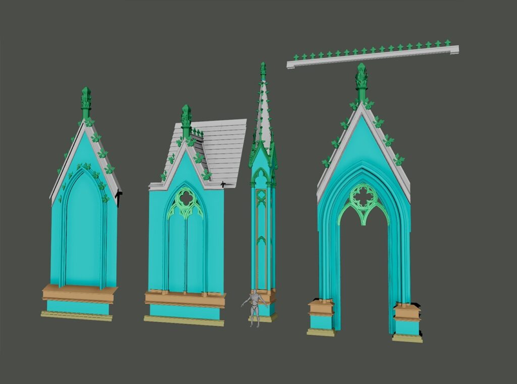
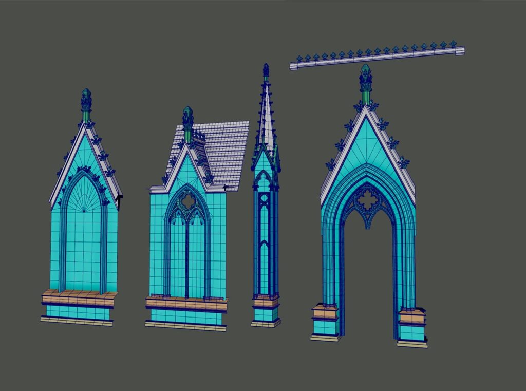
The idea here was to start with a large Gothic arch profile and then break it down into smaller sections.
Each of these smaller sections serves as a base where additional arches can be attached. This way, I could gradually build up layers of detail, just like in real Gothic architecture.
By structuring it this way, I was able to create a hierarchy of shapes starting with the biggest forms and then adding progressively smaller details.
This method helps achieve a sense of depth and complexity, making the architecture feel more intricate and realistic.
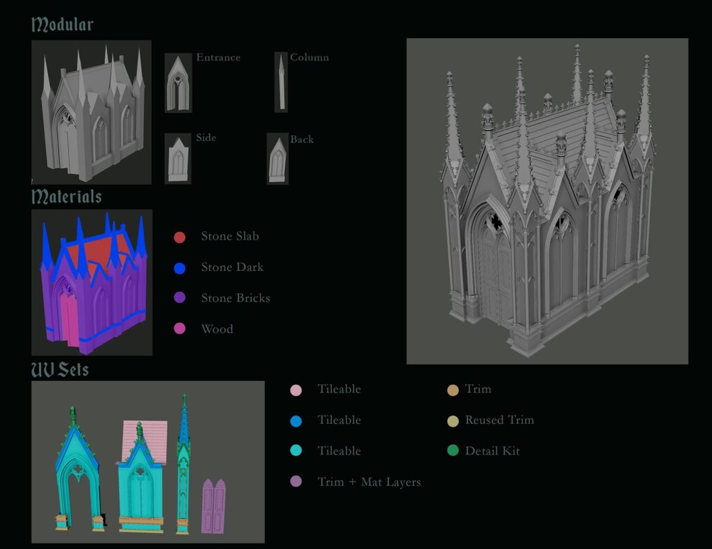
After modeling the blockout of the chapel, I created a material and workflow breakdown to organize and optimize the process, aiming to reduce draw calls once inside the engine.
I ended up creating three tileable texture sets:
- One for the dark stone of the roof (white).
- One of the main stone bricks (cyan).
- A third, similar to the previous one but without visible tiling, for the arches (light green).
In addition, I created a trimsheet (orange) and reused part of the trimsheet I previously developed for the staircase (yellow).
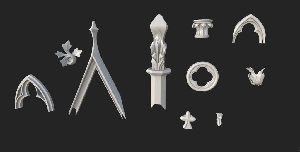
Finally, I built a detail kit for all the ornamental elements of the building, packed into a single 2K texture map (green).
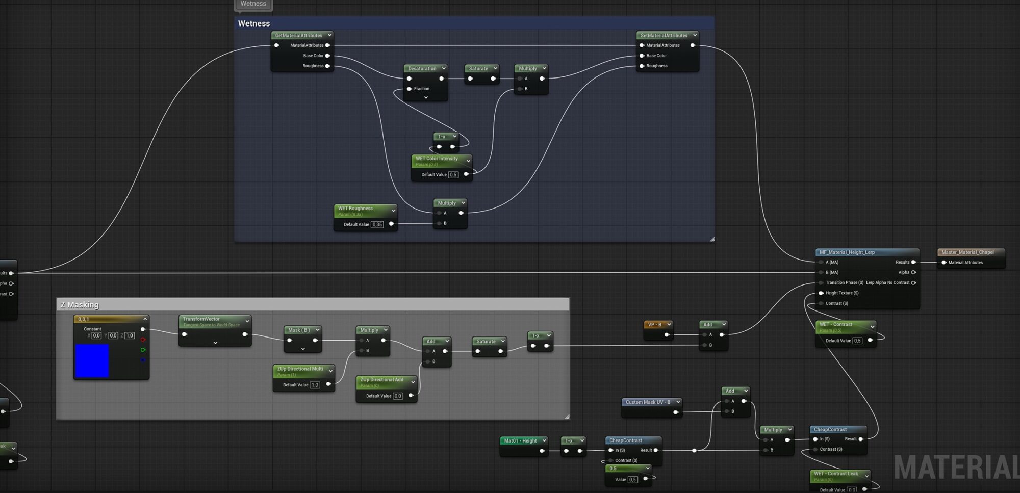
I created a shader that allowed for vertex-painted wet surfaces, useful for the moss and stone, both being porous materials.
Since porous surfaces, like many types of stone, tend to darken and become more saturated when wet, I applied a negative value to the Desaturation node and used a Multiply at the end of the color calculation.
I increased the glossiness to better simulate the reflective behavior of wet surfaces.
Also, I added a mask that automatically covers the upper areas of the models to save some time on the vertex paint.
Tip: To achieve a convincing wet look, the most important map is the Normal Map, which adds the micro-detail necessary to catch highlights.
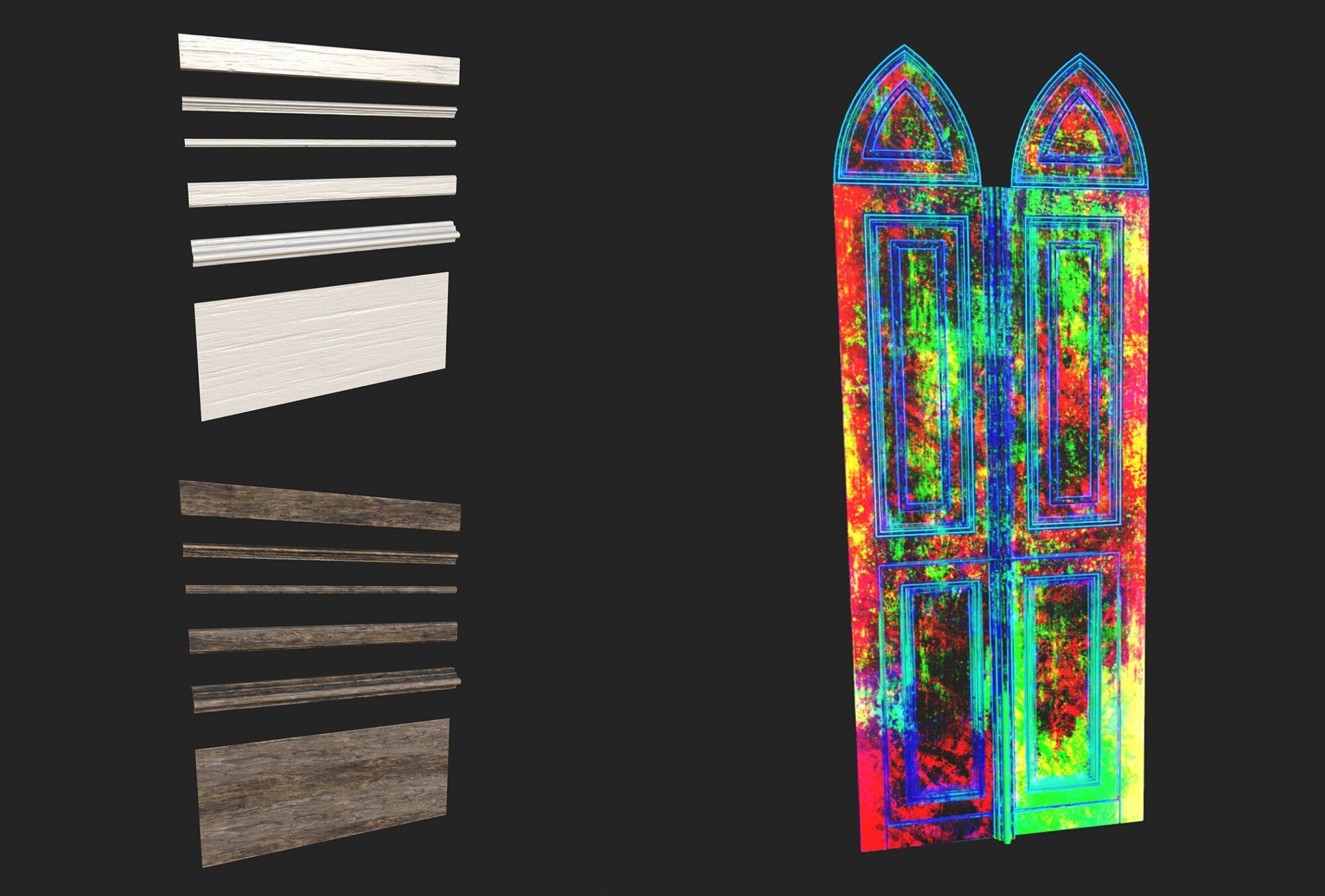
Doorway
For the doorways, I tried a different workflow, Trim Sheet with RGB masks in material layering.
First, I separated the doorway into the various components from which it was composed, in order to create a trim sheet on a 2K map.
Having created the trim, I moved to ZBrush to sculpt the highpoly, which, with the use of wrap mode functions, I was able to sculpt seamlessly.

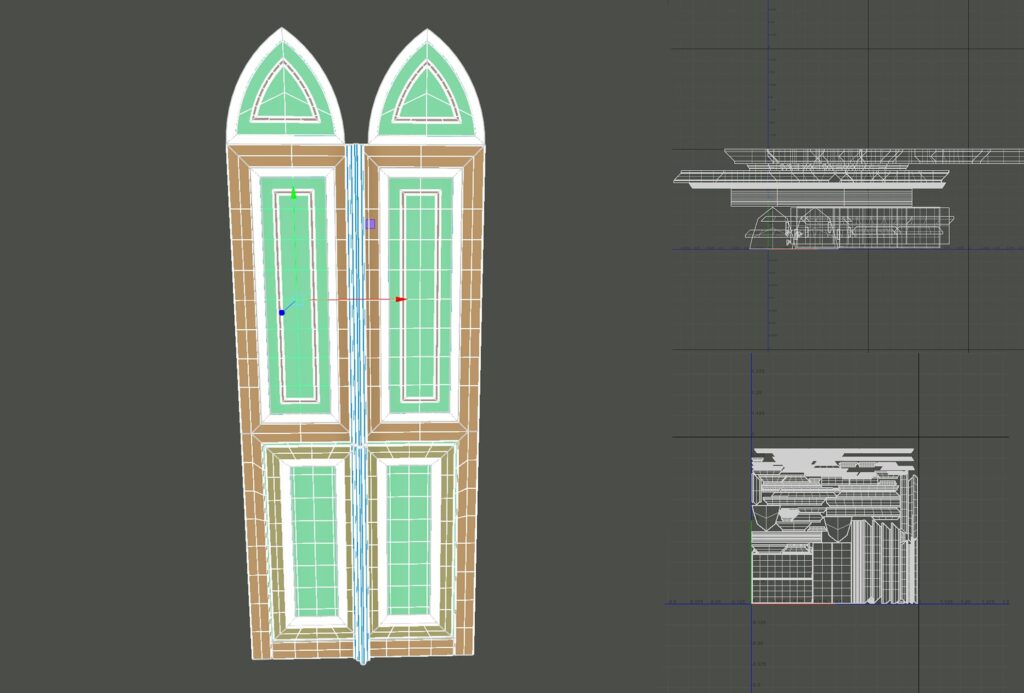
With that done I recreated the entire doorways with the pieces on hand.
Once that was done, in a second UV I packed everything to create custom masks on painter.
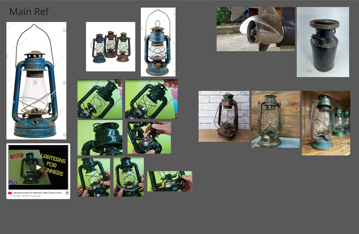
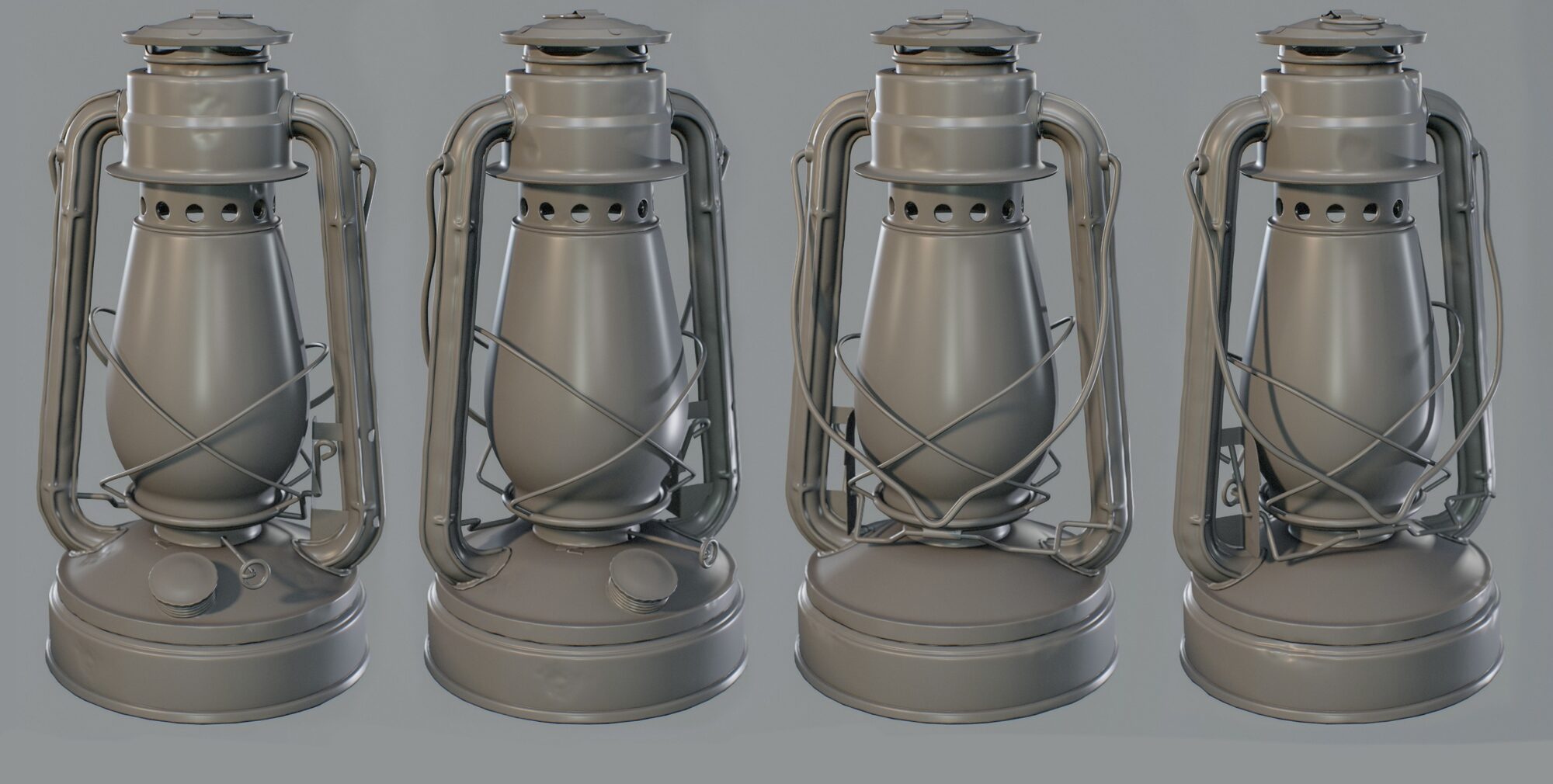
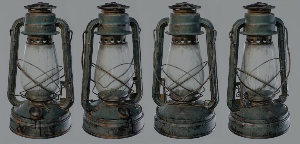
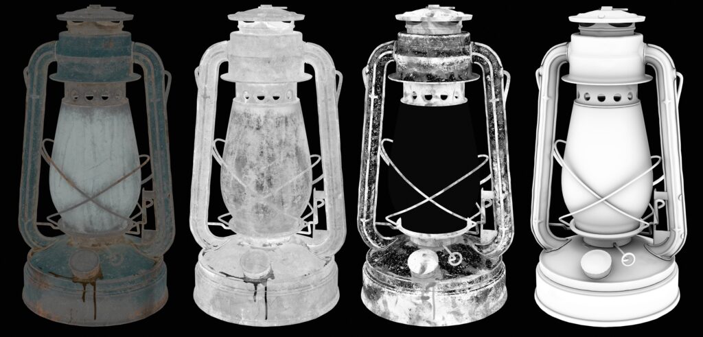
Lantern
When working on props, I usually aim to keep my reference board as minimal and focused as possible.
For weathering and time damage, I don’t necessarily look for references to the exact same object; instead, I focus on examples of objects made from similar materials.
This gives me a clearer understanding of how those surfaces behave over time without overloading the research.
Tip: In addition to static images, I always look for videos showing the object in action. Seeing how it moves and functions helps me better understand its proportions, logic and how to approach modeling and detailing more accurately.
Just like every part of a real-world object serves a practical purpose, I make sure that every element in my 3D models reflects that logic.
When modeling props, my first step is to break down the asset into components based on modeling complexity.
I handle the simpler parts directly in Maya using standard subdivision techniques, while the more intricate shapes are reserved for ZBrush, where I take advantage of Live Booleans to achieve clean and complex forms more efficiently.
This hybrid approach helps me stay both precise and time-effective.
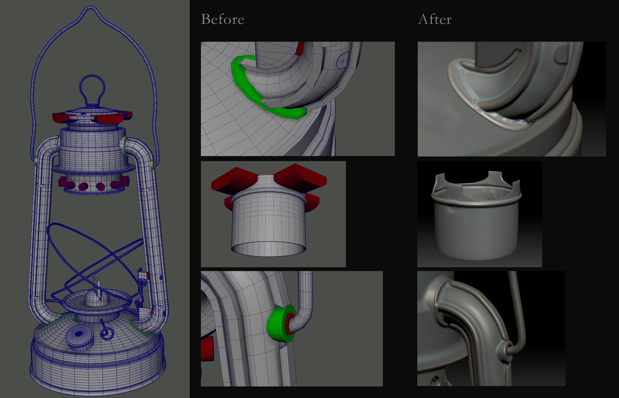
Once the base mesh is ready and everything is properly set up, I export each part into ZBrush to sculpt specific details and enhance the silhouette, making it more visually interesting and believable.
After sculpting, I move to RizomUV for unwrapping, especially since I often work with dense, decimated meshes.
Finally, I complete the baking and texturing process in Substance Painter.
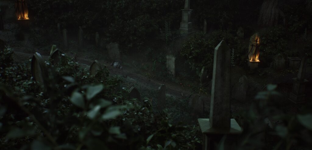
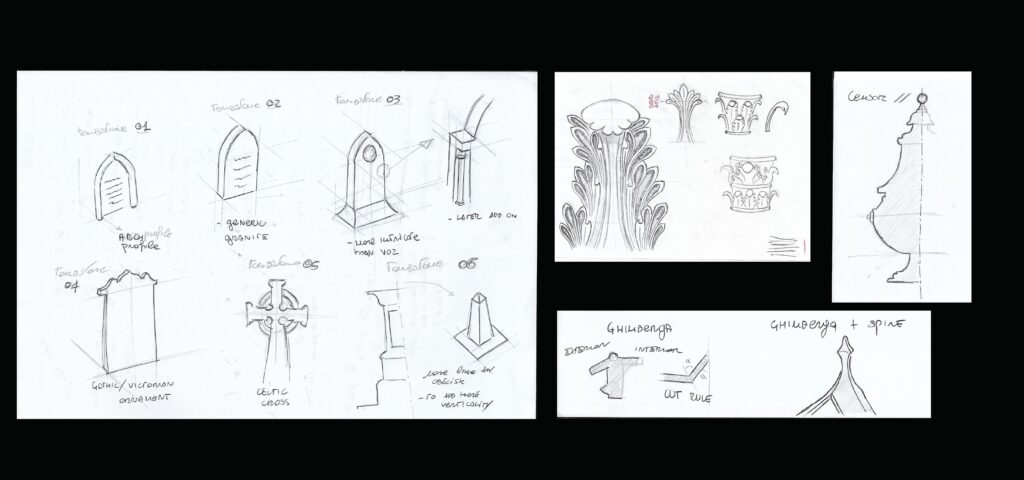
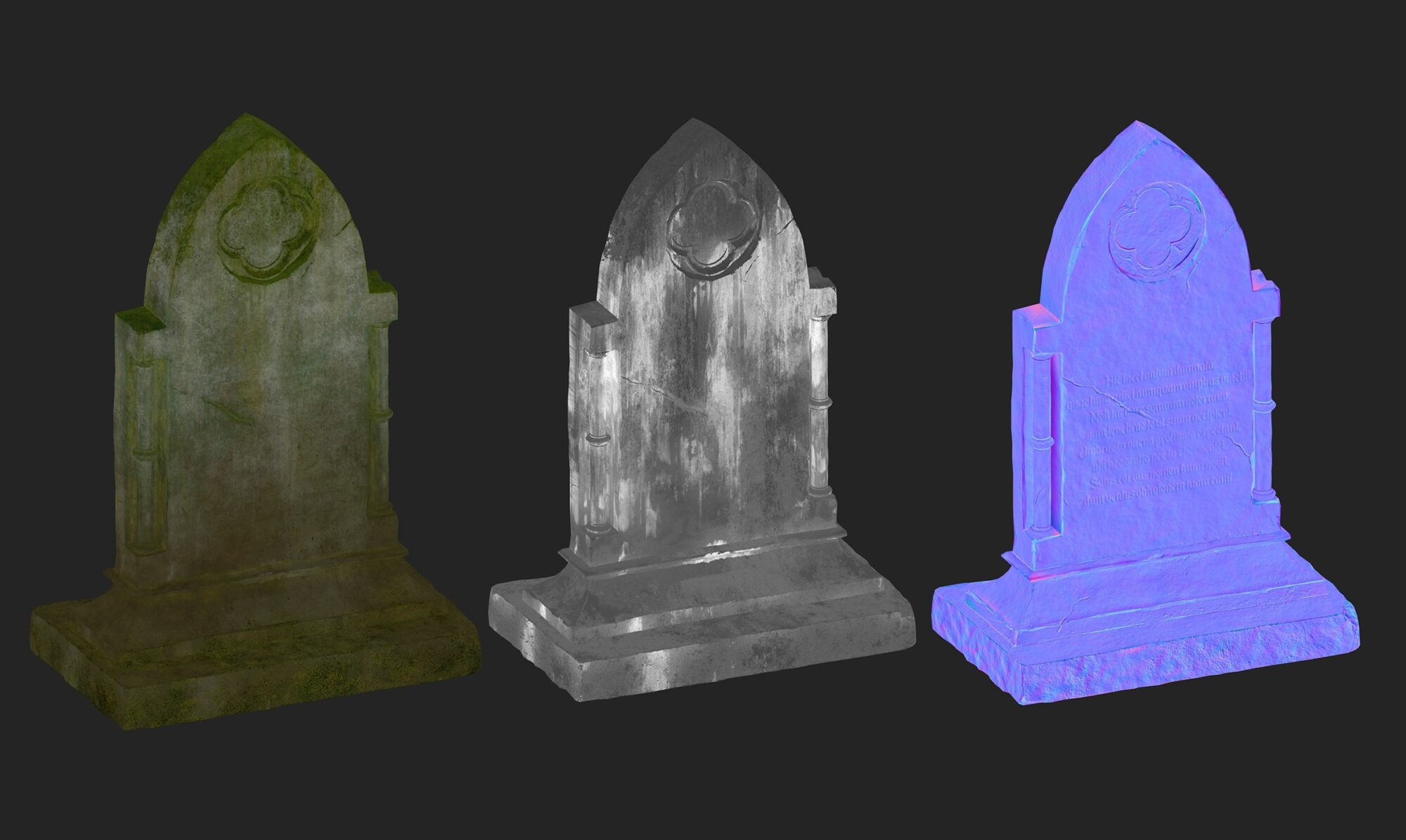
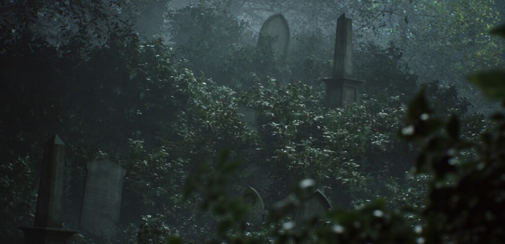
Tombstones
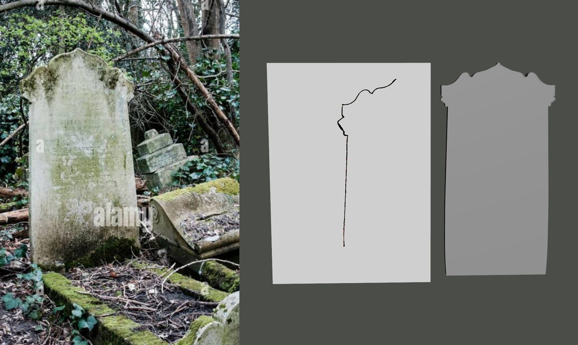
I mainly searched for references of Gothic Victorian-style gravestones, trying to maintain a consistent visual style while also diversifying the shapes to have a more varied set.
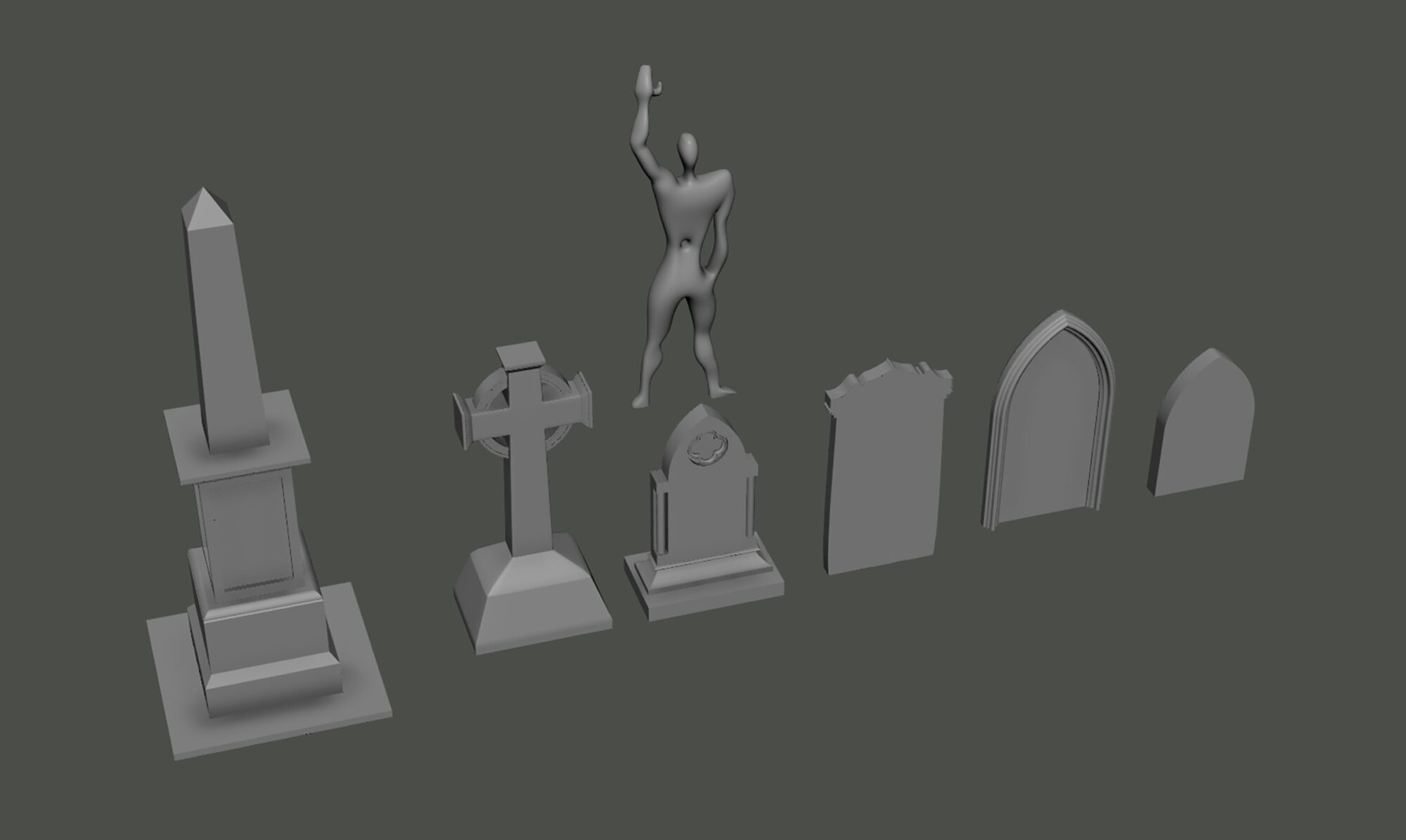
For one of the gravestones, I hand-drew the silhouette, scanned it, and used it as a base in Maya to recreate it in 3D, refining the shape to give it a more gothic look.
After sculpting them in ZBrush, I decimated them and brought them into Rizom for UV mapping.
For the texturing, I decided to create a smart material that would work across all six assets, in order to save time but, more importantly, to maintain a consistent visual style and weathering.
I started with a white marble base, then added some color variation to make it feel more alive.
Afterwards, I layered in weathering based on the references I gathered:
A material heavily affected by moss, especially in occluded areas, and some whitish patches on the surface to mimic lichens.
Since we’re talking about a porous material, it’s more prone to being colonized by moss and lichens.
A small detail I added was a ground-level gradient that fades upward, to improve the blending with the terrain once brought into the engine.
Finally, after a lot of consideration, I decided to create the wet effect directly in Painter instead of the engine.
Mainly because most of the gravestones would be used as foliage and I wasn’t particularly happy with how it looked when using a custom shader.
Tip: There’s a default PBR Validator that I always recommend using!
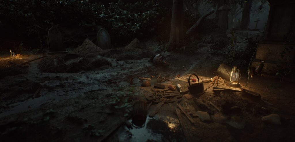
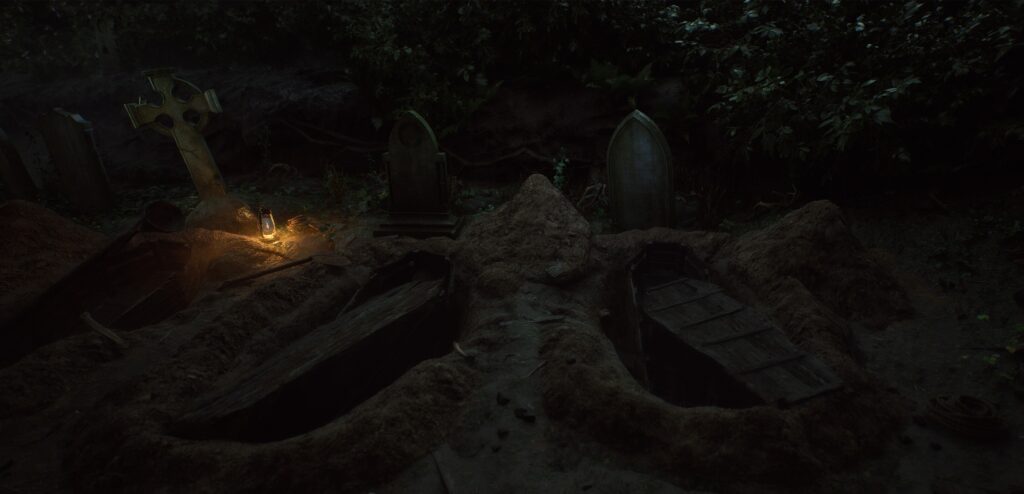
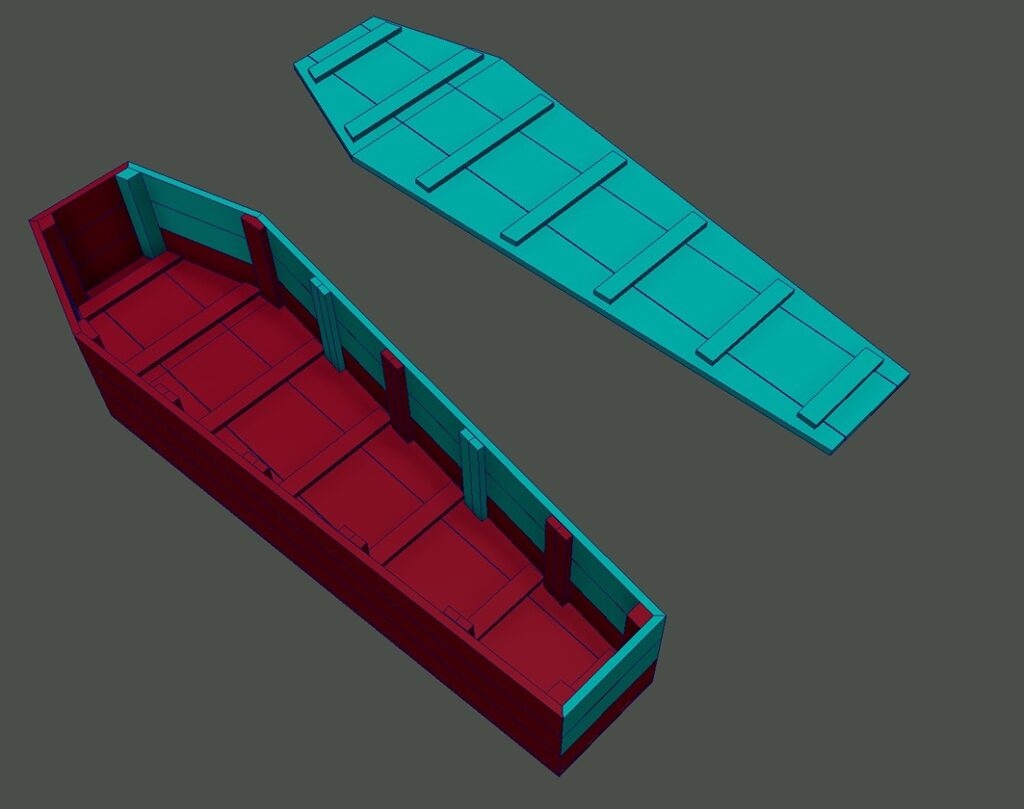
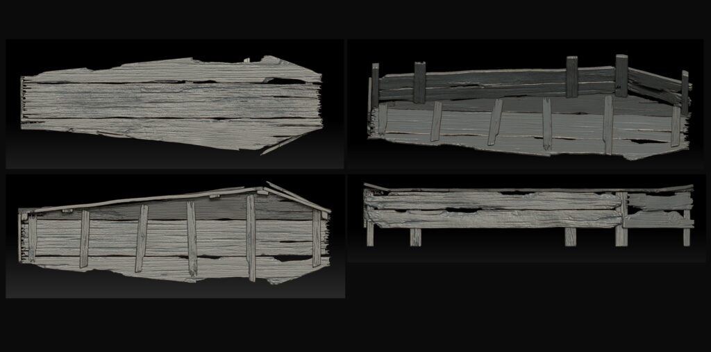
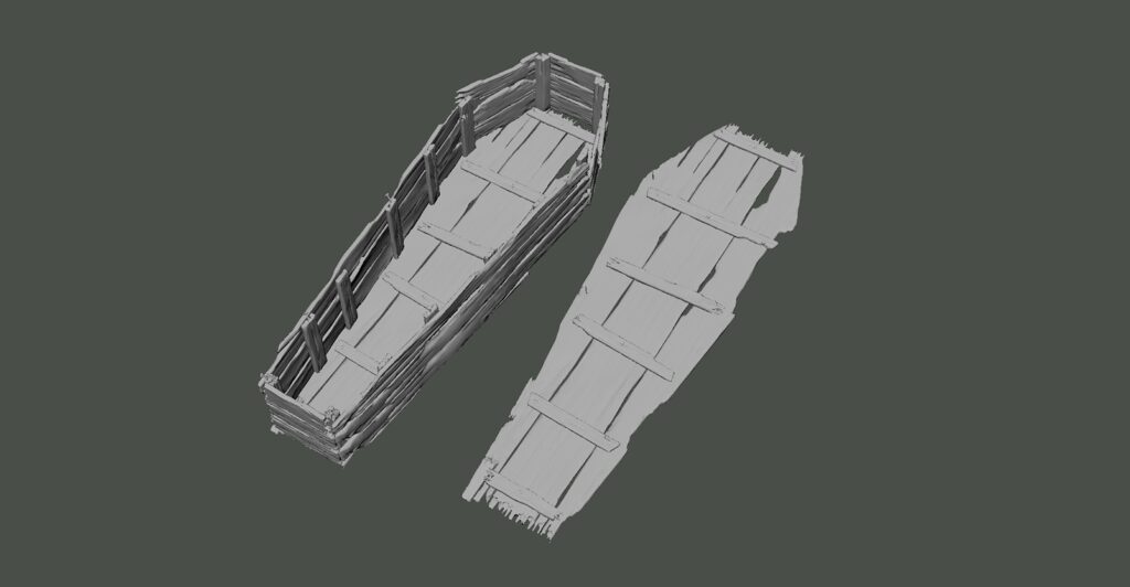
Coffin
Since the coffins are mostly buried underground and partially hidden from view, I optimized the workflow by sculpting only the visible parts and reconstructing the rest directly in Maya, making the model semi-modular.
Since the asset was very close to the camera, similar to what I did for the lantern, I opted for a slightly higher polycount to ensure enough detail in close-up shots.
I individually sculpted each wooden plank and a few nails, then reassembled everything in Maya for better control over the final shape.
Additionally, I reused some of the wooden planks as set dressing around the scene to add more storytelling and consistency.
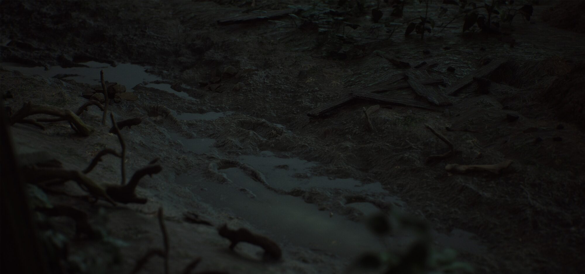
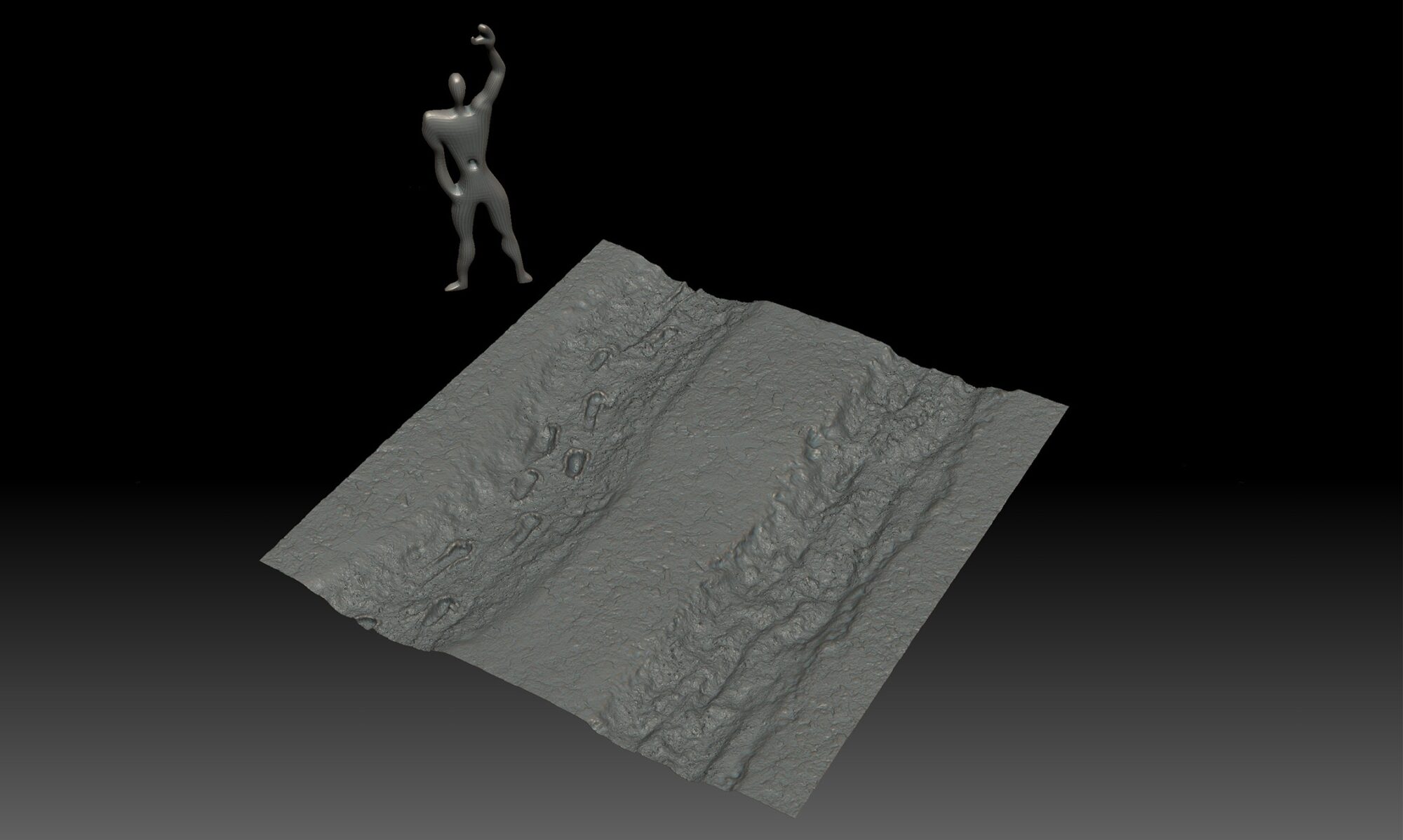
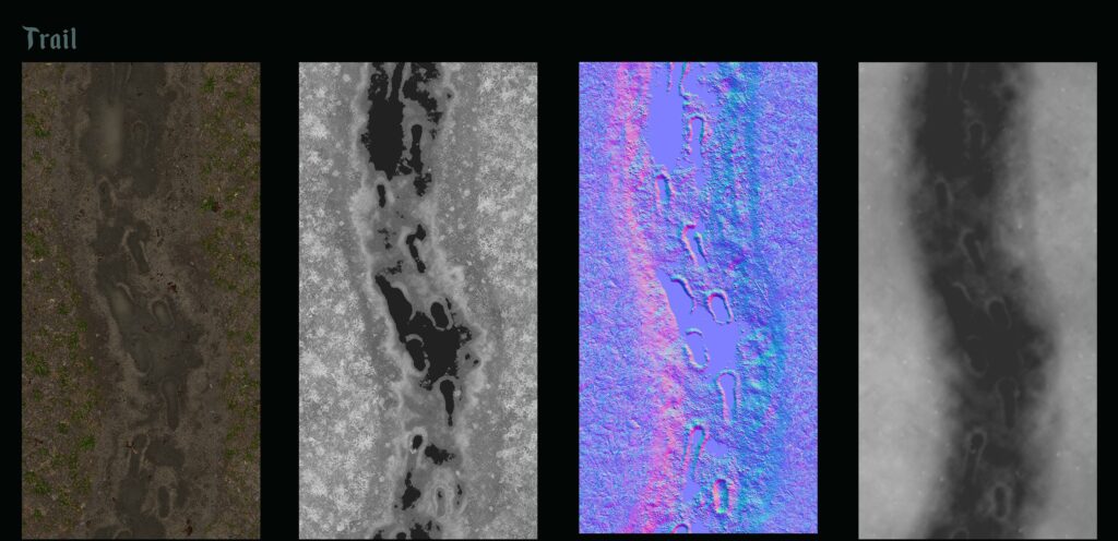
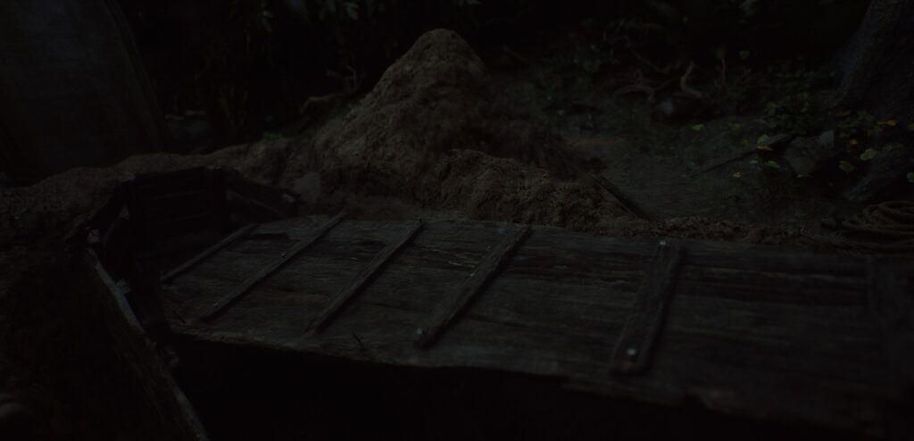
Trail
For the path, I opted for a hybrid workflow by sculpting the high poly on Zbrush and texturing the material in Designer in order to use the new texture painting feature introduced in the Unreal Engine 5.4 update.
The idea was to create a 4K 1024 px/m texture consisting of two trails (2Kx4K each) that I would have blended in engine via texture paint on a tessellated plane inserted in a spline trail.
Disclaimer: Unfortunately, for now, the virtual textures information cannot be saved when used on a spline; the information is reset at each engine restart.
Despite having done previous tests before, I started working on it and therefore knowing my idea would not work out, I still went ahead with it because it is only a matter of time before this feature is gonna be introduced.
Step 1: Sculpting:
I used Zbrush to have more control in creating a specific height map; in my case, I wanted to emphasize footprints on the ground.
Here I created large and medium shapes, for the smaller details like debris atlases, I opted for SD.
Step 2: Texturing:
After baking the height map directly from ZBrush, I created the missing textures in Substance Designer.
After that, I added various debris, as already mentioned, to enrich the material.
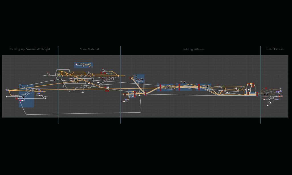
Step 3: Shading:
I setted up the material in order to have acces to texture paiting via virtual textures.
Now the intent at this point was to use the left path as a base material and blend it via texture painting with the right one.
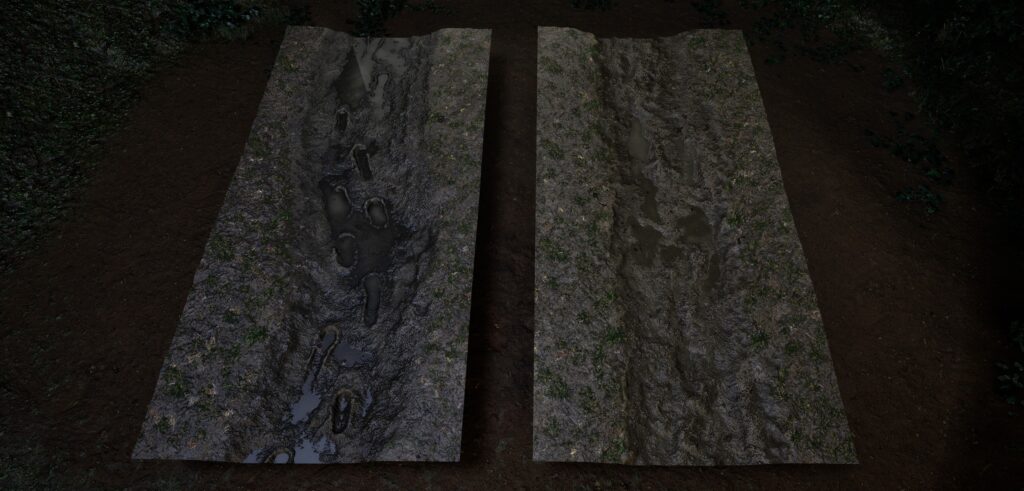
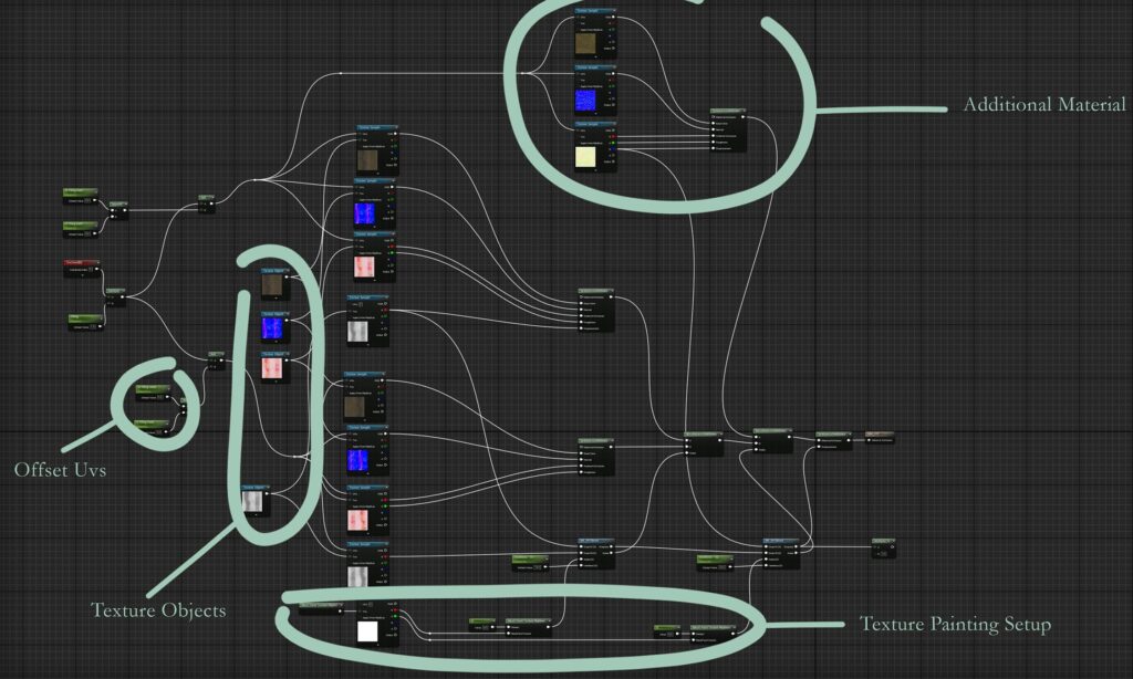
In order to make it possible, I manipulate the UVs of a copy of the same texture of 0.5 horizontally, after which, in order to avoid redundancies and add unnecessary instructions.
I plugged a ‘texture object’ node on all the texture samples.
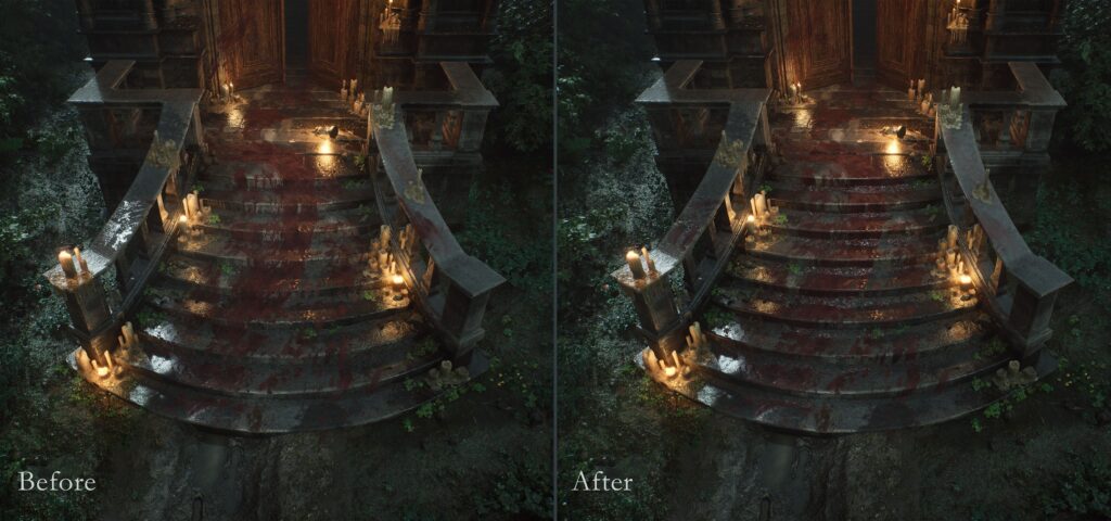
Decal
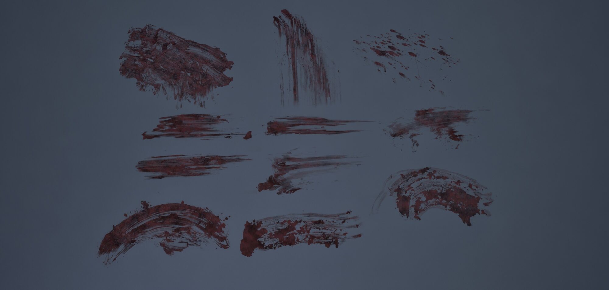
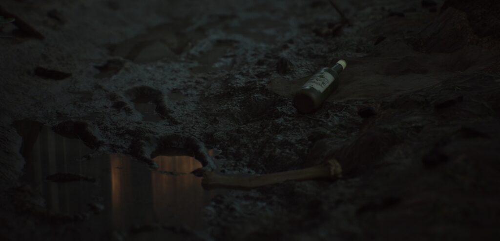
For the decals, I mainly used edge damages and a few blood splatters from Megascans.
I also created some custom opacity masks from real photos for more specific blood decals (which I won’t be sharing here, out of consideration for the more sensitive viewers, myself included!).
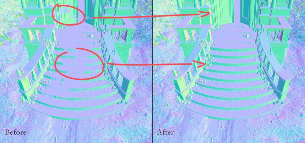
One major issue I ran into was decal projection. If a decal isn’t projected perpendicular to the surface axis, it can cause visual artifacts, especially with normals.
In my case, this led to weird lighting behavior and unusual reflections that really stood out in the final render.
After a fair amount of research and testing, I managed to find an almost complete solution.
There’s a workaround that fixes the visual bugs, but it comes with a tradeoff: the affected mesh segments will display in ‘hard edge’ mode, which can make the shading slightly harsher than intended.
In the end, I decided to accept the compromise, since the visual glitch was fairly minor in context, and honestly, I’d make the same choice again.
Thanks to the page VisualTechArt for the solution.
Composition
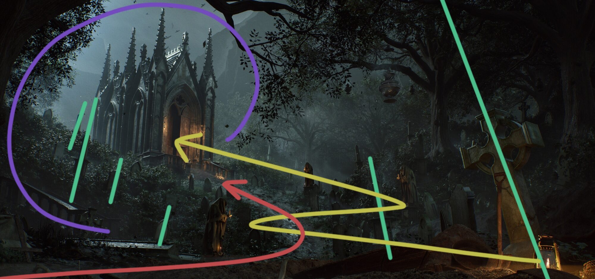
One of the main goals of this project was not only to tell a visual story, but also to raise curiosity and leave open questions for the viewer.
Not everything is explicit or immediately clear, and this is intentional: I prefer to suggest rather than explain, to create an atmosphere full of tension and mystery that stimulates the imagination and leaves space for interpretation.
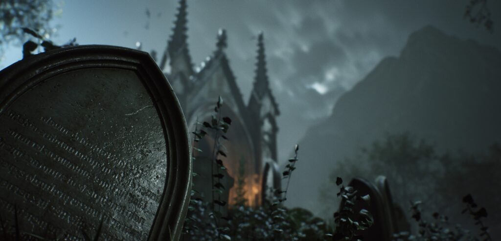
The first composition is designed to direct attention to the focal point, the mausoleum, but I also wanted to give some importance to the tombstone to both balance the scene and reinforce storytelling elements.
Tension is created by the contrast between light and shadow, the tilted elements, the broken path, and the framing of the chapel, which guides the eye in a nonlinear way, increasing the sense of unbalance and unstable, which makes the image more dynamic and evocative.
Main Composition
In order to emphasize the chapel as a focal point, I created a frame in the foreground through trees and a canopy.
After which I left a negative area with less dense spaces so as to let the structure ‘breathe’ and thus create a good area of contrast; moreover, the latter is accentuated by a contrast of lights and values.
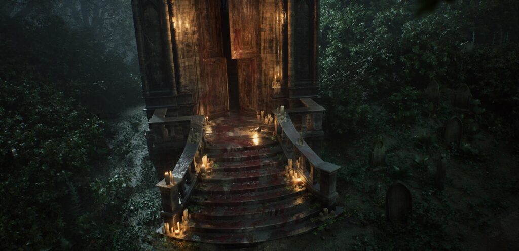
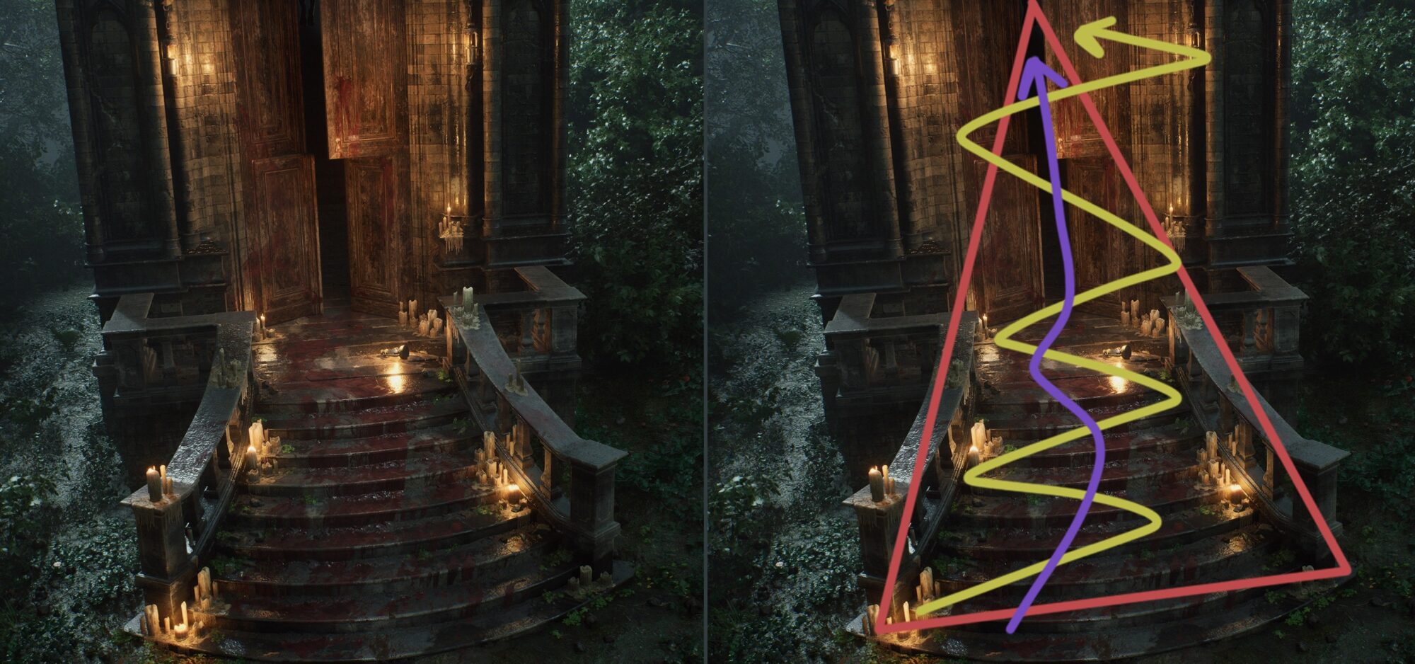
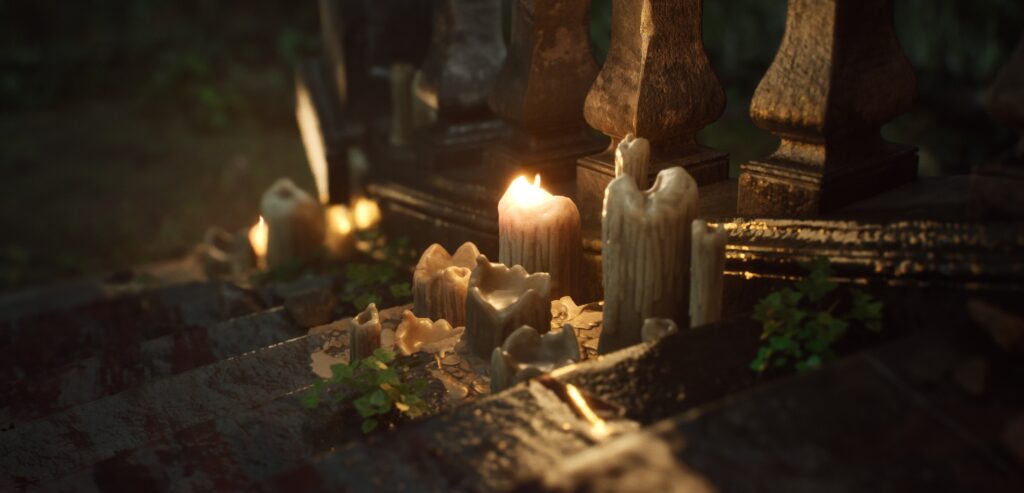
Second Composition
I opted for a more dramatic and theatrical feel.
The goal was to guide the eye in a well-defined path, but at the same time generate a sense of disorientation.
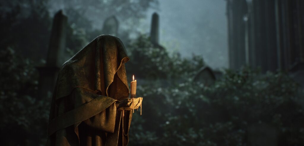
The path created by the candles and blood leads the eye upward toward the hanged man, but the presence of the deep darkness of the interior prevents immediate comprehension, forcing the viewer to question what has happened.
The image itself was already unbalanced to the left and I decided to unbalance it even more by tilting it off a couple of degrees in order to evoke a sense of disease and a slight feeling of imbalance in order to reinforce the goal of the composition.
Lighting
As with everything else, having good lighting references is incredibly helpful. In this case, a beautiful concept art piece by Zitai Guan was my main source of inspiration.
I was really drawn to the idea of a strong, cold moonlight coming from behind, perfect for emphasizing silhouettes and bringing out all the gothic details, contrasted with a warm light hitting the scene from the front.
That balance creates a striking atmosphere, both dramatic and eerie, which was exactly what I wanted to achieve.
As with every project, I started by setting the Post Process Volume to manual exposure mode, with an EV value of 1, which I find ideal for night scenes.
I also applied a few base settings to establish a clean and consistent starting point.
From there, I imported the Skylight and set its intensity to 1. Based on that, I balanced the Directional Light depending on the mood I wanted to achieve.
Since this is a nighttime scene, it’s important to keep that intensity fairly low to maintain the atmosphere.
Next came the Volumetric Fog.
Over time, I’ve learned that even in fog-heavy scenes like this one, it’s usually better to keep the default values fairly close to untouched, and instead focus more on fog cards and volumetric height fog volumes to have better artistic control and avoid visual noise.
At that point, I wrapped up this first lighting pass by placing the key lights: the cold moonlight from behind, and the warm candle lights in the foreground; both crucial for setting the tone and guiding the eye through the scene.
In the second phase, I started adding secondary lights and bouncing lights, mainly to enhance the atmosphere, add depth, and bring out architectural or environmental details that would otherwise be lost in the shadows.
These lights are usually very soft and subtle, but they make a big difference in making the environment more readable.
I use them especially to guide the viewer’s eye to key elements, or to create contrast and separation between different areas of the scene.
It’s worth mentioning that in this case, the bouncing lights were not physically accurate, but rather manually faked.
I placed them intentionally to simulate light bounces where needed, instead of relying entirely on the global illumination system.
Tip: All these extra lights are not exactly the best in terms of optimization. I recommend using this approach only if you have no particular performance constraints, like for portfolio pieces, as in this case.
As a final step, to further strengthen key spots and clearly separate the different areas of the composition, I use fog cards, which I find extremely effective in controlling the atmosphere and readability of the scene.
Color Grading
Final Adjustments to capture the mood.
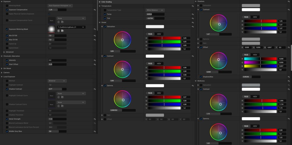
A cool Plugin I found is Color Correction Region (CCR), these are volumes which allow you to have specific color correction settings on specific areas of the scene.
This is very helpful like in my case where I wanted to remove the fog near the entrace in order to have a pitch black area inside the chapel.
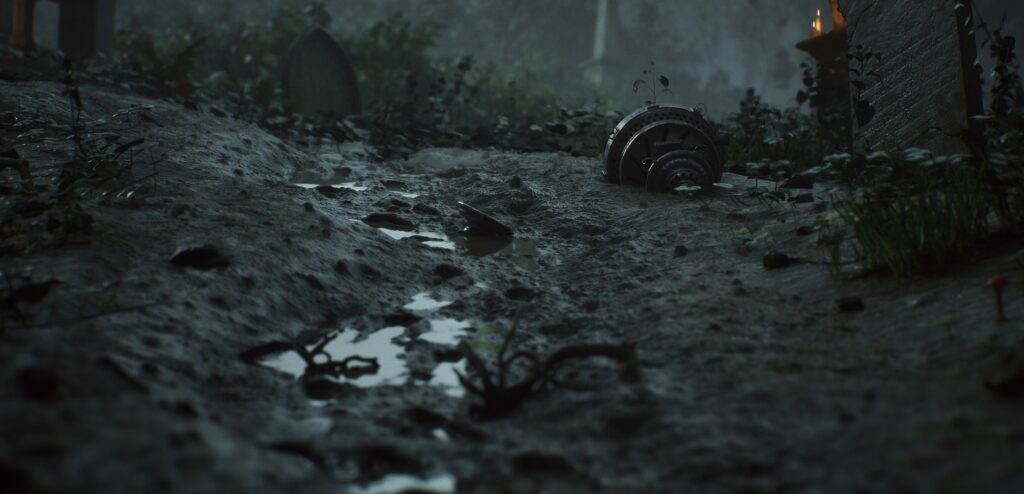
Closeups & Other Shots
To truly immerse the viewer in the scene, I aimed to recreate simple yet impactful sequences, inspired by the visual language of horror films.
I used still shots with subtle camera movements, like a slow zoom or a slight Dutch angle, to build visual tension and make the atmosphere feel more dramatic and unsettling.
These techniques are subtle, but they’re incredibly effective at suggesting that something’s off, without needing to show it directly.
I also put a lot of focus on guiding the viewer through a narrative path: starting from the disturbed graves in the foreground and gradually moving toward the chapel, revealing new details along the way.
I applied the same approach to the close-ups, using each one to revisit the scene from a new perspective and highlight key elements of environmental storytelling.

Conclusion
I’m really proud of how this project turned out; it went far beyond my expectations, and I ended up learning much more than I anticipated.
Lighting, in particular, which had always felt like a bit of a nemesis to me, became one of the most rewarding challenges and areas of growth.
I’d like to give a special thanks to my mentor Jeremy, for guiding me through this journey from start to finish. His feedback and encouragement made a huge difference throughout the entire process.
If you have any questions or want to know more about specific aspects of the project, feel free to reach out to me here on ArtStation. I’d be more than happy to help or chat!
Thanks so much for taking the time to check out my work. I hope you enjoyed it, and most of all, that you learned something new!
Read more articles
You might also like these articles.