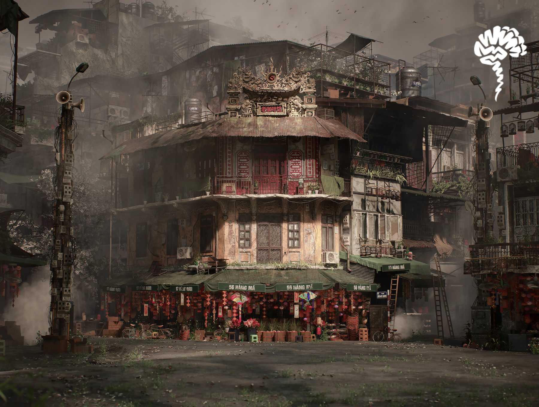
Hanoi Intersection

Introduction
Hello! My name is Jane Dwares, and I’m a recent graduate of Think Tank Training Centre. Before Think Tank, I studied Architecture and Urban Studies at the University of Pennsylvania.
I love using my design thinking skills and knowledge of architectural systems and styles to inform my game environments!
Project
I’ve written a brief breakdown of my most recent scene, “Hanoi Intersection,” my mentorship demo reel completed under the guidance of the extremely talented Sergei Panin.
It’s impossible to include every single artistic decision and technical setting that I’ve made in this six-month-long project, but I hope that this article is able to give some valuable insight into environment creation for developing artists!
Goals & Software
The goal of this project was to capture the complexity and beauty of an intricate urban intersection within a real-time game environment, built entirely from scratch.
I set out to create an environment that demonstrated confidence in every stage of the pipeline — from modular asset creation and foliage to lighting, material authoring, and beyond.
A key focus of this project was mastering Substance Designer, as I had only used it a few times before. I made it a specific goal to not use any Megascan textures or assets in this scene, ensuring that everything had my personal touch.
Additionally, I aimed to refine my skills in Unreal Engine’s material graph system. Ultimately, this project was designed to be a standout portfolio piece to help me break into the games industry.
Tools
The tools I used for this project are:
- Unreal Engine 5
- Autodesk Maya
- Substance 3D Designer
- Substance 3D Painter
- ZBrush
- SpeedTree
- Marvelous Designer
- Marmoset Toolbag – Photoshop
- Davinci Resolve
- Pureref
Reference & Research
The inspiration for this project was Hanoi, Vietnam.
I didn’t choose a specific piece of concept art for this project, instead relying on extensive research on the architectural styles, objects, and plants that could be found in Hanoi’s Old Quarter.
While every detail in this project isn’t perfectly accurate, I wanted to put in the effort to make the city feel authentic and believable.
Using photographs as references offers many benefits, such as providing rich details and ensuring accurate proportions. However, it also probably contributed to my biggest setback in this project: overscoping.
I was essentially tasked with being my own art director, cultivating a densely packed section of a city with no concept illustration to follow.
Populating a scene — along with lighting, composition, and other elements — can feel overwhelming without a clear concept, especially since I tend to get lost in the details.

One thing I would do differently and recommend to others is setting up all cameras as early as possible to avoid wasting time on details that won’t even be visible.
Looking back on this project, I lament all the time spent on intricate details that are either hidden or take up a tiny fraction of the screen.
I dove straight into modeling and assembling my modules as if I were an urban planner or architect.
While this approach might make sense for a game where players can explore freely, for a portfolio piece, I wish I had focused only on what was necessary for a few camera shots instead of meticulously recreating every detail from my reference photos.

Blockout & Modelling
Using my reference images of the Old Quarter’s street level, I began blocking out the basic layout of several buildings at my intersection in Maya.
These buildings were later replaced with modular ones assembled directly in Unreal Engine, but modeling a full proxy for the corner first helped establish a sense of scale and composition.


Arranging the buildings felt a bit like solving a puzzle — I wanted the city to feel natural and lived-in, avoiding any large gaps or empty spaces.
My initial layout needed to reflect the dense urban fabric of the area.
To maintain authenticity, I based each building on a specific photograph, capturing key design elements like the windows, balconies, and awnings of different levels (floor 1, floor 2, floor 3).
Even in the early whitebox stage, I wanted the scene to feel vaguely like Hanoi. The main hero building was modeled as accurately as possible after an actual structure in the Old Quarter — KAFA Café, if I recall correctly.
Additionally, I blocked out basic meshes for a few props, such as lanterns, AC units, bikes, and signs, to get a sense of the busy storefronts.
Modular Kit
After finishing the blockout models in Maya, I imported the proxy into UE5 to get a feeling of the space. Following this, I worked on fine-tuning the blockout meshes so that the buildings could be constructed from a modular kit of parts.
Once the blocked-out modular pieces were separated correctly, I exported them from Maya with the proper naming convention (SM_Hanoi_…_01a), pivot placement, and placement at Maya’s origin.
In Unreal Engine, I manually placed each module to assemble my buildings, using the proxy mesh as a placement guide. Since my buildings were relatively simple — comprised of just a rectangular core and two or three facade pieces — they were quick to assemble.
This allowed me to efficiently expand the scene by creating unique buildings on either side of the road and in the background, followed by set dressing with interchangeable awnings and balconies.
Once the initial scene was assembled using the first versions of the modules, I returned to Maya for more detailed modeling. Some modules remained simple, while others incorporated cloth simulations made in Marvelous Designer, as well as damage details and wires.
I followed a mid-poly workflow for the architecture kit and UV-mapped every mesh with a texel density of 5.12.
After finalizing the more detailed meshes in Maya, I once again exported the modules with accurate naming conventions, pivot placement, and material assignments.
This pipeline allowed me to efficiently re-import them into Unreal, where the meshes automatically updated, saving me lots of time and allowing me to iterate on the kit many other times through development.

One important tip I’d offer for modeling is to avoid perfectly straight edges. In real life, especially with older architecture, buildings often reveal their history through damage or warping.
I made a point to add distortion to all my modular pieces, sometimes exaggerating the warping.
While it might look strange up close, from a distance, it transforms the scene from looking overly gamified and blocky to more realistic and human-made.
Another tip is to ensure that your mesh density is optimized for polycount while still having enough vertices to support vertex painting.
Some of my walls initially lacked enough vertices for vertex painting, so I had to revisit and iterate on the wireframe. However, if your export settings and naming conventions are consistent, adjustments like this shouldn’t be a problem!


The scene first used basic solid colors to help identify the main materials like metal, paint, and fabric.
These placeholders were later replaced with my custom Designer materials using ‘Replace References’ for the material instances in Unreal.
When moving assets around in the UE5 folder structure, renaming, and replacing references, it’s important to remember to use the ‘Fix Up Redirectors’ tool to prevent asset references from breaking/causing issues.


As the shaders became more complex, I gradually added additional details through vertex painting, RGB masking, and decals to the modules.
In addition to the master material for the walls (plaster, concrete, brick, etc). I also created a fake glass material in Unreal Engine for all the windows in my modular kit.
The window shader uses a sky reflection HDRI, an interior HDRI, and also a dirt texture. I’ll dive deeper into the texturing and detailing process for the buildings later in the article.
Props & Set dressing
For the props, I made sure to gather specific photograph references for each object or set of objects I wanted to create.
I began by analyzing images of Hanoi to identify which props I wanted to model, then I would conduct separate Google searches for those particular items.
For example, I noticed electrical boxes in some of the street-level images. I added them to my list and then searched for high-resolution photos of isolated electrical boxes to use for both modeling and texturing.

Admittedly, I continued adding more and more props to the scene as the project progressed, even after moving on to the later stages.
This was part of my struggle to balance my desire to capture all of the information from the reference photos with the need to optimize my time and resources.
In the future, I’ll aim to avoid an ever-growing list of assets and stick strictly to a predetermined list.
I followed the high poly to low poly workflow, baking in either Marmoset Toolbag or Substance Painter depending on the intricacy of the props.
I prefer using Marmoset Toolbag for baking because I find it produces cleaner results, especially for complex meshes due to its increased control over bake settings.
When baking in Marmoset, it’s crucial to consistently separate or group the meshes between the high and low poly versions, along with ensuring accurate naming conventions using the _high, _low, and _floater tags.


For the low-poly props, I tried to reduce the tri-count as much as possible. The low-poly model for this bike has 24,018 tris, which is higher than I would have liked.
However, given the complexity of the prop and its importance in my portfolio piece, I felt the extra detail was justified.

I UVed and textured the props in groups to optimize texture usage in Unreal. All props were set to a 5.12 texel density, and each group’s UVs were placed within the 0-1 UV space.
Baking material IDs helped save time during texturing. In Maya, I would assign different materials and colors to my high poly models to later have that information selectable with color selection masks in Painter.


Here are some of the high poly sculpts I created in ZBrush.
While I generally prefer hard surface modeling over digital sculpting, I make it a point to include some organic modeling in my projects to improve my skills with my Wacom tablet and the ZBrush interface.
All subtools are initially blocked out in Maya and then brought into ZBrush for detailing and adding damage.


One aspect of my prop Master Material that I really enjoyed creating was the world position color shift.
This feature was incredibly useful for introducing subtle differences to the scene, especially with heavily repeated assets, without having to create new color-tinted instances for each one.
I was able to achieve quick variation using the same material instance just by moving the prop in the X and Y directions.


My neon sign kit relies solely on tiling textures, so there are no high-poly meshes or baked maps involved.
To bring the nighttime version of the scene to life, I created a flickering neon Master Material that includes parameters for speed, stability, dark spots, and intensity.
The words were modeled in Maya, which has a fantastic tool for turning text into 3D models with selectable fonts. This tool saved me a lot of time and allowed for quick iteration.


For the wires in the scene, I used Unreal Engine’s cable actors. It’s a simple tool to work with, offering easy adjustments for width, length, wireframe density, and more.
When placing the cables, I kept my keyshot in mind, using them as guidelines to direct the viewer’s attention toward my hero building.
The only issue I encountered was during the rendering stage, where the cables would stretch and bounce erratically due to the physics simulation.
However, by increasing the Engine Warm-Up Count, I was able to achieve well-behaved cables with either a gentle sway or no motion at all.
In addition to optimizing texture memory and poly counts with my props, I also focused on optimizing draw calls.
After placing the props around the scene manually, I used actor merging workflows in Unreal. This was especially helpful due to the many repetitive objects in my scene, like lanterns, Tet decorations, and boxes.
I wanted a high density of props in the city without overwhelming my computer, so actor merging was the way to go!
Materials
Creating the procedural materials in Substance Designer was one of my favorite parts of the project.
I used to dread opening Substance Designer, but now I really enjoy the procedural node-based thought processes!

I tried to find references for every single material that I wanted to create, identifying them first in my Hanoi photograph references.
I found that using base color, roughness, and normal map references from Megascans helped a lot when creating my own materials from scratch.
I probably created more materials than necessary for this project, but I was having fun experimenting with different nodes and techniques.
In total, I made 23 materials (24 if you count a simple wood material that was rarely used in the scene), covering variations of ground, architecture, fabric, and moss surfaces.
My Designer graphs could be better organized and probably more optimized, but they were efficient enough that I could quickly iterate on them to create damaged, overgrown, and wet versions of the same materials.
I used these variations for vertex painting—it’s much more effective to paint materials that are variants of each other rather than paint entirely different surfaces.
For example, instead of vertex painting a grass/weeds material over a paver material, it’s better to paint an overgrown version of the paver material over its clean counterpart. Some of the material families used during vertex painting:
-
Clean, broken and overgrown pavers.
-
Gravel, broken asphalt and undamaged asphalt.
-
Puddle, mud with puddles and dry mud with trash.
-
Clean metal and rusted metal.
-
Clean paint and chipping paint.

For a few surfaces, the vertex painting isn’t done between variations of the same material.
For instance, when vertex painting the architectural materials, the painted plaster is layered over the cement or stucco, which is layered over the brick.
This follows a slightly different logic, as these layers exist independently as distinct building materials.

In addition to the more elaborate vertex painting, my master material also included simple parameters to adjust normal intensity, roughness, and color tint.
This flexibility allowed me to reuse the same tiling materials from Designer and give them entirely different looks in the engine.
For example, I used the plaster and paint materials throughout the scene, with variations in bright red, orange, or white for unique buildings.
Foliage
I really enjoyed creating the foliage for this project.
The process began by finding a few species of plants that could be native to Hanoi and appealed to me visually.

I decided on the following:
-
Vietnamese Coriander Vine (Persicaria odorata).
-
Climbing Fig (Ficus pumila).
-
Goatweed (Ageratum conyzoides).
-
Jasmine Vine (Jasminum sambac).
-
Wild Morning Glory (Ipomoea cairica).
-
Spider Plant (Chlorophytum comosum).

The first steps were blocking out the leaf shape in Maya to get the general profile of each species.

Following this, I brought the leaves into ZBrush to begin sculpting the details.
I focused mostly on the vein structure of each leaf, and eventually duplicated the subtools and created some variations of each.

After finishing the sculpts, I baked the high polys onto a plane in Marmoset Toolbag to get the alpha, AO, curve, height, material ID, normal, position, and normal object space.
I then brought them into Substance Painter to begin hand-painting the textures.


One specific technique I would like to draw attention to would be the SSS painting.
I painted out the veins and stems so that light would appear to shine through the thinnest parts of the leaves, highlighting the intricate midrib and veinlets of each unique venation.

The scattering effect is essential for foliage, as it ensures they don’t appear plasticky or clay-like in engine, but instead look more natural and alive.
The smaller plants were assembled in SpeedTree by creating mesh cards for individual leaves from my atlas. I used one of the default stem materials in the software.
For the larger vegetation, I first created high poly atlases in SpeedTree to bake out the larger chunks of branches and flowers.
With these atlases, I could cut out branch cards, keeping the poly count low while maintaining visual density on the final asset. I created three LODs for all the vegetation and used Unreal’s Foliage Mode to scatter and paint them across the scene.
For larger vegetation, such as bushes and trees, I hand-placed them according to the keyshot.


Initially, the scene had very little vegetation, just a couple of trees, but I decided to fill the ground and buildings with plants to enhance the storytelling.
These aren’t modern buildings, but ones rich with history. Portraying the age and weathering of the location isn’t only about dirt and damage, but also the weeds and vines that emerge and thrive in every crevice.
Additionally, the city is meant to be full of life — the potted plants that adorn the balconies and windowsills serve as evidence of the community that would have occupied it.
Detailing
I added detail to the scene using decals, vertex painting, and RGB masking. My goal was to create a density of detail not just through geometry, but also through textures and surface variation.
This allowed me to delve deeper into Unreal Master Material creation, developing elaborate systems that controlled edge weathering, stains, occlusion dirt, world-aligned grunge, and more.

Decals were created using both Substance Designer and Photoshop. For the stain and dirt decals, I focused only on creating the general splatter and dripping alphas, without generating albedo, normal, or ARM maps.
The four alphas were packed together and made into a selectable parameter for material instances.
The base color, normals, and ARM maps were sourced from my other tiling textures created in Designer to optimize texture memory usage.


My decal Master Material incorporates its own weathering effects using tileable grunge maps applied to both opacity and color.
The four grunge maps, also created and packed together in Designer, are exposed as a selectable parameter to introduce variation across different posters and signs.
I also used these grunge maps in my RGB mask shader.


Overall, the decals helped with pushing the density of details even further while bringing more authenticity to the scene through language, symbols, and weathering.
The posters especially helped to make the street level feel faithful to Hanoi, while the Master Material grunge parameters added that final touch of lived-in storytelling to them.
The RGB masking workflow was used to elevate certain buildings to a level of detail that vertex painting and decals alone couldn’t achieve.
This shader allowed me to control not only stains on surfaces, but dirt collecting in cavities and edge weathering.
I wanted to use this workflow to emphasize ornate details that I modeled, adding dirt and highlights on intricate geometry that might have otherwise gone unnoticed.

After creating a second UV set in Maya for the full building in the 0–1 space, I painted weathering details in Substance Painter.
The green correlates to occlusion dirt, the red correlates to staining/discoloration, and the blue correlates to edges.
Using smart masks in Substance Painter was a huge time-saver, and I highly recommend them for creating efficient and believable weathering effects.
Rather than random splotches uniformly scattered across the model, there should be a logic behind why each surface variation occurs.
For instance, “Why is there more dirt here?” The answer: “Because it collects underneath the balcony and isn’t washed away by the rain.”
After using the smart masks, I hand-painted in some more detail to further push the storytelling of the building.

While there are many different parameters in the RGB mask Master Material, one that I would like to call attention to would be the use of the Blue Channel for creating edge weathering.
I was able to use the normal map of a different tiling material to blend with the existing normals, creating the effect of damaging and chipping, but only along the edges.
I chose to use the normal map of my stucco material because of its high contrast in height and overall eroded look, and when adjusted with my tiling and strength parameters, a natural edge damage effect could be achieved.
Vertex painting was the final technique used to create surface variation, applied not only to the modular kit but also to the ground planes.
The asphalt road and its dirt shoulder were blocked out in Maya and then sculpted in ZBrush.
It’s crucial to add distortion to the ground geometry, just as warping was applied to the modular kit — roads won’t be perfectly flat surfaces.
Following this, I retopologized the mesh back in Maya and additionally used the modeling tools in Unreal Engine to adjust the triangle count of the terrain.
After completing all of these steps, I was left with a mesh that had enough vertices to effectively paint on that wasn’t overly dense.

To achieve the visual effect of trash being scattered throughout the scene, I used a combination of vertex painting and Foliage Mode.
Simple meshes representing discarded cups, bags, straws, and bits of paper were created quickly in Maya with as low poly count as possible.

To save texture memory, the albedo for these meshes was reused from the poster decals.
These meshes were painted around the scene using the Foliage painting tools and adjusting settings such as density, Z offset, and scale.
The effect of litter was also enhanced with Substance Designer.
In my ground surface materials, I created varying densities of trash bits built directly into the tileables to complement the mesh scattering, adding more believability to the ground plane.
I wanted the asphalt, mud, and pavers to have the same level of detail as the surrounding buildings, and with the weeds from SpeedTree, trash meshes, and Substance Designer trash, I was able to achieve this.


One specific technique I’d like to highlight from my ground Master Material is the wind ripple effect.
I wanted to add movement to the dirty pooling water found around the scene but couldn’t have the rippling occur on the solid surfaces (pavers, asphalt, dirt).
This presented a challenge due to the way I created the materials in Designer to be pre-blended with puddles.
My solution was to use an If-Then node to target the roughness of the water. Since I made the puddles significantly less rough, the panning normals would only affect the flooded areas, creating the desired isolated ripple effect.


Lighting
The project initially started with only a daytime lighting setup, but as I became more intrigued by Cyberpunk and Sci-Fi aesthetics, I decided to create a rainy, nighttime transition that would completely change the mood of the scene.
My neon sign kit, in fact, was modeled much later than the other assets and was added to the scene toward the end of the project.

Before diving into lighting the scene, it was essential to have the correct Rendering setup in the Project Settings. William Faucher’s resources were invaluable for learning these settings and understanding lighting theory and tips.
I used Lumen and Nanite for the scene but still ensured that I mastered older workflows of low poly modeling in the project.

I rebuilt the lighting several times, often finding that things looked unnatural. I eventually realized that the issue was over-lighting my scene — the best results I had were the simplest builds.
Trying to art direct every shadow and highlight ended up hindering the scene’s realism and performance.
Ultimately, a directional light, skylight, sky atmosphere, and a couple of spotlights on the main building produced the best outcome.
I also experimented with different color schemes — testing colder tones, a warmer golden hour setup, and a yellow hazy aesthetic reminiscent of early 2010s video games.
I eventually settled on a muted, fog-laden atmosphere with a warm, brown tint and overcast skies. I wanted to emphasize the color red, so I boosted those values in my post-process volume.
Given that my scene featured a lot of Tet decorations, red lanterns, and red ornamentation on the architecture, it seemed like a good artistic choice to highlight those details while desaturating the rest of the scene. I also slightly emphasized the green to create a contrast with the red.
The contrast between green and red also accentuates the difference between the lush vegetation and the hard-surface urban assets.
It was important to me not to overwhelm the viewer’s eyes with the full spectrum of vibrant colors, as the sheer amount of geometry already made the scene quite visually busy.
While I wanted the scene to feel chaotic and dense, I also wanted to ensure it was digestible and not too overwhelming, so toning down the saturation felt like a good solution.


For the nighttime scene, I used a few techniques to create the glowing effects on the lanterns, vending machines, and neon lights.
First, I set up a simple Material Parameter Collection, or MPC, to quickly adjust the emissives all around my scene between the daytime and nighttime shots.
Another technical approach I initially tried but ultimately scrapped was using a blueprint to attach a point light to each neon sign.
This would have saved time by eliminating the need to place lights manually at each sign, but I decided against it because I only wanted to light the closest and most important neon objects.
The signs farther in the distance looked fine with just the emissive material, so hand-placing a few point lights and rectangle lights for the signs that occupied the most screen space ended up being a better solution, especially performance-wise.
The rain in this scene was created using William Faucher’s EasyRain, and I highly recommend giving it a try!
It integrated seamlessly with my scene and really helped enhance the cloudy, nighttime street, making it feel much more immersive and moody.

Oftentimes, you need to ‘fake’ the lighting in your environments. I did this for many of my storefronts, for example. After applying emissive values to the lanterns, I had to replicate the glow around the storefront with a single point light.
There were many settings that I fine-tuned, such as source radius, attenuation radius, and temperature, to make the light feel believable in the space.
Other elements I had to ‘fake’ included the light reflecting off the wet street using spotlights and the glow of vending machines using cyan colored rectangle lights.
I also included a few spotlights to emphasize certain moments, for example, this electrical box, and also the facade of my main building.
I didn’t make many changes to the color grading for the nighttime version compared to the daytime one, but I did push the scene to a slightly colder temperature.
While I wanted the nighttime version to be more vibrant/saturated than the daytime, I was careful not to go overboard. I limited the emissive colors to red, cyan/green, white, and yellow to avoid the scene feeling like an overwhelming, rainbow eyesore.
Cameras & Rendering
In the early stages of the project, I was focused on piling in the details through modeling and texturing.
I didn’t want any empty space—it needed to be packed with posters, decorations, and objects, all reflecting the hustle and bustle of urban life.
However, it eventually became a bit too chaotic, and I felt like my eyes had trouble resting comfortably on my main building.
In the later stages of the project, I switched gears and worked on scaling back some of that visual chaos with my cameras, atmosphere, and post-processing.
I used a heavy amount of exponential height fog to draw focus away from the modular architecture in the background. At first, my thinking was that the scene needed to tower over you — I didn’t want the background to be an empty sky.
This quickly became too noisy, but I needed to maintain the sense of the city’s vastness without overwhelming the scene with detail.
Fog ended up being the perfect solution to achieve that balance. In addition to the fog, I adjusted my camera settings so that the foreground and background blurred quite a bit.
Adjustments like camera aperture, Min F-stop, focal length, and filmback all helped achieve this effect.
I considered using a console command to remove the foreground blur, but ultimately decided against it in order to keep the focus entirely on my hero building.
While I won’t dive into every post-process volume setting (in addition to every camera setting), some of my favorites included color grading, vignette, exposure, slope, toe, film grain, and bloom.

For composition, I tried to keep it simple, keeping in mind basic principles like the rule of thirds, balance, guiding lines, and visual hierarchy.
I used the layout grids in my cinematic cameras to help me frame my shots, centering the hero building in the middle third or framing the nighttime alleyway so that it converges to a single point at the center of the screen, for instance.

When rendering the flythroughs for each shot, I made sure to set my keyframes to linear. I also added some camera shake where appropriate for added immersion.
After rendering, I did some minimal color grading in DaVinci Resolve, and that was it!
In hindsight, I regret not rendering the flythroughs at 4K resolution with more temporal samples, but given the time constraints, I opted for settings that provided the fastest render while still meeting the resolution recommendations of game studio recruiters.
Final Thoughts
Here are some of my final tips for tackling a realistic environment like this:
-
Add imperfections: Break away from straight edges and clean surfaces to make the environment feel more natural.
-
Don’t overscope: It’s tempting to try to build an entire city, but this can easily lead to burnout. Stay focused on smaller, high-quality scenes.
-
Always start with research and reference gathering: I personally prefer using photographs because they contain a wealth of information. However, avoid wasting time recreating every single detail.
-
When you run into technical issues, learn how to search for solutions online: I often had to troubleshoot my Unreal shaders, Movie Render Queue settings, and lighting builds. YouTube, Reddit, and online forums were invaluable resources.
-
Set a goal for the visual quality that you want your project to reach, but at the same time, don’t compare yourself to others. Setting extremely high expectations for yourself and constantly comparing your project to other finished pieces are great ways to lose motivation. Feel confident in your work, and don’t worry about how many eyes will see it — just focus on learning and mastering the workflows!

I wish I could break down every setting, prop, and material graph in detail, but here’s a brief look into the development of my scene.
There are probably things that I’m forgetting to explain, so if you have any specific questions about my work, feel free to reach out! I love connecting with other creatives 🙂
I’d like to give a final thank you to all of my Think Tank mentors: Giacomo Bonanno, Pedro Hurtado, Jason Gullion, and once again the talented Sergei Panin.
I couldn’t have gotten to this point without you! Also, a huge thank you to Games Artist UK for giving me the opportunity to talk about my artwork.
Cheers!

Read more articles
You might also like these articles.