Runes Camp


Introduction
Hello, my name is Jens Peppler and I am a 3D Environment Artist from Germany. Currently, I work for Wayward Studios, an Indie Studio that my friends and I founded, and, at the same time, as a 3D Art Lecturer.
Project & Goals
My newest project “Rune’s Camp” is my first exterior environment. As with every new portfolio piece, my goal was to improve my own skill to create a finished environment scene.
Specifically for this project, my goal was to enhance my abilities in composition and lighting, as well as to recreate a concept made by another person.
But first and foremost I had to think about what scene I want to create. I turned to my Artstation Environment Collection and Simon Fuchs who gave me feedback for my past projects as well to elaborate, what would be a good new project to improve myself. After a little back and forth I made the decision that I wanted to recreate this awesome concept called “Runes Camp“ by Zimmy.


Planning
To start the project I took the concept and circled individual assets. This method makes it very easy to separate assets from the environment. The focus is on separated sections and not on the whole scene anymore. That makes dissecting assets and planning modules pretty comfortable.
In addition to that, I set up a Trello Board to organize everything. As a little side note, I even listed notes for creating a to-do list or to break down the assets, in order to immediately have something checked as done, as a small motivation.
What helped me as well was that I sat down with Dennis Levi at regular intervals, so that everyone can work on their project. This created a work environment, motivated us, and gave us the possibility to get feedback immediately.
Blockout
To create my Blockout I used Maya. With the help of Image Planes to get my reference into the scene, I blocked out the main shapes. For size regulation, I placed characters around my blockout on important points. This helps me, not just to work with measures, but also to get the size in a visual relation.
Once I had something that looked appealing I imported the blockout into Unreal. I built the first lighting setup and created a fixed camera for my main shot. That way I know how the most important screenshot will look like, which will represent my project. And besides that, I am able to document my progress, which is always a huge motivation during a project.

Software
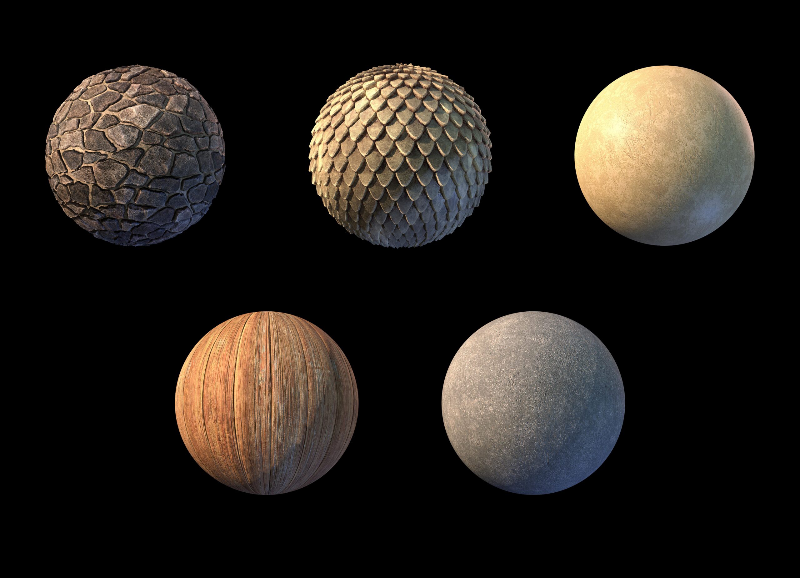
I used Maya for modeling to create UVs. ZBrush to sculpt organic assets or to generate Highpolys with Polygroups and Deformation Modifiers. Marmoset Toolbag to bake the assets. Substance Designer and Painter to create Materials, Smart Materials, and texturing assets. And finally, Unreal Engine 4 to present my scene.
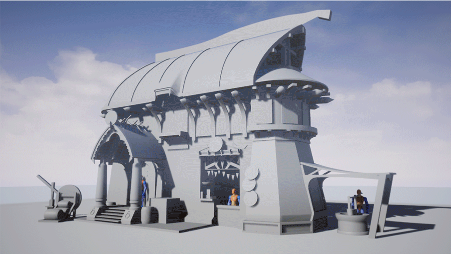
Main Assets
I started with the parts, which shape the silhouette of the house. The largest part was the house facade for the first floor. The geometry is quite simple, but the texture is interesting. It is a huge surface, which Tileables are perfect for, but in the concept, the surface consists out of two materials that merge into another. This is something I have never done before, which was also a reason why I wanted to recreate this scene in particular.
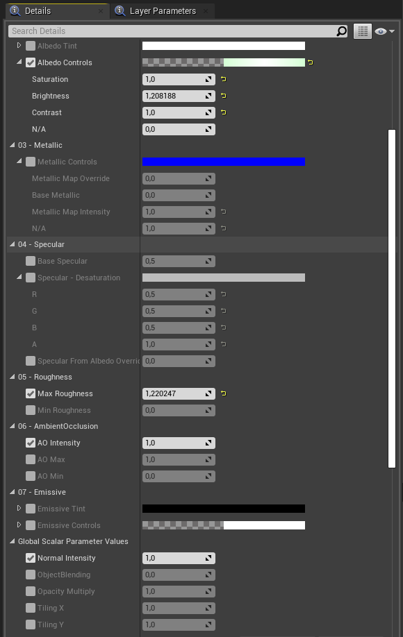
I remembered the Quixel Scene “Goddess Temple” by Jakob Keudel. He used an ID Map with a specially designed Master Material to blend Materials in Unreal similar to Substance.
This workflow gave him a non-destructive workflow with a lot of control within the engine without any loss of the texel density.
Goddess Temple in UE4: Remixing Assets
That inspired me to try something like this as well. I imported the geometry into ZBrush and sculpted the transition of the materials. After that, I marked each of the two materials and the transition with Polygroups and Polypain. Then I baked my Highpoly onto my Lowpoly to get an Ambient Occlusion Map, a Normal Map, and an ID Map. In Unreal I created my Master Material to do the blending. The baked Ambient Occlusion Map and Normal Map were the foundation and on top of that, I blended Tileable Materials based on the ID Map.
To create the second floor I sculpted five wooden planks. That gave me enough variety to not directly notice a repeating pattern, especially if you consider that they will be used on other occasions as well. I arranged them around the house to build the second floor. To get the wooden planks a bit mossy, I created a Master Material to blend two materials per World Space. This workflow gave me a lot of control to arrange every single wooden plank because the mossy part was always at the bottom, no matter how the asset is turned around.
Afterward, I created a trim sheet out of the wooden planks to texture some larger parts as well like the frame of the roof or the window wall for the second floor.
The Highpolys were also reused a lot. If an asset was made of wood, I used the Highpolys of the wooden planks as a base to save me a work step. For example, you can recognize the same wooden planks within the doors.
To create the roofs I focused primarily on materials. I used one-sided geometry and a Displacement/Tesselation Master Material to get the tile-like shape. With one material I create a base but the concept shows mossy parts as well. To get these implemented in my Master Material I used a blend, based on Height Map Information and a Grunge Map. Similar to my Master Material specifically for the first floor, I get a non-destructive Workflow and a lot of control.


Modeling Workflow
Most of the assets were created in the Lowpoly Highpoly workflow. Nothing special, except that every Highpoly went through ZBrush. Instead of Support Edges which have to be set up everywhere, I used the Polygrup and Deformation by Zbrush. With “Group By Normals” I divide the asset into areas where I wanted “Soft Edges” and “Hard Edges”. Sometimes I had to regroup some parts because the Polygroups were not exactly generated where I wanted them, but that only took a short time to tweak.
After that, I used ”DynaMesh” to get a higher Polycount, and then I used “Polish By Features”. This workflow gives me a Highpoly with a smooth surface and hard edges which are positioned exactly where different Polygroups meet in a short amount of time. To get the edges a bit rounder I masked the different edges with the help of “Mask By Features” and then I used “Polish” so that I can make the edges softer using a parameter. I see the effects straight away and have more control over them than with a workflow that relies on support edges.

Foliage
For foliage, I primarily used Quixel Megascans. Ivy is the only exception. By chance, I came across a program “An Ivy Generator” by Thomas Luft. An incredible tool and really simple to use. You import an asset in this software, create a point with one mouse click to be the root of the ivy, adjust some growing parameters, and done. It was a real pleasure to work with this tool.
Background
Originally the scene was planned as a diorama, but to watch Dennis Levi build his background inspired me to do a full background as well. With the positioning of the mountains and the treetops, I tried to draw composition lines that
point to the house. On the left side, you can see that it worked very well but not so much in the background. This is definitely something where I want to improve my skills.
To create the ground I searched for software that gets me a Height Map based on real-world maps and found “Terrain2STL”.
I selected a piece of the map and generated the ground and the mountains for my scene. In addition to that, I created a Master Material with Vertex Painting to texture the ground. For the materials and rocks, I used Quixel Megascans.


Lighting and Final Composition
For the light, I wanted a cold ambient and a warm light as a contrast. At first, it was a bit difficult for me, without inking the project too much in one color. Over time, however, I came closer to my goal and now I am very satisfied with the setting of my Sky Light and Directional Light.
For the final touch, I created a LUT in Photoshop and adjusted the materials of some assets in Unreal with their shader.

Final Thoughts
I really learned a lot from this project. Not only is this my first exterior environment, but also my first scene, which I designed based on a concept. With every new project, I try something new to push my Environment Art skills further. I draw inspiration out of every new aspect that I learn. That is something very important from my point of view, especially if you work on 3D Art as a job in addition to your private project. On the one hand, you train your brain and consequently improve its capacity to always crave more knowledge, and on the other hand, it is just a lot of fun to keep the spark in your eyes.
At first, I had my concerns when it came to creating an exterior environment. An interior environment has a closed-off space whereas an exterior is open and you can look up to the horizon. Working with the available space was a lot of fun because you simply had more options. Even creating a composition that supports the house was surprisingly easy. Nevertheless, creating an appealing composition is definitely something I still want to improve myself in.
What really surprised me is how much efficiency has become more and more important to me. I got really proud when I used one asset for several things or sped up my workflow with
a little tweak on a unique asset. It was really great to work on a project similar to that of the person you meet regularly to discuss progress.
Thank you Dennis Levi. Also, I want to thank Simon Fuchs who helps me to improve myself with every new project by giving me feedback and practical advice. Last but not least, a big thanks to GamesArtist.co.uk for giving me this opportunity to break down my project. I hope this article helped you somehow. Please do not hesitate to contact me if you have any questions. We are an artistic industry where it is important to hold together. So I can only advise you to do the same. Pass on your knowledge and also don’t be afraid to ask for advice.
Thank you very much for reading.
● Artstation
● LinkedIn
● Instagram
Read more articles
You might also like these articles.


