Echelon

Introduction
My name is Adriano Ferreira from Vancouver, B.C.. After being in and out of fine arts post-secondary, along with learning concept art on the side for 5 years.
I decided to pursue deeper into 3D as I found out that is where my true passion is.


Project
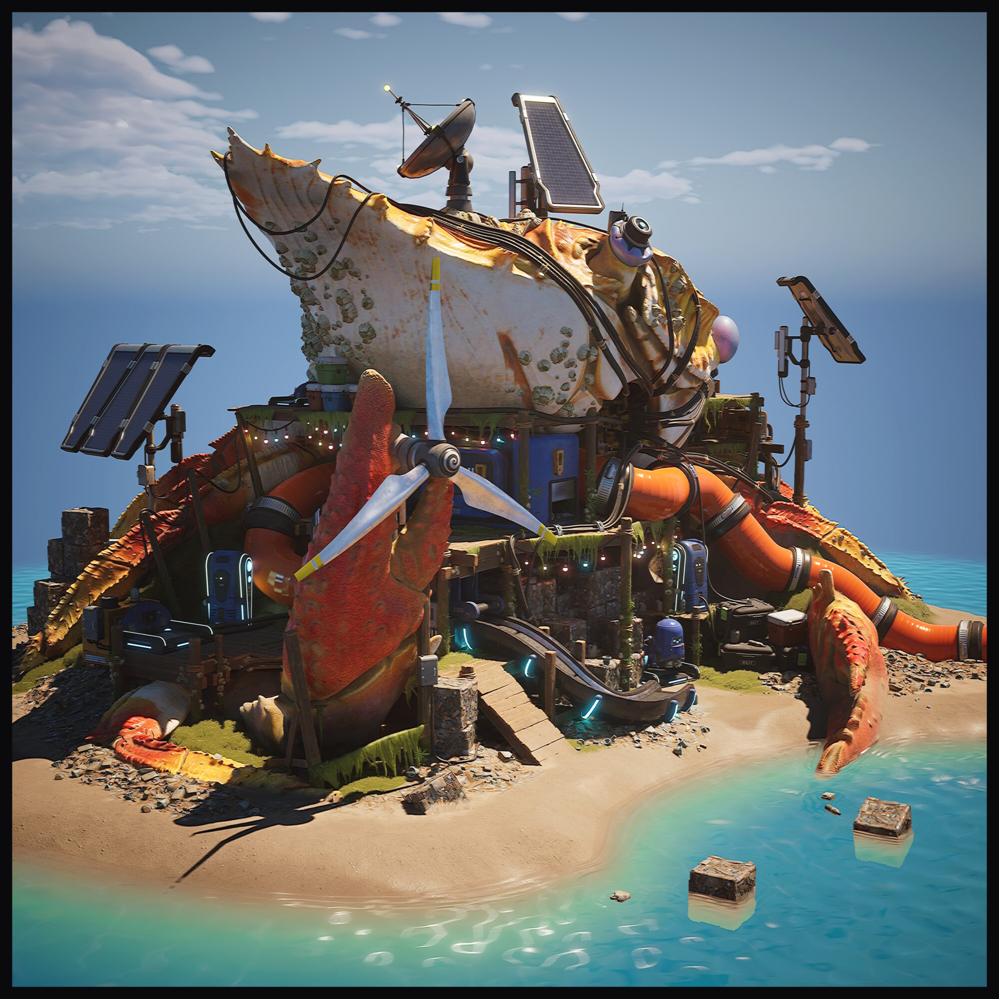
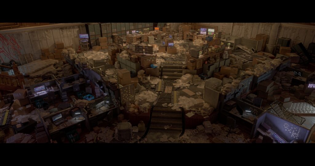
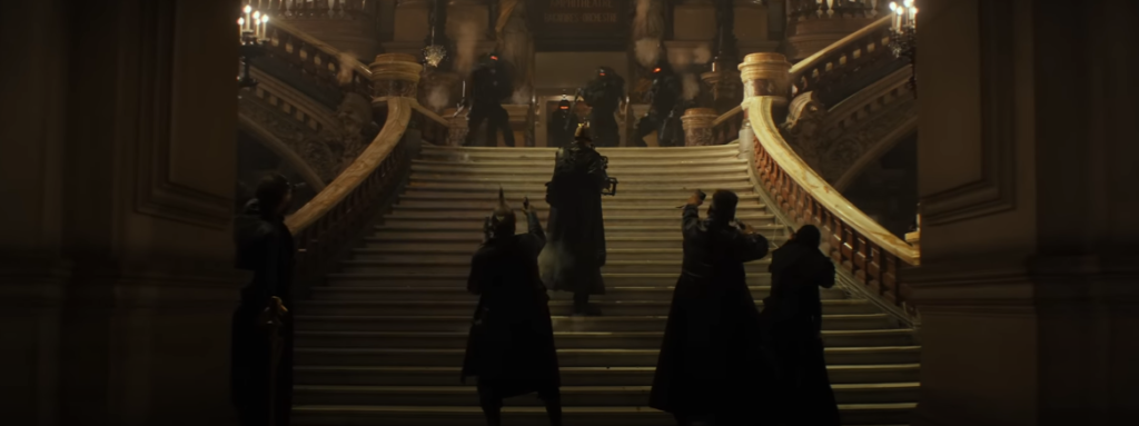
This is the project that I created, along with the guidance of Stefan Oprisan who was my mentor from the ThinkTank Training center mentorship term.
References
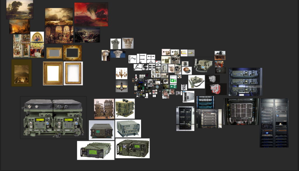
My favorite part of any project is gathering references. I was working off a 2D concept but I made sure to take as many references of the various props I was going to model. There were a lot of areas in the shadow that were a bit blurry so I used my imagination to come up with various storytelling elements that I could add to the scene.
During this stage, I made sure to also keep in mind any decals or materials (like types of concrete, wood, and stains) I might need in the future and saved them into my PureRef file. My inspirations were The Division 2 and Control. Rammstein had some pretty inspiring music videos that I took creative direction on as well.
Goals
This was my final school assignment. I started with a 2D concept from Ubisoft’s concept artist Tony Tran. This was my third Unreal environment Project so I wanted to test my efficiency with a larger environment and see how well I can keep organized from macro to micro detail, as well as keep things flexible.
I challenged myself to try different workflows because I wanted to understand a larger area of how different aspects of 3D speak to each other during a game development pipeline. Since this was somewhat of a personal project I was free to experiment and be creative.
I also tried to think about the story behind the environment since I wanted to freeze the moment when mass panic and chaos took place (and the environment had to be modular as well). At the end of the project, I wanted to have a broad understanding of the tools I was working with and an efficient workflow that kept the best modeling and texturing practices in mind.
Software
- Maya
- Zbrush
- Substance Painter
- Substance Designer
- Marvelous Designer
- Photoshop
- Unreal engine 5
- PureRef
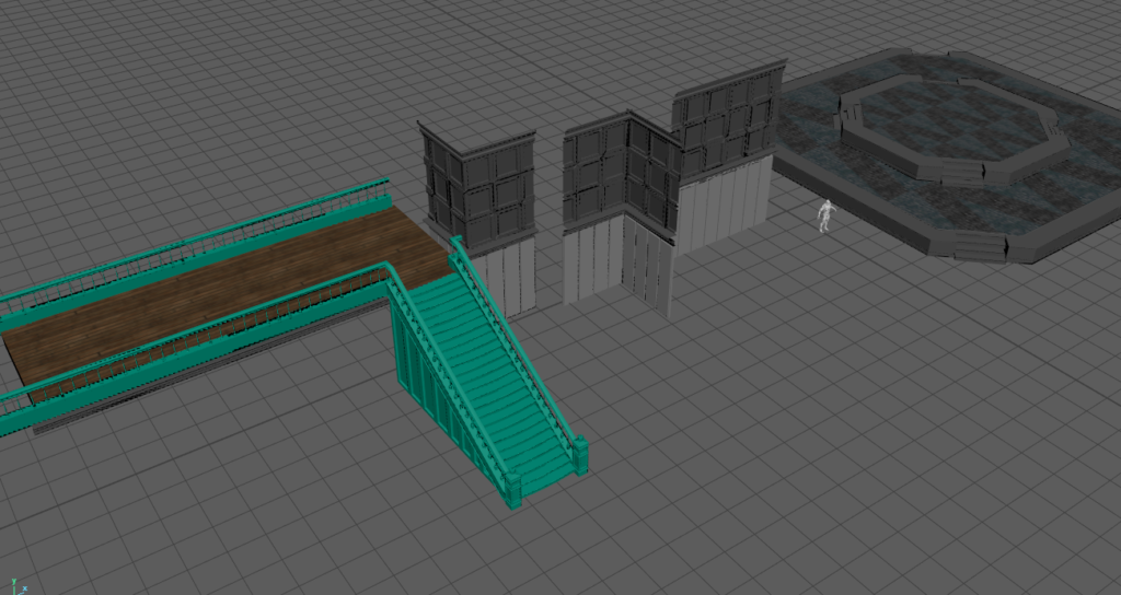
Blockout
When I started to think about blocking out my scene, I worked with a measurement of 5×7 meters since it is a large room. At first, the walls seemed a bit too short and made the scene a bit claustrophobic so I nudged the height a little bit to get the feeling right.
After the walls, I started getting to work on the middle platform. I made sure to be working in whole units (1,2,3,4 meter) because I knew there were stairs I needed to worry about. I divided the grid until I had the right amount of divisions to measure the stairs so that they would be even.
Next, it was time to fill up the office with desks and I was basically done with the blockout. I did a very quick lighting pass with the lights I saw in the concept and didn’t touch them until later on.
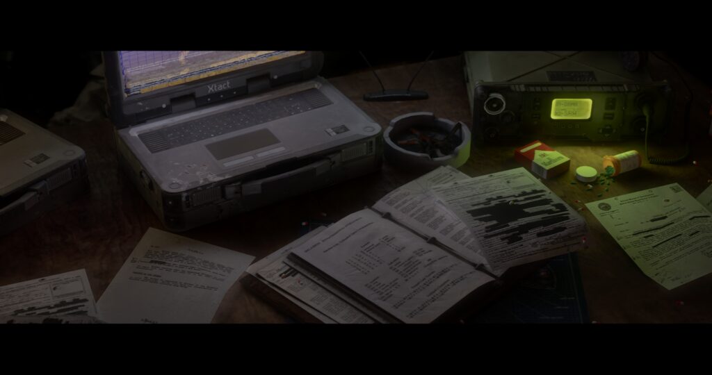
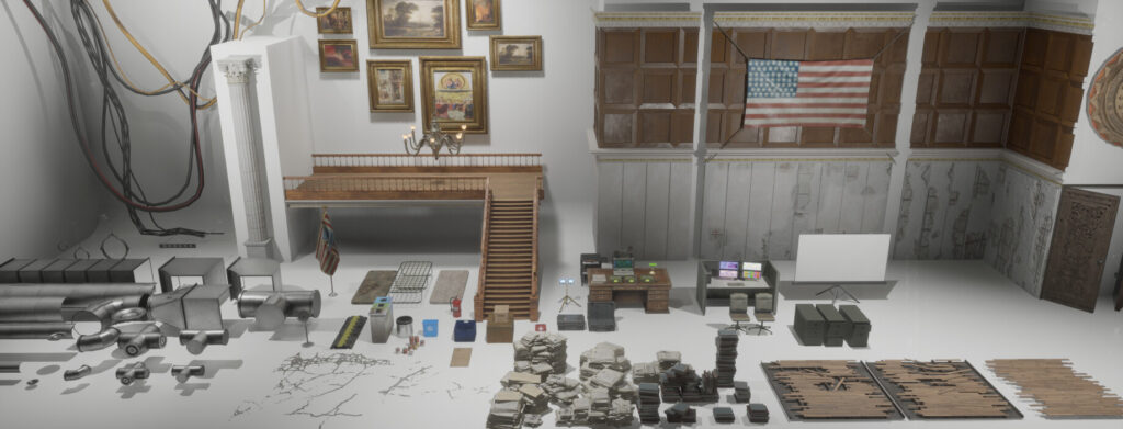
The rest is the fun part of modeling all the office equipment, tools and supplies to fill up the scene.
Modelling
I knew this environment was going to have a lot of tiny things which I underestimated when I started. I split up my project files into – big, medium, and small. Each hero prop got its own project file. This way I could find my files much easier and kept everything more organized. For all the hero props I would try to model everything as low poly as possible in the beginning to keep everything clean and easy to work with.
When I was satisfied with the proportions I would start adding supporting edges to convert the smooth preview into polygons finally. Before I did that I made sure to make a duplicate of the prop so I could use it as the low poly, all I had to do was remove the supporting edges.
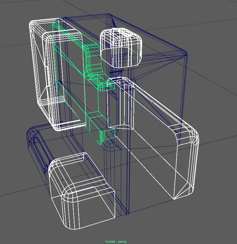
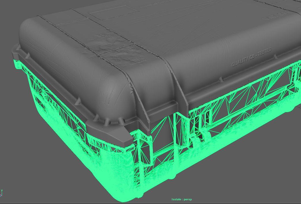
Some props had crashing geometry that would have increased the poly count if it was stitched together so instead I made sure to have all crashed vertices lined up as close to the surface as possible for efficient lightmap baking. I mirrored any symmetrical pieces along with their UVs to save time and texture space but this was highly dependent on how much space was left on the UV grid after laying out the shells. If I had a lot of space left I would connect the pieces to get better texture variation on certain pieces.
Here I point out the crashing geometry. I made sure the edges were precisely hand-cut and snapped to the bordering vertices to eliminate any Z fighting which is where the vertex normals are trying to overlap each other creating a flickering effect.
I used the FFD lattice tool when I was modeling the stacks of paper which helped a lot in achieving variation and avoiding perfect stacks.

Left: smoothed model.
Right: Low poly asset with supporting edge loops.
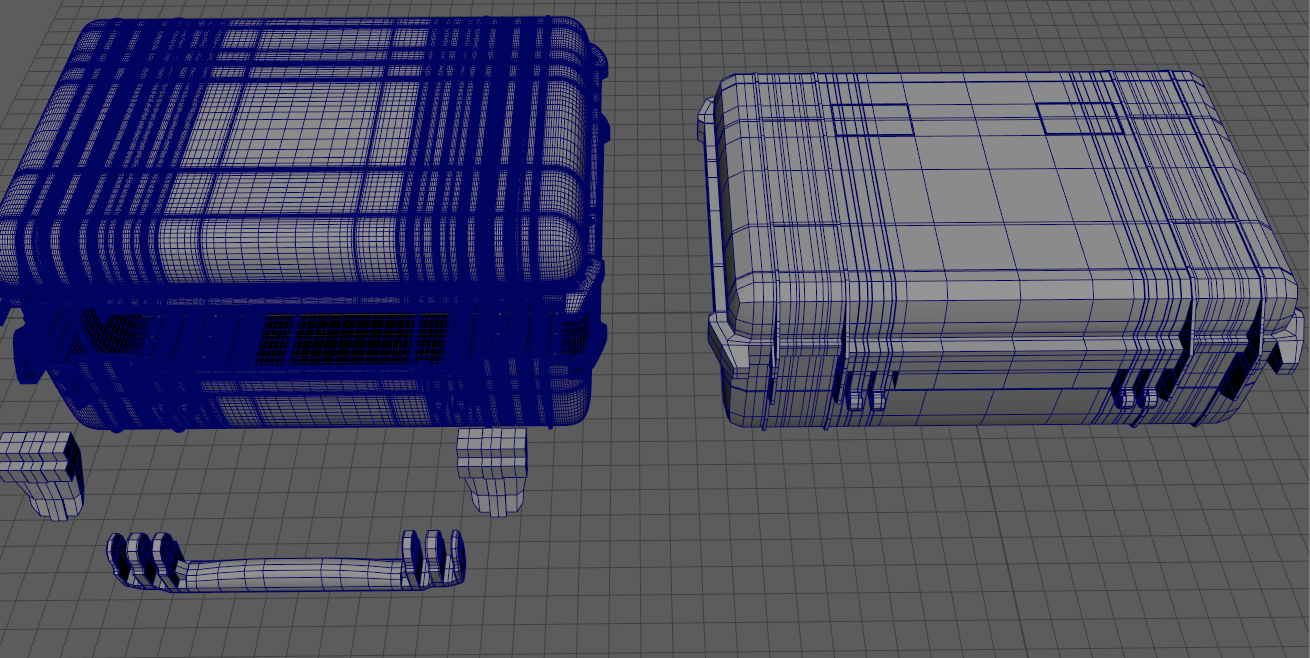
This is the optimized low poly models that I use in the engine.
ZBrush
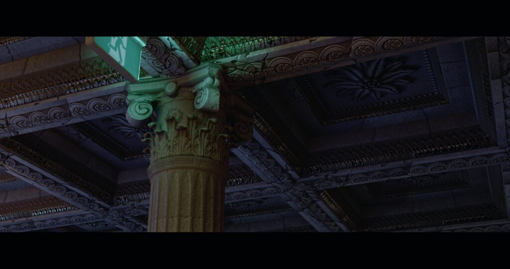
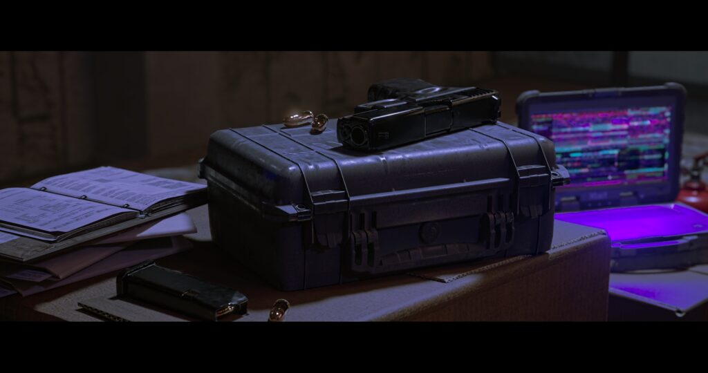
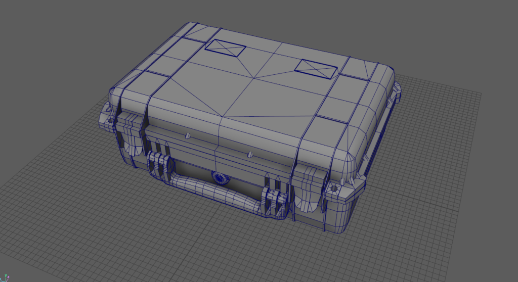
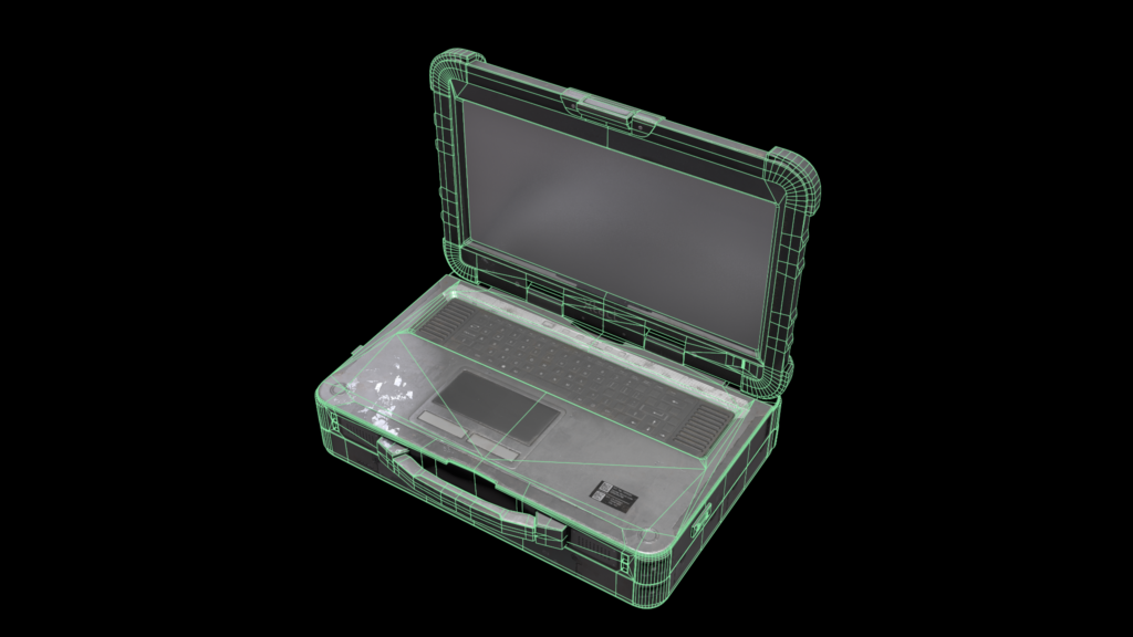
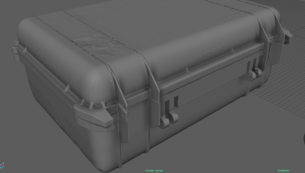
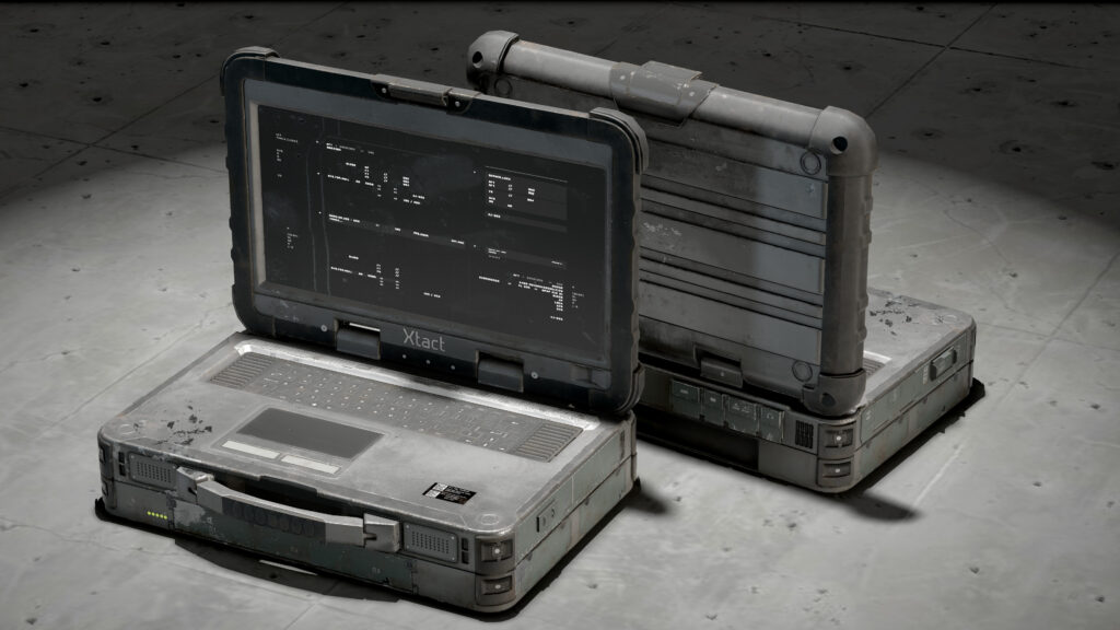
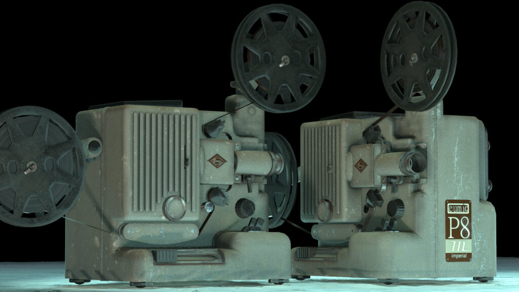
I only brought the pelican case, projector, chair and column into ZBrush. In reality, these models had been manufactured in factories using molds so they had a continuous surface through every curve. I was also working with stone and leather so I sculpted those details.
Dynamesh was the tool to help fuse the geometry together seamlessly. Then I sculpted some wear and tear where needed, then decimated to an appropriate polycount so Maya could have an easier time. I also ensured everything was properly smoothed before I hit the Dynamesh or else the faceted edges would remain.
So this is how the high-poly will look after I have done all the sculpted details after the dynamesh. The brushes I used were: Standard Brush, Dam Standard, Trimsmoothboarder, TrimDynamic and Trim Adaptive, Planar Brush, Move and SnakeHook with Backface mask.
Example of decimating geometry to save CPU power. I experimented with different levels of decimation to get the least amount of geometry and to retain the most detail.
Baking
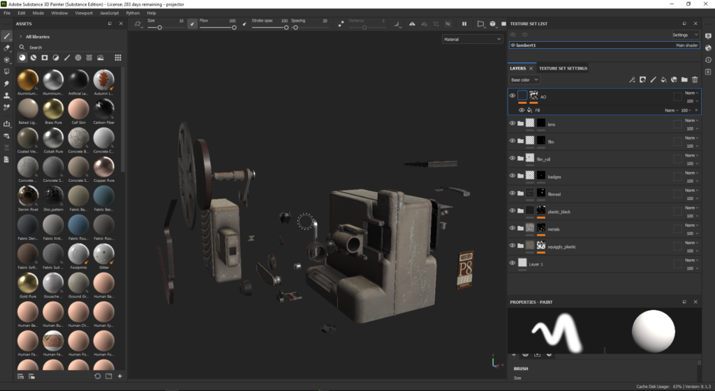
For baking, I used Substance painter. I made sure the lowpoly was as accurate as I could make it, meaning there would not be any faceting in the curves. I smoothed my normals before sending them to bake and the texture resolution I used for most bakes was 1024 and the hero props used 4098. During the bakes, I exploded my geometry even if it was an outdated workflow.
This was because I found it easier to focus on a single piece when I needed to. I tried keeping my UVs as straight as possible to avoid any saw tooth artifacts on the normal map. Most of the time I would be baking at a .001 rear distance and a .01 front distance, but I found myself playing around within those values most of the time.
Prop Workflow
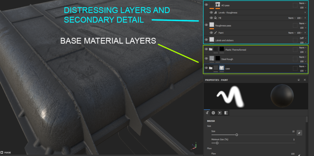
It is now time to texture the props after the bake. Having Straight UVs is essential to ensure you do for all models so that you don’t run into sawtoothing and maximize UV space. I normally set up my layers with clean base materials which in this case are thermoformed plastic and steel and layer finer details on top.
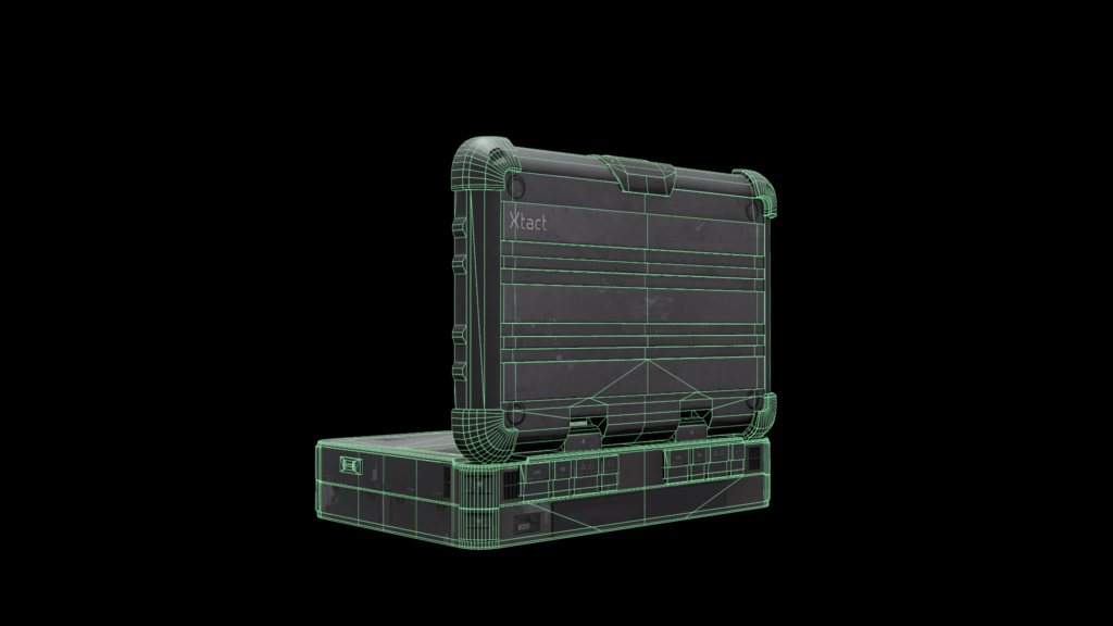
I’m also happy that the frayed edges I sculpted on the case ridges picked up on the bake. I used the move and snake hook brush with the Backface mask turned on in order to quickly add a fraying effect. I tried to research the materials or think back on memory about how these felt or looked. The pelican case reminded me of the compostable corn plastic mixed with a very hard polymer.
I would also use an ID map when I am baking any geometry onto a flat area. Or generally, if there were a lot of small pieces that I needed to add a material on I could color pick it quickly.
The plastic grain for the case was a texture I made quickly in Substance Designer.
I just saved the bitmap and imported it into Painter. I then layered some directional blurs and warps to break up the fine points of the texture. I left the case to be quite shiny so that I could have contrasting fingerprint smudges in the roughness layer. I used an AO generator as the final layer to darken and roughen out the crevices but leave the curves to be a bit shinier.
For some props, I used damaged alphas on a black mask layer. I was able to get some real damage and scratches. This combined with the occasional height values made for some realistic indentations.
This was the workflow for most of the props in my scene.
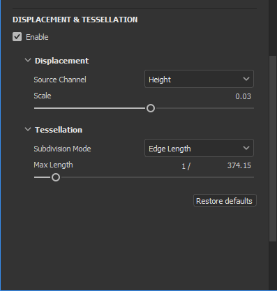
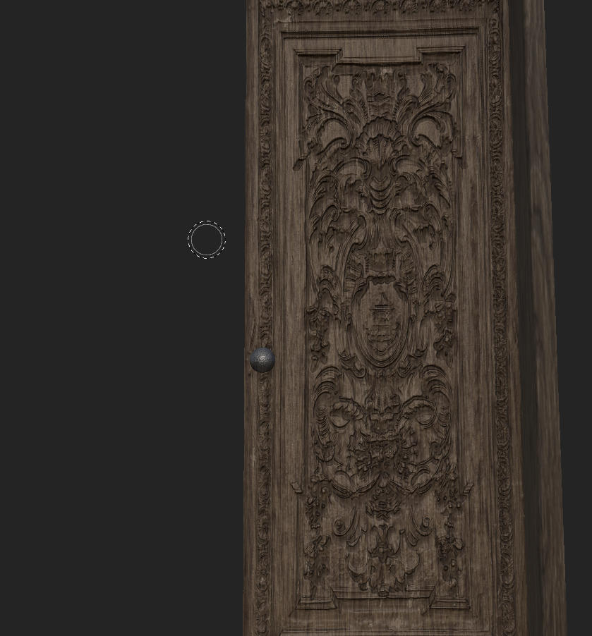
I also textured a door using one of Painter’s new tools which is the tessellation via height map in the shader settings. I thought this would be a cool experiment to try with the nanite feature in Unreal Engine 5. In the shader settings, I only used an edge length of 360 because that was the number where the silhouette stopped being affected no matter how much I cranked the tessellation.
First I found an image of a door with carved detail that was as diffuse as possible meaning little to no shadows or highlights as this will affect the height map detail. I made sure it was as straight as possible so I mirrored the image in photoshop as well as created a normal map.
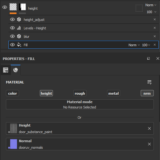
I brought a rectangular box into Painter which had the Height map already mapped to the UVs. I created a fill layer with everything turned off except the normal and height data. Then I used the blur filter to soften the height map a bit because it was a bit too crispy for my liking.
After that, I created a level and a height adjustment layer to finely tweak the height extrusion. Since I was not using any baking data, I used the Normal and AO maps I created in Designer. I was able to use a 1024 texture map for this since the height detail did a lot of the work in pushing the details of the asset. The doorknob was made the same way which was on the same texture map as the door.
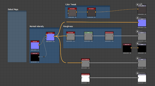
This is the graph I made to process the image which converted the normal map I made in photoshop into a height map. I also used the height map to drive the AO to bring those maps in Painter to finally texture the prop.
This method allowed me to save a lot of time because it cut out the sculpting and baking process for this detailed prop as Painter’s height sculpting technology is very powerful.
Misc Software
The reason I am going to put Marvelous designer in here is that I only used it for simulating the American Flag. I made use of the freezing and pinning near the top of the flag and let the simulation drape where it needed to.
I flattened out the UVs in MD and exported it out so I could transfer the vertex location and UVs of the flattened pattern which took a couple of tries and fiddling around with vertices to get a good bake.
Texturing
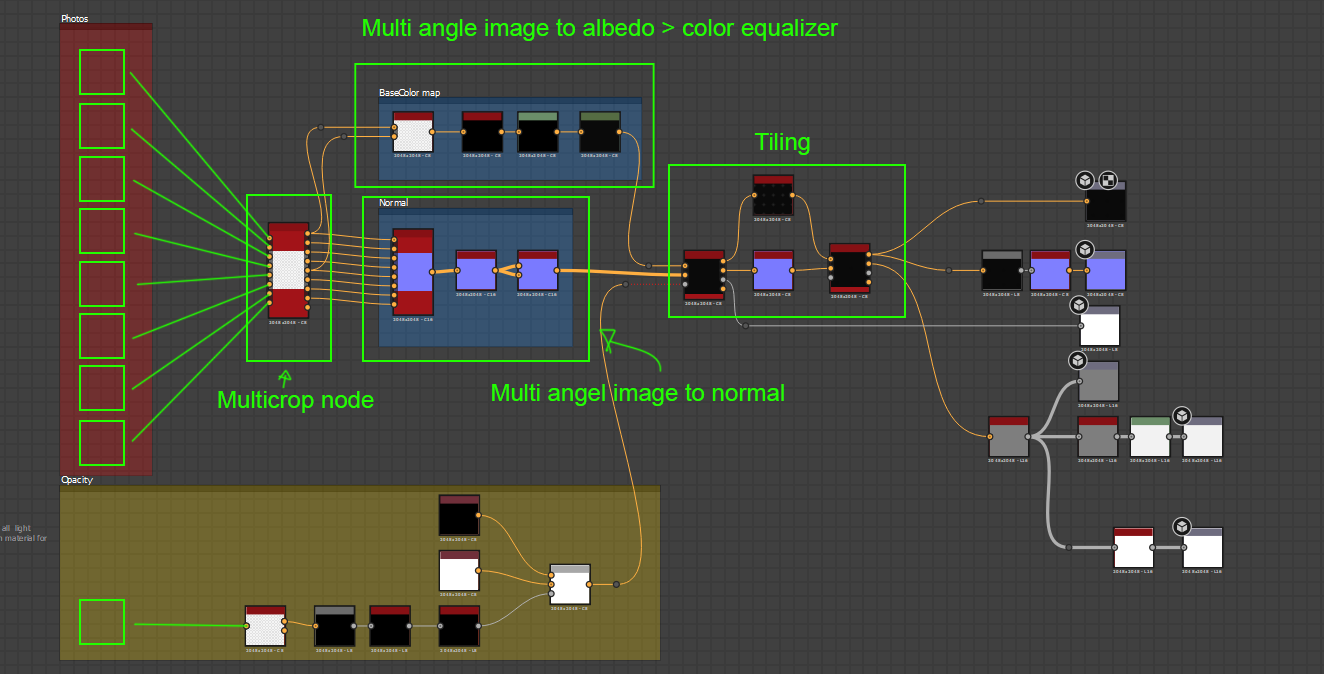
I used mostly Trim Sheets for the modular pieces and small objects to avoid baking time. I first made seamless copies of the textures I got from google searches. I then brought them into Substance Designer to section out the Trim sheet and to make my normal and Packed maps.
I also created a scene in Maya to replicate the photogrammetry workflow of scanning textiles from the substance website.
First I took a photo with my phone on a rainy day, made it seamless in photoshop and made some adjustments in photoshop. I threw an AI standard surface shader onto the plane, I set up the displacement. Then I set up 8 lights around the tile and added them each to a layer. Then I would turn them on one by one from the top-down viewport. I rendered each image using Arnold
And the displacement would give realistic lighting information. I plan on learning the actual photogrammetry workflow now that I’m finished with the project but this was just to save time.
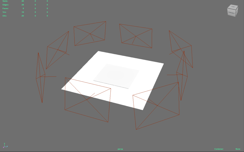
I then brought this into Substance Designer using this graph. It uses the multi-angle nodes from the scanning tools section. They were pretty cool to experiment with and I was learning new tools every step of the way.
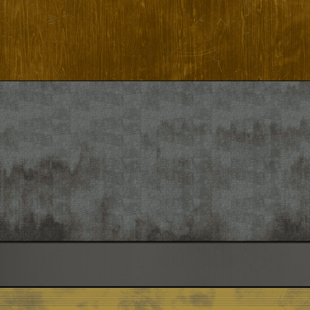
Materials
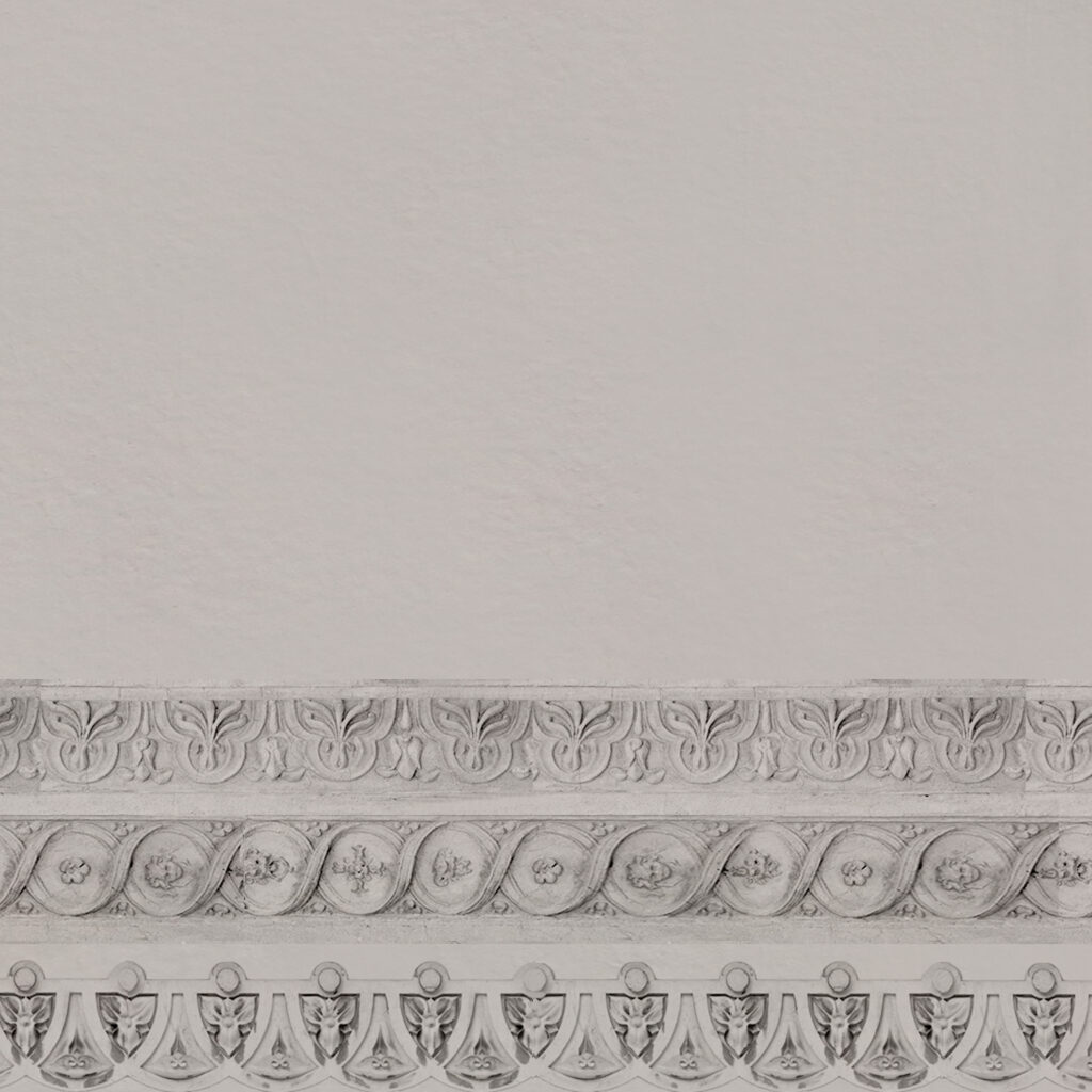
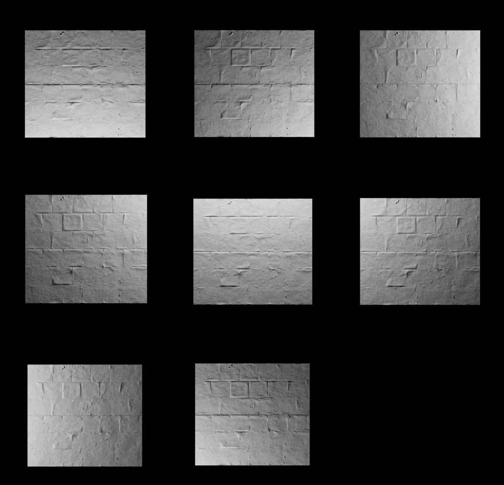
I used Substance designer which is a node-based program that uses black and white values to create height and all kinds of shapes. The materials I needed to make in SD were the Ceiling and subtly different variations of concrete.
The ceiling was created using mostly the shape node together with the blend node set to subtract or add. I made sure to layer the shapes keeping in mind the border areas and interior areas and those were used as masks to create the metallic and color maps. The ceiling material was definitely the most fun because I was just using simple shapes to construct a complex design.
For my cement with rebar exposure, I simply took my rebar material and cement material and mixed it together with a custom mask.
Shaders
Before I started this project I had zero understanding of how shaders worked but I tried my best to build a few master materials that I could create instances of for different variations. In hindsight, I could have combined the dust shader with the master material I made for the actors.
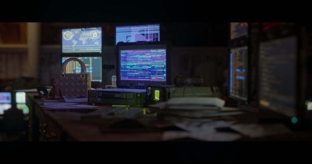
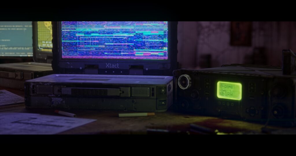
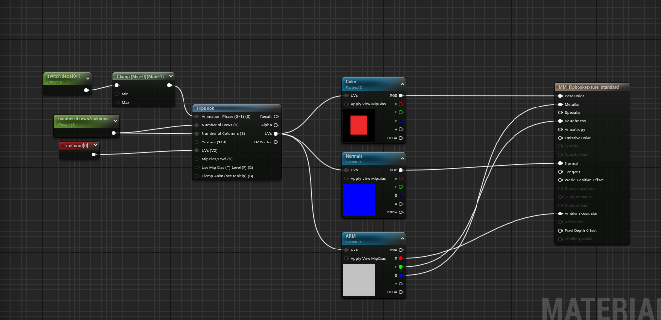
I made shaders for the LED screens, a Dust build-up shader, And a Vertex painting shader. I also thought of a way to consolidate all the paintings into a single atlas of 3×3 rows using a flipbook node, which allowed me to enter a value of between 0 and 1 to change the image.
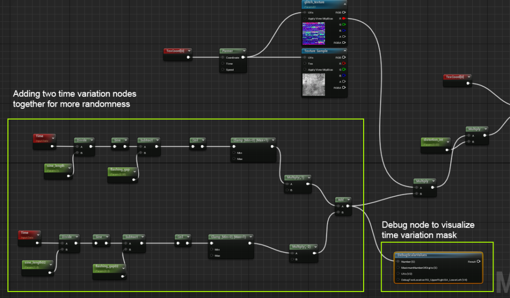
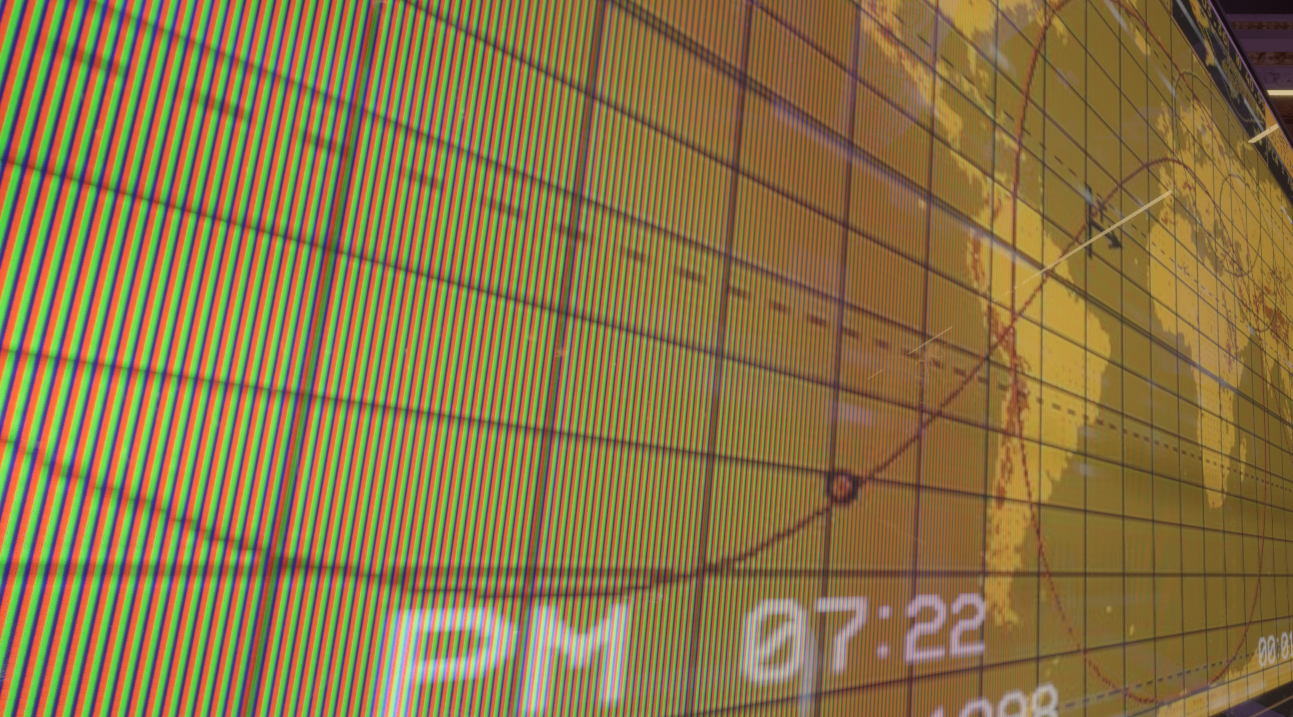
The LED shader has parameters to control the fade distance at which the LED texture shows up which uses the pixel depth node to create a distance mask at glancing angles so the LEDs show up close to the camera but disappear further away. The glitching effect you see is a glitch texture driven by a sine node that is then added to the base texture. I then Multiplied a CRT line effect which was driven by a vertical panning node.
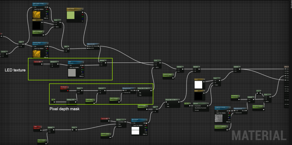
So there is also the dust overlay shader. RGB is the same as XYZ so I multiplied Blue by the world space mask to get a top-down shader. Unreal is Z up unlike other software which is Y up.
I also have controls for the contrast of the dust and tiling. I also am using some detail normal in the shader.
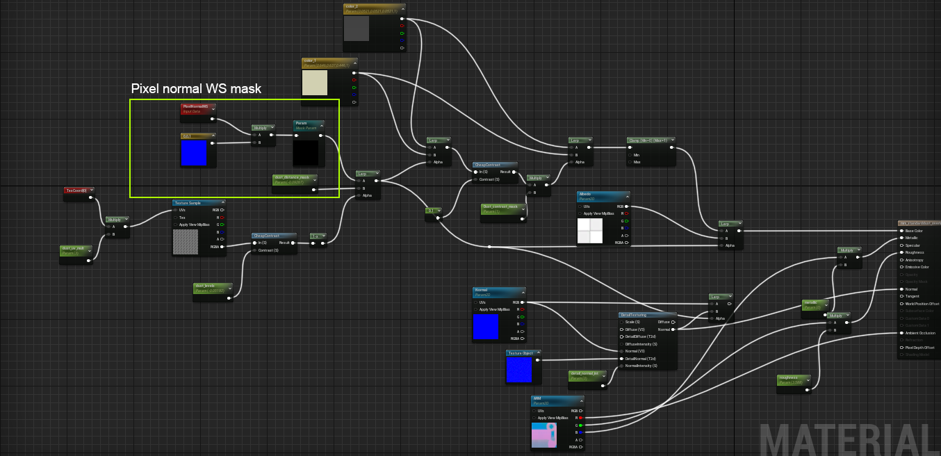
Here is the material graph for the flipbook shader that is driving all the different paintings, decals and photographs. I had to stitch the decal textures into rows in photoshop and create a custom opacity map for the decal version.
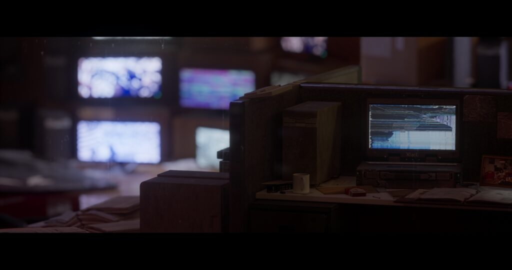
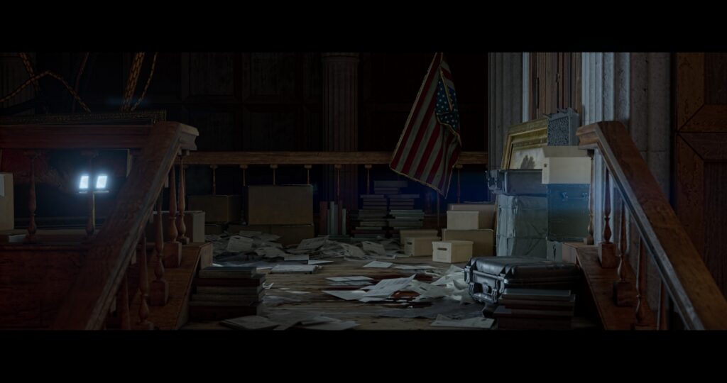
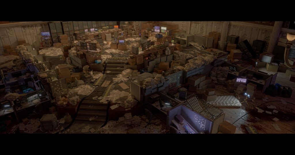
Set Dressing
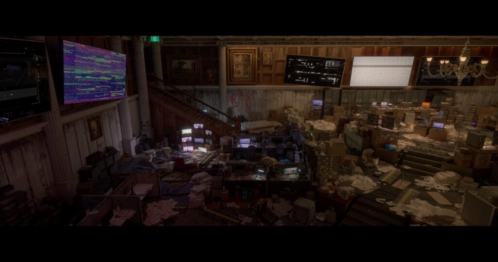
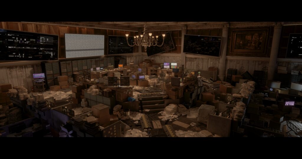
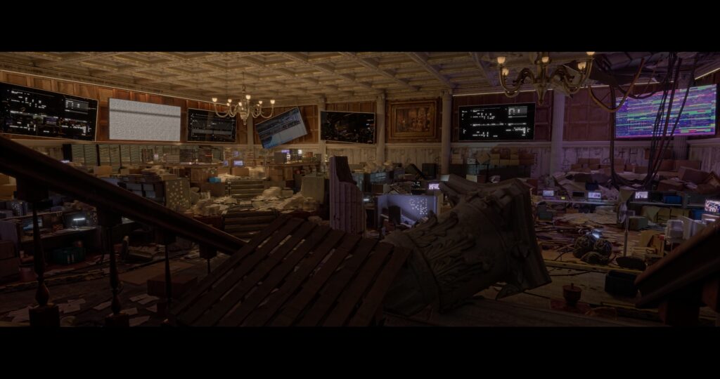
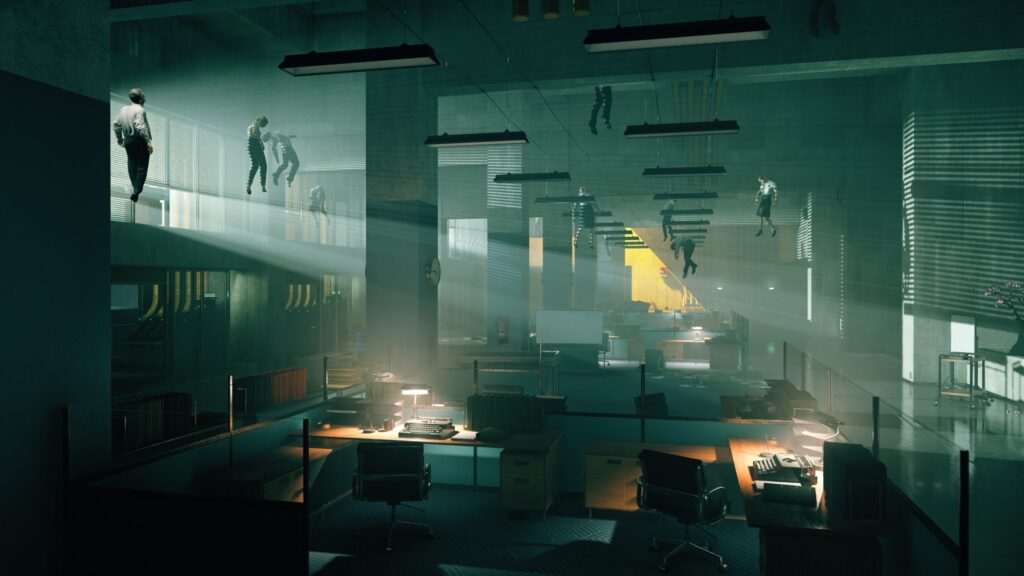
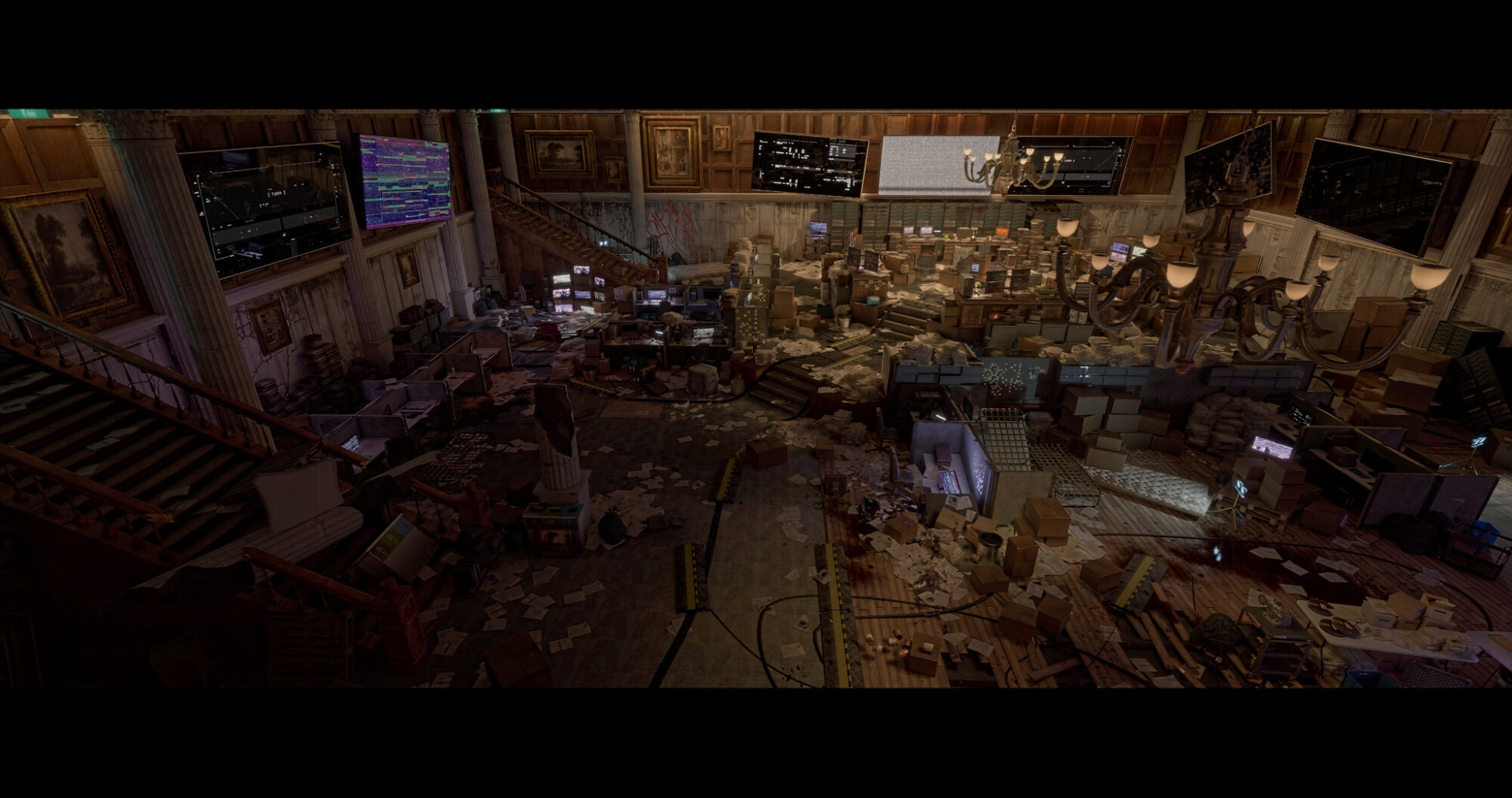
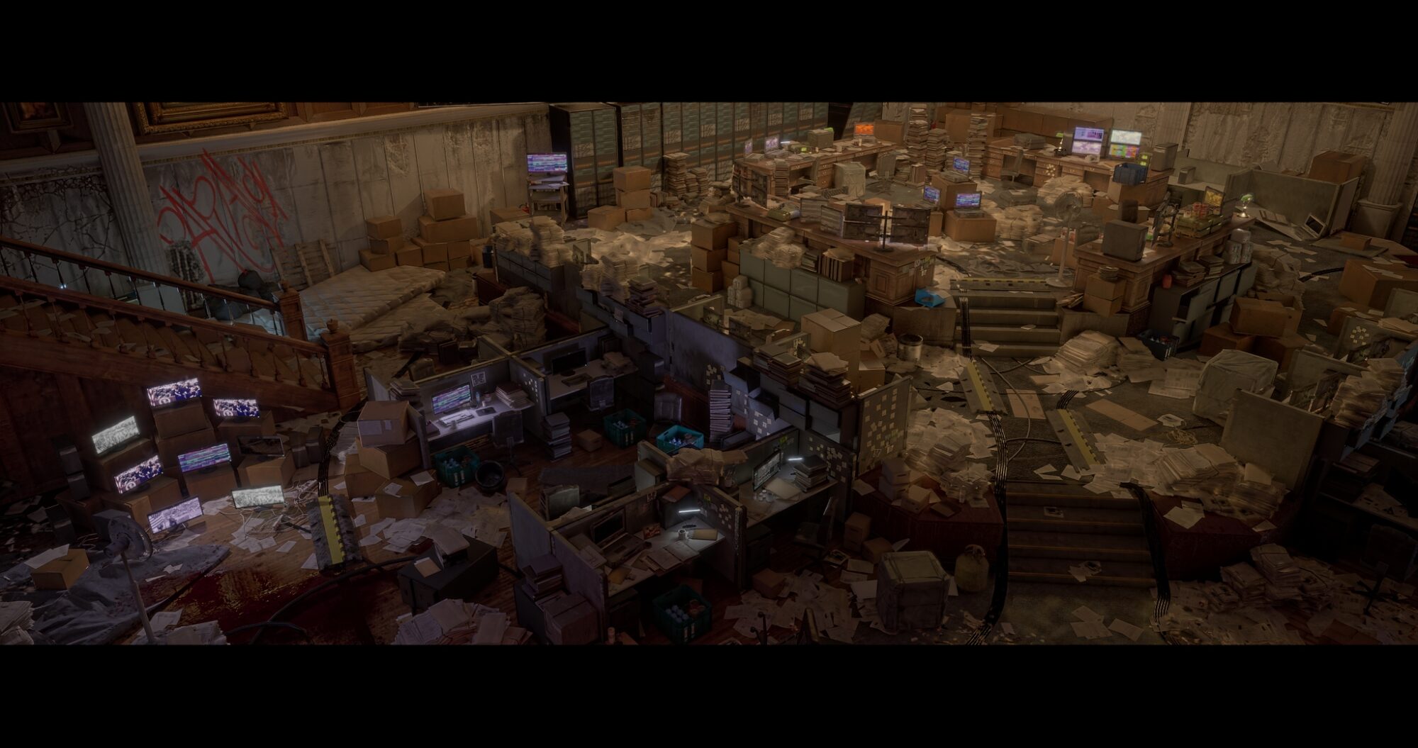
This part was very time-consuming. There was a lot of space to cover and I wanted the scene to be very chaotic near the center platform since that is where I imagined the most action. I want to create a black Thursday stock market crash vibe.
I took a lot of inspiration from the division, control and real abandoned offices. I was going for a spooky base of operations to reflect those two games. It wasn’t until much later down the line when I made more and more objects to fill it up that the set finally came together.
All the paper was scattered using the foliage tool and the garbage and stains were decals I made or downloaded from the Megascans library.
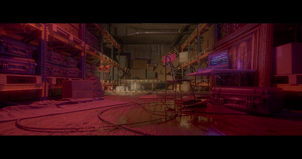
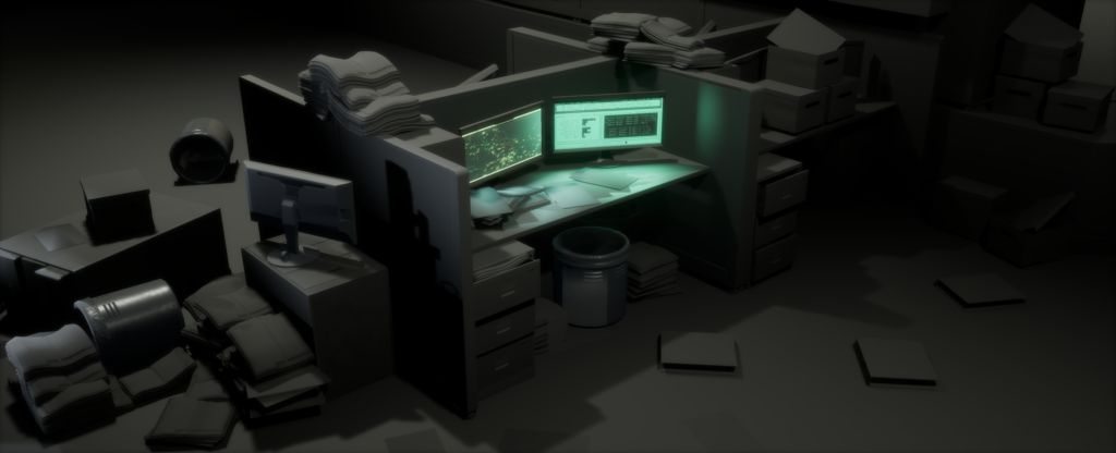
Near the end, I decided to make an extra room kind of like a storage area where somebody has been camping out in. It was very fun decorating the room and I could use the modular pipes I made to fill up the ceiling.
The floor pieces were pieces of rectangles that I brought into Painter to texture and were arranged in a tileable fashion. I created 2 damaged variations from the clean one I had made. While
I made the floor I kept in mind the foundation it was built on so I included an area under the floorboards for the ripped-out pieces to be put in to replicate the boards falling in.
I merged a lot of book stacks and paper stacks into combined actors to optimize the scene more. These are the early stages of the level. Looking like something that came out of an SCP universe!
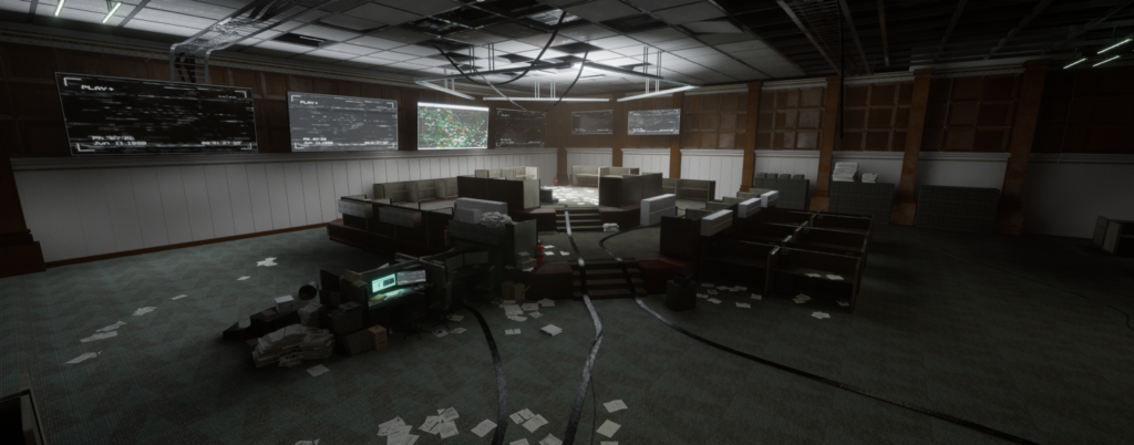
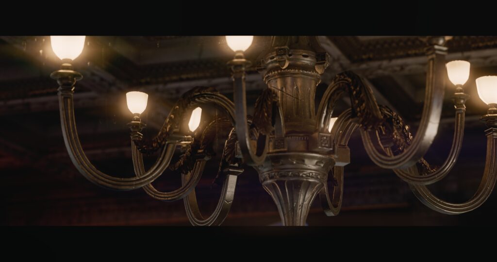
Lighting
My goal was to make a moody scene with dark shadows and bright focal points. I worked with lumen on this level and I liked the real-time updates. I used the computer screens to my advantage by giving the overall room a cohesive color palette by remembering my color theory.
I had to also research the correct temperature used for offices and they are somewhere around 3200K for the warm color lights. I made sure not to overexpose anything and I added some invisible fill lights to some areas to give the space a mix of warm and cool colors.
For the lights that could be seen in the reflections, I turned their specular level to zero. At the end of placing all the lights, I set all my lumen settings to 20 to get accurate lighting details.
I created one spotlight with zero specular intensity that had a cone of 90 degrees and a pretty big attenuation range right above the raised platform area. Also, a very important setting that I unchecked was the “Inverse square fall off”. This allowed the light to not be concentrated at a single point but rather much more spread out which was perfect for a general indirect fill light.
I wanted the most important area of the room to be the brightest, which was difficult because I had a few TV screens that were also really bright around the room and would grab people’s
attention too strongly. At first, I created a few screen graphics that were too colorful and messed up the color palette of the room. So I switched them to black. Now the room was mostly warm tones, I was able to bring in the complimentary colors and also some colder lights to give it contrast.
I used the small flood lights and some monitors and TV screens to be responsible for the purple complimentary colors and cold white light. I did not bother putting rectangle lights in front of some monitors because it added too much light and color to the scene even if it was the realistic thing to do.
*Sometimes I had streaks in my shadows coming from strong spotlights. Increase the Shadow Bias to fix this.*
Rendering
I made my cinematic shots with the sequencer in Unreal. I wanted to get as many pleasing angles as I could of my scene. I experimented with high and low camera placements and usually shot with a far to medium focal length.
I used depth of field when wanting to give attention to an area in the shot. I had to play around with exposure in certain shots to get the right amount of brightness.
I had a total of around 12 shots which took 8 hours to render so I had to be very careful with every shot. I went back and forth from Unreal to Davinci Resolve a lot, checking out individual clips to check how it would look fully rendered to see if anything went wrong.
A lot of things did wrong in the rendering phase and I spent quite some time here because time was such a commitment. There was random flickering from highlights, wrong color outputs, camera issues, etc. I wanted to use the OCIO ACESCG color output but it was not working at the time with DaVinci resolve.
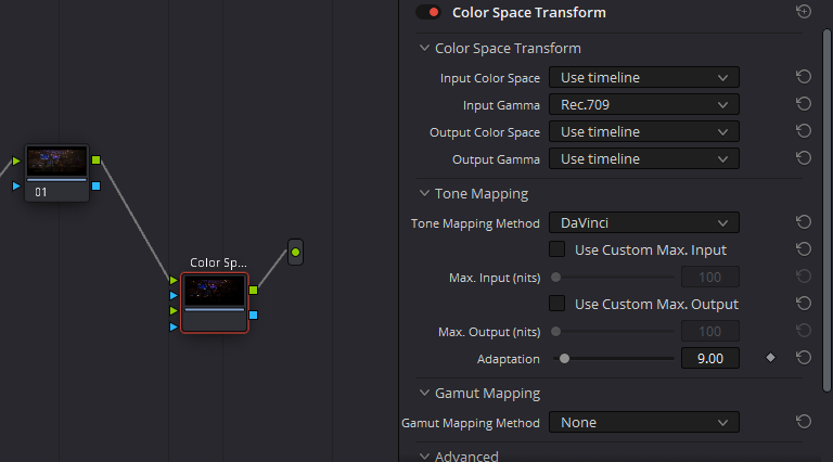
I exported everything without the tone curve and as an .EXR file for a wider gamut range then changed the color space to sRGB linear in DaVinci.
The final step was to add a color space transform node to the clips. The image below shows a weird workaround that gave me really nice colors in my scene and made color grading easier.
Conclusion
This project took me a bit over 7 months to finish and a lot of trial and error since I was still quite a newbie to unreal.
I am most happy about all the new tools I was exposed to and that this project challenged my creativity as a new environment artist. I discovered a lot of new things from the references I collected during late nights which felt like a small adventure. Also, remember to take breaks to come back to the project with more energy.
I also learned to restart projects that I could sense would not end well. I was able to let things go much more easily and although self-criticism is difficult for any artist, it got easier for me as time went on.
Overall I tried to be as professional as I could when dealing with problems as I learned from my mentor who kept a very objective and focused outlook on the scope of the project which was very inspirational.
Thank you GamesArtistUK for giving me the wonderful opportunity to write about my project and I hope everyone enjoyed reading it.
Read more articles
You might also like these articles.