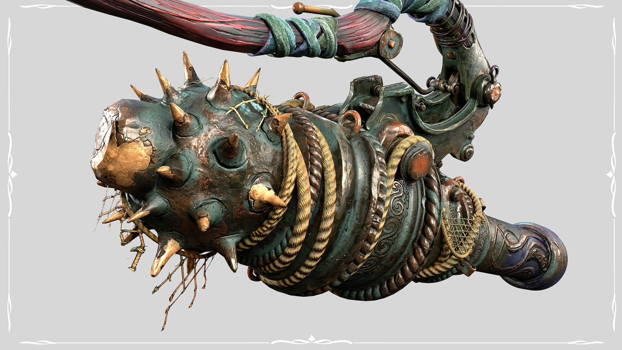
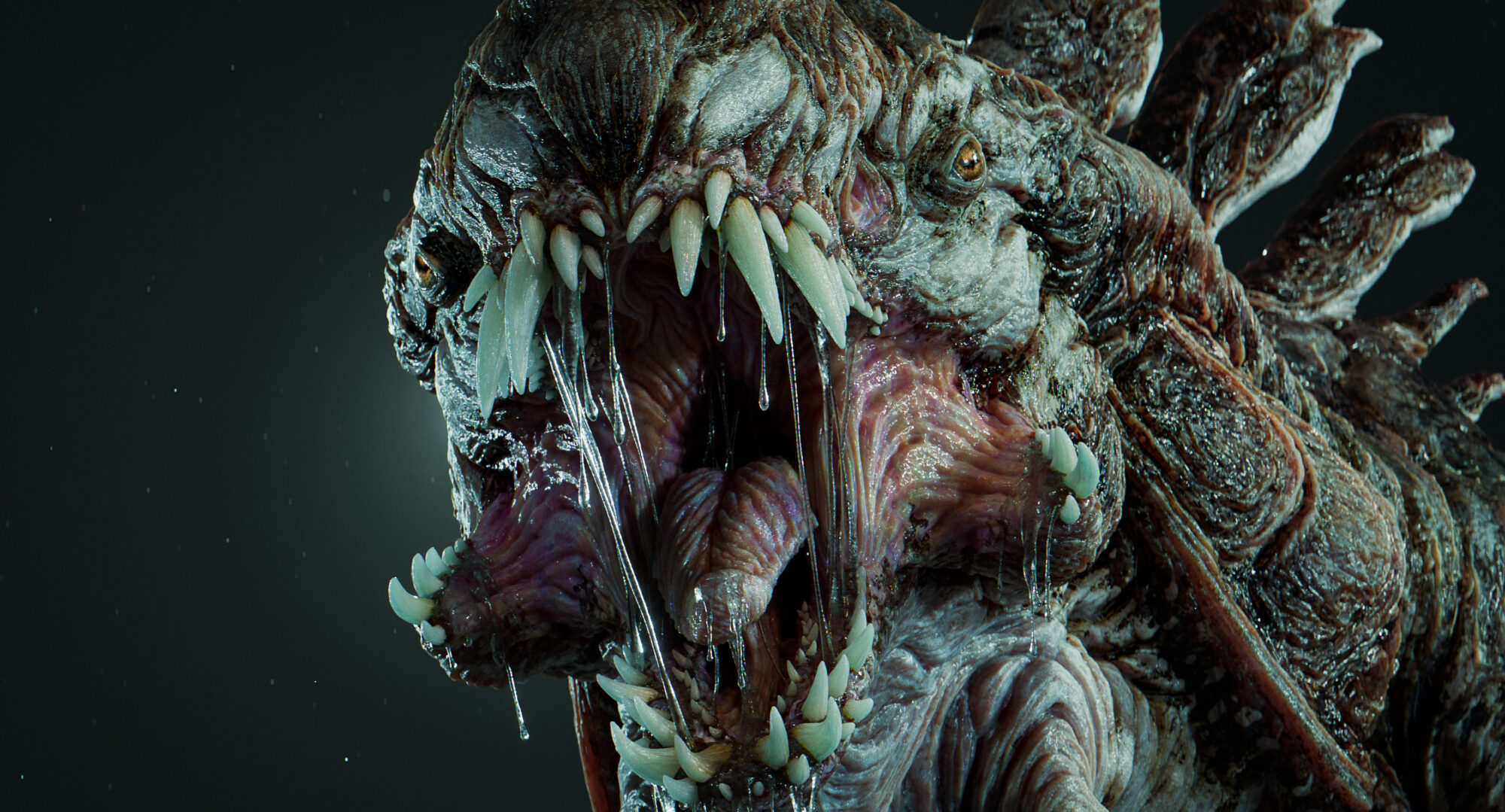
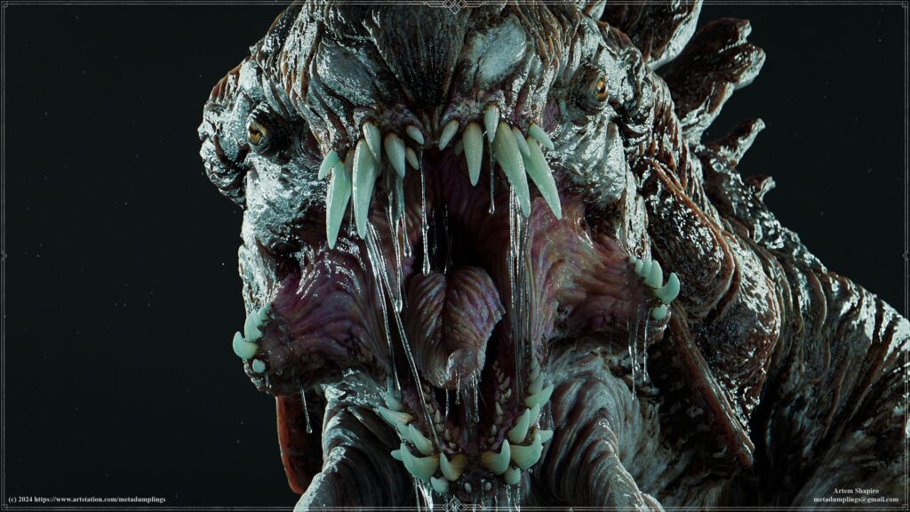
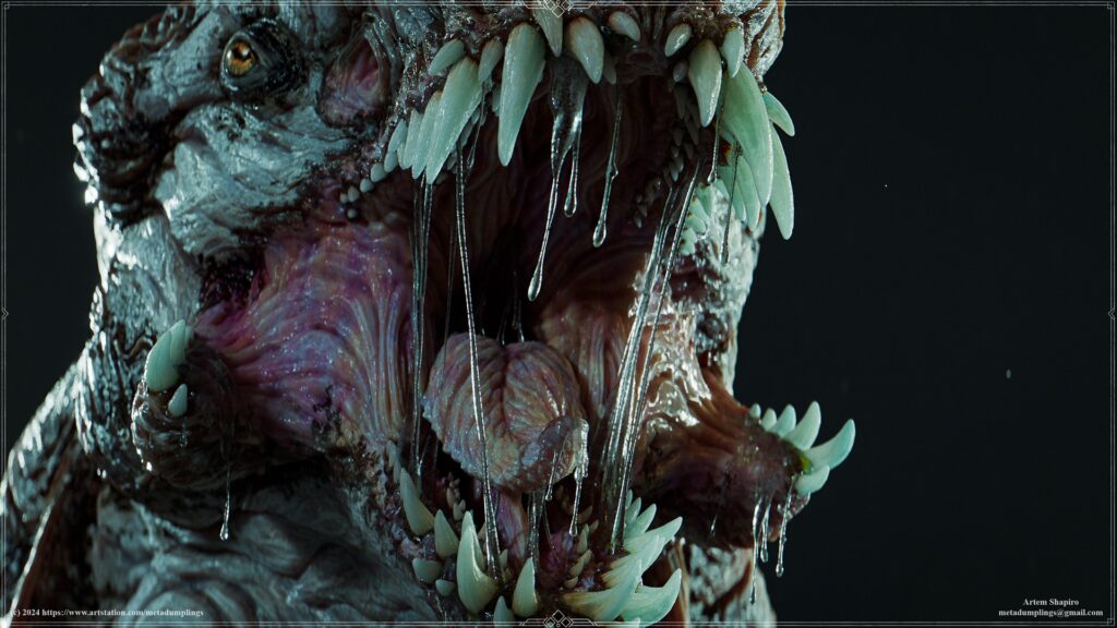
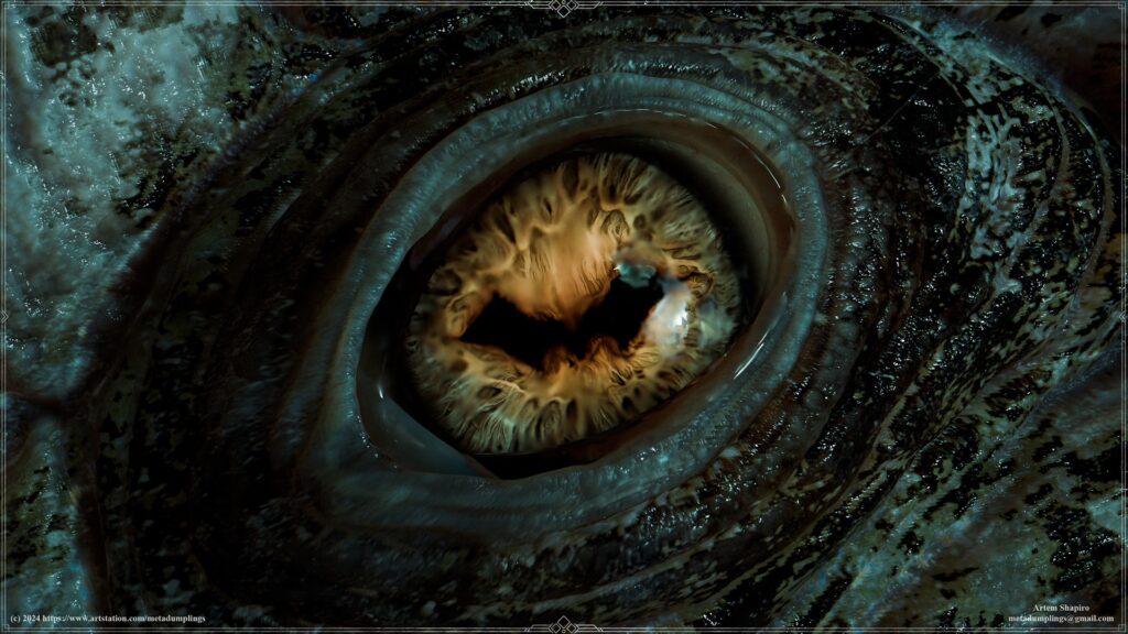
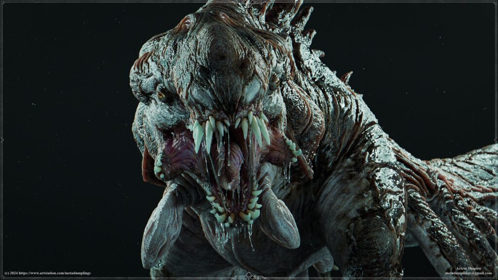
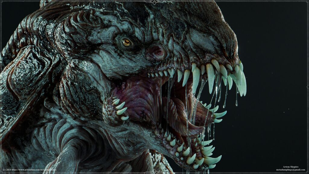
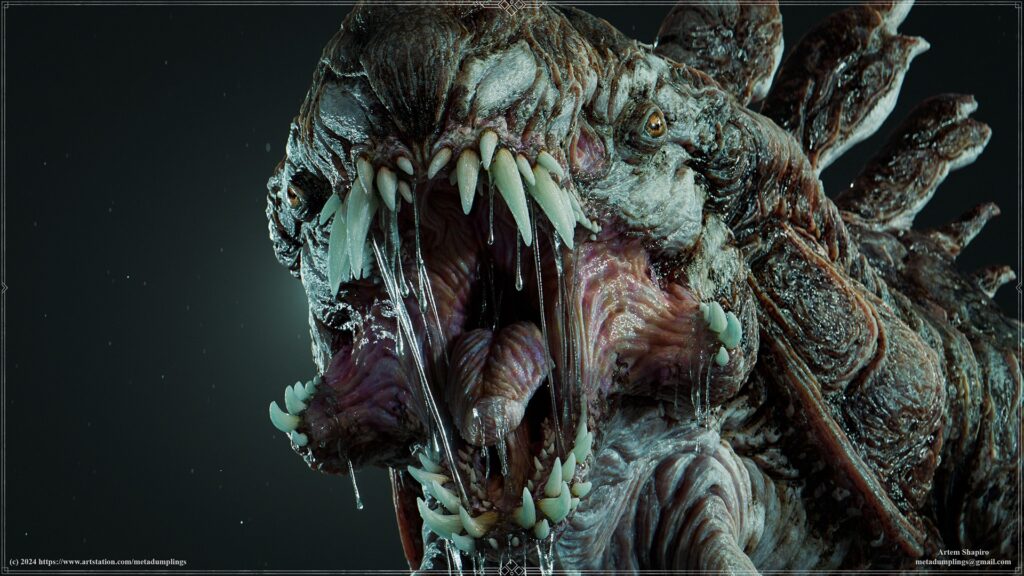
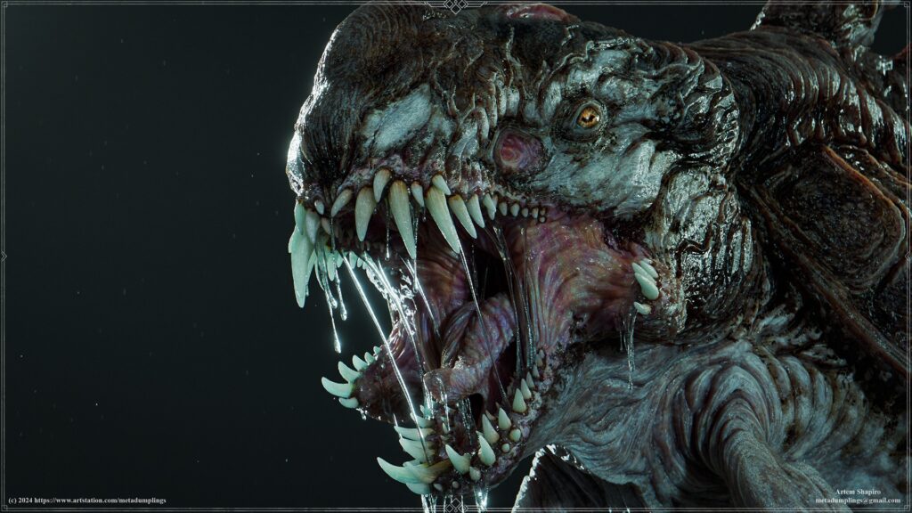
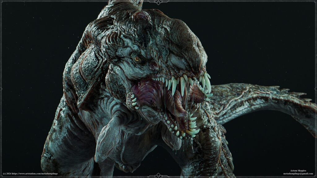
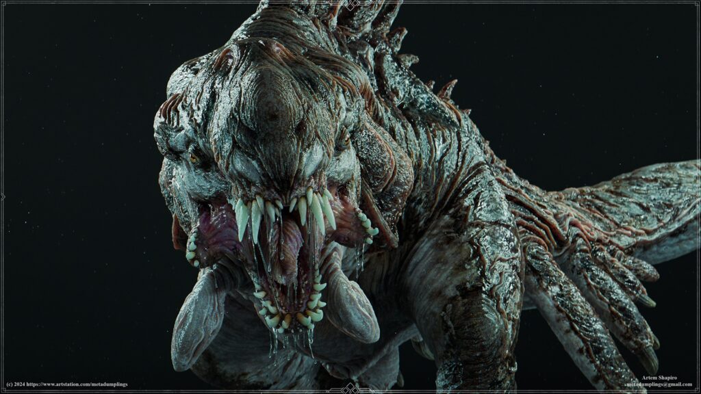
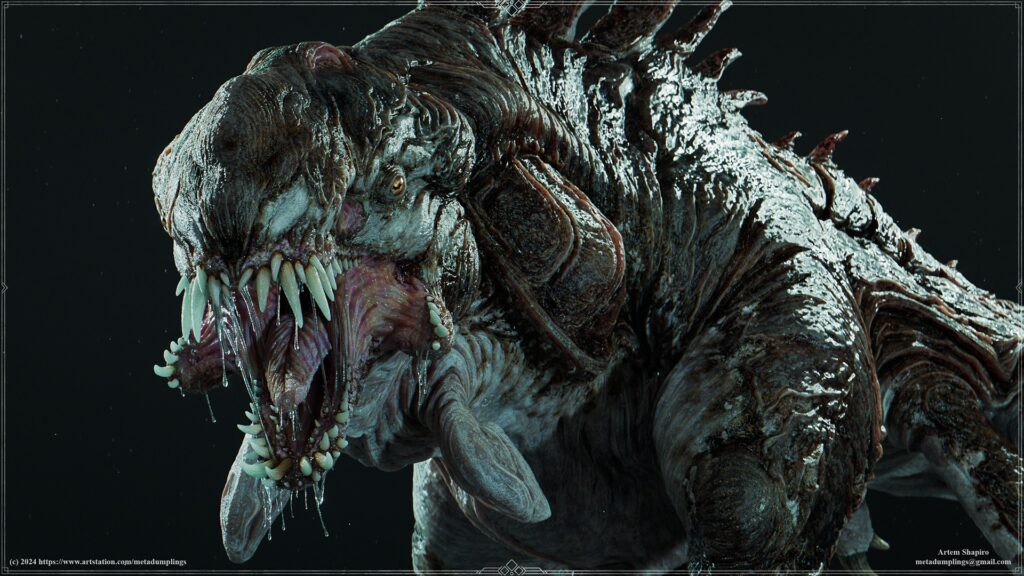
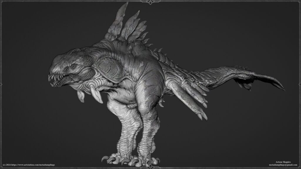
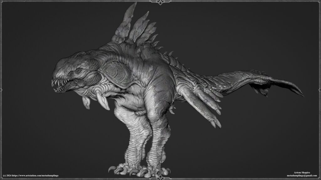
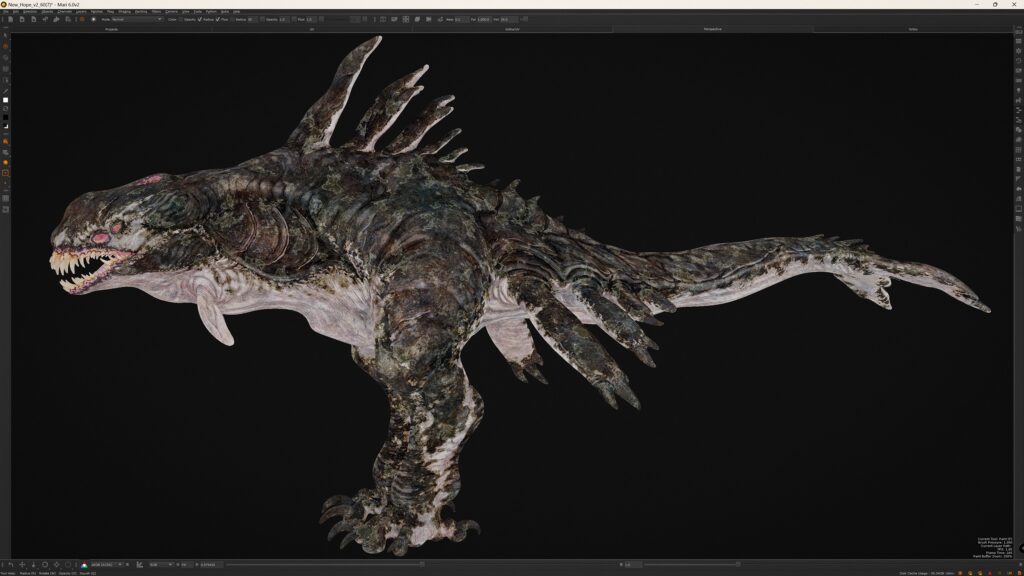
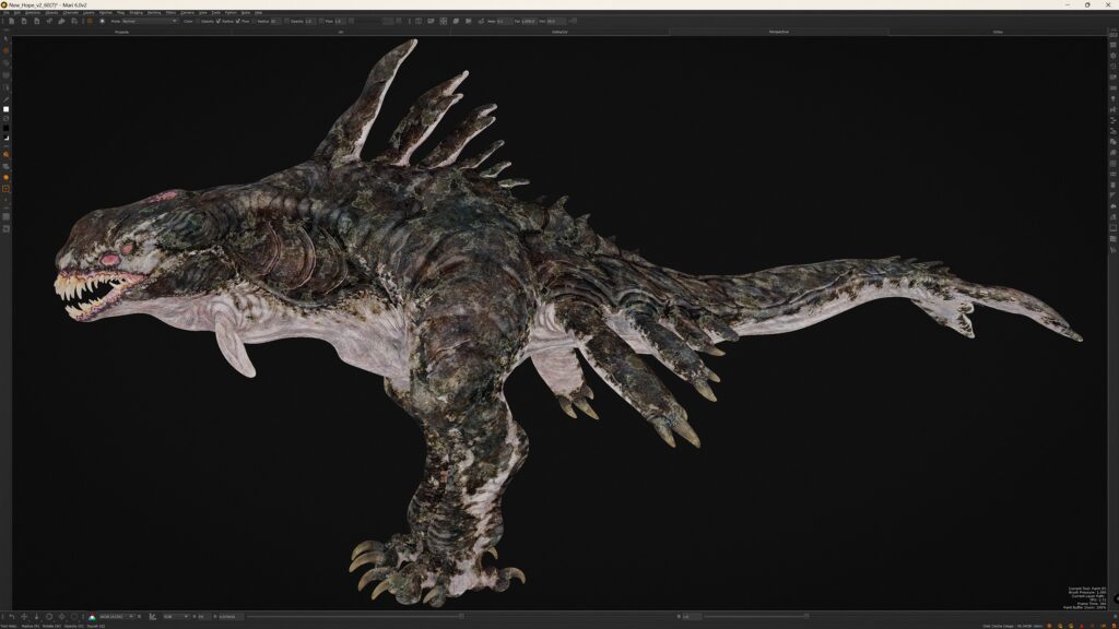
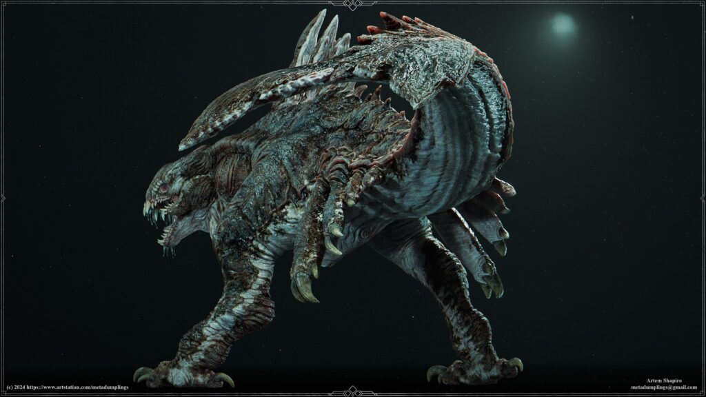
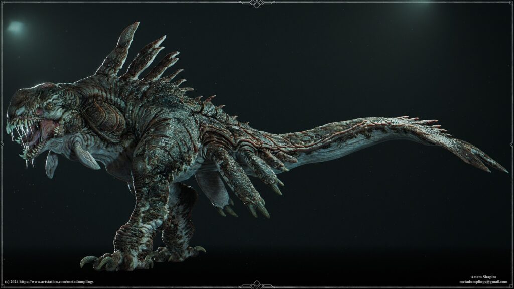
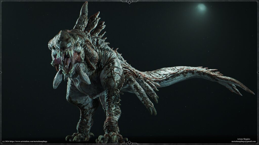
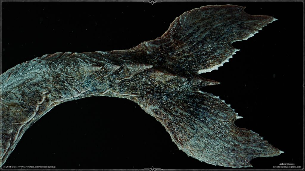
Chimera
Introduction
Hi I'm Artem Shapiro - I'm currently a Senior 3D Character Artist at Larian Studios.
Project, Preparation & Concept
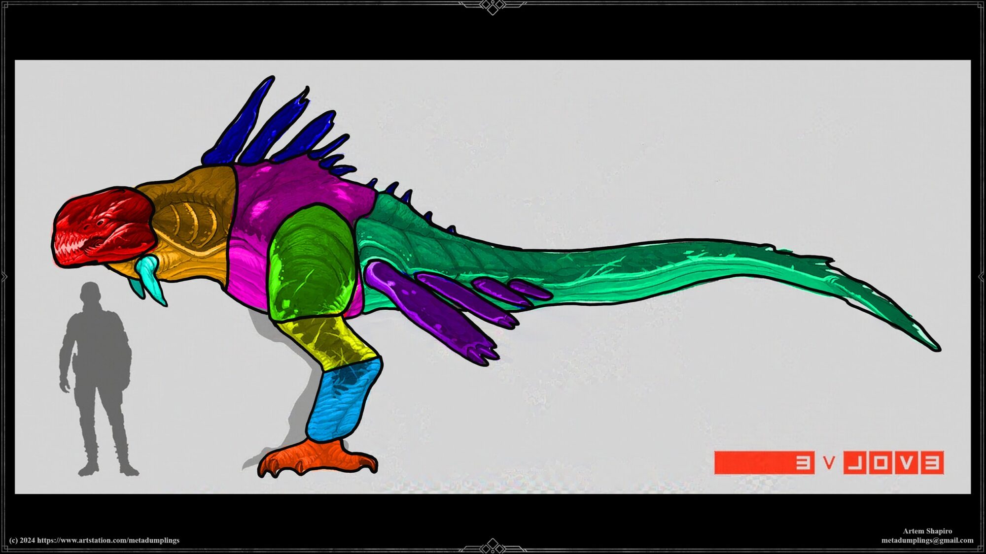
Before starting character modeling, it’s important to analyze the concept art carefully. This first step includes categorizing materials and surfaces, such as Hard-Surface, Soft-Surface, clothing, skin, and organic elements.
Understanding each material type helps translate the design accurately during modelling.
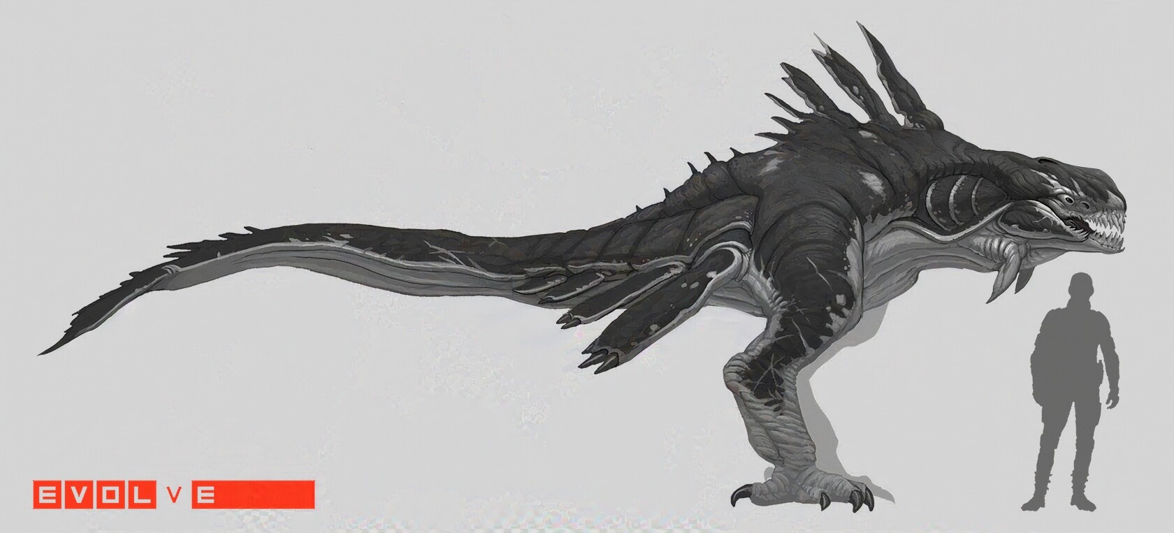
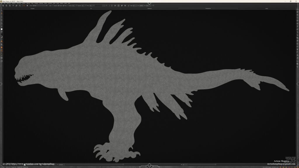
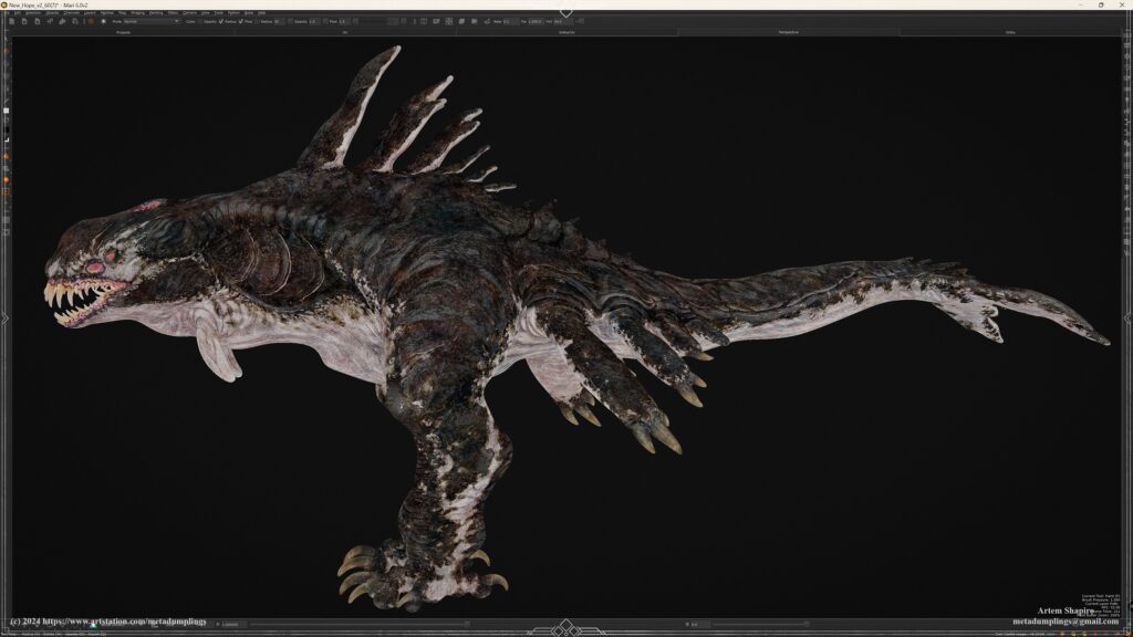
Concept by Stephen Oakley
Artwork: Chimera
Using Photoshop’s “Lasso” tool to select and fill forms with color can emphasize key details, making the design easier to interpret.
This method breaks down the design into clear parts, simplifying the view of shapes and proportions in the concept.
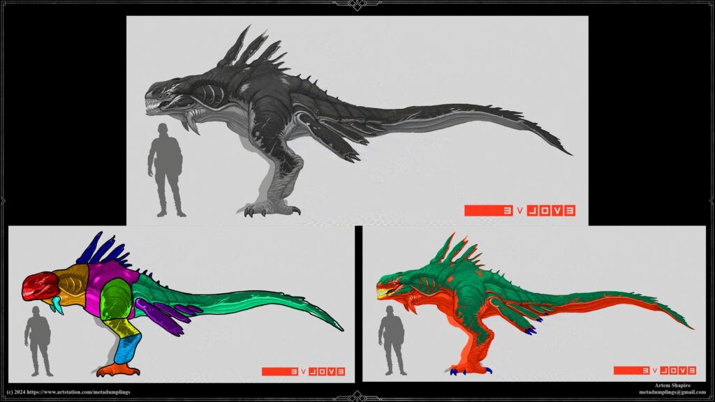
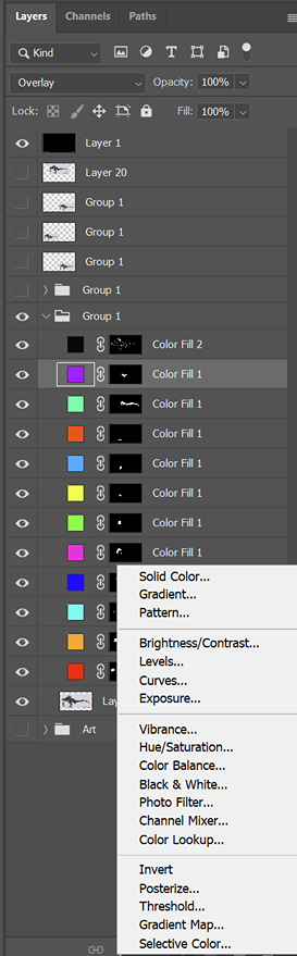
Color Coding for Form Visualization
Color-coding materials improve form readability, which is essential for modeling. In ZBrush, for instance, this approach simplifies the process by eliminating unnecessary elements from the start, helping avoid complications.
Starting simple and gradually building up complexity minimizes errors and optimizes the workflow.
Simple Forms
Dividing complex parts into simple shapes, like primitives, helps during the initial blockout stage when the main proportions are set.
For example, breaking down parts by joints and major muscle groups makes forms easier to understand, ensuring accuracy in later stages.
Material Breakdown
This approach can be adapted for any concept. Here, we divide materials by type:
Skin, claws, eyes, teeth, and more. Contrasting colors for each material type helps clarify transitions, making material distinctions clear for modeling.
Key Material Properties for Analysis:
- Color-coded materials
- Organic vs. inorganic elements
- Solid vs. deformable materials
- Emphasis on specific details with color coding
These principles help separate organic and inorganic parts, as well as deformable and non-deformable areas. This makes analyzing and understanding shapes easier, supporting a clear view of transitions and interactions in the model.
For instance, I use “Solid Color” with the “Overlay” blending mode for fill color in Photoshop.
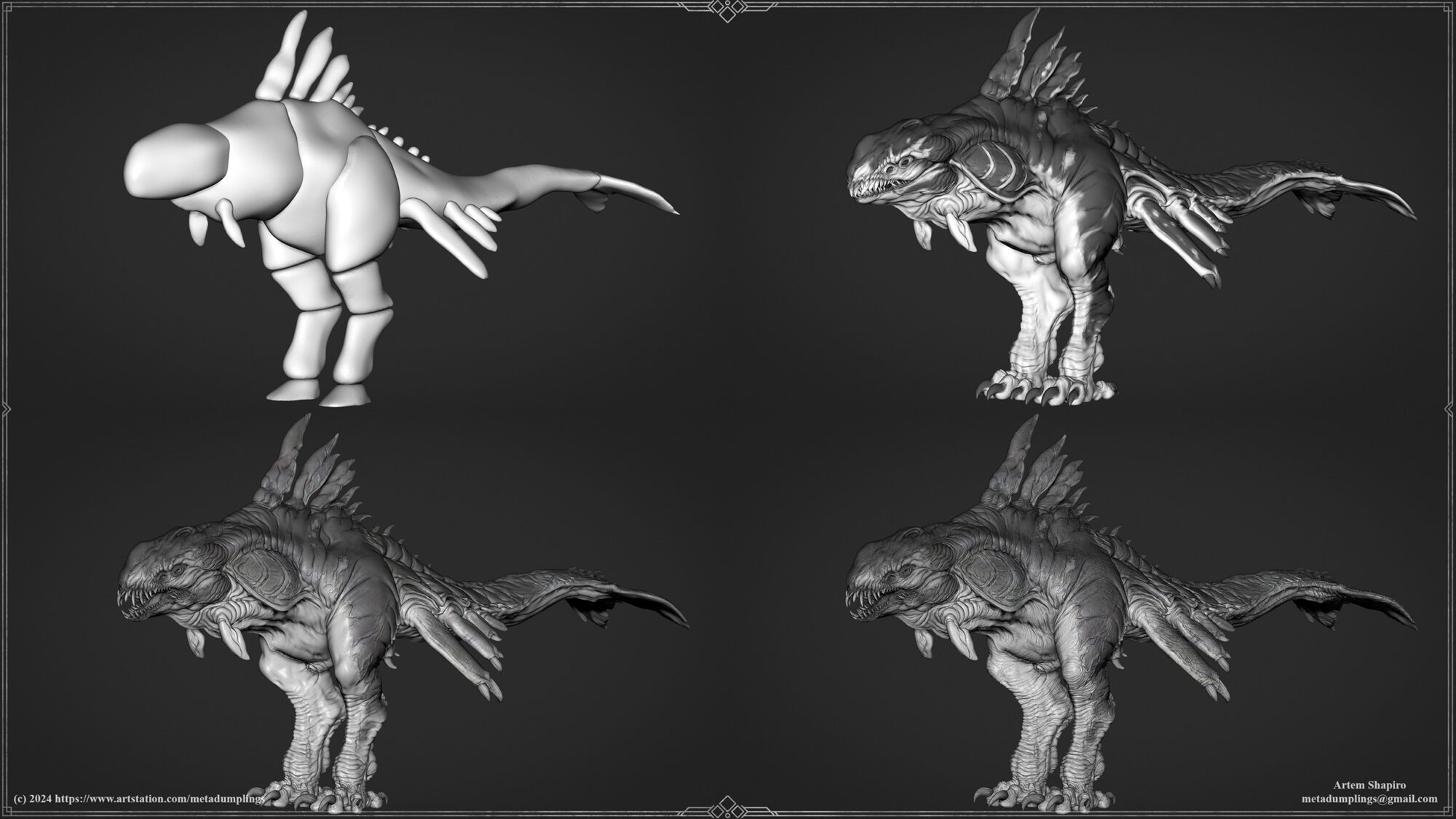
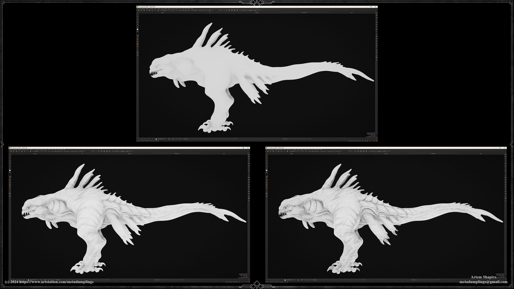
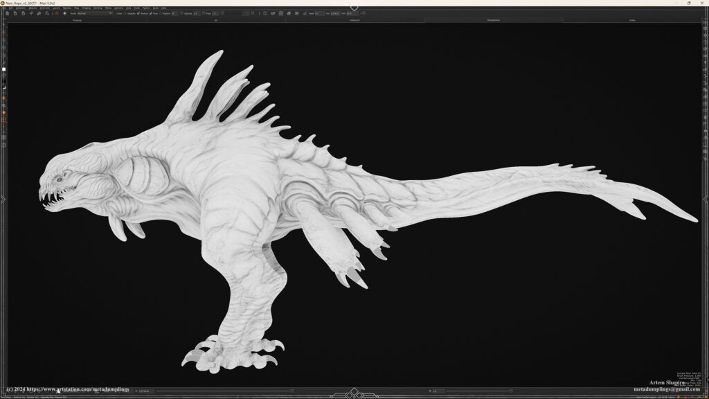
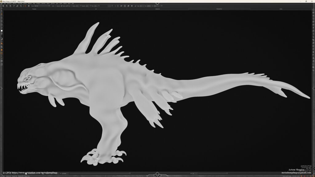
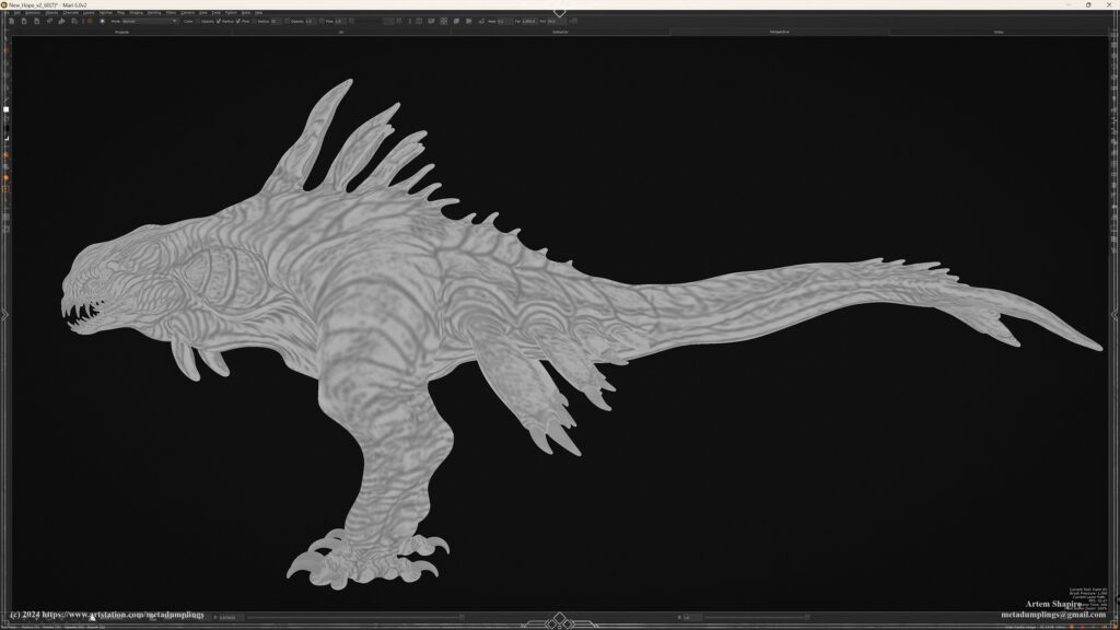
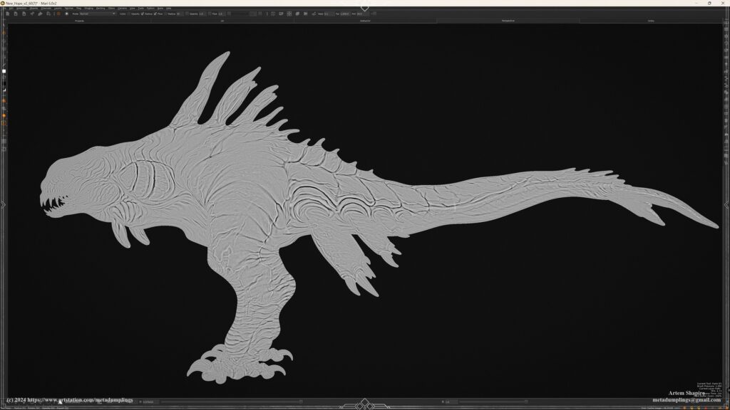
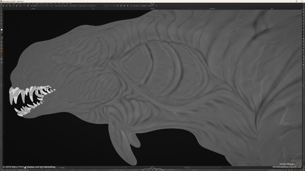
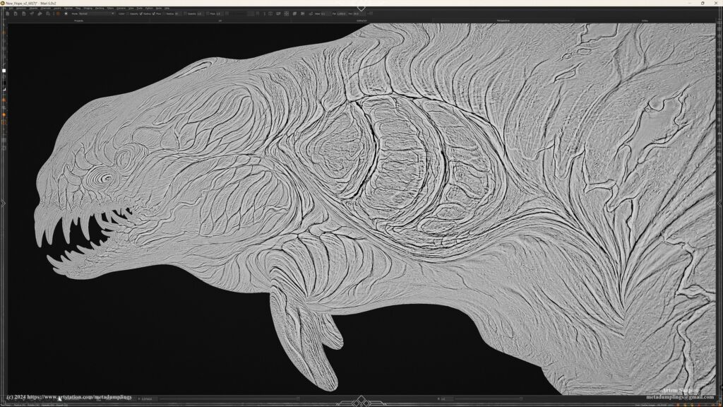
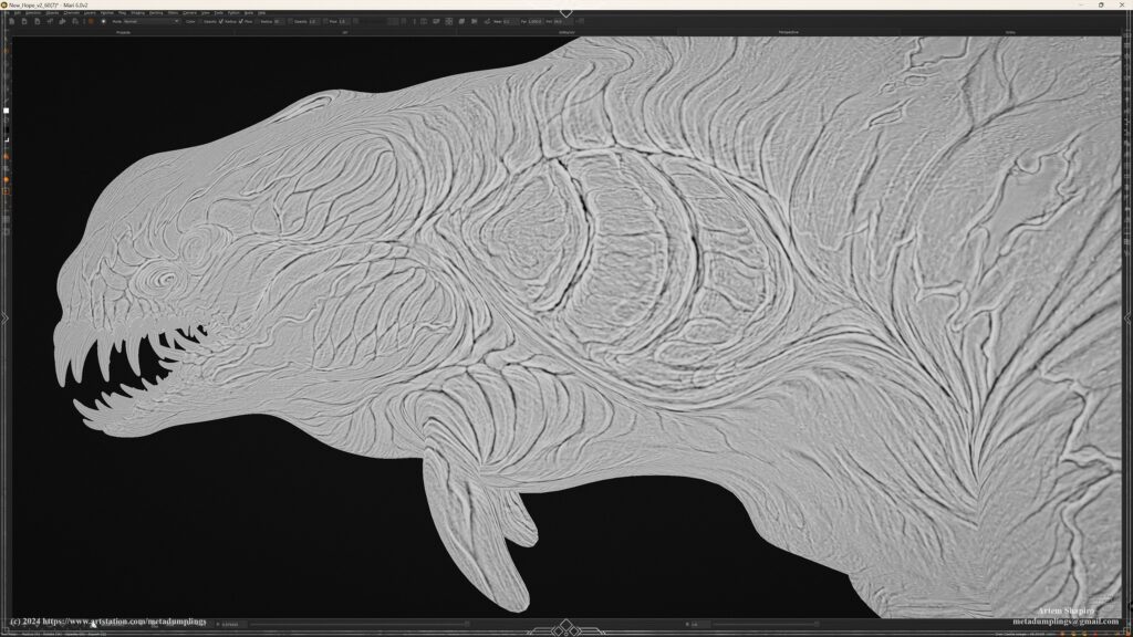
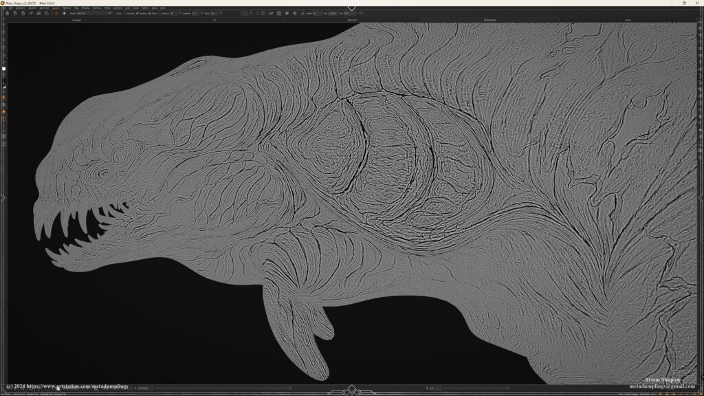
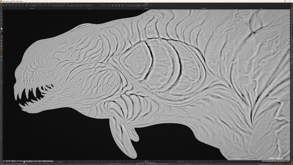
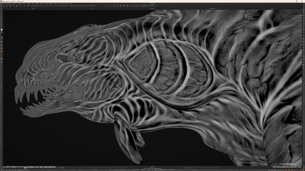
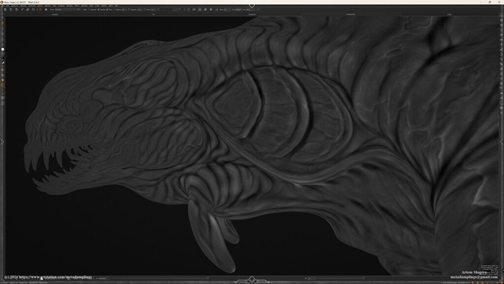
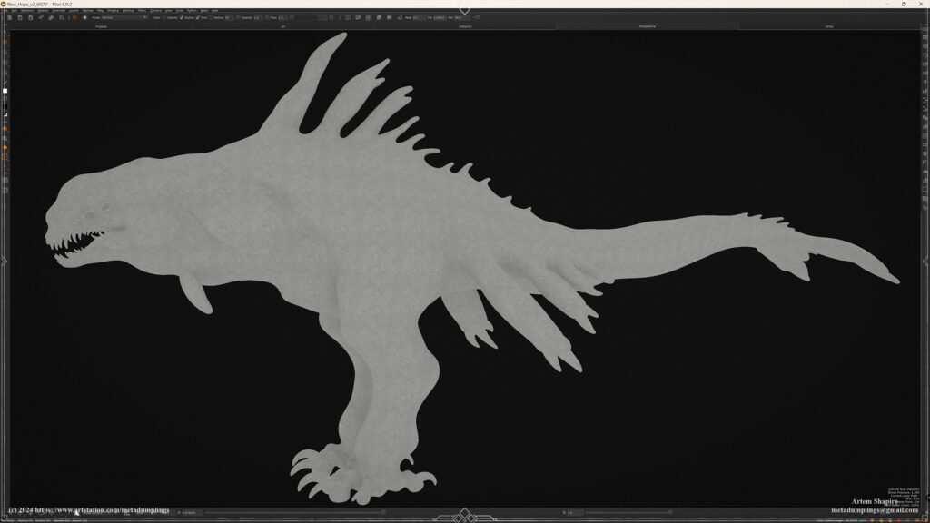
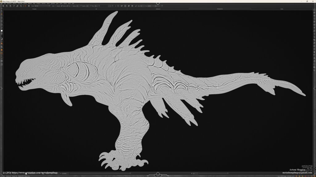
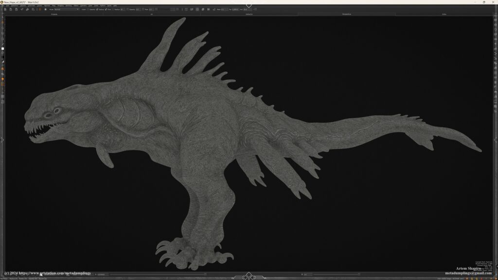
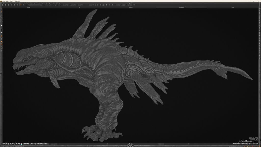
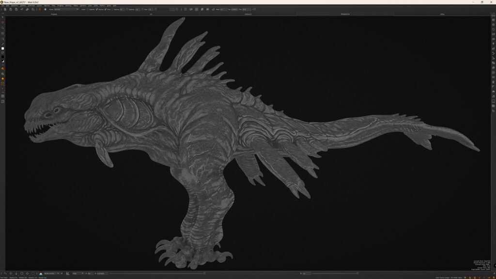
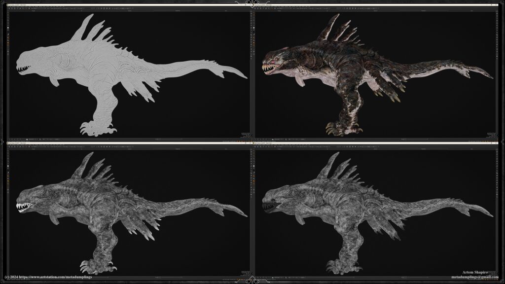
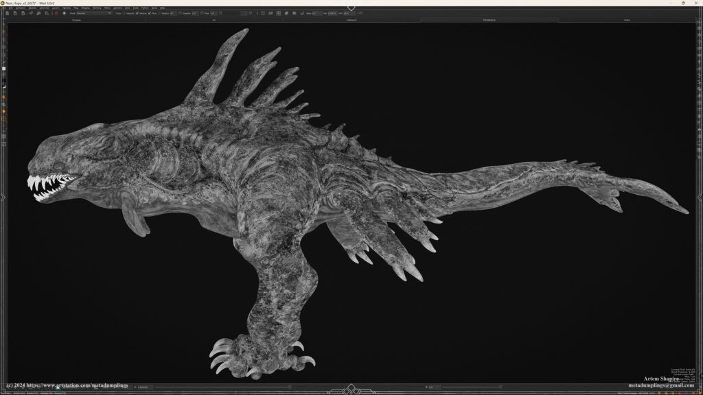
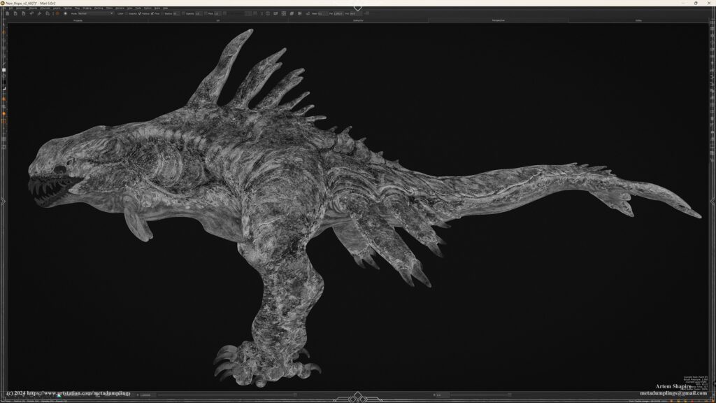
High-Poly
In this breakdown, I’ll outline the main concepts and my workflow during the high-poly modeling stage.
This guide won’t go into tool mechanics, brushes, or software specifics; instead, it focuses on the logical sequence I follow to prototype and develop the model at this stage.
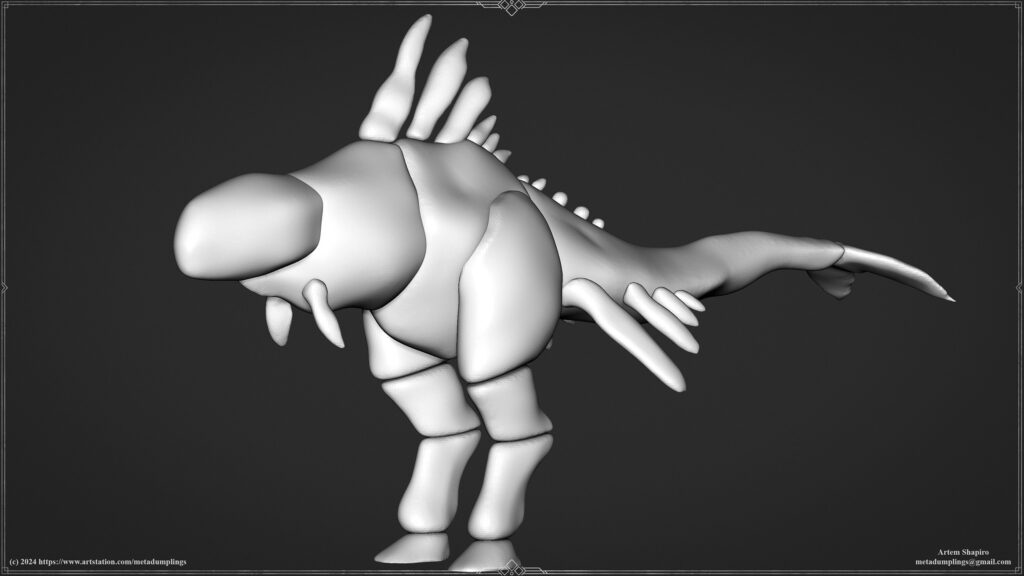
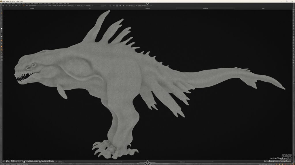
Key Stages
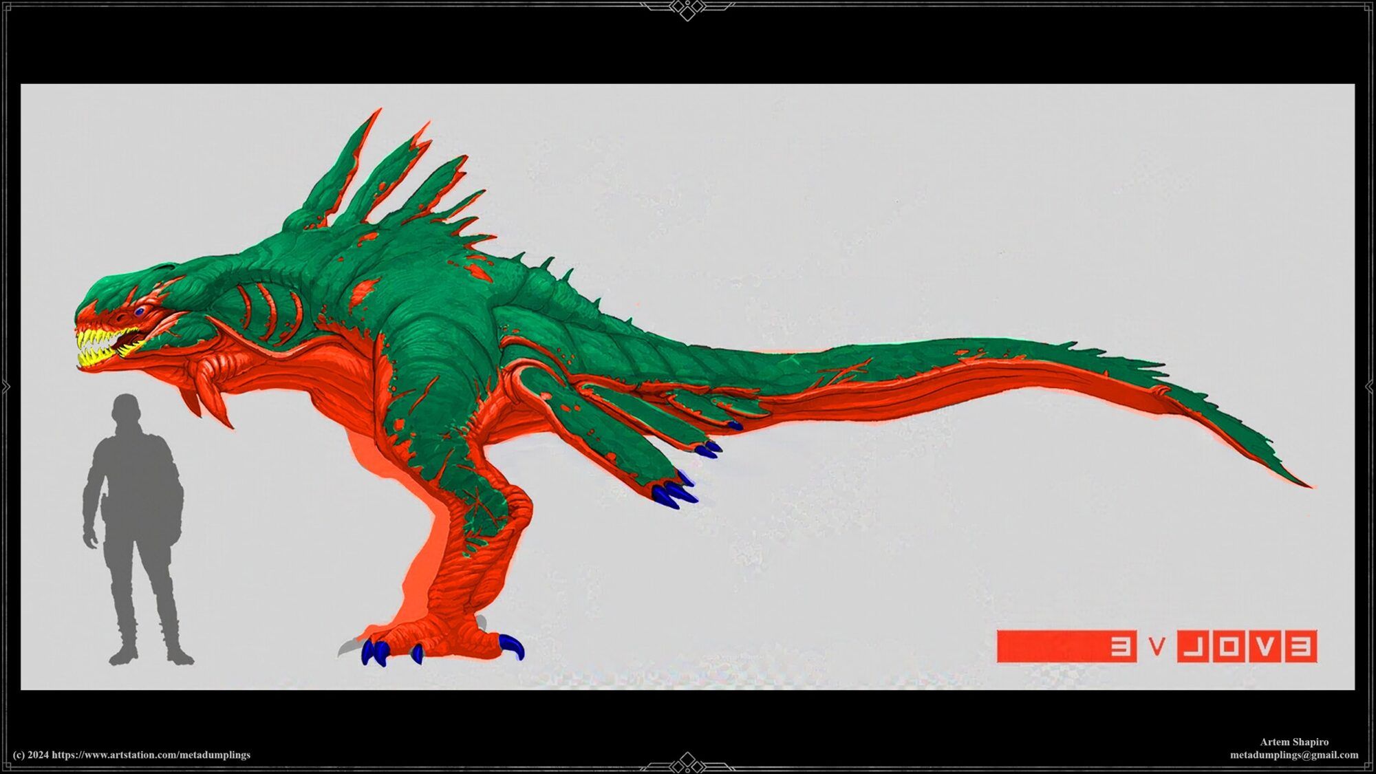
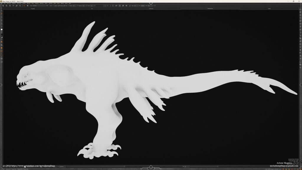
- Primary Forms: The foundational shapes and silhouettes of the model are created using simple primitives. This stage is crucial for setting the proportions and overall feel of the character.
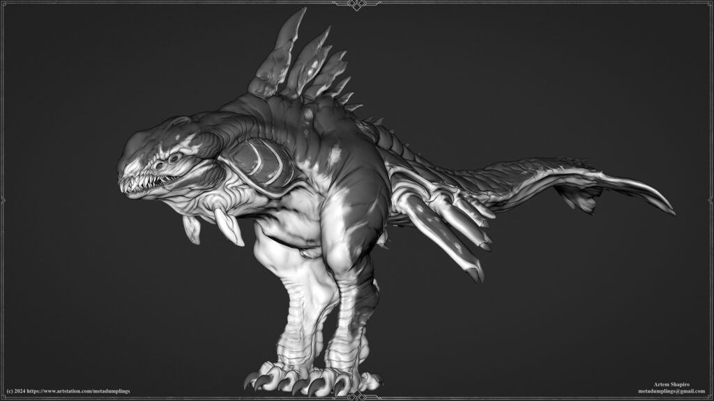
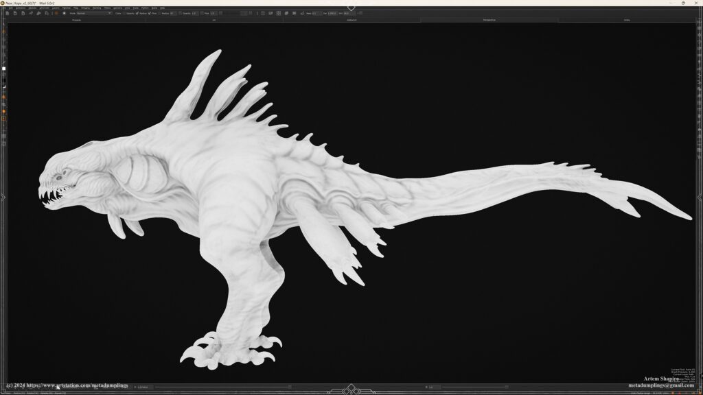
- Secondary Forms: Structural details such as muscle groups, joints, and specific body parts (teeth, claws, eyes) are added. Polypaint is used to visualize the model’s tonal areas, considering weight, gravity, and how skin sags or folds.
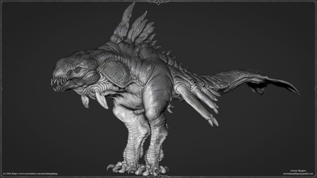
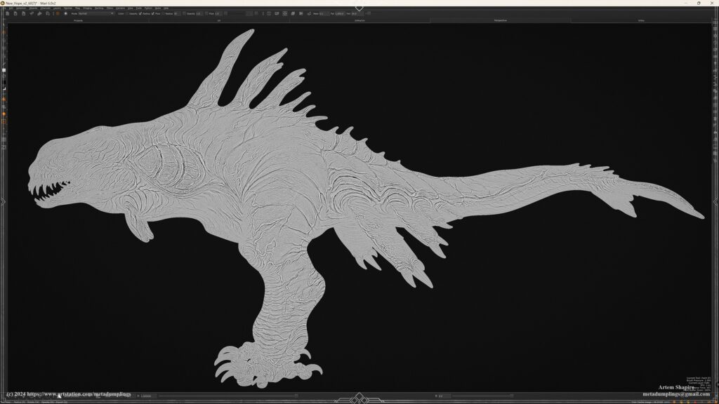
- Tertiary Forms: These finer details refine the model, adding wrinkles, folds, and other micro-details that give the model a more realistic appearance.
- Surface Detailing: The final layer of detailing includes skin pores, tiny surface irregularities, bumps, and scratches, ensuring the model feels complete and highly detailed.
Key Recommendations
- Start with basic forms and build complexity gradually.
- Regularly rotate the model and make changes as needed.
- Compare with the concept and refine the model continuously.
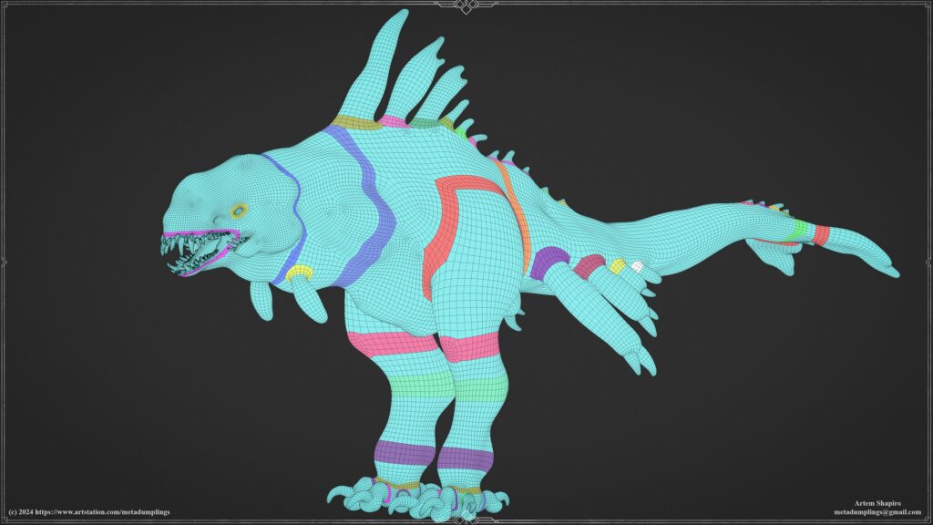
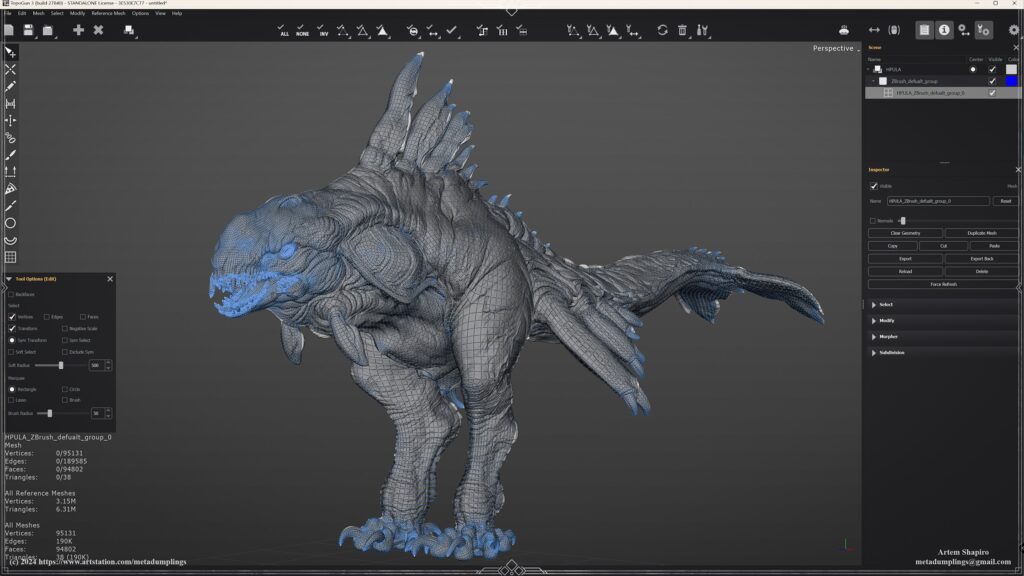
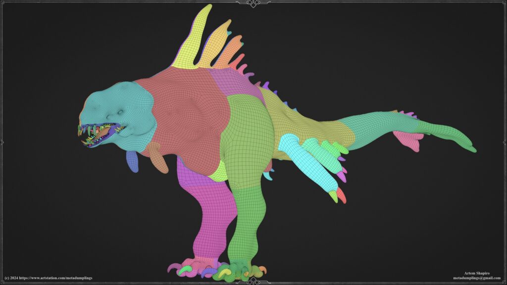
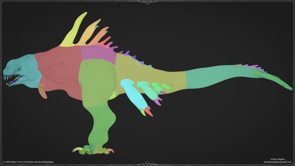
Retopology
For retopology, I prefer using TopoGun — a convenient, functional, and powerful software that meets my needs perfectly. When creating a low-poly model, I follow specific principles, as illustrated in the color-coded guidelines in the accompanying image.
Before beginning retopology, I place poly loops in key areas where deformations and twists are expected, such as at limb joints, around the mouth, and the eyes.
Initially, I focus on the body topology by placing necessary poly loops in deformation zones, leaving small gaps around these areas to help preserve them for potential animation.
Next, I fill in the remaining areas, adhering to two main rules:
- Direction of movement — ensuring polygons follow the shape and intended motion of the model.
- Polygon density — maintaining a balanced distribution of polygons to avoid distortions during deformation.
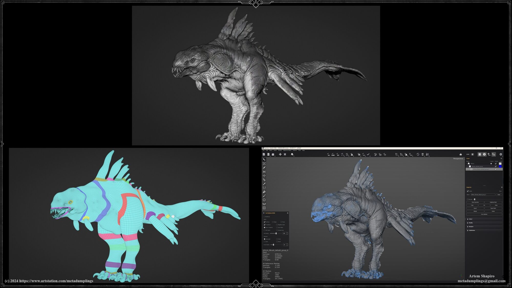
Once the body framework is complete, I move on to the topology of the head and feet, where a higher polygon density is required compared to the body.
The goal of this topology is to create a foundation suitable for both High-Poly and Low-Poly workflows, simplifying the process and making the model versatile for different levels of detail.
The Low-Poly model is created during the secondary forms phase and then used as the first subdivision level for High-Poly modeling.
UV Mapping
For UV mapping, I use RizomUV, with a structured layout for tiles:
- UV tiles 1001 to 1010 for the left side of the model.
- UV tiles 1011 to 1020 for the right side.
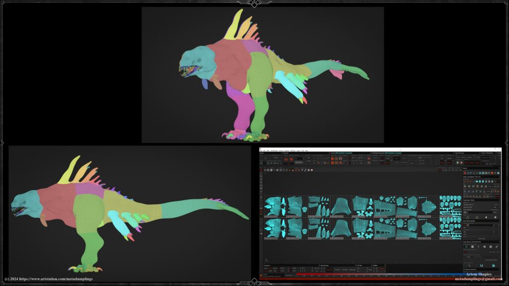
These tiles are identical but offset by 10, which helps maintain order. As seen in the images from RizomUV and ZBrush, I try to align UV shells with the geometry’s direction to maintain consistency in mapping.
Another essential factor is maintaining consistent texel density. This provides a stable texture display, especially when using tiled textures and triplanar mapping.
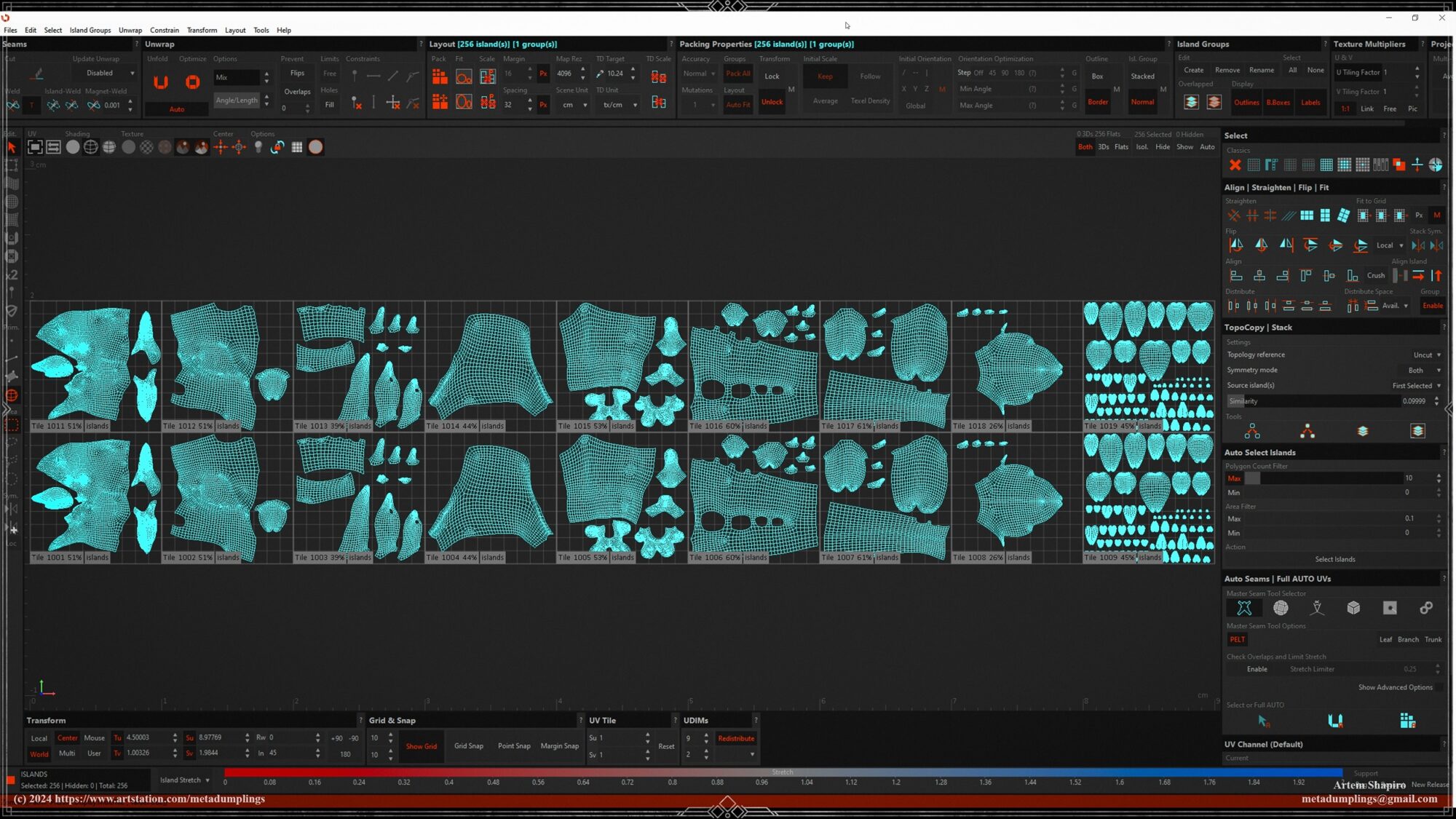
This way, texture directions and scales remain consistent across the model, eliminating the need to adjust tiled textures for each UV shell. The model is packed from left to right, from head to tail, so the UV layout resembles a flat reflection of the geometry from ZBrush.
This approach to mapping is convenient, allowing you to work with the entire model without the need to adjust textures for each UV shell individually.
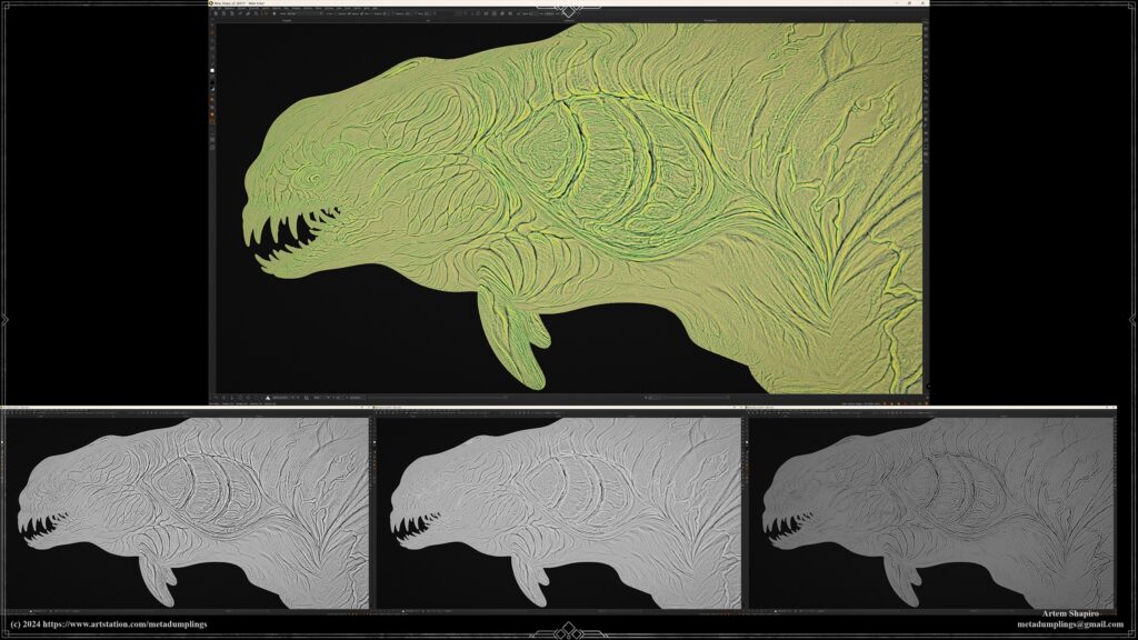
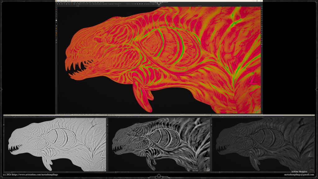
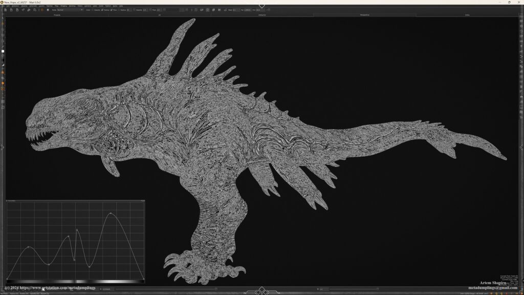
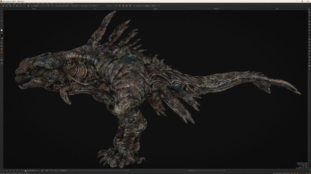
Baking
In this section, I’ll cover several unique aspects of my baking process, particularly focusing on the use of three types of Ambient Occlusion (AO) and Curvature maps, as well as displacement extraction in Substance Designer to create two mask sets for texturing.
This part might be particularly interesting as I’ll explain why I use three Ambient Occlusions, three Curvatures, and displacement data extracted into two RGB masks across three channels each.
While I won’t discuss the standard baking maps like normals, thickness, or height, I will focus on techniques less commonly used in typical workflows.
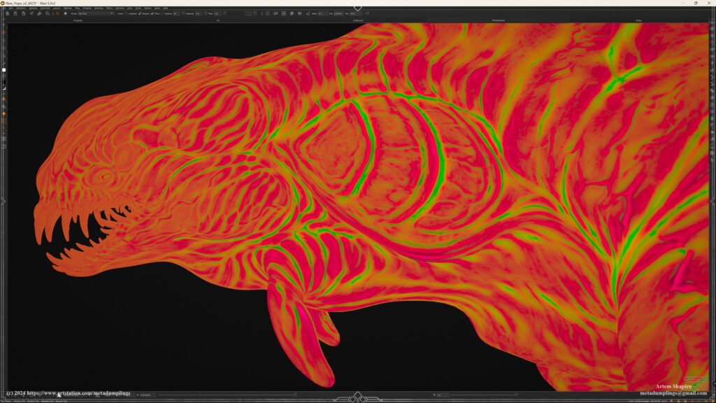
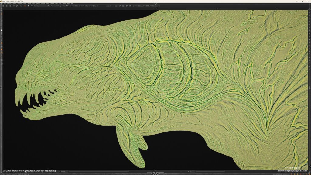
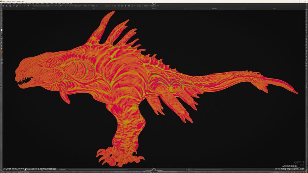
Ambient Occlusion & Curvature Maps
- Low-Poly AO: Represents primary forms.
- Middle-Poly AO: Enhances muscle groups and joints (secondary forms).
- High-Poly AO: Focuses on fine details like wrinkles and small surface details (tertiary forms).
Mask Sets
Displacement and result of extracts Mask Set 1 and Mask Set 2.
Mask Set 1: Displacement extraction for cavity information.
Mask Set 2: Displacement extraction for larger shapes and volumes.
The primary purpose of these maps is similar to the approach used in High-Poly modeling — working from general to specific.
Imagine applying this concept to texturing, with each map representing primary, secondary and tertiary forms, and surface detail.
Here’s a breakdown:
Low-Poly AO and Curvature (Primary Forms)
The Low-Poly AO and Curvature maps function as primary forms.
These maps allow for subtle gradient fills and blending modes without excessive detail, enabling manipulation of base colors based on the primary shapes.
Middle-Poly AO and Curvature (Secondary Forms)
The Middle-Poly AO and Curvature maps represent secondary forms, including muscle groups, joints, and limb sections.
With these maps, finer details like muscle groups, deformation folds, and form transitions can be enhanced, providing additional color variation at a medium level of detail in the texturing process.
High-Poly AO and Curvature (Tertiary Forms)
High-Poly AO and Curvature maps focus on small details, adding a sense of completion to the model. This includes wrinkle direction, expressive lines, fold definition, and material properties (e.g., making skin look like skin, or bone look like bone).
Micro-details in these maps allow for more nuanced control over color variations and tertiary-level details.
This layered approach offers a rich, controlled result by providing three sets of maps for Ambient Occlusion and Curvature, each suited to a different level of detail.

Mask Sets from Displacement Extraction
For Mask Set 1 and Mask Set 2, displacement information is extracted and split into RGB channels. Here’s a simple workflow using Photoshop:
Open the displacement map and duplicate it as a layer. Experiment with contrast, levels, gradients, curves, inversion, blur, High Pass, and Smart Sharpen filters.
After achieving different versions, create a new file and place each version in a separate RGB channel.
This results in a multicolored mask that’s convenient to use since you can select the desired channel directly.
Mask Set 1: Displacement extraction for cavity information, with varied intensity, sharpness, and inversion settings for capturing curvature and cavity details.
Mask Set 2: Displacement extraction for larger shapes and volumes, capturing broader forms, heights, and sharpness with inverted information.
This workflow allows you to use a single texture file and easily select the required channel based on RGB masks, offering flexibility and control in texturing while maintaining a streamlined process.
I will try to briefly describe the work of some of these masks during the texturing process.

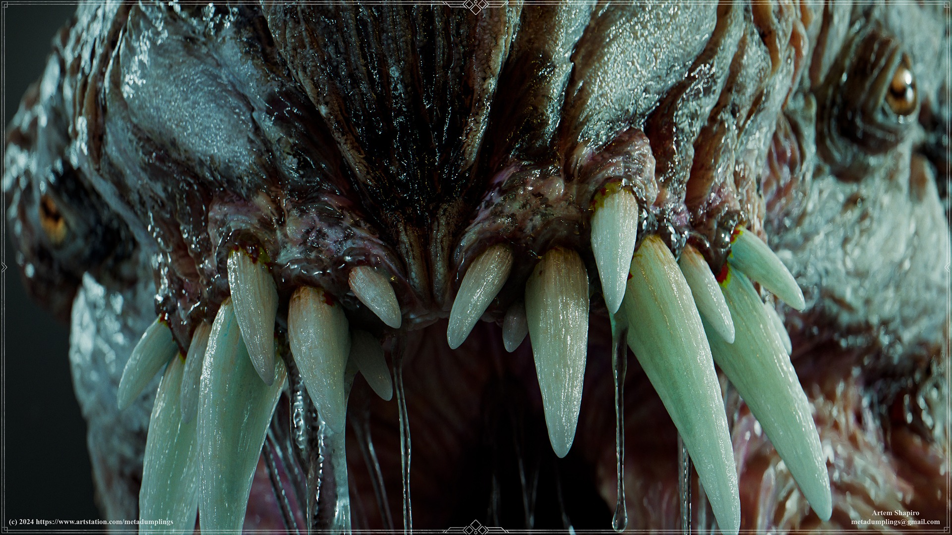
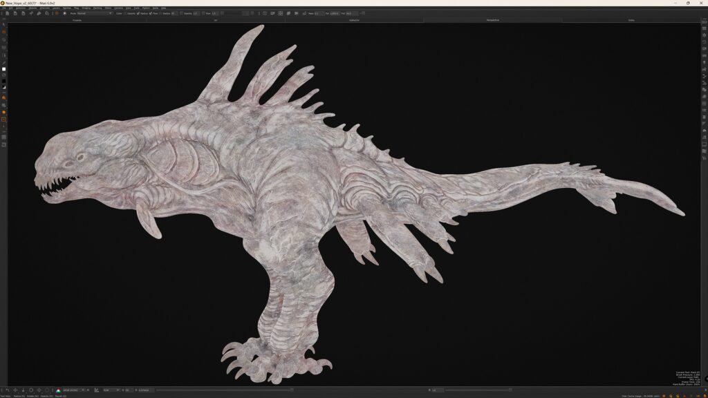
Texturing
In this section, I’ll showcase a few of the masks and maps I prepared in the previous section to demonstrate how they work.
This is probably the most exciting step for many, as I’ll walk you through a layer-by-layer breakdown of the fundamental set of textures I use as a foundation for the rest of the work.
Some people were particularly interested in the claws section, so I’ll include a brief explanation of that as well.
Layers
The first and most important layer doesn’t involve color. Instead, I use a tiled marble texture as the base and adjust it to the desired tone using HSL, HSV, Levels, and other settings.
Why marble? Marble has a unique and intriguing texture that can be applied to almost anything—organic or inorganic, such as metal. Let’s go through the layers step-by-step.
As I mentioned earlier, I follow the general-to-specific approach. For the next couple of layers, I use the Low-Poly AO map to add color depth for lighter tones and its inverted version for darker tones.
Now, for the most interesting part, I will apply a mask from Mask_Set 2, specifically the red channel. At first glance, it doesn’t look particularly exciting.
However, let’s look at the result after tweaking the curve settings into a sinusoidal shape. The mask transforms into something much more interesting, and this concept can be applied to any mask.
There’s no strictly “right” or “wrong” configuration—it’s up to you to decide how your mask should look. I’ll also include a layer-by-layer breakdown of how the textures evolve.


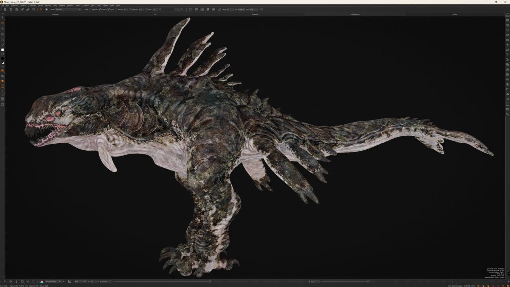
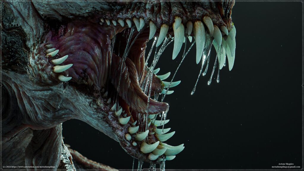
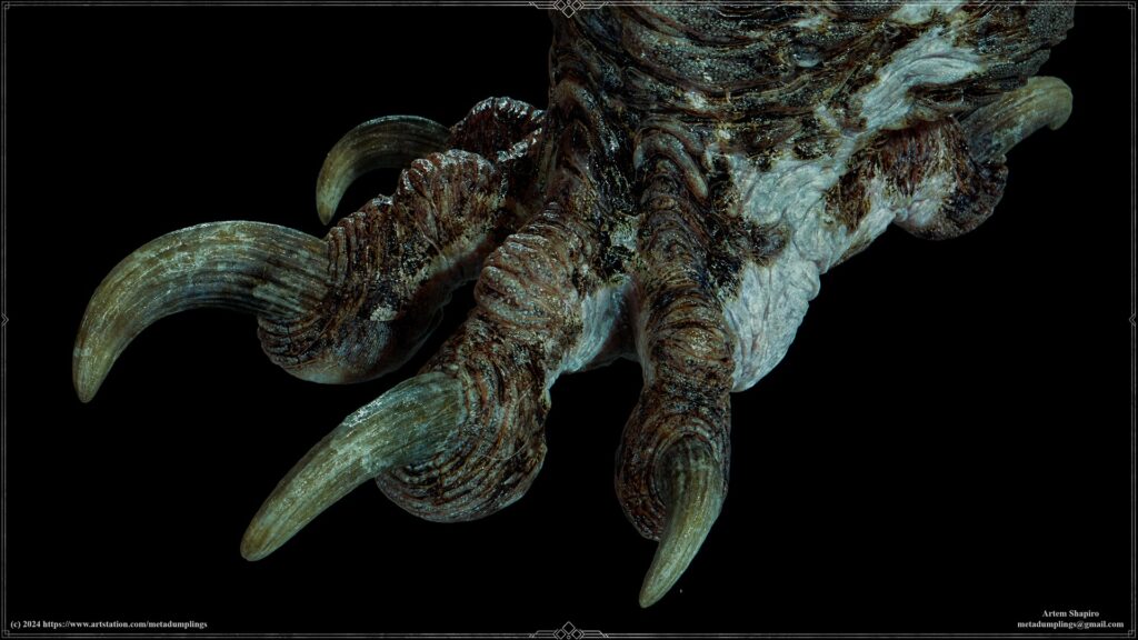
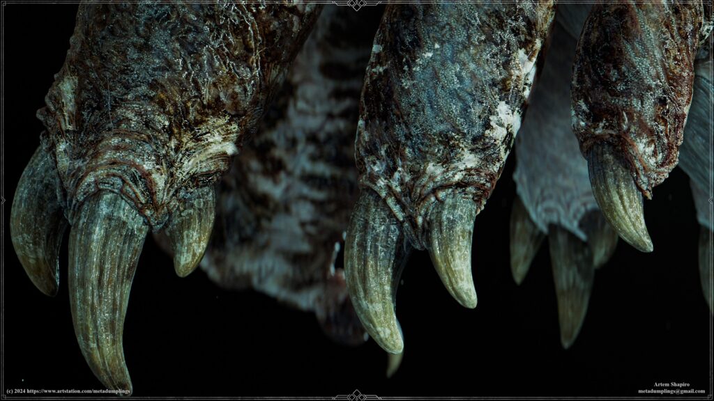
Claws
This part is straightforward. I used a photo texture mapped to the claws’ UV layout. Beyond that, there’s no special magic—the same process I demonstrated earlier applies here as well.
Pro Tip: Use Real-Life References
A simple yet often overlooked tip is to rely on real-world references, not just for texturing, but also for design, High-Poly modeling, and more.
Many people miss this opportunity and instead use references from other digital works, which can unintentionally lead to adopting both good and bad practices. Be mindful of this!
Mask Application Example
Here’s an example of how I use a mask. Initially, the raw mask doesn’t reveal anything particularly interesting.
However, by adjusting the curve settings, I can transform the mask into something visually unique and highly usable for texturing.
Creating Roughness Textures
Let me share how I approach creating roughness textures. I always start with a base for roughness using Curvature, Cavity, and Displacement maps.
By adjusting contrast, curves, and levels, I refine these maps into a solid foundation for further development.
In the next layers, I add a black-and-white version of the Diffuse Color with different blending modes. Using masks, I create areas with varying levels of detail.
By tweaking Levels and contrast, I set the desired roughness values, which introduce variation. The final layer typically includes tiled elements, perfection patterns, and dirt.
This workflow allows me to achieve a flexible and dynamic approach to roughness texturing. I follow the same process for all types of textures, whether it’s color, metalness, or other parameters.
Separating Channels for better control
I always separate channels to make working with color, roughness, metalness, and other properties more manageable. For example, I don’t like having all parameters combined in a single layer in Substance Painter.
Instead, I work with separate layers, which provides greater control and predictability in the results.
Animation
When it comes to animation, you might think I’m crazy, but the entire idle animation was created using key shapes in Blender. Let me share a few examples of how I approached this process.
I’ll use eye animation as an example, as even this small movement involved quite a few key shapes.
The simplest part, opening and closing the eye, was handled with just 1–2 key shapes:
One for the actual opening and closing movement and another for the final fixed position.
To create the animation for opening and closing the eye, including the third eyelid, I had to record five different positions.
Each object had its own key shape, and to synchronize them, I used drivers in Blender. This allowed me to link the entire sequence to one action, which then triggered the whole setup.
After that, I adjusted the transition curves to ensure the transformations were smooth and precise.
Yes, it sounds a bit crazy, but it was also a lot of fun.
The same approach was used for all other elements, with synchronization handled through drivers and fine-tuned using offset and curve graphs. Some might question the sanity of this method, but I genuinely enjoyed the process.
It also gave me a deep understanding of how to work with blendshapes and keyshapes.
Rendering
For the presentation, I used Blender Cycles. The materials were kept fairly simple, as the focus was primarily on the textures.
Lighting was achieved using a studio HDRI setup with three light sources:
Two rim lights and one warm fill light, along with some fog for added atmosphere.
I also ended up using around 30 cameras, mainly for experimenting and comparing interesting angles. The HDRI intensity was typically set between 0.1 and 0.5 out of 1.
As for render settings, I took the easy route and maxed out everything for the best quality.
In the compositor, I created a preset for quick color corrections and additional adjustments. These included tweaks like temperature, tint, and bloom.
Conclusion
Project Chimera was a fascinating journey, involving careful analysis, iteration, and refinement at every stage. From modeling to texturing, animation, and rendering, each phase contributed to the final result.
I hope this breakdown offers valuable insights into my workflow. I would like to thank my friend Gael Kerchenbaum.
For further details, check out my ArtStation page: Project Chimera and Patreon Collection.
Read more articles
You might also like these articles.