Caffè la mattina


Introduction
My name is Carmen García, and I am a self-taught 3D Artist from Spain. I specialize in creating realistic props, hard surface models and environments.
Goal
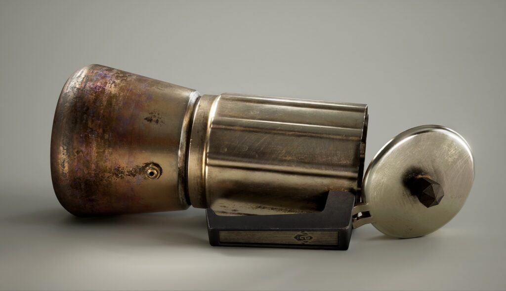
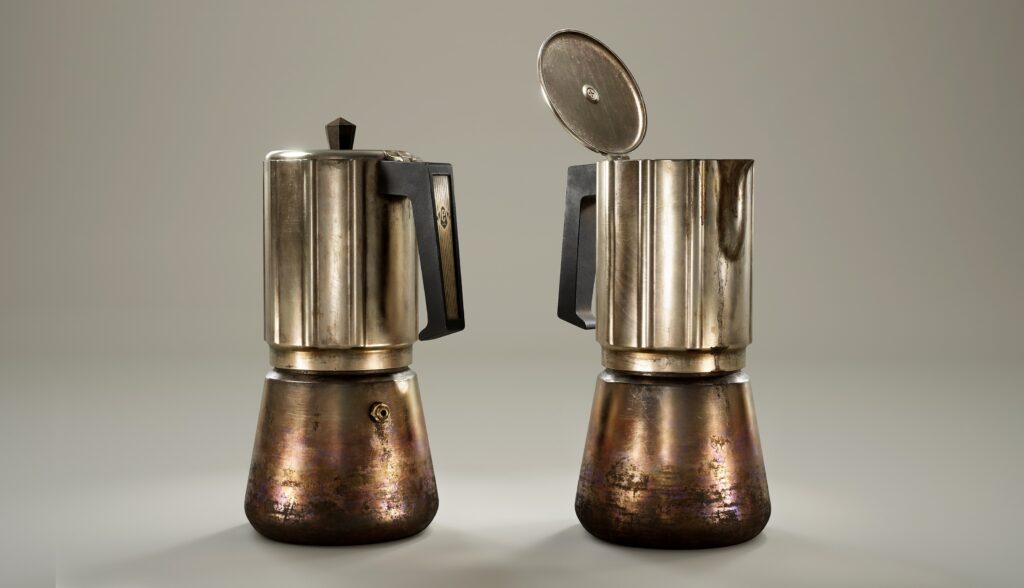
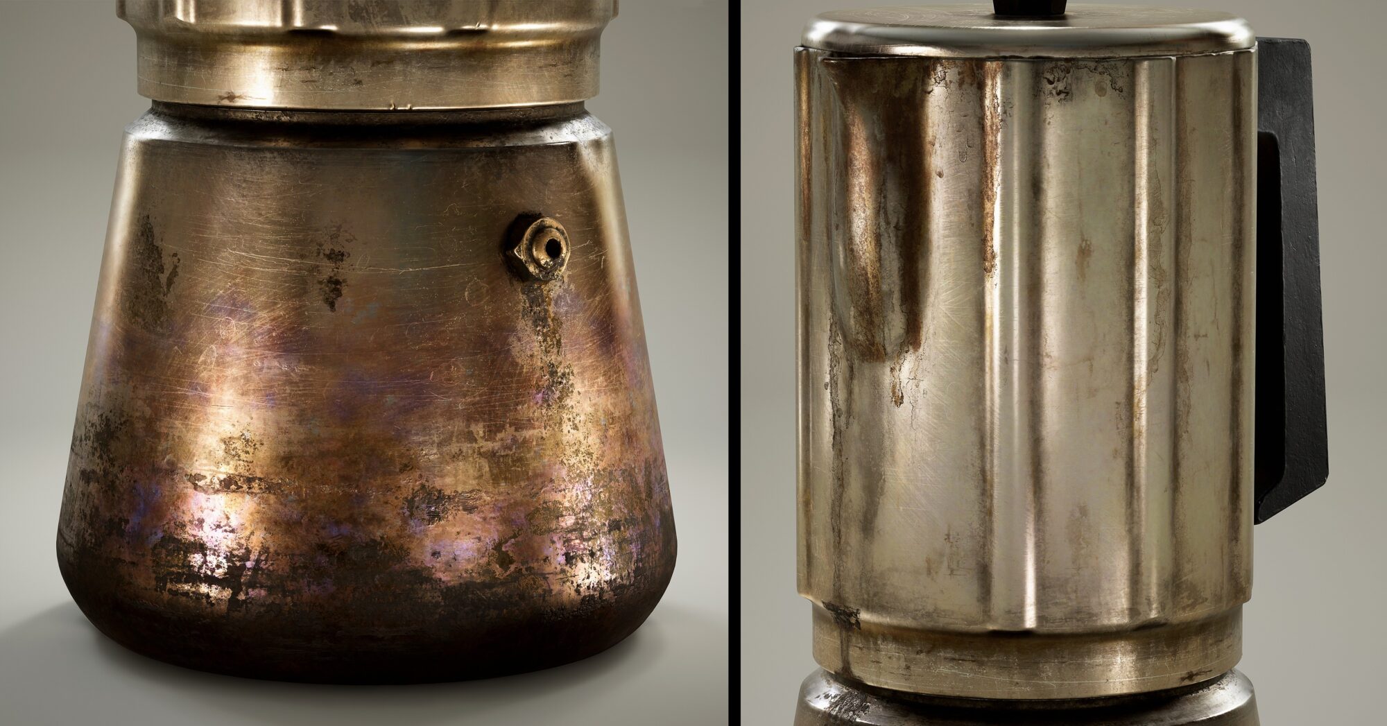
In this project, I wanted to push myself during the texturing phase and try to convey the use and aging of the object through its materials, emphasizing wear and tear.
I aimed for as much texel density as possible to work with small details, so I chose to use a UDIM workflow.
I also used this project to learn more about Nanite and the new Substrate materials in Unreal Engine.
Tools
- 3ds Max for blocking.
- ZBrush for details, high-poly, and mid-poly (as the final asset).
- Maya for UVs.
- Substance Painter for texturing.
- Unreal Engine for final shaders, detail maps, lighting, and rendering.
- Photoshop for render touch-ups.
- PureRef for reference organization.
Reference & Inspiration
I think it all started when I saw the artwork Pot by John Lee. I really liked how the texture of something as simple as a pot could look so interesting, so I began searching for similar assets.
Once I decided the asset would be a coffee maker, I started researching different models to create a mix of interesting shapes. I also looked for used or second-hand coffee makers to study the wear patterns of this type of metal.
Searching for references is both nice and interesting because you learn a lot of unexpected details about an object. However, there is a fine line between productive research and getting lost in an endless search, potentially losing sight of your original vision.
If you feel frustrated at this point, let your creativity take over and use it as an opportunity to train your artistic instincts!
When gathering references, it is important to find the correct proportions of the object. I usually browse auction websites since they often have high-resolution images and detailed information.
As I was recreating a very common item, I used the dimensions of my personal coffee maker.
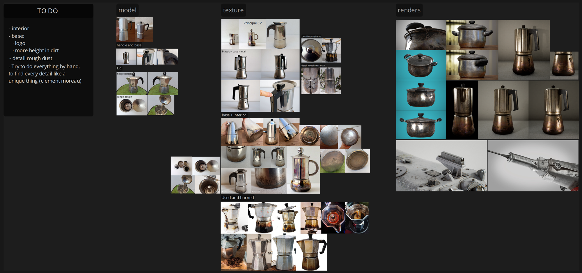
I organized my PureRef board into stages of progression:
- The coffee maker model I wanted, along with the details I planned to sculpt in ZBrush.
- The textures I envisioned for my asset, started from simple details and progressed to more complex ones.
- A comparison of 3D artworks from artists I admire for their texturing skills.
- A “To-Do” list in PureRef, which I updated as I completed the texturing and detailing phases.
Blockout
Blocking out the asset helps you understand the complexity of its shapes and, most importantly, its dimensions.
I started modeling in 3ds Max by creating the simplest and largest parts of the asset with the correct proportions. Once I had the base shape, it was easier to create the smaller components while maintaining proper dimensions.
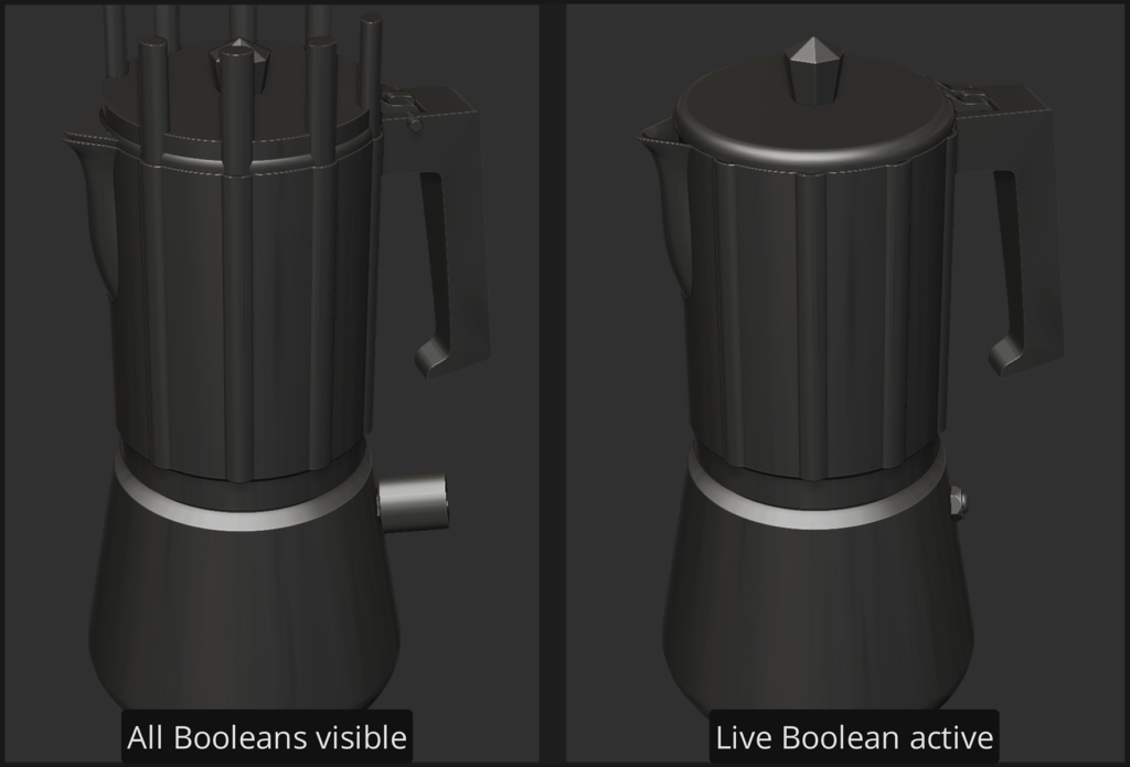
I kept the shapes basic because I planned to refine them using booleans in ZBrush without worrying about topology.
Highpoly
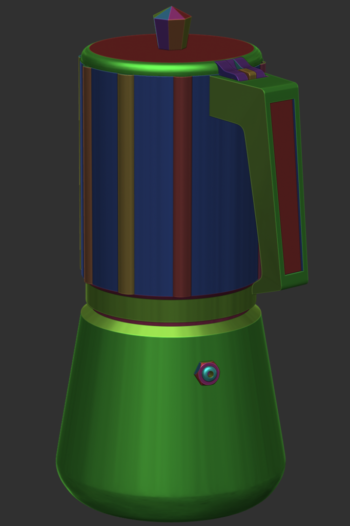
When importing the asset into ZBrush, it is essential to plan and maintain polygroups to streamline your workflow. Polygroups will guide the polishing process to chamfer edges and later assist in generating UVs.
To follow this workflow, I recommend this tutorial by Eugene Petrov.
After finalizing the blocking and booleans, I moved to ZBrush to work with live booleans.
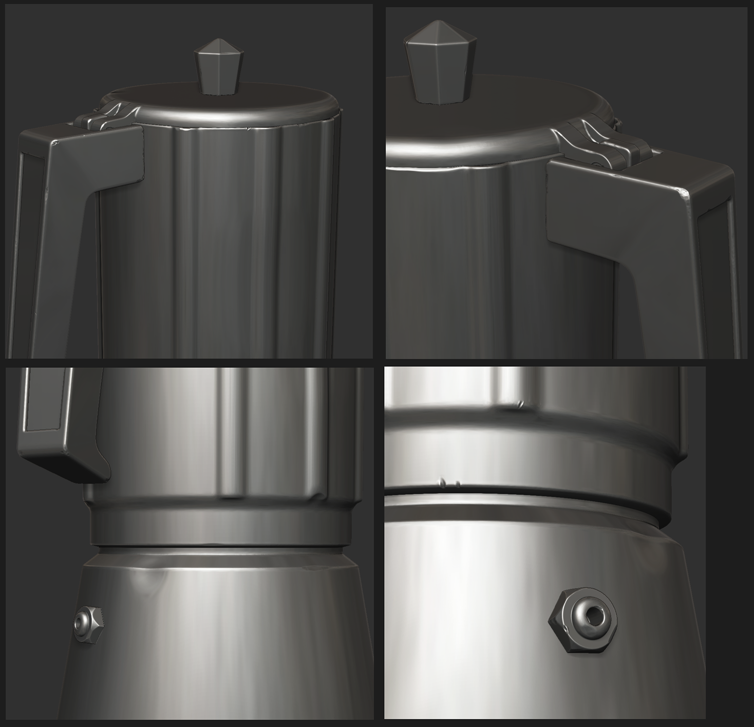
Now, with the asset completed, I Dynameshed the pieces while ensuring I preserved the polygroups. I then polished the surfaces using masks by polygroups to apply different degrees of polish. I also used Morph Target to restore over-polished edges.
My goal was to sculpt a mix of subtle and prominent details, leaving almost no surface untouched since this was a heavily used object.
I always kept lighting in mind, ensuring that the wear and tear would be emphasized by rim lighting.
Midpoly & UVs
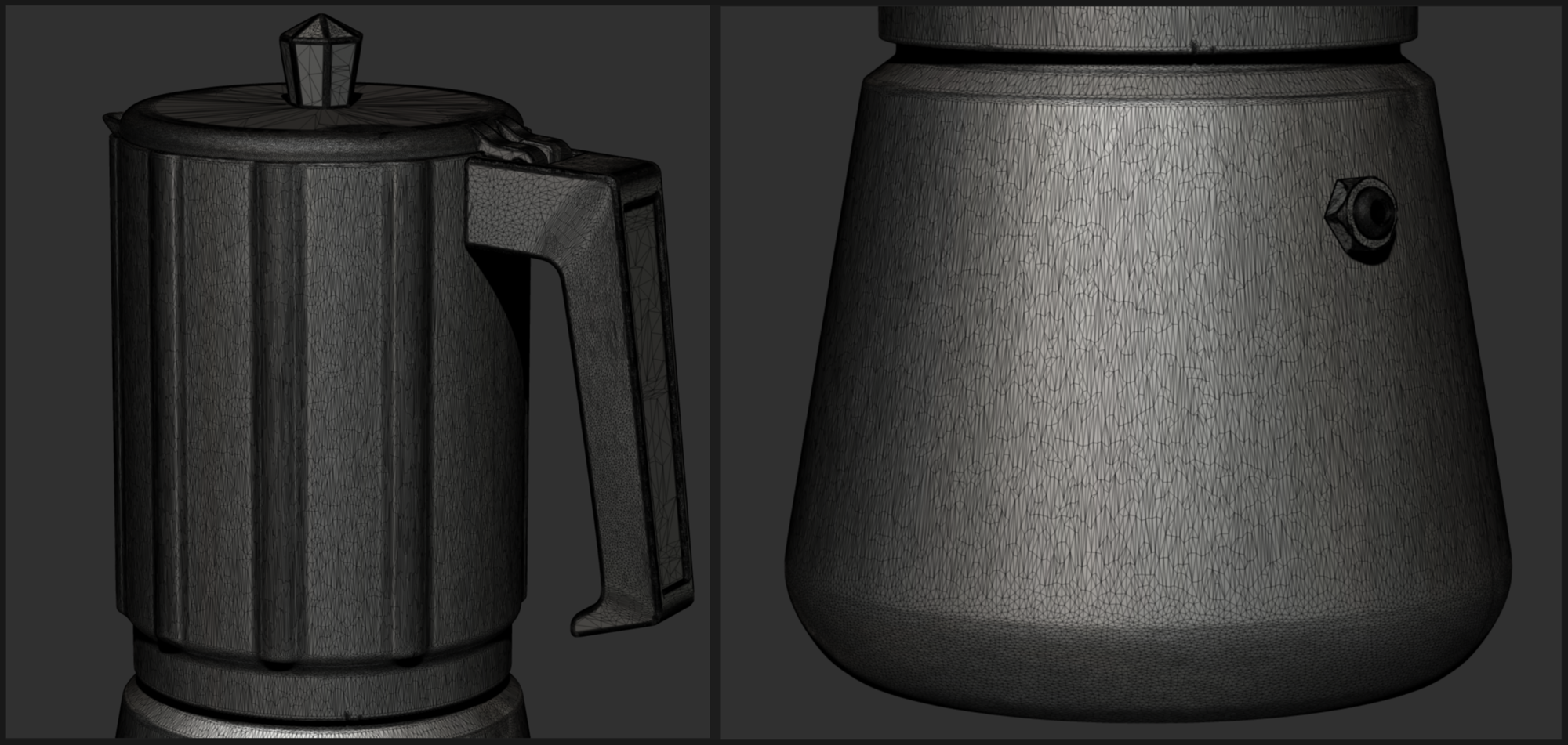
For this project, I did not create a game-ready low-poly model. Instead, I opted for a mid-poly approach by simply decimating my high-poly model.
This process resets your polygroups, so it is best to leave Dynameshing for the last stage. Keeping the polygroups intact simplifies the UV mapping process.
Since UV mapping a decimated object in Maya or 3ds Max can be a nightmare, I chose to generate UVs directly in ZBrush to streamline the workflow.
First of all I merged the polygroups by the UV shells I wanted, then I duplicate the mesh (this is so we save a mesh with all the details to project them later) and applied a Zremesher with the confi guration shown in the image:
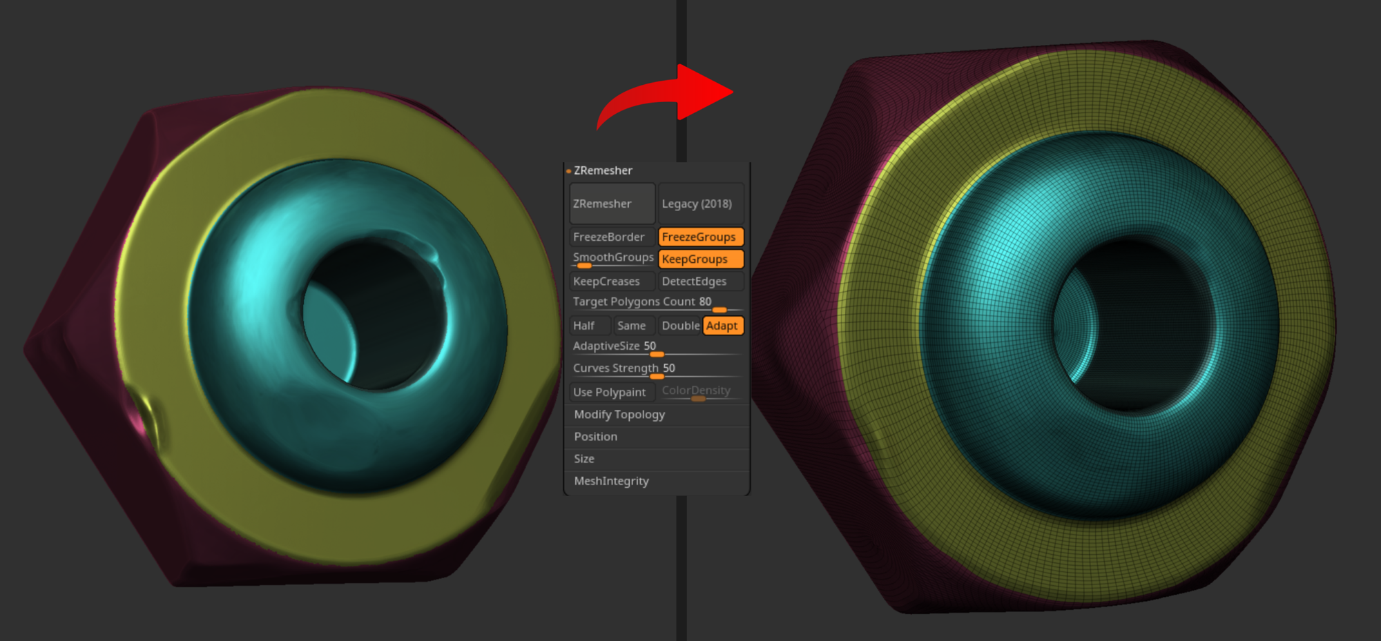
SmoothGroups quantity can be between 0.2/0.8, also FreezeGroups may cause problems with the topology, in some cases I had to apply it and in others I did not use it at all, but I think it helps not to create small polygroups generated by Zremesher.
Apply a small amount of ‘Polish crisp edges’, it will help you identify those small polygroups generated by Zremesher:
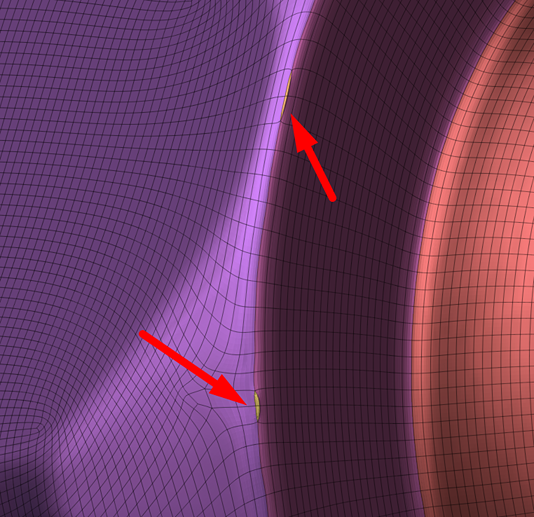
As seen in the image, select the new polygroups (yellow) with the ‘SelectRect’ brush together with the polygroup you want to merge, hide the rest of the polygroups and apply ‘Group visible’ to create a new polygroup.
At this point, you can create your UVs of the zremeshed model with the button Polygroups active, so it will keep them. You can preview the UVs by pressing Flatten.
And finally, because I didn’t like how undetailed the object had become with Zremesher and Polish crisp edges, I subdivided to have again about the same polygons as the non-zremeshed highpoly and applied a ‘Project all’ to recover the details. To end, I decimated the object with the button ‘Keep UVs’ active.
Below is the final decimated Midpoly with UVs generated in ZBrush.
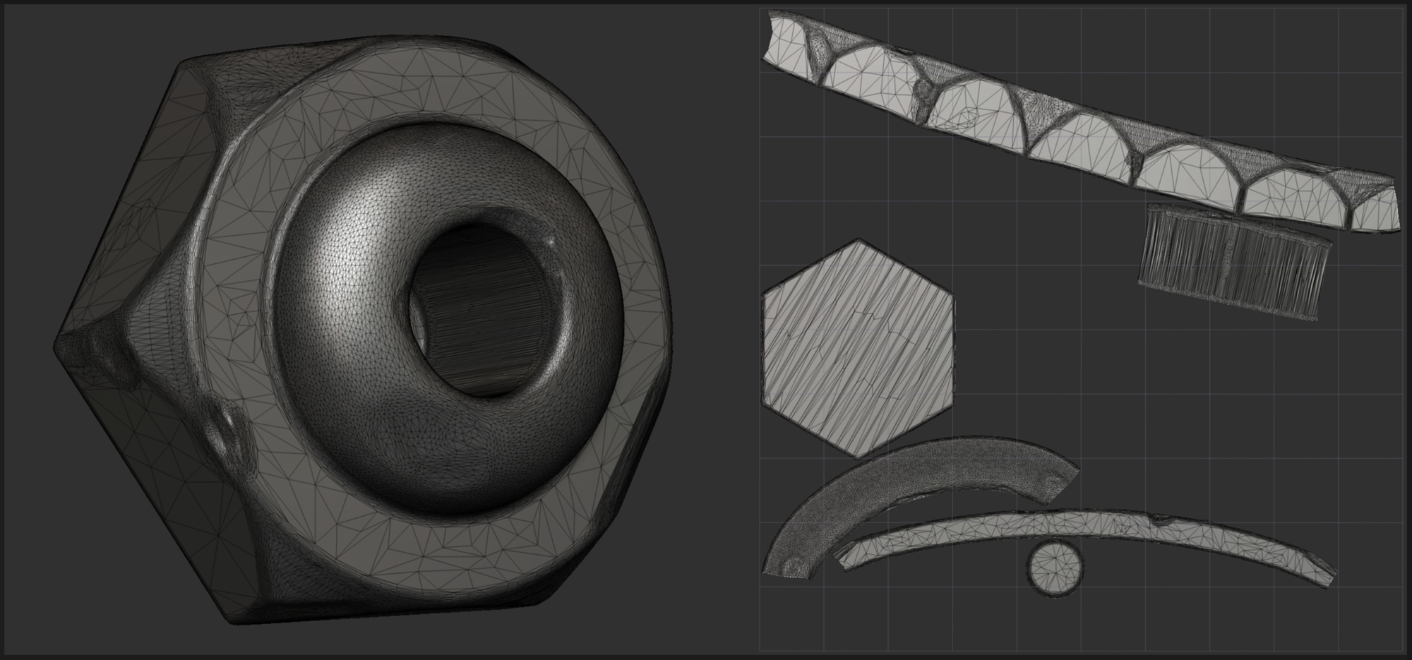
Once I generated the UVs in all the pieces, I jumped into Maya to relax, straight and arrange them.
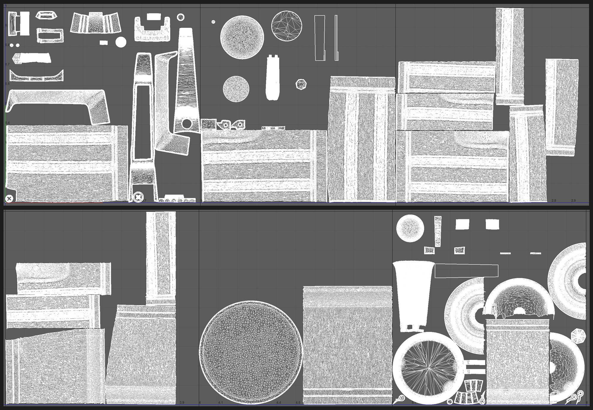
I ended up with 6 horizontal UV tiles for an average of 200px/unit for 4096 map size.
I know this is by far NOT the best UVs packing, the only thing I did by hand was to scale down significantly unimportant UVs of the object to occupy less space and important UVs shells up, but the layout was made by Maya.
Baking
I choose to bake in Marmoset Toolbag since it has become one of the best software to do it with.
In 3ds Max I prepared the two versions of the asset for Marmoset Toolbag: I imported the Midpoly with UVs and the Highpoly to center them in coordinates 0,0,0 and renamed the objects with the suffixes _high and _low.
I have also created a material for each UDIM so that everything is well organized in Marmoset.
In order to keep this article short as possible I recommend you check out this blog post made by MykhailykArt, he explains to great detail how this process works.
Texturing
Texturing is part of the process I enjoy the most, and for this project, I was highly motivated to start, as I had been preparing a very high texel density!
To start the project I chose the Specular Glossiness template with a document resolution of 4096, and since I am doing a UDIM workflow I checked the UV Tile workflow in combination with ‘Preserve UV tile layout’ per material and ‘enable painting across tiles’.
Once I imported the mid poly and the baked maps I went to toggle the display and shader settings:
I activated the color profile using ACES_UE5_Log, which matches the colors as accurately as possible to Unreal Engine 5 (I think new versions of Substance Painter works differently), leaving tone mapping as linear and activated Temporal anti_aliasing with 64 accumulations.
Also in shader settings, I set the quality to ultra as it is recommended to raise it because it has a significant impact on the glossiness and reflections, but maybe you need to lower it in the future if your project starts to slow down.

As for the environment map, I first used Tomoco Studio as always, it helps you see the real color of the texture because it is not influenced by any colored lighting source.
But when I created a scene in Unreal Engine where I was going to render the asset, I started to set up the lighting and wanted to find an HDR map that would provide some kind of natural light.
I ended up with ‘Artist workshop’ and wanted to transfer the same light color to Substance Painter as I needed it to be as similar as possible to Unreal Engine.
To start texturing I go from large/basic materials to medium details and to fine & micro details.
For the micro details it is best to know first your final renders so you can pay extra attention to those visible areas.
My key points for texturing this project were the following:
- The base material of the metal and plastic, including color, gloss, grunge and some height variation for the whole asset as an initial point.
- Specification on every part of the asset: the base of the coffee maker was more used and worn, and the upper part was going to have different grunges and coffee stains. The same goes for the lid, the big screw and the plastic!
- Again some general grunges to combine all the parts of the asset.
- In Unreal Engine I made some shaders with detail glossiness and normal maps for extra detail, apart from setting good lighting.
I started the base metallic material with the main diff use, specular and gloss parameters to get a simple metal, from there I applied the Matfi nish rough filter and a cloud map to create a little variation in the surface with the height map.
I went for the color/specular variation using maps that were not too noisy, with soft greyscales and some areas a little darker or lighter to get some contrast.
I also used the map fractal sum base colored, which I think helps to get a more believable metallic color.
And to end with the basic material, I used the curve and ambient occlusion maps to give some depth and extra grunge details to the asset.
Now, with the basics achieved, it was time to get serious about the medium details, starting with the part of the object that I was most looking forward to, the base of the coffee maker.
First, I started doing a mask I was going to use as an anchor point for the generation of the vivid colors that the metal has, the result of being highly used in the fire to produce the coffee.
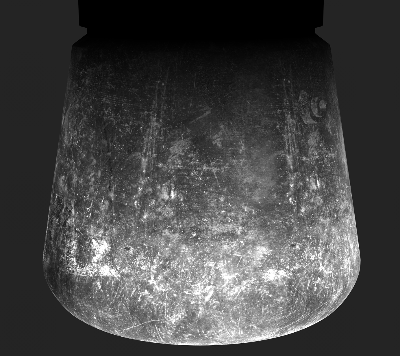
Then I created different layers with some grunge maps and filters to get the specular variation and also some layers with gloss variation too.
I think it is important to note that the better you learn how to merge different grunge or dirt maps together, the more realistic your material is going to look.
Feel free to use many layers with masks, filters, levels and anchor points, and customize some details by hand painting.
However, be careful not to overload Substance Painter with all these steps!
For the grunge, as mentioned before, I mixed different maps, organizing them in folders and using masks and gradients to merge the different types of maps with their respective specular and glossiness.
In this video you can see the different layers of grunge maps I applied in the upper part of the coffee maker:
Now it is time for big and medium spots of coffee stains which I generated the same way as the previous grunge maps I made.
I downloaded images from Textures.com and Megascans and made different alphas in Photoshop to use them as stencils.
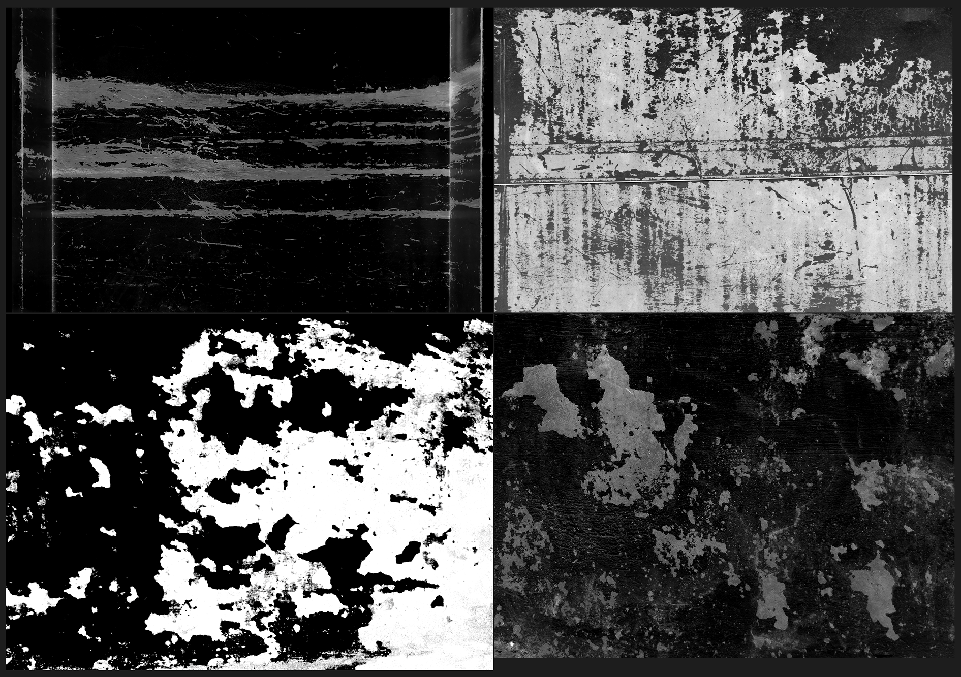
Once I painted the stains I made the color variation, some hand-painted adjustments and added the same way darkest stains which would contain height information using anchor points.
As you can see, it is a process of mixing and blending different stages & layers of dirt and grunge maps to achieve a rich texture, while also breaking it up with masks that could be hand-painted.
Or use your baked maps as curves or ambient occlusion to break up the natural uniformity of procedural masks.
Always layering them similarly as they would do in real life:
- Base material.
- Color and roughness & gloss variation.
- A first pass of wear and tear due to the passage of time and inclement weather or specific use (if any).
- Dust and dirt accumulated in cavities.
- The most visible and main layer of dirt and signs of use: leaks, stains & scratches.
- If this is the case, heavier damage.
- And to end: Global dust, dirt & fibers.
While working on these steps and moving forward through your texture, never stop checking your references, even mirror them to see new details you may have missed.
It is also good to rest for a day to come back recharged with fresh thoughts and eyes and if you feel you need to go back and start a texture almost from scratch, do not worry, keep a backup just in case and try again.
Likewise, if you can rely on trustworthy feedback, it will help you push your final textures further.
Also, do not be afraid to use images, textures & alphas from the internet, as they are valuable resources for your work.
I believe it is a good way to train your eye to be able to see how details behave and what shapes they tend to have, so you can look for images that look similar and capture them in your work.
Polish in Unreal Engine
While I was working on the texture, I set up a scene in Unreal Engine with the Substrate materials enabled and the lighting was almost finished.
As I progressed with the textures I worked at the same time on the lighting in my scene from unreal engine, so I very often imported the textures from Substance Painter to check them and change the lights or textures based on my impressions or feelings, trying to improve the result.
To complete the final details, I created tileable textures within UE with multiple maps edited and personalized in Substance Painter, using RGB masks to determine where I wanted these details.
Lighting and Rendering
For the final renders, I experimented with several ideas but in the end, I opted for a neutral white background.
Try to use lighting to emphasize those details you worked on, the edge damage you sculpted, and the roughness details you loved so much while texturing.
Use rim lights to highlight the shape of your asset, which helps to separate it from the background and create more depth and contrast.
Rendering is the 10% of the process, but it is one of the most important ones, either you make it or break it.

Post Processing in Photoshop
This step is all about boosting and pushing your renders a bit further, but be careful not to overdo it with levels, sharpness, contrast or saturation.
In this project, I took the opportunity to lighten the areas that appeared darker in the original renders. I also applied a highpass filter and adjusted the contrast to strengthen the overall quality of the render.
Conclusion
If you’ve made it this far, thank you for reading! I hope you found something useful and informative!
In my opinion, sometimes we tend to do big projects with high expectations, but in the end it can be draining, and it may slow down your progress making it diffi cult to fi nish your project.
For this reason, I recommend learning and practising with bright but small objects, like this coff ee maker was for me, and pushing yourself at certain stages of the workflow.
Thank you Games Artist for this opportunity! I enjoyed putting this all together in hopes of bringing some useful information to the community.
Regards, Carmen.
And don’t forget to drink your daily morning coffee!

