The Vintage Camera

Introduction
My name is Daniel Lindblom. Even as a child, I was dead set on working in the game industry, and as of now, I have spent my entire career doing so. I love being creative, and the gaming industry has introduced me to so much more than just games, continuously sparking new hobbies and interests. Cinema, music, art, photography, writing, and cooking are all big parts of my life that inspire me in all my upcoming projects and adventures.
I have always been interested in environment art, and when I started out, it was all about vegetation: open fields with grass swaying in the wind, complex and intricate mangrove trees casting dancing shadows on the forest floor, beautiful ivy decorating a brickstone wall. This interest landed me a job as a vegetation artist in my hometown of Stockholm and kicked off my journey. Now I am pushing my 12th year in the industry, and I have gone from being a pure vegetation artist to more of a generalist. Something I have learned about myself is that I don’t like standing still for too long in the same spot, so I love getting to do a bit of everything that a game project has to offer.
I have worked at many different studios, and a few honorable mentions are: Starbreeze (The Walking Dead), Arrowhead (Helldivers 2), and Funcom (Dune: Awakening). I am currently working as an Environment Artist at the Stockholm-based studio Liquid Swords.
My Goal with the Project
I have worked at several studios, and something that has always been waiting around the corner is the big question of “when do we all switch to Blender?” During my earlier days in the industry, I was a strong Maya advocate. But as time went by, Blender gradually took over, and eventually, I was required to switch completely.
Making the switch felt like the right thing to do as the industry grew. Blender really is the whole package. While I was a lot slower in it at first, it forced me to become a better artist, a more precise and thoughtful artist.
The goal with this exercise was to explore new techniques in Blender and get comfortable with modeling complex shapes and putting everything together into a game-ready model.
Professionally, I have mostly done organic modeling: vegetation, rocks, landscapes, and set dressing. Hard surfaces are fun, but I have not gotten around to doing as much of it. With this model, I really wanted to create something that was made out of a solid piece of metal, either with welded parts or a complete metal-cast casing.
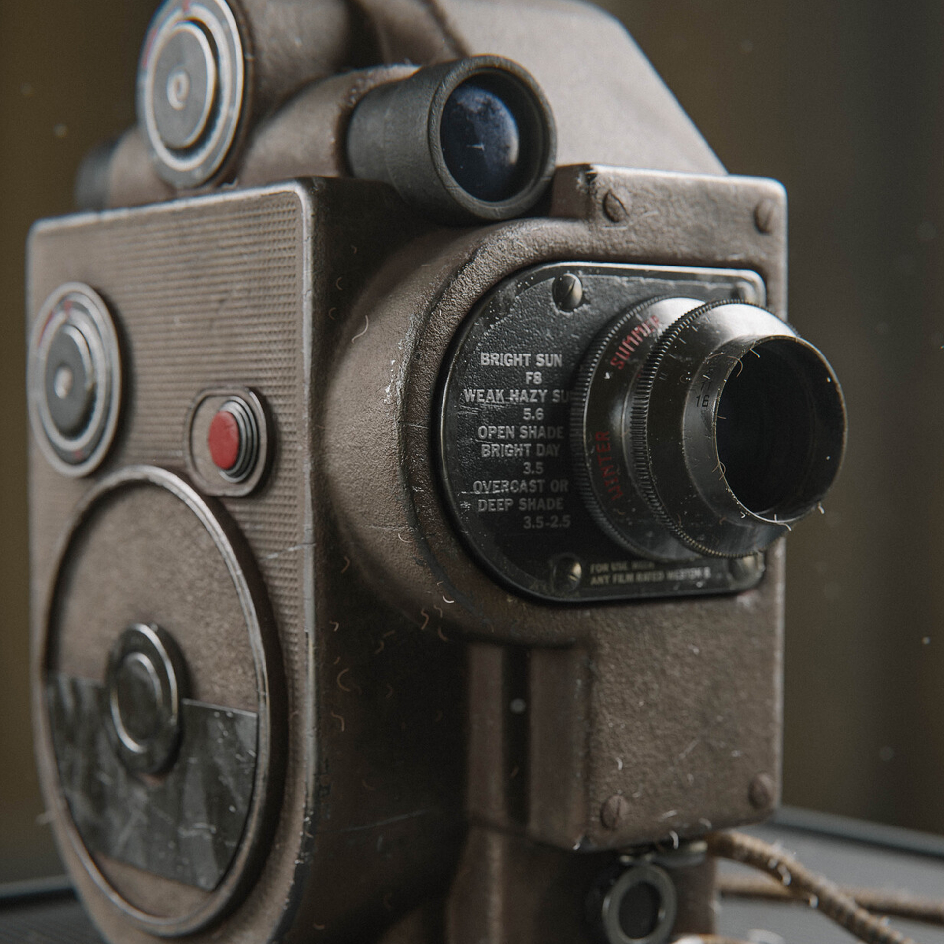
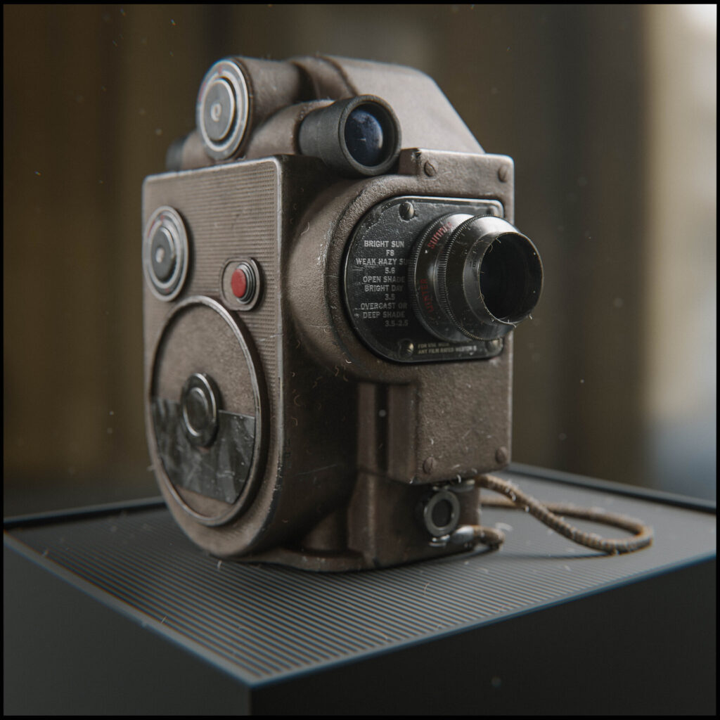
My love for photography and cameras sparked the idea of a vintage camera.
Tools
- Modeling: Blender
- Texturing: Substance Painter, Substance Designer, Photoshop
- Rendering: Blender, Lightroom
References & Inspiration
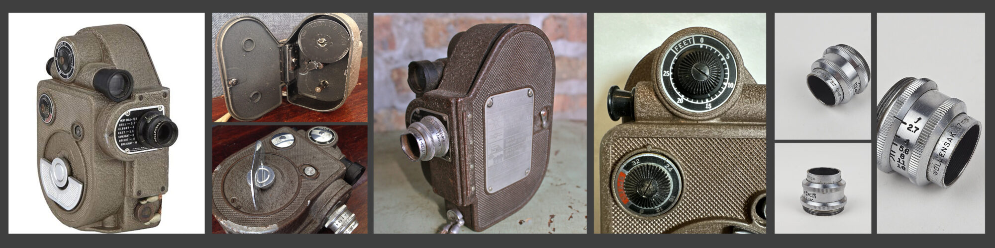
When I model, I create. I don’t like to replicate things fully and therefore I am seldom very picky about references. I collect a few of them but treat them more like guidelines. Sometimes it can be a struggle, but one of my favorite things in the world of art is how subjective it is.
There is no right or wrong, which means I am free to do whatever I want. That is a mindset I often take with me into my personal projects.
Blockout & Hard Surface Techniques
I knew this was going to be the hard part, but I had a good idea right off the bat on how to achieve the look I was going for.
Having a model with just a few complex parts can be a struggle or a blessing depending on how you look at it. It requires a lot of planning beforehand, but once you are done, it will make other steps in the process easier.
I am used to organic modeling, and working with a complex metal cast made a lot of my rock modeling techniques come in handy.
I started by blocking out the camera using simple shapes and defining which parts would be merged into the main body and which parts would stand on their own. In the end, most of the metal parts were welded together.
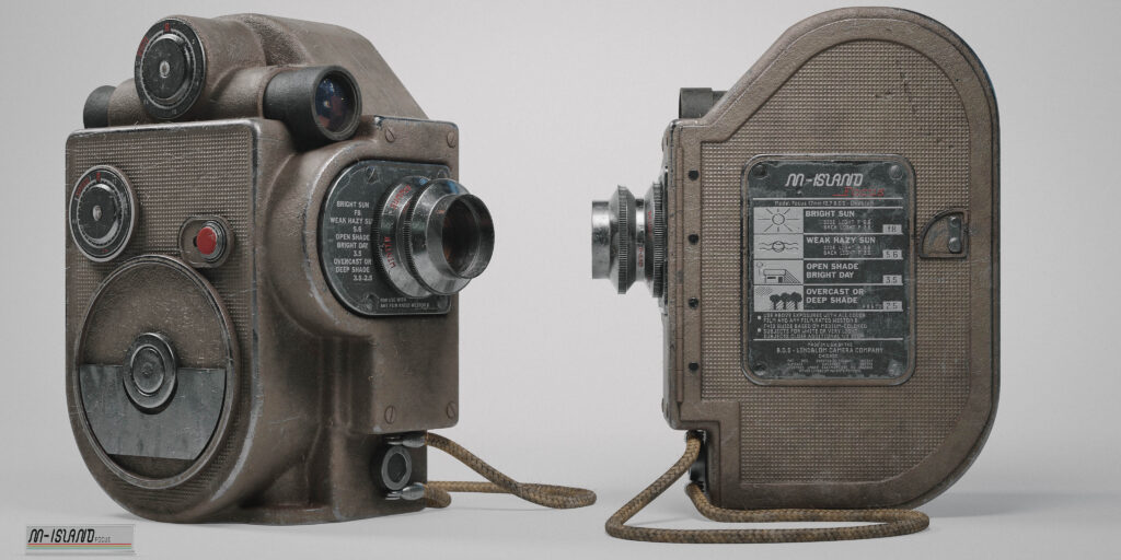
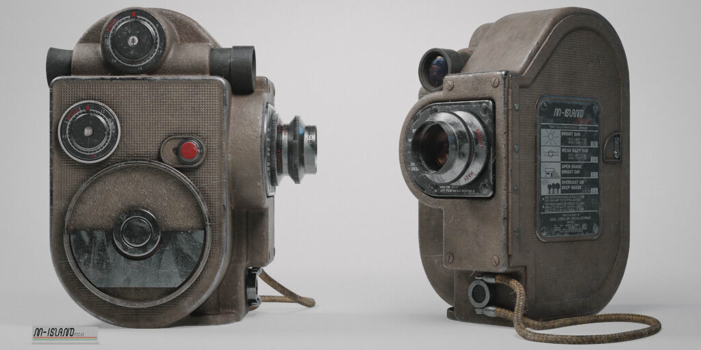
Here, I made sure the size of the model was somewhat in line with a real-world reference. It doesn’t matter that much in empty space while modeling, but it plays a key part later when using a physical camera for rendering since it actually mimics a real camera.
Size plays a huge factor in how different sensors and lenses see an object.
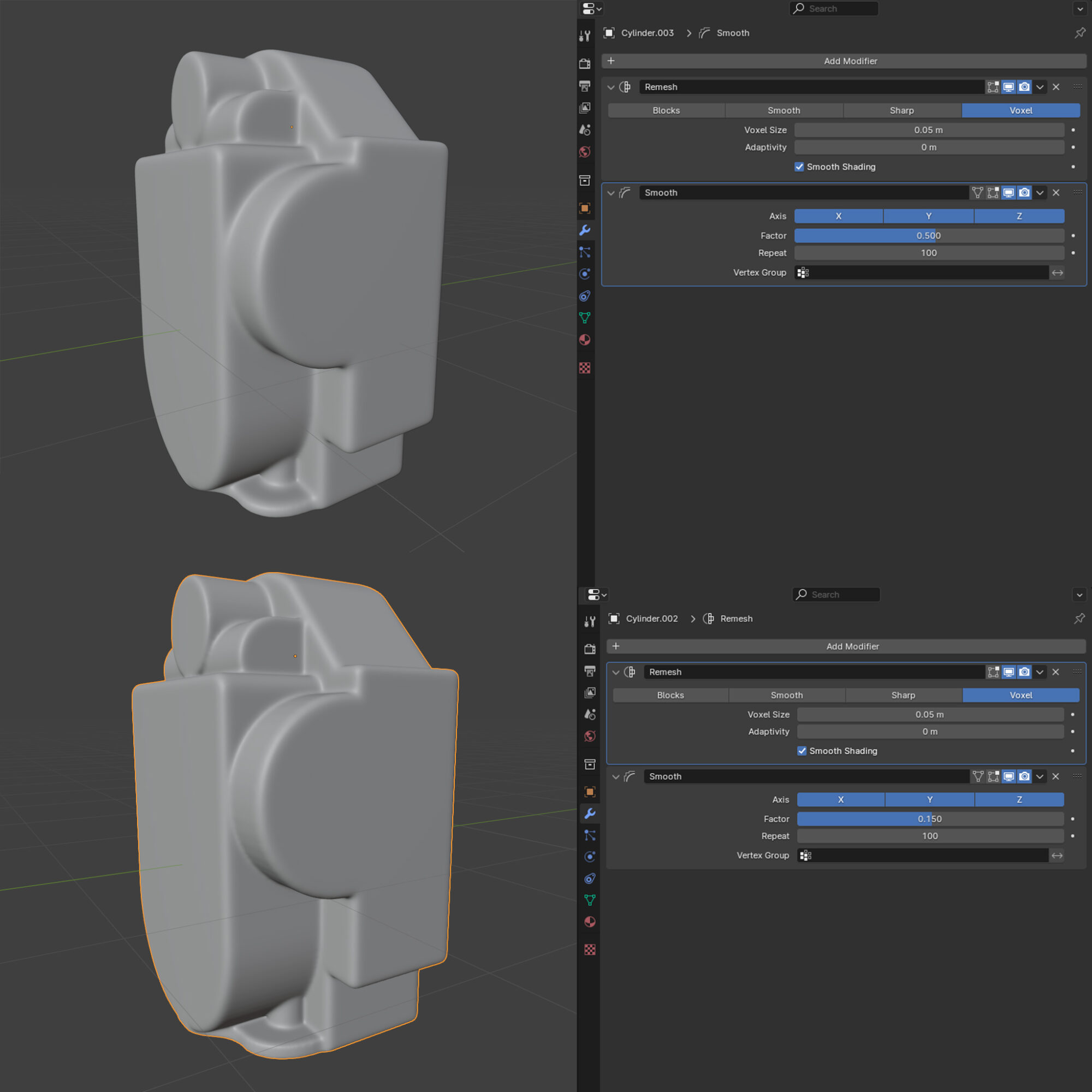
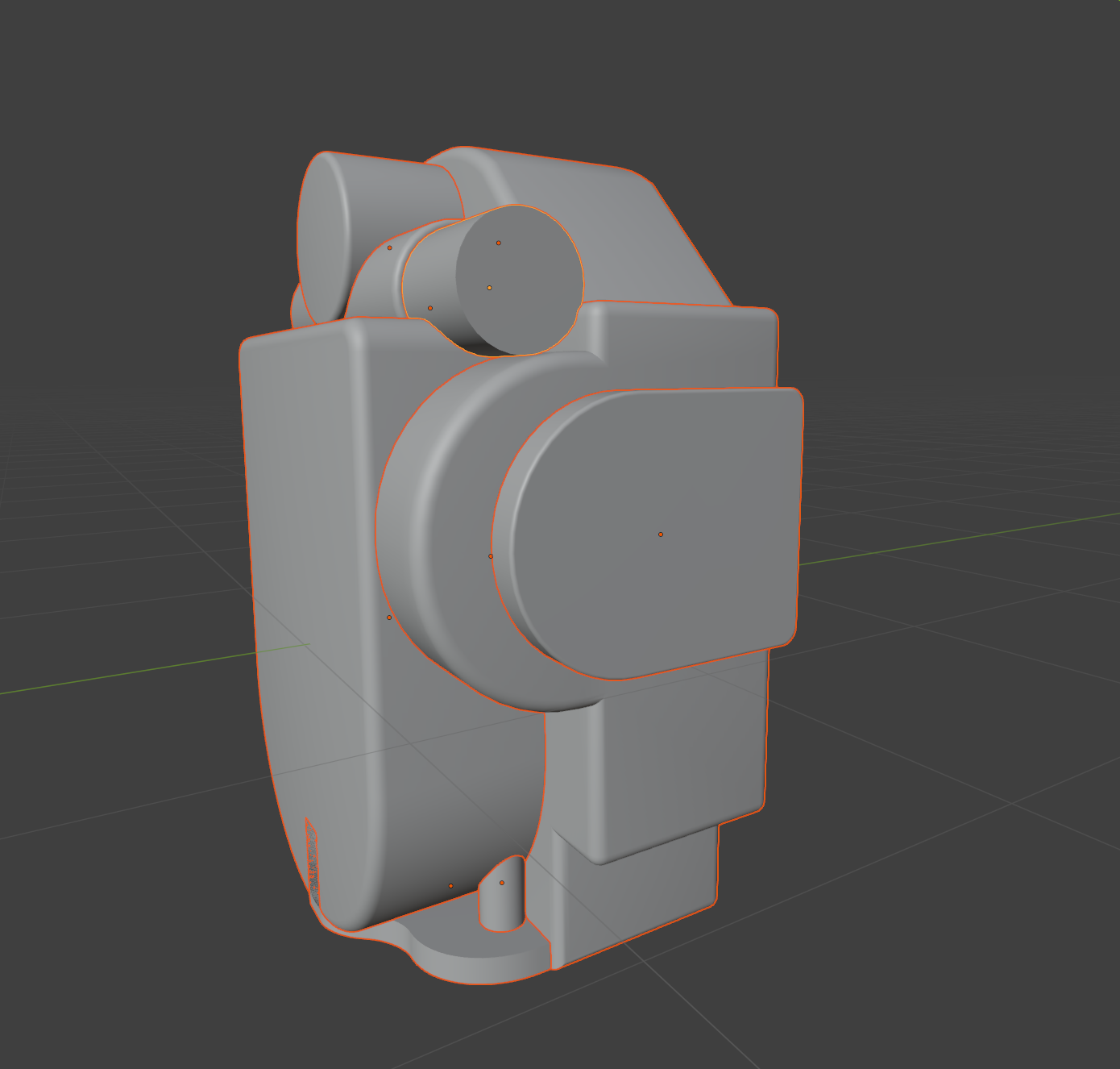
To merge the models together, I used a technique that combines a remesh modifier and a smooth modifier. The remesh modifier controls the resolution of your model, while the smooth modifier affects how the transitions between parts will look.
Having a large voxel resolution will require you to be more aggressive with the smooth modifier, but will enable you to achieve really sharp and precise bevels.
If you want your model to have a more factory-like appearance (blobby and less precise), you can use a lower voxel resolution and control the overall shape with the smooth modifier instead.
It is usually a balancing act to find the look you are after. Sometimes it can be beneficial to divide the fusing into separate steps, allowing you to keep different resolutions on different parts.
A tip when merging models like this is to keep round objects really round. Working with low-poly objects will result in weird sharp edges and limit what you can do with the modifiers. I set my cylinders in the blockout stage to have 100 segments just to be sure.
Once the model is fused, I make sure to check for shading errors. Since it is a personal project, I didn’t focus on the topology. The important part was getting the shading to behave the way I wanted.
I highly encourage artists who are new to the industry and still learning the ropes not to skip the foundations such as maintaining a reasonable topology or packing a UV to perfection.
However, after so many years, I sometimes make an active decision not to spend time on those parts but rather keep my eyes on the prize. With this prop, it’s all about visuals and realism in the final render.
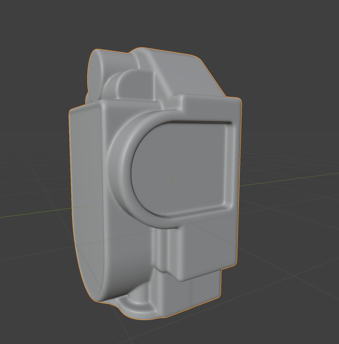
When I am happy with the fuse, I decimate the model to a polycount I am comfortable with and once again check for shading errors. The fusing part is somewhat destructive since you need to apply multiple modifiers to the model.
I always keep a collection of backups before applying a modifier in case I need to go back and change things later. However, this will require you to redo a lot of steps, so “measure twice, cut once” is a saying that fits well here.
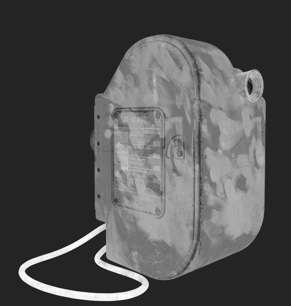
Below is the final fused and decimated model:
High & Low Poly
The industry has evolved so much in the last couple of years, and something that I believe will play a big part moving forward is mid-polys. I abandoned the traditional high-poly to low-poly workflow for this model and decided to directly create the final model.
Here, shading is key, and it’s important to ensure the mesh not only looks the way you want but also behaves the way you want. You need to get the bevels smooth and consistent. Insets and accessories need to fit together in a way that makes sense.
You need to decide what level of detail is fine to put in the normal map at a later stage and what you need to use actual geometry for.
Blender’s viewport is such a bliss for this stage. I set up a basic HDRI and adjust the lighting while modeling to make sure the silhouette is nice and that light wraps around the model the way I want it.
When I have my fused cast, I model the insets and accessories.
These consist of a mix of geometry with beveled edges that appear smooth, as well as a good deal of classic subdiv meshes that I apply before UV mapping.
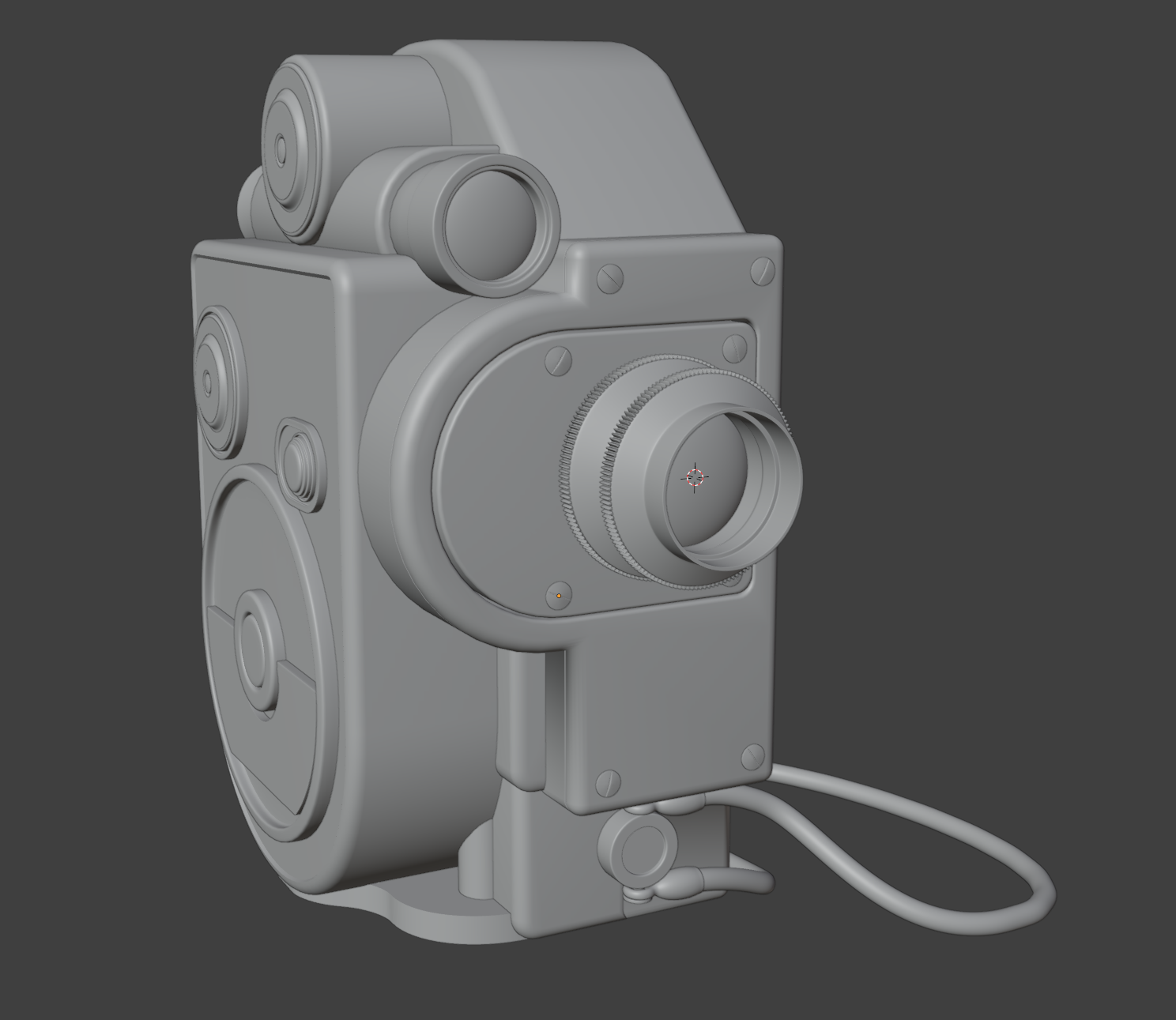
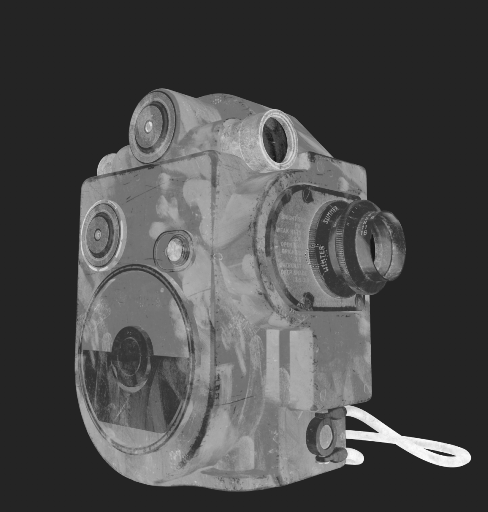
All parts of the model blocked out before fusing the main body together.
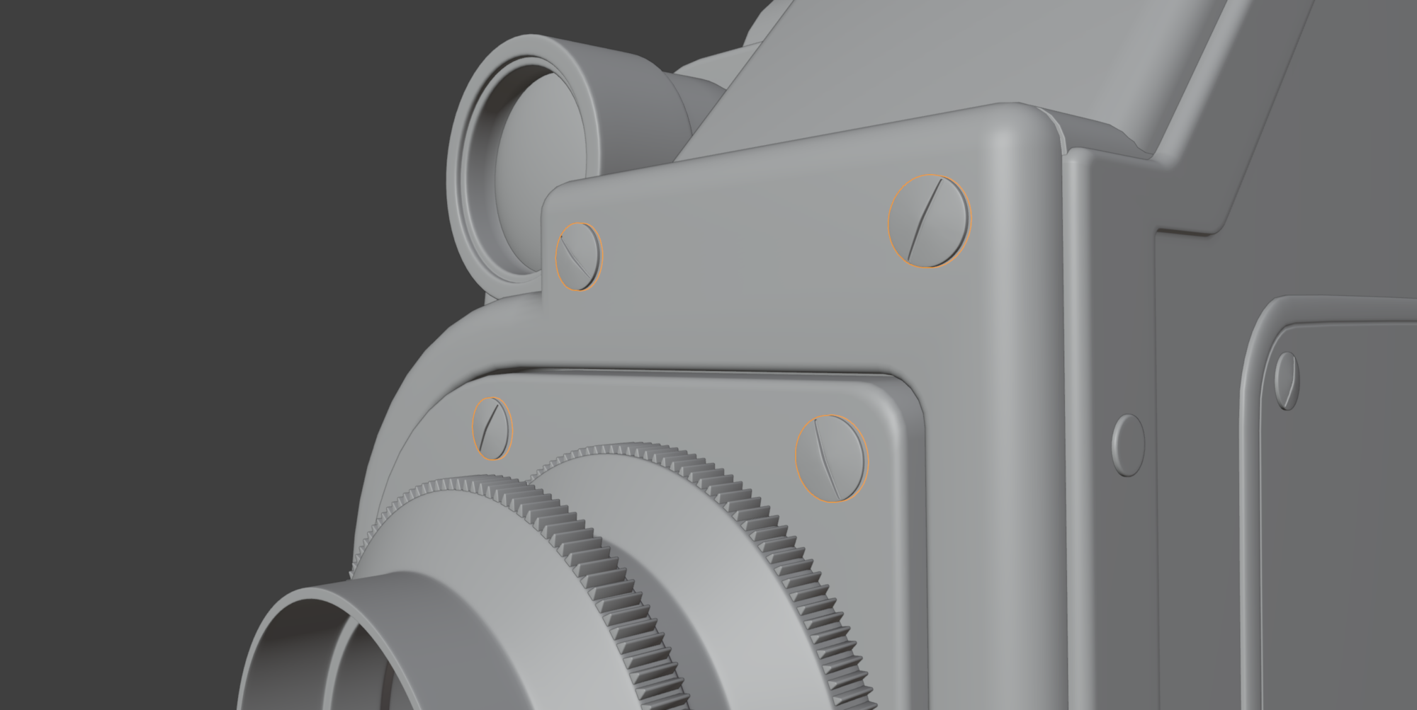
Screws are very simple subdiv geometry. I made sure to offset the screws to make them seem a bit loose and more realistic.
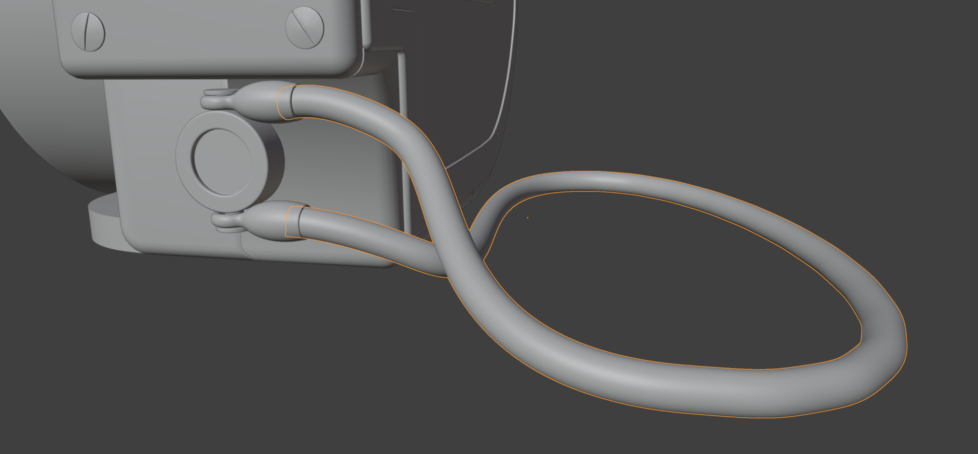
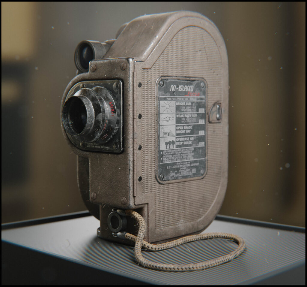
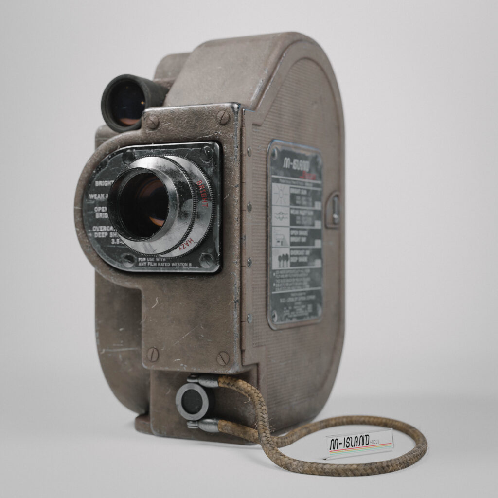
The wrist strap consists of two parts: the connectors and the cord. The connectors are simple geometry merged in a similar fashion to the main body. The cord is a curve circle used as the geometry object on another curve.
With this method, you can get a non-destructive cord that can later be tweaked to your liking when putting together your final scene.
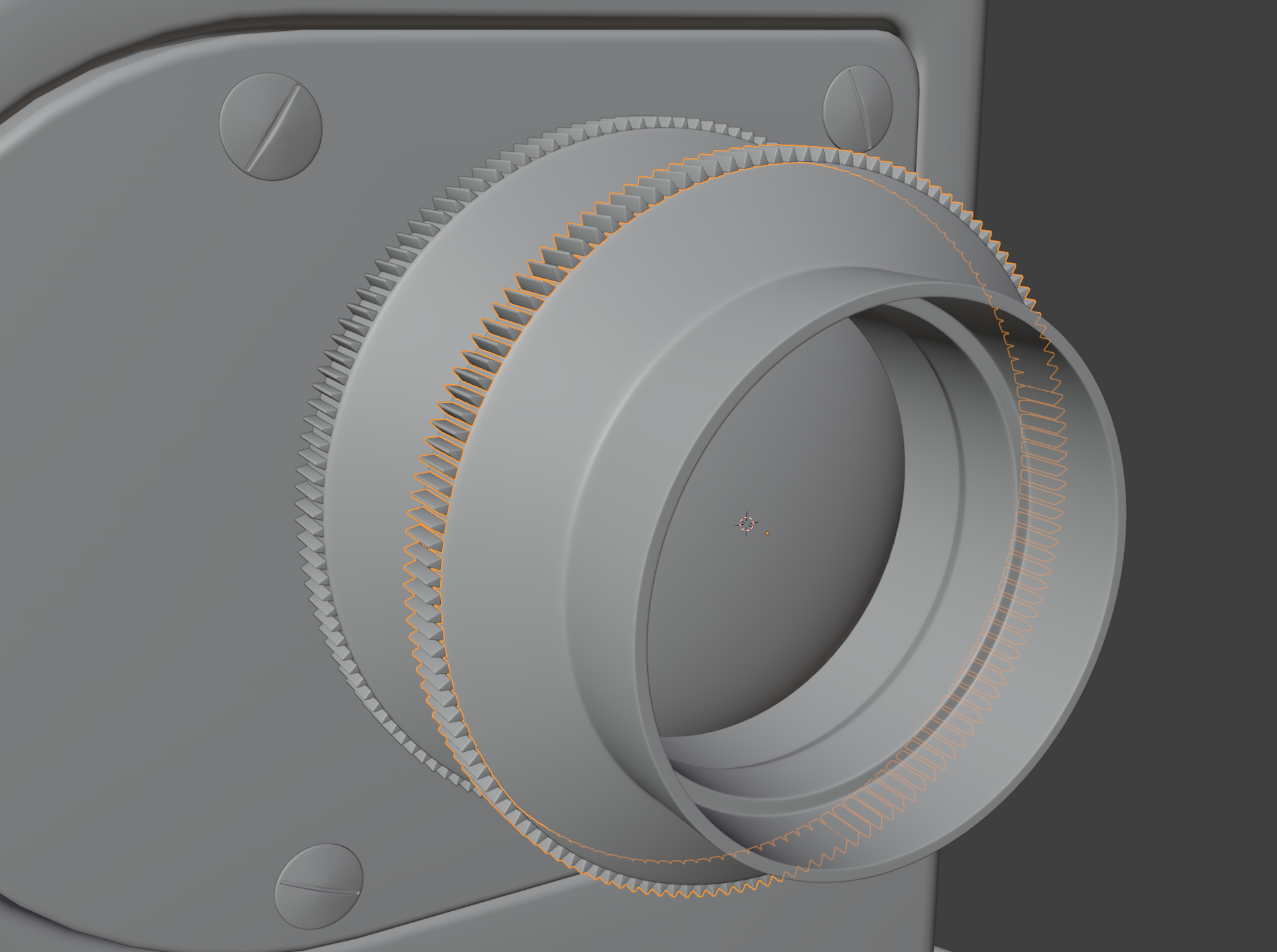
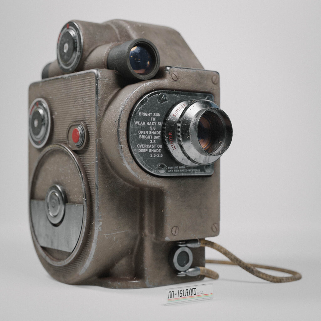
The focus and aperture ring on the lens are made using the Spin tool. I modeled one of the teeth, placed its pivot at the center of the lens, and duplicated it 150 times around the lens.
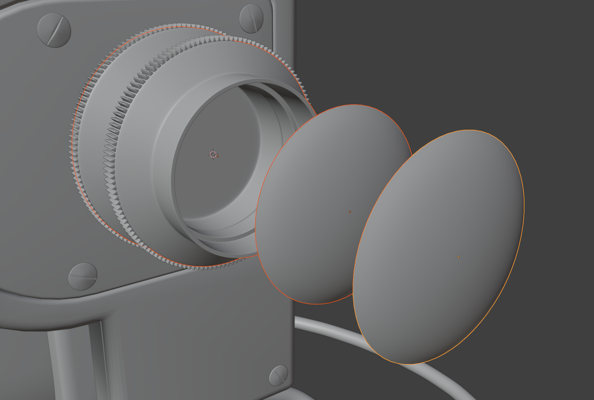
The glass in the scene is made using a similar approach to how eyes are commonly done. I have a bottom part of the lens that will be a dark metal color in its final stage. After that, I add a see-through, glossy blue glass layer.
Many old camera lenses tend to get a yellow hue as they age because of the metals used in the lens coating, so I decided to add another glass layer tinted yellow with a lower opacity than the one under it to create a depth/parallax illusion.
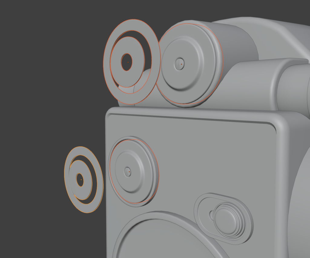
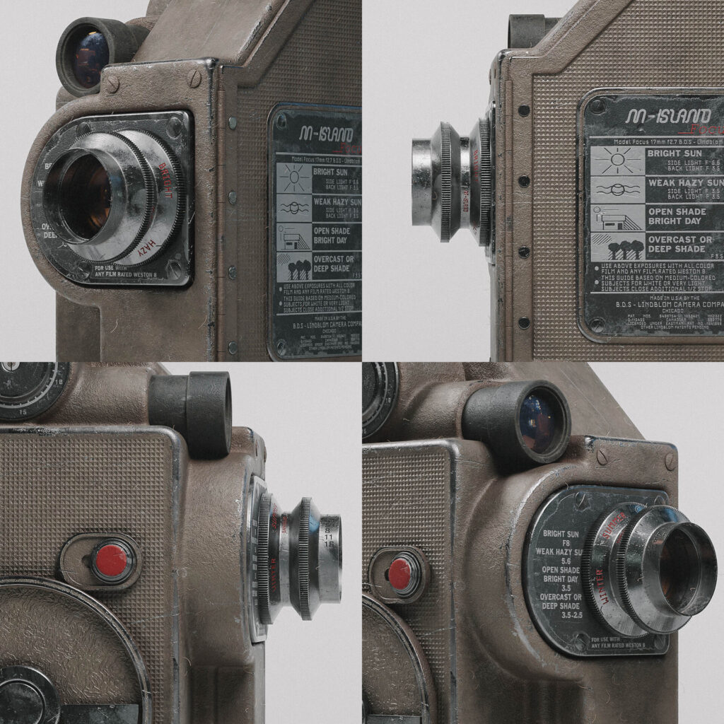
Everything that was going to have text or be stamped needed extra care when it came to UVs. I decided to split out parts to more easily lay out the UV map for them.
When projecting text in Substance Painter, it is much easier if you can line up your texture with a straight piece in the UV viewer and paint it all at once, so I made sure to keep them straight.
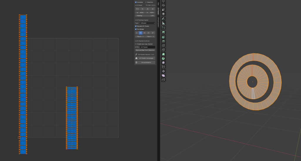
UVs & Baking
UVs for the model were very straightforward. Since most of the model is one fused cast, it is actually very similar to UV mapping a rock. Blender’s shortest path select is very useful when it comes to making seams for slightly higher poly models.
Just Ctrl + click from one side to the other to cut around the model.
The most important thing about this model was to keep the texel density consistent while giving enough space for text, numbers, and stamps to not break apart.
Sometimes, when having a lot of text that is important for the player/viewer to read or see, it can be useful to keep these on a separate texture set, make them as decals, or use similar solutions.
For a low-poly game prop using smaller texture sizes, it can be tough without having small text appear all smudged. Here I went with a generous set of 4k textures.
The model, being quite simple and small, presented no issue giving the text and numbers the resolution needed for them to hold up.
When it came to baking, I was already in the clear. Using a mid-poly together with Substance Painter’s “Use low-poly as high-poly” feature, you can generate all the maps you need for the texturing process.
Here is another beautiful thing with the mid-poly approach: since you are baking the exact same mesh on top of each other and not fusing any small details between a high-poly and a low-poly, no cage will be needed, and no material ID needs to be baked either.
Everything will be standalone meshes, so to mask it off, you can just use Painter’s “fill mesh” tool when texturing for quick masking.
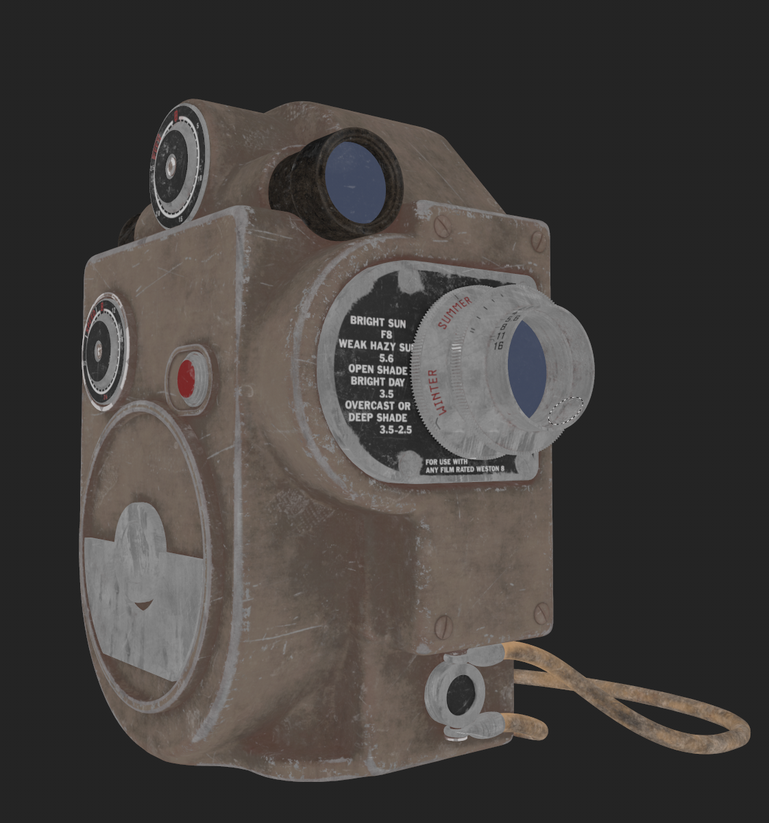
Materials & Texturing
I did the materials for this project in Painter with some support from Designer. I prefer to create all my materials from scratch without relying on Megascans or other texture sites. I like to visualize the models in layers, considering how they would be manufactured in a factory. I build up the materials in the Painter scene without using any masking initially, and later unify everything by applying edge wear, scratches, and smudges between the different layers.
For this model, the process looked something like this:
- Base Metal
- Metal Coating
- Leather/Sticker/Plastic/Glass/Rubber
Whenever I needed a pattern or wear-and-tear texture, I switched over to Designer and generated what I needed.
For all the text and markings, I researched camera-themed fonts and created them from scratch in Photoshop. I drew inspiration from the descriptive signs found on old vintage cameras.
It’s fascinating how these cameras had instructions printed all over, making it accessible for anyone picking them up to participate in the activity. I also love the aesthetics of these plaques.
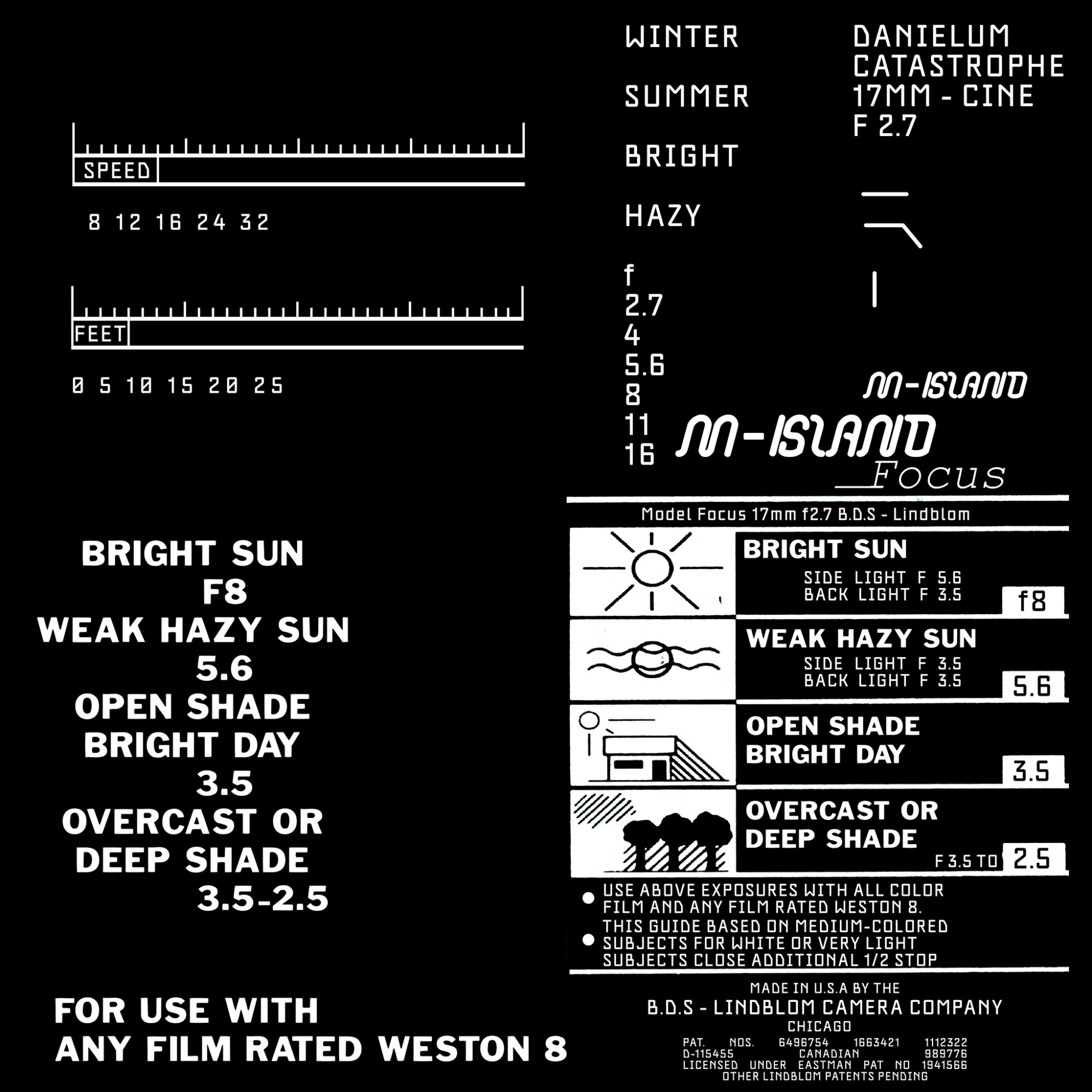
All stamps used in the project. These are projected on top of the mesh with Painter’s projection tool.
Wear & Tear
Scratches and dents are important and fun to create, but what sells realism even more are the details you don’t immediately notice without turning an object in your hands: fingerprints, oils, or layers of dust that bend and reflect light in a completely different way than the underlying material.
I enjoy applying really rough fingerprints to models. Here, it’s crucial not to be shy. Go over the top and really let the effect shine through. I try to keep fingerprints separate from the albedo values and height, focusing instead on adjusting the roughness of the model for these effects.
A tip here is to consider how a person would use the object. Focus on adding wear and tear in areas where it makes sense; in my case, under the camera and over the lens.
The base color is quite simple since this model is driven largely by the contrast in roughness. Most wear and tear is represented in the albedo, and I tried to introduce some extra saturation and specks of color around sharp edges or deep AO (ambient occlusion) pockets.
My Approach to Realism
It’s time to render our model. This is a crucial step, as it brings together all of your hard work. To make it easier to explain, I have prepared a small chart showcasing how I like to think of an asset and why certain parts of a model are particularly important. Let’s dive into it.
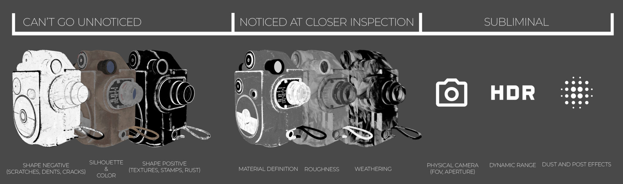
I have split up the way a viewer takes in the final render into three stages.
The first stage involves details that can’t go unnoticed. Most people will catch these details and can relate to them in one way or another. Silhouette and colors are aspects people often develop preferences for throughout their lives. Many have a favorite color and a preferred shape language. These elements draw people in and pique their interest.
The second stage focuses on things noticed upon closer inspection of an item. By turning or shining light onto an object, you can discern whether it is clean or dirty, old or pristine, matte or glossy.
The final stage is where we can push things one step further. I refer to these as the subliminal layers, which encompass things we register all the time but never consciously think about.
Field of View (FOV):
A human has about the same FOV and angle of view as a 50mm lens on a full-frame (35mm sensor) camera.
Using a similar setup in your camera within your chosen rendering software could potentially increase the realism of your prop.
Dynamic Range
Dynamic range describes the ratio between the brightest and darkest parts of an image.
It is often discussed in terms of light ratios that describe the lighting in a scene and how many light stops are between the brightest and darkest points, together with tonal range—the levels between an image’s darkest and lightest points.
The human eye has a very good dynamic range of 18-20 stops, while modern cameras typically range from 10-15 stops, with some high-end cinema cameras exceeding this range.
Regarding dynamic range, while high contrast and dramatic colors are appealing and can create a cool effect on screen, making an image flatter and more evenly lit could potentially enhance realism, aligning more closely with how viewers perceive their daily lives.
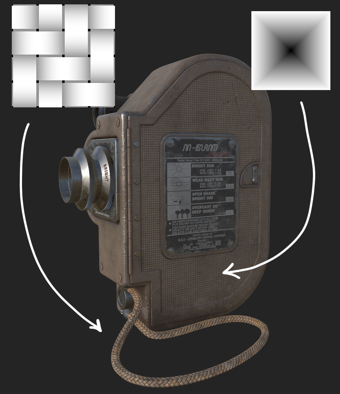
Dust and Post Effects
Continuing the discussion on dynamic range, I want to touch on barrel distortion, pincushion distortion, and chromatic aberration—small imperfections caused by the camera lens that distort the image.
While humans have a wide FOV, much of it consists of our peripheral vision, where fine detail is not discernible. Introducing distortions at the edges of an image can sometimes increase realism.
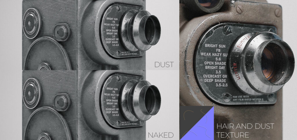
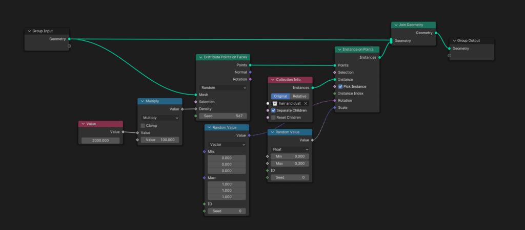
Dust is ubiquitous and often acts as a form of weathering separate from other types of wear. An asset can be dirty or clean, damaged or pristine, yet it will still be covered in a layer of dust. For this project, I generated strands of hair in Designer and procedurally placed them on the mesh using a simple geometry node setup. I used a subsurface shader with a strong subsurface color matching the desired hair color and a sharp normal map to create distinct highlights when light hits it at certain angles.
Contrast within Contrast
When conducting workshops or giving feedback, I like to discuss “contrast within contrast.” The definition of contrast is “an obvious difference between two or more things.
” When I started my art journey, I initially thought of contrast in terms of colors blending or clashing. However, as I grew as an artist, I began to see that contrast exists within every aspect of our work.
We can use contrast to convey endless stories by adding subtle details. It’s a tool to introduce history and lore to the viewer. What has our asset been through? What was it designed to withstand? How did its owner personalize it and make it their own?
With this, I encourage you to think of contrast not only as something different from something else but also consider why it exists.
Example 1: Consider two different kinds of scratches on an object. This is a contrast in itself. One scratch has pierced the paint while the other has not—a further contrast.
One was made with a sharp object and the other with a blunt one. From these details, one can infer that this item has been on at least two different adventures—one stormy and the other calmer. This adds realism and deepens the viewer’s connection to the work.
Example 2: Imagine an item with paint chipping away to reveal metal underneath, but only on one side. The other side remains pristine. This could suggest that the item has been stored or used in a specific orientation consistently.
Ultimately, what I am emphasizing is not to shy away from storytelling with your prop.
Encourage viewers to wonder, delve deeper, and ultimately create their own narratives, preferably at first glance.
Conclusion
This was a very fun project, and I learned a lot while working on it. I spent a bit over a week during my spare time in the evenings after work. Some days I did more, and some I did less.
It was a great exercise in managing scope, as I do have a tendency to become a bit too ambitious with my personal projects. I’m proud of the result and how I managed to finish it within my planned time frame.
One big takeaway that I find myself learning again and again across my projects is how little individual details matter on their own compared to how they all fit together as a whole.
I can’t recall who, but an artist told me a long time ago that it doesn’t matter how high-res textures are or how many polygons you add to an object. If the idea, art direction, and fundamentals work well together, the prop will always look good, whether it runs on a potato or NASA’s fastest supercomputer.
To this day, that statement still holds true in my book, and it’s something I will always push for in my everyday work.
Read more articles
You might also like these articles.