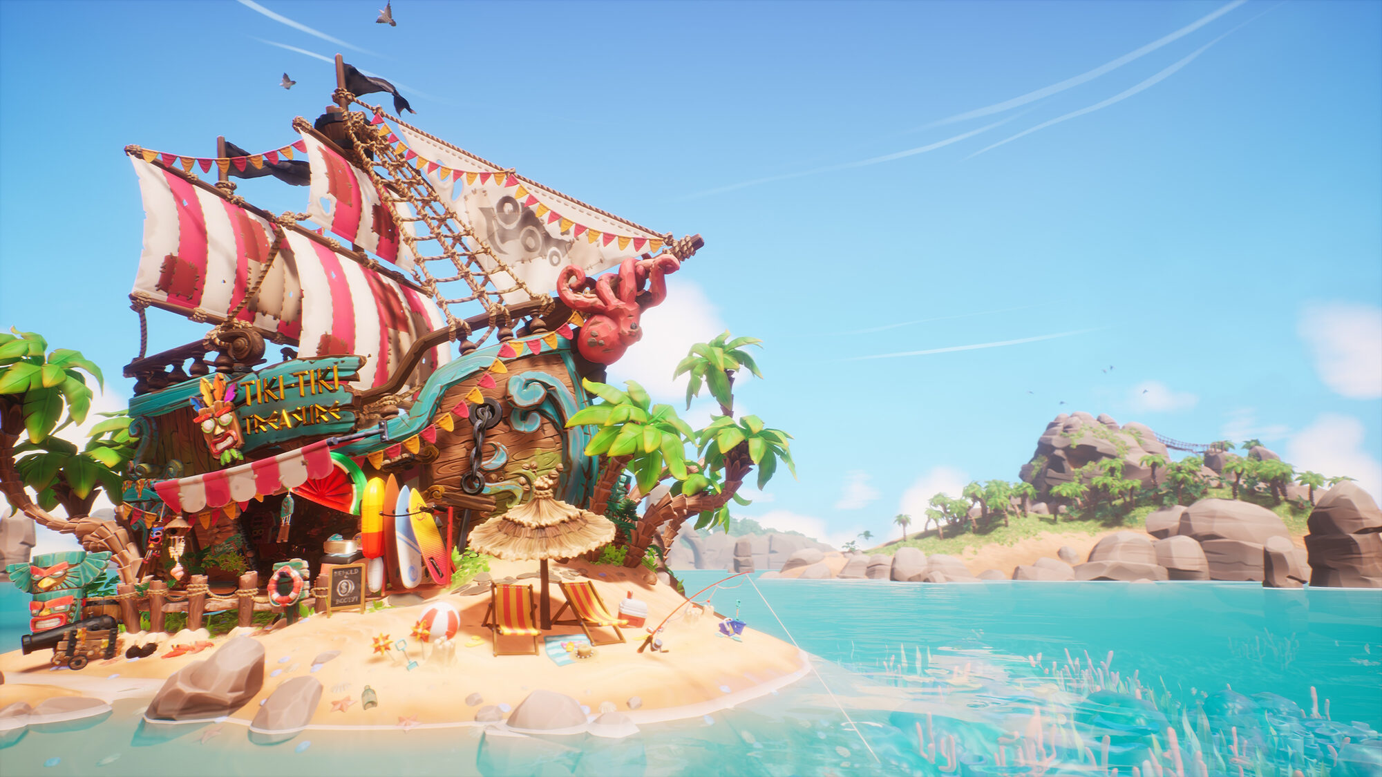
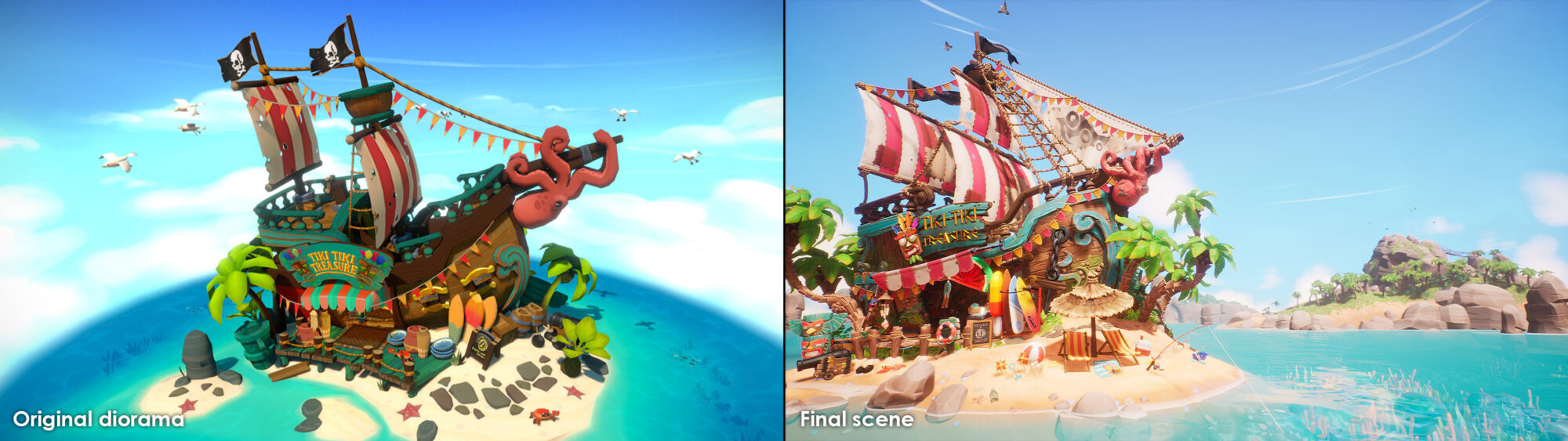
Tiki Treasure

Introduction
8 years of industry experience working on AAA console games and BAFTA-winning mobile games.
Graduated from the University of Lincolnshire in 2009.
Likes handpainted textures, zombie films, and a nice pint of ale!
Blockout
I usually start with a very simple block out in Unreal, consisting mostly of primitive shapes and very loose proxy meshes, to represent the larger assets in the scene (the boat itself was a bit of an outlier for this scene, as an iteration of it already existed).
This allows me to quickly and easily get a grasp on the overall composition of the scene, and begin to figure out how to break the scene down, along with what assets are most abundant or impactful to the image.
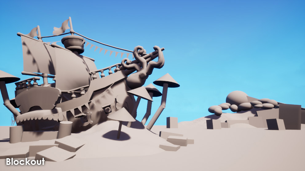
As this scene was based on a loose diorama I created a few years back, I already knew what the focal point of the scene should be (the ship itself), and could easily build a blockout around the proportions of the original mesh.
Along with blocking out the actual shapes of the scene, I tend to block out most of my more abundant materials early on, to get a rough idea of the colour palette, and how materials may light and affect the scene. This involves creating a simple master material that allows you to assign a colour, and roughness/metallic values.
Once I’m happy with these blockout materials, I can colour-pick the colour and roughness values when creating the final materials, giving myself a jumping-off point.

Composition
As this scene was based on a previous diorama, the overall composition of the ship and island was partly complete. However, with this being a recreation, it allowed me to have a fresh take on how the main elements were framed, and what supporting shapes could help both bed in and expand-on these original elements.
I knew I wanted to create a feeling of a larger world, but the ship itself was still the focal point of the first key image. I created a few distant islands, with enough unique bespoke features, to make them attractive. These were layered, at different distances, to create a feeling of depth.
Trees, totems, and other more considerable, larger assets were shifted around the ship, to frame it, rather than obscure it.
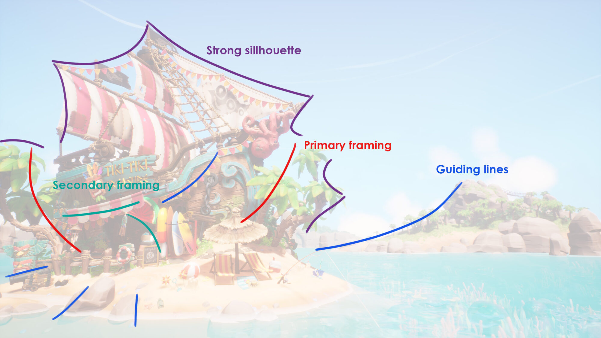
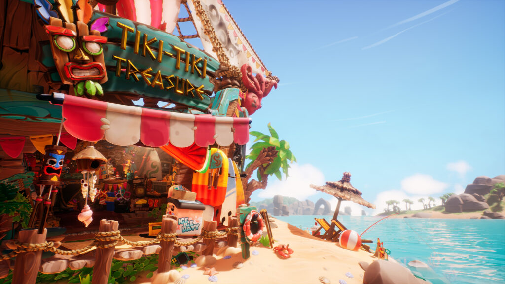
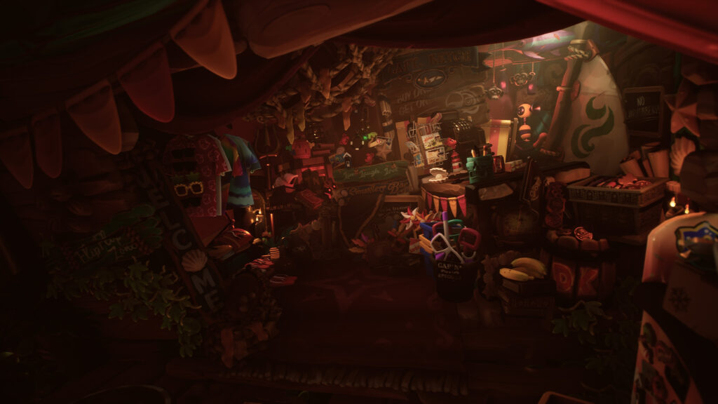
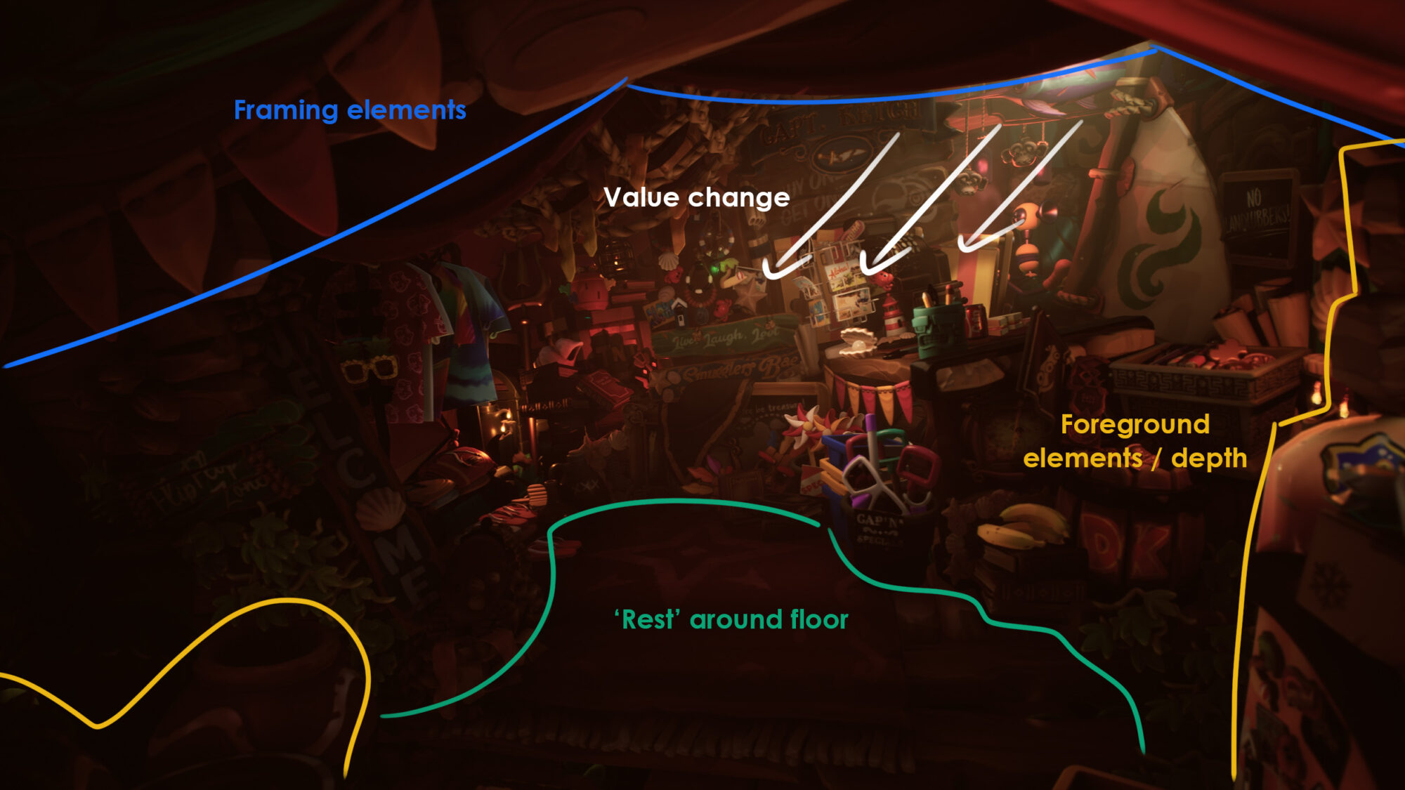
The interior composition was more difficult to achieve. It required striking a balance between a cluttered treasure trove aesthetic, and everything still being readable. I wanted to include a lot of smaller bespoke assets, and I needed to make sure these didn’t overlap too much, and things like value and material separation were also kept in mind.
There are assets sitting close to the camera, at the edges of the screen in the interior camera view, to create more depth to the image, and to also help to frame. The floor was kept as a large area of relative rest, to help focus the chaos.
Sculpting
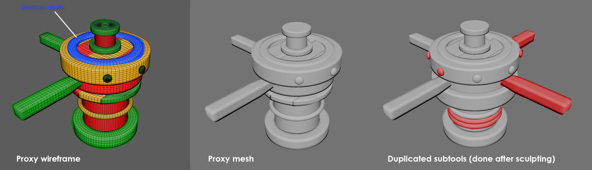
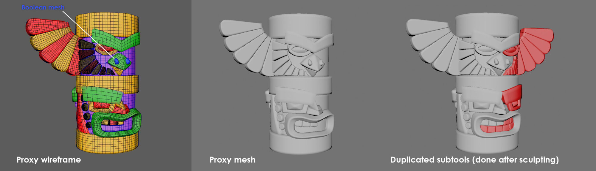
Proxy Meshes:
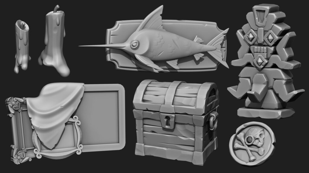
I always start sculpting by creating a proxy mesh for an asset in Maya. I break the prop down into its basic shapes and elements and try to get something quite representative of the intended final form. This has 2 advantages
- I can export this proxy mesh to Unreal and start dressing the scene with it before tackling the sculpt, simply re-exporting it with the final mesh once complete. This allows me to begin to get a better picture of the detail spread in the scene before working into an asset too much.
- I start my sculpt with a solid base to work from, where the main shapes and proportions are already pretty much there.
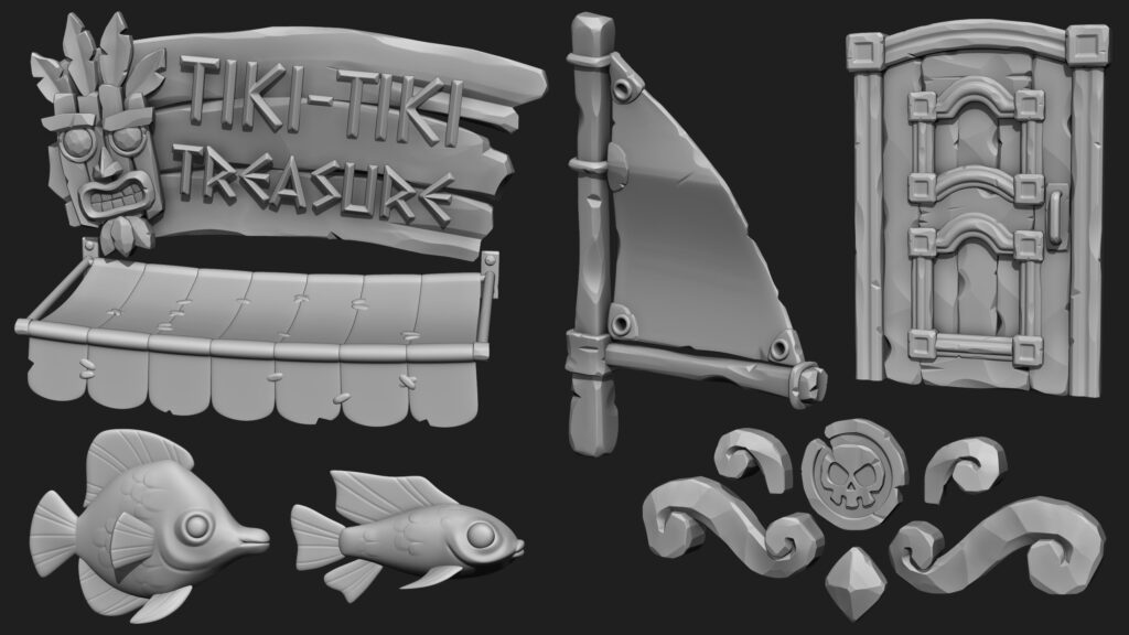
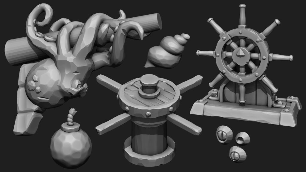
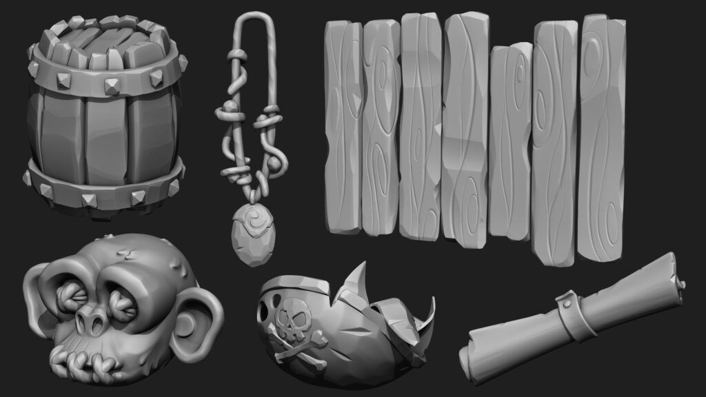
It also dramatically helps to split assets into smaller primitives or parts, working on these separately before merging them together and Dynameshing. For example, the decorative swirls on the front of the ship were separated into smaller pieces, so I could sculpt the inside edges without worrying about fiddly masking, or affecting the surface on the other side.
Here are a couple of examples of the breakdown of a proxy mesh, ready for sculpting:
Brushes
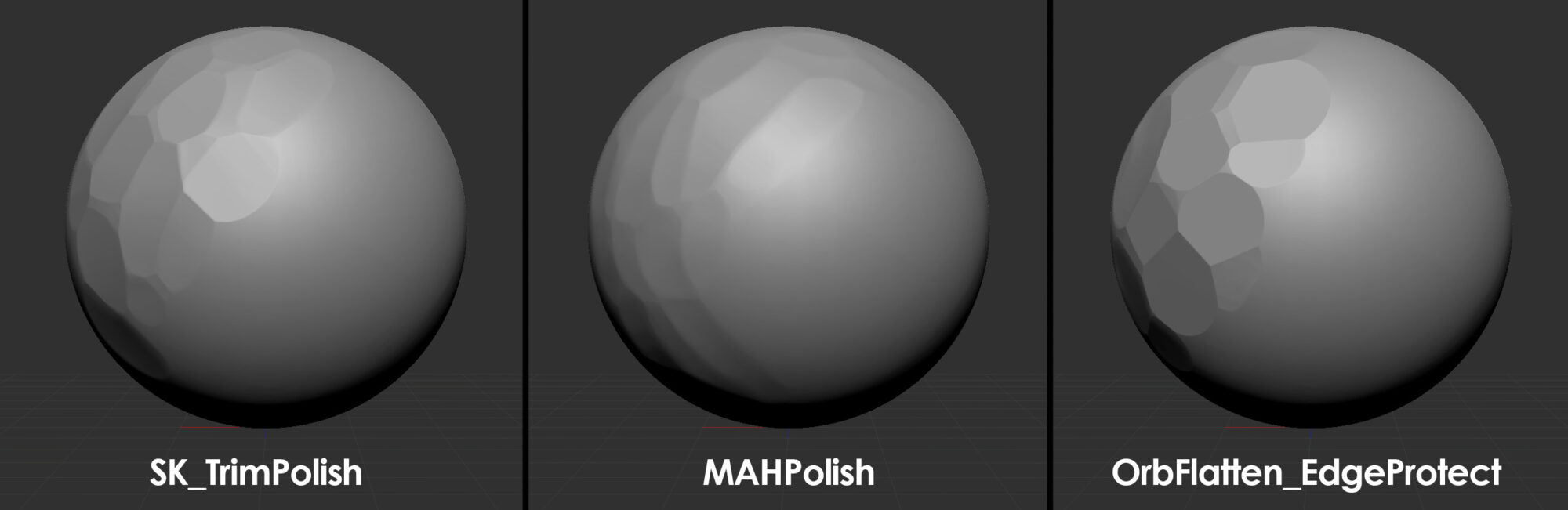
I like to work as simply as possible when sculpting. I pretty much used 3 or 4 brushes for most materials/surfaces in this scene. The combination of brushes used per asset, and how they are used achieves slight differences in surface treatment.
- TrimPolish is a great brush for knocking facets into an asset but keeping softer bevels/transitions around these facets.
- MAHPolish is a much softer brush and can be used to create softer facets or to blend between facets. It can also be used well as a general polish brush, for any areas of the sculpt that are a bit chewy.
- OrbEdgeProtect is a more extreme brush and can be used to create much harsher facets, with sharper transitions. This is great for harder surfaces like crystal, or for chipped damage.
The visual style of the scene is intended to be very stylized and simple, with little-to-no surface detail on assets, and everything generally being quite soft and playful. However, I still wanted separation between different surfaces, how they are sculpted, and how I approached their shape, softness, bevels, and what little surface detail they had.
I tend to create a few critical assets for the scene first, to find what approach I want to take with asset creation, and find the desired result, before rolling this out to the other assets. Picking a few assets that are very present in the scene, and that cover most of the more abundant materials (in this case wood, metal, and rock), allows me to see a more defined cross-section of what my shape language will look like for the scene as a whole.
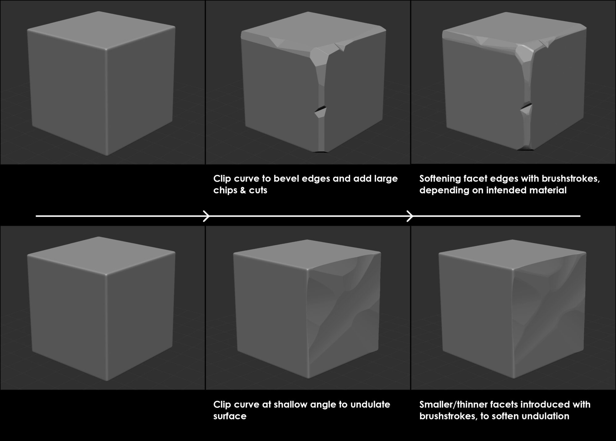
Clip Curve
I use the clip curve tool a large amount, to add thick cuts and precise bevels to objects. On metallic surfaces, these are usually left as-is, as you would expect harsher facets in these areas. I use TrimPolish or MAHPolish afterward to soften these cuts on softer surfaces such as wood or stone.
The Clip Curve tool can also be used at a narrow angle to a surface to work in some nice undulation. Again, the larger facets that this creates are usually then softened or separated by smaller/thinner bevels.
Booleans
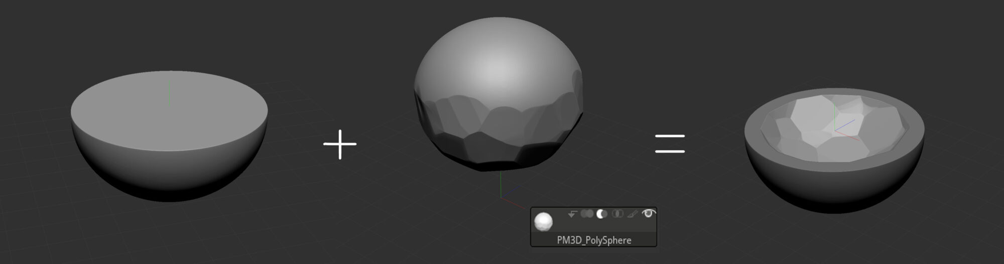
Booleans can help to cleanly sculpt concave shapes, punch holes or emboss things into elements, in a much easier and (in a sense) non-destructive way. Once these boolean shapes are finalized, you can run the boolean function to merge them together, fix or merge any unwanted polygroups, and dynamesh them (if needed).
You can then soften any harsh transitions created by these booleans, and add any nuance edge-wear to these transitions.
Modelling
The majority of the low poly meshes were made using QuadDraw in Maya. A simple retopology tool that allows you to draw vertices over a decimated version of the sculpt and connect these up to form geometry.
Many of the assets have a more organic feel to them, with little-to-no straight edges, so this form of retopology felt more natural and suitable, as opposed to box modeling around the high poly mesh, or re-using/adding detail to the existing proxy mesh.
As the majority of the meshes were static and not deformable, the topology had a heavy emphasis on simply making sure the silhouette and main shapes would work well, there was no noticeable faceting and no smoothing issues. Triangles are not a problem in this sense, and are often necessary for me to dictate more easily how I want the mesh to shade.
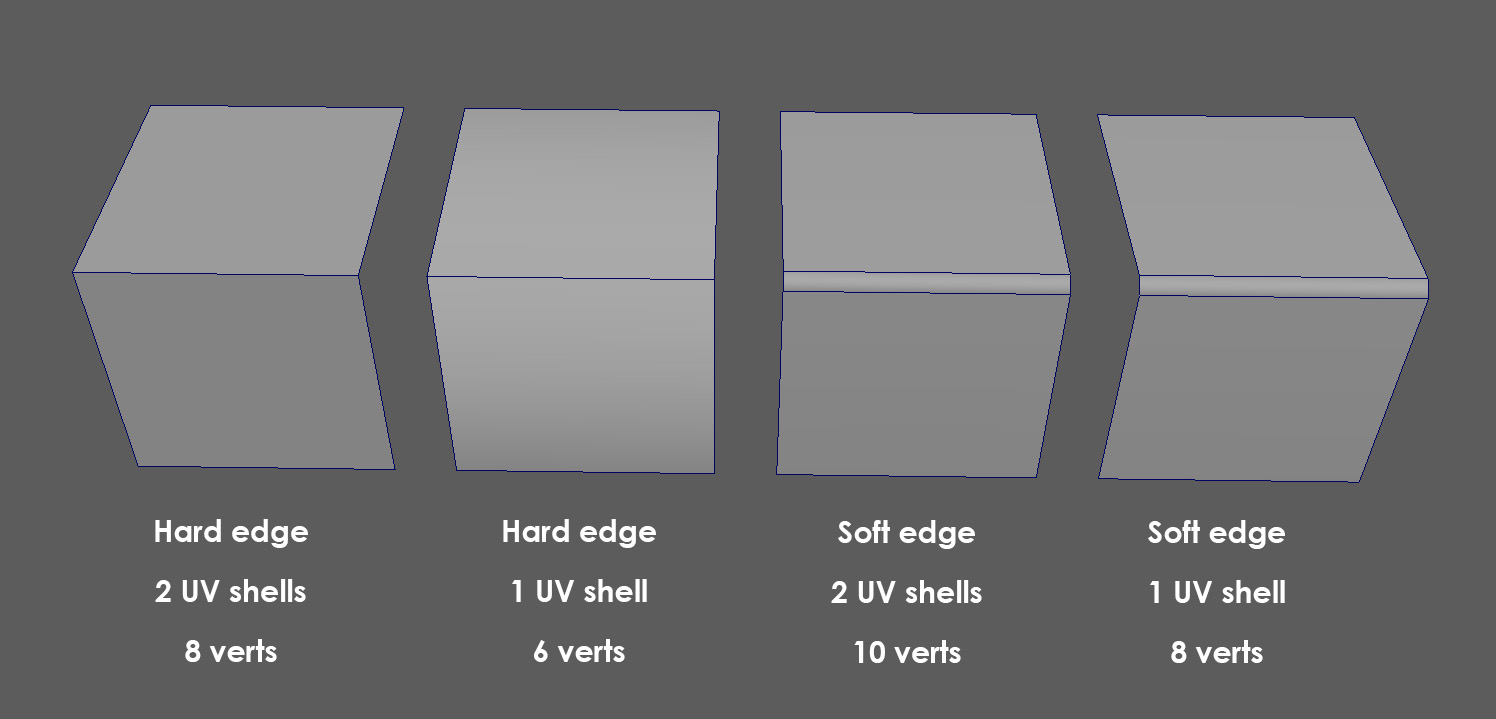
Softened bevels were added to most edges, to help create an asset with smoother shading, and a more pleasing silhouette. The extra cost was minimal, as the UV shells were not split along these bevels.
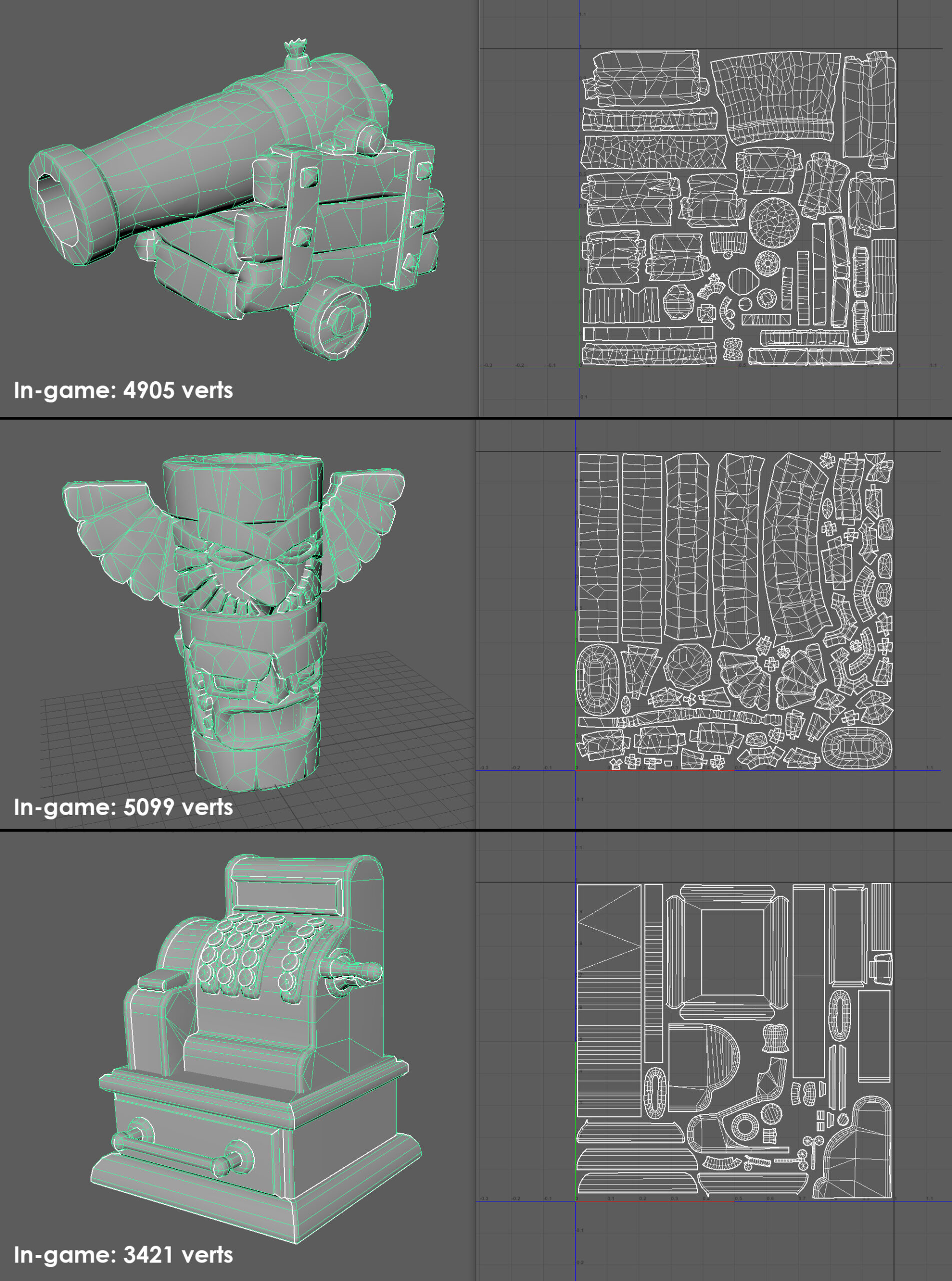
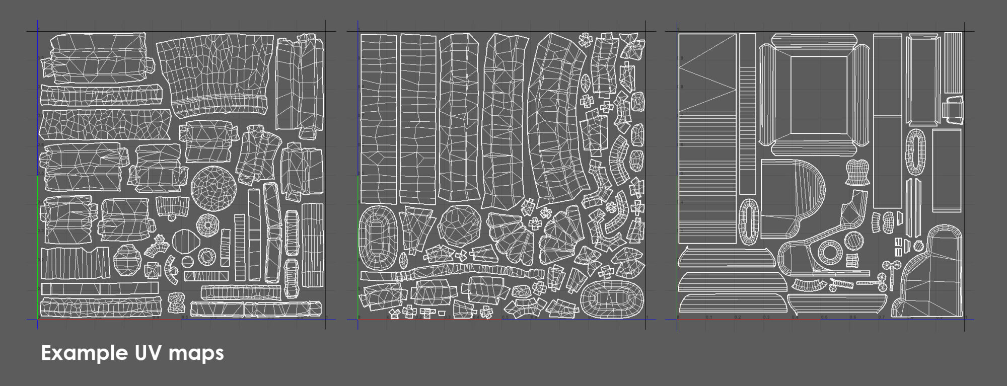
Here are some examples of low poly meshes, with vert counts and UV atlases:
UVs
Uvs were created in Maya, to avoid having to jump into extra software packages. Maya has a good suite of UV tools that are quite intuitive, and create pretty good results.
I generally tend to pelt map most of my assets, drawing on some seams before unfolding and relaxing the shells. I then use layout to unify the texel density on all the shells, and this also sometimes gives me a jumping-off point for packing. I hand pack all of my UV shells, to ensure I’m getting the best possible resolution, and to ensure that they’re going to be artist-friendly and readable.
It’s worth noting that while not always great practice, with a simple art style with little granular surface detail, you can get away with UVs being slightly skewed and warped in places. I would rather have one UV shell that has slight warping in places, than multiple shells that are more costly and more difficult to read.
For this particular piece, the majority of assets used either bespoke 0-1 space UV atlases, or tiling textures. There are a few things such as ropes and wooden trims that use a trim sheet.
The process of creating this was very similar to the individual assets; high poly sculpt / low poly mesh (this time simply a plane) / bake and texture. The only difference was making sure that these would tile seamlessly on the x-axis (horizontally).
Baking
The majority of assets were baked in Marmoset. This is my preferred package, simply down to the ease of usability, and how clean the bakes come out.
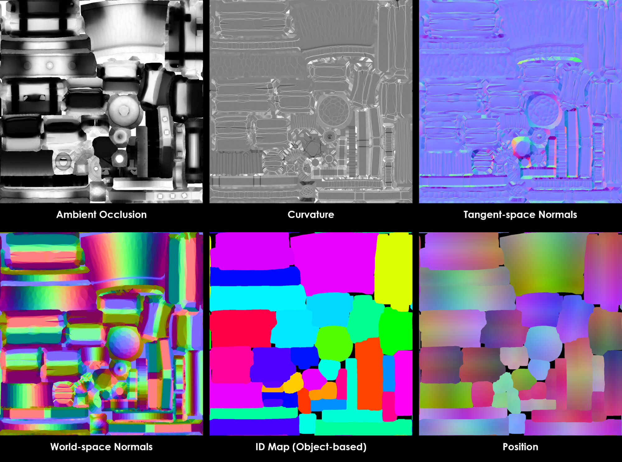
Most assets had their tangent and world-space normals baked, along with a curvature map and position map, all baked from the high poly mesh. I also baked an object or material ID map, if I needed to be able to mask areas of the mesh that weren’t already separate elements. The bake meshes were separated into elements and grouped up in Marmoset, so there were no joining seams or overlaps.
The AO was also baked in Marmoset. I usually simply bake the low poly onto itself, so the AO matches 1-1 with the shape of the low poly mesh. This does however have 2 caveats;
- If there isn’t enough geometry in the low poly mesh, there may be faceting as the AO shades over the separate polygons.
- The AO bake will only take into account elements that are present in the low poly mesh, and won’t take into account any high poly, baked down elements.
An example of a full texture bake set:
Lighting
Colour
The Colour palette for this scene was essential to me. I wanted everything to be lush and vibrant but stick to a restrained selection of colours to avoid everything becoming too unreadable or over-saturated. Most things are earthy yellows/oranges, with highlights being either teal or a slightly pinky red.
Values
Value separation between the more significant elements was key, to helping them read. For example, the water has a different colour value than the sand, and the sky has a very different colour value from the ship’s sails.
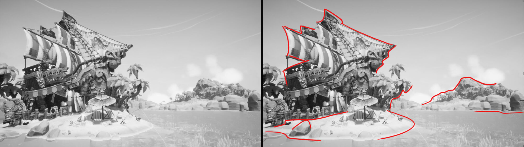
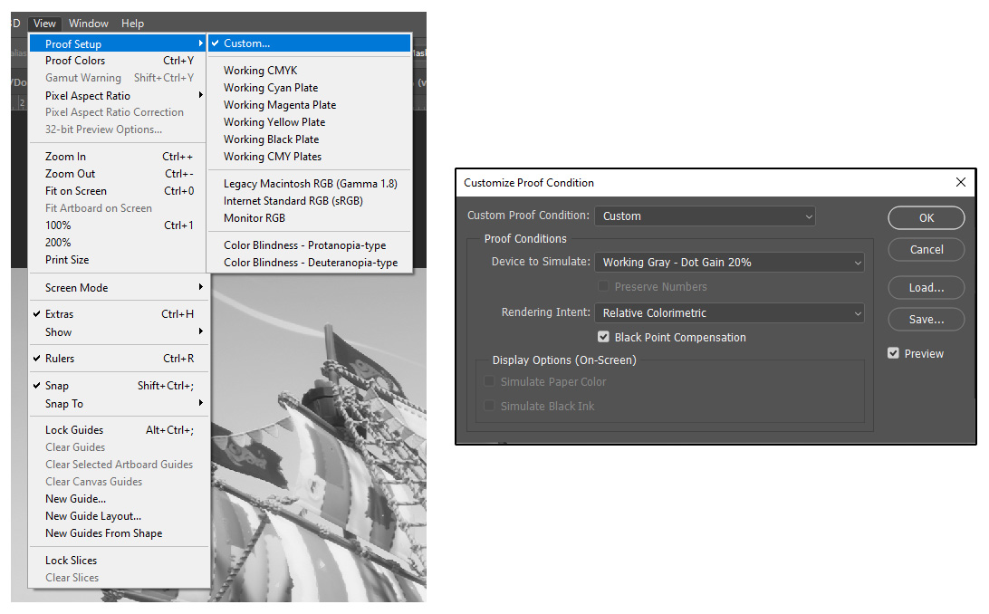
I check the values in my scene regularly, by grabbing a screenshot and bringing it into Photoshop. I have my Proof Condition set to working grayscale. That way, I can simply press Ctrl-Y and flip between full colour and greyscale values.
Exterior Lighting
I wanted to convey a bright, sunny, almost sweltering early-afternoon heat for the lighting itself. The primary directional light has a slight peachy color to it, and its bounce value is increased. This was the only light affecting the exterior, apart from the influence of the skylight.
The skylight itself is set to Scene Capture, but has a slight brown hue, to help get more warmth into the scene.
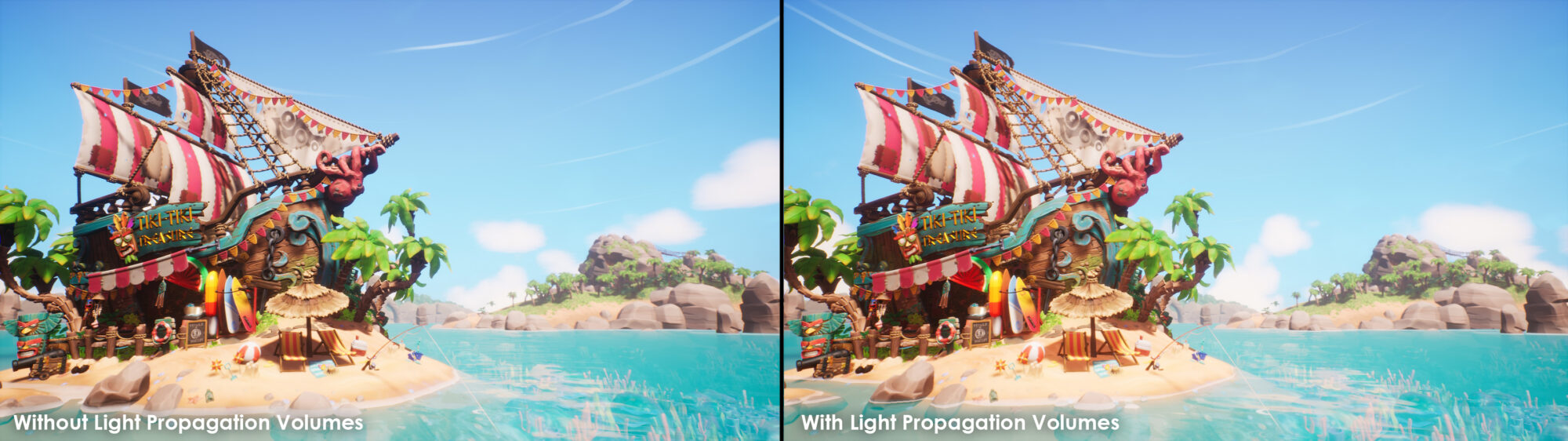
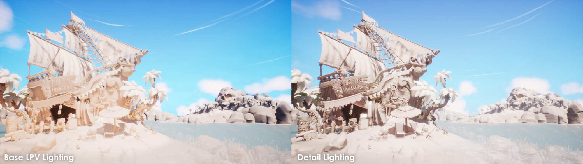
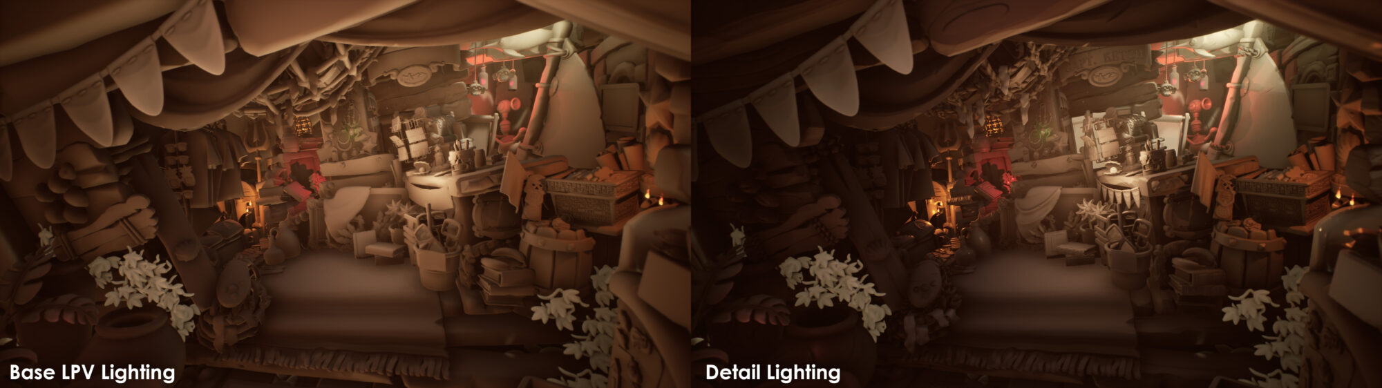
Light Propagation Volumes
I decided to use Light Propagation Volumes for this scene. Performance was not really much of a priority, which allowed me to quickly iterate and see the effects of light bounce immediately, without the need for baking. The distance for these LPVs was increased, to give a softer look, and the bounce value was increased slightly, to help attenuate the light across the darker spots of the scene.
Reflections
Reflection probes were placed in key areas, to capture more accurate reflections. As there are very few brilliant surfaces in the level, the result is simply more accurate values on the reflective bounces.
Interior Lighting
Interior lighting was a little more involved, with a lot more bespoke, manual placement of lights. A large fake light was placed near the hatch in the upper right, to simulate daylight piercing through the ship. I tried to achieve this with the actual main directional light, but due to asset placement, etc, I couldn’t achieve the look I wanted (the faked light looks accurate enough). A larger, softer light is placed in the middle of the room, to add some more fake bounce light.
Small lights were placed around candles and small areas of interest, such as the Shroudbreaker and bottles near the shrunken monkey heads. These were kept in a similar color range as the main light, so as to not become antagonistic.
Volumetric fog volumes were placed in the room, to create a nice dusty look, and simple floating bits of VFX dust and motes added to the look and created some subtle movement.
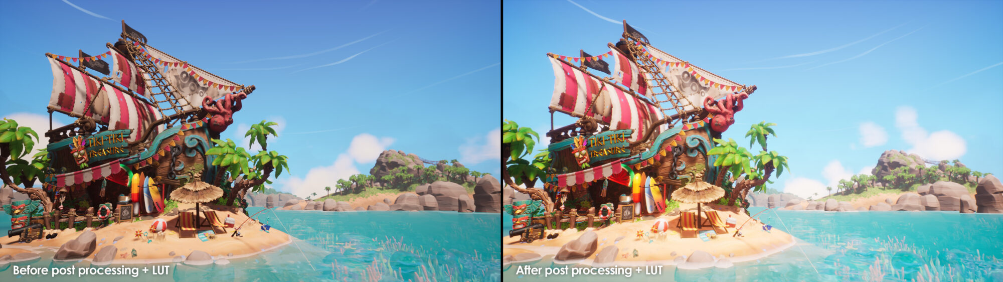
Post-Processing Volumes
The post-processing volume for the exterior bumped up the saturation and contrast of everything, and increased bloom, to capture that feeling of a hot bright sun bouncing off objects and intentionally bleaching certain elements.
Some of this grading was achieved through the post-process settings themselves, with a LUT being created for the finer tweaks to contrast and how separate color channels behave in shadows/mids/highlights.
There is a separate post-processing volume for the interior, which fades in when the viewer is closed. This allowed me to have far more control over the look and overall lighting of the interior.
With this switched off, or using the primary post-processing volume, everything was visually noisy, competing against other assets, with way less focus.
This post-processing volume dials back the saturation and introduces a warm sepia tone. It boosts the highlights, but darkens the shadows, and increases the vignette, to pull attention towards the center-right of the frame. It also increases the intensity of SSAO but reduces its range of it, which helps bed the smaller assets in.
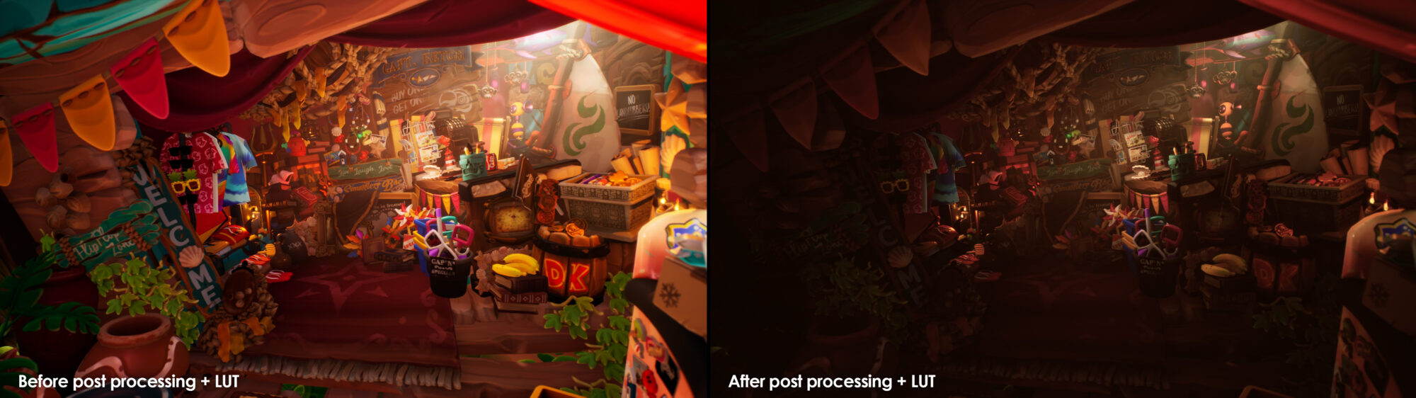
A fade-to-black cube is placed over the interior, which fades out as you approach. This way, the interior becomes more knocked back in the exterior/distant shots, creating less visual noise.
Texturing
I textured most of the individual assets in Substance Painter. Once again, I began by focusing on one or two assets that covered the more abundant materials in my scene (wood/iron/paint).
Once I was happy with these, I could easily make smart materials from them and apply them to my other assets, only needing to make a few edits to some masks, and work on any bespoke or more esoteric materials and details.
In my opinion, the base color and roughness value of an asset is the most important aspect to get right and is the primary reason why I block out these materials early on. Extra surface detail and features help to elevate these textures, but are really supporting elements, and have a less overall impact on scene tone and read than the initial, larger-scale values.
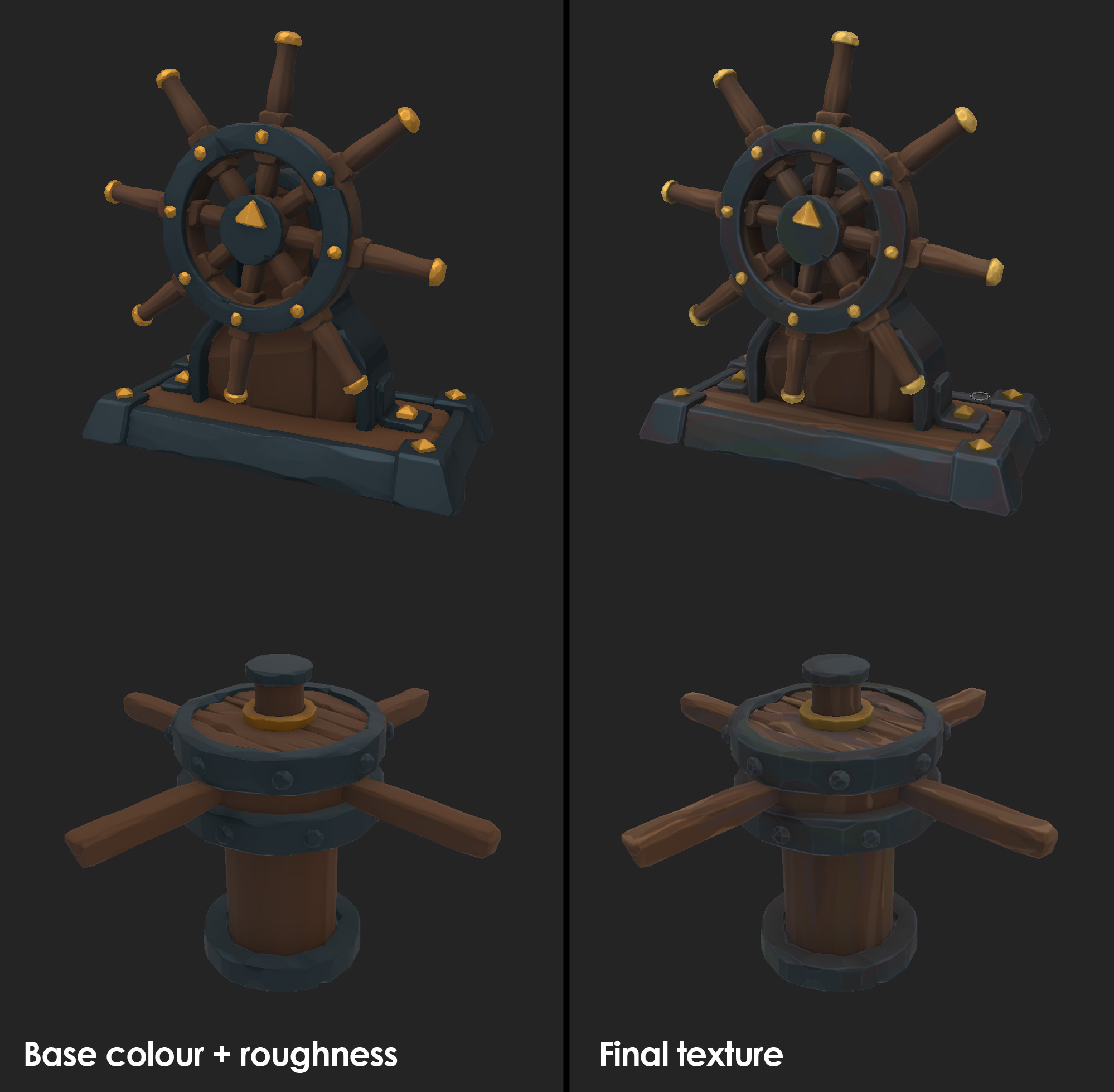
On top of the base color and roughness/metalness values, fill layers with simple masks are used to bring in some light grungy interest such as dirt, rust, etc., often using the baked curvature map, or an AO generator, filtered with various slope blurs and levels.
Edge highlights are applied to almost all surfaces. These are subtle, but help to define the key shapes of an asset, making them pop.
Extra positional highlights are sometimes added on top to give interest to certain assets, for example, subtle gradient mapping to a taller asset like a totem or palm tree. These are generally done using a Position generator and the baked position map. This gradient can also help to bed in larger objects to the scene, or softly fade them into the surfaces they sit on e.g. adding sand to their base.
To add noise to masks, I usually apply a couple of slope blur filters (one large and soft, the other smaller and more granular). This adds a bit of organic variation to the mask, without too much realistic or high fidelity/granular noise.
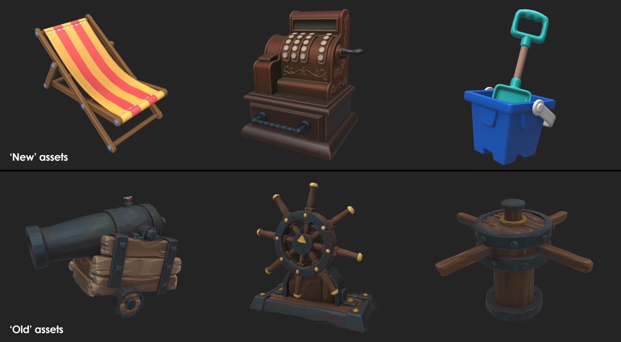
Old VS New
There is an intended contrast between how I approached the older/antique assets vs the newer assets. Newer assets have less surface detail and damage and are generally slightly more vibrant than the older things in the scene.
Older/antique assets are slightly less saturated, with more wear and tear, stronger dirt masks, and stronger variance in these masks. I wanted these assets to look as though they have been sitting in the scene for a long time, although without sacrificing too much overall vibrancy.
Surface Detail
The surface detail was painted by hand. Scratches/chips in paint etc. were placed using alphas which I created with simple shapes in Maya. This approach is not very procedural, which means that it would be less ideal if I were to create a larger library of assets that I wanted to iterate on quickly or easily.
However, it allows me to be very precise and meaningful with these surface characteristics, placing them with more purpose, and allowing me to author the exact patterns I want the viewer to see.
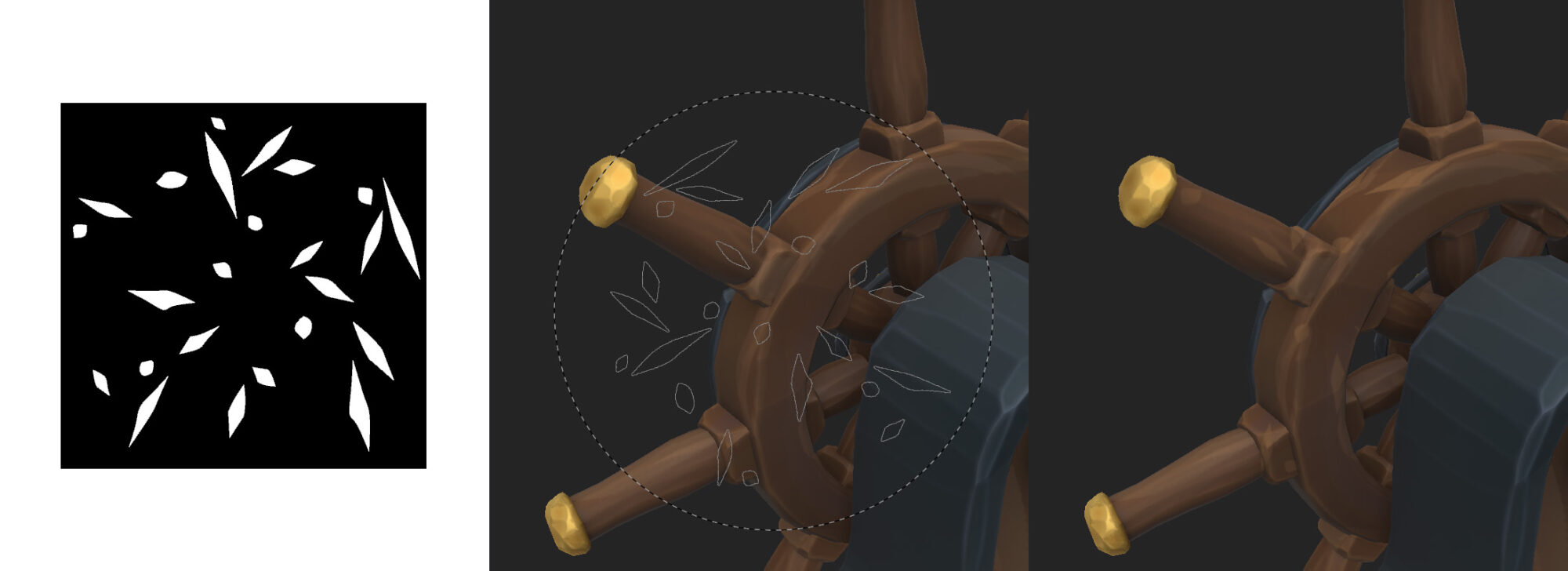
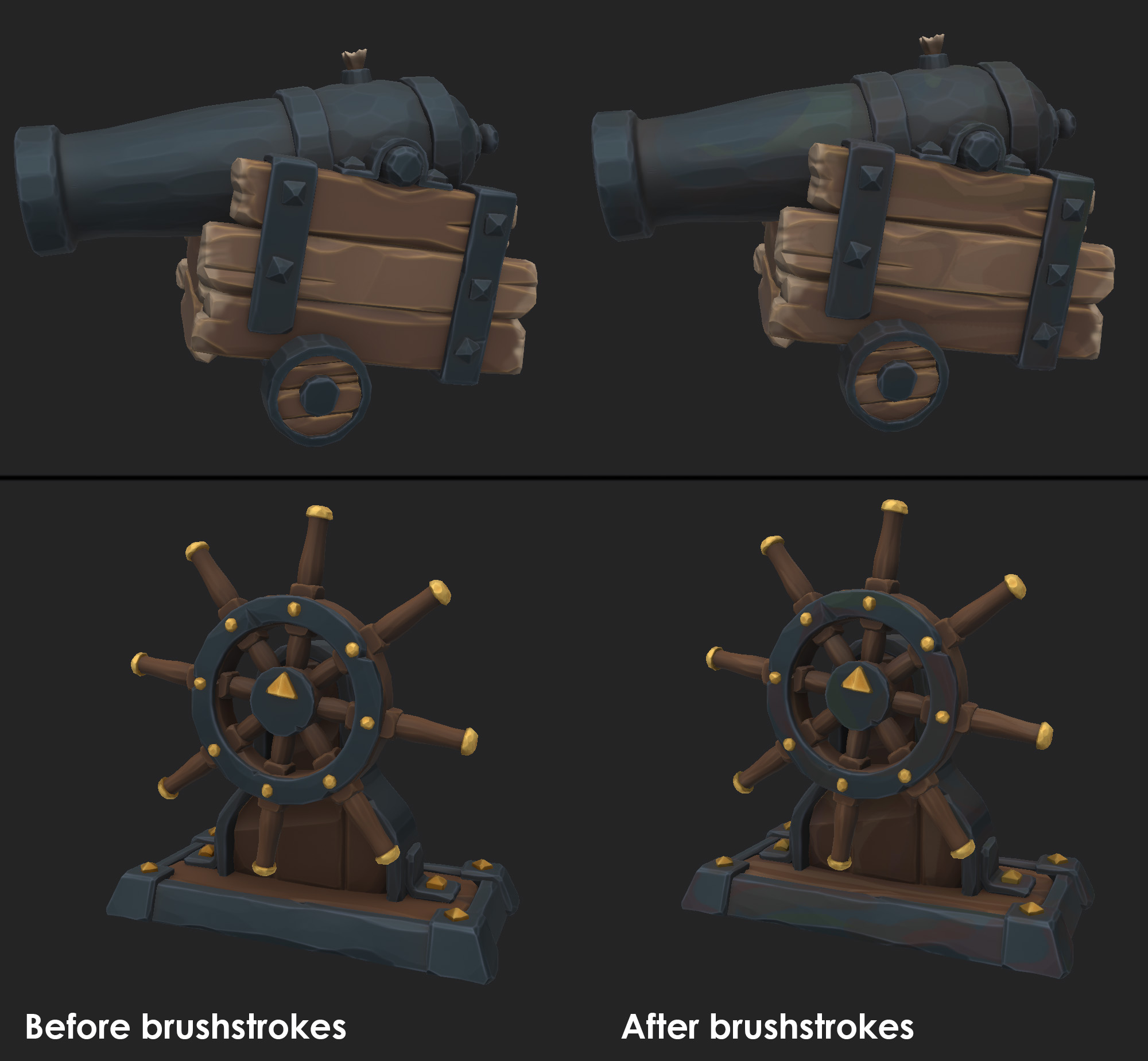
Brushstrokes
Certain things that are baked such as wood grain and color variation were painted using a brush with a wet alpha. This allowed me to get some nice brushstrokes to work in and ensure detail is picked up in areas I want, without having overall noise.
Switching between black and white in the mask while layering these brushstrokes allows me to get a nice mix of harder and softer edges. Again, this is a less procedural approach, but gave me more control over what the end result would look like. There are 2 types of brushstroke layers in most of these textures:
- Value interest: I like to add softer highlights and lowlights around the edges of opposing facets, to add more visual contrast, and make these facets pop. These are usually simple blacks/whites set to overlay or multiply.
- Color variation: This is crucial to create a more organic look, and to also break up larger, flatter surfaces. This was also used a lot more on the assets that were intended to look older, layering on thick greens, browns, reds, and blues.
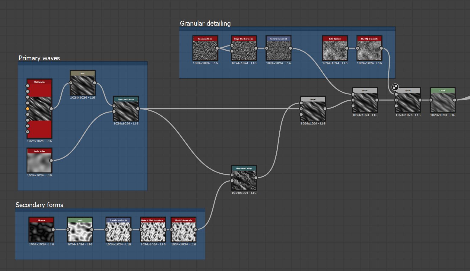
Tiling Materials
I use Substance Designer to create the tiling materials, but as I don’t usually require my materials to be completely procedural, I sometimes create elements in ZBrush, which I then bake down to height maps and bring in to Designer. This allows me to quickly and easily create things such as wooden planks, that fit exactly with the sculpted shape language of the scene, without struggling to make them through shapes and nodes.
The sand texture tiles are probably the more complex or interesting materials made for this scene. They use multiple, high-strength directional warps to get the wave effect:
Polish/Final Pass
Animation
I try to add as much movement to my scenes as possible, to make them feel dynamic and alive. I’m by no means an animator, so everything I approach is designed to be relatively simple to achieve. Most things are animated using simple rotations, positional movements, or meshes that move/animate along a spline.
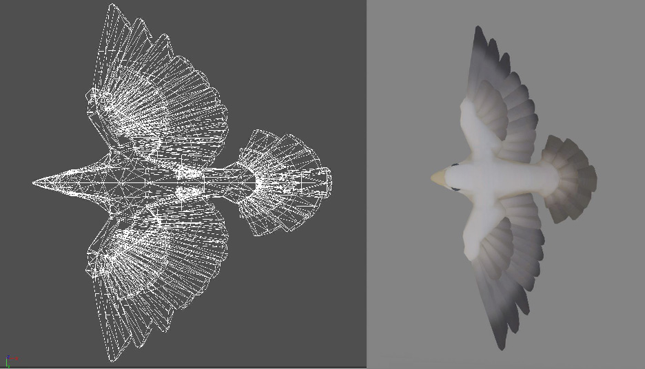
Birds
The bird movement was all done inside Unreal. The bird flapping animation is done through top-down mesh displacement. I had a second UV channel on the bird, which was a simple planar map. I then lerped between two black and white gradients along this, with the alpha based on Time multiplied by a Sine wave, and used it as the world offset for the bird. It’s by no means believable or high quality, but it achieves what it needs to.
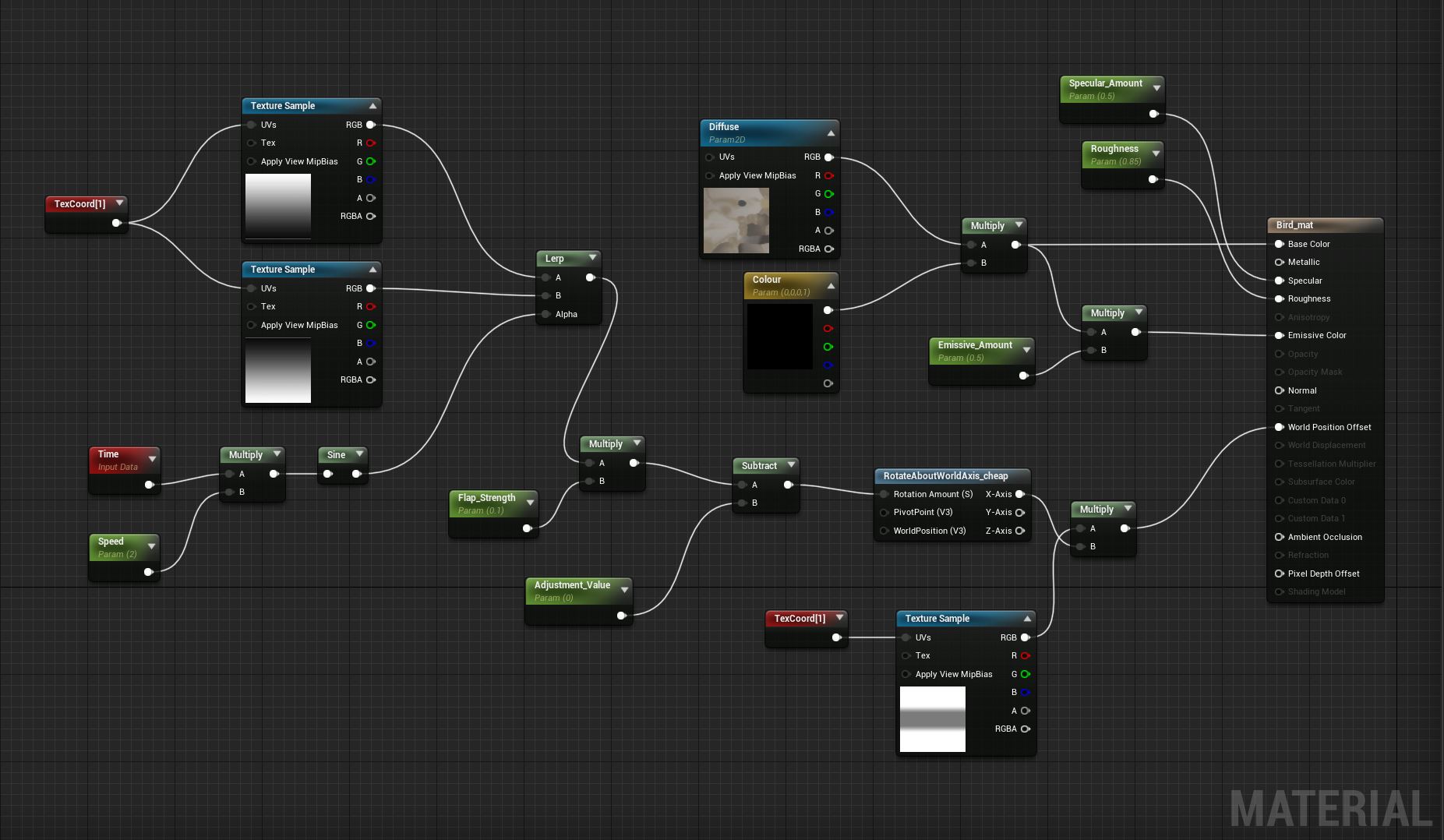
The movement of the bird within the world was done by simply attaching them to a few splines, setting up a simple blueprint to move them along it, and looping this blueprint indefinitely.
Fish
The fish that sit closer to the camera was done using the same techniques as the bird. This time the displacement was mapped down the side of the fish to get the fin and rear half of the body moving, then the fish was attached to a spline.
I wanted the distant fish to feel more like a large school, so I used a Niagara system for those. A simple emitter shoots invisible particles out from an origin point every few seconds. A larger emitter (the fish themselves) are set to follow the invisible particles and switch to following a new invisible particle as and when they are shot out. This results in a sporadic and organic motion.
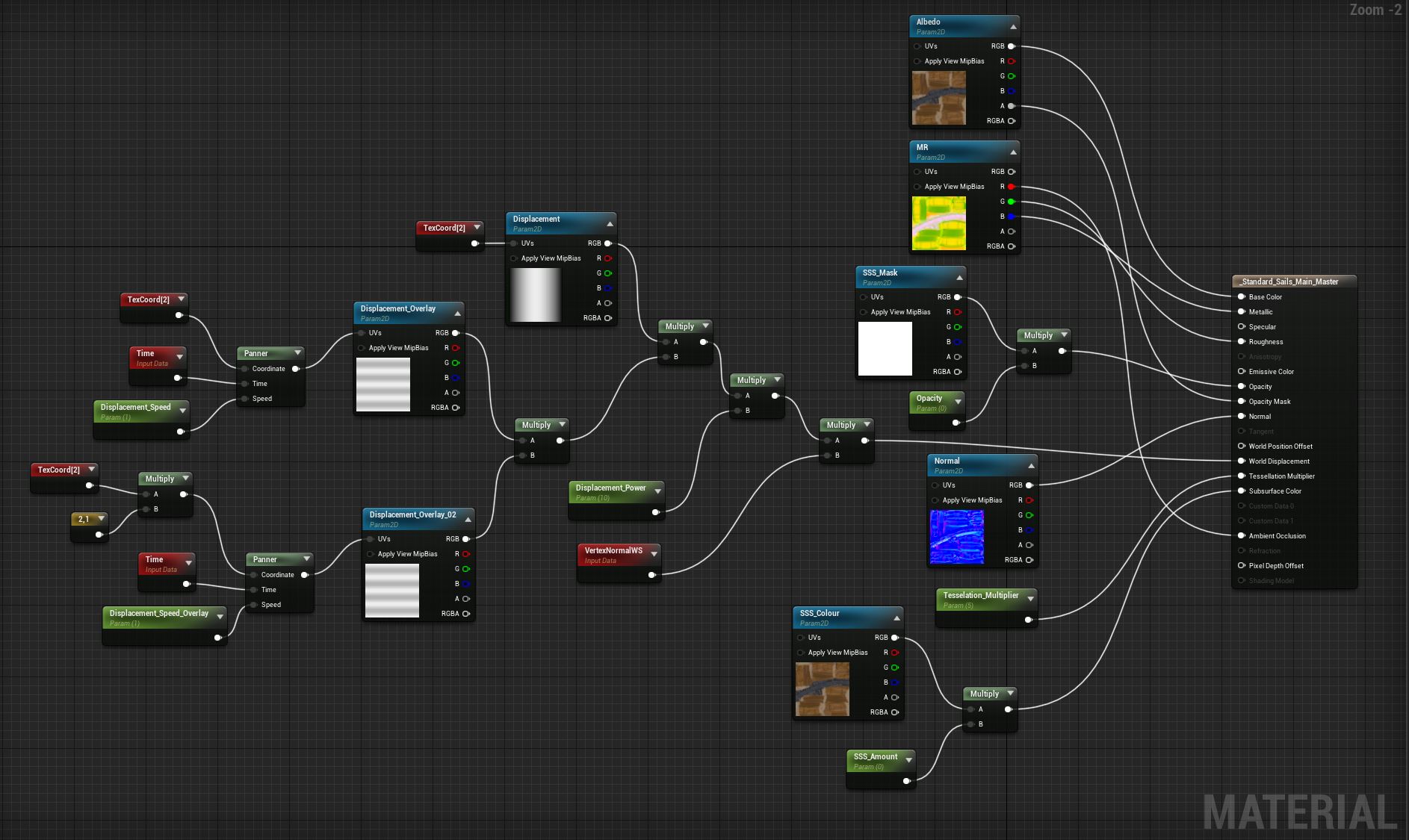
Sails
The movement on the larger sails was achieved by simply scrolling 2 displacement maps along them at different speeds, to get a series of larger and smaller ripples. These fed into the World Displacement channel
(Can you tell I like displacement maps yet?)
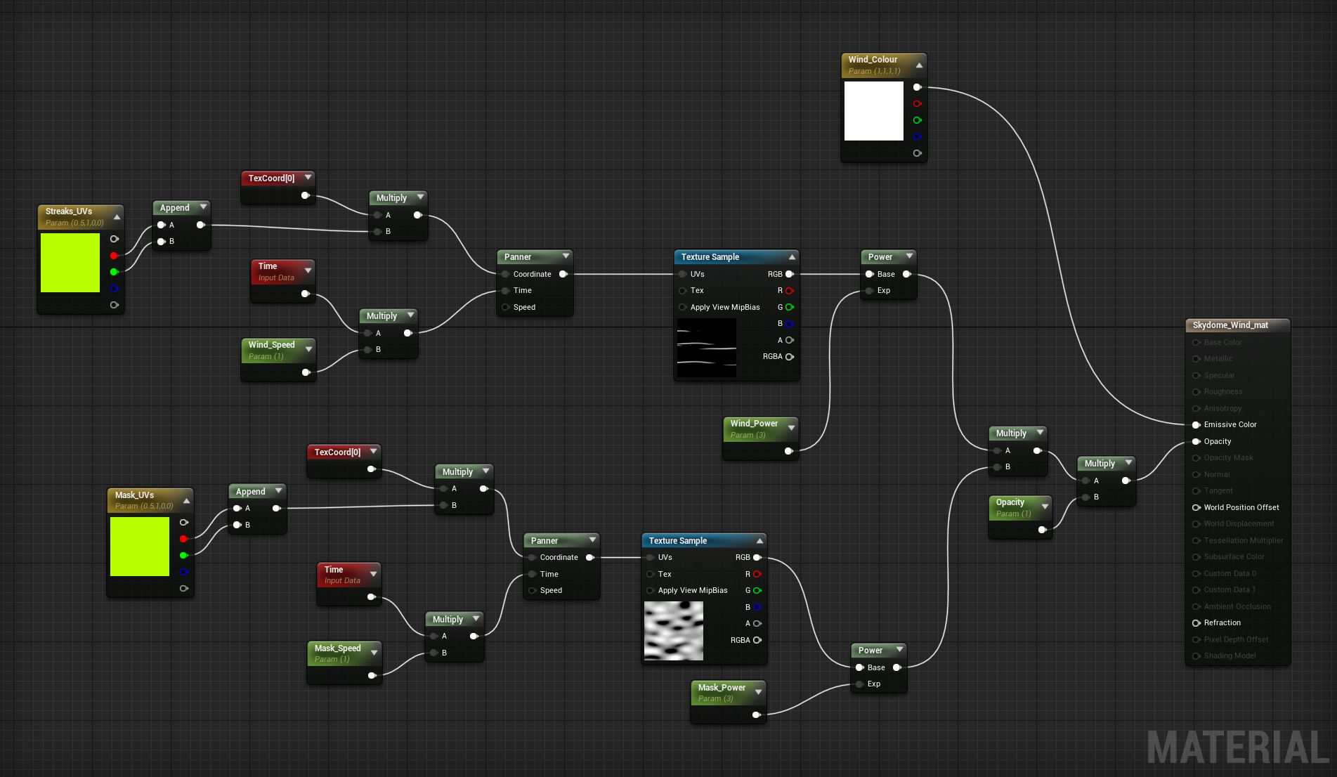
Wind
The wind effect was done by panning some wispy lines around a hemisphere and masking these with a larger noise mask, which was also panning but at a slower speed. Very simple, but effective at giving a bit of movement and dynamism to the sky.
Water
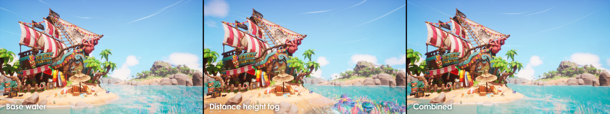
Water was a big feature of this scene, covering a large amount of the screen, so I made sure to spend a lot of time trying to get a good-looking shader that achieved a lot and had a lot of control. I wanted water that was vibrant and juicy, with some nice soft movement, and a crisp transition with the shoreline. I wanted the water to have a certain thickness to it, but for the viewer to still be able to see the coral reef and all the vibrant colors of that underneath the surface.
The distance water didn’t have enough thickness to it so a simple fog volume was added that fades near the camera.
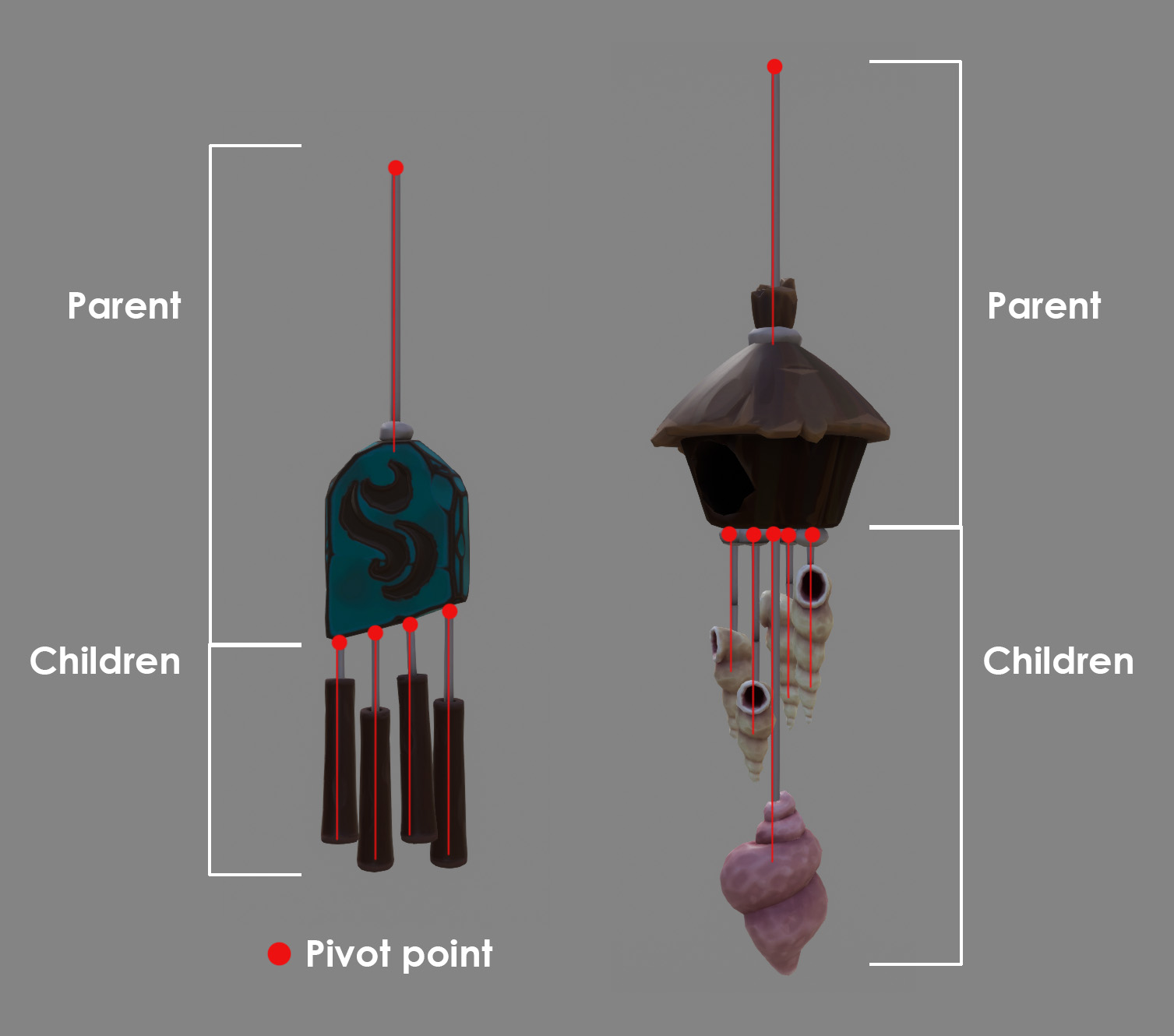
Windchimes
The wind chimes were probably some of the more complex ‘animations’. These were achieved by splitting the mesh into separate rigid pieces, and parenting the parts to one another, so each chime is essentially a chain. Pivot points lay at the top of each element, to make animation easier, and require no bones. These elements were then hand rotated over a timeline, and looped. I made sure to animate each type of windchime with differing strengths and frequencies, to get a more organic feel.
Crab
The crab was animated in a very similar way. I consciously modeled it so that all of the separate elements could be detached, then parented and animated with no bones or deformation necessary.
I animated a simple short walk cycle (about 2 seconds long), which could then loop. I then created a blueprint in unreal, which simply slides the crab along a spline. Extra up and down movement was created using a timeline in the same Unreal blueprint, just to give that extra feeling of it traversing an undulating surface.
The footsteps were a tiling normal map decal, with a mask that pans over time, revealing them. I planned to only have one shot of the crab moving over the sand, so it didn’t matter that it loops poorly. The Time function was exposed on this material, so I could match the movement of the crab easier. It’s all smoke and mirrors!
Polish
A very large amount of time is spent toward the end of the project simply tweaking material colours, roughness values, lighting values, etc. As much as you can block out and preempt/prepare when the scene starts coming together and you start adding more elements, things such as colour palette, scene values and lighting will inevitably shift slightly.
As most artists can attest, the last 5% of scene creation can often take a disproportionate amount of time, as you polish and tweak, pushing colour values and roughness sliders 0.1 either way, increasing or decreasing light intensity by 0.1 etc. However, these small tweaks can really tie jarring elements together and can make all the difference between a good scene, and a great scene.
I also like to bench my projects at a few key points in development, including for a period toward the end of production, after I’ve done the first pass on all the elements of the scene. Spending so long staring at one thing can cause fatigue and make you not see fundamental flaws in the overall read and consistency of your scene. Having that time to come back with fresh eyes can help you re-evaluate how to approach areas that aren’t working, and can also simply reignite your passion for that piece of work.
Conclusion
I hope this article has been insightful and has helped shed light on my approach to the conception and creation of my scenes.
Read more articles
You might also like these articles.