
Introduction
Hello everyone, I'm Adrien Lemoine, I'm an Environment Artist at Dontnod Entertainment currently working on an announced project.

Project Goal
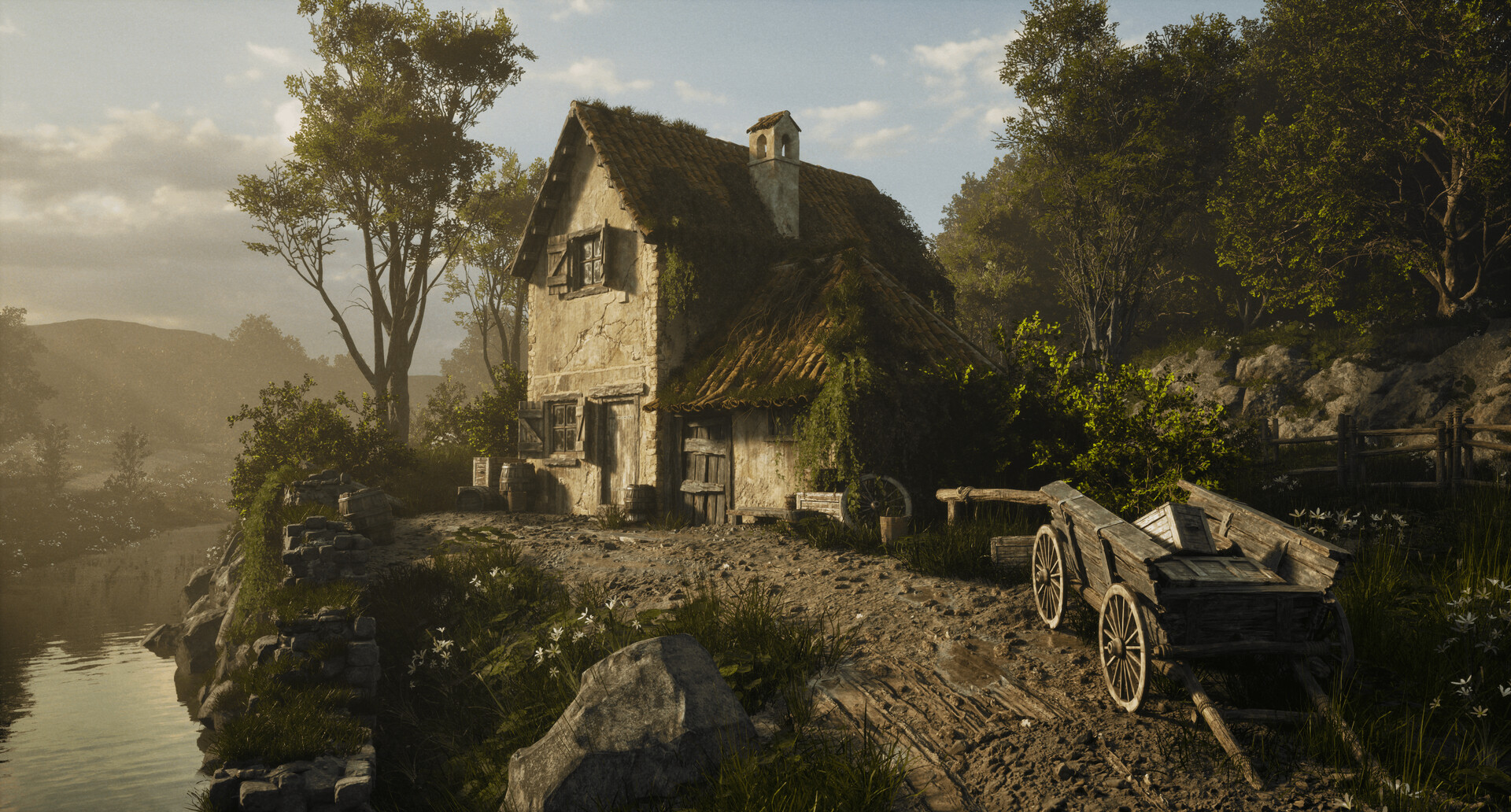
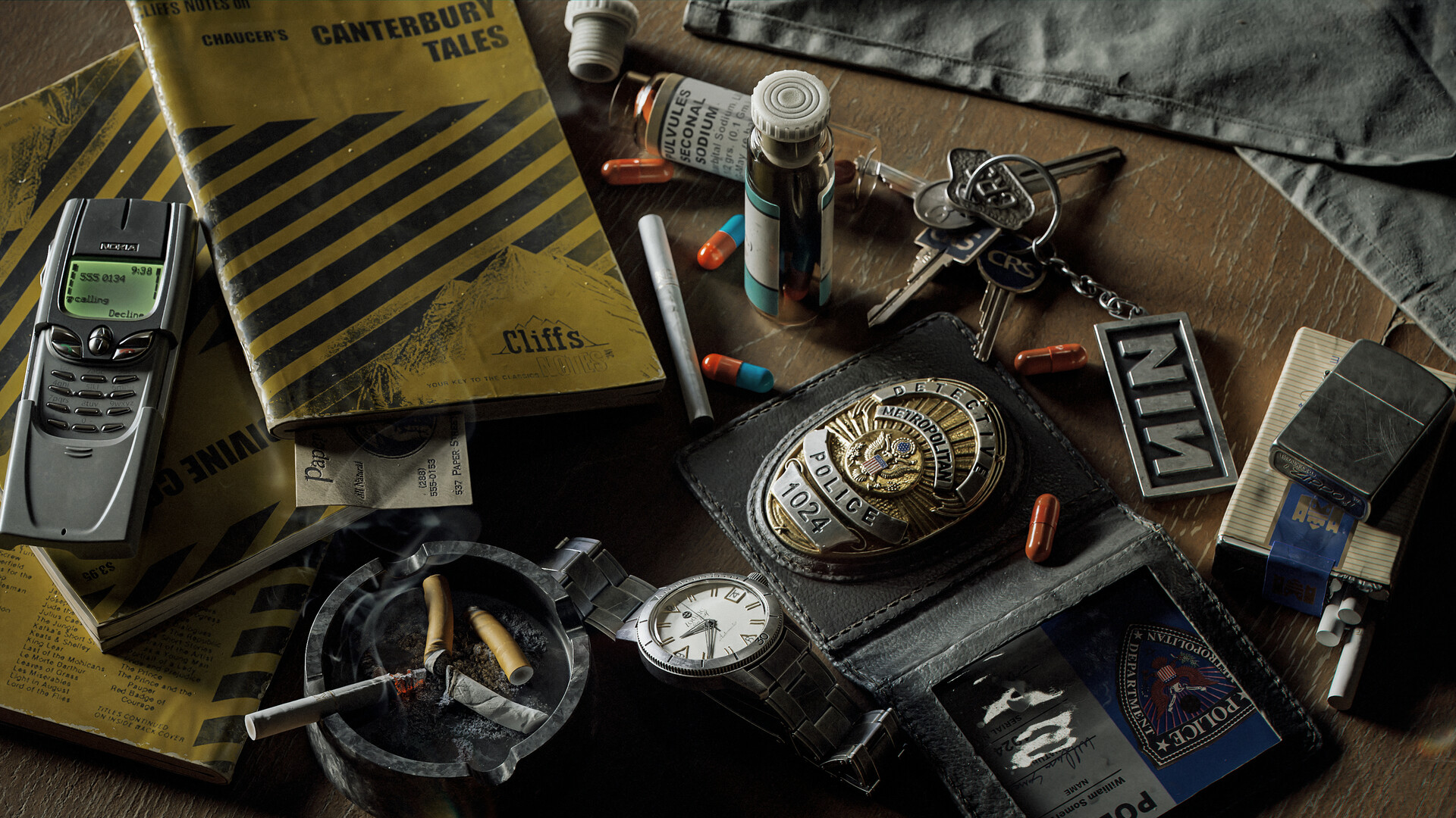
Through this project, I wanted to try myself with realistic material that carries specific details and little stories in it. I was inspired a lot by Gustav Engman, Vincent Derozier and Geoffrey Rosin Piperaud on this one.
The focus here was to gather a few strong references with clear details to reproduce and mixed them into an adaptable material.
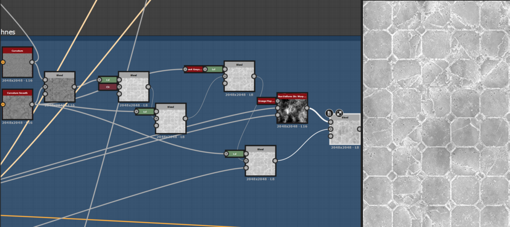
I also tried new techniques that I was eager for some time, like the flood-filled-based cracks. This graph wasn’t made to be super optimized, but more about learning micro storytelling and practicing details.
References
If references are the key, sometimes too many of them overwhelmed me. When I have a clear idea of what I want to do, I try to gather just a few of them, but with strong details, nice colors, and enough resolution.
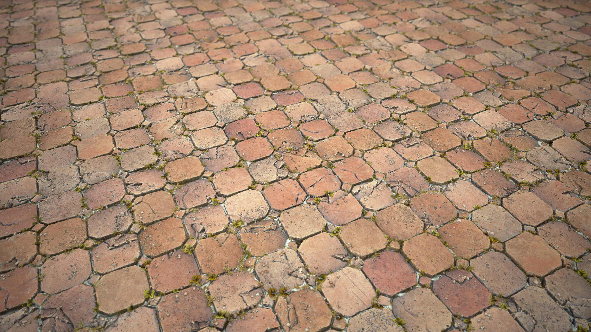
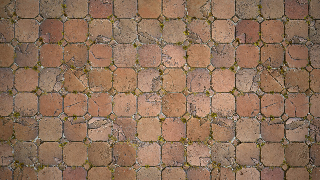
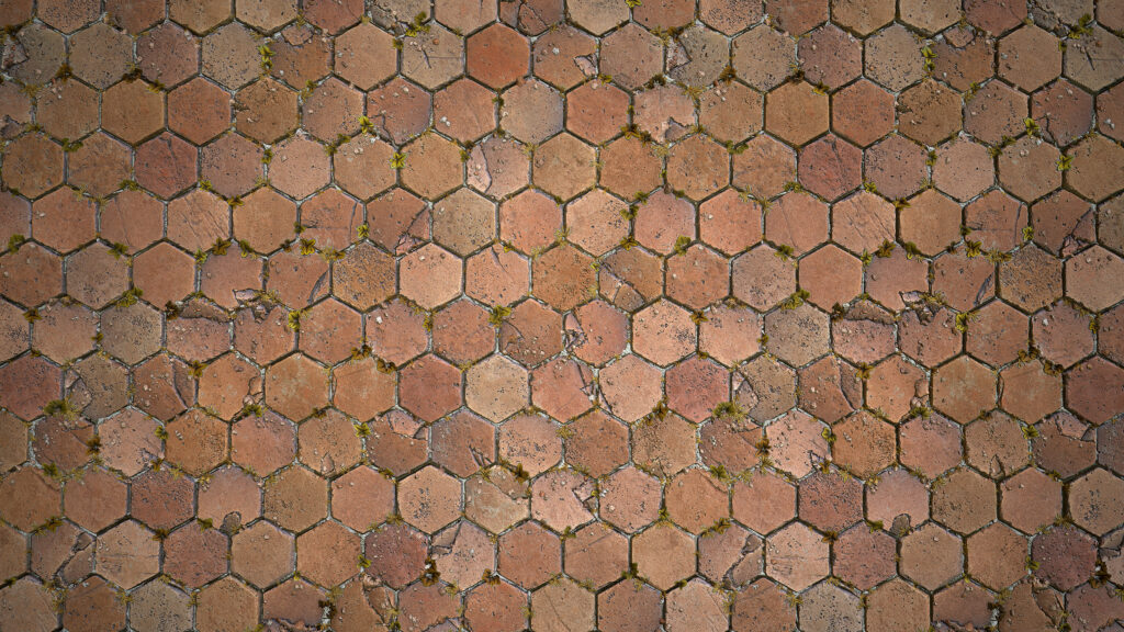
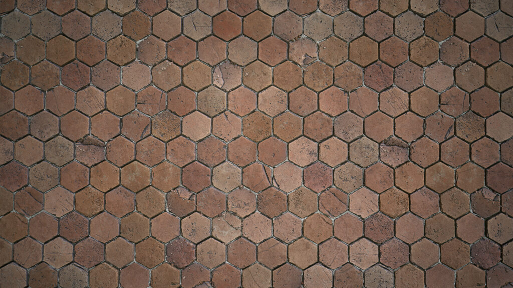
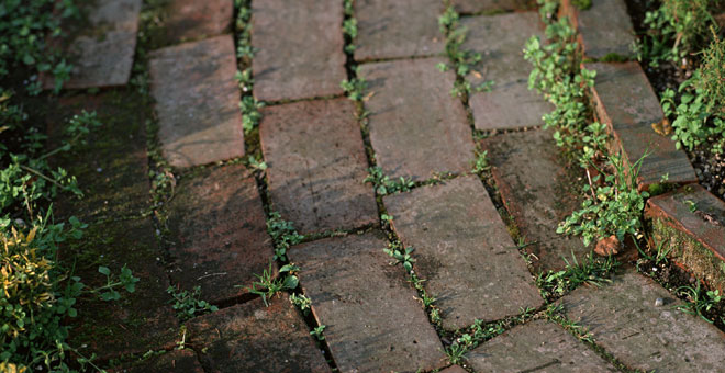
Since my focus was details and story, I chose old-aged terracotta tiles and some little plants.
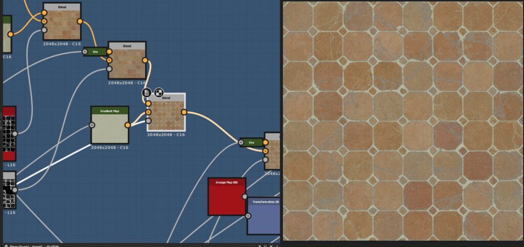
Material
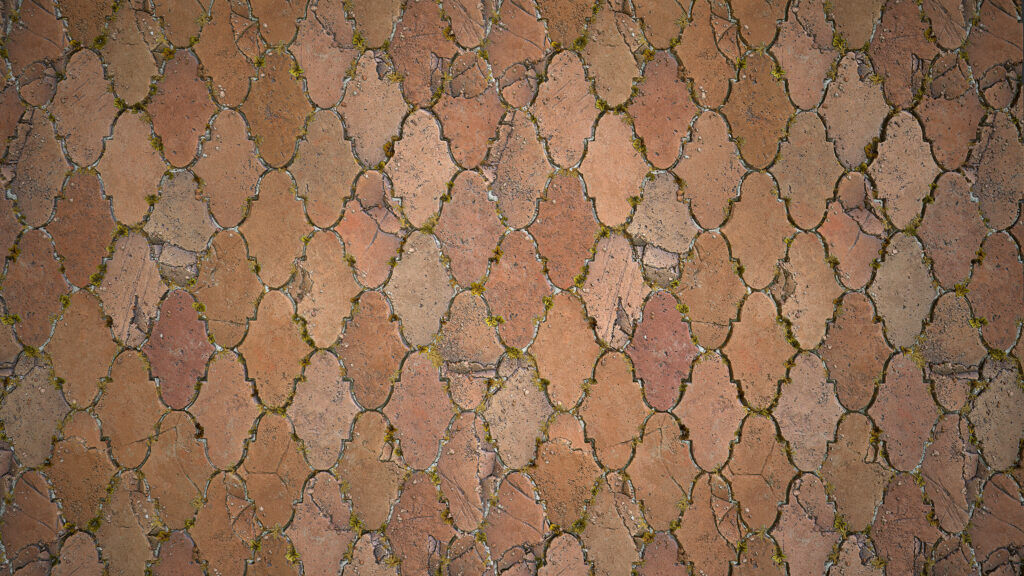
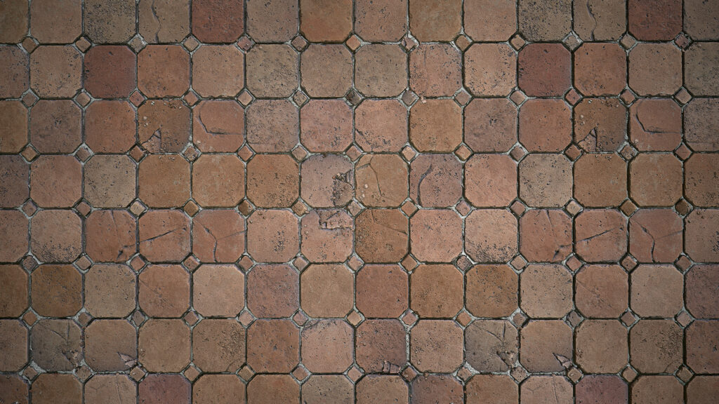
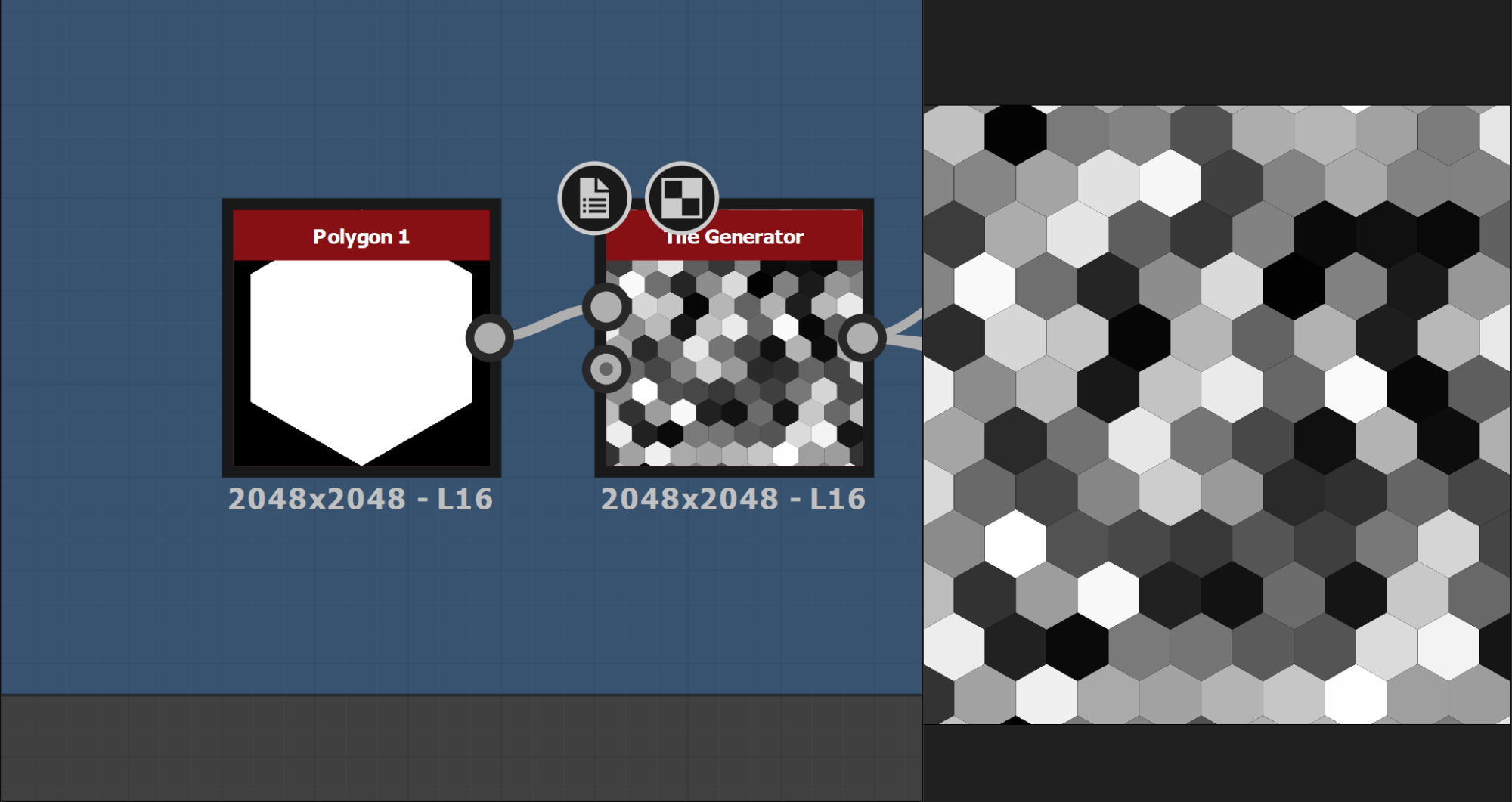
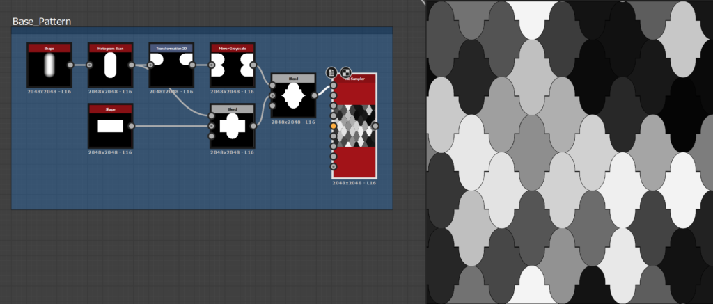
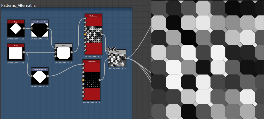
I started with a simple pattern as I didn’t want to spend too much time on it, but I quickly tested others that have more shape variations.
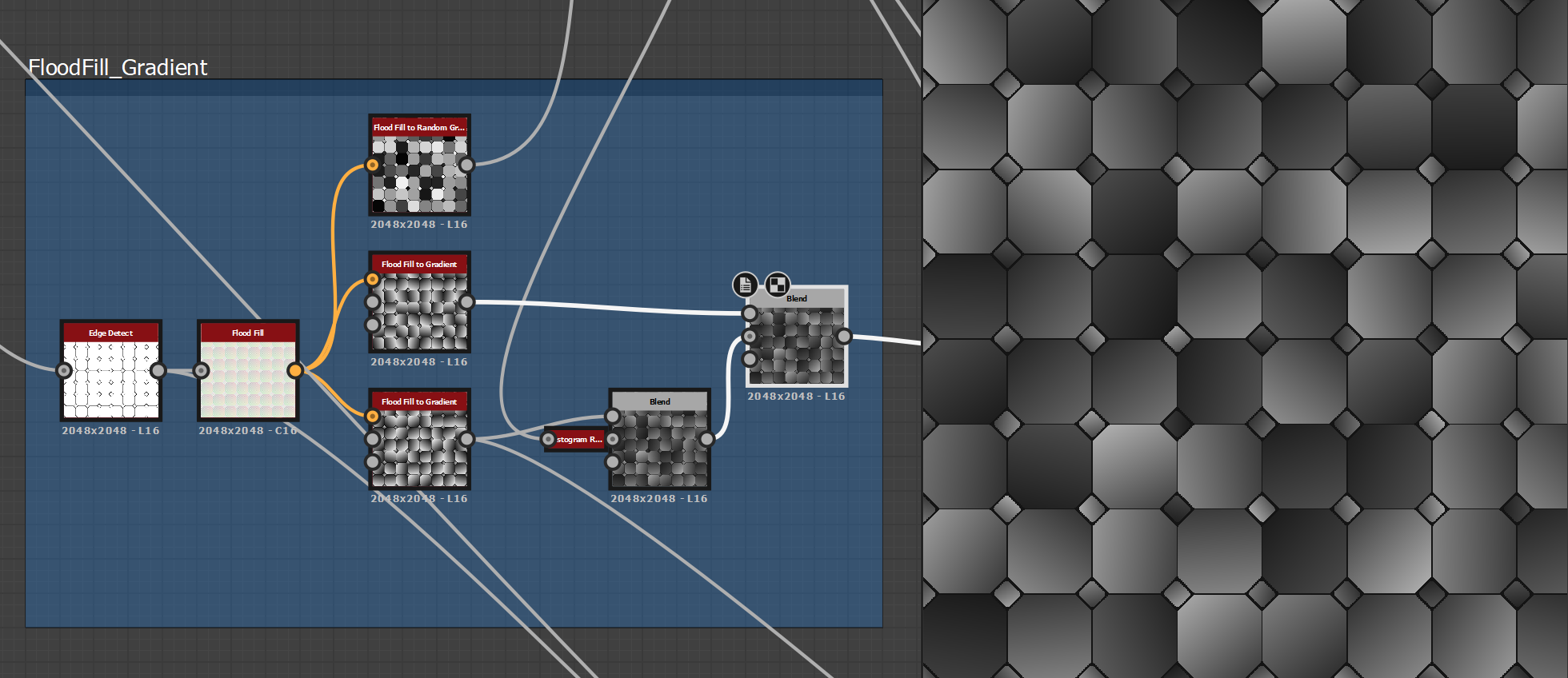
After that, I created some volumes for the height map with a flood fill gradient and random grayscale.
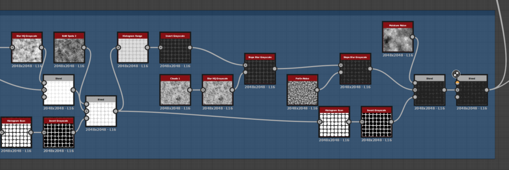
Edge Damages and Mortar
The first step of detailing the material was to add edge damage, with a mix of the different edge detect values and a bevel to have different sizes of the intersection. I then added some slope blur based on blurred Perlin and cloud 02 noises.
To recreate some details I liked on the references, I worked on basic shapes, splatter them and slope blur with it then multiply them on top of the other slope blur.
To have more control, I blend each slope blur in multiply or min darken to have access to the opacity slider and choose the intensity of the effect. Or just use a mask for selected areas.
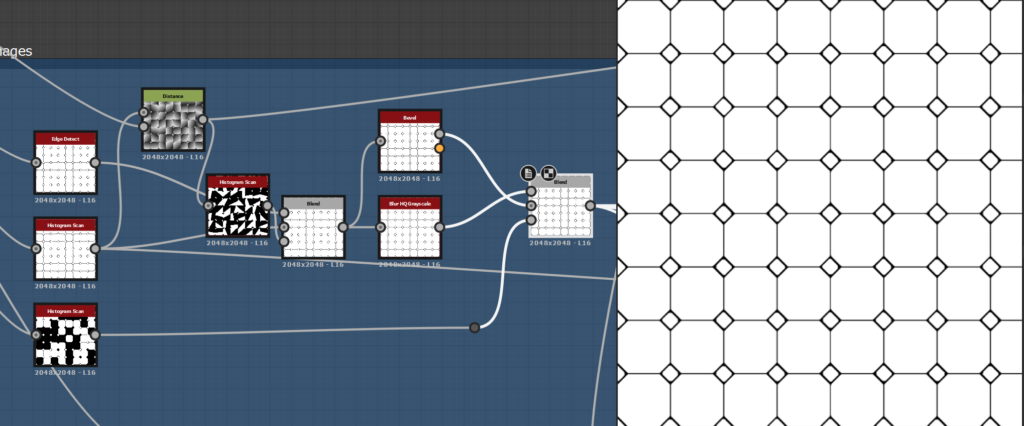
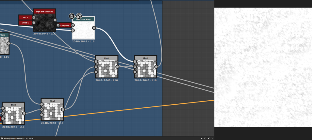
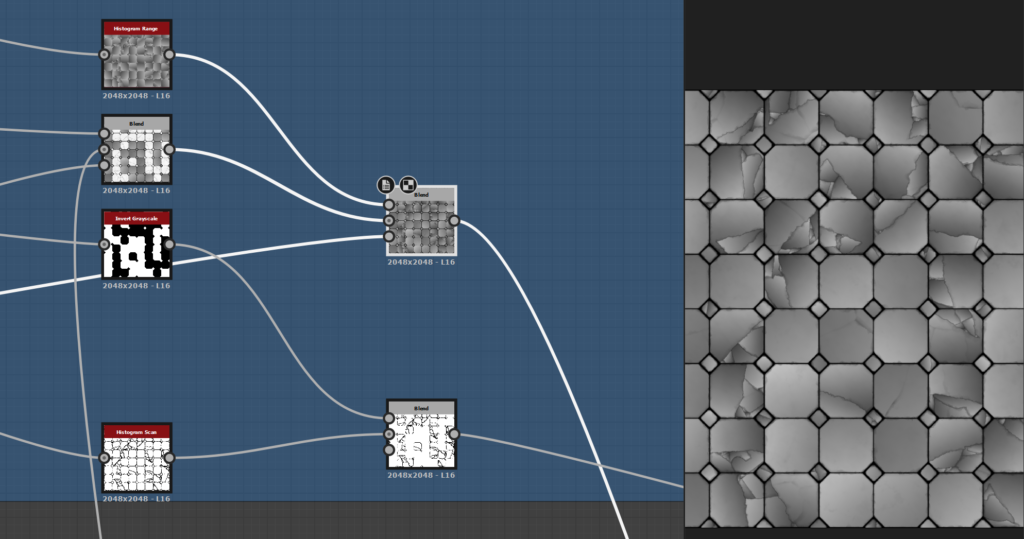
For the mortar base, I inverted the edge detect, beveled it and add damages and details with noise blending and slope blur, just like the edges.
When blended with the tiles, I used a histogram range to find a value for the height map to fit the references.
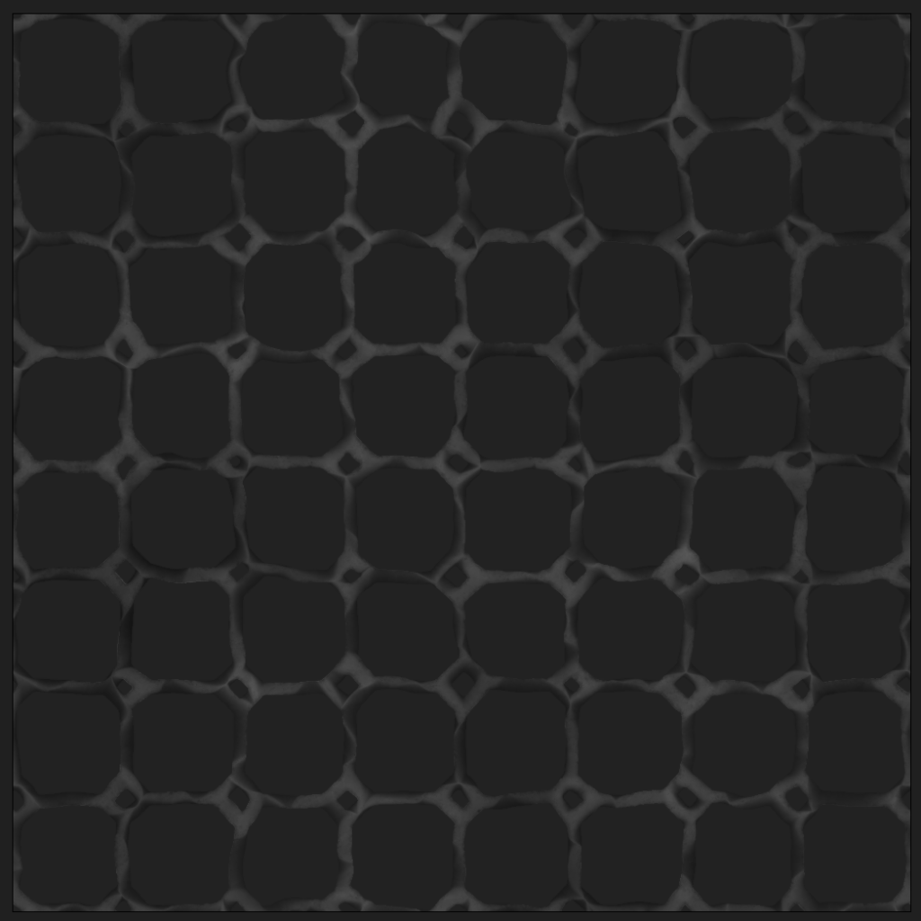
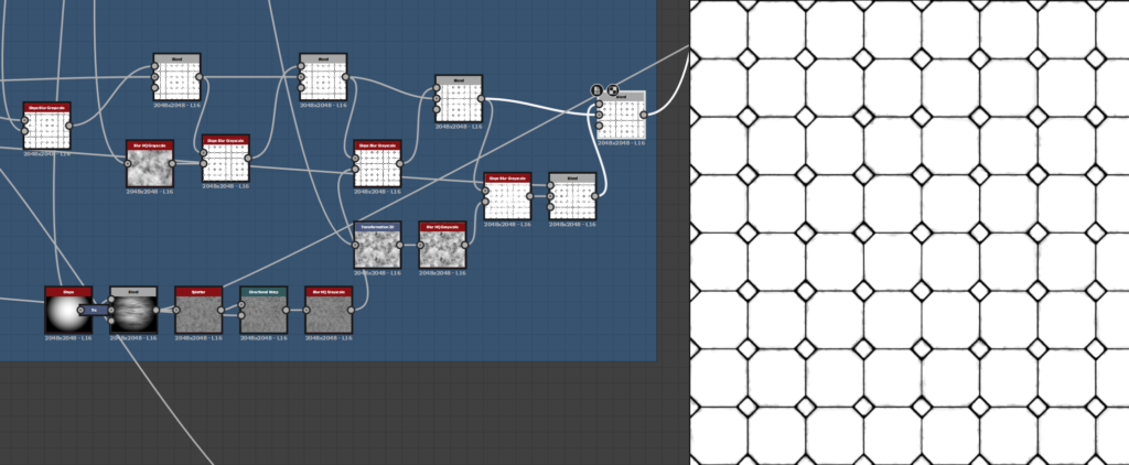
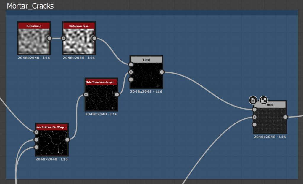
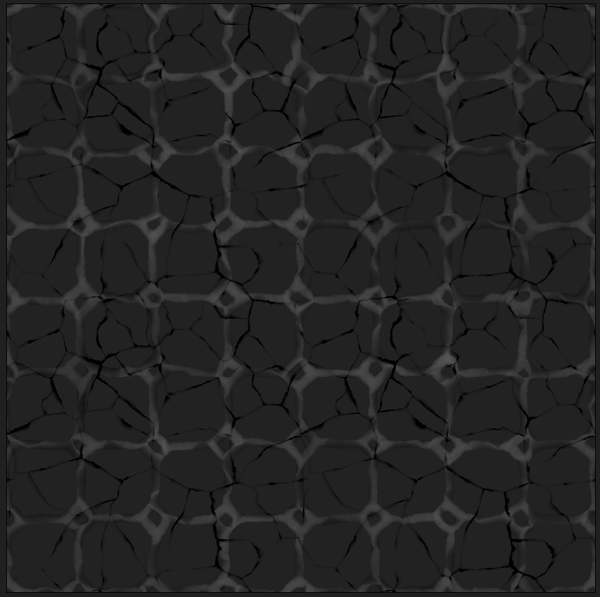
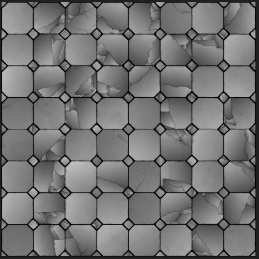
Small Cracks
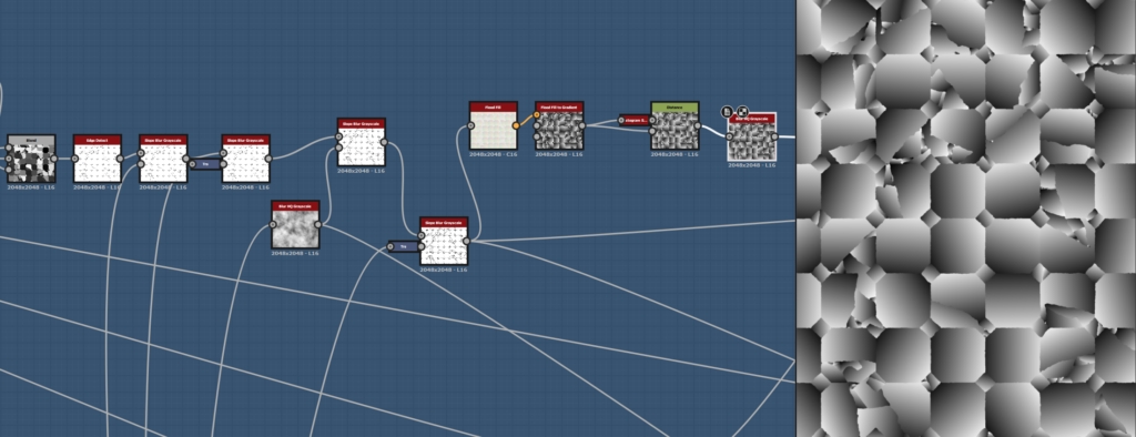
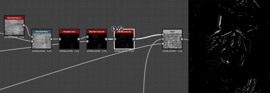
Time to add details on the tiles: With a tile sample, a distance and an edge detect, I build a simple cracks generator and I deformed the result with the directional warp to make it more natural.
One of the more important steps here at the end of the cracks details process is to have a nonuniform directional warp with your grayscale pattern (the first flood fill random grayscale) in the intensity and warp input with a big value to break the continuity of the cracks.
For the mortar cracks, I just reused the small crack parts, with different random seeds and multiply them on top.
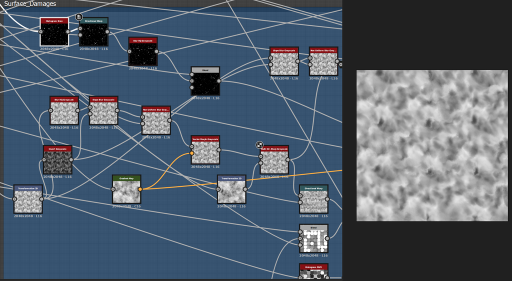
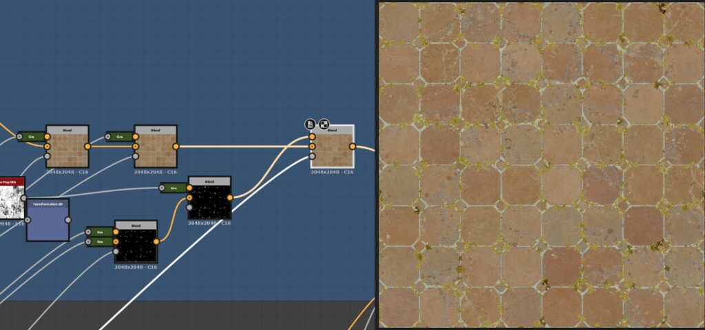
Surface Details
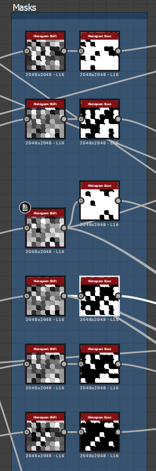
I split the surface details of the terracotta tiles by their size and their importance. The main goal here was to really look at the references, find interesting details and try to reproduce some of them.
To make the noise process easier, I shared them across the graph. I did the same with the masks I created with a histogram shift and a histogram scan to bring different details to each tile.
The first pass of details is made with a bunch of noises, warps and vector morph to deform them and blend them with the tiles. I tweaked a lot the values to find the one I liked the most. This part is a lot of back and forth.
I tried various recipes with slope blur, inverted noises with subtracting blending mode, and different noises to see what effect I can achieve. The key here is experimentation.
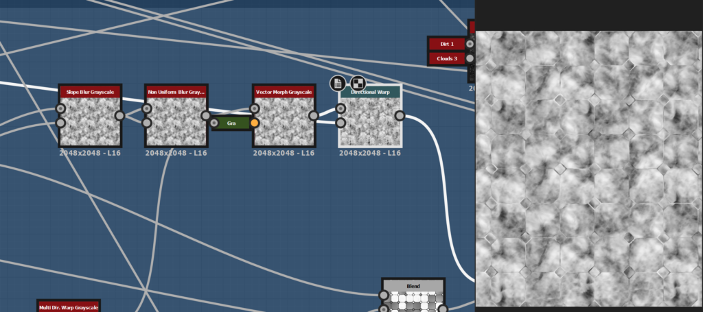
One of the detail I really wanted to try was big cracks with a different orientation for each island and easy procedural control over them. For that, I get back to the start of my graph and created a new flood fill with two different random gradients and a random grayscale.
I used a histogram scan to have a nice black and white mask. With the position slider of those nodes, I controlled the spread of my big cracks and the age of my tiles.
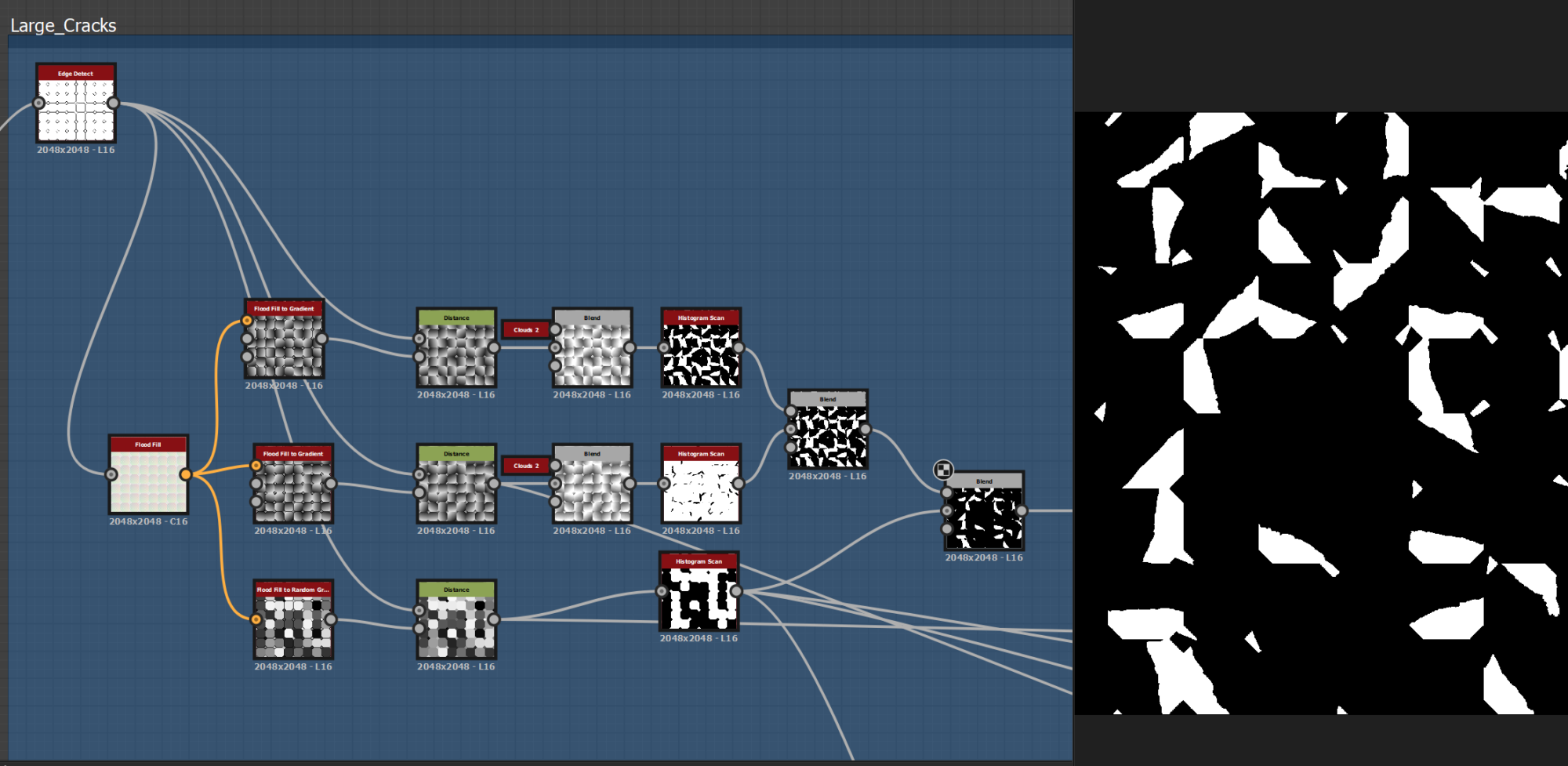
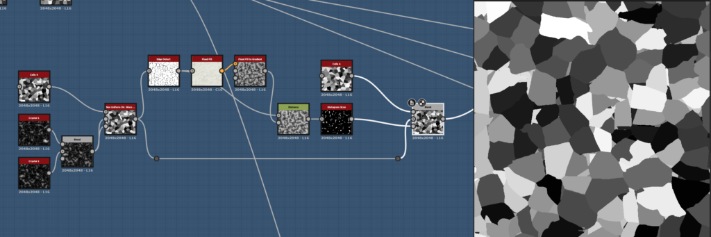
Then, I use two cell nodes of different sizes with another flood fill and blend them with a mask. I edged detect the result, put it in another flood fill and us the random gradient to drive the orientation of the islands.
With a histogram range to balance the value and a mask, I blended it with my base tiles.
After that, I moved to more specific details:
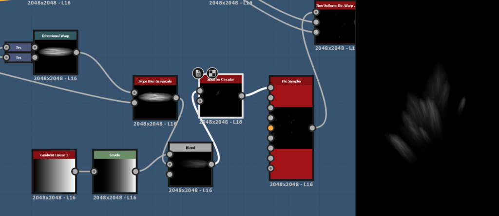
The scratches, the little holes, and some foot damage over time. With a custom shape, the splatter circular and the tile sampler I was able to reproduce these specific details and add them randomly on some tiles with my previously made masks.
Then, I spend some time tweaking the value to find the right balance between all these details. I wanted it realistic, but not too noisy.
I used a height blend node for blending the tiles with the mortar and tweak the values to have a good height map.
Grass and pebbles
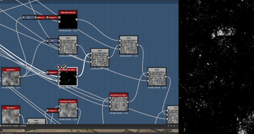
For the small grass, plants and pebbles, I created simple shapes in different graphs and scatter them in Tile Samplers. For more details, I doubled them to have size and color variations.
At the end of each tile sampler, I used a histogram scan to create a mask to guide the scattering of the next one. I used a shadow node on the cracks to drive the pebbles around them in a specific direction.
For blending the grass and pebbles with the tiles and mortar, I used a Non Uniform blur grayscale with the previous histogram scan to remove the details of the heightmap beneath.
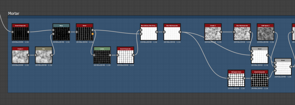
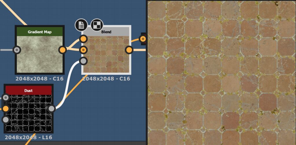
Base Color
The BaseColor was one of the trickiest parts of this material, as I didn’t want it to be too noisy and over-detailed, but still rich with good variations.
I started with a simple gradient to have the main colors of the tiles, and a grunge map to bring subtle variation.
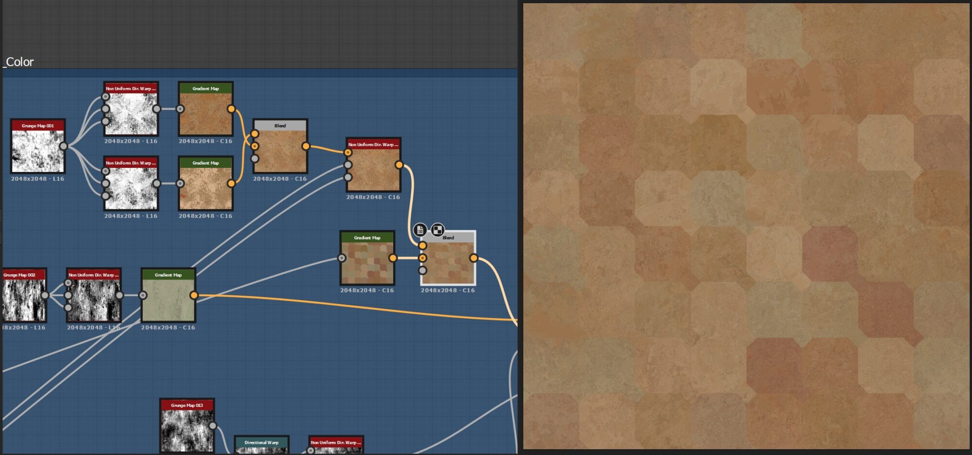
I used another grunge and a dirt generator to bring the first pass of weathering and a second one, driven by a deformed Ambient Occlusion.
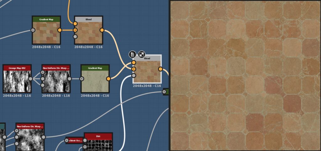
I moved to the Mortar color, keeping it fairly simple to create contrast and readability. With the different tile samples and masks for the grass, plant and pebbles, I created different layers of colors for the plants.
The dust is great to create harmony and uniformity among the previous steps of base color.
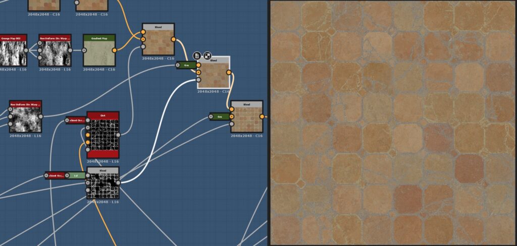
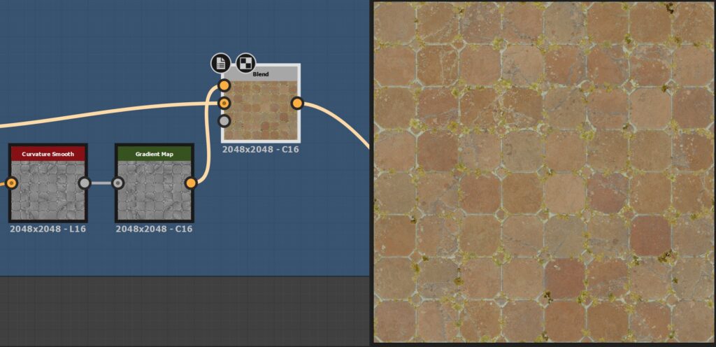
For the last part, I used a Curvature smooth with a really low overlay opacity on top of the base color, to have a little sharpness at the end.
Roughness, AO and Normal
I kept the roughness quite simple, with a mix of curvature, levels, and a bit of grunge on top of it. I tried to bring variation and readability to the tiles and plants, but not to bring another layer of visual noise on top.
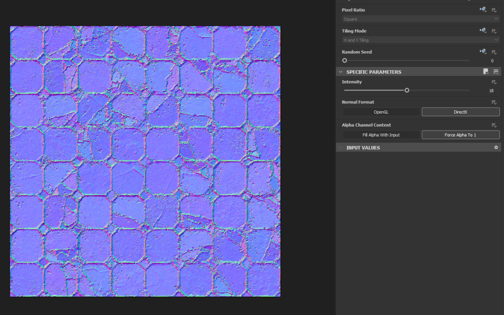
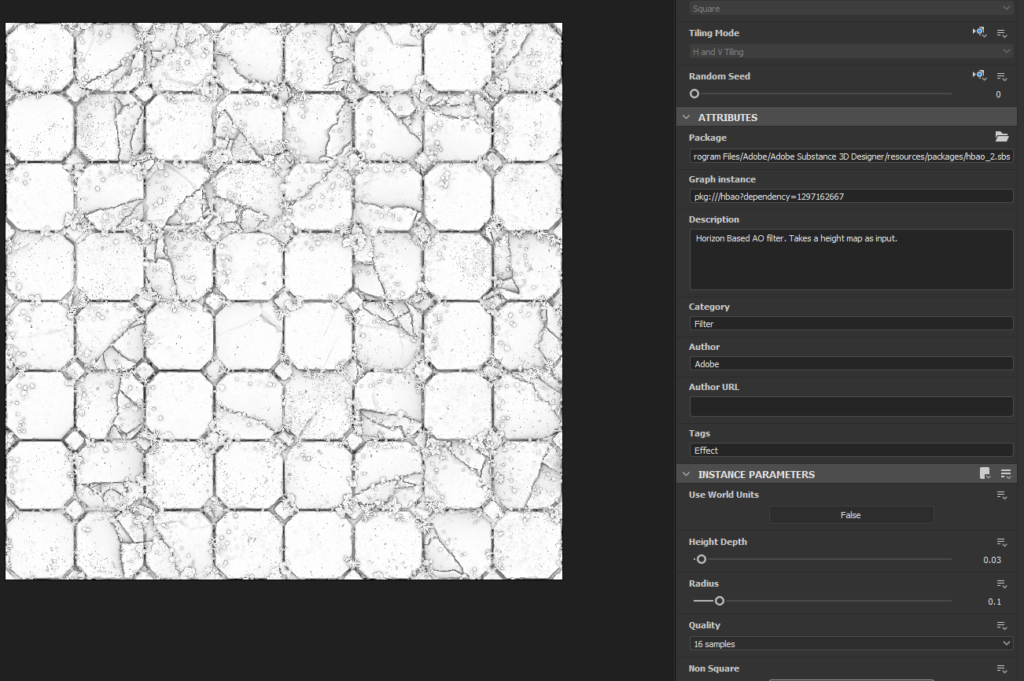
For sale for the normal map, I used a pretty strong value with some tweaking, and a simple AO to add contrast.
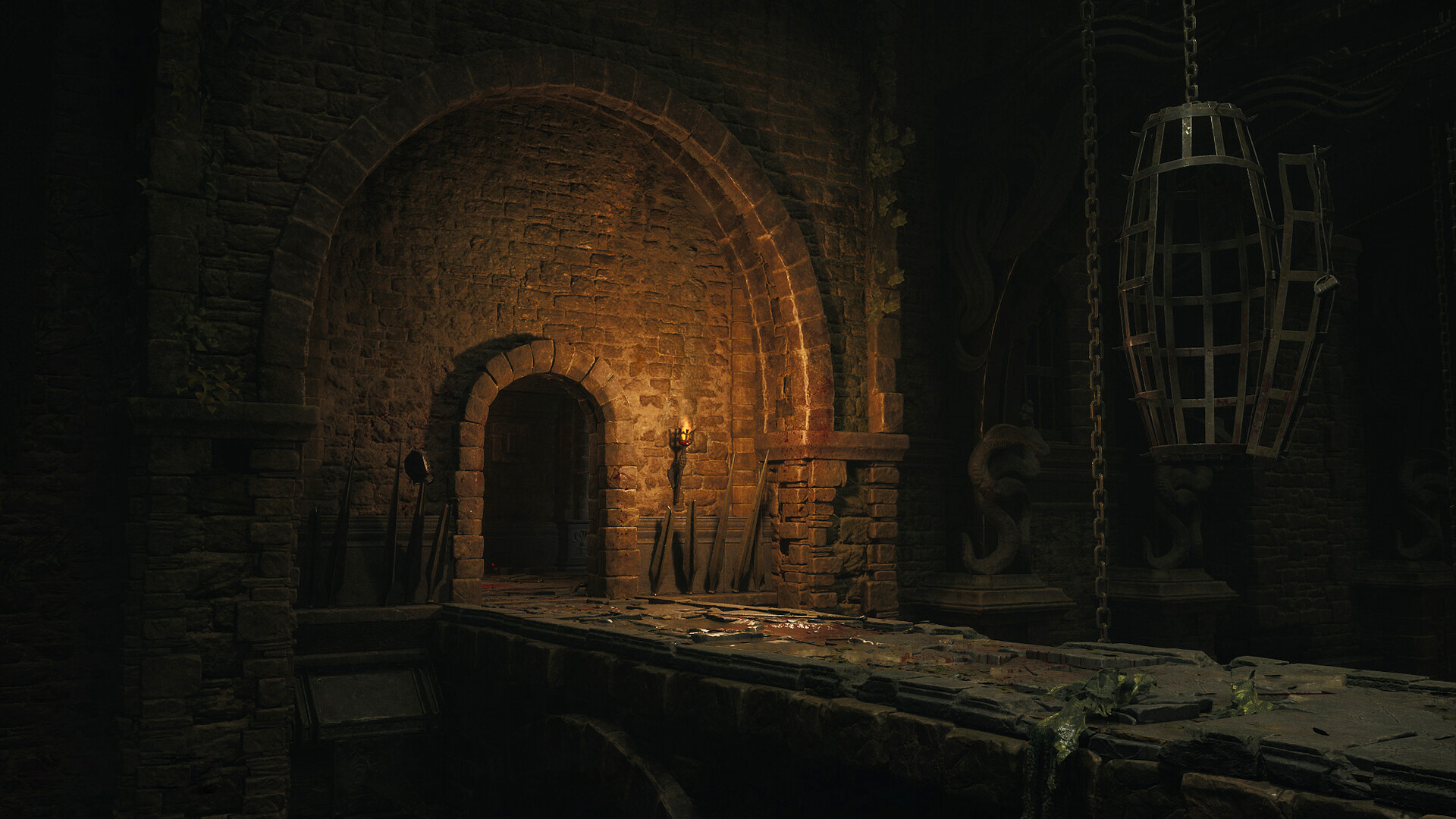
Lighting & Rendering
I wanted the lighting as simple as possible, and focus more on clear composition, strong values and interesting colors. I used Marmoset Toolbag 4, with a simple neutral HDRI, one light and some Photoshop adjustments (contrast, saturation, etc).
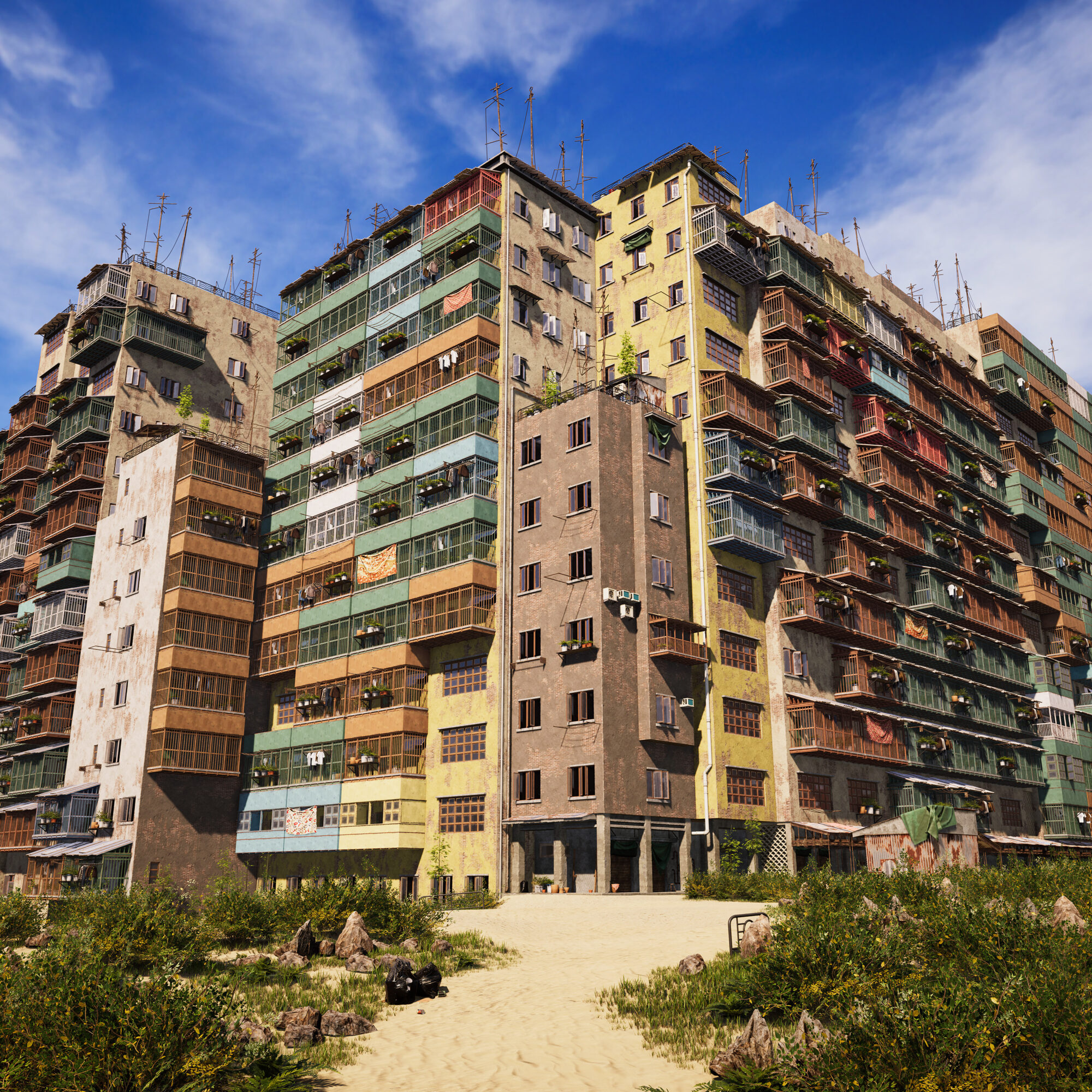
This material was really fun to make, it is good sometimes to really focus on details and small things. I like to alternate between the macro storytelling of a big environment scene where all the models and textures need to work together, and a more micro storytelling material, that just focuses on his own history.
Conclusion
Thank you for taking the time to read this I hope you learned one thing or two.
Thanks a lot to GameArtist! If you have any questions, feel free to ask!
Read more articles
You might also like these articles.