Introduction
Hello! My name is Jacob Brown, I'm currently working as a Junior 3d artist at Realmforge Studios in Munich, Germany.
About
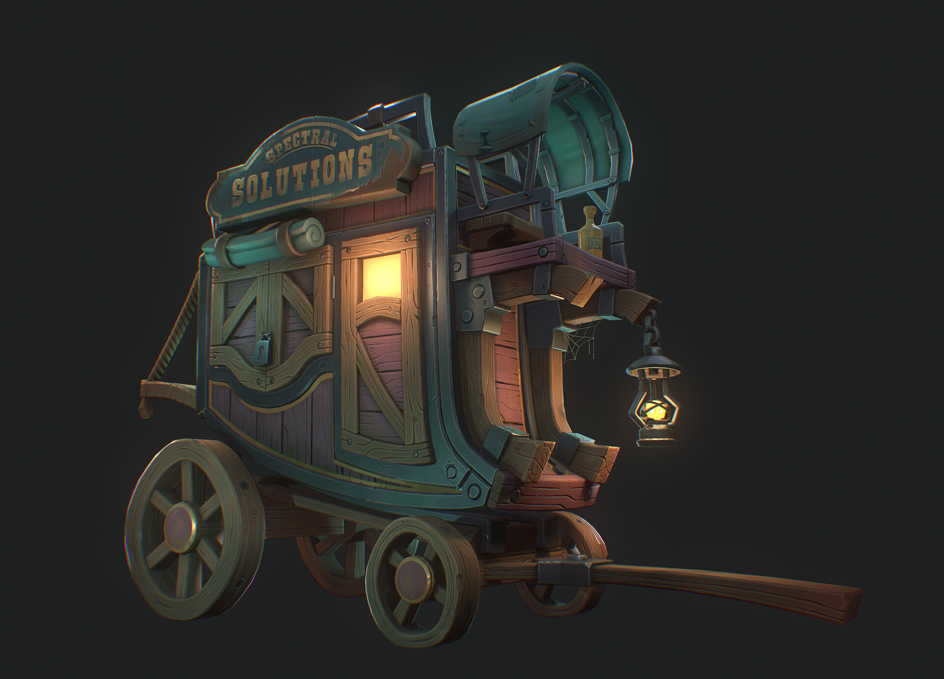
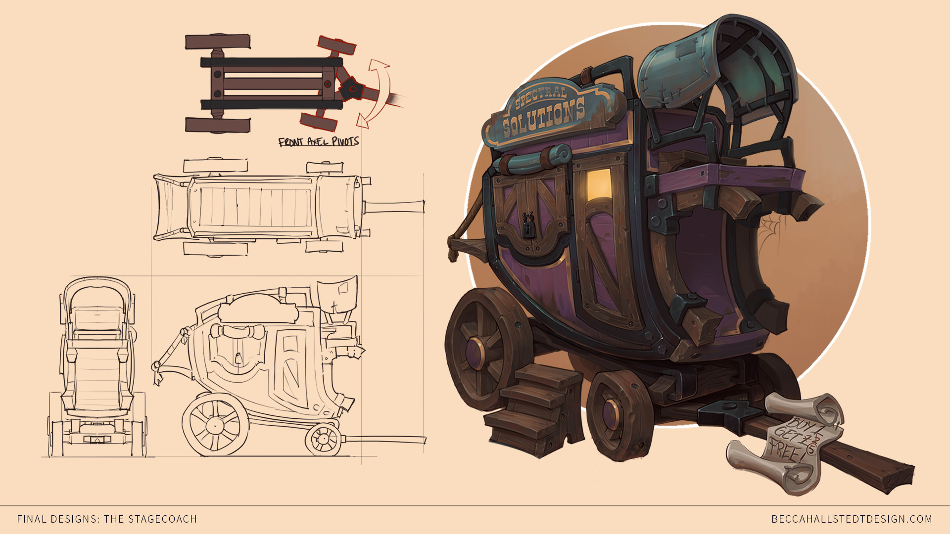
This article will be a breakdown of my latest stylized game prop “spectral solutions” a stylized wagon based on the concept by the talented Becca Hallstedt.
If you are a frequent reader of breakdown articles or have been doing game art for a little while, you probably have all the basic and necessary steps needed to get a final model.
So I will cover these only briefly and try to focus this article more on some tips/tricks/techniques and workflows I use that you may not know about to hopefully help you push your next prop up a level!
Blockout
Ok, so let’s start with the blockout stage. Universal blockout rules: Start big and work your way down to details.
No planks, no screws or bolts at the beginning. If you look at your reference image and cross your eyes slightly to blur it, you shouldn’t be modeling anything you can’t see until you have all the major shapes locked down.
- Below are some helpful tips for blocking out:
Lights, camera, action!
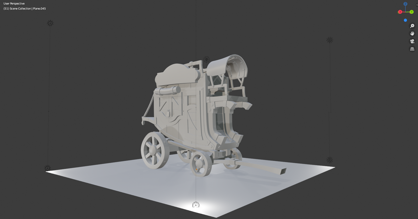
Blender has a real-time render preview called Eevee, this makes it super easy to preview your model with some lighting information, so set up some lights! Nothing complicated, just some basic point lights and the default HDRI preview is fine.
Why do this? Shadows and lighting information can change how we see shapes and how they relate to each other. Adding shadowing to our model can help us spot mistakes or areas that need adjusting that we might have missed.
Keep in mind: The blockout in this image is the final blockout with all the details in, so it should look more simple at this stage.
Adding colour
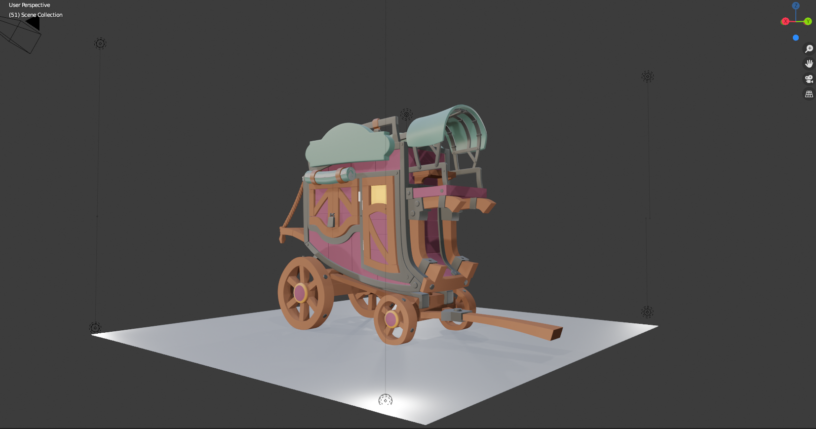
Adding some simple colours to your blockout is probably the most useful thing you can do for much the same reasons as adding lights.
It will help you spot mistakes in scaling and shape and how the parts relate to each other. It’s not going to look pretty! But it’s not supposed to at this point.
Preparing for ZBrush
This part is a shameless plug, but hey it’s free! When you want to bring models into ZBrush you have to make sure that it will smooth correctly when subdividing. The traditional way to do this is to add support edge loops so that the edges you want tight, are tight, and the rest are smooth curves/bends.
This can take a long time however and is incredibly boring. Luckily, I have a plugin made for a blender that does this automatically (and most importantly, non-destructively). It’s available for free, and you can check out the download link and short intro/tutorial on it here.
Below is the sculpt.
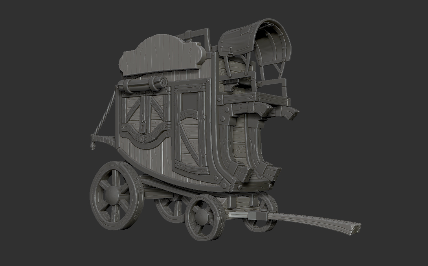
Ok, so we should have our model in ZBrush now. I like to import the entire prop as a single obj mesh, this makes the whole prep work a little quicker and easier.
We can then use the auto polygroups function to split all the meshes into their own polygroups.
You can preview this with shift F, you can then use the select function to select any polygroups you want in the same subtool and split. I like to split my mesh into subtools that need further subdividing/smoothing and subtools that can just be Dynamesh’d straight away.
Using the Dynamesh “Groups” function we can avoid our polygroups welding together enabling us to have many meshes in a single subtool and not clog up our subtool list, yay!
Wood
Alright, so this prop is primarily made up of wood, so for this article, I will focus on sculpting technique’s for that to keep it short(er) and sweet.
You can find quite a few tutorials out there on sculpting stylized wood. Some of them have really gorgeous results but can take a long time to sculpt a single plank. These techniques will focus on speed whilst also giving you a result that looks decent.
Trim Edges
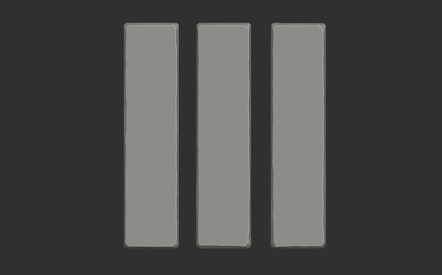
Using the trim dynamic brush, we want to shave down/bevel the edges of the planks. The size of the bevel will depend on what look you are going for. You can use the “lazy mouse” function in the “stroke” menu on the top toolbar to get smoother brush strokes.
Add grain/lines
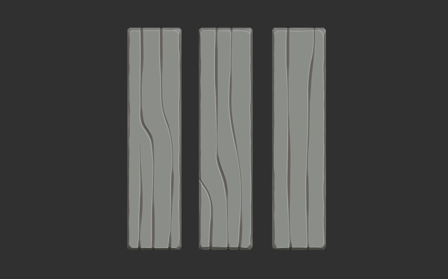
Using the “Orbs cracks” Brush from the free orb brush set, we want to add in our grain lines. I find I use 4 stroke types a lot and vary them slightly.
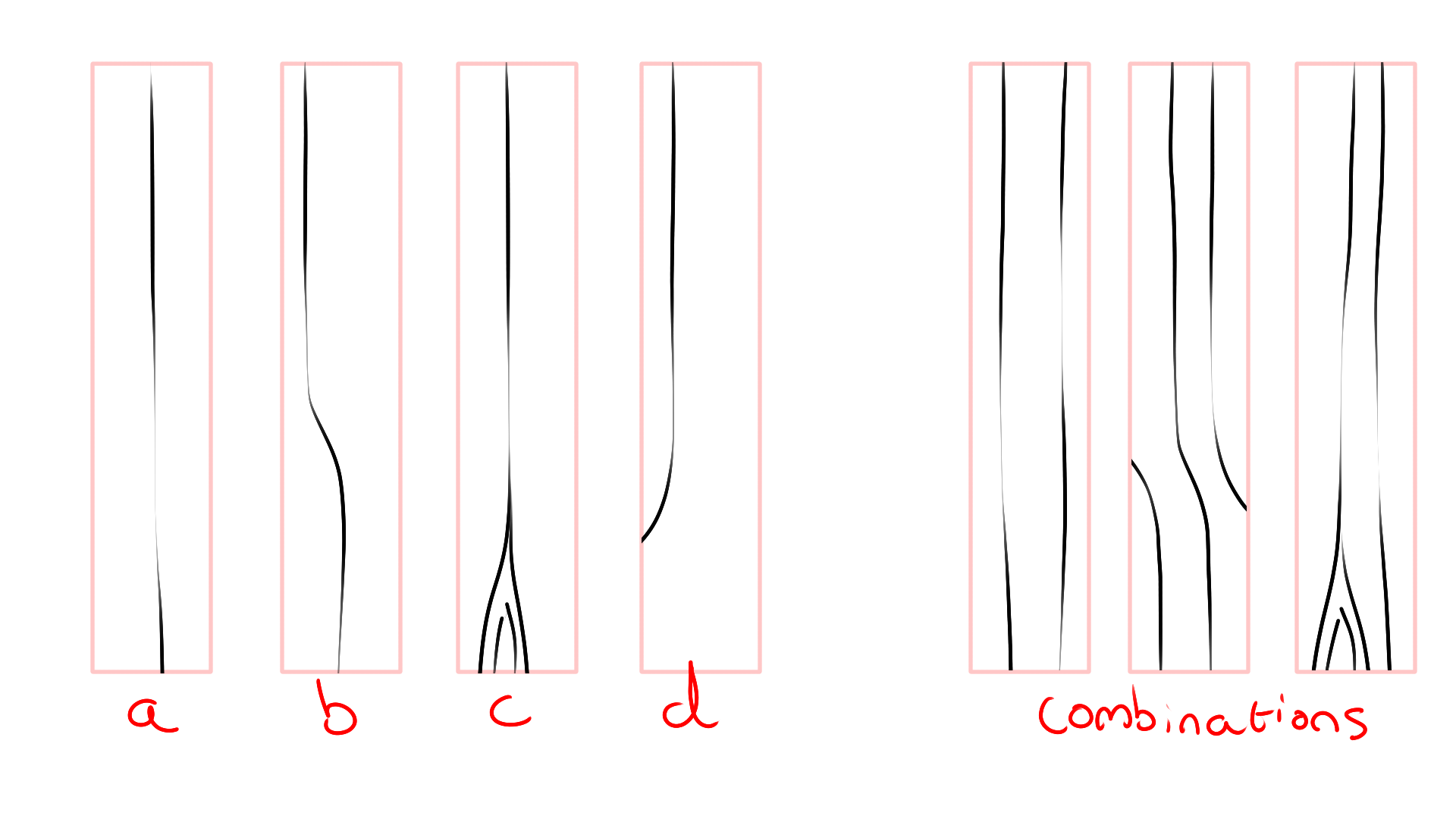
It’s important to vary the pressure you press with your pen when making these lines to get depth and width variation in each line.
You also want to use a “lazy mouse” and try to get these lines to look smooth.I also like to adjust the default strength to something a little stronger, like 25 or 30.
Break the silhouette
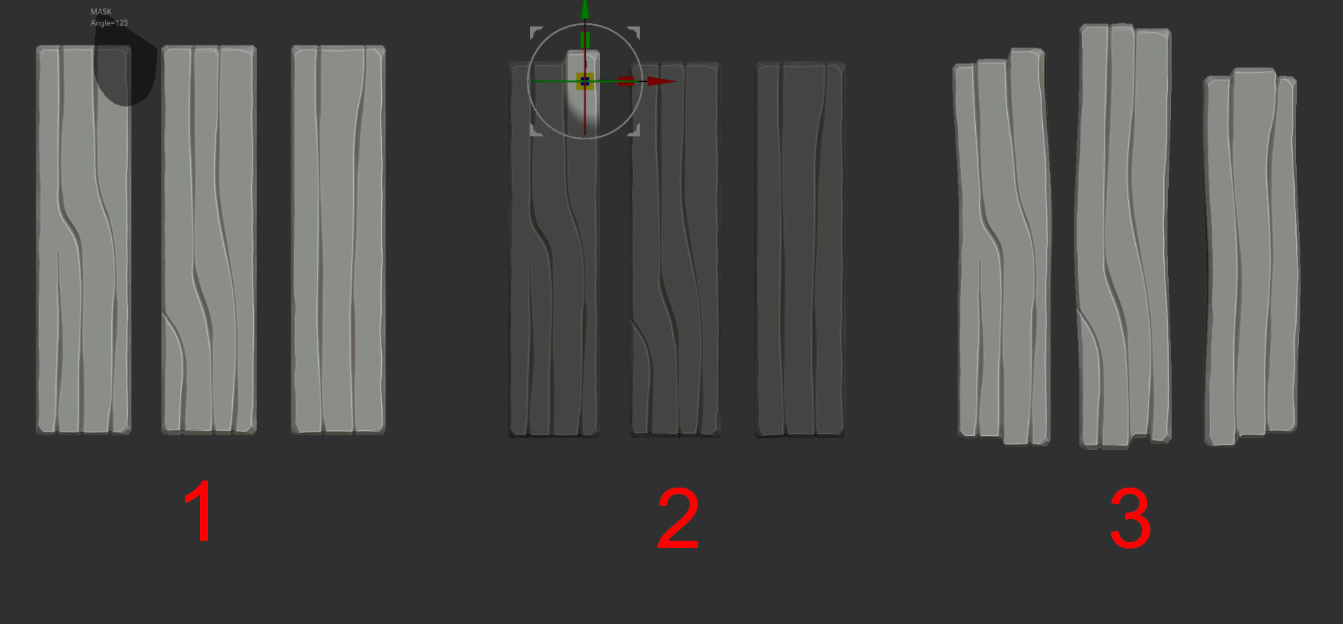
Ok great, we now have some basic stylized planks, but they still look a little boring and uniform, so let’s break the silhouette.
Using the mask lasso tool in ZBrush we can select some of the ends using the grain lines as borders and pull them out or push them in.
It’s also a good idea to vary then the length of your planks if your model allows for this and use the move brush to bend them slightly, so they aren’t perfectly straight.
Add smaller details
Alright, our planks are almost complete, we just need to add some smaller details to give it that final touch.
-Using the clay brush, we can add small dots/knots to the wood for a little extra charm.
-Using the H polish brush, we can dig into the edges adding a chipped-like effect
You can experiment with some more of the orbs brush pack and add in as much damage or wear as you need for your project.

And there you have it, this is my workflow for creating stylized wood sculpts pretty fast. I learned a lot of these techniques from another artist at my studio Bastian Brem, so a big thanks to him for mentoring me through my first few months as a junior. Check him out here.
Low poly and baking
I don’t have much to say about the low poly and baking process. If you used the HSS plugin I recommended in the earlier section it’s a simple matter of removing the modifiers, collapsing any edges that don’t affect your silhouette and removing back faces to optimize triangle counts, and you will already have most of your low poly done.
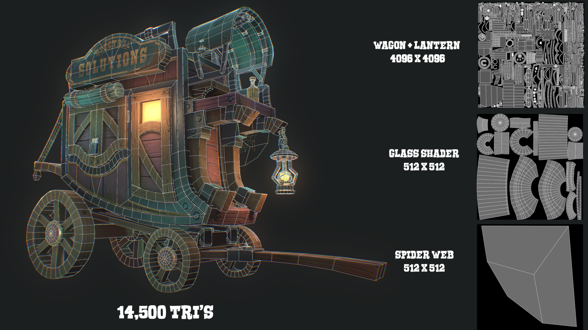
for unwrapping and preparing your bake by mesh name sets, I would recommend checking out another free plugin I created “Pre Wrap”, which just helps with speeding up the unwrapping and bake setup. You can check it out here with a quick intro/tutorial on how I use it with my workflow.
QUICK TIP: If you bake in substance painter, go to the Ambient Occlusion options and turn off “ignore backface”. This will stop annoying nonbaked lines along the intersections of objects.
Texturing
My material set up for most objects is pretty much the same, with some variations based on specific needs. I will outline what a typical base stack looks like for me in substance painter for 90% of the things I’m texturing.
Base colour and base colour variation
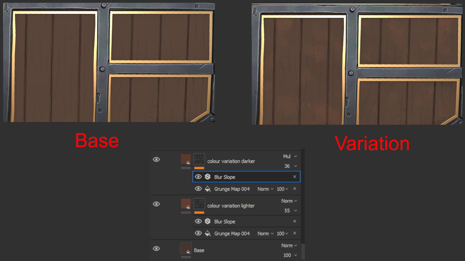
I will start by selecting what I want the base color of my object to look like, then I will duplicate this layer two more times to use as variations.
A lot of the time for variation layer 1, I will just play with the saturation and value to get a lighter version of the base and the same with variation layer 2 to get a darker version or just set the layer to multiply.
This works in a lot of cases, but feel free to change and experiment with the hue if you want some subtle different colors in there too.
I will then add a bitmap grunge mask, adjust the scaling and add a blur slope filter on top. (blur slope filter is the painter’s best-kept secret for getting that stylized brush stroke feel).
Highlights and cracks
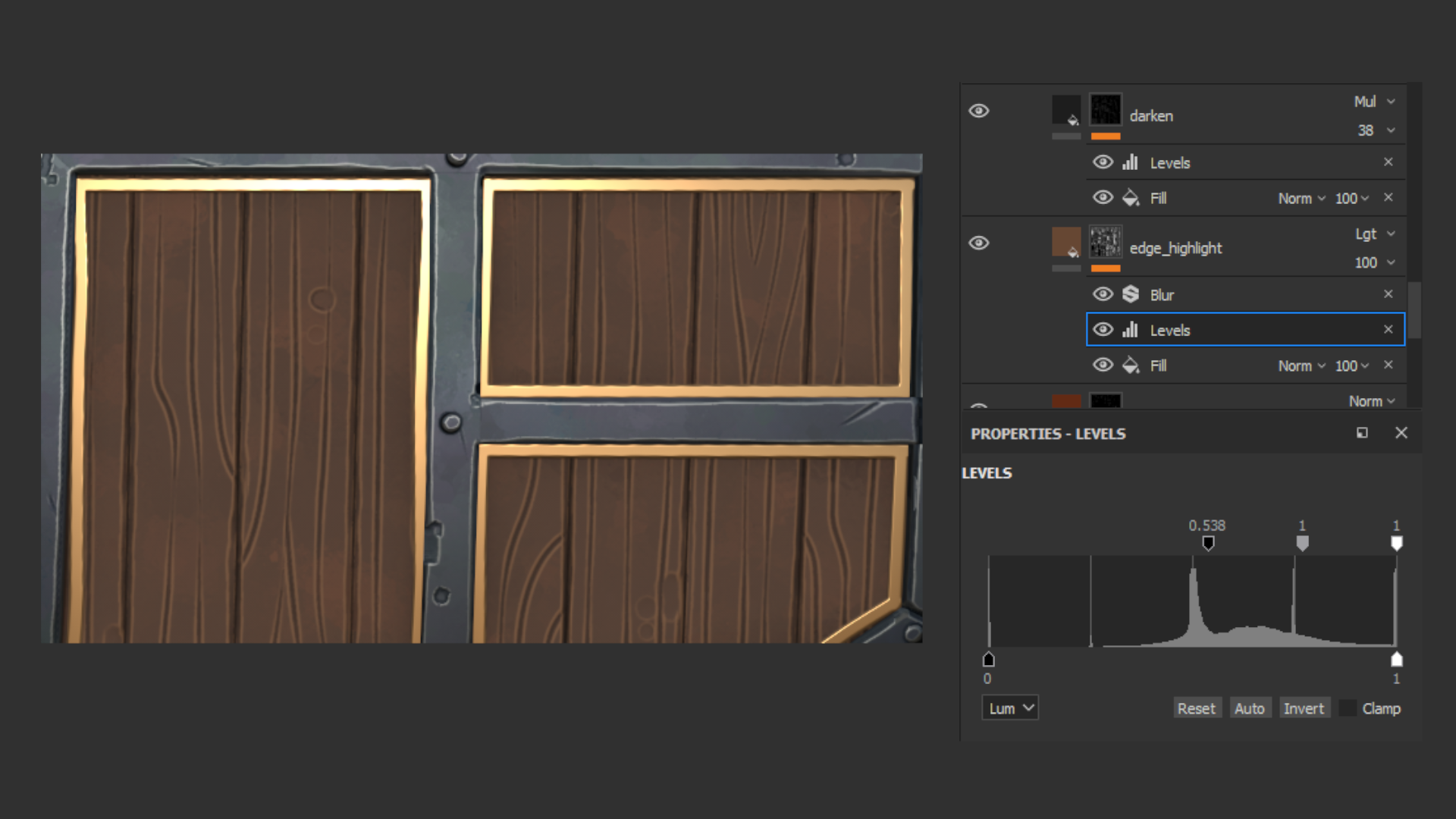
Next on the list is to add highlights to the mesh using our baked curvature map. You want to be subtle and don’t over do it here. I have definitely cranked my highlights way too high in the past. Adding a levels filter to your mask and playing with it can help with isolating the areas you want to affect.
Now the same for the cracks or grain adding a darkened pass, again using your curvature map and inverting the levels.
Ambient occlusion
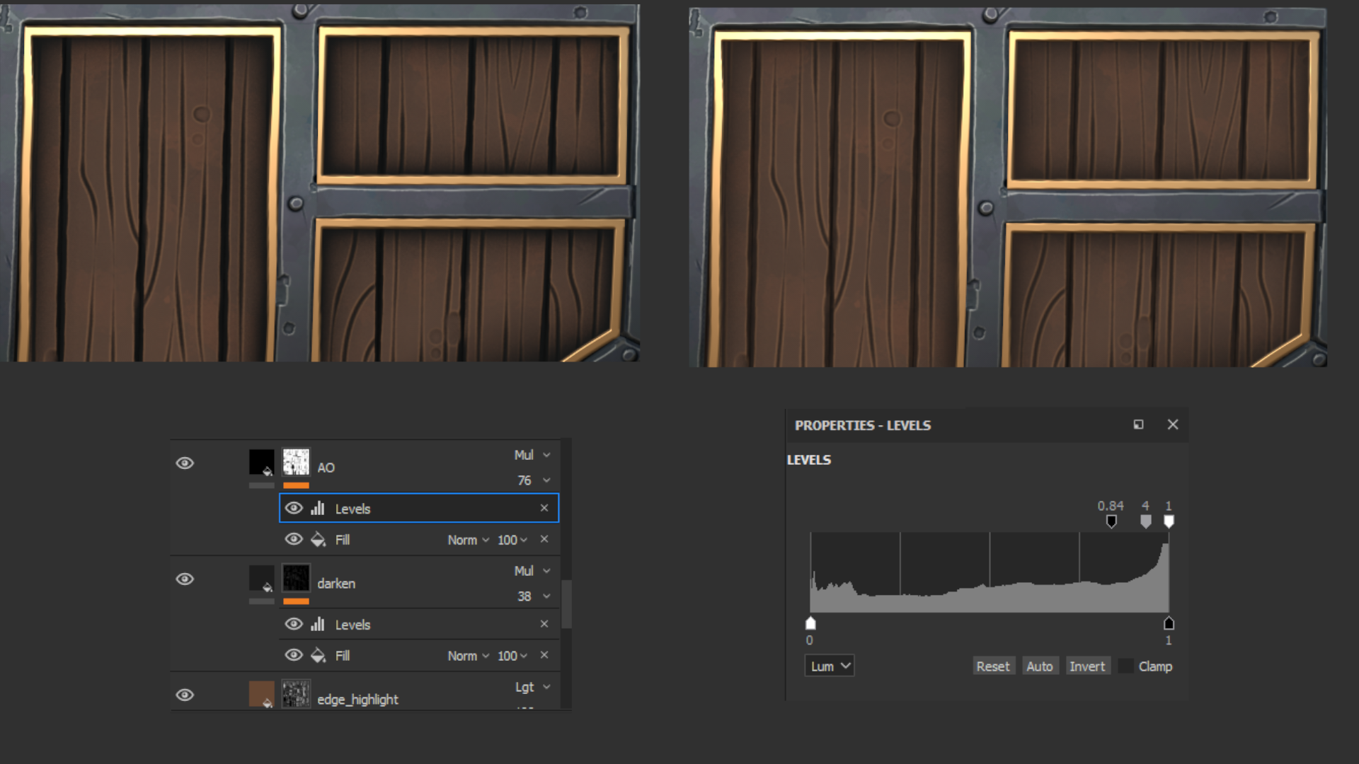
Using our baked AO map as a mask I like to set the layer to full black on multiply, adjust the levels until I get something like seen in the image below and then adjust the opacity of the layer.
This makes your mesh POP some more and gives it that stylized hand painted/baked lighting feel.
Gradients and plank variation
At this point, I would go back to my “Base” layer and duplicate it with a black mask, adjust the color slightly, then paint the mask white on random planks so not all planks are the same color. For my final wagon model, the planks are painted purple, so I didn’t do this step.
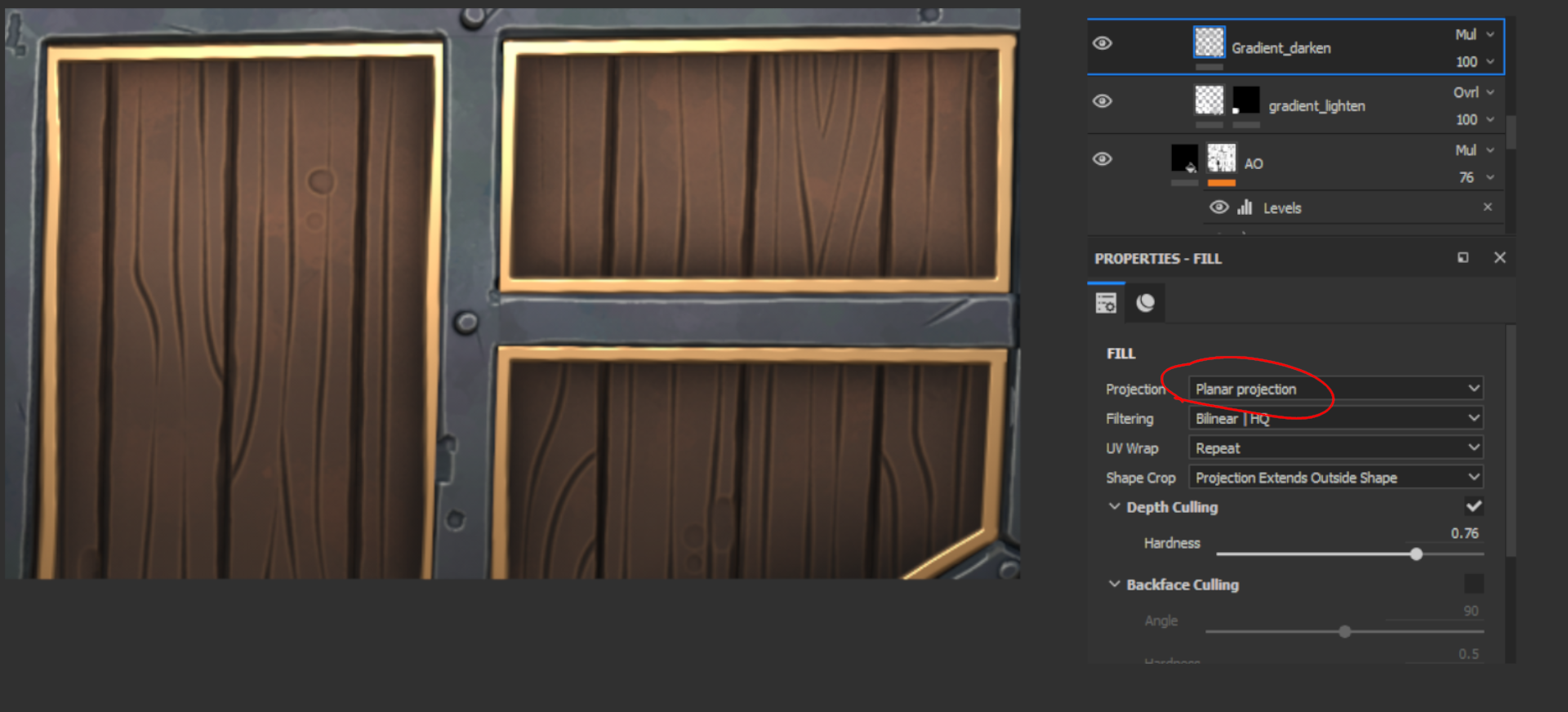
Moving onto gradients, I create a layer for a dark gradient and a layer for lighter gradients. Set the projection method to “Planar” in the fill properties of each layer, then set the lighter gradient to overlay and the darker to multiply.
You can then rotate/position/scale the bounding box in the view and play with the “Hardness” option to get a gradient you like. I generally use a lighter gradient from the top-down and a darker gradient coming from the bottom, fading up.
The final thing I would do is adjust the roughness on different layers, or possibly add a few roughness-only layers with grunge masks to break up the roughness.
And that’s pretty much my texturing workflow. 90% of the assets I paint use this layer stack with some adjustments and variations.
Lighting and rendering
In my opinion, lighting is THE most important part of a project. Don’t neglect or rush this part. Flat or boring lighting can make a fantastic model look like crap, while great lighting with high contrast, nice saturation levels and color harmonies can make a “not great” model look pretty fantastic.
Lighting is something I really try to push, improve and learn more about with each project. I am far from a lighting expert, and I’m sure I still make many mistakes, but I have learned some tips that have served me well that I will try to share with you.

3 Point lighting
Most of the time I will start my setup with a basic 3-point light system unless I already know exactly what I want it to look like.
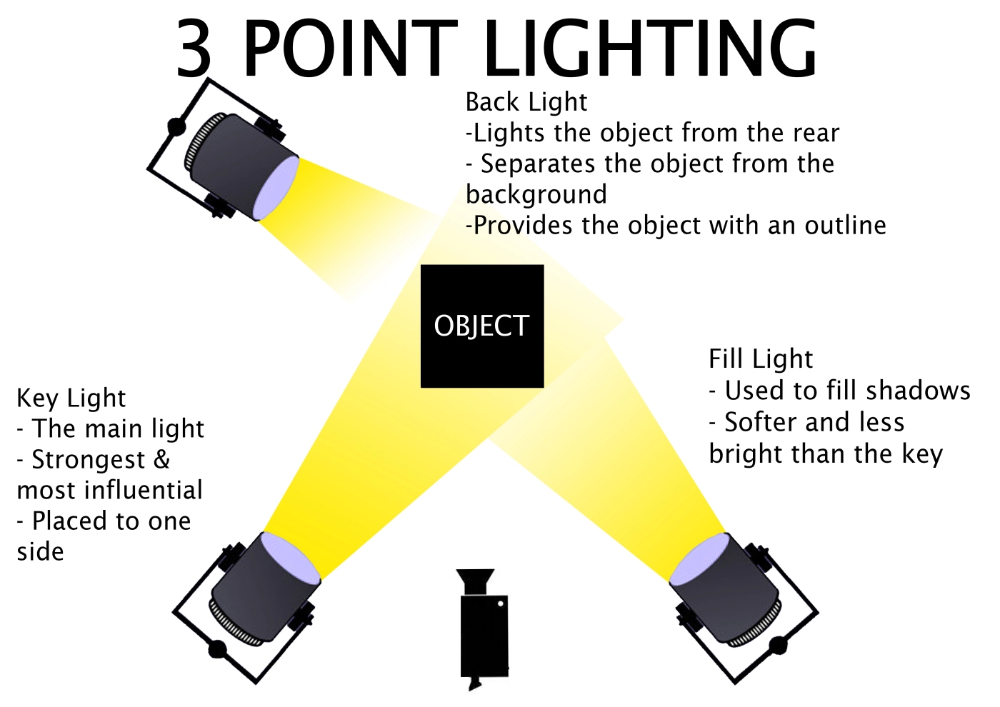
The 3-point lighting system is a great base to start with. I have found it to be the most versatile and complimentary lighting setup to get up and running quickly. “It just works” Todd says.
Don’t be afraid to play with the height and angle of the lights either. I will have my “Key light” above the object pointing down to create some interesting shadows. Same with my backlight to get some nice rim lighting. For the Fill light, sometimes I will even position it below the object, pointing up slightly, so it’s in direct contrast with the Key Light.
Here is a great video on some cinematic lighting techniques.
Colour theory
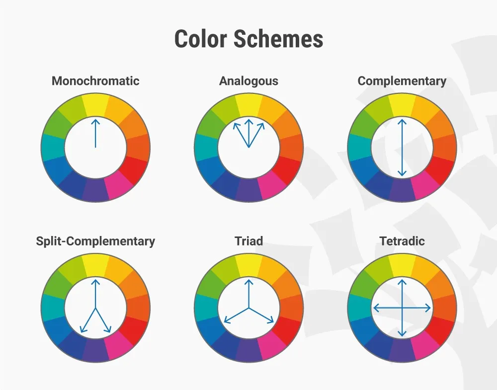
The color of your lights is just as, if not more important, than your light positions. It will help convey the mood and story of your image. Emotions when looking at images are strongly linked to colors. The 2015 Macbeth movie with Michael Fassbender is a fantastic example of this, and I highly recommend watching this breakdown of the visuals from the movie by Filmento.
And also here is a quick lesson on the basics of color theory.
If you want the cheat code to have pretty nice lighting quickly. Look at almost any big movie poster like start wars/marvel etc. A warm color key light (most often orange) and cool fill light (teal or blue) with a strong white backlight for rim lighting. This is the most used color combination in lighting and for good reason, it nearly always looks great.
Post processing
While not technically part of lighting…it kind of is. It has such a large impact on your final colors/contrasts/saturation. I usually just play around with settings until I find something I like and will tweak it multiple times throughout the lighting process.
Effects I like to play with most are usually Contrast, Saturation, Sharpness, Bloom, Chromatic aberration, depth of field and sometimes a subtle Vignette. Also, make sure to play with your camera settings. A different focal length can impact the final render a lot.
PAINTING WITH LIGHT
As digital artists, we have a massive advantage over the real world when it comes to lighting. We don’t have to obey real-world rules. Once you have a good base setup with 3-point lighting, it’s time to experiment and have some fun. Play with colors and light positions. Some place feels a little too dark.
Add a point light with a low distance threshold and brightness to fake some global illumination. Still, feel like an area needs a splash of color? Add another low-distance colored light to “paint” that area. If you can think about this part as “painting” or another pass of texturing your model, you’re bound to find some really cool color and light combinations through trial and error.
Check out this lighting setup to get a better understanding of what I mean when I say painting with light.
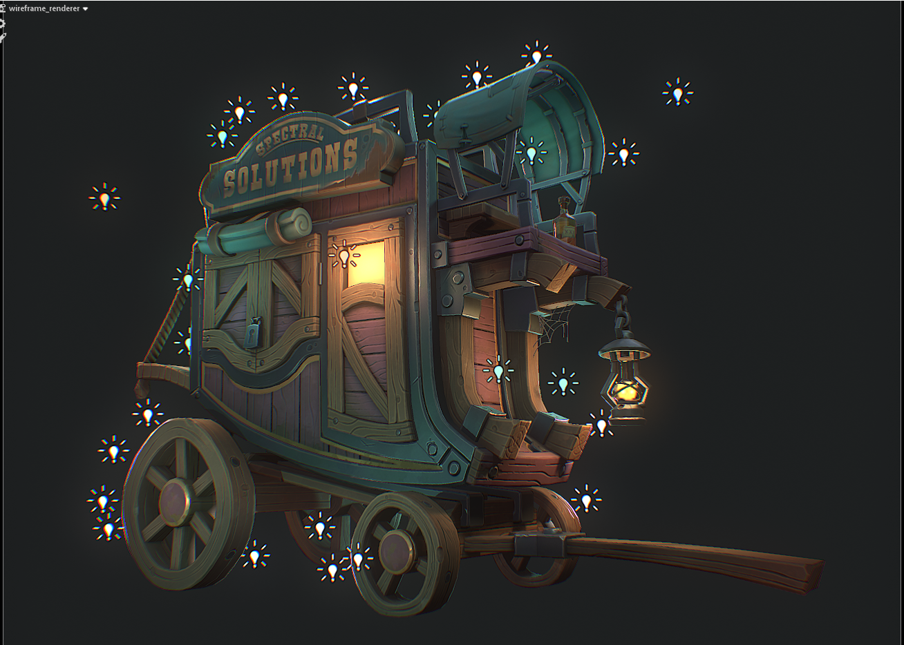
It looks a bit over the top, right? Of course, you can’t use this method when it comes to a real game project for optimization reasons, but for a simple prop or portfolio, piece go crazy.
Conclusion
If you made it this far through the article, thanks for taking the time to read my ramblings on game art. I hope some of the tips I have shared help you in your art journey and best of luck to you!
