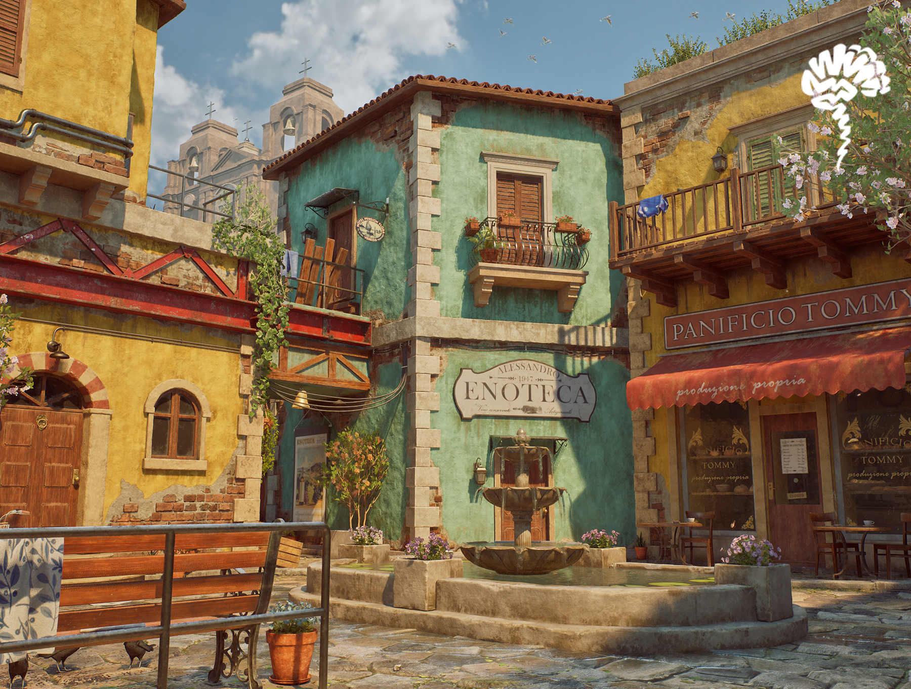
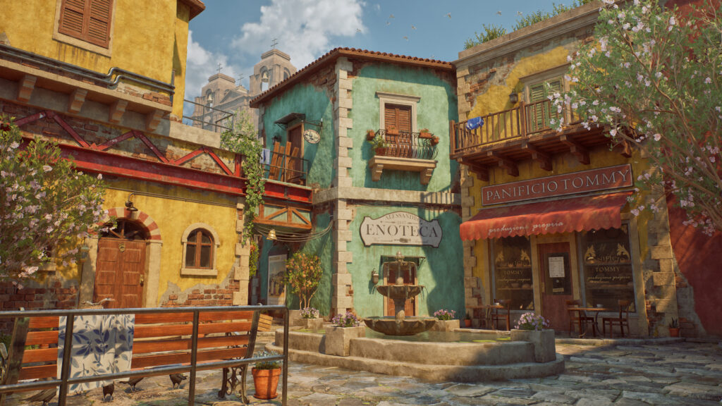
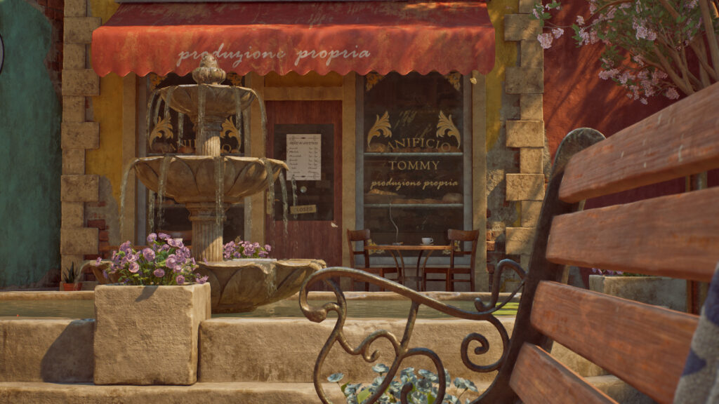
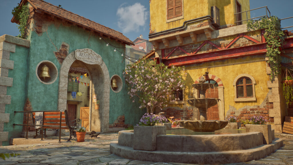
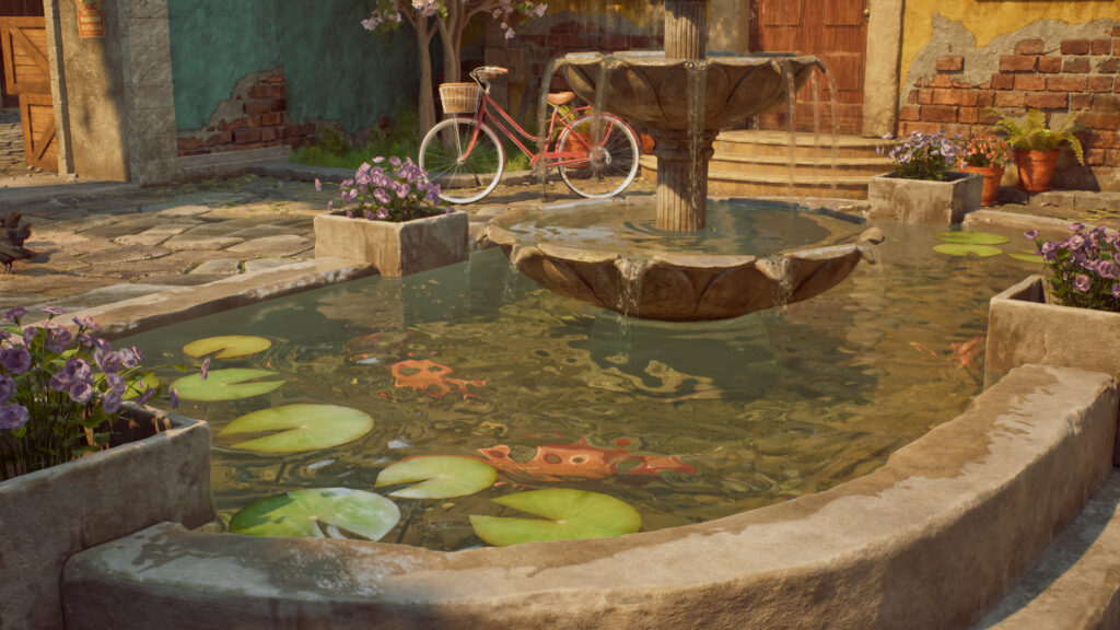
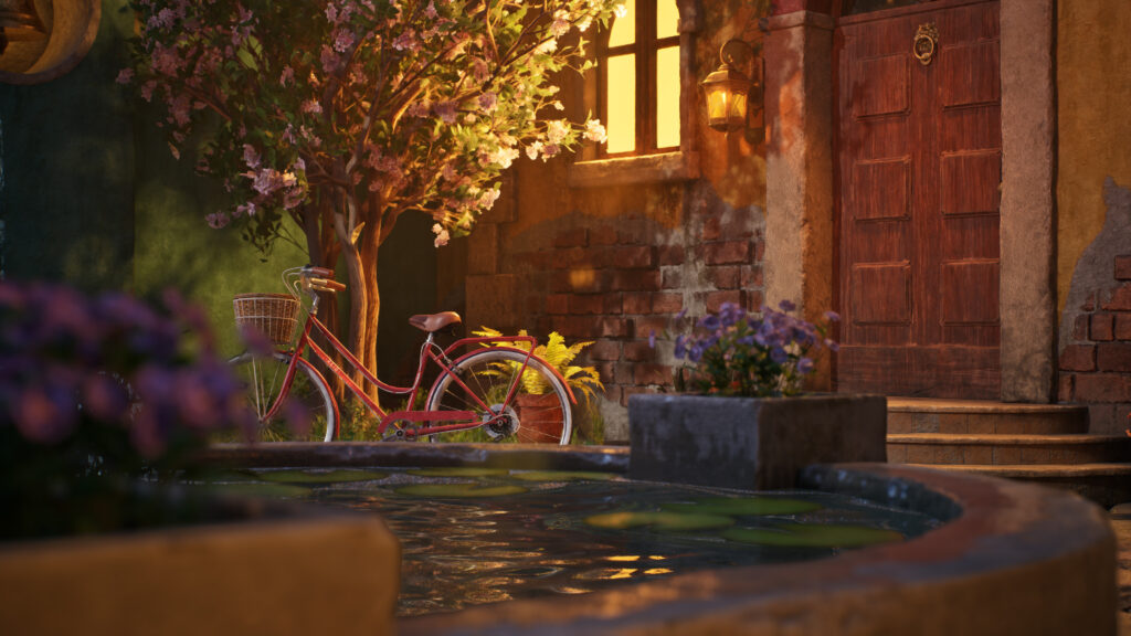
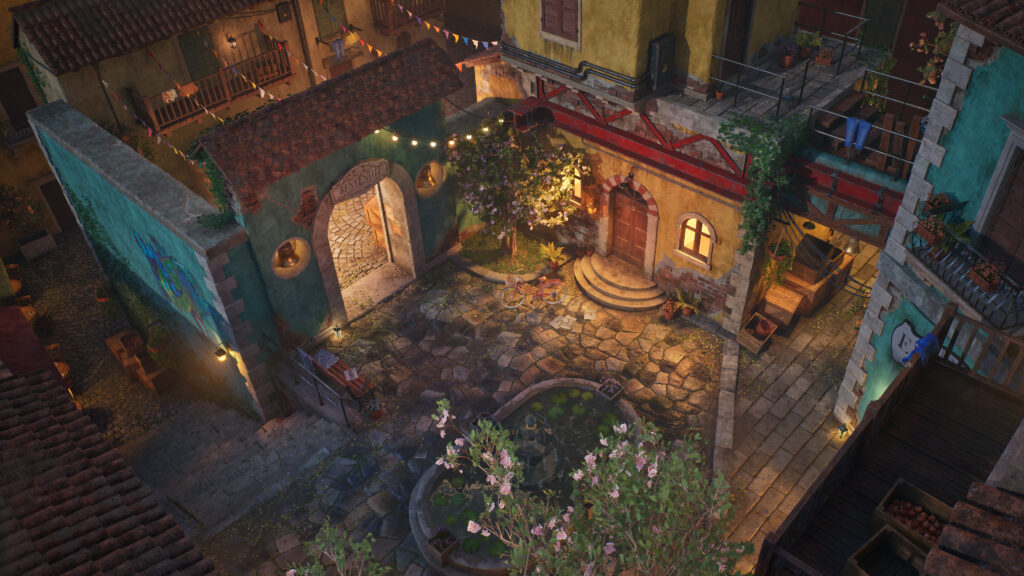
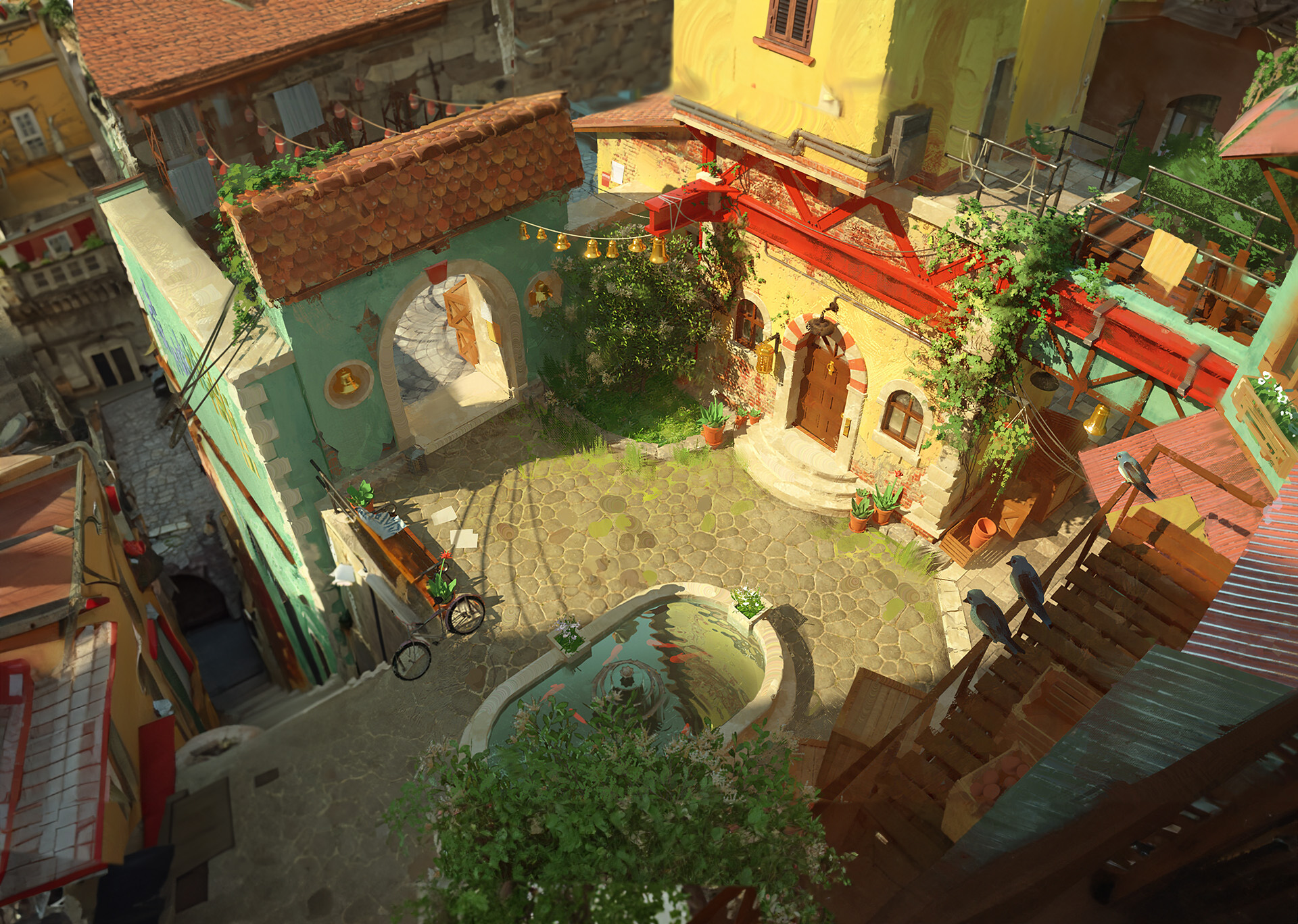
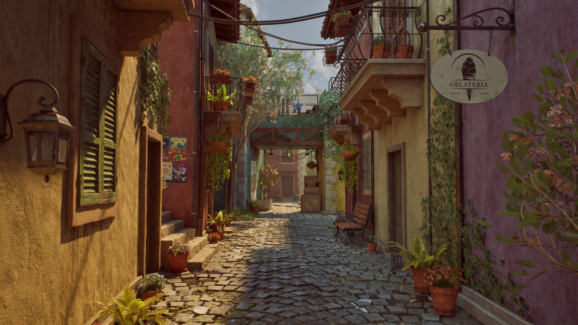
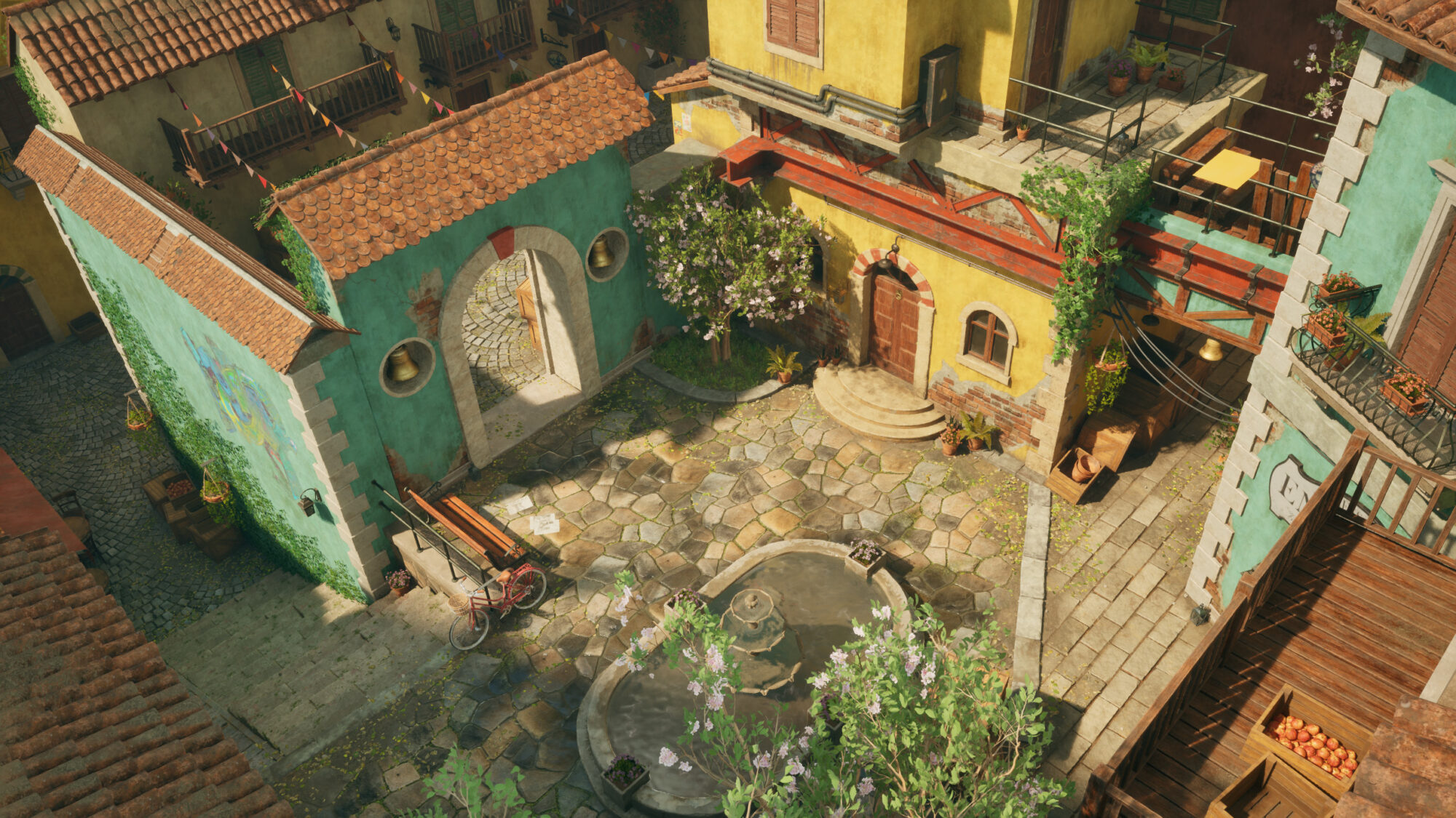
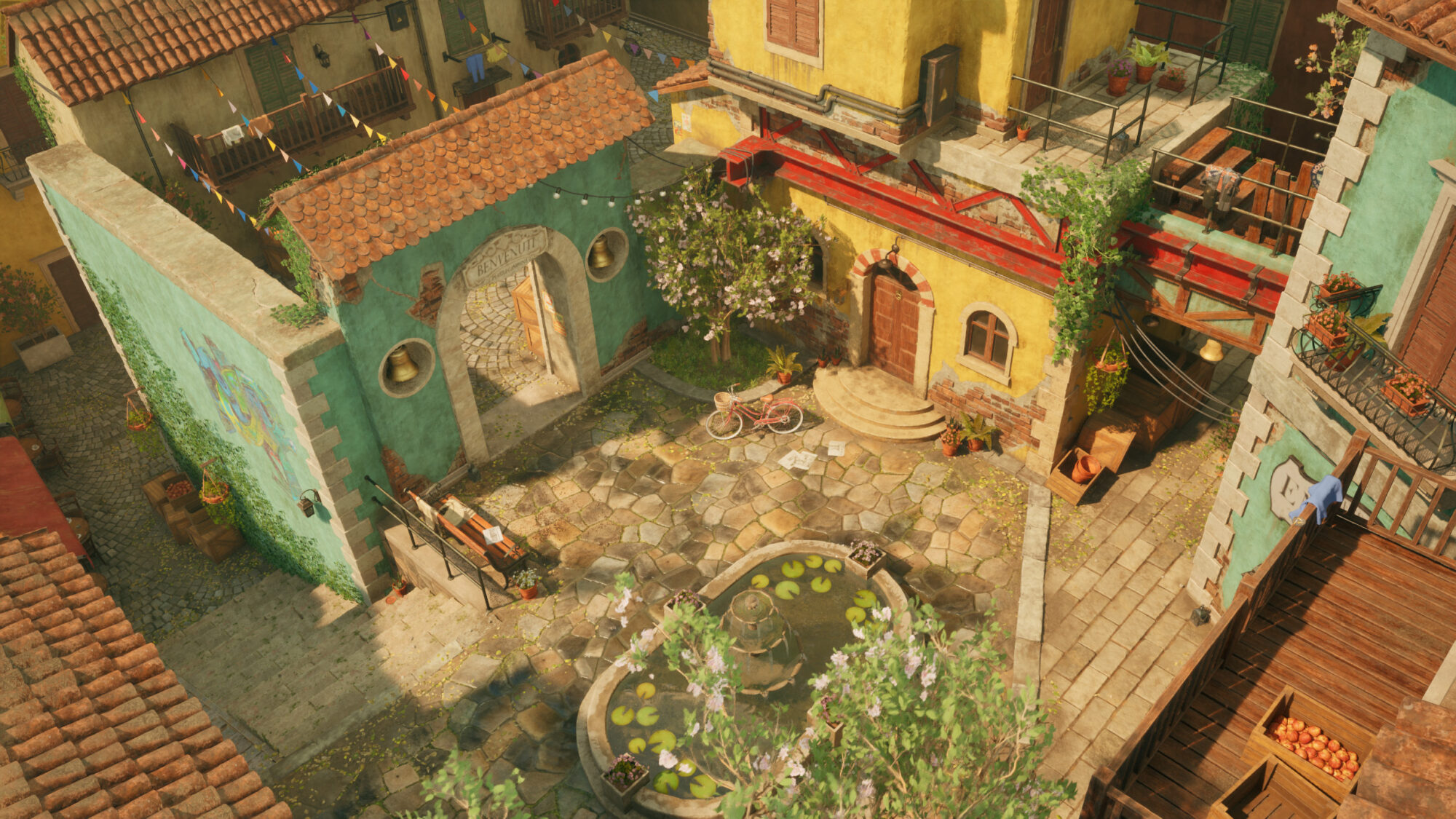
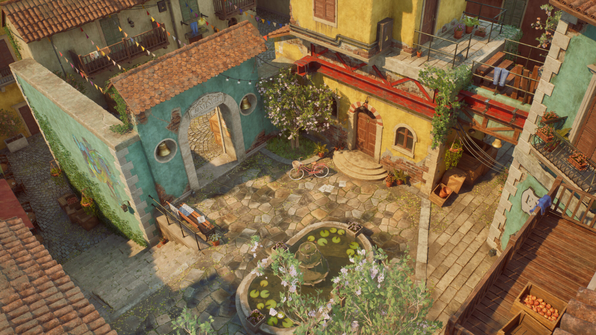
La Piazzetta

Introduction
Hi! My name is Alexander Agredo and I'm a 3D Environment Artist for games. I’m 24 years old, born in Colombia and recently living in the US.
My passion for 3D art ignited during my childhood, leading me to major in Multimedia Engineering in Colombia.
Afterward, I honed my skills in the 3D Asset Creation program at Think Tank Training Centre in Vancouver, where I recently completed my final project. Now, I'm excited to kick off my career in the gaming industry!
Goals & Software
My main goals when doing this project were:
- Having enough challenges and variety to make this a difficult project in which I could learn and feel confident as an environment artist.
- Using modern and traditional workflows cohesively to learn the latest tools of environment creation while still dominating the fundamentals.
- Convey a sense of peace, happiness and vacations in an art piece.
- Have a strong portfolio to show recruiters of what I’m capable of.
- Having fun!
For this project I used Maya, Substance Painter, Designer, Unreal Engine, Zbrush, Speedtree, Marvelous Designer, Rizom UV, Photoshop and Premiere.

References & Inspiration
I picked the concept “Bell Terrace” by Quentin Stipp because I was really drawn to its bright colors and calm vibe. My mentor pointed out that we needed to tweak the left side since it could be tricky to handle perspective-wise and make it work in 3D.
I wasn’t sure what to do at first, but then I found this cool tool in Photoshop called Firefly, which is a generative AI (though it doesn’t replace real artists).
It helped me play around with different prompts to adjust the concept, so it fit better in 3D:
It’s not perfect, but it sparked the idea of creating this cozy Italian town. For some reason, my mind immediately went to Italy.
I pictured myself wandering through the streets and stumbling upon a cozy plaza on a summer day, so beautiful that you’d want to stay there all day. That’s the feeling I knew I wanted to capture with this piece.
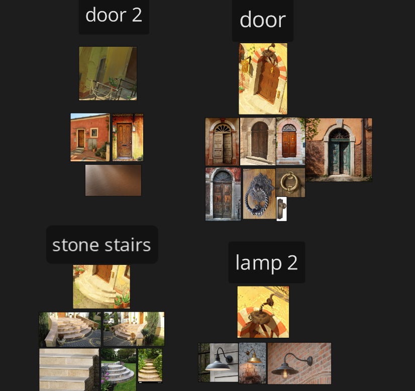
I prefer to keep things simple by limiting myself to 3-6 references per asset. While others might collect a lot of images, I find that too many can be distracting and cause me to lose focus on my original selection.
By choosing a few key images with clear intentions, I can stay organized. However, for more significant or complex assets, like a bike or fountain, I may gather additional references since they are my “hero” props.
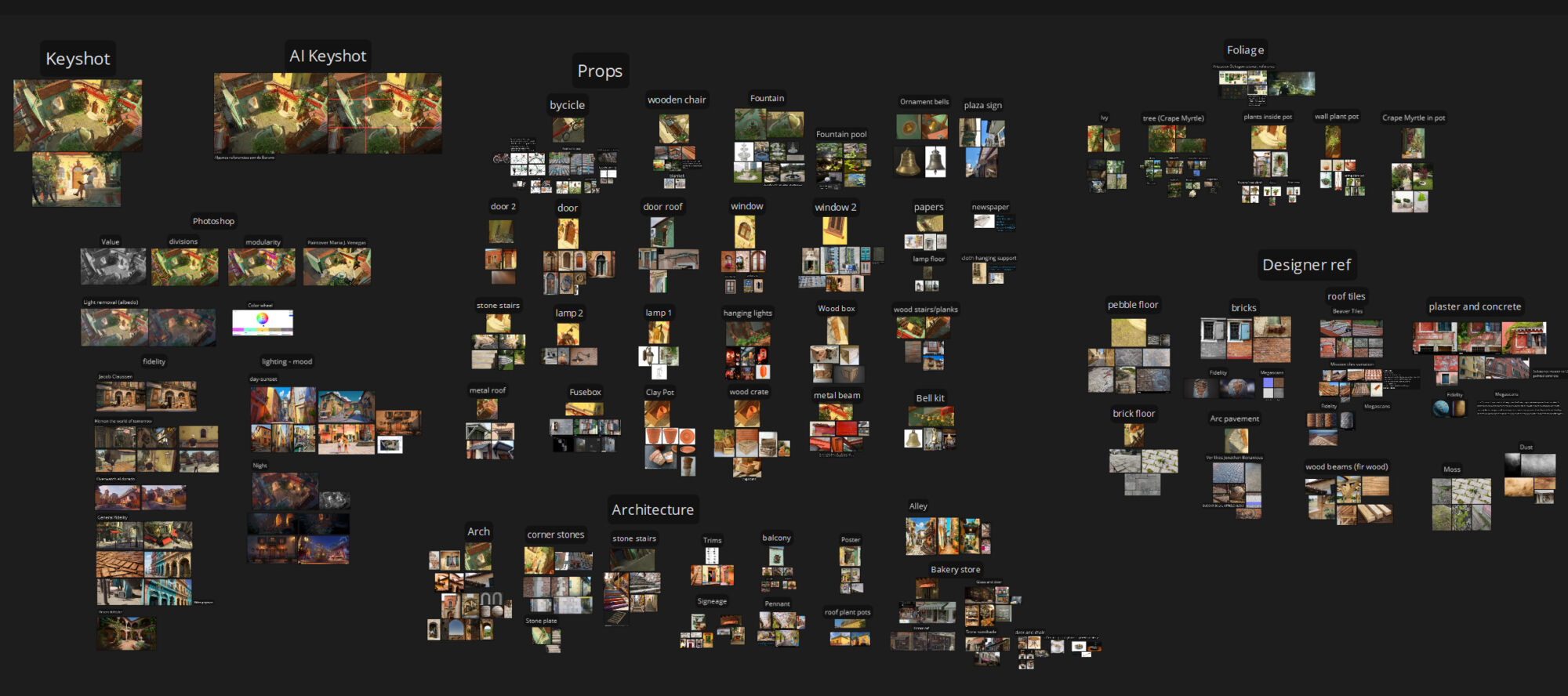
I like to gather references that align with the quality and fidelity I aim for in my projects, often pulling from other video games or portfolios.
For this project, I found great references in “Hitman: The World of Tomorrow” and “Overwatch: El Dorado,” while also looking at lighting and mood from Pixar’s *Luca*, real-life photos, and other artists’ work.
Taking screenshots of all my assets and collecting specific references for each helps me stay focused and reduces the need to constantly revisit the concept.
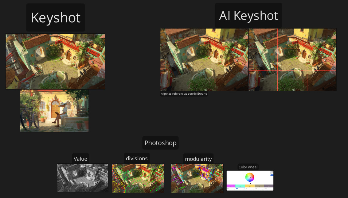
I perform several analyses to deepen my understanding of the concept:
- Composition Analysis: Identify key elements the artist focused on.
- Black and White Pass: Analyze lighting values by converting the concept to grayscale.
- Scene Division: Separate the scene into foreground, midground, and background to evaluate importance.
- Modularity Analysis: Break down structures into compatible modules, if applicable.
- Color Wheel Analysis: Assess the color scheme for harmony, using tools like Adobe Color.
Blockout & Modelling
I kick things off by using simple shapes to block out the main forms of the scene, starting with the biggest assets. Then, I tweak the camera angle in Maya to match the concept art.
From there, I focus on refining the silhouettes of the key objects with more primitives, just trying to get the shapes right without stressing about polishing.


Once everything is imported and you’ve got the lighting pass set up, you can continue the blockout in Unreal.
The key here is to prioritize speed over perfection, which is why I used some Megascans assets to quickly block out the foliage.

Cameras
Yes, you need to start working on your camera shots in the early stages. This step is crucial because it helps you identify which areas are worth focusing on.
It’s much more efficient, as you can avoid wasting time polishing sections that won’t be visible or are far in the background. Plus, it gets you thinking about the storytelling aspect of your project.
Of course, these won’t be your final shots—you’ll keep iterating as you work. But trust me, it’ll save you time later. To set up my shots, I used a great video from William Faucher (highly recommend his channel).
In previous projects, I fell into the trap of setting cameras to capture at 60fps, thinking that’s how games look.
While that’s fine, if you want cinematic quality in Unreal, you need to mimic how cameras work in films—like shooting at 24fps and using DSLR settings.
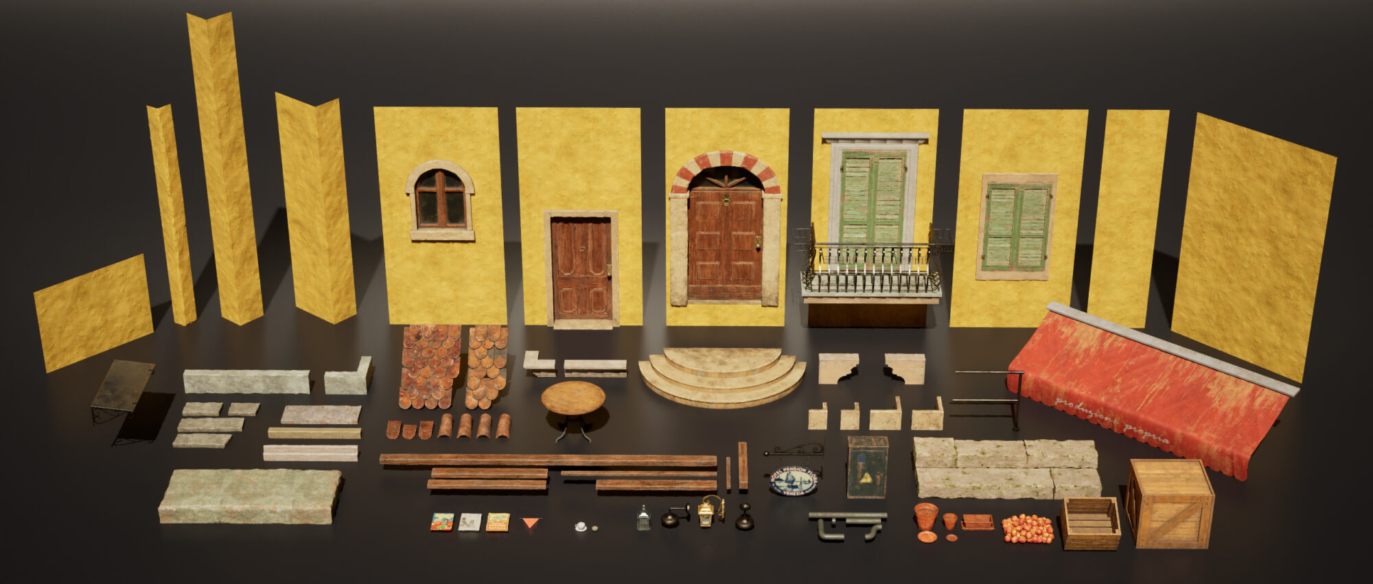
Modularity
A powerful workflow, but if you don’t understand its true purpose, it can become more of a headache than a help. The whole point of modularity is to reuse modules (meshes) to create different buildings or structures.
It’s a huge time-saver when you need to create variations of the same assets.
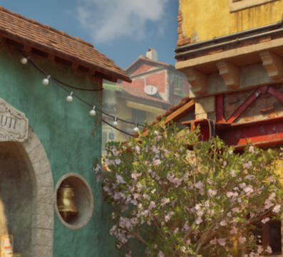
For “La Piazzetta,” I knew I had to use modularity because, aside from the arch, I needed to make several houses that looked similar but had slight differences.
They could share the same walls or roofs, but still vary with details like windows or doors. I had a clear *why*.
Modularity can be incredibly useful when needed. In the final weeks of my project, I received feedback highlighting a lack of depth.
To address this, I added an alley, which became one of the scene’s best shots.
Since I had already modeled and textured all the necessary modules, I could quickly assemble the buildings in the alley.
The background buildings were also made in those last weeks, it was fast because of modularity and helped a lot with the depth of the scene:
Nanite
Many people think that just enabling Nanite when importing an asset means they’re fully using the Nanite workflow, but really, that just applies Nanite to a dense mesh.
The true Nanite workflow still involves optimization without sacrificing quality.
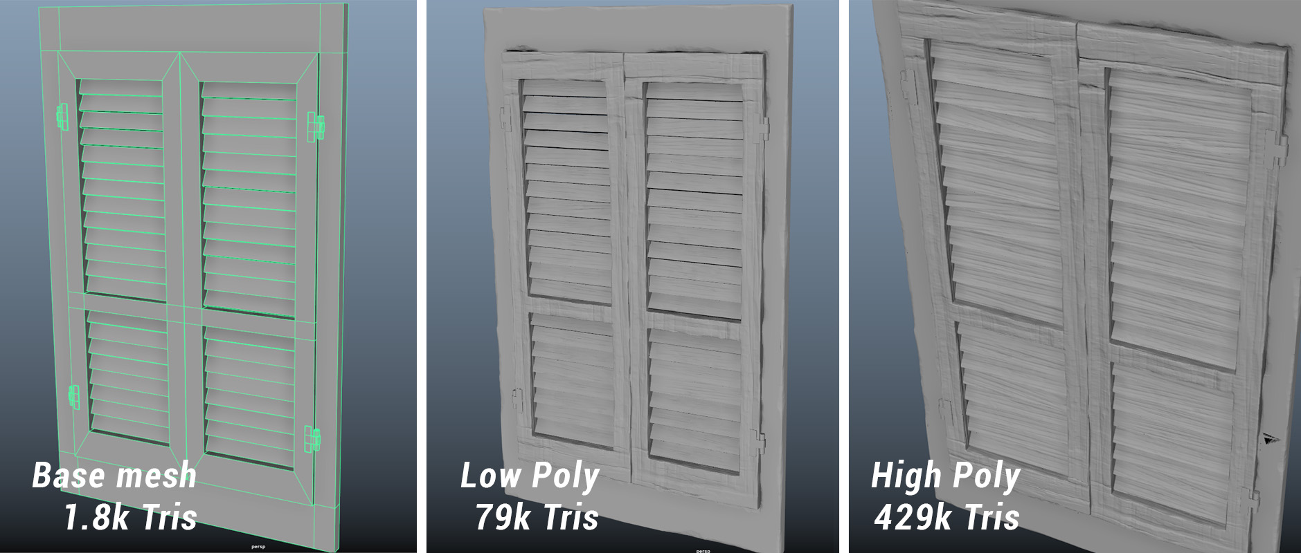
It works like a high-to-low poly process. You start by creating a base mesh, bring it into ZBrush, generate high and low poly versions (I used decimation for this), and then create UVs for the low poly.
The advantage here is that your low poly will be much closer to the high poly, retaining more detail. This means shapes like cavities, curved deformations, and sculpted details will respond to lighting much better than with traditional methods.
Here’s an example with one of the wooden windows:
Creating UVs for decimated meshes can be tricky. What I typically did was create UVs for the base mesh, then use Maya’s “Transfer Attributes” option to transfer the UVs in a world-aligned position.
If that didn’t work, I’d use Rizom UV to manually create the UVs. Then, I exported both the low and high poly versions to Painter.
After baking, you’ll have the high poly normal map baked onto the low poly. You can export this by right-clicking in Painter. I later used this map in the third workflow, Material Layers.
Finally, I imported the low poly into Unreal to test how the lighting interacted with the sculpted details.
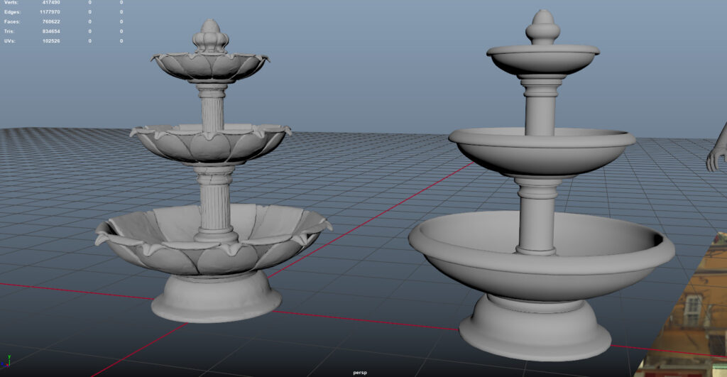
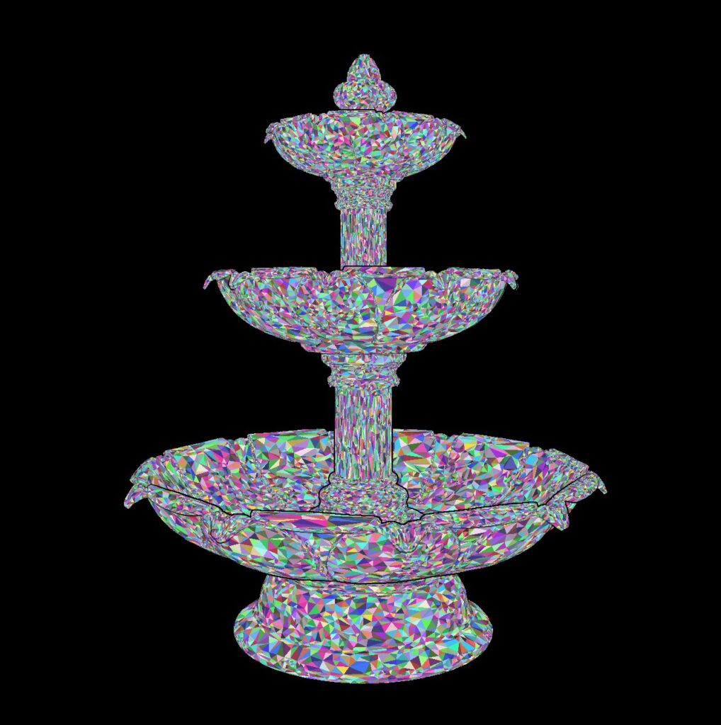
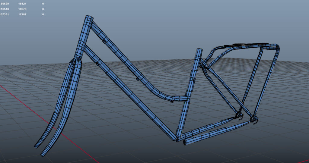
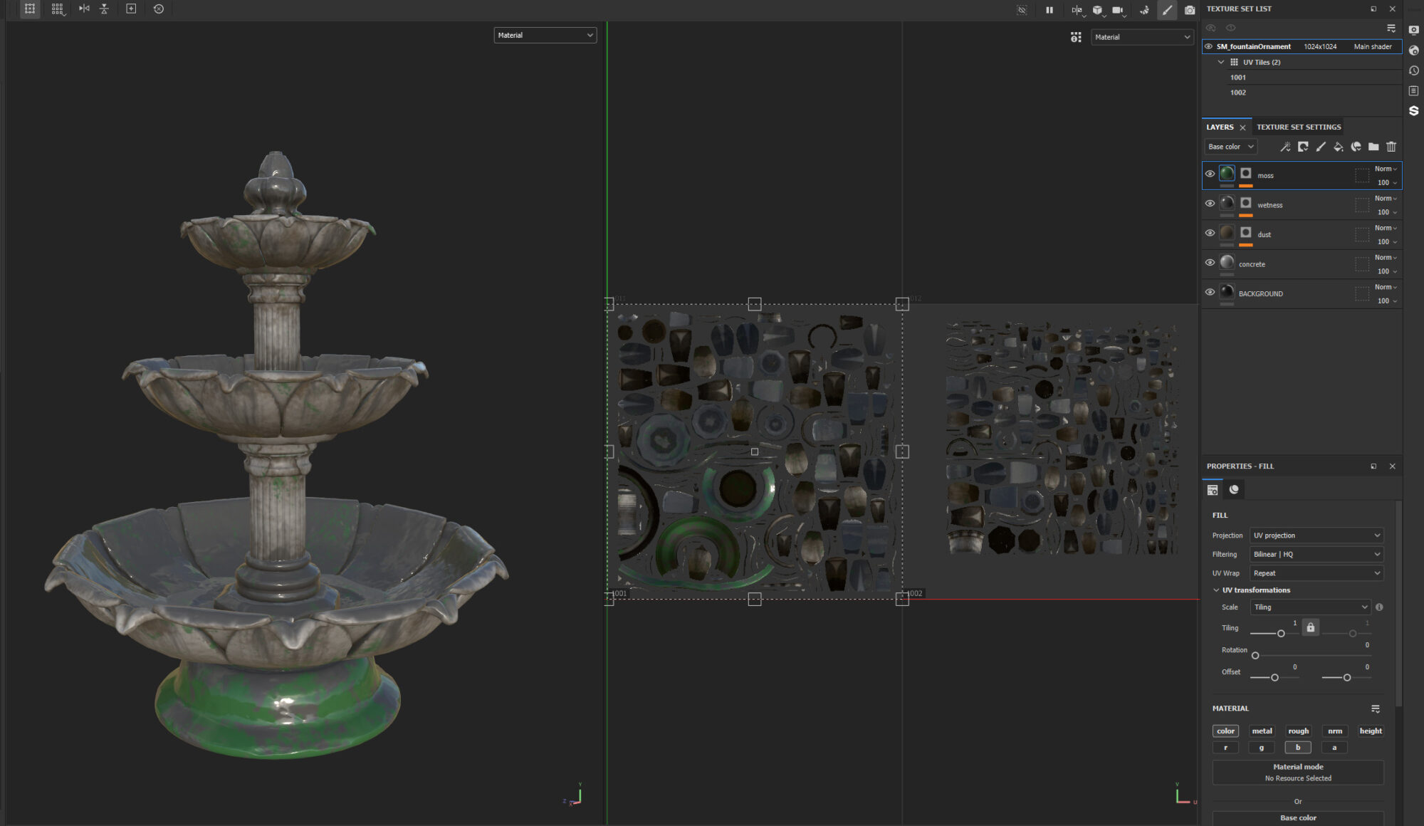
I followed this workflow for every asset that needed sculpting (except the hero prop), like the fountain:
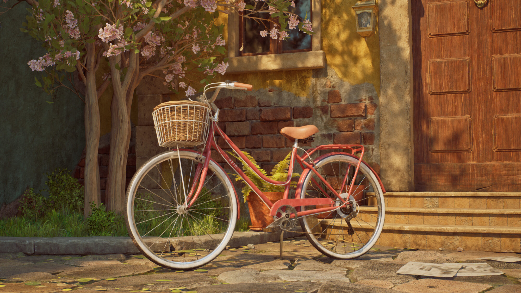
Hero Prop Workflow
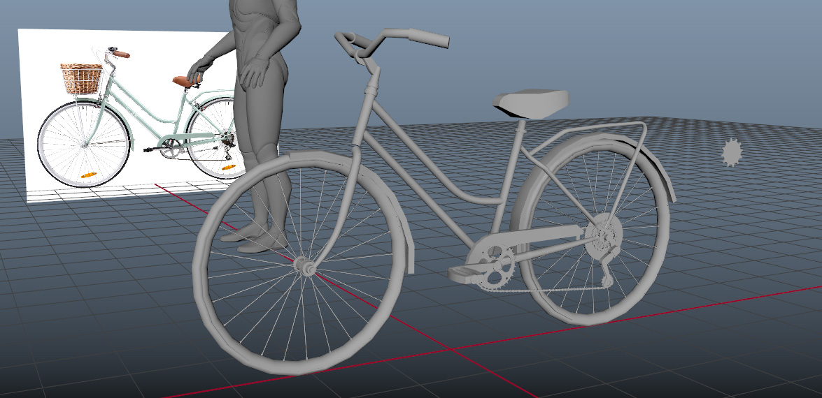
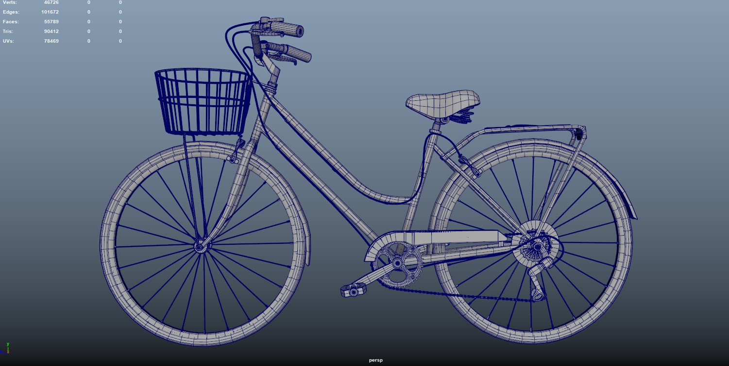
For the bicycle, I used the traditional high-to-low poly workflow, meaning the mesh isn’t decimated or using Nanite.
I started by creating a blockout as accurately as possible, using the actual dimensions from the manufacturer.
Since some pieces were identical on both sides, I only modeled one side to save time.
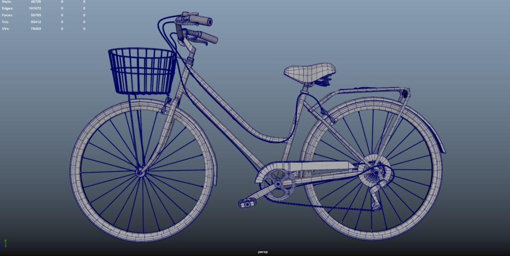
For the polishing stage, I divided all the parts into three main categories: beveled, SUBD, and sculpted.
- Beveled: These are the meshes that only need beveled edges and softening. This was the easiest of the three categories, typically consisting of smaller pieces that didn’t require SUBD modelling. Both the high and low poly versions were the same (e.g., the accessories on the bicycle handlebar).
- Subd: I applied this to the high poly meshes. These used supporting edges to achieve the desired shape when subdividing. For the low poly, I added the necessary edges to make it as accurate as possible to the high poly.
- Sculpted: mainly the metal tubes of the bike. I aimed to replicate the real-world welding effect and add some scratches. For this mesh, I used retopology.
After this process, I ended up with a low poly that had beveled edges, was not subdivided, and was retopologized, along with a high poly that was beveled, subdivided, and decimated.
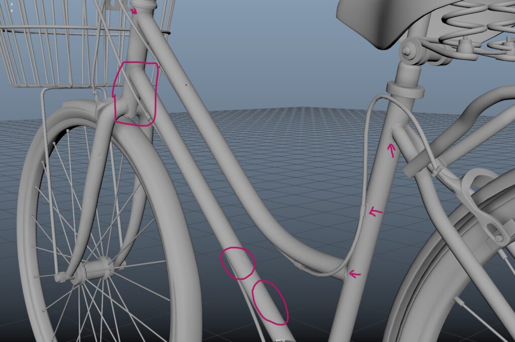
High poly (I know the sculpted detail looks subtle, but I wanted to practice retopo):
Some may consider that the polycount is still a bit high for a game asset, but I received some great advice from my mentor:
This is your portfolio piece, and these days, polycount isn’t as much of an issue for engines.
Focus on making things look good, especially for your hero prop.
Other Props
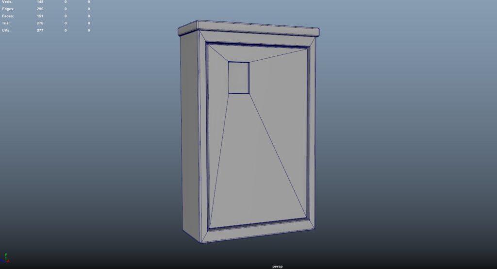
For the props that didn’t require sculpting, the process was much more straightforward.
Most of them were small enough to fit in the 0-1 UV space, and I textured them in Painter without needing a high poly model, just adding beveled edges.
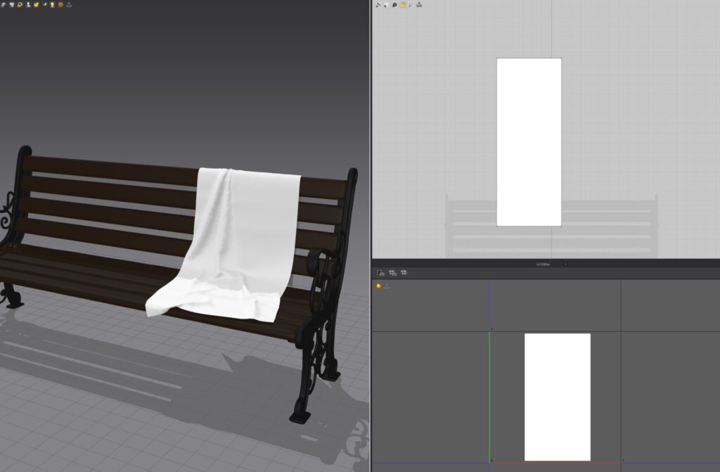
The cloth props were made in Marvelous Designer and simulated to have more realistic folds:

UVing & Baking
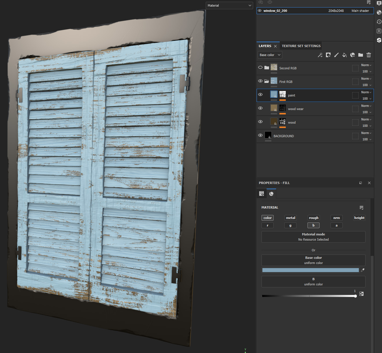
Material Layers
Material Layers (ML) lets you blend and layer different textures in a single material using masks, which I find more powerful and efficient than using a master material with RGBA masks for in-game asset changes.
Is like having a mini version of Painter in Unreal!
For unwrapping, a challenge was ensuring my UVs fit within the 0-1 space for baking maps, especially since some assets were too large. I was using a texel density of 10.24 and typically packing into a 4096 texture resolution.
My mentor offered one solution, while I developed another approach.
UDIMs
The goal is to unwrap the mesh so that all UV shells fit within a single tile, called UDIMs, which helps maintain texel density for baked maps and masks. However, there are some downsides to this method:
- It can lead to more visible seams due to the extra UV cuts needed to fit islands into a UDIM.
- Using more than 2-3 UDIMs can be tedious, time-consuming, and costly, as each UDIM requires its own Material Layer instance and RGB mask. Additionally, if you’ve sculpted, you’ll need to import a high poly normal map for each instance, making the process exponentially more expensive with each added UDIM.
Using 2 UV Sets
I came up with this solution. We create two UV sets for the asset.
- The first set packs all UVs into the 0-1 space without considering texel density, which we use to bake the high poly data.
- The second set maintains proper texel density and is designed for tileable materials, helping us avoid UDIMs.
While our bake won’t be at texel density, the tiled textures will be. If done correctly, the difference won’t be noticeable.
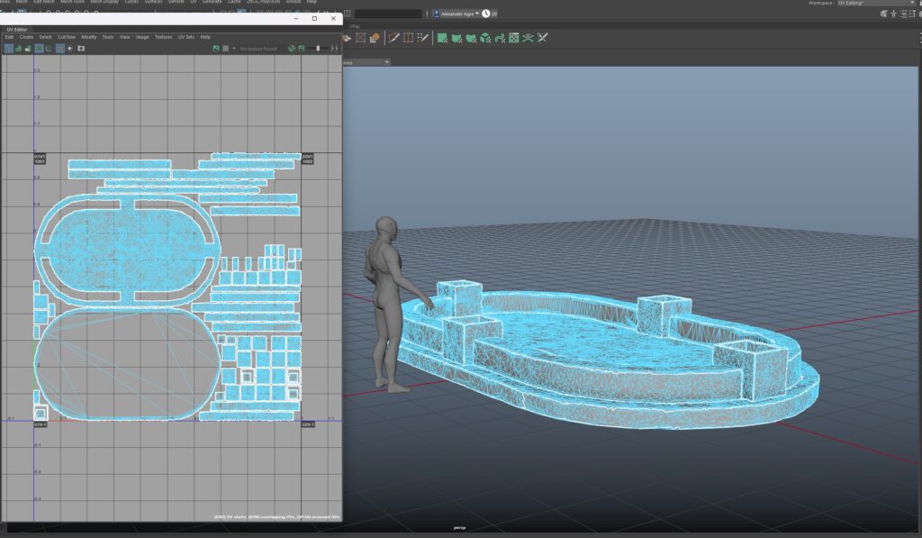
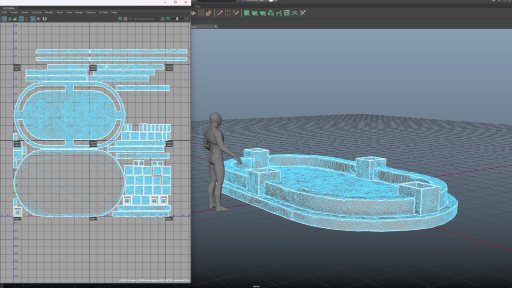
I applied this method to the fountain pool since it was large and would require multiple UDIMs. However, there are some downsides:
- If you want highly detailed sculpts, this may lead to resolution issues, making this approach less effective.
- RGB masks will also lack texel density, which could result in blurrier masks, so it’s not ideal for high-detail masking.
Lef: UV set 1 (0-1space) – Right: UV set 2 (tiling texture):
Hero Prop UVs & Baking
Since not all the parts could fit into the 0-1 UV space, I opted to use different texture sets. First, I created all my UVs and organized them using the layout tool.
Then, I assigned different materials to some of those UVs in Maya, allowing me to fit everything into the 0-1 space.
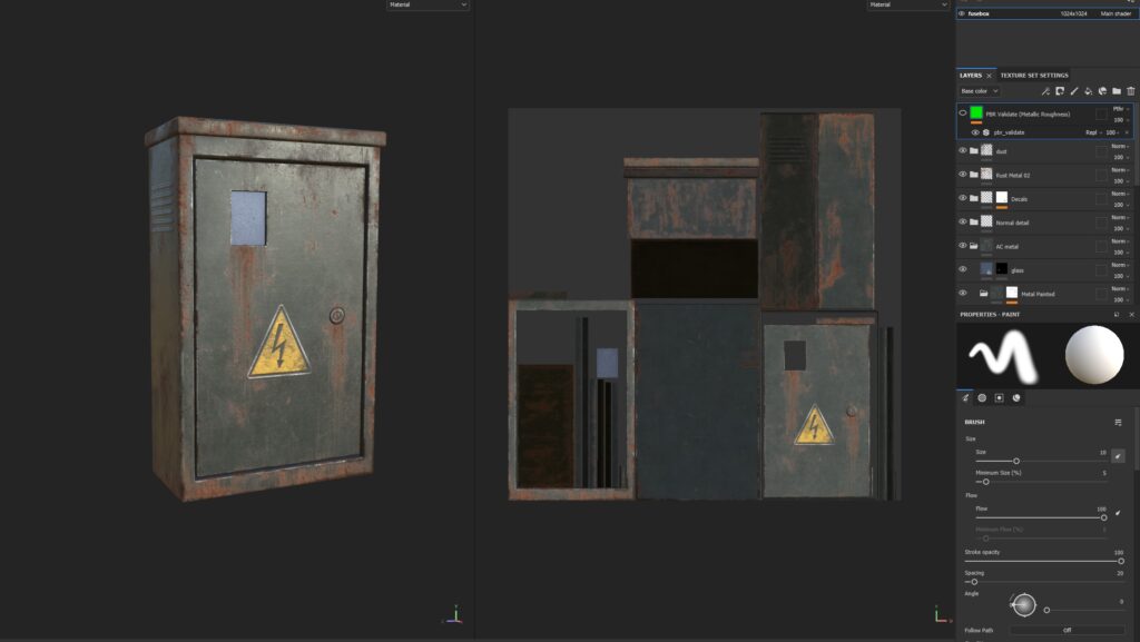
For baking, I softened all the edges of the low poly mesh and added seams wherever there were hard edges. After that, I imported it into Painter and used these settings:
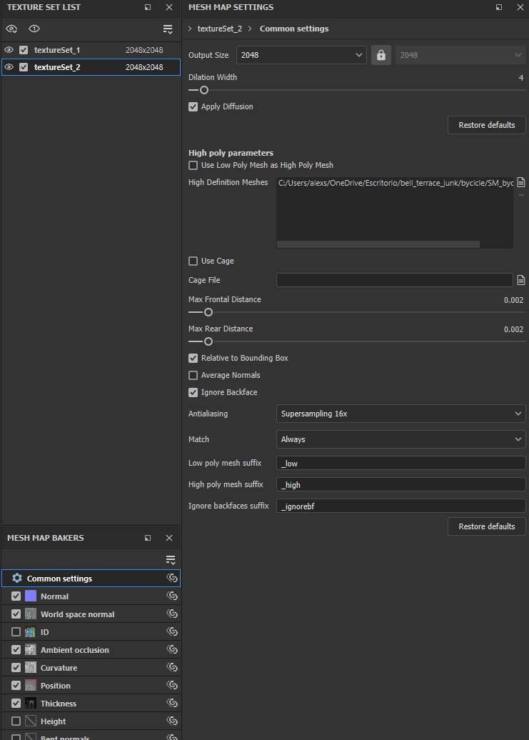
Since I had different texture sets, I decided that the best approach for texturing was to use an ID map, separating the bike parts by materials (like metal, plastic, leather, etc.).
This method allowed me to have more control over the masks in Painter.
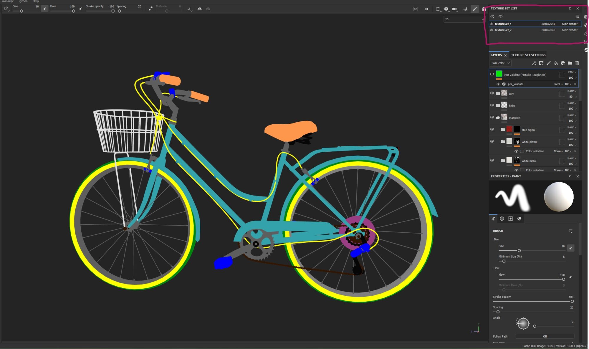
After this I was all set! I just needed to play with Painter using smart masks, trying different smart materials, fill layers, filters, etc.
Texturing
Material Layers 2nd Part
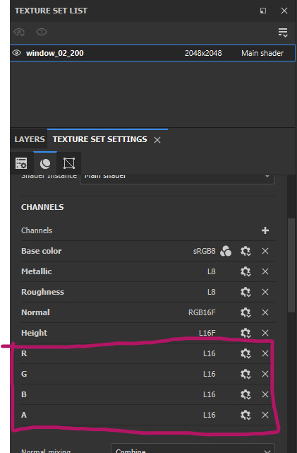
I created the RGBA masks inside Painter, for this, I created my own output channels and renamed them to R, G, B or A.
For creating effective masks, I recommend using smart masks. Painter has a solid library, but you can also check out great options like the ones from Javad Rajabzade.
I suggest editing these masks and creating your own to add variety and incorporate your artistic style.
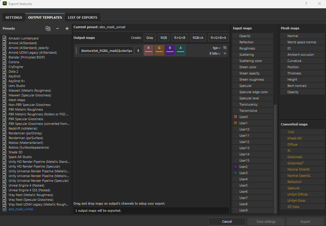
To ensure a smooth export process, I utilized a custom export template in Painter. You can check it out here:
Setting up the Material Layer shader can be a bit tricky, but after a few iterations, I created a material that:
- Supports the use of a high poly baked normal map and a curvature map for projection onto the mesh.
- Allows control over various parameters of the tileable materials.
- Utilizes RGBA masks for layering.
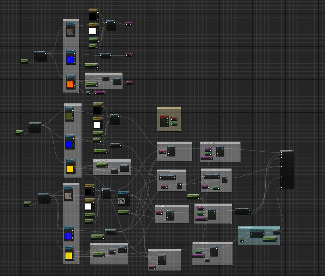
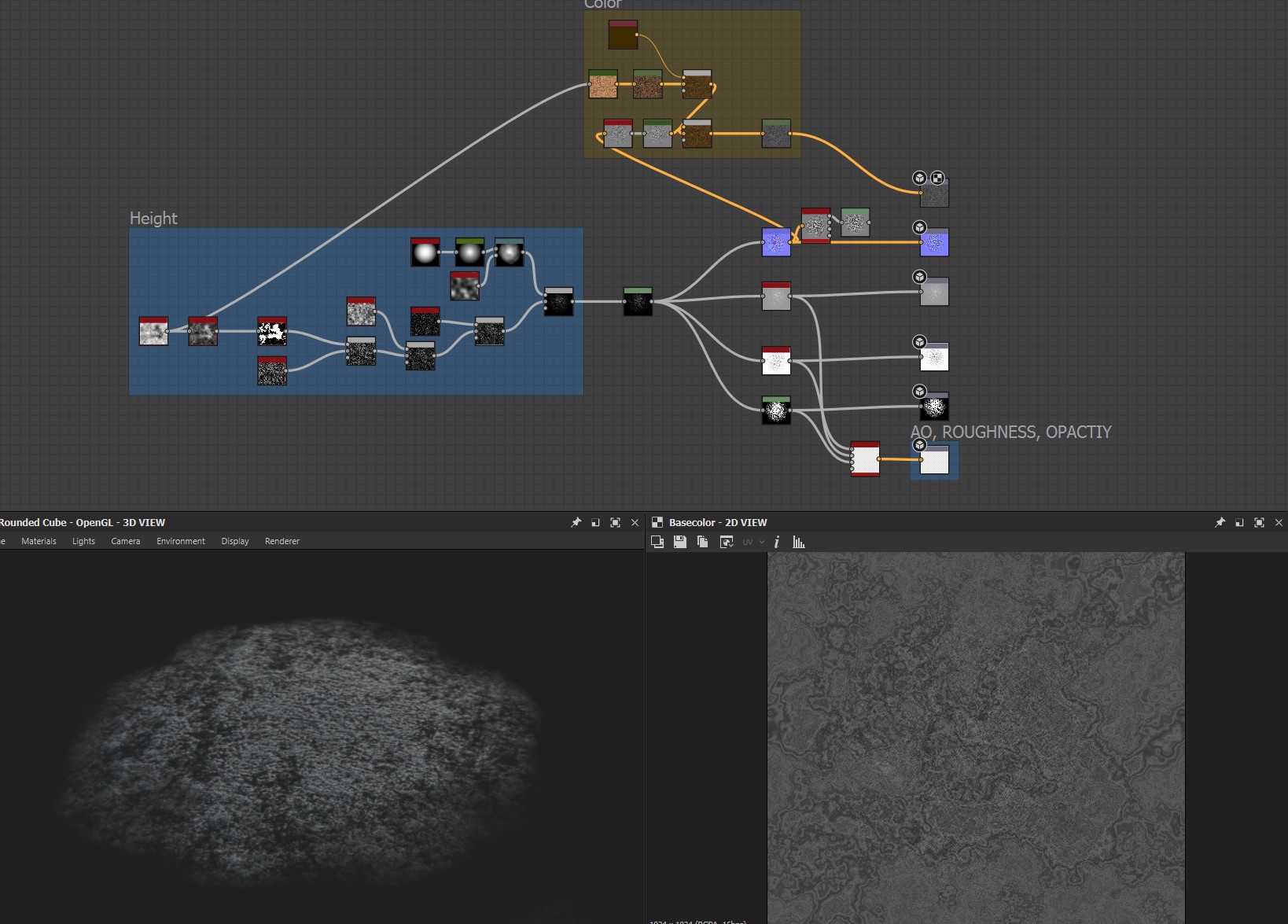
Tileable Textures
What I’ve learned is that the best approach to creating a material is to start with larger shapes before moving on to finer details.
Establishing a clear procedure helps too; I typically begin with the height map, then work on the color, and finish with the roughness. This approach keeps my workflow organized.
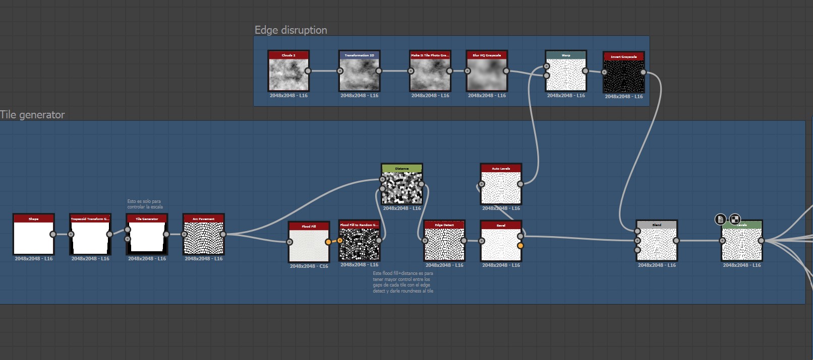
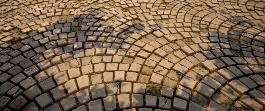
Now, let me walk you through how I created one of my favorite materials, the cobblestone arched floor:
- I started by designing the individual tile separately to have better control over its shape.
- Next, I applied a flood fill combined with a distance node to manage the gaps between each tile, which also added some roundness to their edges.
- I then used a Clouds 2 node, tweaking it to produce blurred, low-frequency noise that I plugged into a Warp node. This added slight variations between the tiles and helped extend the gaps a bit.
- Finally, I utilized a blend node to subtract the initial gaps from the warped ones, resulting in areas where the gaps are more compressed and others where they’re more spread out. I also employed a Levels node to fine-tune the contrast of the gaps.
I applied the Flood Fill to generate random gradients that helped me cut corners off the tiles. I also utilized a slope blur combined with some noise to break up the edges a bit.
Finally, I added a random color to create a mask, allowing each tile to have its own unique level of disruption.
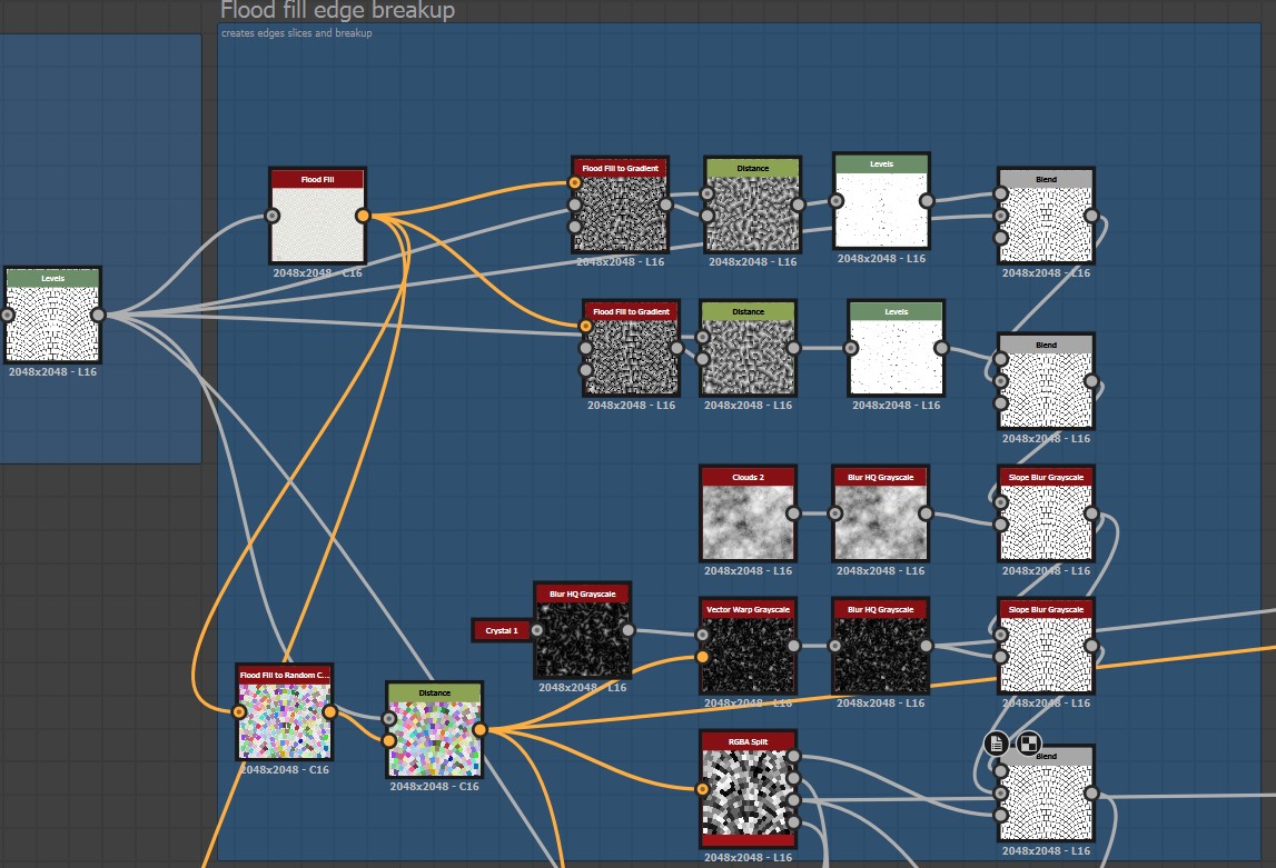
Next, I used the same RGBA split to introduce some height variation, which I combined with gradients to ensure each tile had a slight tilt and a lot more height diversity.
I realized my texture was becoming too dark, so I applied an Auto Levels adjustment followed by a Levels adjustment to restore the value range.

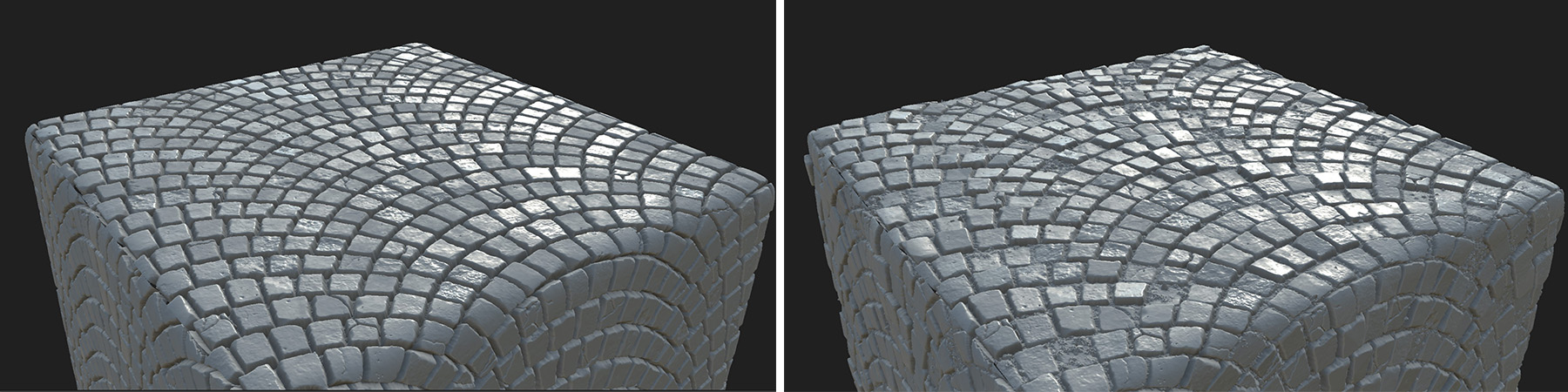
As you can see, the height variation really enhances the material’s visual interest.
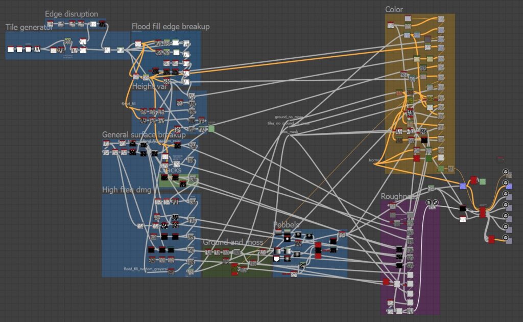
After that, I focused on adding smaller, high-frequency damage details, followed by moss and small rocks using Height Blend nodes. Here’s how the final graph turned out:
Many of my materials followed a similar approach to the arched cobblestone, including the bricks.
If you’re interested in seeing more stunning renders of other materials created in Designer, along with some timelapse videos, check out my Material Showcase post.
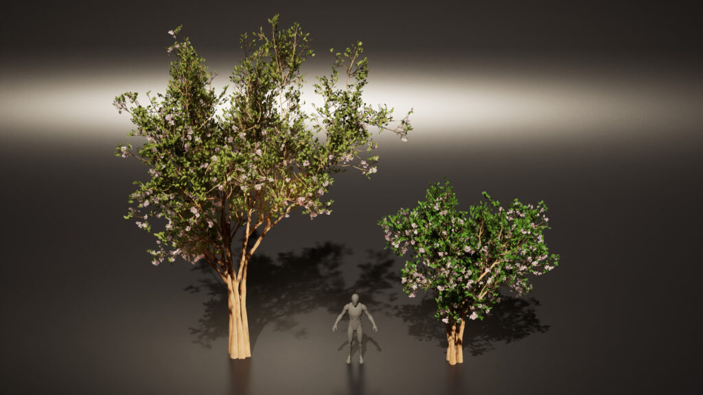
Foliage
For the foliage, I used both, custom foliage made in Speedtree and some Megascans assets. From Megascans I used Boxwood, English Ivy, Lemongrass, Thyme, and Dead Leaves.
Additionally, I downloaded various bread models from the bakery section of Megascans, along with a small wooden chair.
Megascans can be a great resource if they don’t dominate your scene, and you make sure to credit the original creators properly.
There were two key resources that helped me understand how to create foliage. First, an amazing tutorial from Dekogon on using SpeedTree to make realistic trees.
Second, I had the privilege of learning from Sylvia Cheng, an incredible foliage mentor, who walked me through workflows for various types of foliage and provided invaluable feedback and resources.
I discovered that while references are important for props, they’re even more crucial for foliage due to their organic variability.
A useful tip is to look up the scientific name of the plant you’re working on for more accurate references.
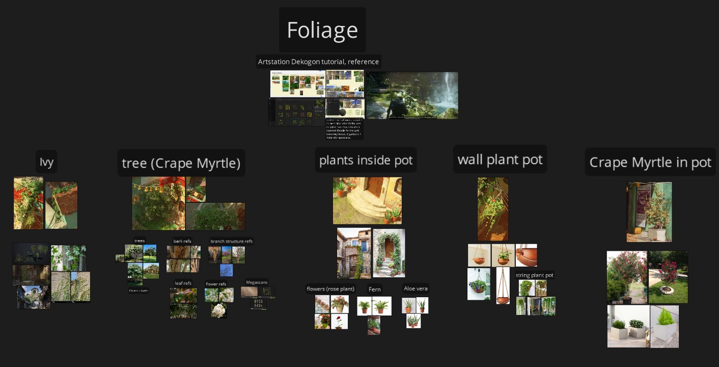
Here’s a breakdown of the process I followed to create the tree:
- Atlas Creation: I started by making an atlas for the tree branches using SpeedTree nodes.
To add variation, I cut out leaves and flowers from a Megascans texture and created three different versions, which I then exported.
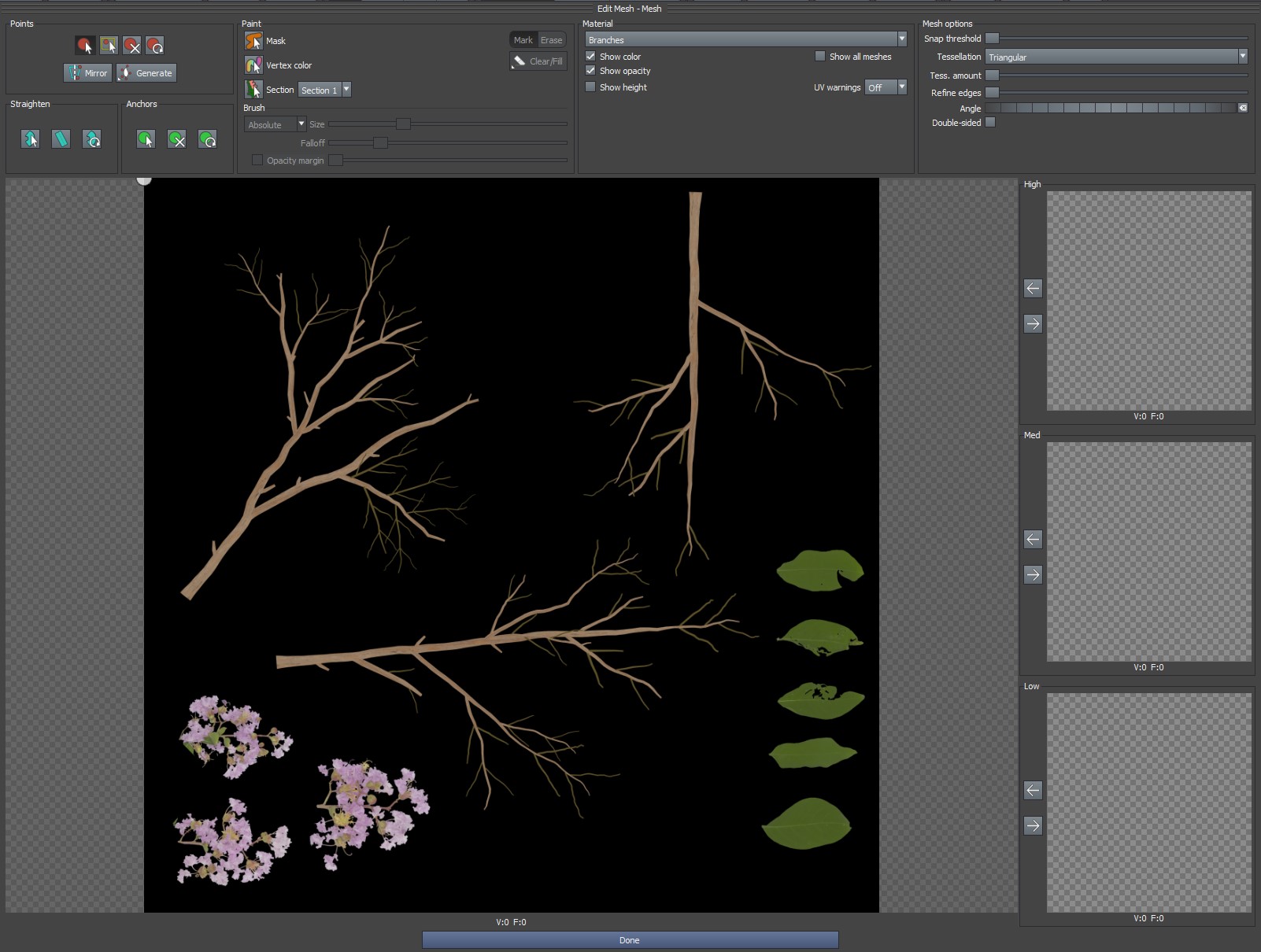
- Mesh Creation: Using SpeedTree’s “edit mesh” tool, I created a mesh from the atlas. I also added anchor points so that SpeedTree knew where to place the leaves.
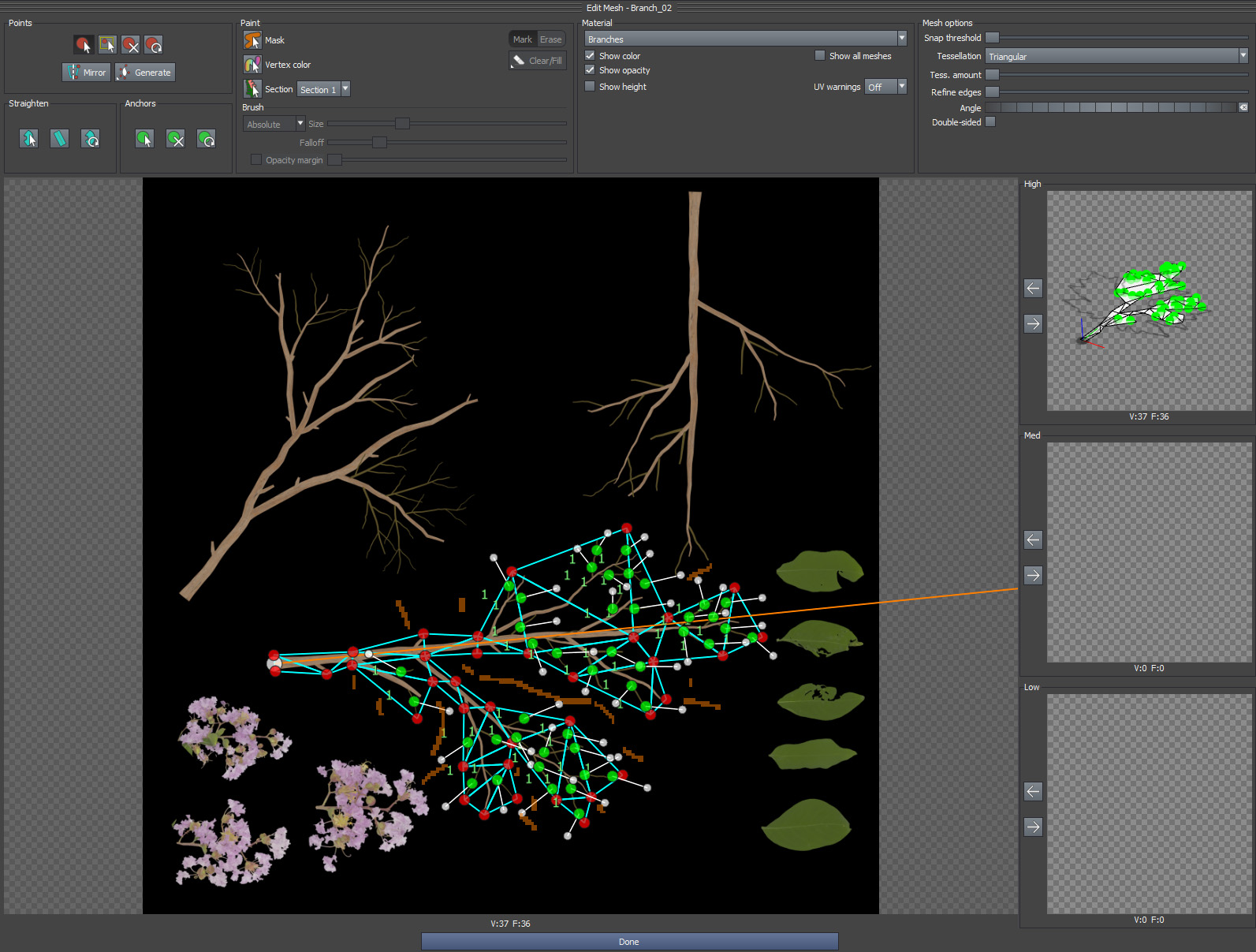
- Tree creation: I completed the base branches of the tree and used the previously created meshes as leaf nodes, then added flowers on top for the final look.
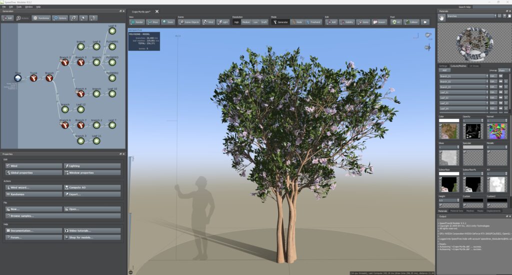
For the plant pots, I used a similar approach, although it was challenging to achieve the desired look for each plant using only SpeedTree nodes.
I highly recommend checking out the SpeedTree YouTube channel for excellent tutorials on creating specific plants.
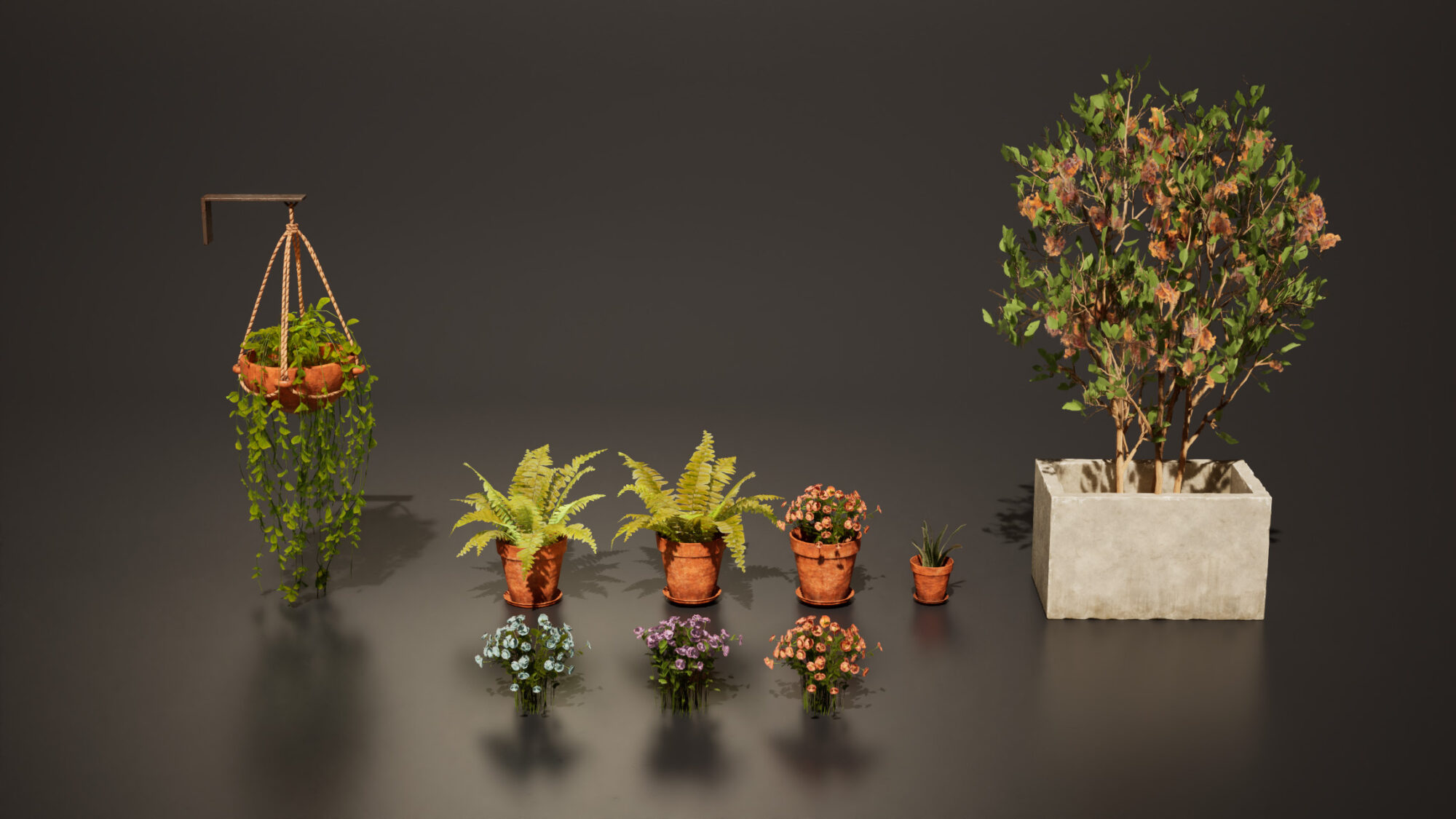
I designed the flowers for both the plant pots and the trees to allow for adjustments in color and translucency within the engine.
This gave me greater control over their appearance.
Unreal Engine
- Adding Depth to Your Scene
Thanks to feedback from global mentors, I realized that my shots lacked depth.
To address this, I added an alley, background buildings, and the church.
I accomplished all of this in just 2-3 weeks because I had already completed the modular kits, and the church was a project from my studies on modular design in games—like a little Easter egg!

These changes significantly enhanced my shots, helping the scene feel like a genuine environment rather than a movie set.
Adding Movement to the Scene
Many environment artists create visually stunning scenes that ultimately feel static. Adding movement can significantly enhance immersion and storytelling.
I used custom blueprints, Niagara particles and other techniques to introduce movement:
Water Shader
This shader pans a normal map along with other fx to simulate the water, it also generates ripples whenever a mesh interacts with the water surface.
Waterfall Effect
I aimed for realism by incorporating droplets rather than just a scrolling water texture. I found excellent reference material thanks to Ivan Remez.
For water creation and shaders, Ben Cloward’s YouTube channel is a fantastic resource.
Fish Movement Along Spline
I created a Blueprint that allows fish actors to follow a spline path, with controls for the number of actors, speed, and offset.
Fish Fin Animation
Using a simple shader setup with a sine function, I animated the fish UVs to simulate swimming motion while they followed the spline.
The goldfish model was sourced from Epic3DCrafters, and I adjusted the textures to ensure they were game-ready.
Flags Spline
I developed a procedural spline system to position flags hanging from a cable. This spline includes a scaling option and allows for varied flag colors based on their object position.
Birds
To make the plaza feel more dynamic, I included birds pecking at seeds near a bench, along with flying birds for background movement.
I sourced these from two free packs on the Unreal Marketplace: Animal Variety and Rural Australia.
Cigarette Smoke
I added cigarette smoke using a ribbon-based smoke trail created with Niagara particles, inspired by a tutorial from Tim Engelke, to give the store a lived-in feel.
Polishing
To improve the building exteriors, add more variety, and seamlessly integrate the meshes with dirt, I used a combination of vertex painting and decals.
Vertex Paint
- The first variation blends two textures while utilizing a third texture for the transition.
It uses Material Attributes to create an alpha mask in the painted area, which is subtracted from the center to yield a white mask around the painted section, where the transition is going to be.
This approach was particularly beneficial for painting wall damage, allowing for a natural and procedural blend of the three materials.
A global mentor introduced me to this shader, I learned it and adapted it to my specific needs, such as implementing Parallax Occlusion for the bricks and exposing texture parameters. Here’s how the final shader works:
This variation is a more traditional vertex paint shader that enables blending between three different textures.
I used it to seamlessly blend the rock floor with moss and a puddle effect was created using the water node in Designer. T
o ensure that the moss appears primarily in the gaps between the rocks, I applied a specific mask that controls its placement.
Decals
Decals were particularly effective in reducing texture repetition and blending adjacent meshes. I created custom decals using Designer and supplemented my work with textures from Textures.com for efficiency.
I typically desaturated all decals to allow for tinting in the engine, making the process more procedural and adaptable.
Lighting & Rendering
For the final lighting, I went with Lumen and Ray-tracing reflections.
At first, I tried to replicate the greenish, low-contrast light from the concept art since it looked great there. But when I used it in my scene, it just didn’t click the way I hoped.
After that initial test, I realized I wanted the colors to really stand out and make the scene feel more vibrant, not so cold.
Since the story I had in mind was a summer vacation spot, I thought a warm, sunset vibe would fit perfectly. After some adjustments, here’s how it turned out:
It still wasn’t quite there, but it was improving.
The shadows were softer due to the indirect lighting, and the warmer tones helped bring out the yellows and reds in the main house, which was a key focal point.
I revisited my references and noticed that most of them weren’t sunset scenes, but rather noon or afternoon lighting with a vibrant, saturated blue sky.
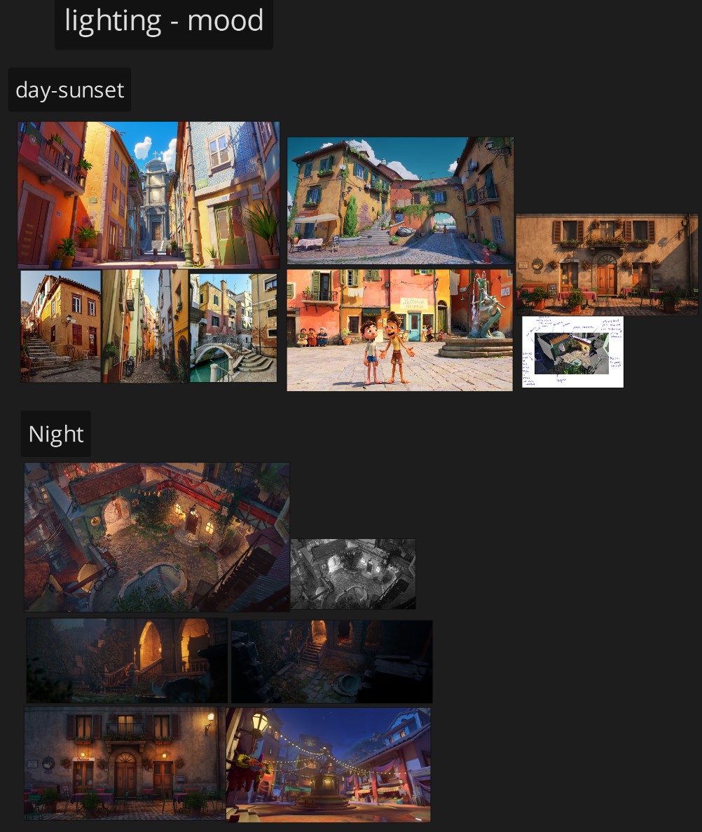
That’s when I finally knew the lighting setup I wanted. The real breakthrough came after finding Karim Abou Shousha’s YouTube channel—he gives great tips on achieving realistic lighting with Lumen in Unreal. I can’t recommend his content enough.
Here’s what I did next:
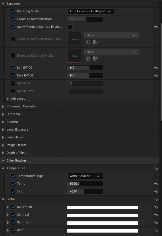
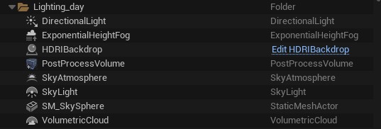
- Switched the default skylight for an HDRIBackdrop.
- Used the Skylight for fill lighting (added blue tones to the shadows) and reflections.
- Increased the visibility of the fog to better scatter the light.
- Tweaked the Post Process Volume, adjusting exposure, bloom, and color grading.
I’ve learned that lighting is a process of constant experimentation. You have to test out different moods, shift the direction of the light, and play around with colors and shadows until you land on something that feels right.
It’s one of my favorite steps because it’s when your creativity really takes the lead.
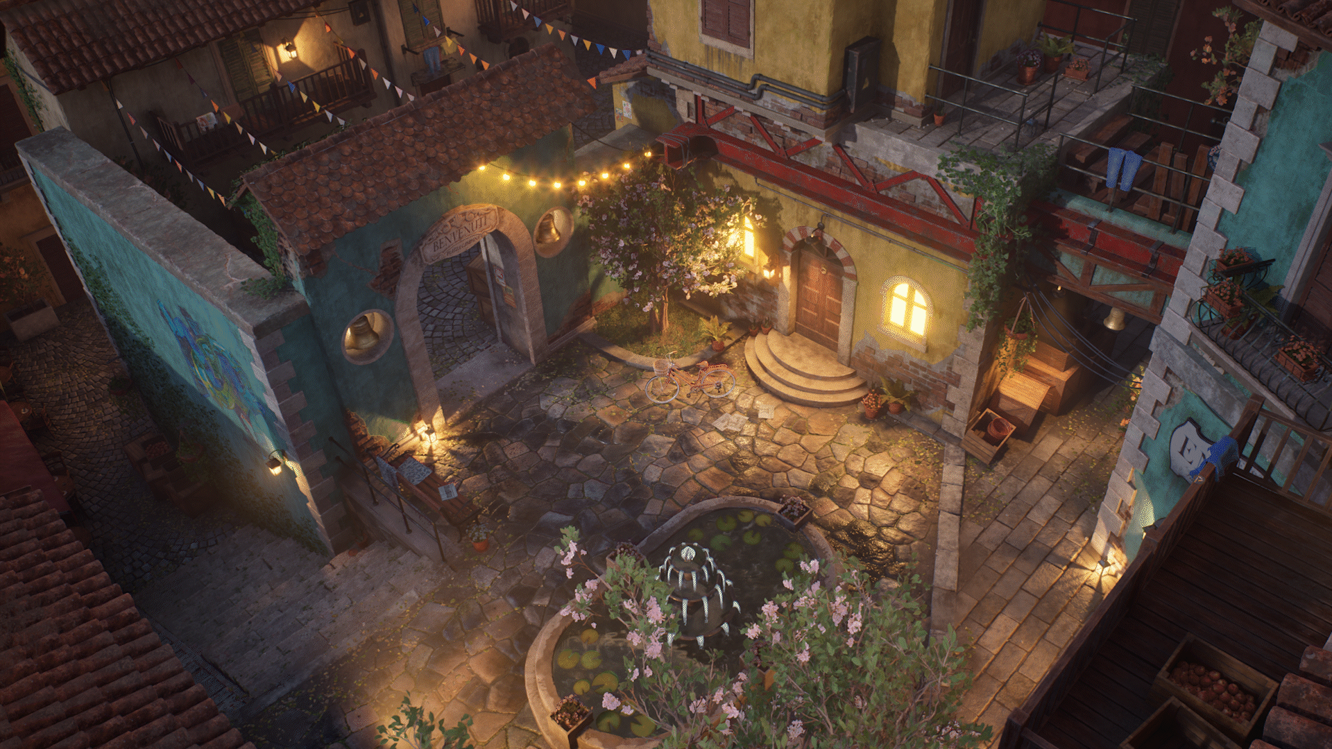
Nightime
One of the mistakes I made early on was giving almost all the lights the same intensity and using mostly yellow-orange tones. I needed more variation in color and brightness to match the energy of the scene.
Big shoutout to Tanay Parab for pointing this out. Here’s the nighttime with lighting only:
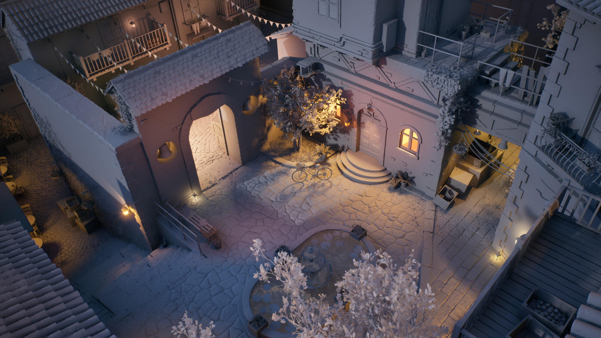
As you can see, I started experimenting much more with the color and intensity of each individual light. In reality, not every bulb shines the same—some are older, newly replaced, flickering, or even broken.
I also leaned into a more bluish tone for the overall mood. Here’s how the progression looked:
Conclusion
Completing this project was not easy; it took me around 10 months to finish. There were days when I felt overwhelmed and doubted my abilities, but I pushed through.
Looking back, I’m incredibly proud of my determination and perseverance. It’s a reminder that even the toughest journeys can lead to something truly rewarding.
I would like to share some tips that I learned while making this project:
- Enjoy the process more than the outcome.
- Don’t be stressed because your work doesn’t look how you want at the beginning or even at the mid-term, focus first on learning and understanding the new skill/workflow you’re trying to do, then apply and repeat, the results will come.
- Over-feedback is something that happens and can affect you negatively, it’s better to have few trusted people you can ask.
- Don’t take feedback personally. Remember, the people giving you feedback are often more experienced and have an interest in seeing you improve. If you don’t agree, make sure you can back up your perspective with solid arguments.
- Even on days when you don’t feel motivated, making some progress on your project, even if it’s just 1-2%, is better than making no progress at all.
- If you feel lost and don’t know what to do next in your project, always go from big to small, what’s bigger in the scene should have more importance.
- Perfection is in imperfection.
I want to express my gratitude to my mentor, Aleksandar Danilovac, for encouraging me to explore new workflows and for boosting my confidence in my abilities.
I’m also thankful to the global mentors at Think Tank, as well as my parents and girlfriend for their invaluable support. Big thanks to GamesArtist for the opportunity.
This project is dedicated to my dog, Tommy, who passed away during its completion.
Thank you for reading my breakdown. I’m now looking to start my career in the games industry, if you have any connections or opportunities you can offer, let’s connect!
Read more articles
You might also like these articles.