Neo-Noir
Introduction
Hello everyone! My name is Ilgis Fatykhov, AKA Ilya Dolgov.
Project
Today, I would like to take this opportunity to tell you about how I made my latest work, Neo-noir.
I started getting acquainted with 3D in 2016. I work in 3DS Max, do sculpting in ZBrush, and texturize in Substance Painter. I do texture baking and rendering in Marmoset Toolbag. In general, nothing special—everything is quite traditional.

First of all, with this work, I wanted to improve my skills in post-processing and color grading since I think that, at this stage, I have some disadvantages and little knowledge.
Often, my renders seem very over-counted and sharp to me, so I wanted to work on this a little.


Planning
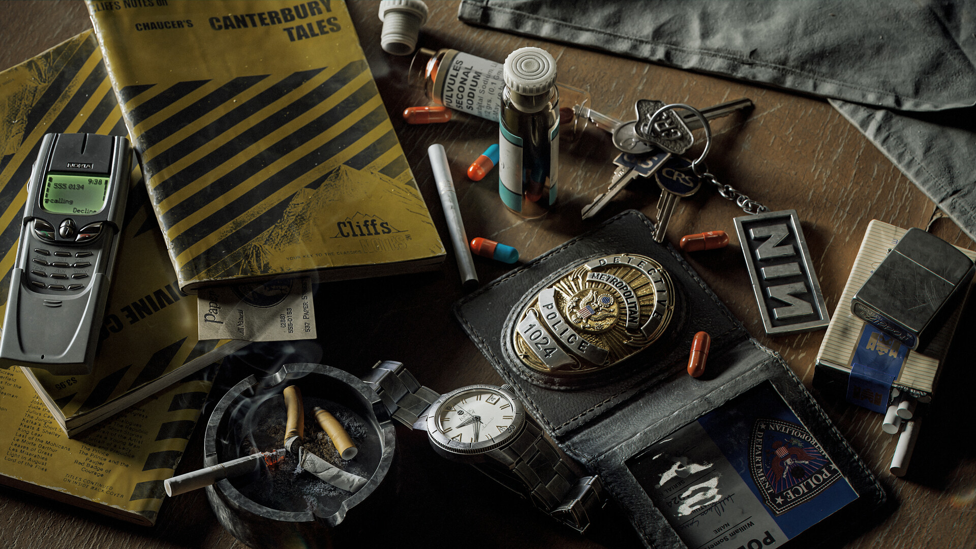
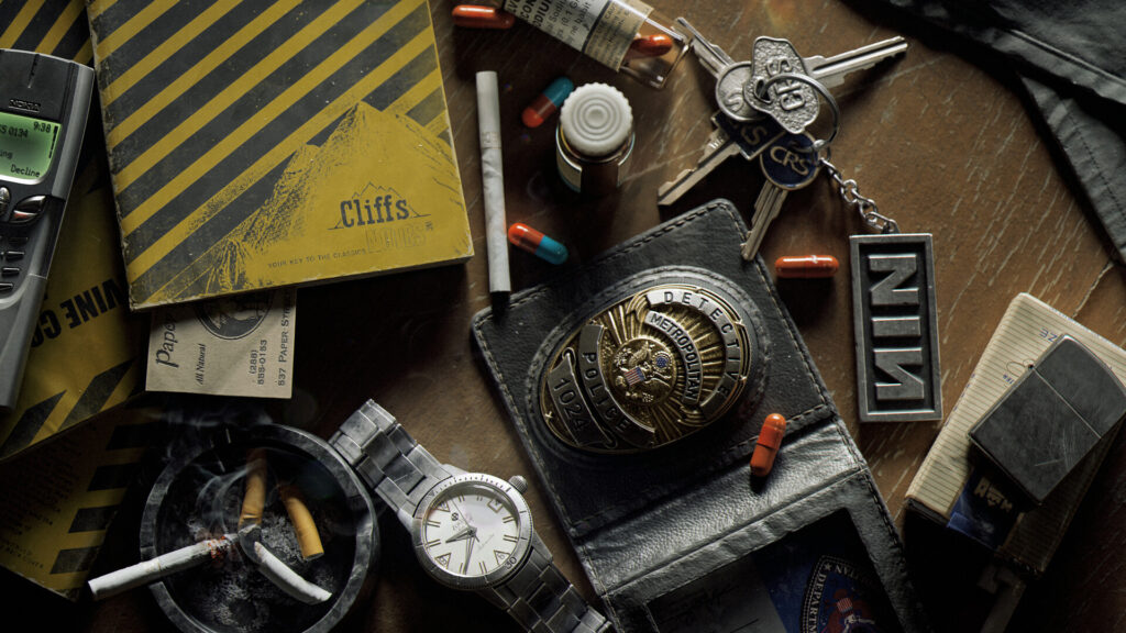
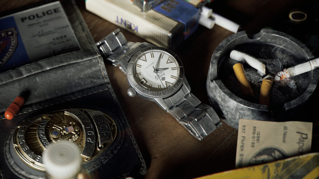
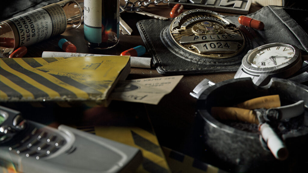
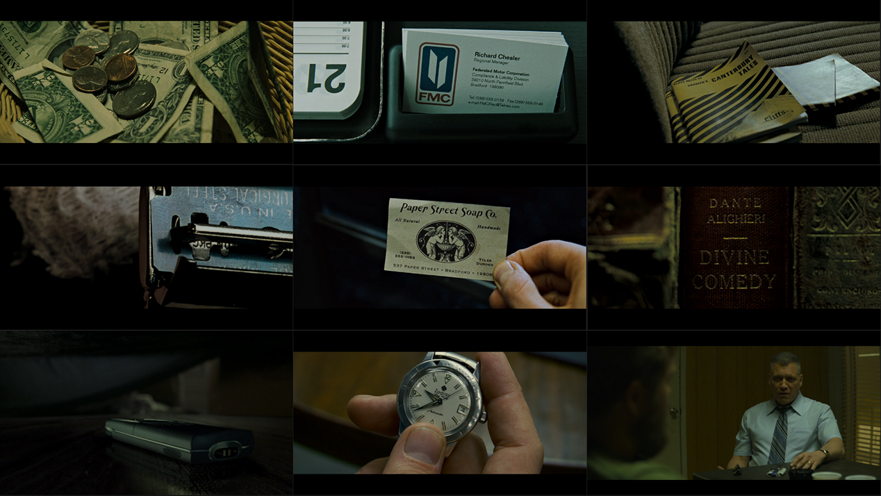
The choice of theme did not take me long to think about. I am a fan of David Fincher’s films and like the visual style of his pictures, so I relied on certain shots in his films.
They look really cool up close and this gave me the idea to place several assets from different films on a small area of the table to make a kind of compilation of different films united by one common theme – a dark neo-noir style.
I tried to choose assets that were relevant to the theme and, simultaneously, recognizable.
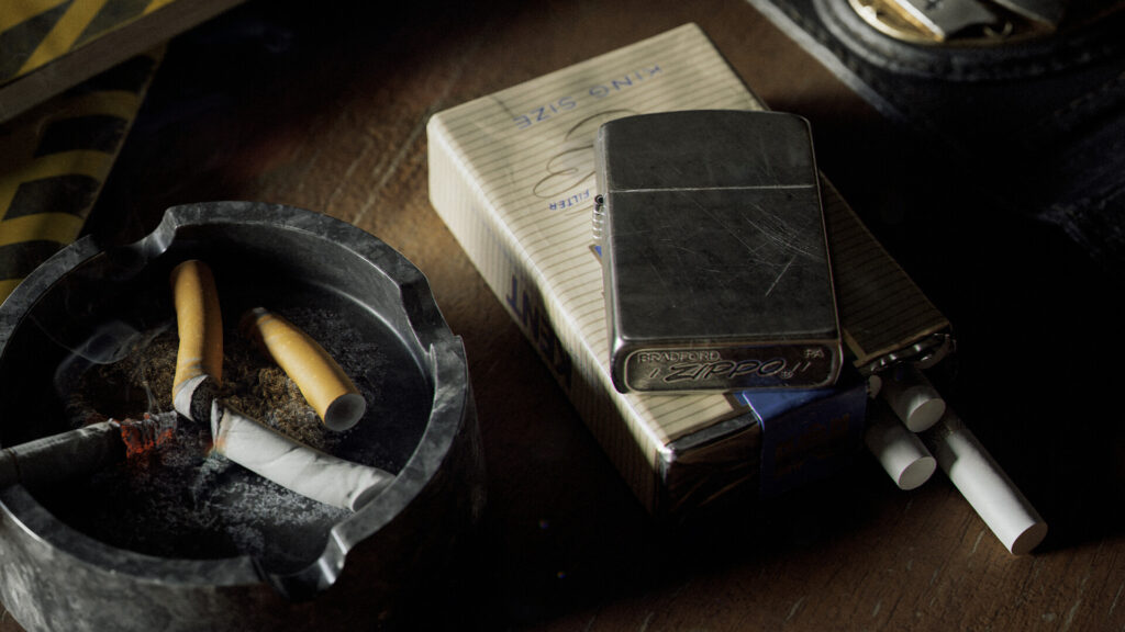
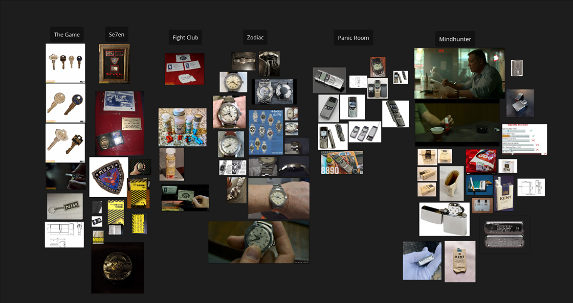
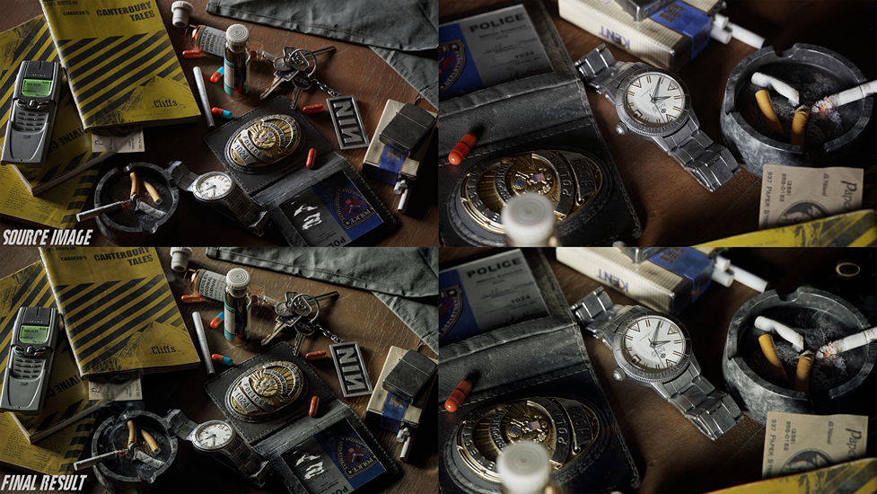
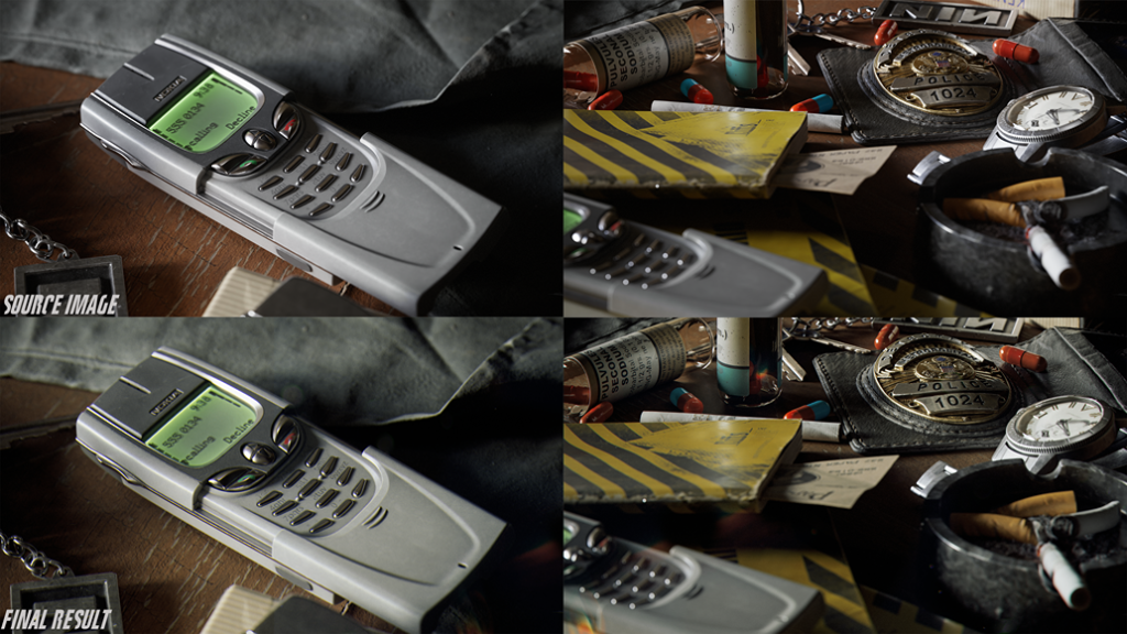
So I chose books and a police badge from Seven, a business card and pills from Fight Club, keys from The Game, a watch from Zodiac, Nokia phone from Panic Room, as well as сigarettes and a lighter with their characteristic placement, this is how one of the main character of Mindhunter, Bill Tench, usually put a pack of cigarettes and a lighter.
It seemed to me that these objects would not stand out from the general style and, at the same time, would be good reference elements.
So I collected all possible references, collected them and began modeling one by one.
Modelling & Sculpting
As I already wrote above, my main software for modeling is 3dsmax.
Before starting, I usually search the Internet for all possible sizes and dimensions of what I’m trying to do. In my case, this is not work on a fantasy asset or a rough sketch with an art concept, but on real-life objects, so I had no problems with blockout and sizes in this case.
All objects are common in everyday life and there are enough references, etc.
So after a quick blockout, I start modeling the model for further smoothing and sending the model to Zbrush to add smaller things there, like seams and threads for a police wallet or edge wear details for keys.
In general, this is a rather boring point and I think there is no point in describing in detail how I did everything.
As I already wrote earlier, the main goal that I had in this project was post-processing and color grading.
Since I did not have much free time, I decided to use decimated meshes for the final assets and not waste time on low-poly retopology.
So, with the help of the decimation master Zbrush, I lightened the weight of the high poly models. I used the Nanite workflow in this case.
This saved me a lot of time. But in this case, do not forget that the decimation master may not work correctly with some parts of the geometry, so it is advisable to check the resulting geometry for breaks, backfaces and other bugs that can affect the shading or the final result.
So, in some parts, I still used a traditional mesh.
UVs
Unwrapping UV and baking the base textures, I think, is also not the most interesting part of the process.
I am unwrapping in RizomUV 2023 because I still haven’t been able to get used to the updated interface of the 2024 version. I use Marmoset Toolbag 4 for texture baking.
Texturing
For texturing, I use Substance Painter. As HDR,I I use probably the most common and beloved by many 3D Artists Tomoco Studio.
As a color profile, I use ACES_UE4. The scene setup for texturing is also quite standard, especially for artists who often work with the Unreal Engine.
Over the years of work, I have accumulated a lot of saved materials, so I had no problems with this or that material.
I managed to texture two assets per day in general, I completed the texturing in about 3-4 days of work. I don’t see any point in staying at this stage since I didn’t use anything special in texturing
Rendering & Lighting
Let’s move on to the most interesting part. After texturing was finished and I placed all the objects in the Marmoset Toolbag 4 scene. I used Toolbag 4 because for some reason version 5 crashed in this scene.
I added two Quixel assets (Table and fabric) to diversify the scene. I noticed that it has become trending to add some elements from the Quixel library for renders, especially for weapon renders.
These elements really add realism to the overall scene.
The main thing is that they do not overlap key assets and do not distract attention and are in context.
At this stage, I encountered the first problem. The Ultimate HDRI Tomoco Studio did not fit the style I had chosen.
First of all, I began to analyze the general style of Fincher’s films and the method by which such stylistics is achieved. If you analyze the above-mentioned frame references, you can single out the main elements.
Firstly, the minimum amount of light, secondly, dark shadows and increased contrast, and as a result, I understood this to be the most natural light without additional light sources.
That is, for myself, I decided to use one light source. What is in the shadow should remain in the shadow; even if you want to highlight some of the elements, it is better not to do this.
After some variations, I chose Fort Point. It is a cool HDRI that is in the Marmoset library. It gives long, dark shadows because the main source is located in the center. It suits my case well.
Subsequently, these shadows will look good in dynamics if you animate the movement of the environment. Here, it is worth considering that I choose the most neutral colors for the environment map, that is, the light source is white, without shades.
Since I decided that I would do the main color correction in Photoshop, I do not need the extra tone of the environment to be incorrectly corrected later. Of the additional elements that affect the source render, I added a little grain. And, of course, depth of field.
Here, the settings depend on the chosen camera angle.
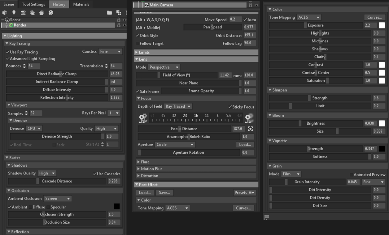
As a result, I rendered all the frames and three camera angles for the video piece and then moved to Photoshop for the final post-processing.
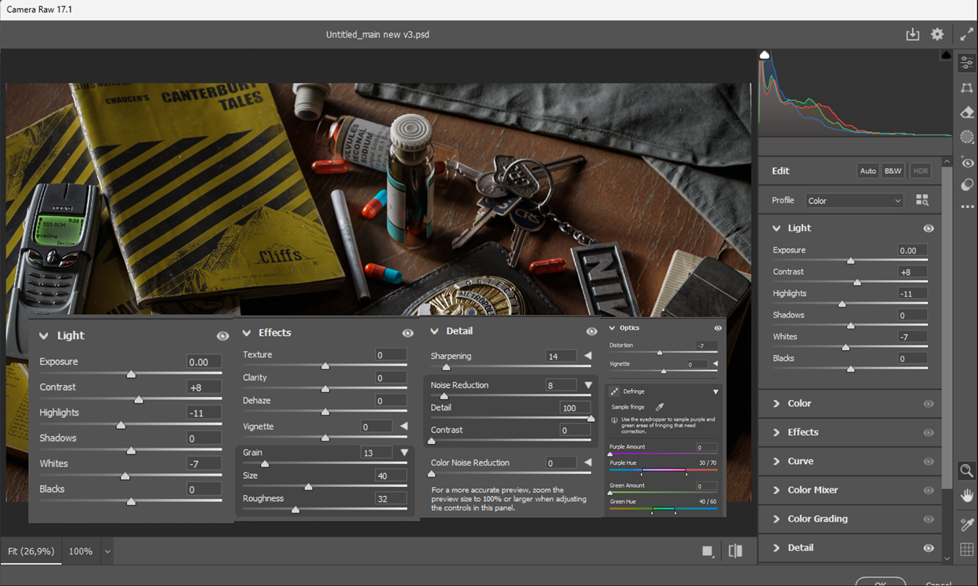
Color Grading in Photoshop
After I added all the resulting renders to Photoshop, the first thing I did was set up and save the Camera Raw preset to apply it to all renders.
In general, it’s a matter of taste, how you set it up, but in my case, I added these settings. I didn’t change any other options.
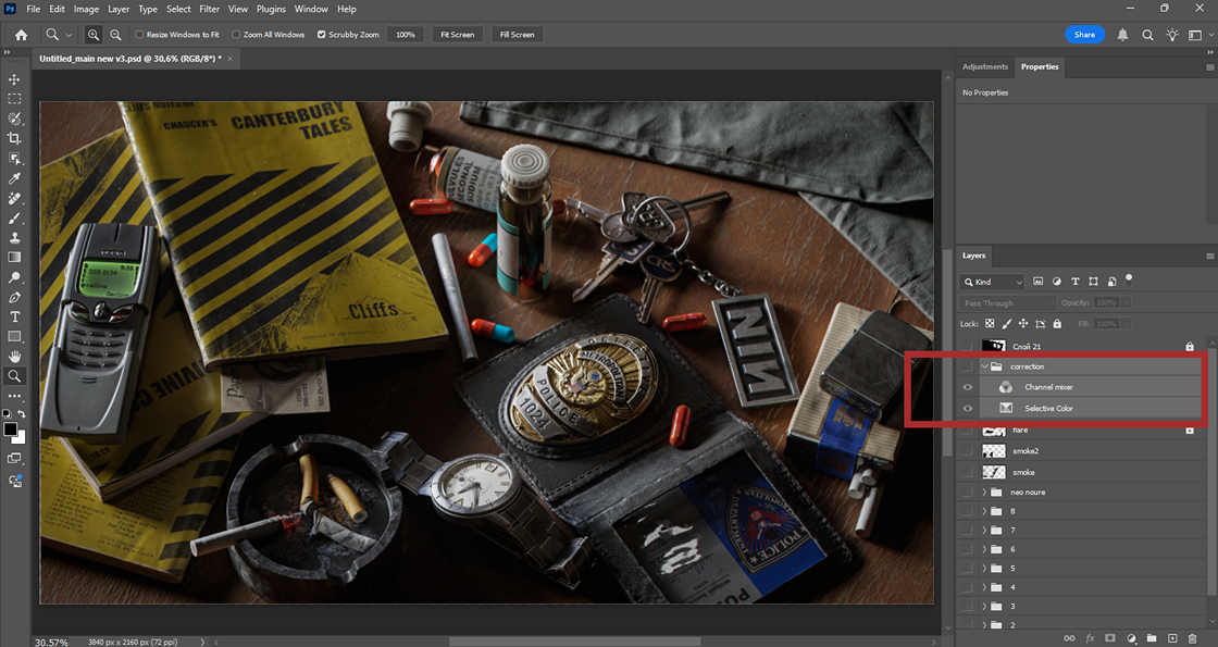
After that, I moved on to setting up adjustment layers.
The Internet is full of articles about the color grading of video and static frames.
In my opinion, this video from Photoshop Training Channel most informatively explains the basics of color correction in Photoshop without the need to resort to more professional software.
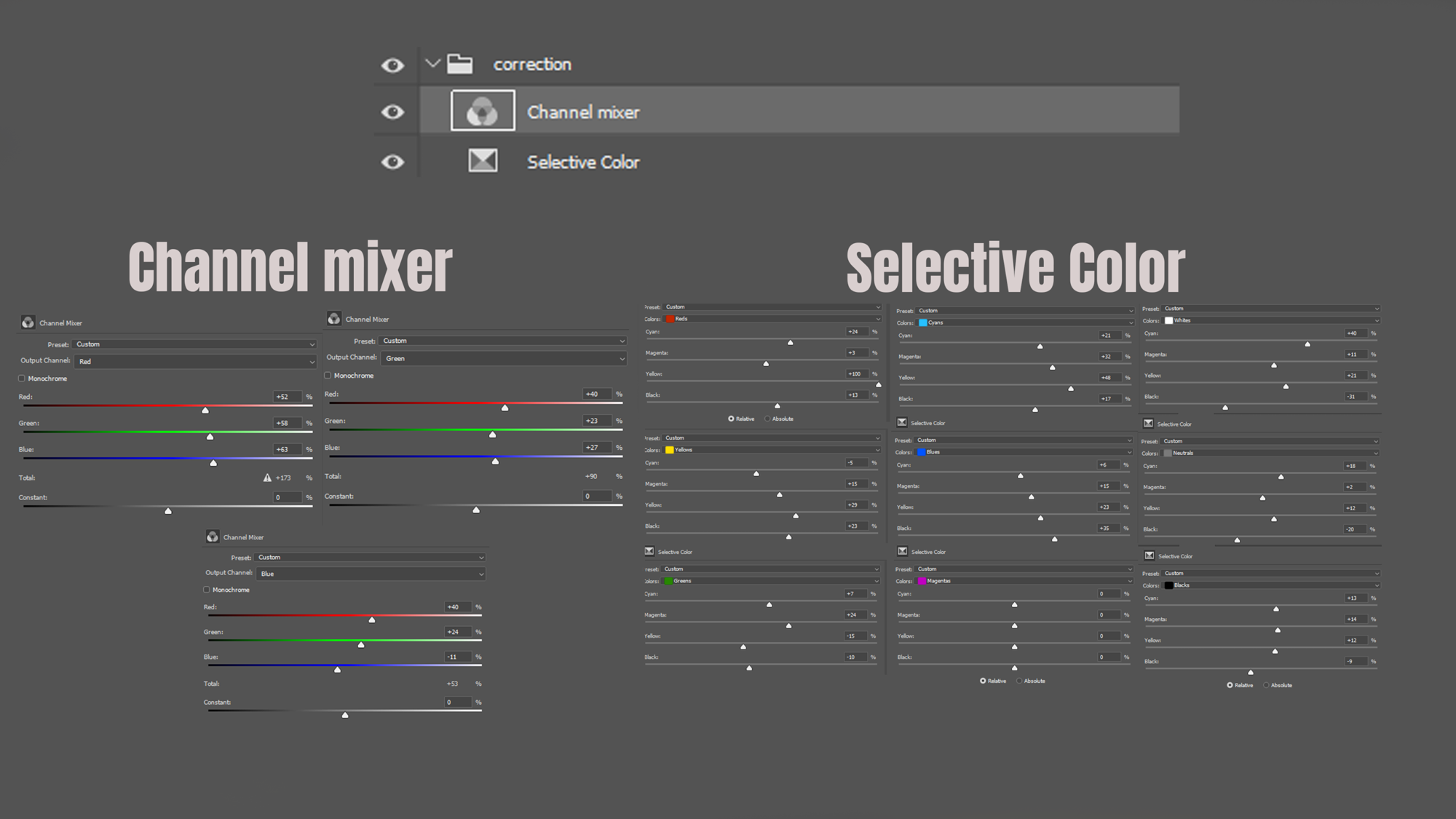
To sum it up, two main layers will work for color grading: a layer of selective color correction and a mixing layer that will complete the overall visual component depending on the chosen style that I wanted to achieve. In my case, this is a contrasting dark picture with an emphasis on orange-green tones without pronounced red.
A little lower, I will add detailed settings for these layers.
To have a sample, I added screenshots of frames from the film to the workspace. This helps to compare where you are mistaken in the selection of tones when adjusting the color
As for other effects like chromatic aberration, glare and cigarette smoke, I have already added them separately depending on the selected render frame.
I edited the video piece in Photoshop in the same way, using the same two color correction layers.
Here are some examples of comparison of source images and the resulting images after working in Photoshop.
Conclusion
That’s all I wanted to write about the creation of this work. I hope someone will find it.
I will be glad to any feedback, especially one that would explain my mistakes in color grading, since I understand that most likely I made enough of them and I want to better understand this process.
Thank you for reading this article & have a nice day, everyone.
Read more articles
You might also like these articles.