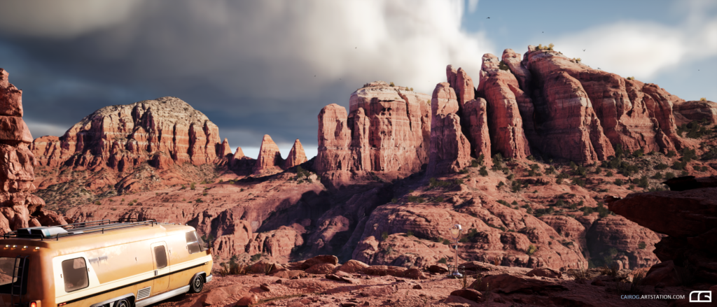
MJ’s Room


Introduction
Hello! I’m Roy Bennett, an online student at Think Tank Training Centre about to enter my final term and mentorship studying Environment Art for Games. Getting into 3D Art was kind of an act of trial and error. I always knew I wanted to pursue a career in video games, but it’s such a vast industry with so many disciplines, that it was difficult to see where I could fit. My current career has been in the IT field, troubleshooting computer issues and doing system administrator work - but after 10-years doing that, the desire to pursue this creative industry only grew.
So in an effort to pursue this passion, I figured the best way for me to start the journey was by going back to school. I did some research and found Full Sail University. They had a Game Arts degree program, but at that time I thought I couldn’t do that—I mean, me, an artist? Pfft. I’m a tech guy, I couldn’t even draw! So instead, I went for the next best thing which was their Game Design degree program. It had all my boxes checked; it was creative, technical and allowed me to work with a team of classmates to create a video game by the end of the term.
However, during my time there I was introduced to 3D tools and game engines like Autodesk Maya and Unity. I’ll never forget rendering my first image in Maya—I thought it was the coolest thing on the planet. It isn’t anything special, but I saved that first render, it was of a tree, picnic table and a fence. That feeling of amazement grew into a curiosity of, “What else can I create in 3D?” That’s where I believe my interest in 3D Art began.


I still kept that voice inside silent though, believing I couldn’t do 3D Art and that I wasn’t an artist. So upon graduating from Game Design, my classmates and I released our first game, Duncan & The Wisp, on Steam and parted ways. All looking to our futures and what was next.
Some of them got jobs in QA and made their way into design positions, but I was still stuck wondering if design was where I belonged. A few weeks after graduation, I had thought about it and figured that my favorite part about game design was getting to block out levels which is the gameplay space players would experience. I thought maybe I could specialize in that and enrolled in CGMA’s Level Design for Games course. It was an awesome experience and I learned a great deal from Naughty Dog’s own Emilia Schatz.
Having taken a lot away from that course, I realized that I enjoyed detailing my blocked out environments with subtle details a lot more than the design process itself. I wanted to flesh them out more, add textures, detailed props, etc. Speaking with a friend about this he said, “Dude, you’re not a designer. You’re an artist. BE an artist!” which of course contradicted everything I have been saying to myself from the start.
Just be an artist. Okay. Why not? I felt I’ve come so far and tried a bit of everything already—might as well do the one thing I haven’t done, or maybe was too afraid to do.

Enter Think Tank Training Centre—I enrolled in their Online Environment for Games course and started doing the thing I thought I couldn’t and worked on 3D Art. Needless to say, it’s where I found my flow. Everything just started to click and I stopped questioning it—instead I just ran with it. I could fine-tune those details, push the quality higher, breathe life into the image and pour my passion into every project. After my first term at Think Tank, I was awarded a scholarship for my 3D rendering of Milqui, a concept by Alejandro Burdisio. I finally felt like I was on the right path and everything I learned throughout my journey so far was just preparing me to dive fully into 3D art without any reservations.
Goals
First, I’m a HUGE fan of Spider-Man, video games and of course Marvel in general. My wife and I spent a lot of time together watching the Marvel movies and rewatching them again in chronological timeline order. It’s a great time to be a Marvel fan and what Insomniac Games is doing with Spider-Man is just thrilling—that game alongside Miles Morales is just insanely fun and made with so much heart. And now we have Spider-Man 2 and Wolverine games to look forward to! It’s just so exciting, I can’t wait!

When it came to MJ’s Apartment, I spent a good week planning using PureRef and Photoshop. PureRef to gather all my images, references, and create an asset list. Photoshop helped break the concept down into categories of primary, secondary and tertiary groups—whatever assets fell within those groups were the priority in which I addressed them. For example, the big things like walls, windows, doors, rugs and curtains encompassed a large amount of space in the concept so these became primary assets. Secondary assets were classified as things like furniture—couch, coffee table, bookshelves, end tables, window AC Unit, etc. And tertiary assets were everything that could be considered clutter like books, loose papers, picture frames, etc.
While planning this scene, I kept in mind that I had only 4 months to complete it. This was a project for school after all—so even though I wanted everything to make it into the scene, I clarified some ‘must-haves’ that would take priority over the other details. That way if I had to cut some things for time, at least the story-elements were visible.The kitchen was also a stretch goal. I considered it a secondary asset due to its size, however it isn’t entirely visible in Dennis’ concept. So it could definitely get cut if time is an issue at no cost to the story. But I wanted to try and get it in there to pay homage to the cutscenes we see in Insomniac’s Spider-Man. Watching where Peter stands to wash a dish and how he’s positioned to turn off a burning gas stove, I was able to rough the layout of the kitchen and use additional studio apartment kitchen images as reference.

With the concept broken down, I started to identify and label everything that I saw into what later would become my asset list. You’ll see things like “First Pass Done” as a way for me to keep track of what assets need to be created, polished, and finalized. Every asset had at least one or two real life references accompanying them that were similar to what was shown in the concept art. This helped save time later down the road when I started texturing.

Overall, my primary goal with this scene was to create a powerful cinematic. It was the first thing that struck me when I came across Dennis Chan’s concept—I imagined the spider suspended on the window sill with the sounds of New York City in the background, the slow camera pan across a cluttered coffee table accompanied by heartfelt piano keys similar to John Paesano’s original score of the video game. It was a flood of inspiration that I clung to throughout the project, which kept me motivated to execute and see it through to the end. It’s been extremely humbling to see the scene and cinematic receive such a warm reception across the game art community.
Modelling
I modeled everything using Autodesk Maya and ZBrush. I created everything from scratch with the exception of the Spider you see on the window sill during the cinematic and the Teddy Bear on the couch—these were assets I obtained for free from TurboSquid which helped save time towards the end of the project.
I was able to quickly rework and texture them to fit the needs of the scene. For everything else, I started with blocking them all out in Maya and bringing them into Unreal Engine one asset at a time. Each asset was shaped very roughly, with no regard for topology or polycount. These block outs are only meant to get a sense of scale and placement to capture the overall composition of the concept. They all are eventually replaced or reworked with a more polished mesh after the block out is completed.

After that, I had a good clear picture of the workload in front of me and from then on it was just reworking each and every prop until they were at the quality I wanted. In the case of the laptop and couch, the block out established its size and scale within the scene—I even went further to check the real dimensions of a laptop like the MacBook Pro and couch to make sure they were within reality. So then it was just modeling it out following the references I gathered until it looked right.

Hard surface props like these were created using beveled edging on the high poly to bake down onto the low poly to get that nice rounded edge. Some props I used separate floating meshes like screws to bake into the low poly as well and utilized face weighted normals by softening edges to take out any unwanted lines/bumps.

Organic props like the sofa required some additional treatment. After the block out, I reshaped it into a mid-poly model that could be sculpted using Zbrush. In the photo below you’ll see from right to left, the initial block out, the mid-poly mesh and the sculpted high-poly mesh created in ZBrush. I created the mid-poly mesh because I wanted there to be enough geometry on it with good topology in order to cleanly sub-divide it while working within ZBrush and also easily optimize it into a low poly to be baked upon. This was a new workflow for me because I don’t often work in ZBrush or on organic models, but I was happy to get to learn ZBrush and look forward to improving my sculpting skills with more practice!

Books, papers and pictures all had a very simple low poly mesh, with varying sizes but would eventually all share texture atlases so that texturing them individually would be much more efficient. Laying out their UV’s correctly and grouping them together as a single mesh to be brought into Substance Painter was the idea. And it worked out pretty well for me. After the texturing was completed in Painter, I could import all the static meshes into Unreal Engine, create one material for each cluster of books, papers and photos.


Texturing
Most of the assets were all treated individually, taken in one at a time into Substance Painter and layered on with materials. First, I bring the asset in and bake in the high poly. Then, typically I start creating folders, masking out the primary parts of the asset and breaking it down to the smallest bits—for example, the camera from the bottom up I broke it down from the base of the camera all the way up to the detailed writing. This just helps to keep my head straight on where everything is so I can iterate quickly if something doesn’t look right.

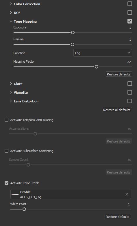
Before I start layering in my textures, I also set up my Substance Painter with the ACES UE4 Color Profile so that my viewport bears some resemblance to the viewport in Unreal Engine 4.
Once all that’s done I get to building up the asset with textures! And then once finished I check it with a PBR Validator to make sure my values aren’t completely out of whack. The PBR Validator is just an approximating tool, so you have to be careful and understand that it’s not always right, but certainly helps if you need to make a judgment call on either the color value or roughness of certain areas of your prop. Green is good, red is not so good!

The real challenge was figuring out how to texture all the books, magazines, papers, pictures and other small clutter assets. I mean, that’s A LOT of props to texture one at a time! And even more of a performance hit having so many unique shaders all with different textures in a game environment. So I did some research and found my solution by creating prop/texture atlases. This allowed me to group similar assets together, bring them into Substance Painter, texture them, and export one set of textures that would cover multiple assets.

Having all these books sharing the same UV space allowed me not only to have one set of textures for 10 props, but it also allowed me the freedom to tailor each book with a unique look of roughness, edge wear, etc. I was really excited when I figured out how to do this because it streamlined texturing small props like these and reducing the amount of texture files.
All of the book and magazine graphic covers were obtained for free through Textures.com to save time—I did create The Digital Photography book cover from scratch in Photoshop for fun to add as an easter egg with the Think Tank logo and the name Jason Gullion, my instructor.

Scattering & Composition
Assembling the final scene and scattering details everywhere was a lot of fun. For the most part, I remained faithful to the original concept. Where I added my own spin was in the pictures having mostly screenshots from Insomniac’s Spider-Man video games with a few free stock photos found online, as well as a couple of other details from the game. Like a Roxxon Power merchandise bag hanging in the kitchen and an Oscorp Industries branded AC Unit.
Lighting & Post Production
I used Unreal Engine 4 because of my focus on the game art pipeline. And my lighting setup for both lighting scenarios primarily consisted of a static Directional Light and Skylight as my main light sources, with a customized emissive Sky Sphere HDRI.
First, for the custom Sky Sphere, I dragged in a basic Sphere from UE4 and scaled it up to about 20000 units so it would encapsulate the entire scene. I then created a material for the Sky Sphere that would allow me to add in an HDRI and give me control over the brightness and rotation of the HDRI within the scene.

I then created a material instance of this and applied that instance to my scaled-up sphere and searched HDRIHaven.com to find an HDRI that contributed best to the scene and matched up well with the concept.
With my custom HDRI sky set, I then researched some ArchViz lighting setups and found Luoshuangs GPU Lightmass (https://forums.unrealengine.com/t/luoshuangs-gpulightmass/109474). I believe something like this has been integrated already into Unreal Engine 4.27, but I was working under 4.26 during the creation of this project. The documentation can provide more in-depth detail, but essentially this allowed me to achieve much faster light bakes for faster iteration and also at a much higher quality with the settings cranked. The only thing I had to adjust was the Number of Indirect Light Bounces within World Settings and edit the BaseLightmass.ini Primary and Secondary GI samples to increase the quality of the light bakes.
I know that last bit probably sounds very confusing—but if you’re still working under 4.26 it’s fun to play around with. Look up some videos on Youtube and check it out! I honestly tried it just to see what it did and was blown away by the results and how fast it baked. I’m not a fan of baked lighting because of how time-consuming it can become when iterating, so this really helped ease that pain a little. It’s always worth exploring tools like these just to pick them apart to see what they can do—just remember and always back up your project! Safety first kids!
I like to keep my Post Processing settings very simple and subtle. Only making dramatic changes if it favors matching the concept. So under the lens you’ll see my settings in this image. Very low Bloom and Grain settings and modest Chromatic Aberration value. The Vignette felt like it darkened my scene so I adjusted that to be less dramatic. The Exposure settings were adjusted to match what felt appropriate realistically as well as to what I felt was happening in the concept.

Color Grading I also barely touched. These settings I feel can be more appropriately managed in something like DaVinci Resolve or After Effects if you are shooting a cinematic, but in general I tend to only make the tiniest adjustments here.

Heading further down the Post Processing volume under Film, I usually start the Slope at .8 and make minor tweaks before finding the result that feels right. Toe usually stays at .55 in most cases and Shoulder I take down to .25. Things like Ambient Occlusion get cranked up for the final renders because it’s always good to get nice-looking AO.
Normally I don’t touch the Global Illumination settings, but I had to adjust the Indirect Lighting Color to get a cooler greenish-blue feel like what’s in the concept. Without it, things looked way too warm. I turned on Motion Blur because of the cinematic I planned on shooting, set the Reflections to Screen Space and cranked up the quality.

Below are two screenshots, first with the Post Processing Volume On, and the second with the Post Processing Volume Off.


Conclusion
The scene was completed in about 4 months—starting from October 4th, finishing around January 23rd. I think the biggest challenge was just believing if I could pull it off or not. I have always been pretty good at managing my time and finding balance, there weren’t many late nights working on this, although I did work full-time every day on it. I took breaks on the weekends, but sometimes I’d lose a weekend or two if I got stuck on a problem or had to play a little catch-up. But yeah, I just mostly struggled with the idea of if this piece would come out good or not and if I could pull off everything that I envisioned in my head. I think I was successful though.
I’m always looking to improve. To be honest, I’m already preparing my next environment piece, but this time I’ll be venturing into Unreal Engine 5 to explore what possibilities are there. I’ve been learning a lot about Nanite and Lumen and would like to incorporate that into my workflow and see where things go. I don’t know where any of this work will lead me, but I’m always moving forward. Thanks so much for giving me this opportunity. As a student, I don’t know if I really educated anyone, but I do hope I at least inspired someone to give this 3D Art a try. You never know what you just might create!
Read more articles
You might also like these articles.