Coffee Shop


Introduction
Hello, my name is Joi Saito. I am currently majoring in Game Design and Production at Drexel University. I began my 3D modeling journey around 3 years ago during my freshman year. I’m slowly working towards the goal of becoming an environment artist.


Project & Goals
For the hero props of my second environment, the “Coffee Shop” I had clear intentions, goals, and obstacles before starting to model. For this case, it was having to surpass the texture quality of my last portfolio piece on three objects with more material variations. When you are working on a portfolio piece you should always have at least one to two goals or learning objectives. After being done with the previous portfolio piece, I wanted to further cement my modeling and texturing skills as well as push myself further.
References, References, References!
I’m sure at this point you have already heard the significance of having good references. Keep in mind that you want to have either lots of references or a few really great ones, so you can surpass the references.
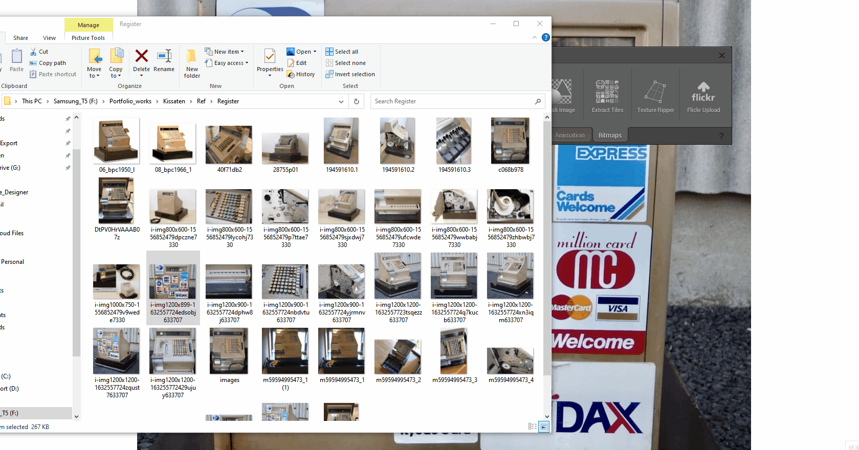
For the props, I chose it was especially difficult to find images online. I had to go through hundreds of Instagram posts and Google keywords in different languages to increase the odds of finding the image from a certain angle.
Therefore, for the entire duration of making the props and texturing, I was constantly finding references. It also helped me significantly to add believable storytelling elements, such as the stickers for the cash register.
They were added solely because one of the images had them on. I mainly used the following sites to gather as many images as possible including Google, YouTube, Yahoo Auction JP (for non-native Japanese speakers I suggest using Buyee to look up Japanese items), Instagram, Twitter, and films!
(You can see that they aren’t all the same type, and have an minor differences)


Modelling

For modeling software, I utilized the boolean workflow from Maya and Zbrush. This helped me as I could keep tweaking the high poly mesh until I was able to get it “right”, in terms of the proportions and all the small details such as the paneling work.
I often find myself in a texturing stage having to come back to my high-poly mesh to add more details I missed or note things I want to add later on. Using this pipeline I can quickly make changes even in later stages.
Therefore in the blockout stage, I find it very important to account for every small detail and component. By doing so, you can simply copy the mesh as a base for your high-poly and low-poly. After finishing your blockout, if you are planning to make an environment, I strongly suggest bringing it inside the environment and comparing the model side by side with the Unreal Engine 4 mannequin to check the proportions.
For example, I couldn’t really grasp the size of my Arcade table since all I could find were images without being able to compare them to a human scale. However, when I placed it inside UE4 and compared it to a reference I immediately knew I needed to fix it.
(Initially I have overestimated length and width by a long shot)

In Zbrush, I mostly use “polish” and “polish by feature”. One thing to do is to UV the boolean mesh so that you can use the auto group with the UV and have an easy time with masking inside Zbrush.
Images in order below:
(Pre-auto group with UV)
(Post-auto group with UV)
(Select the group by control left click to isolate and mask the selected group with drag)
Side note: I usually use polish by feature without the dot in the circle to polish round edges.


After I’m satisfied with the details, I decimate the mesh and bring it back to Maya to create a low-poly mesh and for UVing. This part is pretty straightforward. First I copy my blockout meshes, then boolean the parts depending on whether it makes a huge difference to the silhouette, and leave the rest of the information out for the baking process.
Lastly, I work on optimizing the mesh and removing unnecessary edges. This will depend on how close the camera will be to the object. Since this was supposed to be my “hero” prop, I didn’t go to an extreme extent on optimization.


UVing
For UVing I start off by selecting all of the hard edges on my low-poly mesh and cutting along them. From there: standard planar projection → unfold UV → unfold along U → Unfold along V. Make sure to not have obviously distorted or stretched UVs since it will affect your bakes significantly. If your UVs aren’t straight then it will look significantly worse. Remember, straight pixels will always look better than diagonal pixels.
Baking
For baking, Marmoset toolbag is the best software I know. It just does everything perfectly. Troubleshooting and fine-tuning the bake is very intuitive. I was introduced to the software by Rick Greeve when I did a quick crash course with him last year.
I needed to bake an Alpha cutout for my display fridge, from a cylindrical tray (expensive in tris count) onto a basic plane (cheaper). To do this I enabled Alpha cutout to get a grayscale map. The result was pretty decent though I had to do some clean-ups in Substance Painter.

Lastly, I baked in the highest resolution (8K, 64x samples, 4096 rays for AO) and downsample it in Substance Painter to get the highest quality possible from the baking process.
Below is an early test bake result.

Texturing
For texturing, I always tackle all of the base materials first. I know some people like to go straight into adding roughness variations and other details on one material, but I prefer to start simpler. What I’ve found by doing so is that by the end of it, you run out of motivation if you go all out working on one material on a mesh. I find that going through each pass on all of the materials can give an equal amount of love and care, making the mesh look better altogether.


Decals/Stickers

The cash register was the most enjoyable prop to texture since I had great references and ideas I wanted to add. One of the elements was the stickers. In portfolio pieces, I usually grab real-life logos from the references using software, as opposed to creating a graphic design from scratch.
Sometimes the reference images you gathered aren’t in the best resolution to grab logos, so usually I use an AI image upscaler such as BigJpg.com or another open-source AI solution. This helps to increase the image resolution by 16 times.
Then in Adobe Photoshop I downsample the image to 2~4K and use the software called “Shoebox” to extract the logo from the reference directly. Then I go into Photoshop to create a decal sheet or alpha mask which I can directly stamp onto my mesh in Substance Painter.
If the above method doesn’t work then I would simply recreate the logos in Photoshop quickly with an alpha mask. This also helped me a lot when I had to re-create some of the stickers in Photoshop. I was able to make out the texts using the Upscaling method.

The link to shoebox (http://renderhjs.net/shoebox/textureRipper.htm)
The alternative is to use Photoshop tools to remove distortion, however, I prefer using Shoebox for its simplicity and intuitive nature.
I spent a lot of time texturing since during this process I never felt that it was quite hitting the bar I set up for myself. I kept repeating the process of Substance Painter to Marmoset Toolbag render, back to looking at reference images and seeking feedback.
Sticker Wear n’ Tear

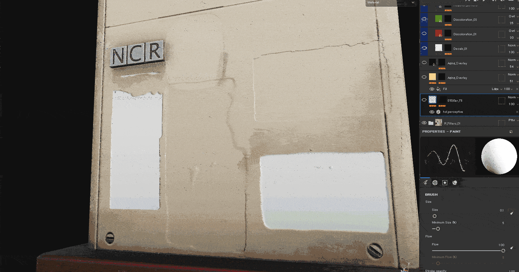
For the Cash Register Stickers added contrast to the prop, since the Cash Register itself is pretty old, from the 1950s. The stickers range from the early 1960s to the 2000s, which implied that it was used with lots of care over the years.
I tackled the stickers first by adding a few HSL adjustment layers and overlaying an orangish color on top to achieve the worn-off look. To further push the wear of the stickers I used a random brush and set it to a very low scale with the flow set to 1, and chipped away the edges. Oftentimes I prefer to use stencils and hand paint a lot, instead of relying heavily on procedural masks. I would strongly encourage you to also use stencils when texturing to get a unique look and tell stories if the asset you are working on is a hero prop.
Rick Greeve has a great tutorial on Artstation learning for free now, going over extensively using stencils. Click here for the link.
Glass
Glass can be quite tricky even in Marmoset Toolbag render, I found myself experimenting with different material setups within it. Creating a glass material from scratch didn’t allow me to get the result I was looking for, so I ended up using the pre-made glass material as a base for the display fridge glass. I replaced the roughness map and tweaked these values.

For the glass textures used for the arcade table and cash register, I simply duplicated the base material and reduced opacity to 0.45 and messed with a few parameters until I got the result I was looking for.


Polishing
For the final pass of the textures, I usually ask three or four times for critiques and feedback. By the time I address the third or fourth critiques, I do one last round of polishing on my own and ask myself, “How else can I elevate the quality?” I did this and noticed that the thumbnail shot didn’t quite look right, so I went back and added a few small components to my cash register which ultimately I was satisfied with.
Below: First and Second pass.


At this point, I played around with the placement of the props in Marmoset and render settings. For most of the part, this was going to be my thumbnail for my piece, the reason why I changed it to the final thumbnail is because of advice I received from an artist at Rockstar games.
The advice was about the importance of thumbnails and how thumbnail flow is very critical before getting caught by anything else.
Myself, I am still trying to master this element and I try to approach this problem similar to posting photography on my Instagram account. If you go on Instagram and look at the majority of the photographer I noticed that they have a consistent element, not only take a great photo but when viewed in a 3×3 grid their “portfolio” has its own character thus making it very unique.


Lighting
Lighting is something I’m not really strong with; what I usually do with lighting for props is to use Tomoco studio HDRI and drag in a bunch of lights from it. For the display fridge, the lights at the top didn’t seem to pass through each tray in the renders. Therefore I had to manually place a rect light in the Marmoset Toolbag with each layer, lowering the light intensity to get the correct look.
Rendering
I spend the same amount of time in the rendering stage as I do in the texturing stage, preferably longer. The presentation can make or break your work and I try my best to compose a dynamic frame. I usually look at films for inspiration such as Christopher Nolan’s work, and the work of cinematographer Hoyte Van Hoytema. Therefore I prefer to stick to a 65mm lens for rendering thumbnails and key shots.
Conclusion
Key takeaways:
- Be sure to include all details and small components in the blockout, keep it simple so you can have an easier time going from High to Low.
- Put your props in context and double-check with your reference.
- Continue to look for more references (can do this away from PC, during a commute, etc)
- Take a day off and come back to the presentation stage with fresh eyes.
- Always seek feedback.
Thank you for your time, I hope some of the processes I shared today were meaningful to you. Also huge thanks to Games Artist for giving me such an opportunity to write the process and share my knowledge.
Special thanks go to :
Martin Truong for giving me lots of great feedback 🤘
Shifu Jeremy Estrellado for being my mentor giving amazing advice and techniques.
Rick Greeve for guiding me on how to push my skill sets further.
Read more articles
You might also like these articles.