
Introduction
Hello there! My name is Bohdan Lvov, I’m a 3D artist from Zaporizhzhia, Ukraine. For the last 15 years, I’ve been doing A LOT of 3D, 2D and CG in various capacities and forms.
This is not only work but something personal and fulfilling for me. This is how I express myself and communicate with the world, that’s the fire that keeps my heart going.


Project
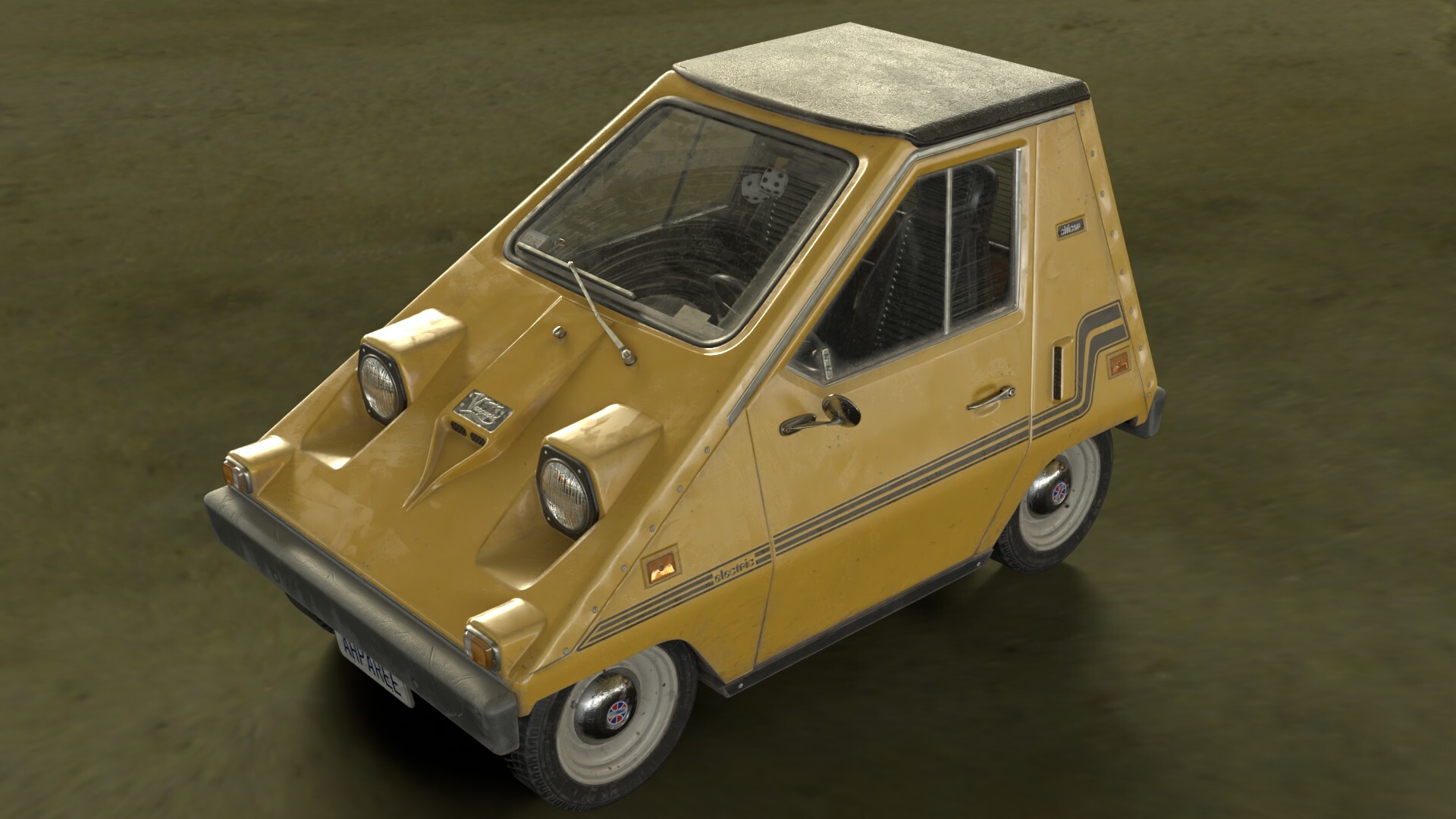
This article is about the Sebring-Vanguard Citicar model which I’ve recently finished. I’ve accumulated a lot of thoughts and techniques which can be useful in different circumstances, so this is the place where I share them.
I hope you’ll enjoy it!
https://sketchfab.com/3d-models/sebring-vanguard-citicar-comuta-car-4c8b09e146ee435094140d015c5437b8
It all started in 1973, when my grandfather, an honorary veteran of WWII passed away from coronary heart disease. Exactly the same year the oil crisis swept the world with a powerful blow. This led Sebring-Vanguard to devise the first mass-market electric car in history which they’ve called Citicar. It entered production in late 1974 and was produced up to 1977.
Fast forward 40 years to 2017 when I’ve seen this video by Simona Giertz:
Of course, I’ve immediately fallen in love with this piece of cheese. It has a very interesting story under its hood, but more importantly, it doesn’t look like an ordinary car at all – it’s almost as if it was devised by the mind of the late Syd Mead for some sci-fi epic from the 70s.
Well, technically it was because clearly, the designers of this car had in mind the vehicle of the future, something that will open a new era of personal transportation in the electric form.
Another great inspiration I had was from Robert Dunn of Aging Wheels, who told me every bit of first-hand experience of driving Citicar. It’s really important to learn your stuff before starting modeling, or doing anything, for that matter.
For example, I learned from Dunn that Citicars are actually made of plastic, and it affected the way I textured the whole vehicle. I mean, it would be REALLY WEIRD to have rust on the plastic parts.
From a technical standpoint Citicar was a perfect candidate to make, because it’s really unusually looking, has its own retro sci-fi vibe and yet it’s still a very much real car, so there’s a plethora of references from Citicar enthusiasts all over the globe.
As with any vehicle, it gave me the opportunity to practice modeling skills, my sense of proportions, my ability to bake maps and to play with texturing, experimenting, blending methods and finding out what’s best for the specific case.

This is how I learn and Citicar was a perfect testing ground for it.
Software & Tools
The choice of tools is important, of course, but it’s crucial not to overdo this. I’ve used Maya for modeling and Substance Painter for baking and texturing with a dish of Photoshop. Last, but certainly not least – Blender was used as my main rendering and unwrapping tool. Although those are the specific tools, I’ll be talking rather about the principles that are applicable to any combination of software.
In my belief 3d packages are just the interface between the creator and their creation and nothing more, that’s why it’s not a point of focus here.
Blockout and Design
Everyone who has at least entertained the thought of modeling cars knows that the first thing you have to do is to find a blueprint.
This is exactly what I did and failed miserably: in the whole vast cosmos of the Internet, there wasn’t a single blueprint for this legendary car!
As an experienced artist, my only weapon in this quest was a degree in eyeballing and belief in a better outcome. A few wobbly photos and a lot of hope are not usually enough to perform tasks such as monumental, but it did work out for me:

But seriously tho, don’t do it, unless you absolutely have to. In that case DO do it, but pay maximum attention. It’s really easy to fall in crevices between different perspectives of the photos, different lenses and the light conditions up to the point when all of the proportions would fall apart and the vehicle becomes unrecognizable.
It worked out for me, yes, but at some point, I noticed that all of the proportions are skewed because of the perspective on the initial photo.
I’ve made a grave mistake. Well, maybe it’s not so horrid, it’s more like a gravy one. On the left, you can see a fixed and unskewed version and on the right is an original reference that caused issues.

This method of fixing things is very risky and very eye-bally because there’s no guarantee that this version will be more precise and won’t add even more confusion. That’s why blueprints are the way to go unless there’s nowhere to take them from.
Either way, with blueprints or not, it’s important to keep in mind the overall look of the model, and the Field of View setting of the camera is a crucial aspect of it. Check out how striking a difference it could make:
Usually, I’m setting the focal length at 60 mm which makes FOV around 15 degrees. I find it the most balanced value when perspective is still intact but it doesn’t feel too forced, allowing the viewer to perceive the model in the appropriate way.
Using AI
“AI ” is not a flashy trendy word in my pipeline these days, it’s a trusty workhorse that allows me to use photo references on a previously unimaginable scale.
Recently I’ve discovered Real-ESRGAN – a brilliant open-source solution for enhancing images up to four times. Finally, a way to channel the power of AI for good and not for evil!

It works great for making references much bigger and easier to rely on and ACTUALLY see all the details despite the original image being very small and compressed:

After its release, Real-ESRGAN reshaped and drastically improved my workflow, allowing me to screengrab a frame from a tiny video, cut even tinier fragments from it and then make a huge alpha map out of them within seconds and with effort close to none.

It works unfathomably well even with colored patches: as you can see, the only place where I could find this specific Sebring-Vanguard logo is a photo of the original wheel cap on some internet auction.

Usually, making a mockup of the logo like this would take a while. That’s just because the best-case scenario for using this fragment as a reference is to overlay the logo over it and rebuild a desirable image from scratch. Fortunately, with the help of AI, the only thing I had to do manually is to get rid of perspective and fix some glaring issues and too noticeable scratches.
Sure, an image built from the ground up would be much more clear and more precise, but some organic artifacts are actually what one needs the most when texturing a weathered asset. And AI is helping to preserve those qualities.
I love to live in the future!
The precision degree
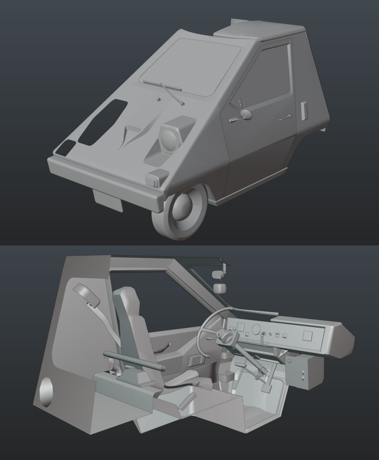
The most important thing for me is to stop. And that’s not an easy task at times. That’s why it’s so crucial to find your limit and model only what needs to be modeled, not a tiny bolt. For this particular project, I decided to stop on the middle frequency and not to proceed to smaller details, like screw heads or wobbles on the plastic itself. They were painted during texturing.
Take a look at this comparison. The left one is the original high poly, the right one is the low poly without baked and painted details, and the middle one is low poly with all the fancy stuff applied.


It is really important to know when to stop, otherwise, not a single project would ever be finished. It’s like da Vinci said:
“Art is never finished, only abandoned”.
The WoBbLe
As clearly seen in the references, the car is fairly wobbled due to the tension of the plastic.
It’s a neat little detail that I’ve exploited extensively to sell the feeling of it being really manufactured in this ultimately faulty way – a lot of Citicar owners complained that because of the way this car is built, in a few years of usage plastic is prone to crack.

Sure, the instinct would be to model everything so bakes will have World Space and AO information about dents. Although it will be problematic to change later and modify at the texturing stage, that’s why I decided to paint these wobbles in Painter.
As one can see, the difference is striking. It’s a simple small effect that goes a long way. And it was achieved in a very easy and procedural way: by using around a bazillion planarly projected fill layers with a Shape object in them. The substance engine is optimized in such a magnificent way that it didn’t drag the performance down at all.
The main issue was to find which shape does what, so don’t repeat my mistakes – name EVERY layer, however, the minute its role seems to be at the moment.

Multidimensional headlights. And backlights. And sidelights.
A few years back Andrii Mykhailov posted a fantastic tutorial on how to add depth to headlights cheaply without additional hassle. No new shaders, no new geo, no down payment, or even a credit card number are required which is wild considering how good this approach is.
It’s been unparalleled for years and it’s no wonder since Andrii’s one of the best real-time vehicle modelers on the planet right now.
I took the freedom to modify this brilliant technique a little:
First of all, rings were drawn on the circular backlights, just as they present themselves on the original car. The second stage was to make a fake occluding shadow to make it look like a shadow is really cast by geometry. The third step was superimposing the bottom part of the inverted normal with the flipped Y channel, just as in Andrii’s tutorial.
And the chef’s kiss was making the top part non-metallic and slightly darker on the base color channel than the original metal part. It makes sense even physically. Think about it: the cap of the headlight is made of plastic and thus has to behave like one, but the shiny cone underneath is made of chrome, which has electric properties.
This simple trick allows the headlight to look like it was composed out of different materials which is exactly what I’m going after.

And this is the basis of this principle. The headlights have more details, like a pattern engraved on them. One of the references clearly stated that those headlights were made by Sylvania which made it really easy to find.

Sure, maybe it’s not that exact model or the owner of the real car replaced them at some point, but it looks sort of, kinda like what I need so it would be enough.
All I had to do was to mimic this pattern and make it slightly less reflective where the real plastic is bending, making the roughness channel lighter to sell the idea of this object made of different material layers.

Unfortunately, at this point it became apparent that I’ve made a mistake orienting the headlight’s UV at the angle instead of vertically, which led to antialiasing issues. Nothing that a pinch of blur couldn’t fix, of course, but this is highlighting the necessity to carefully plan your UVs before everything is baked and partially textured.
Due to this issue I couldn’t get as many tiles as there needed to be, but in this specific case I was lucky enough to go away with it.

The importance of being earnest
With the arrival of Substance Suite as well as procedural texturing in general it became apparent that making dirty weathered objects is easier than ever. This led to another problem – now every texture artist has to fight the seductive looks of the so-easy-to-smear dirt and not overdo it. It is still just a tool and only the artist is in charge to decide how it should be used.
Take a look at this example:

Sure, dirt is multilayered and complex and is looking great overall, but it doesn’t fit the story of a real vehicle in great, but slightly used condition. It looks more like it grew a bristle as any character from the Mad Max universe should. Especially if it’s Furiosa.
Sometimes I find myself looking at the asset for so long that it always seems to be not enough weathering or details in general. In moments like this I remember that I have to resist the temptation and keep the dirt levels in check, overwise I’m at risk of spoiling the rest of the asset.
Too much of a good thing is still too much, you know.
Another one paints the dust
Continuing the theme of easily accessible wearing, it’s important to note that however good procedural wearing is, it is, in fact, procedural. A pinch of manual adjusting and/or painting is always a welcoming addition to make it less uniform. In this case, I’ve used an alpha of splashed dirt, warped it with a Warp tool and that’s it! A few dozen interactions and we’re good to go!
It’s a popular misconception that throwing a few smart materials with masks on them is enough for adding dirt. In that case, everybody and their mother instantly can spot how apparent it is, which generators were utilized and what maps were applied. It’s like breaking off symmetry – a simple step that goes a long way.
The texel focus
Ideally, one should maintain texture density concisely all over the mesh. It makes sense because that’s the point of 3D – to give the user the ability to view it from any angle. Unfortunately, we all live in the real world with its compromises and limitations, like texture space.
It’s not limitless, so sometimes it is worthwhile to set one’s priorities in a specific arrangement, where areas of more particular focus would receive more texel density than the obscured ones. Check this out:

Looks horrible, doesn’t it? Especially the bottom of the car with the ¼ of texture density the rest of the car. And also the back side of the seats with 50% of the average texture density for this model. But something miraculous happens when the whole picture is revealed:

Turns out that the back of the seats doesn’t really have that much detail because it will be obscured by the dirty window anyways. The bottom part of the car is unreachable from the camera in
this position.
The same train of thought is chugging through every single UV shell which allows me to dynamically shift the texture quality to the parts that are the most important to the viewer in this particular model, in this specific usage. Sure, the whole model is tailored in that specific way, and if it was intended for underbelly angles of view, more resources would be directed to those areas.
I’m using UVPackmaster for packing UVs and neatly enough, it has a feature that allows the user to influence the relative scale of the pieces. Just within a few clicks, all the awesomeness of the approach is laying.

As you can see, some areas cranked up to 150% – like the dashboard. I needed more pixels to have there so button names and reading in the speedometer and voltmeter would be readable, so this juggling with texture density goes both ways.
Sure, UVPackmaster has the option to keep overlapping islands together, but I prefer to keep only half of the model during the unwrapping and mirror the geometry after UVs are done. It looks little something like this:
It’s very illustrative to show how much overlapping I use, and instead of making 4 unique wheels I’ve got a single one, but with x4 of possible texel density.
The rule of thumb is using overlapping the objects that are not getting in the camera simultaneously. Wheels and doors are great examples of that.
Multi-layered windows
I’ve dedicated a whole separate UV set to windows because this way I could maximize the usefulness of the Opacity map and there would be no need to assign the transparent shader to the mostly non-transparent car.
The idea behind the windows was to make them multi-structured like there’s a glass itself, there’s dirt on it, partially smeared by a wiper and that glass is sandwiched by a few stickers from the inside. It was really easy to achieve in three small steps:
1. The stickers. Finding examples of registration tickets on the website of DMV of California was extremely easy, although to make them not so dull I’ve devised a special air-bubbles-under-the-sticker material.


There’s nothing too fancy about it, it’s just a Cells map with chiseled away corners as a mask which is driving a lighter layer to highlight the areas where the bubbles would change the appearance of the sticker.
By the way, you can get it from my Gumroad for the astonishing price of $0!

2. The next step is the glass itself. I really like to put some fingerprints as a mask on the fill and play with its Roughness and Base color to slightly vary the appearance of the material,
especially when the light is changing. Sort of a surprise new look revealed from a different angle, and this bright future consists of smeared sweat from fingers.
I’m using Imperfections maps from this pack and I LOVE IT. Makes it easy to make a complicatedly looking surface within a few fills.

3. And the last step – add dirt and voila! – you’re done!

Doesn’t seem to be that complicated, doesn’t it? Almost like that infamous tutorial about drawing an owl:

Don’t you worry tho, I got you. The material of the dirt is pretty generic, it’s just a few Cloud textures of slightly different colors.
What’s really interesting and somewhat complicated – is a mask for all that beauty. My approach is extremely procedural, there’s a minimal amount of painting.
The basis for the whole thing is an Angle gradient which encompasses the falloff caused by the movement of the wiper.
Of course, it spilled all over the place, so a ton of course correction was required – that’s what *Limiter layers do. Mostly it’s just a Square object slotted into planarly projected fills. I needed a mask of wipe gradient for later and this is exactly what the WipeMask anchor is doing there.
To make the gradient less dull I’ve used Anisotropic Radial with the center of it not near the hinge of the geometric wiper, but rather at the elbow of the movement it produces.
After adding a hint of everybody’s favorite Blur Slope I’ve made another anchor for later because it was time to fill the rest of the area with the procedural noise. WipeMask Fill does exactly the name suggests, except in quite the opposite way – instead of adding to the mask, it subtracts the area of the wide wipe, because I needed a clean slate to fill it with the contents of the WindshieldWash anchor.
To blend those two worlds together, I’ve peppered the mask with the imperfections layer with some dust and possibly hair smeared all over the place. As a final touch, I’ve resorted to painting. I know, I know – it may be a weird thing to do with everything else procedural, but it is supposed to be a crowning jewel of this material.
What I needed to paint was a little pile of dust just where the wiper stops, as if everything wiped down found its way here, resting for all eternity. Or till the next big wash.
Sure, I could’ve gone in a way of projecting a photo of the real windshield with the wiper trace, but I felt that there will be more flexibility to design the whole thing if every part of it would be editable.
Don’t confuse it with edible! As you can see in this little demonstration, procedural and manual approaches work at their best when combined.
Talk dirty to me
When I was a kid, my dear mother always quarreled with me over the lack of cleanliness of my possessions. Twenty years later, what I am doing full-time is smearing virtual dirt all over the place.
In one of the previous chapters, I told the dramatic story about texture density and since I’ve put a lot of it into the floor of the car, I’ll be damned if I didn’t use all of it to the maximum potential.
That’s how the idea to put A LOT of dirt in there appeared. That, and this great photo of it, where some nasty leaks are all over the floor:

At the moment Citicar looked like this:

I mean, this is nice, but come one, it’s just boring. Even I, as a person who made this model, amadmitting it.

That’s more like it! Notice how much more life-like appearance it does have. Everything’s better with dirt, as long as we’re talking about virtual production, of course.
You don’t want any dust or rubbish you meal, ever. I’ve made this mistake once and I have no intent to do it again.
Box office flap, potentially poison
Even with as much caution as I approach projects as this, mistakes inevitably happen. We’re all human beings, after all. This time I forgot to model a sun visor, and not just one, but both of them.
Fortunately, this detail is fairly minute and barely visible even in photos thus I didn’t notice it up until the last moment. Literally, it happened right before the publication.
There was no opportunity to add them with the appropriate texel density due to tightly packed UVs, so I left it how it is. It was a good thing that it was such a small interior part in the obscured place because otherwise, consequences could be disastrous. This experience definitely was educational and I won’t make the same mistake in the next project.

Shall I say the project flopped? Well, not really, since there was no sun visor to flap with.
Size doesn’t matter
HDRIs are great. They’re giving a lot of interesting light, act as a reflection probe, add a realistic appearance and everything almost in one click! The only downside of them is a tiny little detail: they’re not real.
Well, nothing is real in this realm, it’s all ones and zeros in the computer, but even in 3D dimension, HDRIs don’t have any geometric form thus making the ground plane the best possible use case.
Well, not necessarily. What I REALLY like to do is to make a small patch of the ground using photo scans and blend it very graciously using the alpha channel.

In this particular instance, I’ve made a round mask subtracting its outer chunks of it using Perlin noise. You know, so it won’t look so procedural. That’s what the mask itself looks like:

To Instantiate or not to Instantiate
It is not even a question for me anymore. For some reason, after 7 years of using Painter almost daily, I’ve never heard about this function. It allows the user to make an instance of the material and put it across multiple UV sets.

It saves me a lot of time and saved me a lot of headaches. The only downside is that for some reason it is impossible to paint on instanced layers, but this issue could be easily negated by the use of an abundance of fill layers set to warp projection.
It was all rigged. Even though I didn’t plan to animate this model, it’s always nice to have some level of control and flexibility to make the showcase easier.
Just as with texture density, the main driver here is the usefulness of the rig and the time spent on it. This is why the only moving parts here are wheels and doors. There’s a very simple approximation of how suspension works, but I didn’t use it that much, so that can be considered a wasted effort.
On the bright side, it is only the left door that’s moving, the right one is driven by the expression that is rotating it in the opposite direction. It allowed me to save so much time doing half of the work on opening doors!
Be kind to your workstation. Even with the incredible power that today’s computers have, it is still a limited value which is never enough. Did you know that your device, stationary, portable, or handheld – has more computing power than existed on the whole planet Earth up to 1963? And it still will chug sooner or later feeling the weight of all quadrillion variables in thousands of layers and effects assigned in Painter.
What I like to do to speed up the process is to make A LOT of folders, to put folders within folders, and so on. Bizarrely, Painter does have to search for everything and their mother, except in the layer stack, so making folders really helps to save time on searching the necessary layer.
From the technical standpoint, it looks like Substance Engine does much lighter computations on the collapsed folders which speed up the software.
Another thing I like to do is to downscale the size of the Texture Sets I’m currently not working on. They still give a general idea of what’s going on and what it would look like, at the same time saving some valuable cycles of processing power.

Here’s a pro tip:
Don’t put profanities in the names of the layers. I’m a professional, so I’ve removed them before making this screenshot.
In general, it is considered to be a good practice to plan your texture sets beforehand, so materials of the same type would be placed together. Or it may depend on the shaders used, as clearly visible from the separation of windows.
It also goes into the division of the project. Sometimes, when it is planned to be big and complicated, it’s nice to separate the texturing process into a few projects. For example, in the case of Citicar, there were two branches: the exterior and the interior.
As seen on the screen grab below, the green texture sets really had hierarchy and active layer stack in this project, but the red ones were baked and exported already from another file, just so I could see how everything would look together.

It may seem weird that the model doesn’t have the outer part of the door, and it is done with the purpose, which is the ability to hide everything and remove the obstructions to the interior. It works the other way round too, so I could easily work with the inner side of the door without chairs getting in the way.

Besides, Painter’s projects contain EVERYTHING from bakes to tiny alphas, and I don’t want to have a single file which I’m constantly rewriting to be 5 gigabytes in size.
Finding the strength to talk to myself.
Very often this type of article consists of praising and bragging about the effectiveness of the chosen methods and paths. In my case, there’s an artistic urge, to tell the truth about the number of issues encountered.
Over the years I found out that it is REALLY important to write EVERYTHING down. Every note and every thought.
The process of making real-time 3D assets is not what it used to be – back in the day you could finish well, within a day, and call the job done, but today, with all of the details and effort put in models it could take days, weeks and even months for a single project. It is impossible to keep everything in your head.
Trust me – I have a famously big head and it’s still hard to keep everything in.
The solution is simple – what I do is make screenshots writing down all the issues present right on them. This is exactly what I do giving feedback to others, so it makes sense to do it for myself. Well, I’m doing it in handwriting only for myself, because nobody else can read it. For the others, I’m typing everything in regular boring fonts, like Comic Sans.
Here’s my feedback to myself on just a single round of baking: as you can see, there are more than 40 issues of different magnitude and origins appearing and all of them needed not only fixed but before that – spotted in time. In the right column, there’s a screen grabs taken after the issue was resolved – it helps me to keep track on what was done and what still has to be done.


Korean Bevels, what are they?
Sure, in the process of making real-time models, it’s crucial to take a thought about optimization for that buttery smooth 60 fps performance even in a web browser’s Sketchfab frame. Normal maps are playing a critical role in this process, but baking them may be not a very straightforward task.
Gradients are a normal map killer because it makes file size bigger, leads to artifacts during scaling and overall are a fallible practice. Sometimes it’s necessary to have a few flat planes without the seam or sharp edge between them, is horrible smoothing and gradients the only way then?
Well, not necessarily. There’s a solution that comes to the rescue – in business, we’re calling them Korean Bevels. It’s an amazing technique that allows you to keep shading controlled and bake flat as a result without the need to make sharp edges or a bazillion tiny pieces out of the single shell.
Take a look at this pedal. It generally has an oblong form with beveled corners, so there are two ways to approach modeling it: the left one is with using additional bevels on both sides and the right one is without them:

As you can see, the resulting bakes are drastically different the beveled one has a nice flat normal and the right one has an atrocious gradient on the sides:

Though you can ask: but Bohdan, what about hard edges?
See for yourself:

Although the bake is nice and dandy, the map itself doesn’t look so great when applied to the geometry. The edge has visible artifacts and with the inability to unwrap it in a straight line, it also looks jagged.
Why is that so? Let’s take a look at the normal direction. The bluish edges are hardened, so that’s why there are two lines – because normals are facing different directions. In the right example there’s a single normal direction for connected faces, but as we established before, in this case, the bake itself will have a ton of artifacts in the form of gradients. What shall one do then?

The solution is, of course – Korean bevels, because thanks to them only the tiny beveled part gets a gradient treatment and most of the surface will be filled with the solid color.
Take a look at this comparison of different approaches and how using Korean bevels is far superior to the other methods: it gets the shading in the right way without producing any artifacts or undesired shading keeping everything in one shell.
What is important is the direction of normals – as clearly visible in the third row, every plane has them perpendicular to the face but the addition of the few loops allows the model to have normals in the intermediate position.

Sure, polycount could be a concern and this approach is like a double-edged sword. It has to be used carefully and thoughtfully, especially on cylinder-like surfaces, because this way polycount is growing really fast.
Although these days it’s not as big of a concern as it was even 10 years ago, so the right balance could be found. Some newest addons as Machin3Tools or HardOps do include toolset for making such things effortlessly


It also can be done in every 3D package by standard means, one just has to clearly understand what they’re doing. As a prominent artist Mary Duhon once said:
“To understand the normal, you have to think like a normal”.
Draw me like one of your French cats
This article is mostly about technical stuff, but it is very important to emphasize that it is only a tool to channel one’s creativity. After all, we’re 3D artists, although people often focus on the “3D” part, forgetting about the “artist” half.
It’s really hard to underestimate the importance of the fundamentals. A lot of 3D artists, including myself, chose the path of perpetual torment in this digital world because they couldn’t draw in the first place, but were eager to do graphics. And it is a working solution for the time being, but everything has its limits.
Sooner or later the lack of the fundamentals will become obvious and will need to be dealt with.
This is why I resorted to regular sketching sessions. Here are a few images I did during Inktober 2022:

Sure, all those cats may be not as sophisticated as they could have been, but with each and every one of them my understanding of how to visually represent different objects is increasing. With each and every drawing, it becomes easier for me to judge proportions not only in the screen space of a 2D drawing but also in the 3rd dimension as well.
This is a great and helpful exercise. I highly recommend it to everybody.
The art of Perseverance
When I was writing notes for this chapter, a dozen missiles hit Zaporizhzhia. And then another batch. And another single one around 7 am, the next day. And a few more the day after that.
Now I’ve just lost count of how many strikes there were and it is really hard to keep up. To be honest, I’m typing this in a pitch-black shelter with no light and no means of communication as a result of the missile strike.
Even the radio doesn’t work at the moment because the stations don’t have the power to transmit. And yet, I’m spending all of the charge left and a few hours a day when the power is back to write this article and spread the word about my passion.
Prepare for unforeseen consequences
Being a resident of Zaporizhizha and Ukraine in general during times of war is adding its own complexities. Sure thing, after 9 months of war and constant shelling one would start to kinda get used to it. Unlike the software which doesn’t care what’s happening all around it takes its time to write a file.
Even today, it takes blazingly fast SSDs a few seconds to write a 1-gigabyte file of a texturing project and it is extremely easy to lose hours of work. That’s why I’m a huge fan of autosaves and cons equal saving.
Power went off a bazillion times only while I was writing this article, and twice as much while I was actually making the thing. 80 gigabytes of regular saves and 117 GB of autosaves was the only way to save the project intact.

The bottom line
And that’s it, folks, I sincerely hope you’ve enjoyed this fairly sizable read and found something useful to take from it. There are even more shots of Citicar on my ArtStation.
Thanks to GamesArtist.co.uk for letting me express all my tornado of thoughts and tell the world about them.
And a special place in my heart is taken by fabulous Polina Dobrynchuk who helped me to recollect the events of the past weeks and iron out all the thoughts that made this article possible!
Thanks, Polina! Without your help, nothing of it would be possible!
Read more articles
You might also like these articles.