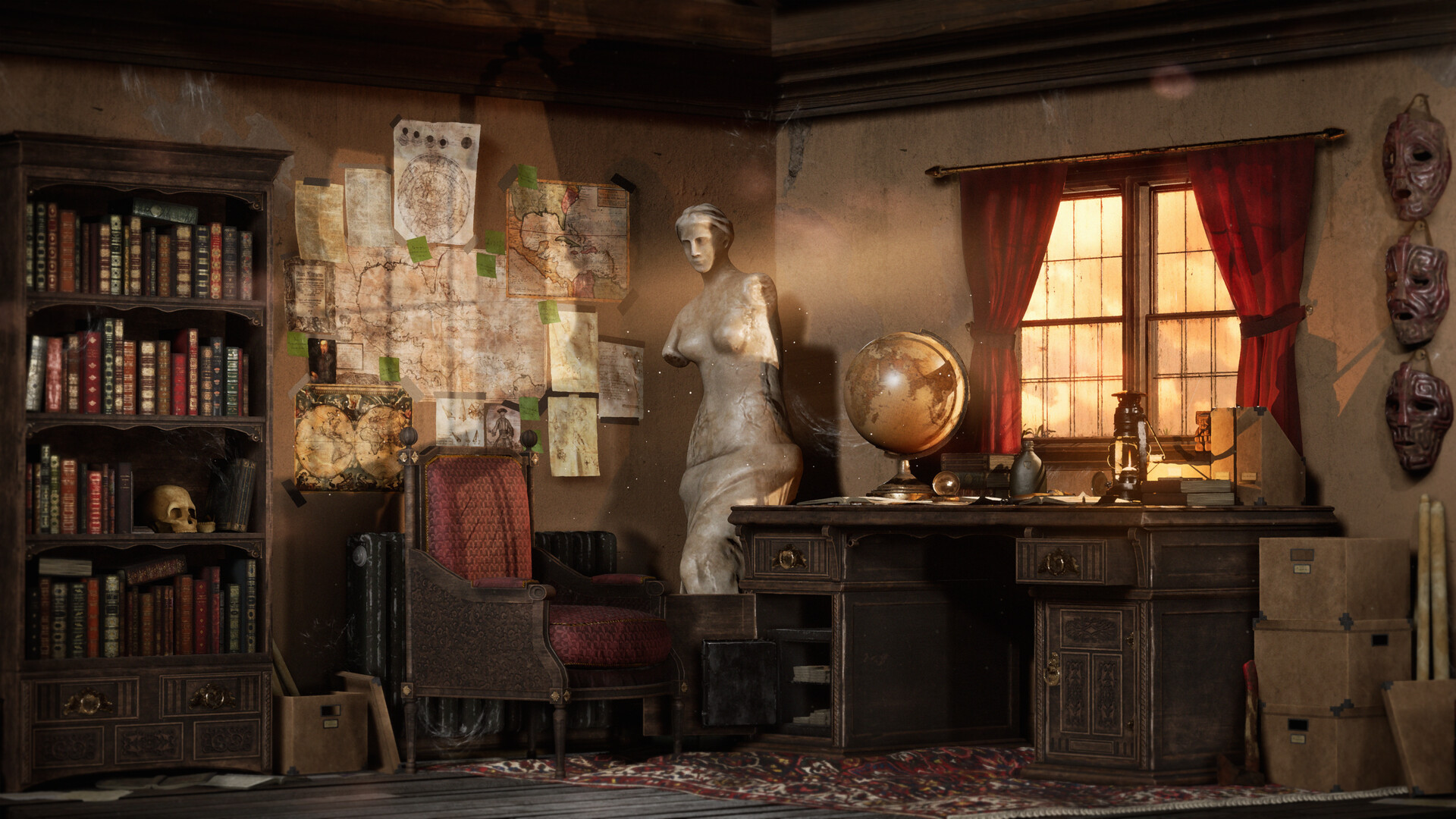
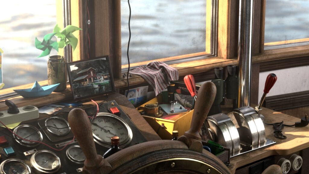
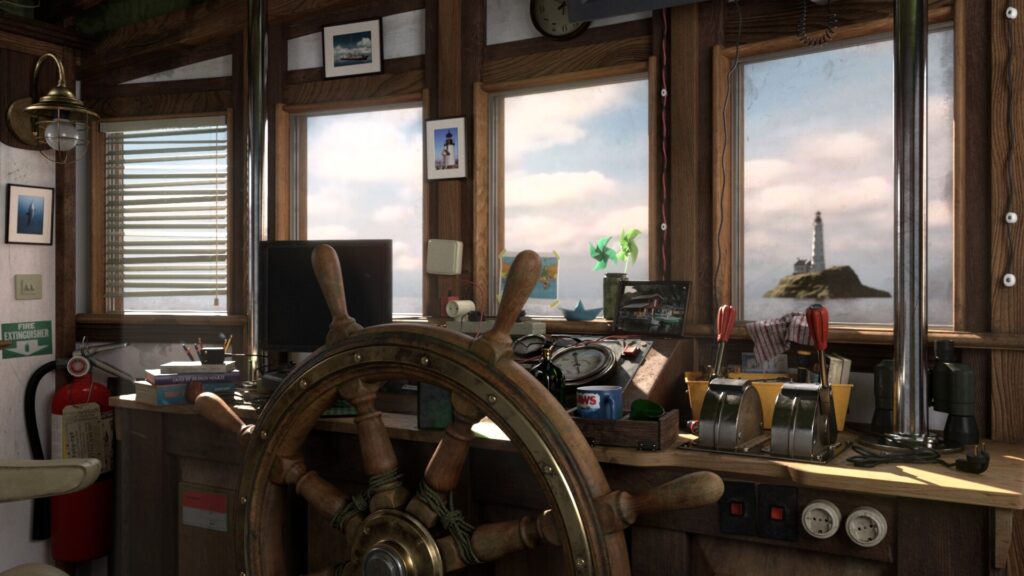
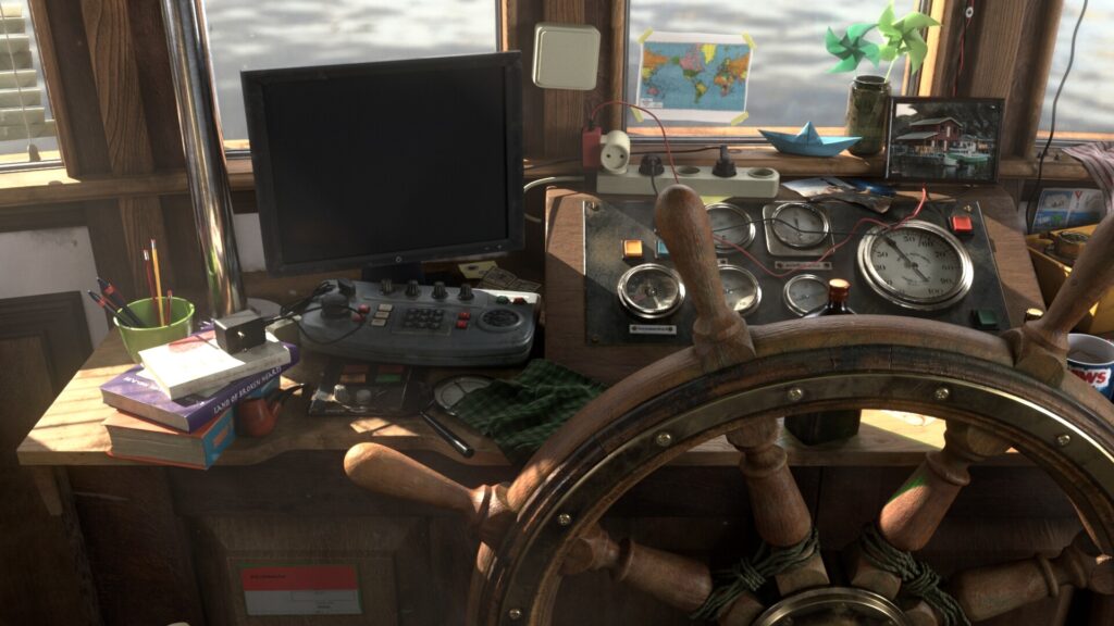
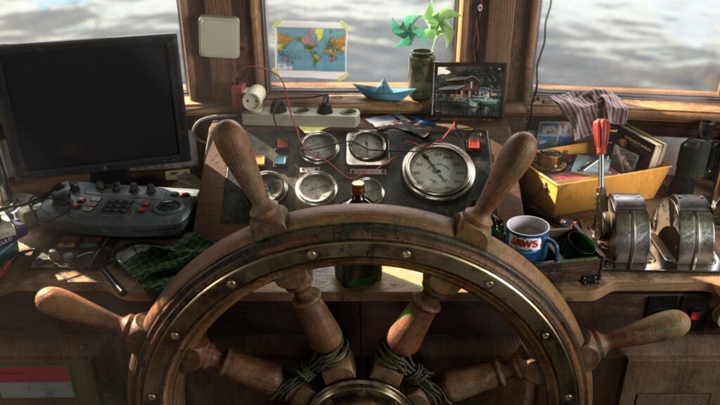
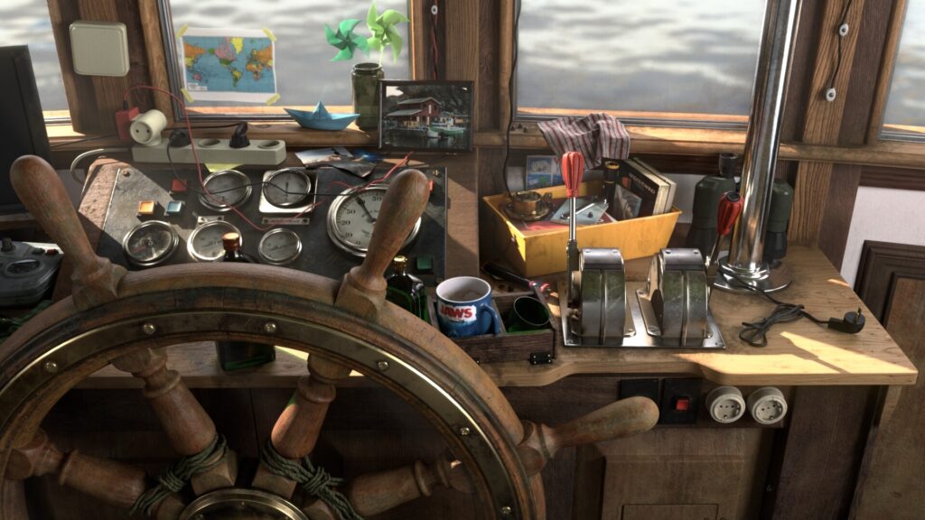
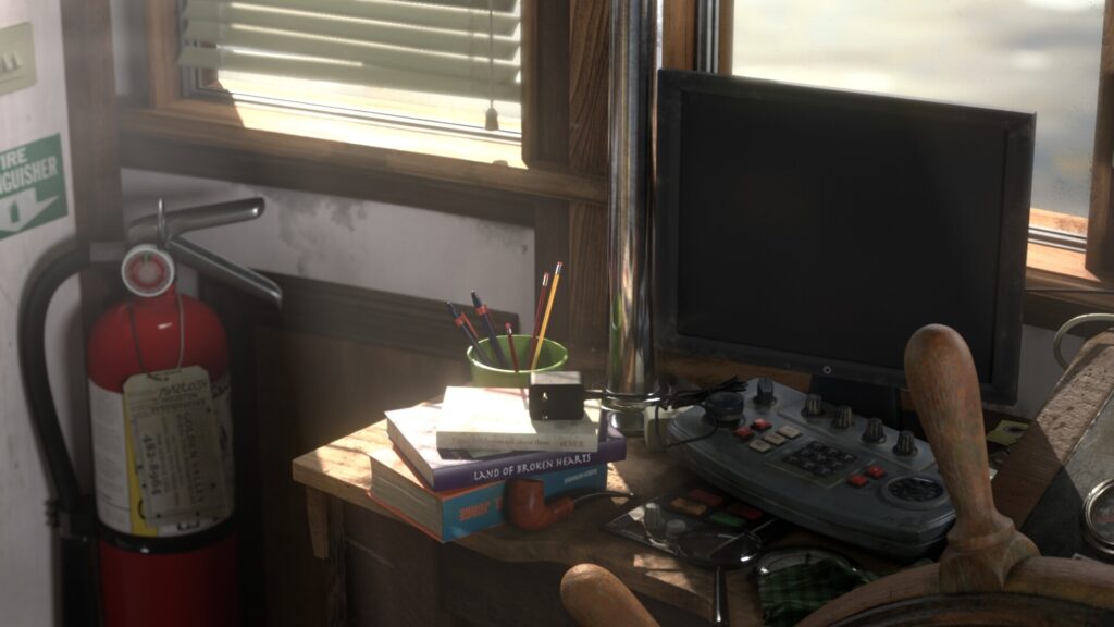
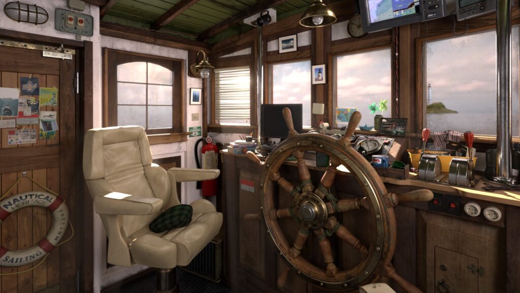
Captains Cabin

Introduction
Hey guys my name is Ryuga Tjew, I'm a Think Tank Training Centre graduate specializing in environment, lighting, and texturing for VFX.
Goals
I really want to become a CG Generalist with some sort of specialization, especially in texturing & lighting for environments. I thought that my concept must showcase interior & exterior lighting, it must also have enough light sources as I want it to be natural or real looking.
Honestly, it is very difficult to follow a 2D-art concept image because it is purely a drawing & it is someone else’s impression on 3D volume. Personally, I think it is not reliable to judge & recreating the 2D concept in a full-CG realistic environment would not go for a great look.
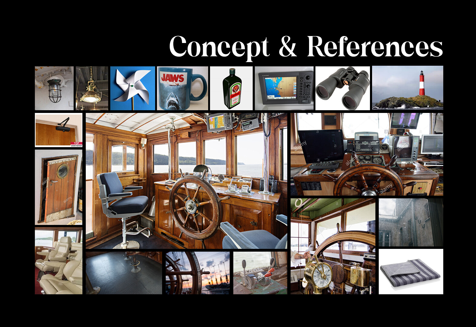
That’s why I go for real photographs when I select my concepts. I won’t go wrong if I follow real-life references & try to replicate them as I don’t assume too much.
References & Inspiration
I realized that the selected concept image (photograph) has some issues. The photograph has very strong photography composition, great lighting (has many windows), & 3D volume that is very clear to read BUT the color palette is very poor & there are no interesting props to showcase.
So, I looked for other photos that have similar environments & lighting conditions that contain interesting props or color features that I can apply to my CG environment.
Block Out & Planning
The aim of this process is to identify the correct scale, size & proportions like in those in real life.
Additionally, I started to block some light rigs, just to give me a rough idea of how the volume will look on grey-shaded material, then I identified which area should be darker or brighter.
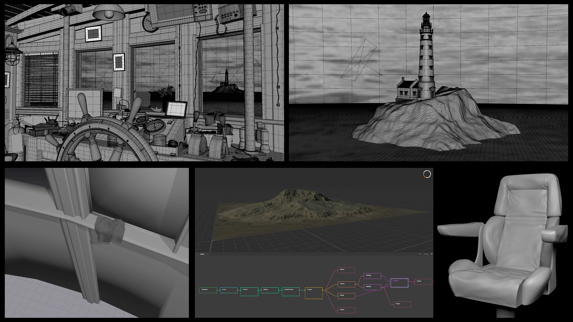
Modelling
By far the most repetitive part of the process (dealing with topology). I polished all the geometries from the blocking stage. I mostly did hard-surface modeling for this reel. For the island, I modeled in Gaea.
For the fabric, I ran the cloth simulation in Marvelous Designer & brought that mesh as an OBJ file to Maya, after that, I did retopology in Maya. The chair was sculpted in ZBrush.
Camera shots & Storytelling
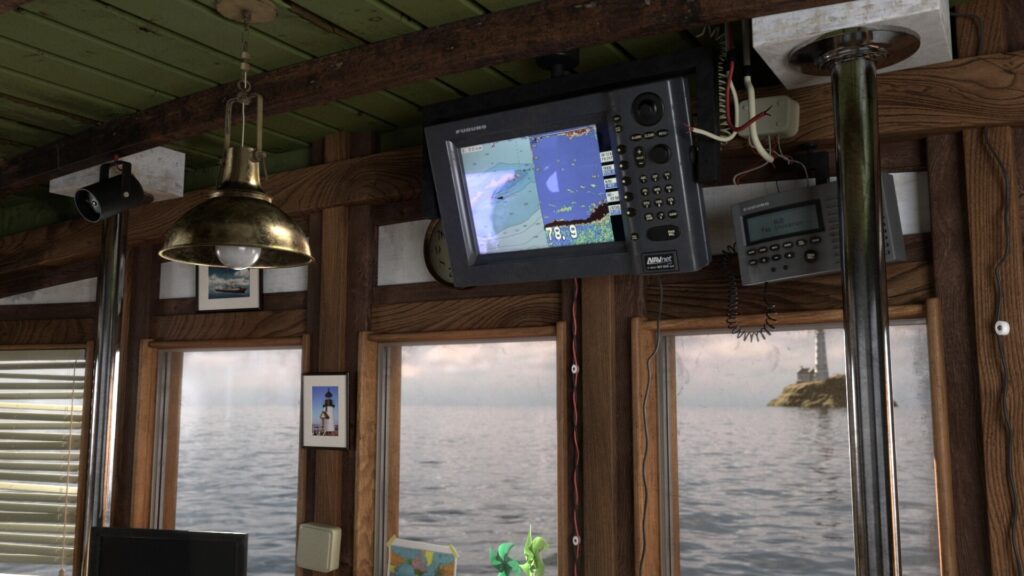
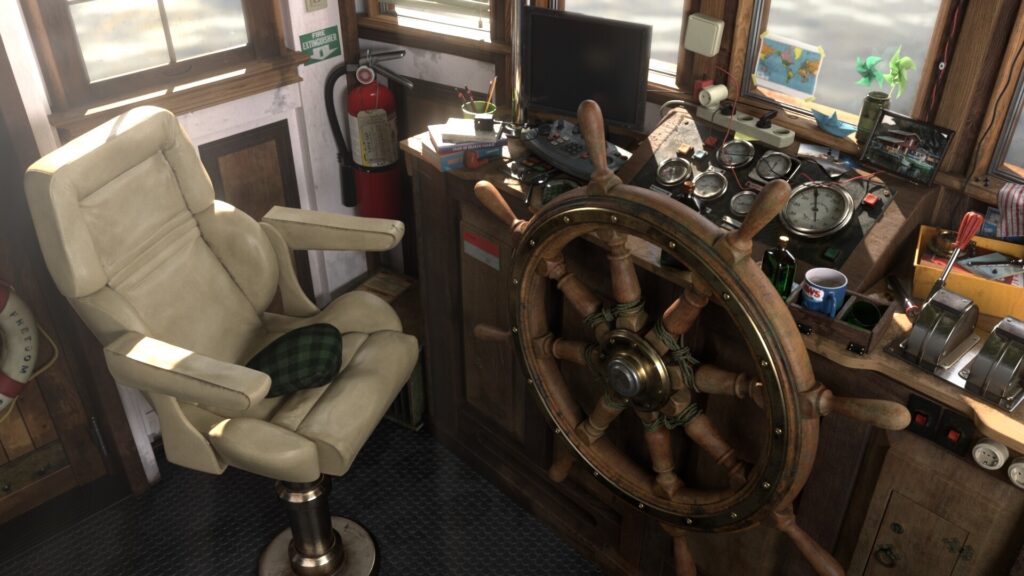
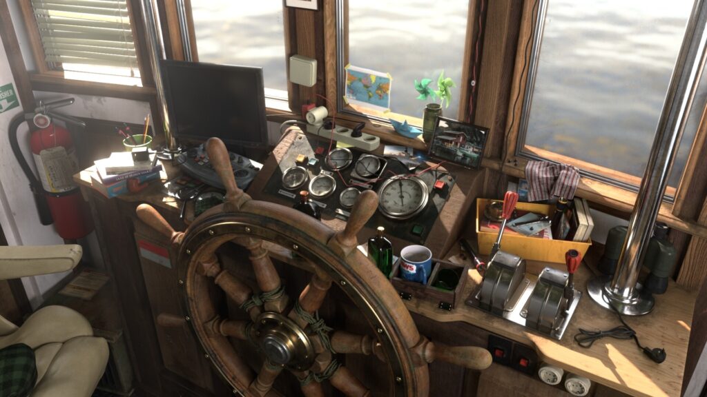
This helped me to plan the required details for the texturing process. At this point, I divided all the 3D assets into 3 categories: hero assets (close-up shot), secondary assets & background assets. In that way, I know where I can spend my energy for texturing, later on in the pipeline process. I have 7 shots in total.
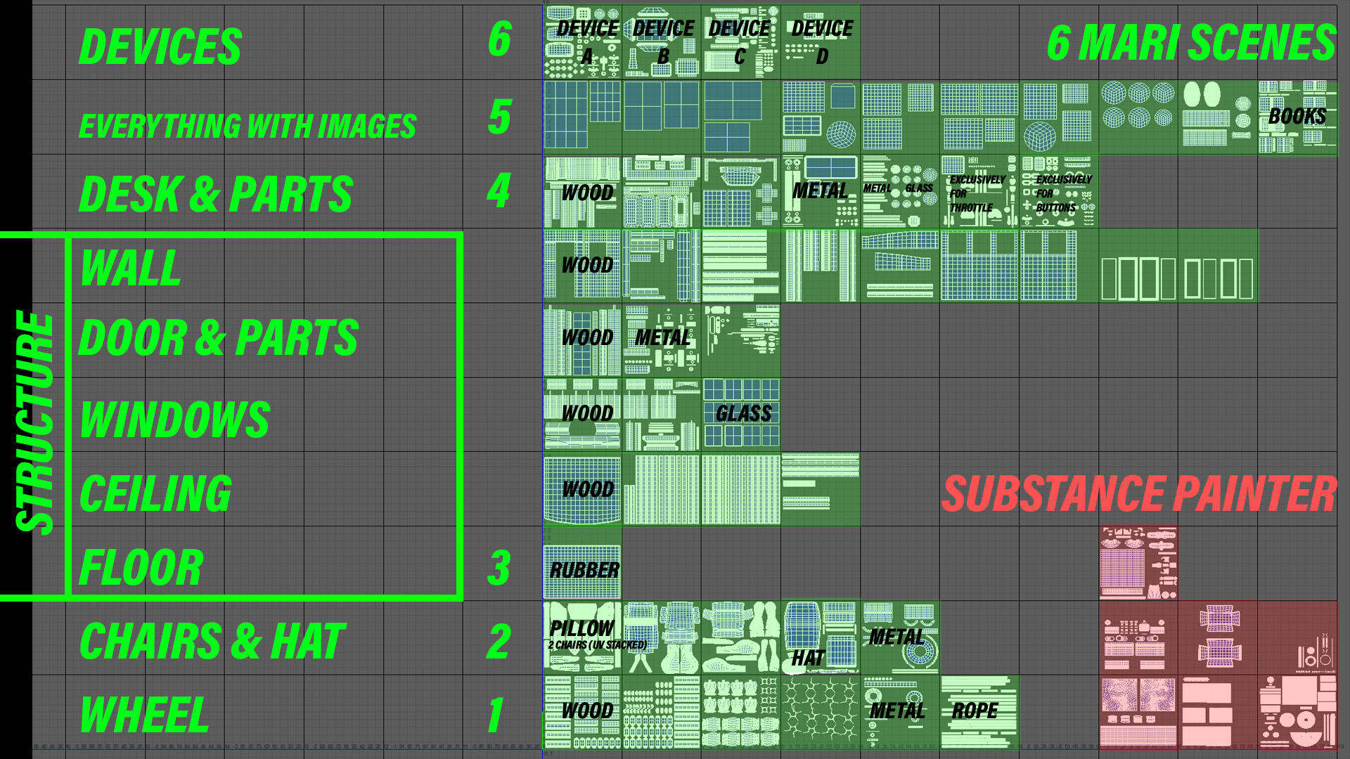
UV Mapping
While working on a hero asset, I determine how close the camera will ever get to the object. The rule that I adopt is to double the final resolution of the piece in texture resolution.
- For example:
If my screen output will be 2K, then UV tiles are going to be 4K. The pieces that I see on my Maya screen should be doubled in my UV view. I like to keep my UVs with a consistent scale to avoid any discrepancy by checking the value of the texel density.
It doesn’t have to be the same value everywhere, but it must have a similar-looking density (UV checker).
Lastly, it is very important to organize the UV tiling. I separated tiles by objects, materials, & assigned software. It’s just made my life easier to know which assets need to be painted in Mari, Substance Painter, or maybe just quick-procedural textures in Maya.
Baking & Texturing
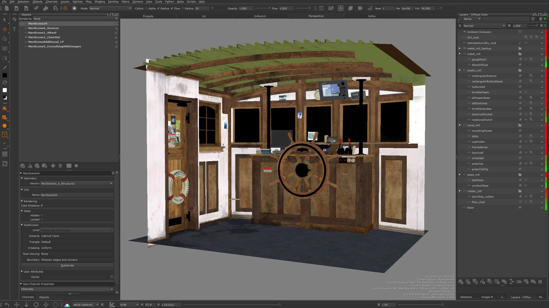
The most fun part is painting all the colors and details & organizing layers of breakups for storytelling purposes. For the hero assets, I used Substance Painter first to get the supporting texturing maps like Ambient Occlusion & Curvature.
I always bring those maps into Mari as a starting point for my breakup layer. After that, I will remove things that I don’t want from the baked maps. Then I add the details that I want to show in specific areas.
- Texturing is storytelling.
It must not look too procedural or instant texture work. The other thing is, I have so many UV tiles since my scene has so many hero props. Mari is a great texturing software that can handle high amounts of UDIMs.
What I like about Mari is that I can paint a high-resolution image with paint projection, which is rather difficult to do in Substance Painter.
For the secondary assets (not so close to the camera), I’ll just use Substance Painter. It’s fast and less complicated compared to Mari.
Also, there are some minor objects like cables, photo frames, or some small things with simple plastic material on the background.
For these objects, I just use procedural textures that I can get quickly with a V-Ray shader from Maya, as long as I know what parameter I want to achieve. Finally, I added dust, dirt, & wetness layer to make everything connected.
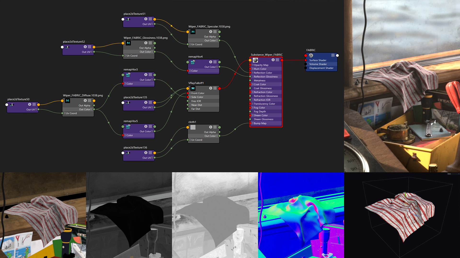
No software is perfect, it’s just a matter of how to achieve better results & work efficiently. Additionally, creating a simple or systematic shader (node setup) might help things if revision is needed.
For example, quick tweaking on color saturation, contrasting value between white & black or using a falloff graph for subtle revision – without doing a dramatic change inside Mari or Substance Painter which sometimes could be destructive.
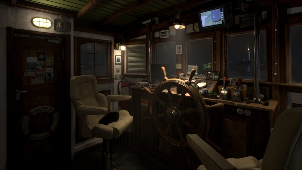
Lighting & Rendering
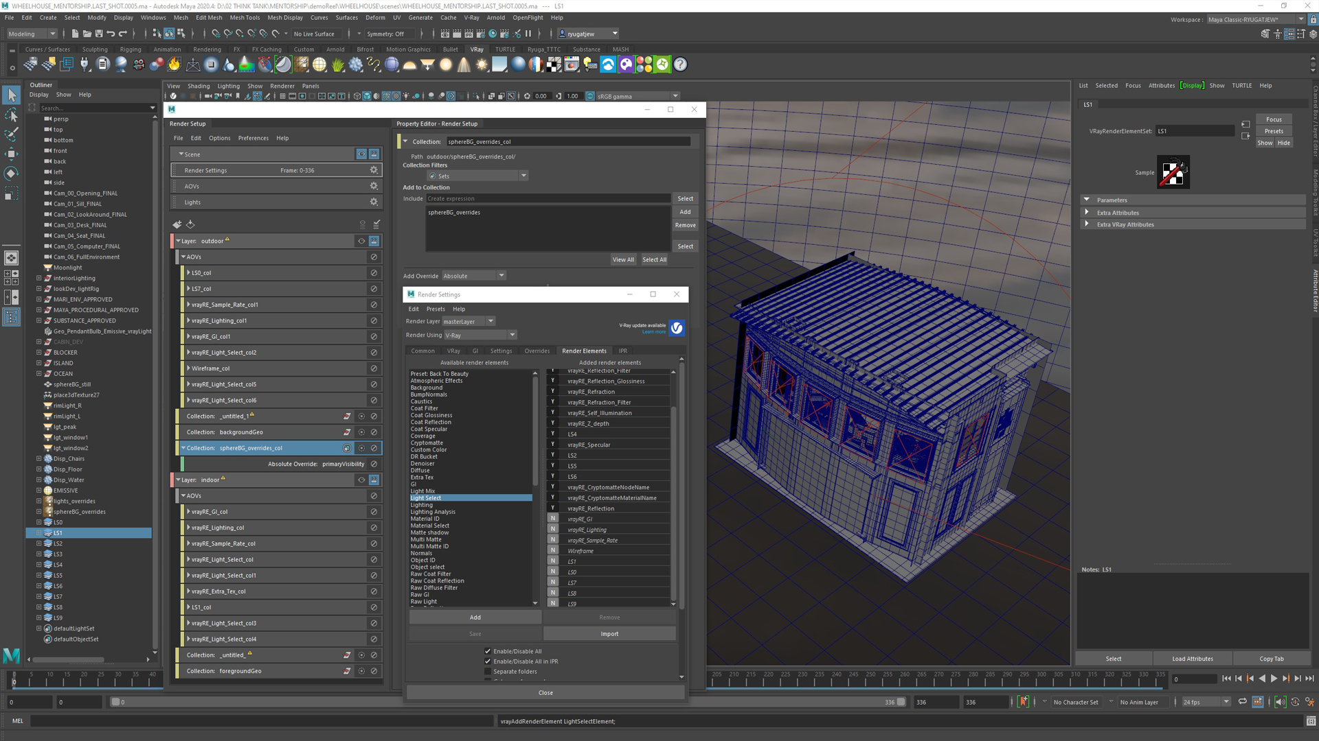
Lighting is a very technical task rather than an artistic one. Often 90% of my time during the lighting phase was tried to solve the issue rather than placing light, intensity & color.
The tasks relied on effective rendering skills such as managing every render pass, planning what element should be separated, what element needed value overrides, what element needed to be visible versus invisible & how to get the render within a great sample rate with an acceptable noise level.
Of course without sacrificing the final output.
Only after that, did I readjust the mood & the color. The most difficult task was creating a timelapse shot! It was not simple compared to other shots. For the timelapse shot, I needed to create sequenced light rigs. These light rigs were placed right in front of all openings or windows (portal lights).
Firstly, I rendered out the animated sky (real timelapse footage) with V-Ray animated ocean as one plate in HD resolution, then plugged that rendered sequence into my animated-light textures & HDRI dome to lit the environment.
The purpose of that is to get the correct environment reflection to the interior part of the boat, like how the cloud movement is reflecting on the interior part during the timelapse, so they are connected as one entity, exterior to interior.
Secondly, I needed to figure out where the brightest point of every frame was (I did a batch render test) and from that, I know where I should locate my sun & animated it from high-angle to low-angle (sunset).
Lastly, I rendered each light in a separate pass, so I have more control in the compositing process. For the atmospheric fog, I duplicated my Maya scene & applied a black constant material to all my geometry with sun ON & V-Ray Fog ON for every shot.
I will use this for the compositing process, to add the volumetric fog on top of everything. Volumetric fog definitely enhances the photographic and spatial feel.
Compositing
In this stage, all render passes were treated to make things beautiful! First, I combined the sky background, water background, & interior layer by using the 3D Scanline render node. This is to make the interior mesh, water surface & sphere container which contains sky projection are fit as they supposed to in the 3D world.
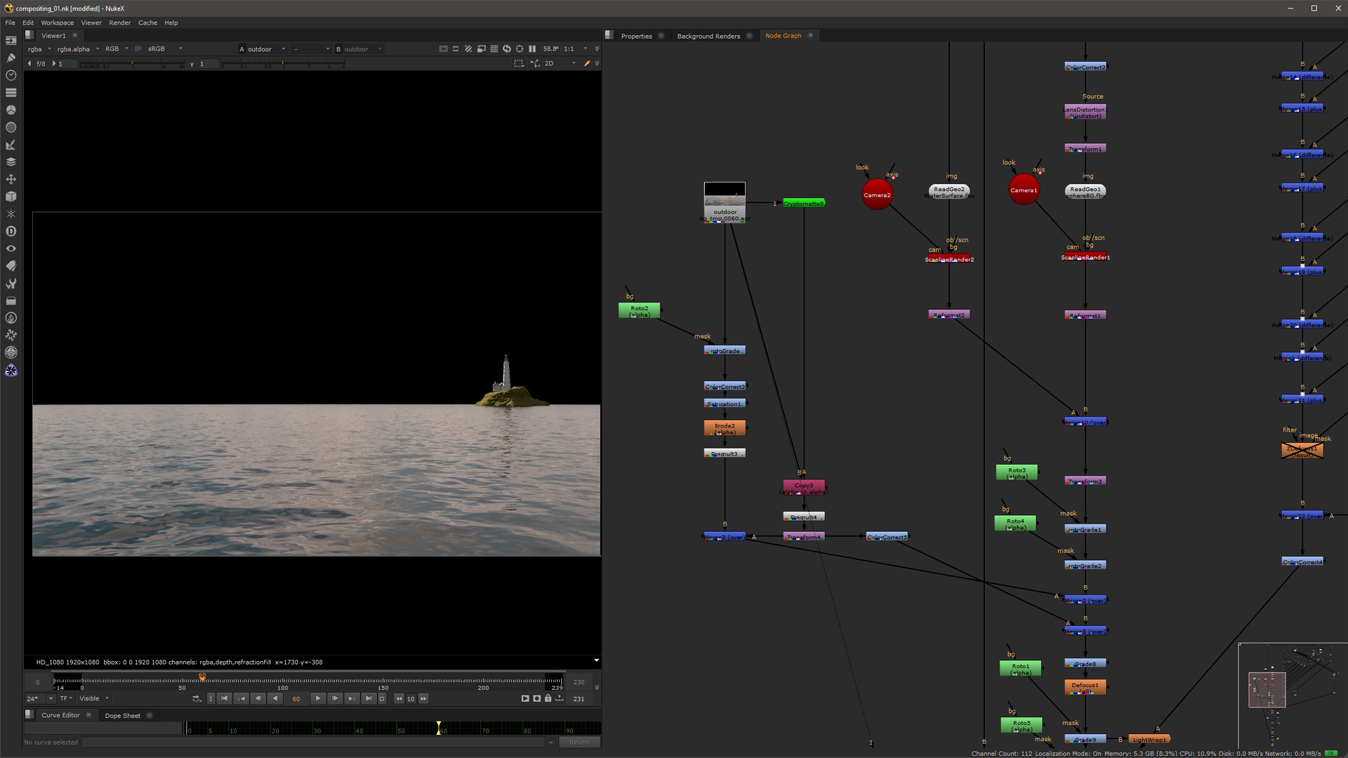
Second, I did some lighting adjustments, for each light pass to control the light contrast, light intensity & color. The grade node, shuffle node & merge operation node are the main tools for this step.
Third, I included my atmospheric fog & I added animated dust particles on top of it.
Forth, I adjusted some of my render passes. Especially the refraction pass and glare to make it beautiful & dramatic.
Fifth, I fixed the color balance. I wanted something that was less saturated because it will make the overall image look more photoreal & I followed some cinematic photographs to do this.
A good resource for reference is a website called Film-Grab. I used the reference to control my white balance for interior versus exterior. The goal was to find the right exposure range & I tried to replicate that range. Finally, adding a vignette to make it more cinematic.
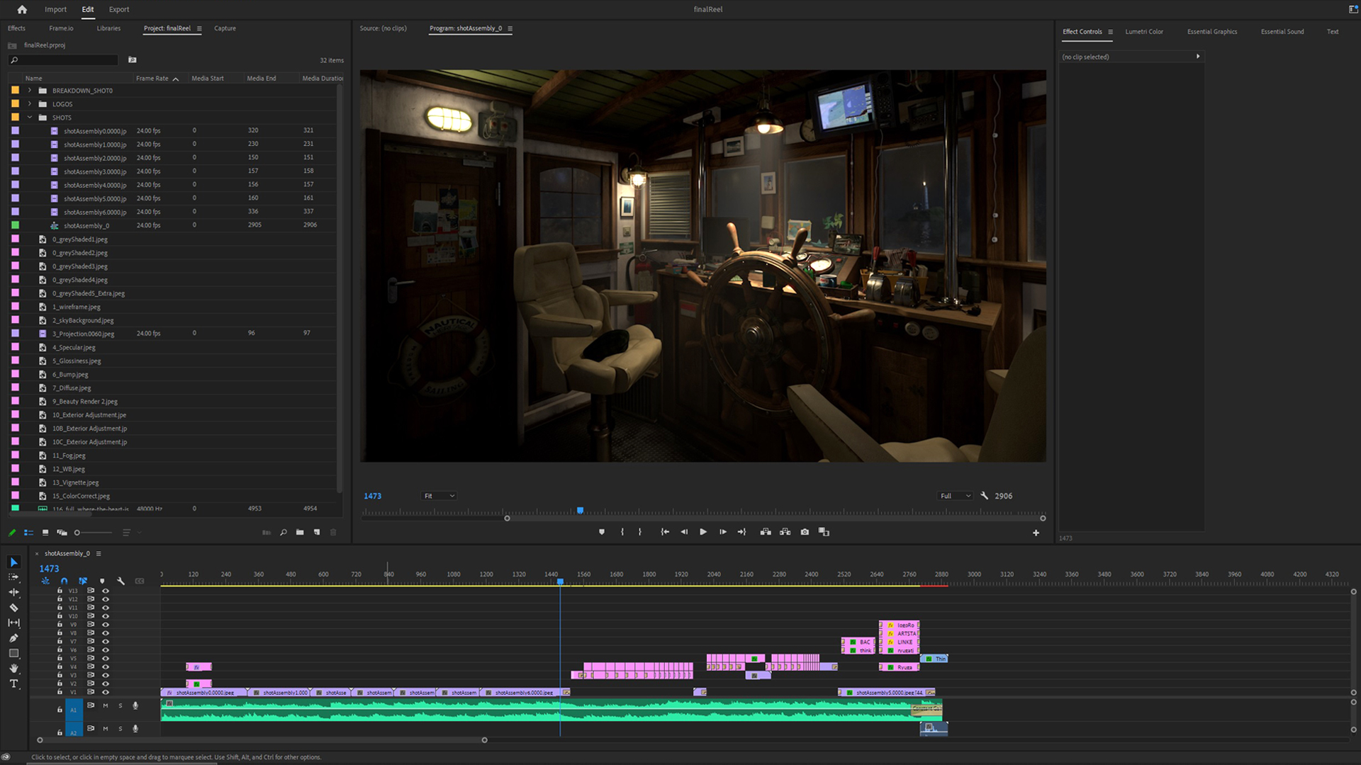
Video Editing
Here is how I rendered a nice & proper video with music and presentation.
Conclusion
Thank you for reading I hope you learned something in the process.
Read more articles
You might also like these articles.