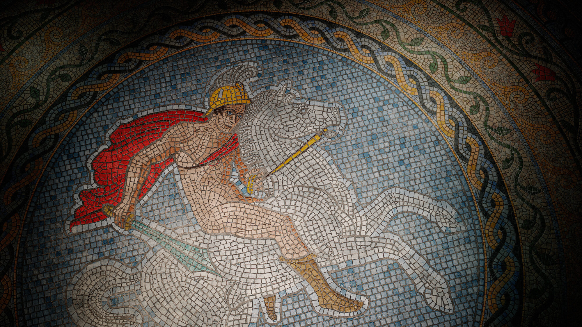
Roman Mosaic
Introduction
Hello, I’m Furkan. I’m an Environment Artist based in the Netherlands.
Project
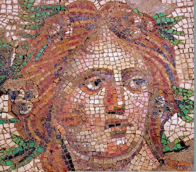
The project is inspired by the museums I visited as a child growing up near numerous historic sites of the Aegean and Anatolia. Although it’s not directly based on a specific artifact, I selected references that felt historically and artistically appropriate.
My main goal was to explore the process of texture creation and see how it could be effectively integrated into an environment.
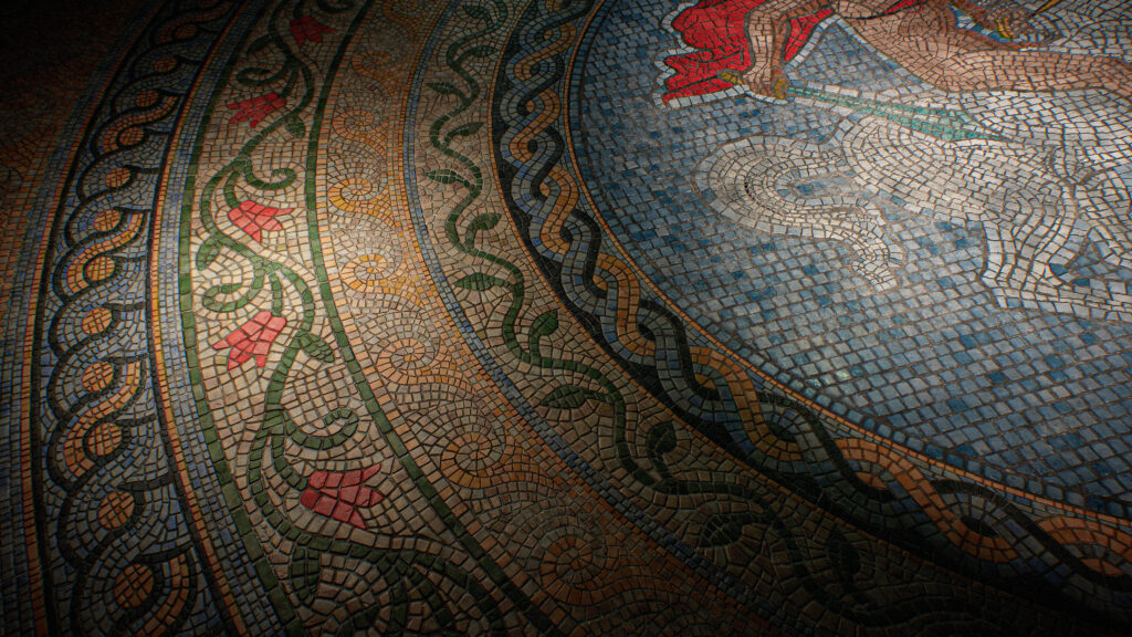
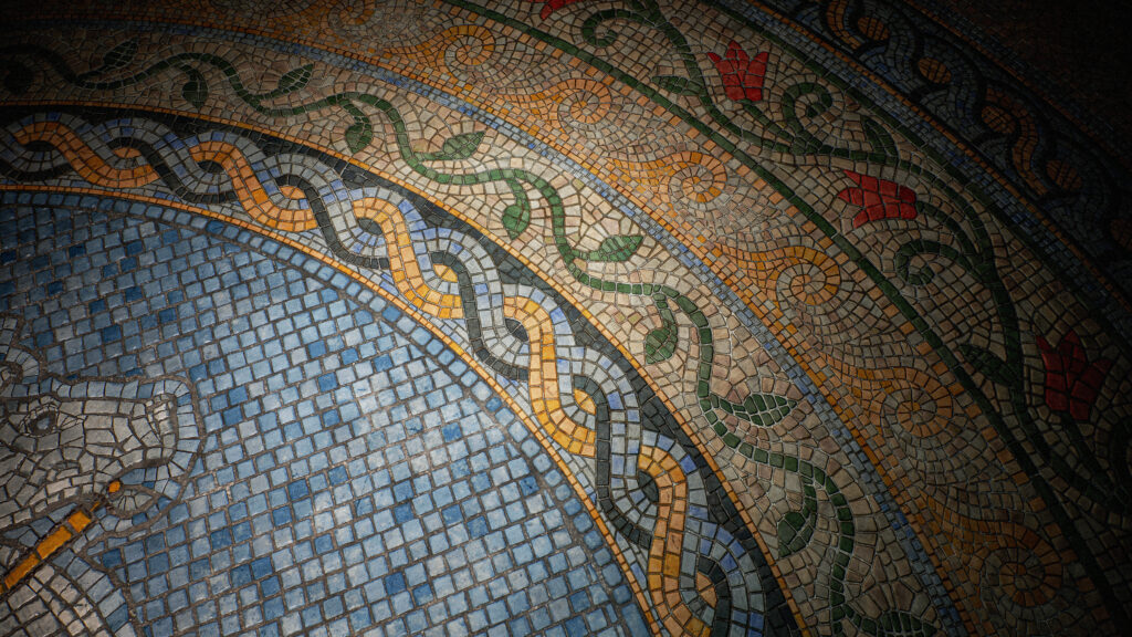
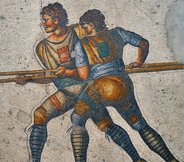
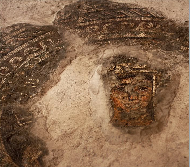
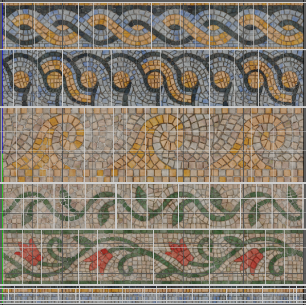
Here are some of the mosaics in Turkey:
Creating Patterns
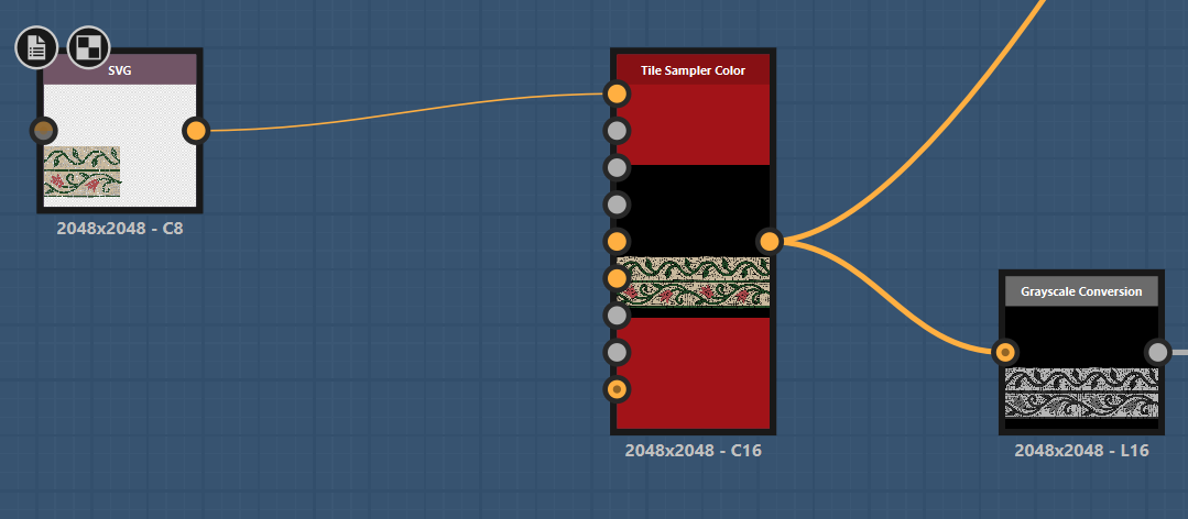
For both the centerpiece and the surrounding patterns, I started by tracing over reference images with the SVG node to build the base shapes.
For the ornamental pieces I had only a section of the pattern ready, I used the Tile Sampler node to repeat and arrange it across the surface. This helped create a more natural, seamless flow.
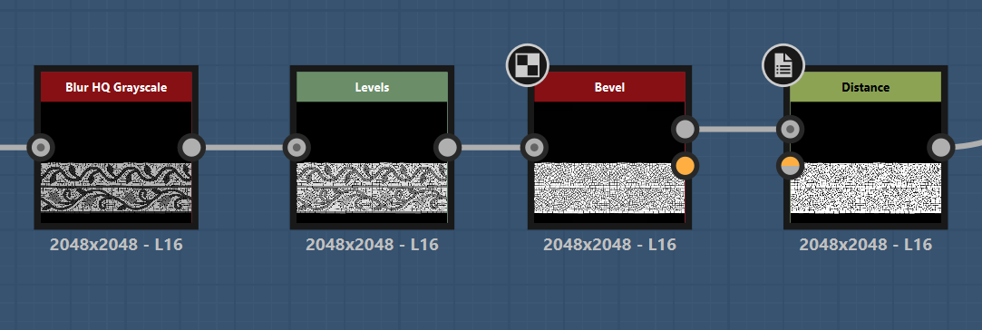
I used Bevel and Distance nodes to give the tiles a more rounded and organic appearance.
The Bevel node helps smooth out the sharp edges of the shapes, giving them a slightly worn, more natural look—something you’d expect from hand-placed mosaic tiles.
The Distance node, on the other hand, was useful for expanding or softening shapes based on their distance from other elements.
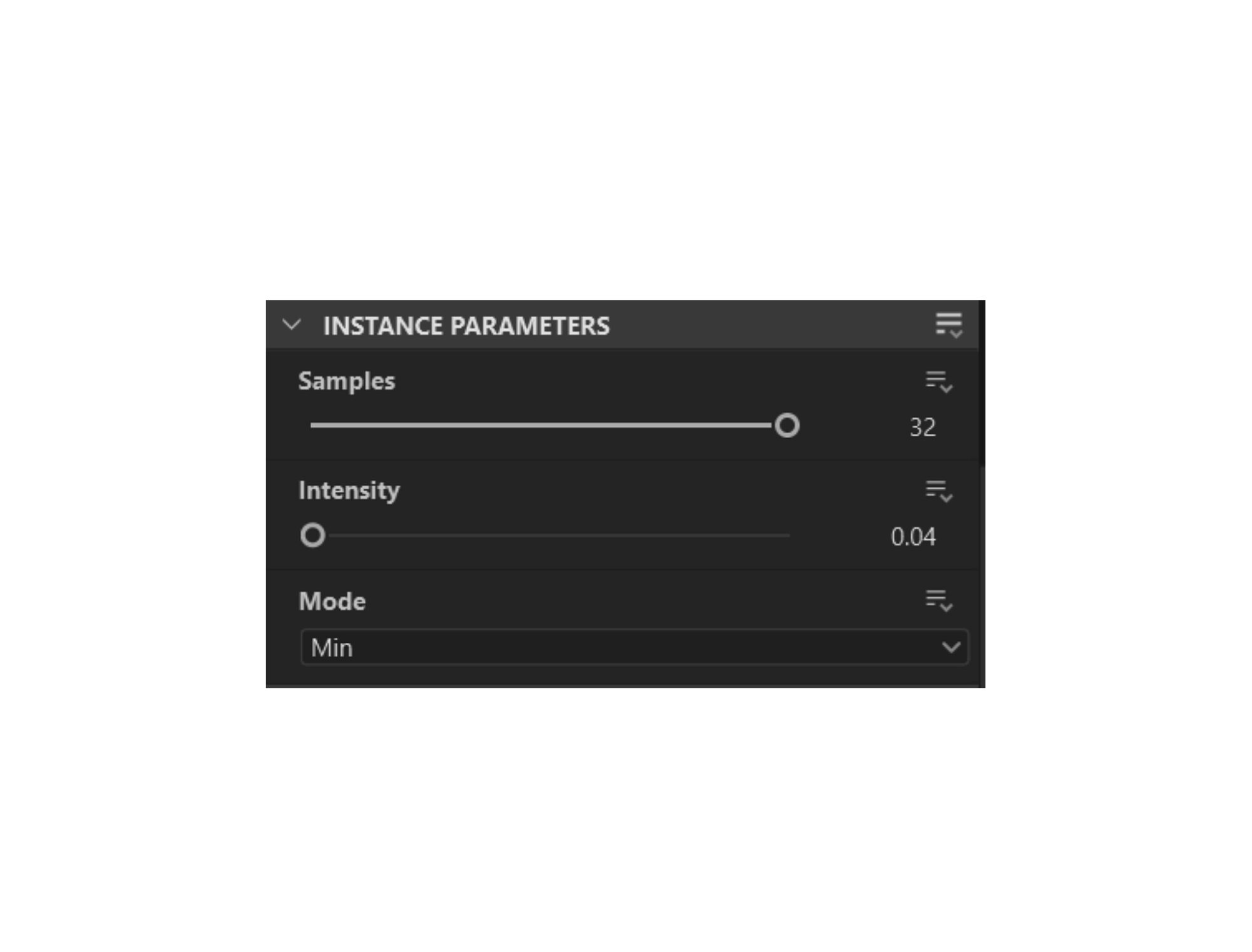
I applied multiple Slope Blur nodes to add subtle edge details and imperfections to the stone pieces.
The Slope Blur node is commonly used to create a worn or eroded effect by distorting a height or grayscale map using the contours of another input.
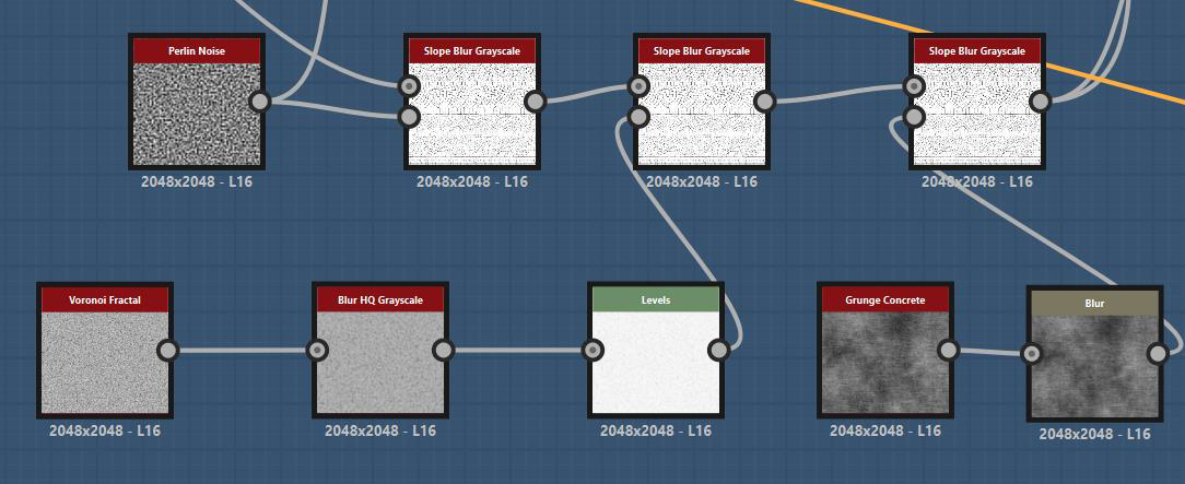
I used the Min mode on the Slope Blur node so that the distortion pushes inward rather than expanding the edges outward.
This approach helps simulate chipping and erosion on the tiles without breaking the silhouette too much
Here is how grayscale map looks for the trimsheet:

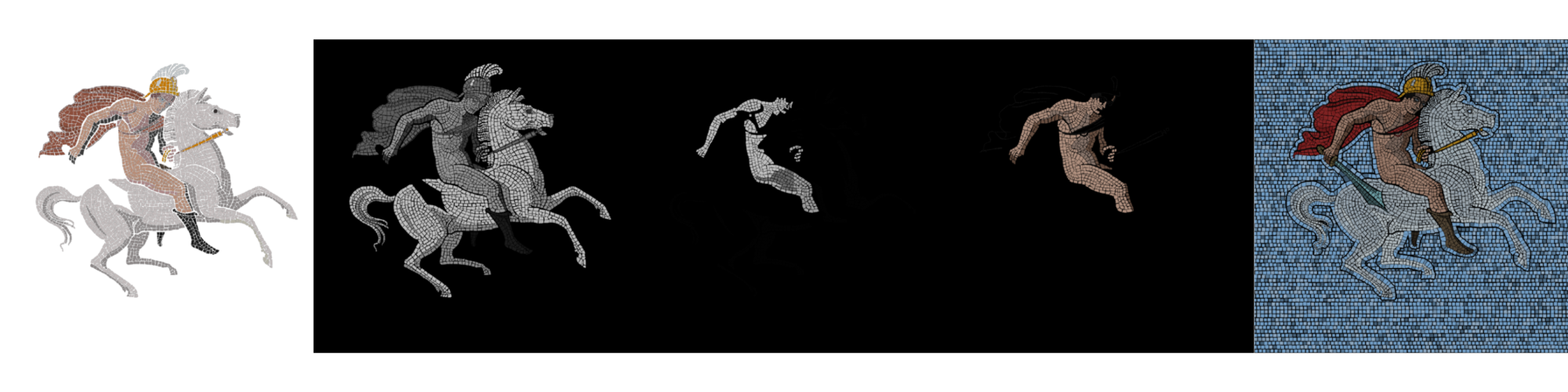
To introduce subtle height variation between individual tiles, it’s important to have slight differences in grayscale values, since these values directly control depth in the height map.
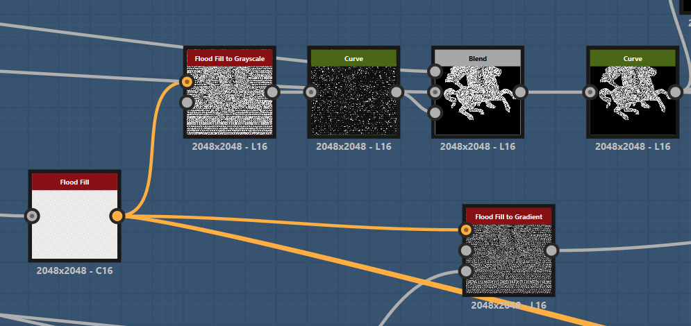
This is where the Flood Fill node becomes very useful.
The Flood Fill node analyzes your shape mask and assigns a value to each isolated shape. From there, you can generate a range of outputs, like random grayscale, color, or gradients.
In this case, I used Flood Fill to Grayscale, which gave every tile a slightly different value, uneven result. Then I applied the Curve node to have more control over the values.
Colour
One of the most important aspects of this project was creating the Color Map, because mosaics are so heavily defined by their use of color—it’s what brings the forms, outlines, and the subject to life.
To start this process, I went back to the SVG nodes I used earlier, since they already held color information from the references I traced.
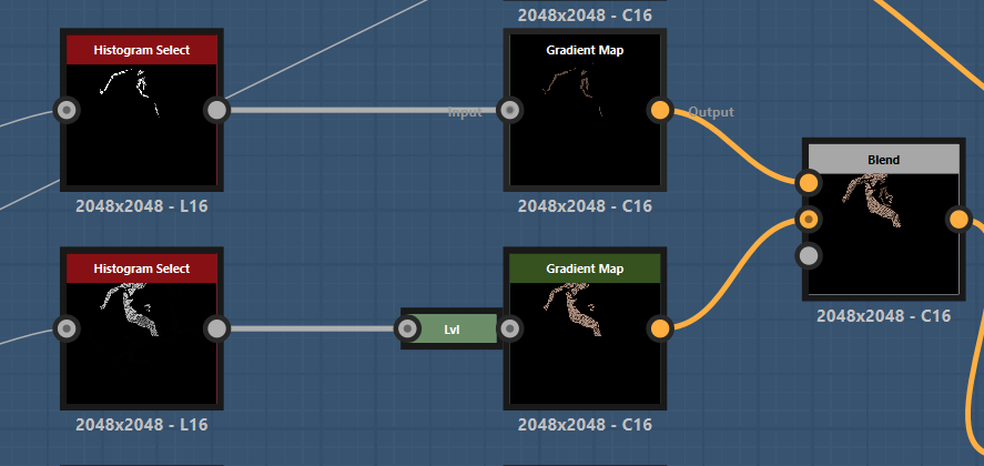
Instead of using the built-in color data, I converted those SVGs into grayscale, which allowed me to isolate different elements based on their values. This gave me more control, so I could adjust each area and then apply the Gradient Map.
This method is pretty standard in Substance Designer. Once you have the grayscale values, you can introduce any color you want just by connecting it to a Gradient Map node. Below you can see how it works:
And here is an example. After having the single-color tone on pieces, you just add each part using the Blend node:
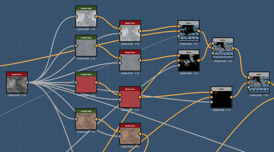
To introduce natural color variation across the tiles, I used the Mosaic Color node, which is great for breaking up flat colors and giving each tile a slightly different tone.
This helps avoid a uniform or overly clean look, which is especially important for a material like mosaic that’s made of many individual pieces.
For example, to add variety to the red cape of the hero figure, I started with a Fractal Sum Noise, then passed it through a Gradient Map to create a range of red tones. This gradient was then plugged into the Color Input of the Mosaic Color node.
By also feeding the same noise into the Mask Input, I ensured the variation was distributed in a way that aligns naturally with the tile layout.
This technique allows for precise control over color palettes while still introducing organic variation, making the material feel more authentic.
Scene Setup & Lighting
The mesh in the scene is pretty simple:
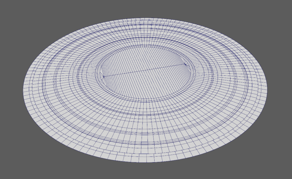
For the ornaments around UV’s are straightened to match the trimsheet:
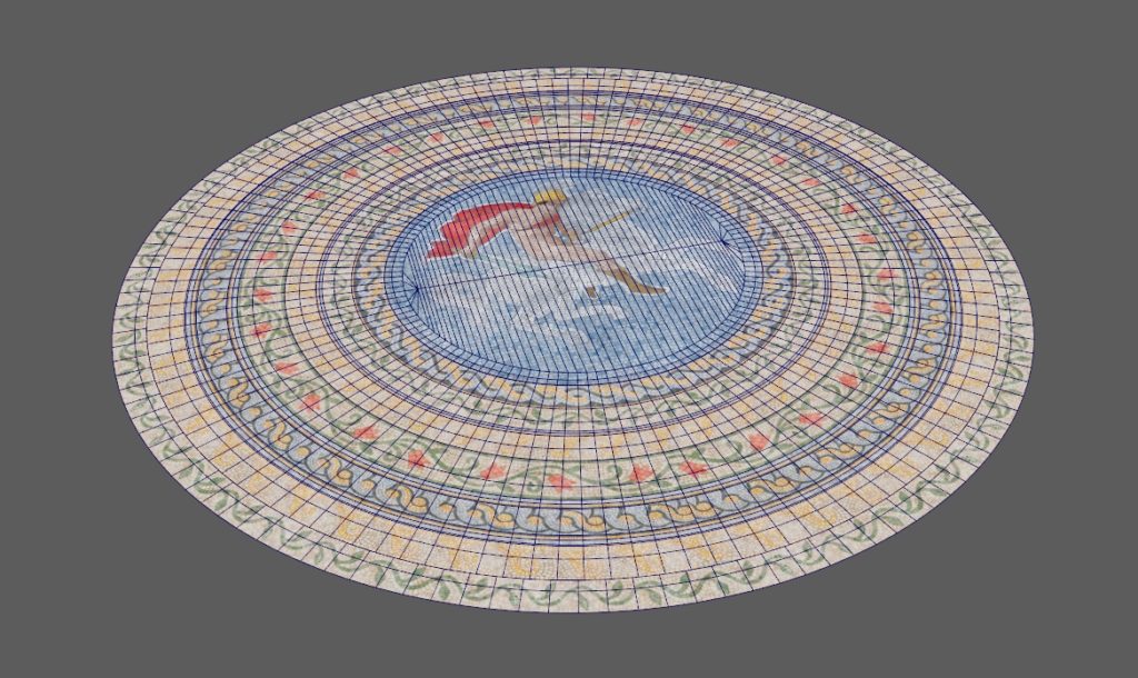
For the lighting, I aimed to create an indoor atmosphere, evoking the feeling of being inside a temple or ancient structure.
The piece is lit unevenly to reflect how light might filter through stained glass windows or enter from an oculus above, casting different hues and intensities across the surface.
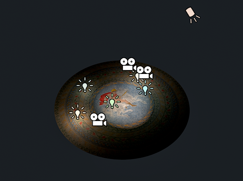
Even though this is a standalone material study, imagining the surrounding architectural context helped me build a more grounded lighting scenario.
It’s a reminder that even when working on isolated assets, thinking beyond the frame can elevate the storytelling and mood of your work.
Conclusion
Thanks for tagging along and following the process. Since this project relies heavily on color, having control over the color channels made everything much more manageable.
The node setups for both the hero figure and the surrounding ornaments are quite similar, so I made sure to include examples from each to show how they work in context
Read more articles
You might also like these articles.