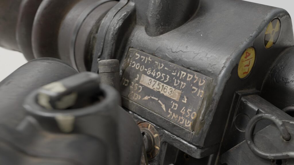
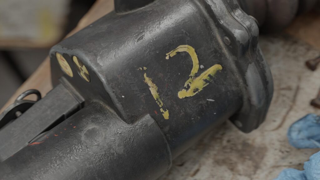
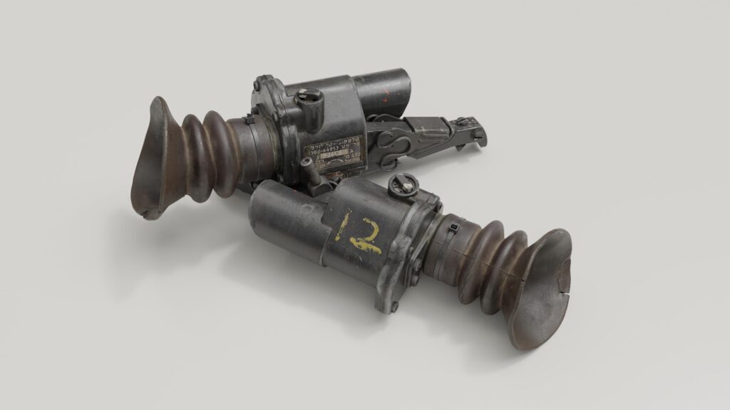
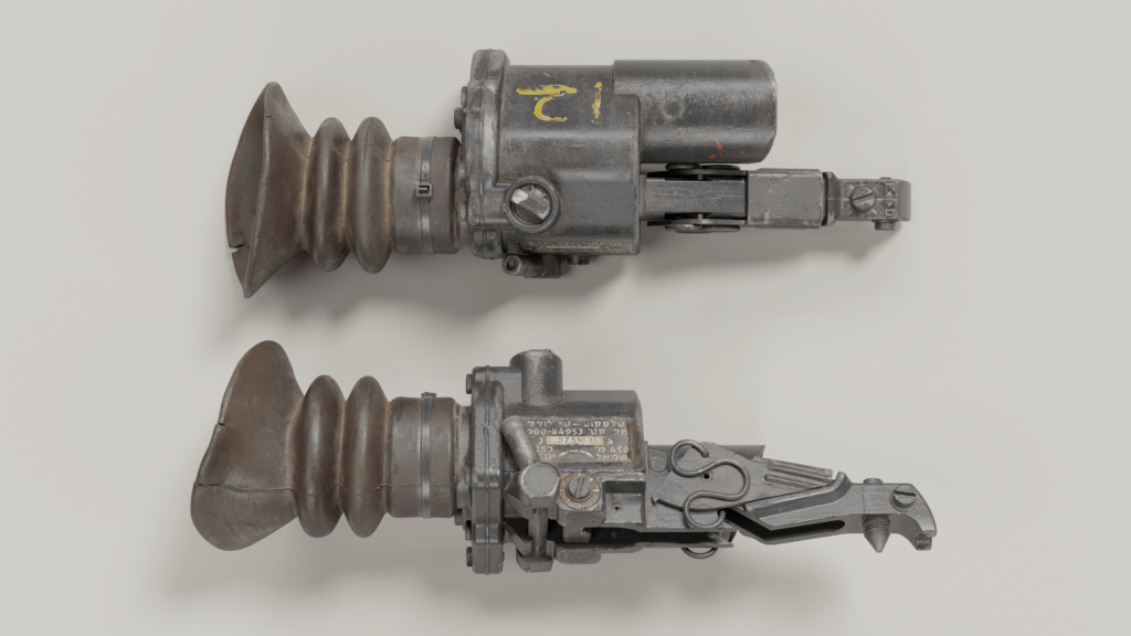
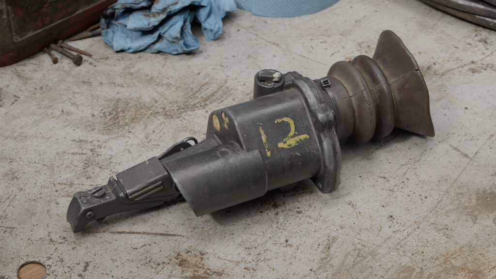
L2A2 Sight


Introduction
Greetings, my name is Anton Kovalenko, and I am a props/weapons artist.
I started learning 3D art a couple of years ago, and with time, I specialized in creating props and weapons with a particular interest in assets from the WWI era to the early 90s.
I worked on different projects in motion art and CGI in the beauty industry while I was studying realistic game art.
Project
I wanted to create a new work to enhance my portfolio.
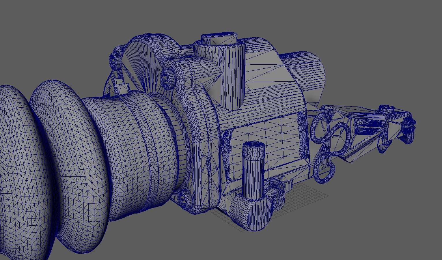
My idea was immediately about making an FN FAL rifle because it represented the very charismatic Cold War era and had plenty of different materials like a wood stock, sling, and a lot of attachments.
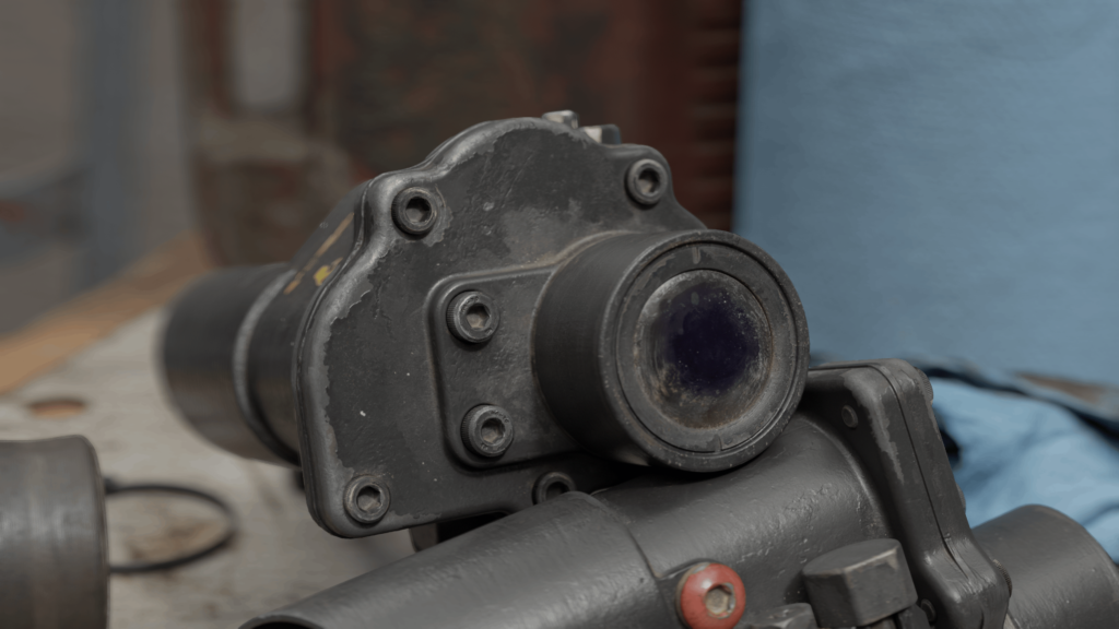
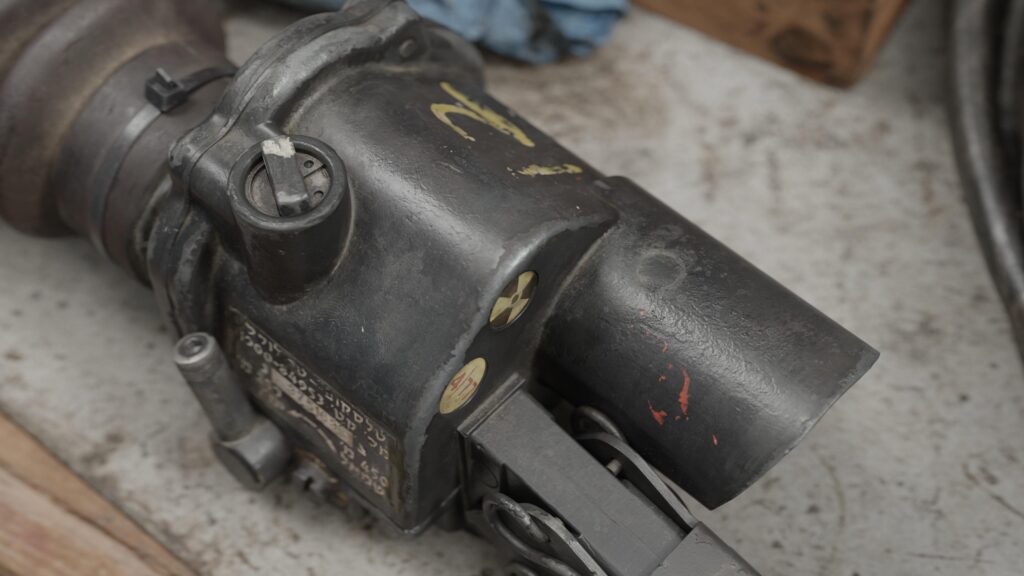
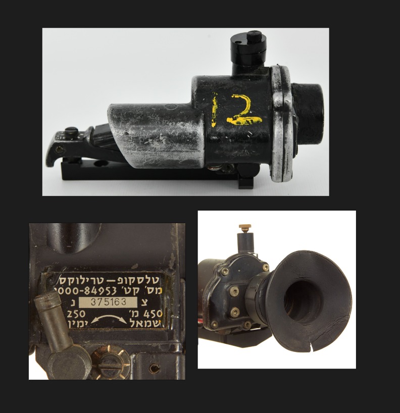
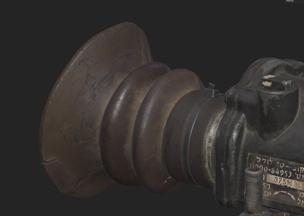
Also, I wanted to make a very unique attachment for this weapon to make it different. My choice quickly became the L2A2 Trilux sight because of its extraordinary form and the quantity of materials it could fit, like rubber, glue, peeled paint, and painted metal.
Soon, I realized this scope was too special to be just a part of another weapon, and I decided to make it a distinct work without sacrificing any quality.
Goals
With this work, I wanted to definitively leave behind work in the beauty industry and proceed with game art.
But the main goal of the project was to show the best I could do with texturing in Substance Painter with a high texel density, using as many material types as possible, because all of my previous works were too strict in technical aspects to give me enough space for my ideas.
I watched a lot of feedback sessions, tutorials, and streams about texturing from different artists like Dan Kenton (ArtStation) and Dmytro Mykhailyk (ArtStation).
I retextured one of my old works and made a new one for an unreleased project to test newly learned techniques, detect main mistakes, and sharpen my skills. After that, I decided it was the right time to start.
This work’s textures were created under the mentorship of Dmytro Mykhailyk (ArtStation), to whom I’m very grateful. He taught me some new techniques, supported me, and gave feedback during the whole process of texturing and rendering.
Tools
• Rendering – Marmoset
• Modeling – Plasticity, Maya
• Retopology & UV – Maya
• Sculpting – ZBrush, Maya
• Baking – Marmoset
• Stencils, Alpha creation, and other details – Photoshop
• References and Blueprints – PureRef
• Image upscaling for references and stencils – Topaz AI
• Texturing – Substance Painter

References
For me, references are the main key to a high-quality asset with good-looking textures. Nearly 80% of interesting details on the asset can be extracted from references.
I would recommend searching on ArtStation for the same or a similar asset to the one you want to create, so you can find some interesting ideas you can implement in your texture or analyze which parts of the mesh are most interesting for viewers, focusing only on the important ones.
However, I do not recommend copying from others’ textures, just taking notes and searching for real-life references to implement others’ ideas in your own way.
When searching for references for rare items, I recommend looking at items from the same era and combining different references to create something unique.
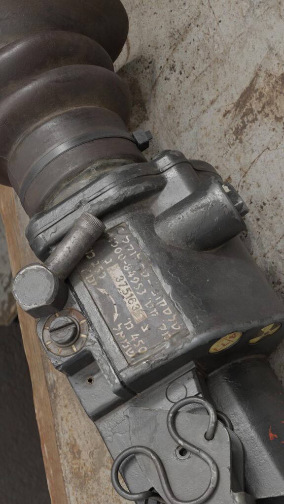
All of the information about the L2A2 I got simply from Google Images and specialized marketplaces or auctions for arms and attachments.
Some of the references I found on Pinterest, or simply took photos of objects at home (like a plastic holder or dust on plastic with oil).
In most cases, I structure my references in this way:
• Initially, I divide them by their source of origin.
• Then, I choose from every group the references I need for a certain part that I’m currently making.
Also, I recommend commenting on references to avoid spending 5 minutes searching in PureRef for the images you need.
Ideas
One of the main ideas was to pay close attention to the variety of materials to make the work as artistic as possible.
That’s why I chose to implement details like glue, a rubber ocular, and a plastic holder to make the work interesting not only for weapon fan artists but also for props, environment, and character artists who are curious about how you implemented rubber, for example, or glue, not just metal.
I wanted to try a new technique: starting texturing by working only with normal and height maps until my mesh looked like a piece of metal without even having metallic or specular values. This really helps a lot in texturing, providing more detailed geometry.
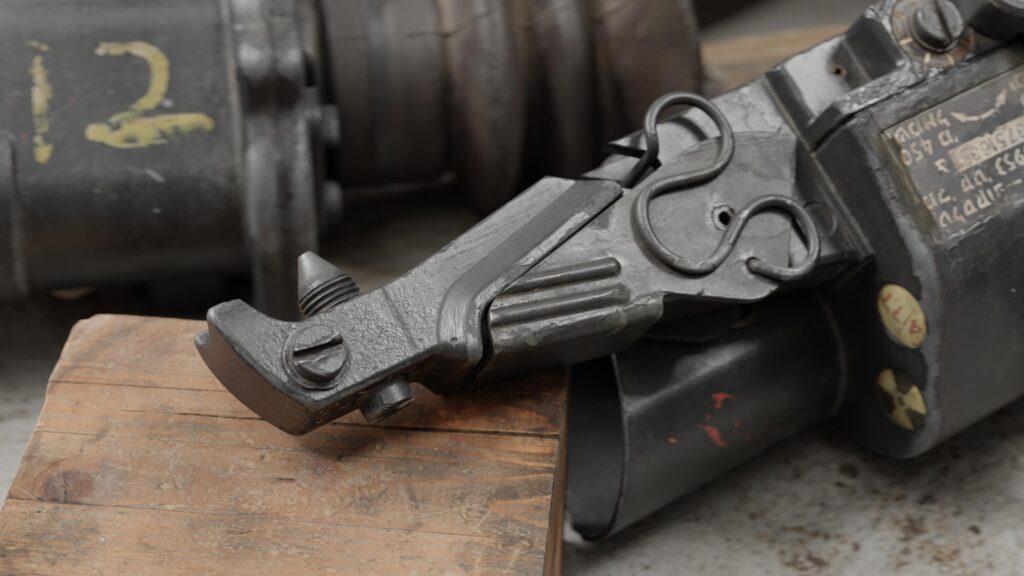
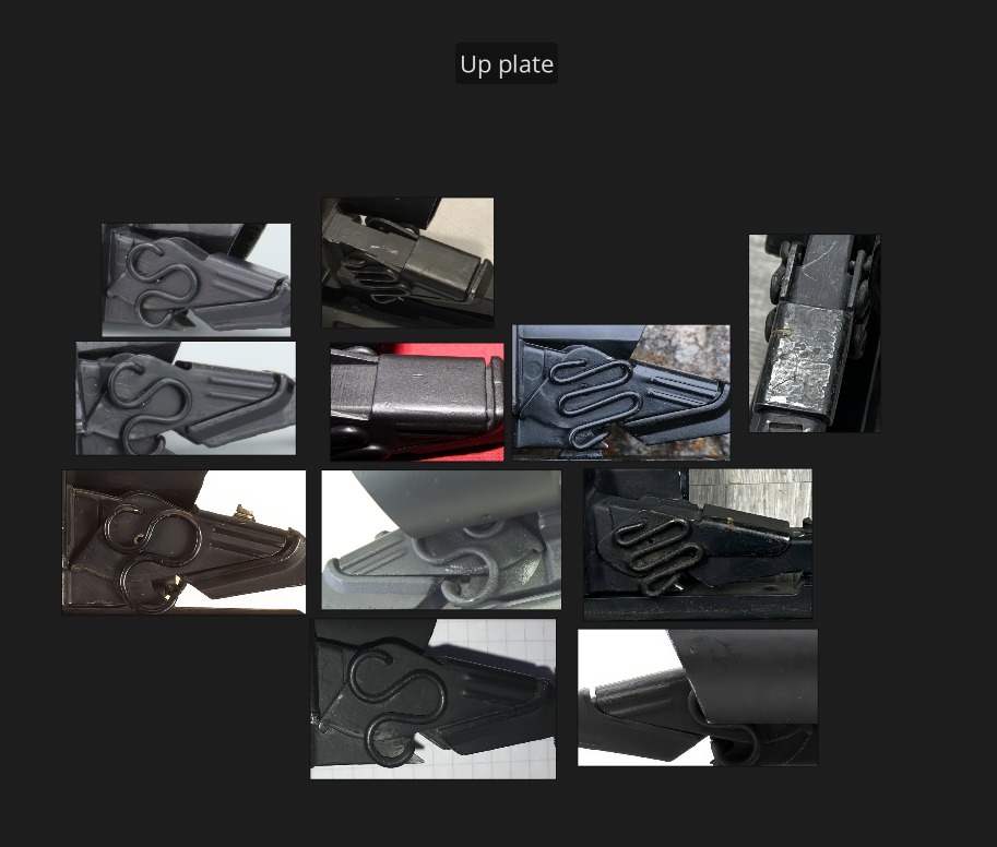
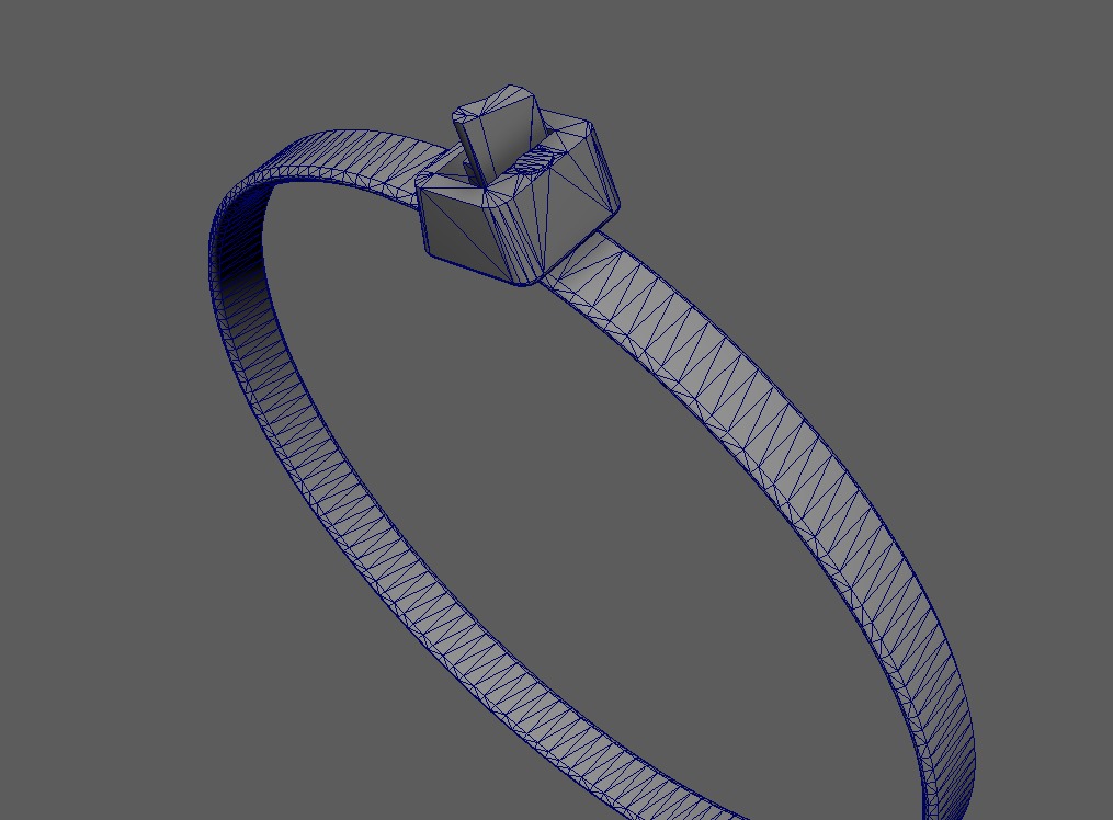
Also, my personal desire was to add a plastic wire holder for authenticity and because I just wanted to place it somewhere.
Design
I immediately chose to combine the design of these three references because this way, I could have interesting and unique details in almost every section of the mesh.
Blokcout
When I find all the necessary references for geometry, I start making the first simple forms. I think that in this phase, the most important thing is to get the right proportions, but it’s also an opportunity to analyze the mesh from angles I hadn’t considered before.
Often, I continue searching for new references when I realize that certain angles of the mesh aren’t visible in the images I already have.
Of course, it’s not effective to search for photos of a rare scope just to correctly model a tiny place that won’t be visible to viewers, so in those cases, I just make new geometry from my head. This is why I think it’s important to first choose which parts of the mesh you want to show to viewers in your future renders.
It’s important to say that in 3D art, you should go from bigger and general forms to smaller ones, not the other way around, like immediately starting with tiny screws.
This way, the work is more organized and follows a logical progression.

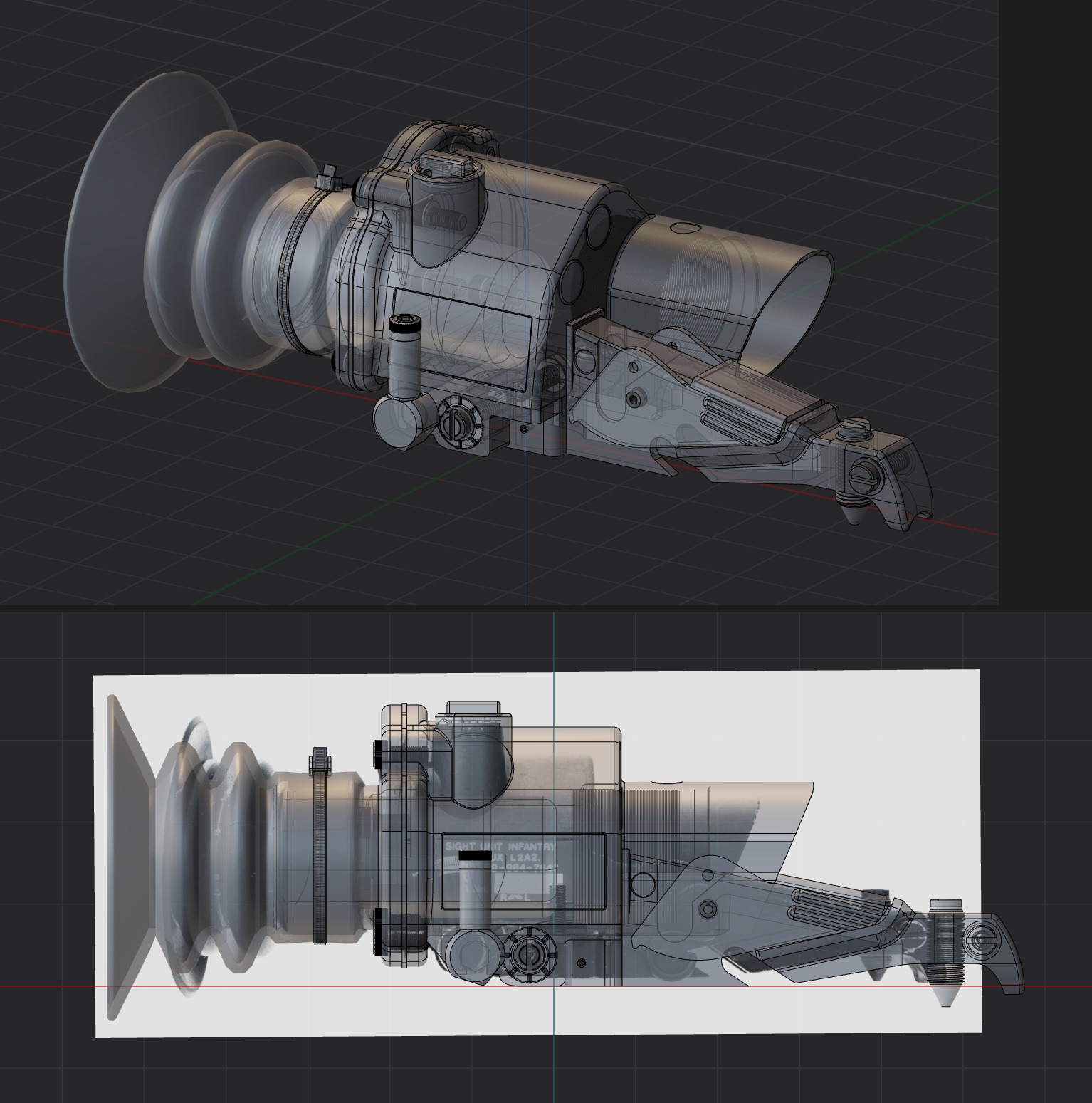
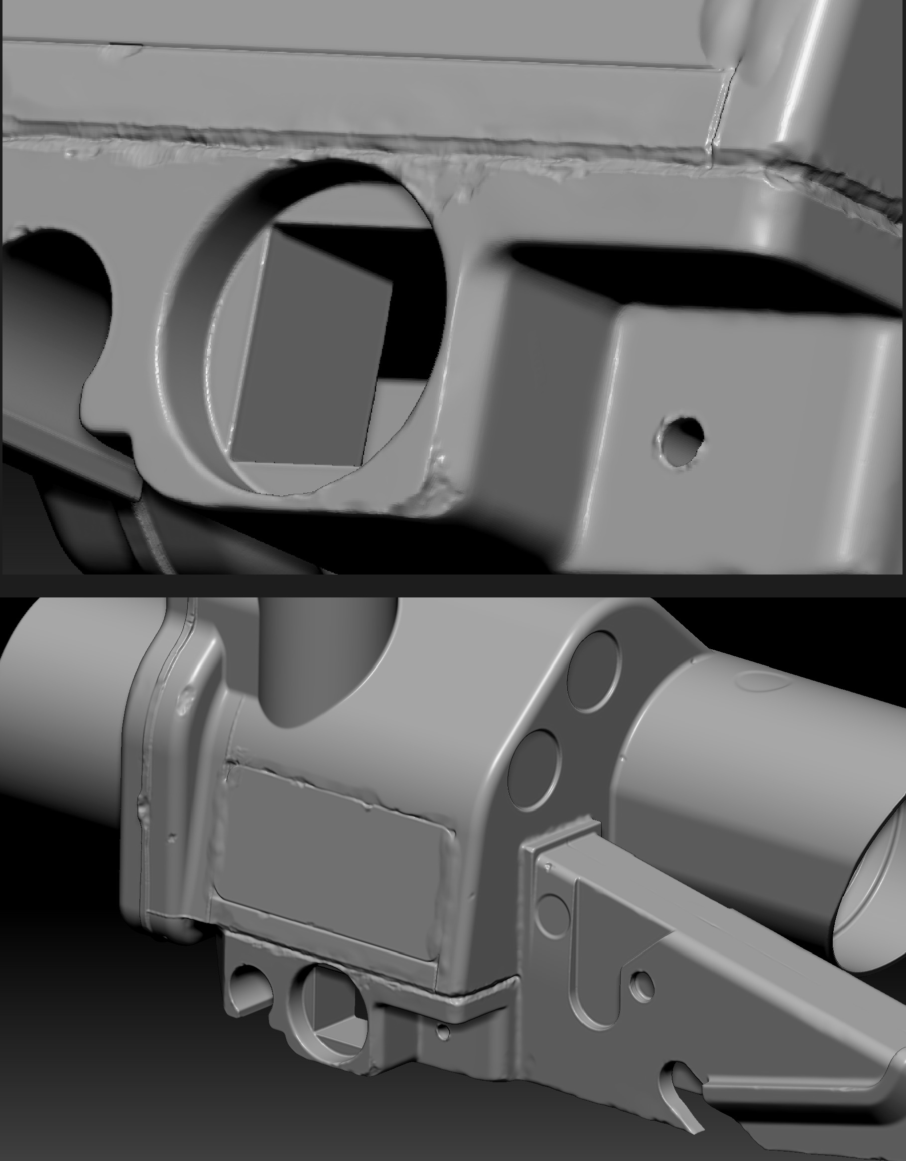
Modelling
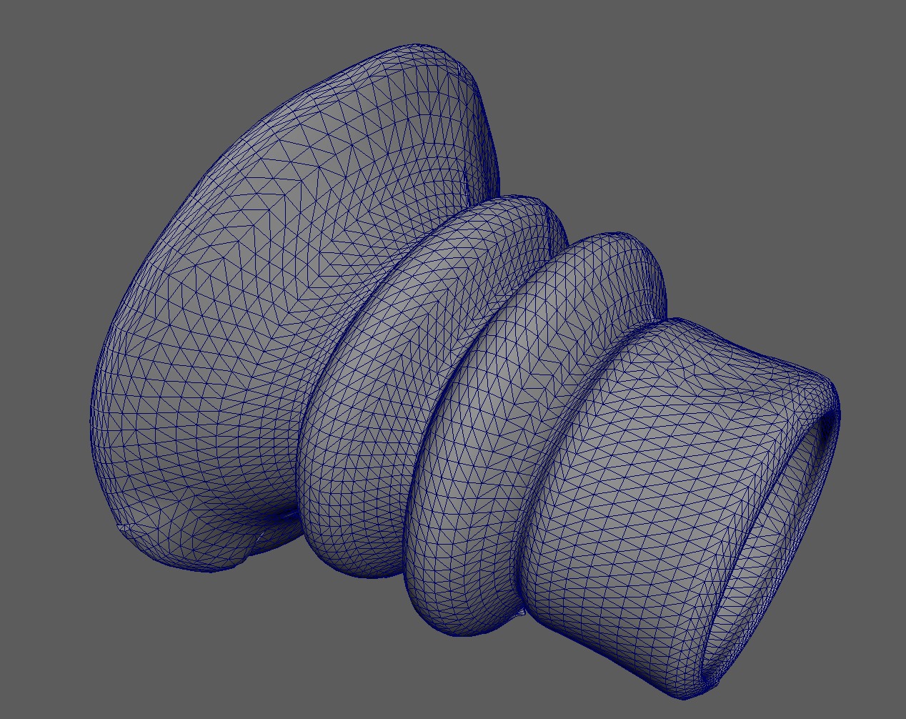
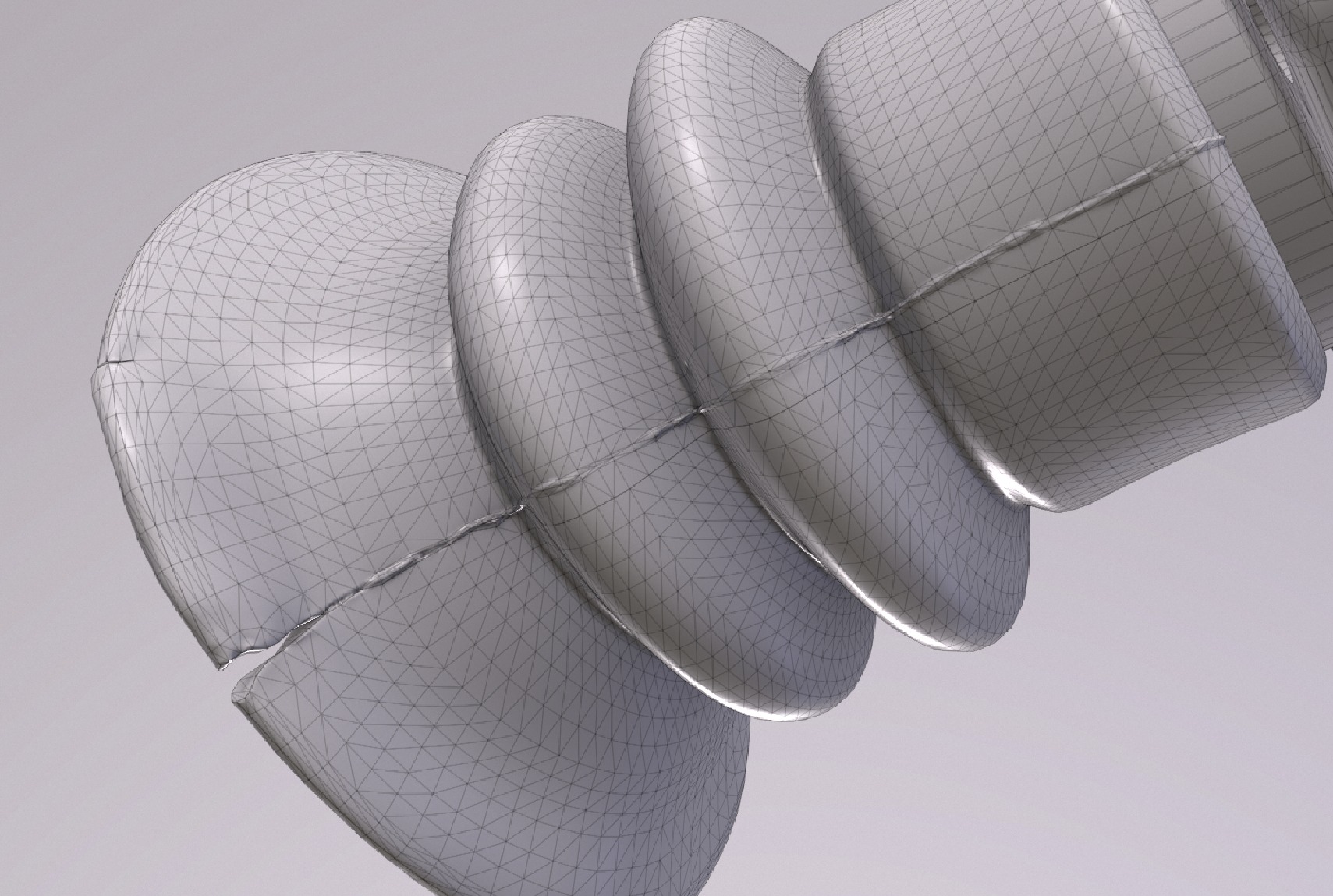
This asset was also my first experience with Plasticity. This type of mesh is too resource-consuming to be made with the subdivision method due to its extraordinary form.
CAD handles this mesh perfectly. I used the Studio version of Plasticity, which provides xNurbs, which I used in some places, but it could have been done easily without any of that.
I used simple photos for my blocking and CAD model because I didn’t have any blueprints.
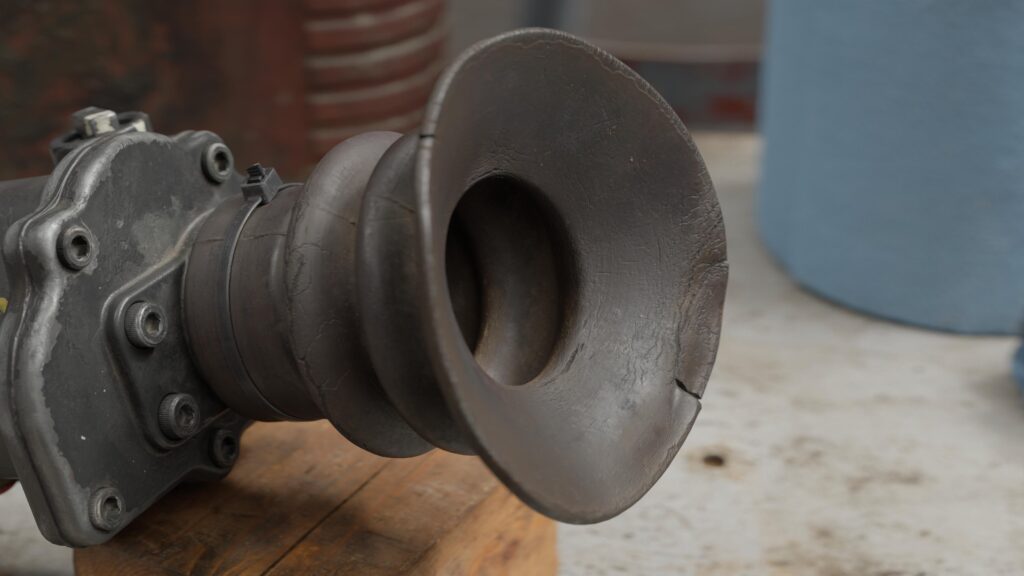
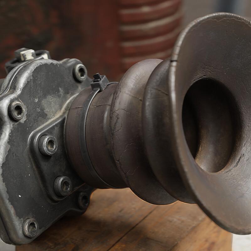
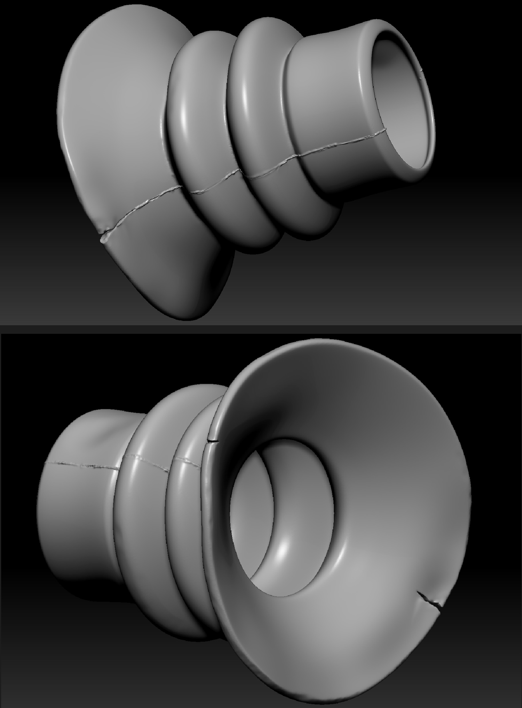
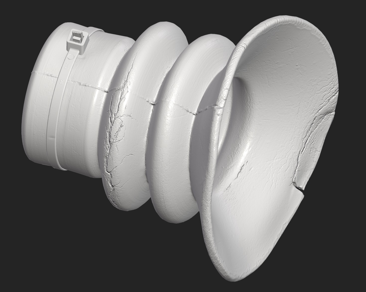
However, the rubber ocular was easier to make via the subdivision method directly in Maya.
After making the basic geometry, I cut some parts of the rubber to make it look older and show some narrative that I noticed in references.
I did this using the Boolean method in Maya.
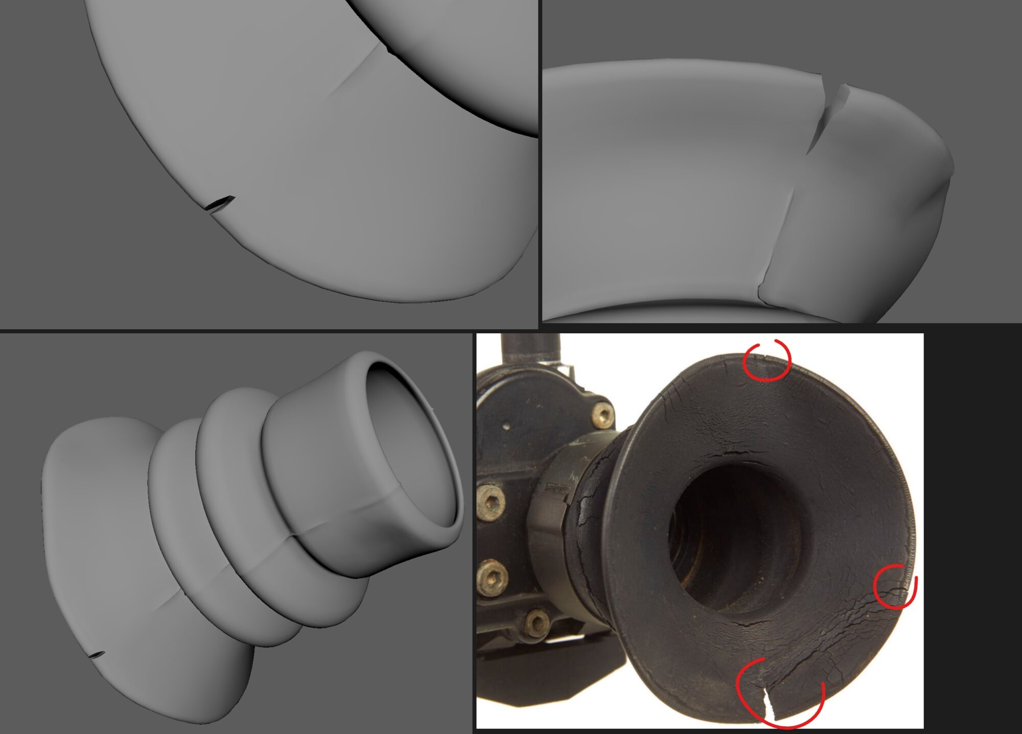
As the next step, I used DynaMesh in ZBrush to prepare the geometry for sculpting and made rubber seams using basic brushes like the Standard brush, Clay, ClayBuildup, and Blob.
On the mesh I made in Maya, I already created barely noticeable guide lines for the rubber seam, so it wasn’t a problem to make the lines straight and accurate.
The high-poly part for the main body was also made using classic brushes like TrimAdaptive/Dynamic, ClayBuildup, and Rake.
I didn’t use any premade damage from packs on the ArtStation marketplace. I tried to stay as close as possible to references during the creation of the high-poly model.

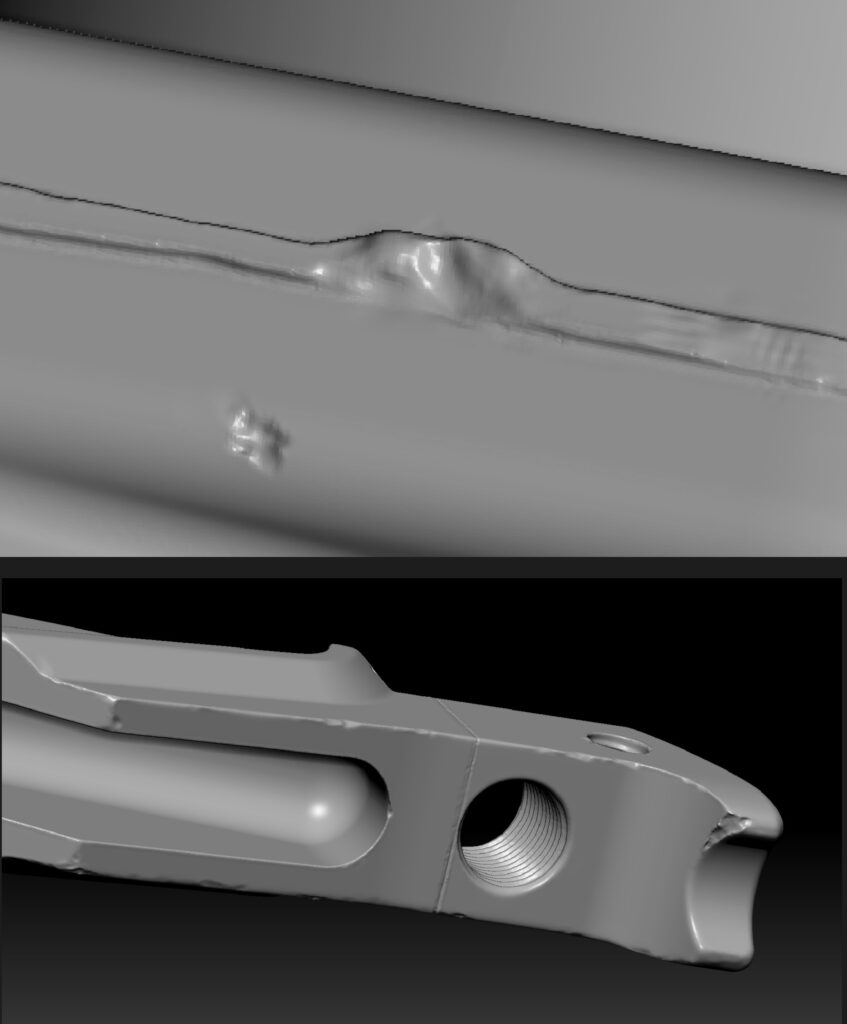
It’s important to notice that metal, in general, and especially on small objects, has to go somewhere when deformed.
I mean, if the object was hit somewhere, it’s bad practice to just make a flat area in that place or cut it away without thinking.
The metal moves when deformed, so when creating any type of damage, it’s better to follow the logic of where the metal from the damaged place will go.
In the case of hit damage, I make a little border around the damage or move the entire damaged part.
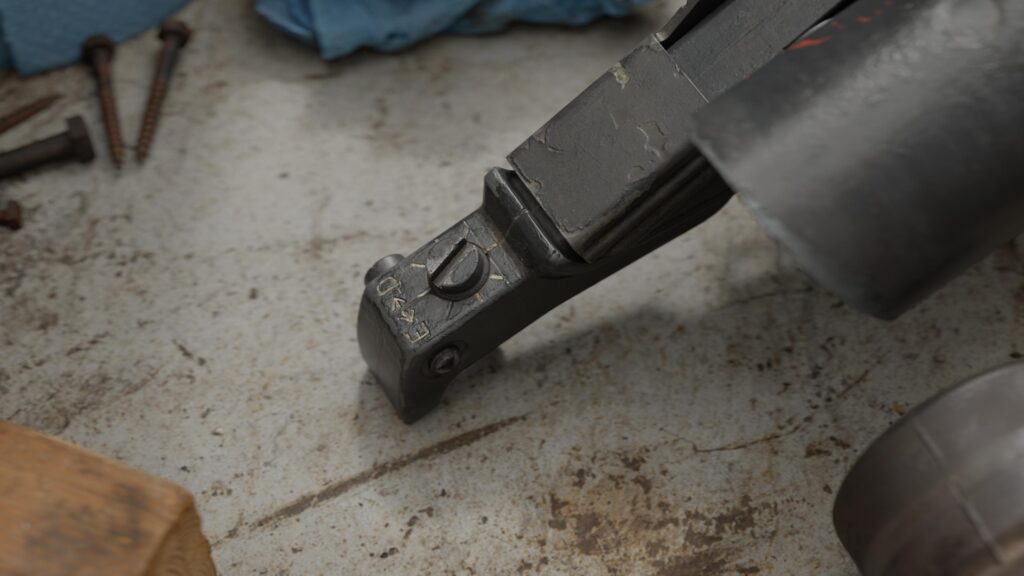
Old screws are the best example of how metal damage works. We can see that the metal isn’t just bent everywhere regularly; it has direction, borders, and a story.
The middle part is less bent, while the edges follow the screwdriver’s direction. The distinctive border tells us that the metal didn’t just vanish; it changed its location.
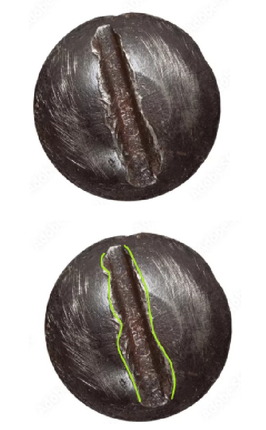

In cases where a metal part is broken off, I make sure the damage border is sharp.
The making of the glue was interesting. For this, I created a separate mesh in Maya, which was used for both the low-poly and high-poly models.
The glue form was copied directly from the reference using subdivisions.

I imported it into ZBrush and combined the mesh with the main body using DynaMesh.

Then, I masked the glue area by hand and added a bit of volume before smoothing it.
Thanks to the mask, I didn’t touch the metal parts, and the border between the glue and metal is sharp enough but also smooth enough to make a nice normal map of it.
Retopology & UVs
Mostly, I just used the mesh I exported from Plasticity, with changes only for high-poly details like big metal cracks, etc.
For the plastic holder, I made a new mesh by hand because the one from the CAD model wasn’t good for this. The ocular and glue were already done from the high-poly phase.
The ocular and glue were already done from the high-poly phase.
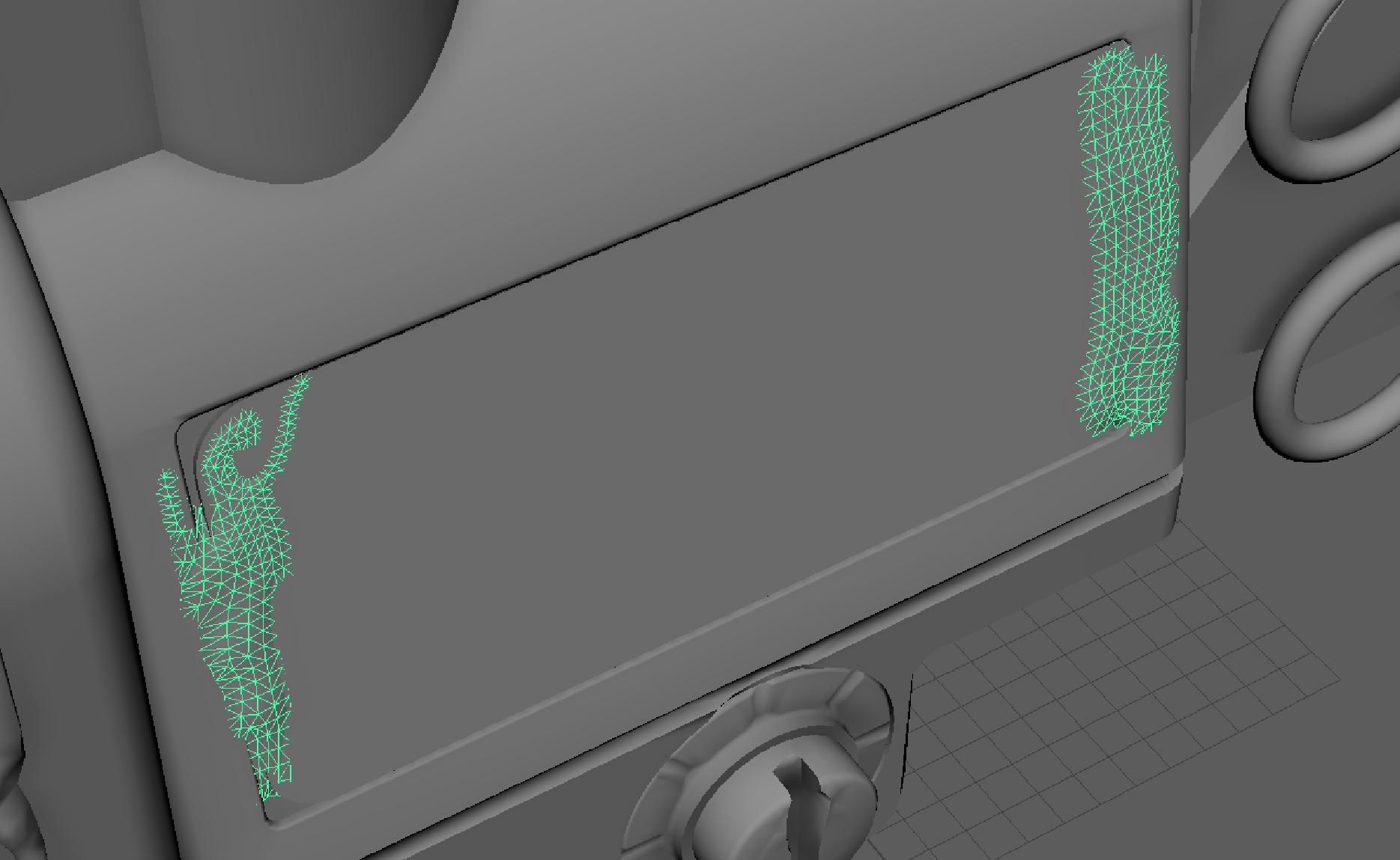
For retopology of more complex forms in Maya, I use tools like Live Object combined with Quad Draw.
For UVs, I used the UDIM workflow for the biggest part of the mesh. Other parts of the asset were made using the traditional workflow.

Other parts of the asset were made by the traditional workflow.
I didn’t pay much attention to UV map quality; my only goal was to achieve a high texel density and UVs that are comfortable for texturing.

Baking
I baked maps for this asset in Marmoset 4. I like Marmoset because it gives you all the freedom you need for your bake.
Personally, I bake only Normal, Curvature, and AO in Marmoset (I didn’t need an ID map for this mesh). Other maps I bake automatically in Substance Painter.
I want to maintain full control over these three maps because they are the main ones that have the most influence on generators in Substance Painter.
The only problem was baking a mesh that uses UDIM because it requires assigning different materials to parts of the mesh that are on different UV tiles and transferring all parts from different UV tiles to the 1001 tile.
I create two AO maps for every material, one without shadows of other objects and another with shadows. It’s nice to switch AO manually in every generator inside Substance Painter, giving more ways to use generators.
Texturing
I textured in the Metal/Rough workflow. I recommend always starting texturing with the most important part of the mesh that will draw the viewer’s attention, because at the end of texturing, the artist is probably tired and tries to pay less attention to details to finish the work as quickly as possible.
That’s why I started with the ocular, probably the best part of this asset.

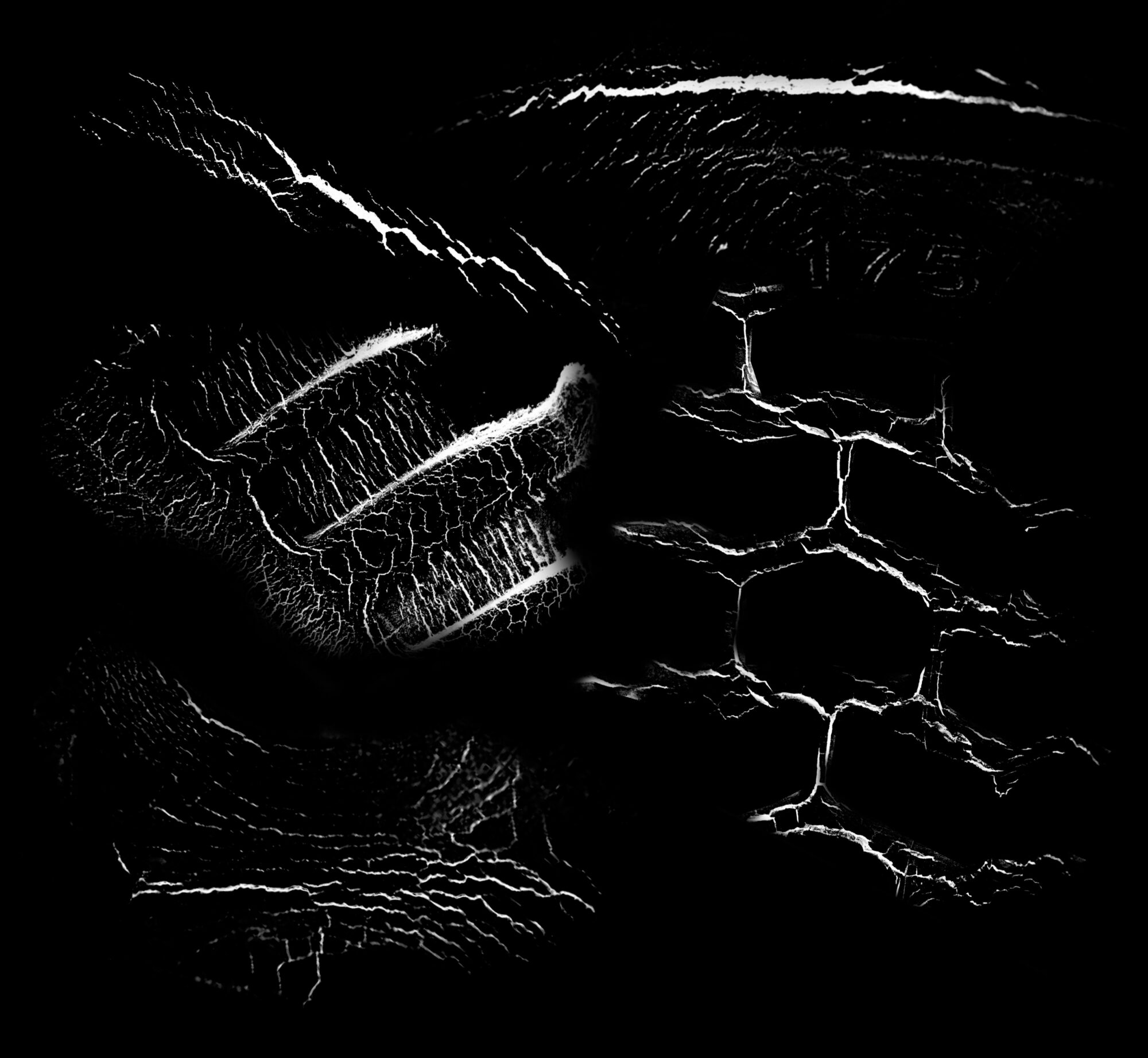
My way of texturing is to always start by working on height and normal details. I made all cracks, rubber lines, etc., without creating any color/roughness layers.
This helps a lot when you have to texture empty places without any details because my rubber looks like rubber without any color at all.
Creating such details before colors and roughness makes you consider them almost like details from the normal map of your high-poly model.
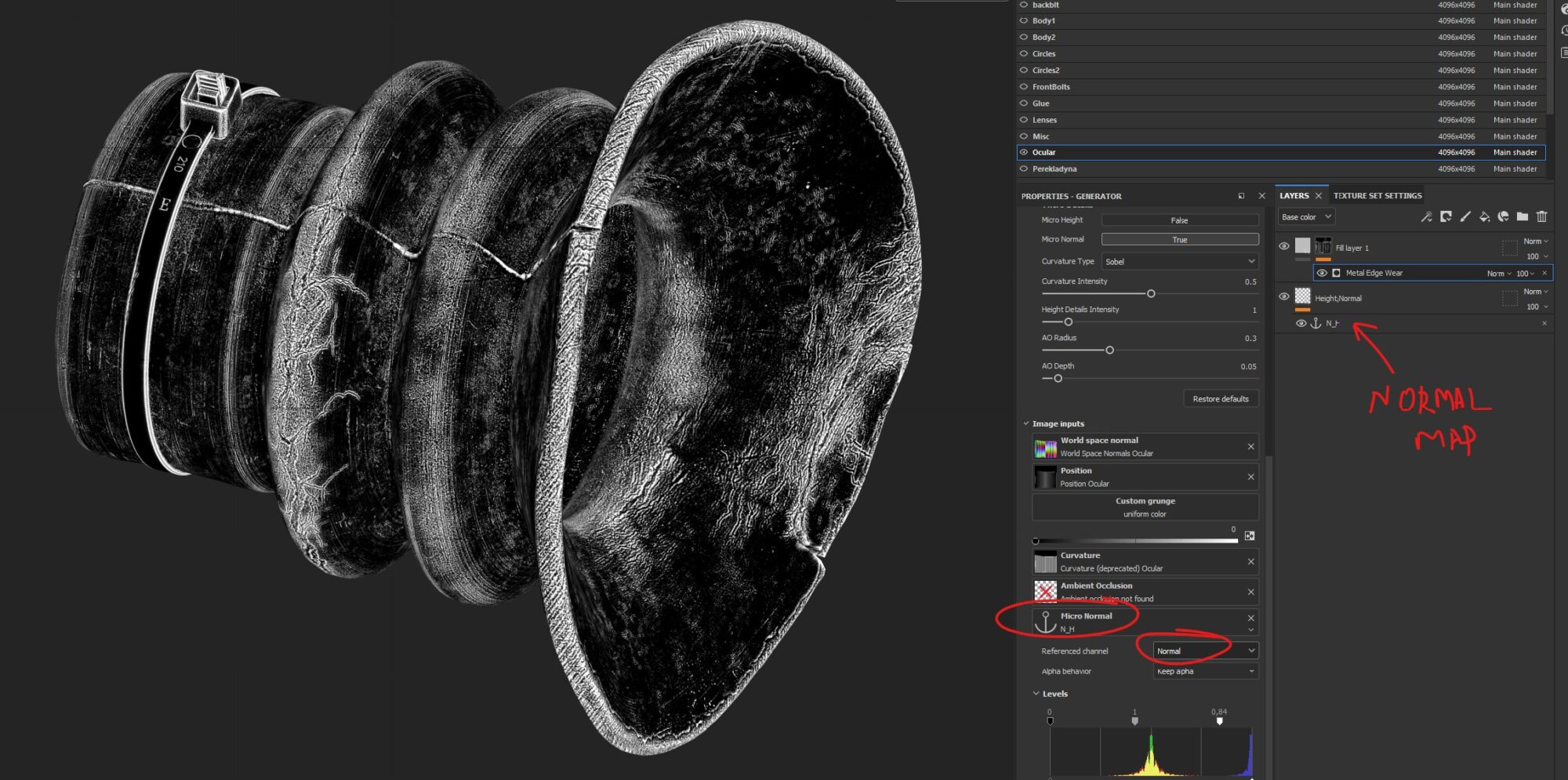
I make cracks like this and any other type of damage using self-made stencils from references in Photoshop.
My favorite use of these height details is to combine them with micro-details and generators to create very detailed masks.
As I said before, it’s important to start with big details and proceed to smaller ones, one step at a time. So initially, I divide the mesh into zones by colors.
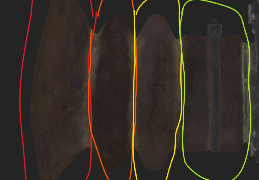
At the beginning, you should texture your asset as if it were “new,” and it has to look good even without damage and dust on it.
This way, I work on different variations using generators, micro-details, grunges, stencils, and anchor points until I like the result and see that it’s possible to move to the next phase of texturing.
However, it’s necessary to understand that everything in texturing should be logical.
I mean, when creating painted metal, you should start with the base gray metal layer, then proceed with patina, oxidation, and only then start applying paint.

So every texture should be made following this logic: every material has to be created in order of its age, from the oldest to the newest.
For example:
- Metal
- Patina
- Paint
- Narrative details
- Rust
- Dirt
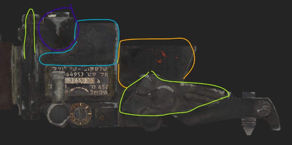
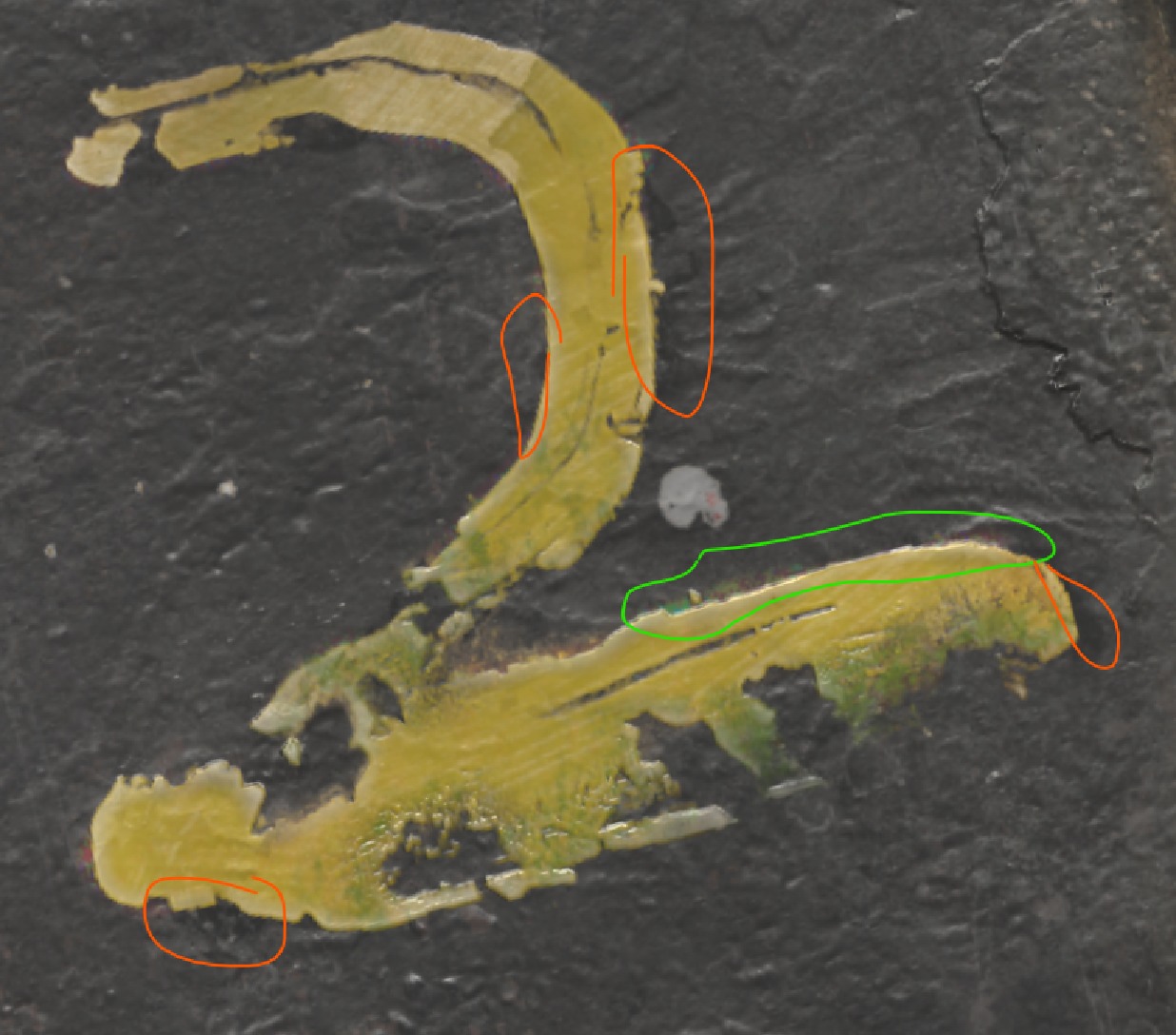
After creating different “levels” of materials, you should “connect them.”
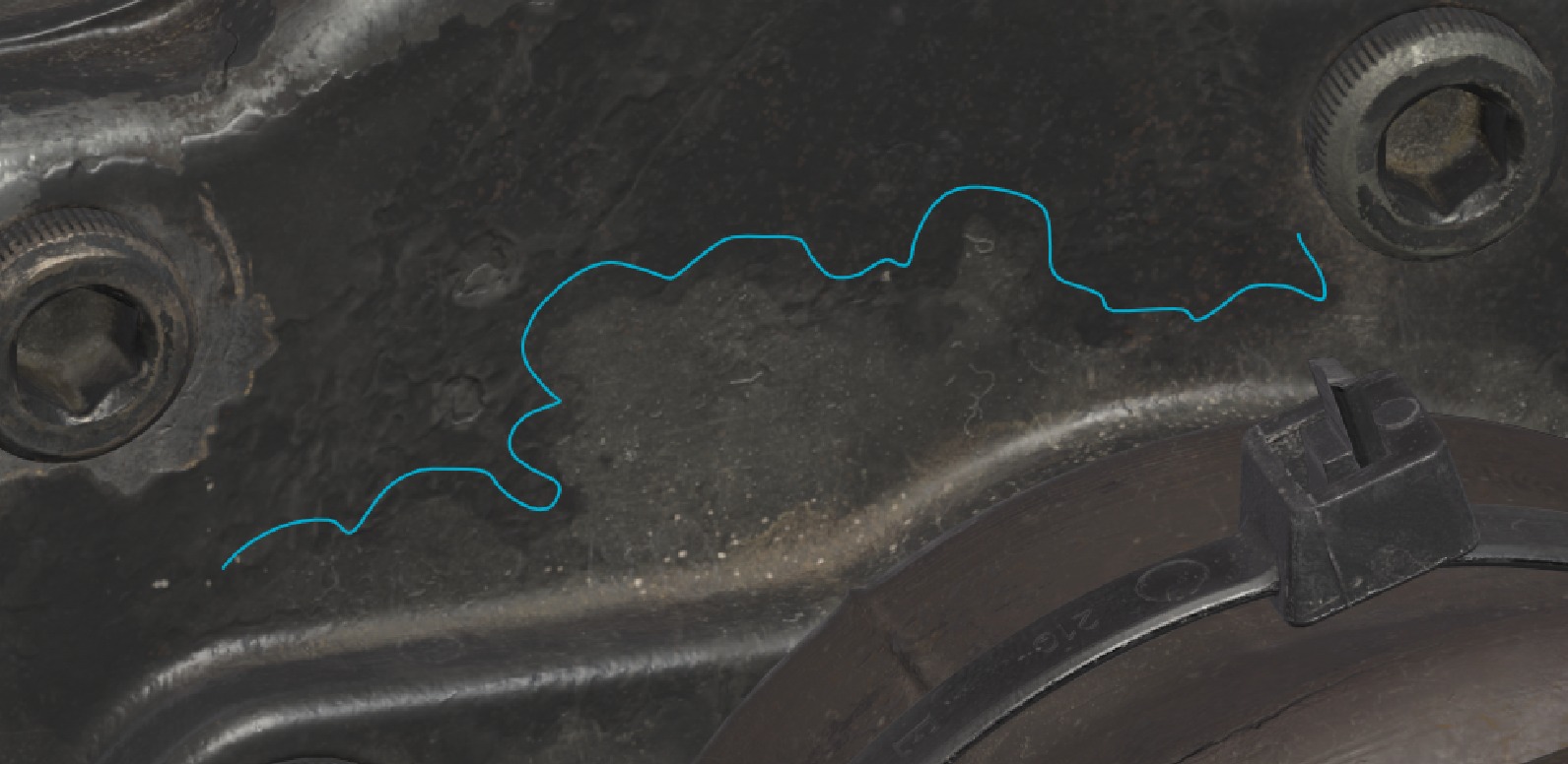
In this place, three different materials are visible. The yellow lines indicate the darkened area from the border of the peeled paint.
Also, I added height multiplied by grunge and a slightly lighter area indicated by brown lines on the patina.
These details, mixed with the peeled paint mask made by hand using stencils from references, help us blend the materials in a beautiful way.
But this isn’t the only detail I considered. You should always be able to answer the question: Why is this detail or layer here? What’s its purpose? What consequences will this detail have on other parts of the material?
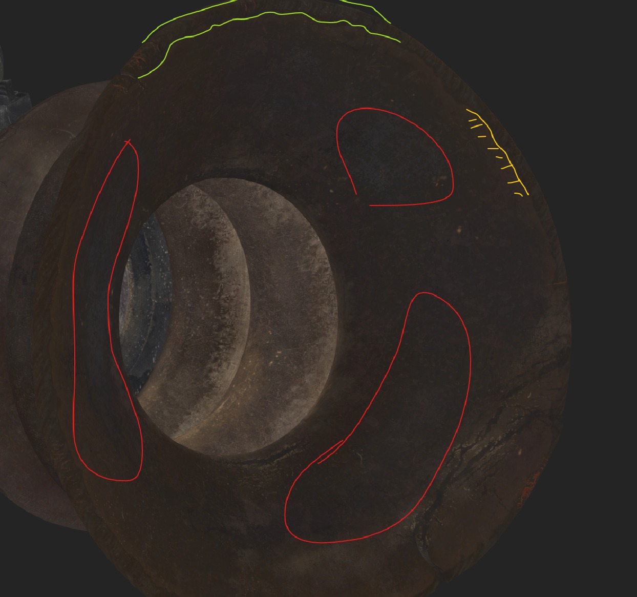
For example, the letters under the glue are less damaged than the other letters, and the part of the plate under the glue is darker than the other part.
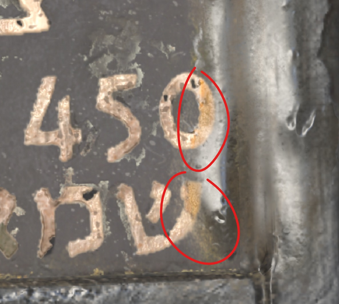
Another example could be the letters painted on top of the scope.
The green circle shows the saturated zone where the yellow paint chemicals interact with the metal paint. The red circles show yellow paint oils, which are contained in most types of paints.
These aren’t always details you can see in your references, but they make sense because of the nature of the materials, so they enhance your texture.
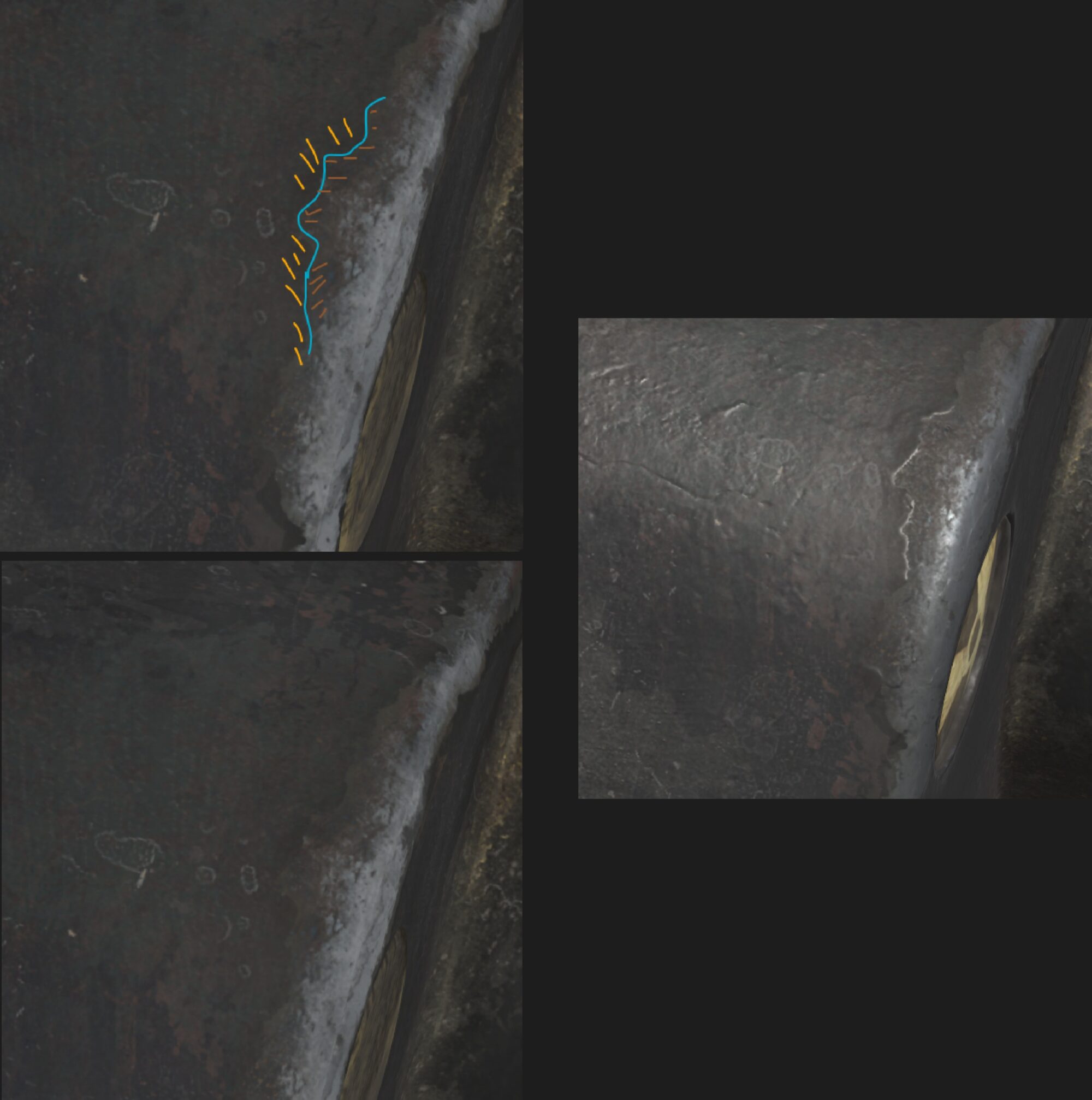
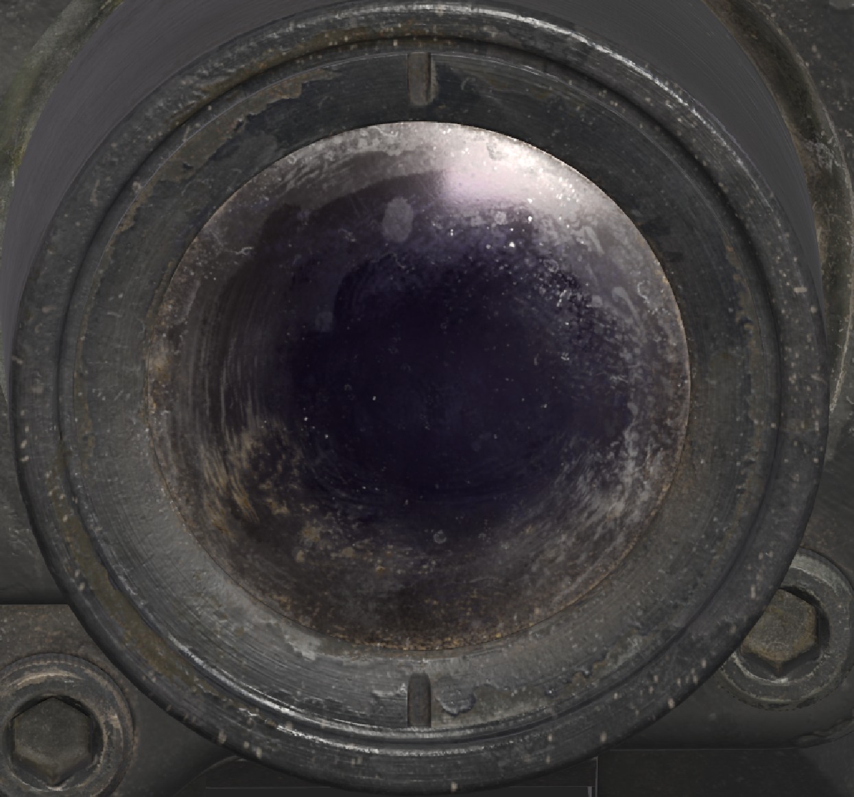
My favorite part of the work is creating dirt.
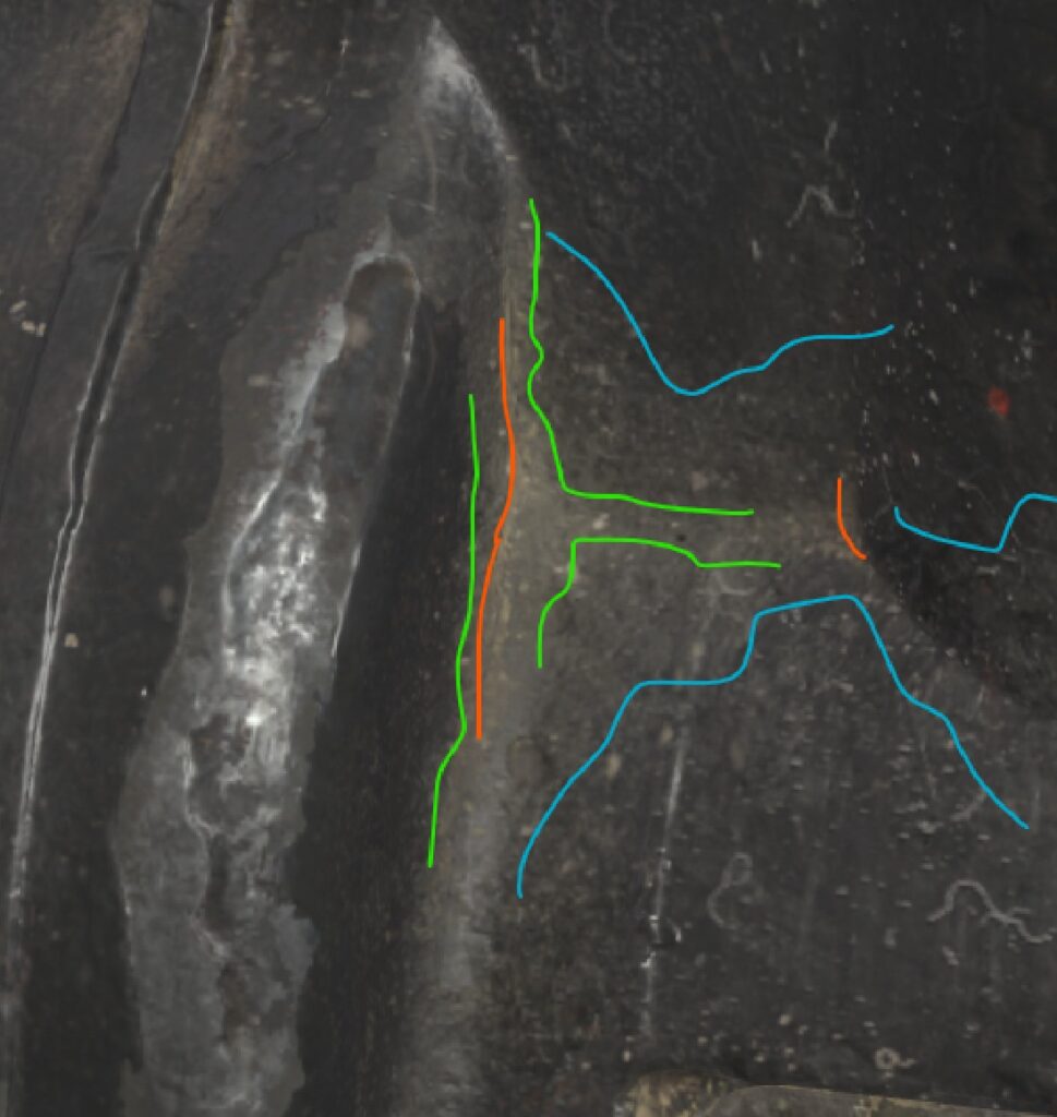
For me, the secret of good dirt lies in creating different layers of dirt ordered by their age.
Here, you can see that my dirt contains a concentrated small line of dust (indicated by red), it’s not very old dust, but it’s not new either; it’s hard to clean.
Then, we have a less concentrated but strong enough layer of old dust that was perhaps cleaned a long time ago but wasn’t cleaned well enough (indicated by green).
And finally, we have a layer with absolutely unconcentrated but distributed dust, it’s the newest layer of dust that can form after a couple of weeks (indicated by blue).
Another important detail about dust is its form. Dust or dirt needs to have a distinctive shape, it helps to recognize it better and makes it more interesting.
Different types of dust/dirt, their different ages, stories, and shapes are visible on the scope’s lenses.
During texturing, I almost didn’t use premade materials except for some Quixel Suite materials that are difficult to find these days.
But for the rest, I didn’t use any smart materials, smart masks, or any kind of premade materials, and I don’t recommend using them.
My texture relies a lot on the height/normal details I made at the very start of texturing.
Almost all of this knowledge was taught to me by Dmytro Mykhailyk (ArtStation) through mentorship, his streams, and tutorials on YouTube. The creation of this texture wouldn’t have been possible without him.
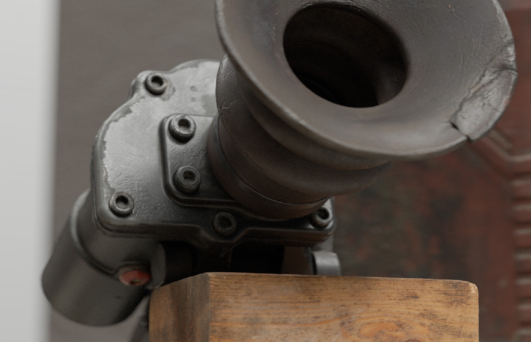
Rendering
For rendering, I built a simple environment scene in Marmoset using Quixel Megascans assets.
The choice of rendering in an environment was motivated by the fact that camera focus is far less noticeable on a clean white surface.
Post-effects are very important, and it’s fundamental to use them, but you need to be very cautious when using them because even a slight overuse can ruin your render, making it look cheap and unprofessional.
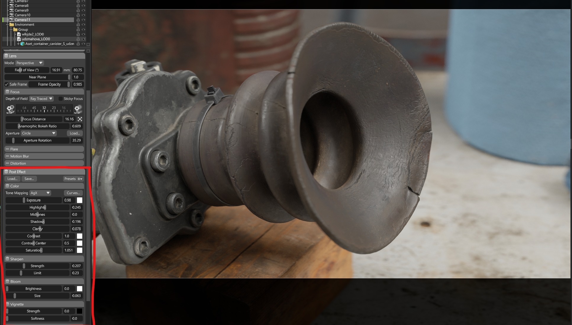
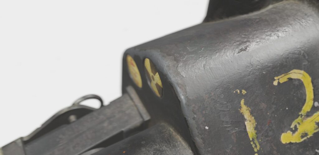
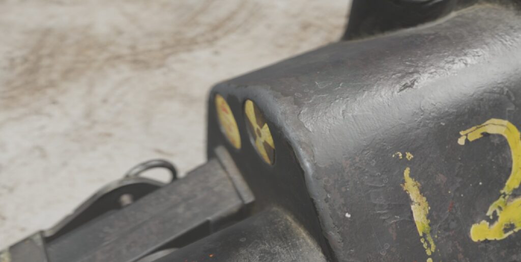
It’s also important to notice that renders of objects should be made from real-life positions.
This means it’s not good practice to render a hard-to-access screw in a very unnatural position.
For example:
It’s hard to find somebody who takes photos like that in real life because it’s physically difficult and reduces your asset’s realism.
Conclusion
I’m very happy with this asset and the attention it has brought. It was my first attempt to make something that can be called realistic, and it was my personal challenge to test my skills.
It was a complex test of newly learned software, techniques, and skills. It’s the smallest asset I’ve ever made, but also the highest quality one.
Thank you for your attention, and I hope this article was useful and interesting to read for you.
Read more articles
You might also like these articles.