Japanese Knife

Introduction
Hi everyone! My name is Oriol. I am a 22-year-old 3D artist whose main focus is hard surface art.
Props, weapons, cars… You name it! Since I was 4 years old and touched my first videogame, I knew I wanted to be in this industry.
I found 3D to be the path that suited me the most as it allowed my technical and artistic sides to coexist in a pretty creative way!


Project
For a long time, I have been watching YouTube videos about knives and how they’re made.
I’ve always seen it as such an interesting topic. I found myself having free time between tasks and decided to give it a go. I wanted a texture challenge — something that took almost no time modeling and UV’ing.
I wanted to concentrate all my time into the texturing and rendering. The Japanese knife project was the perfect project for that.

Tools
My main tools for this project were the following:
- Blender for 3D modeling the high and low poly
- Marmoset Toolbag for baking
- Substance 3D Painter for texturing
- Marmoset Toolbag for rendering
- Photoshop for some final presentation touches
Reference Process
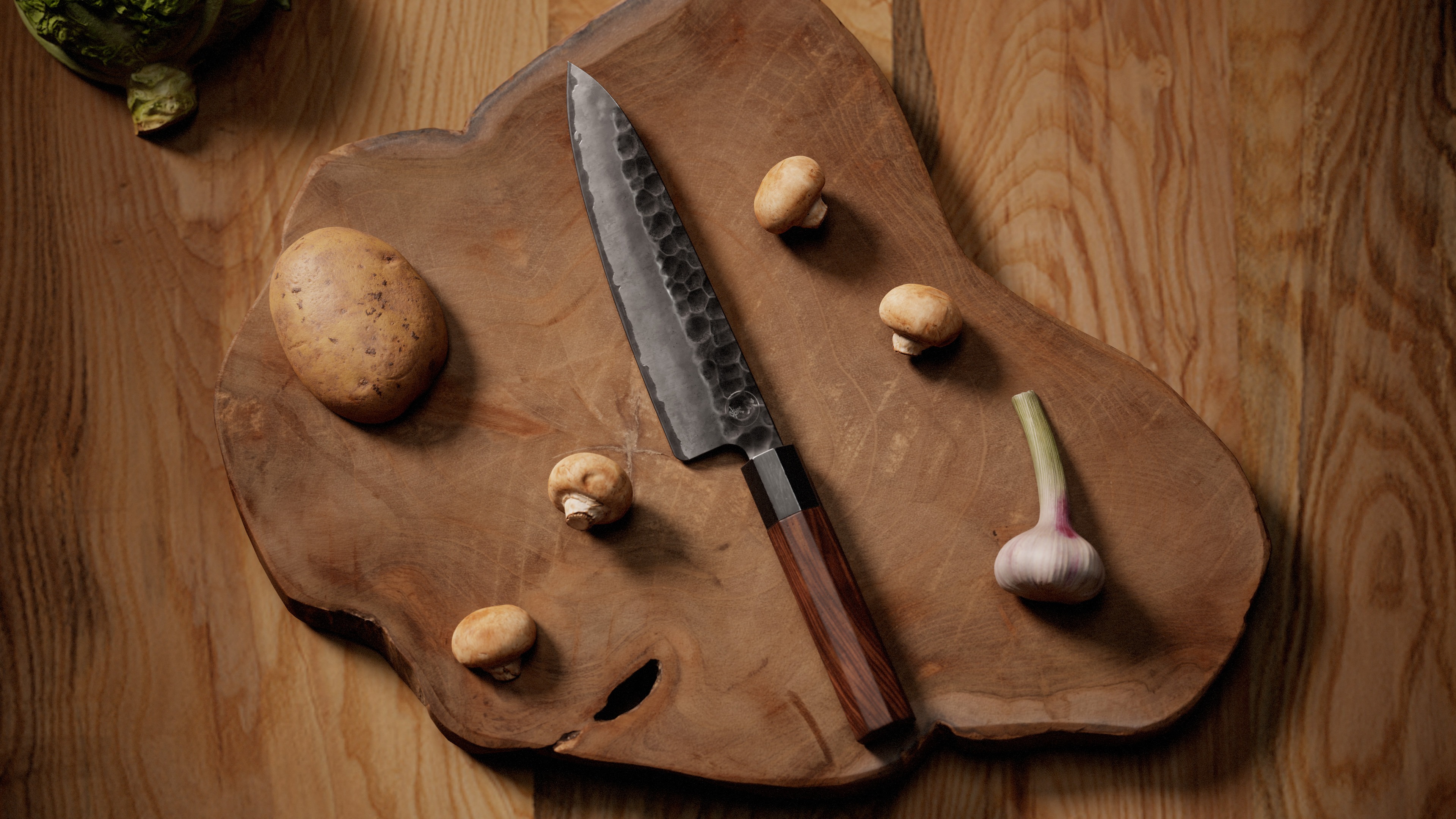
For this knife, I wanted to mix my favorite kind of Japanese knife (Gyuto 牛刀) with my favorite type of hammering pattern (based on looks) and a nice color variation on the blade.
I found a knife that was almost what I wanted; the only thing I wanted to switch was the hammering pattern and exaggerate the colors a bit more. I looked for more patterns and color variations until I found what I was looking for.
When gathering references, I usually use Google Image Search. When I find something I really like, I search for more similar references.
Here is a picture of my actual reference board:

3D Modeling
For this asset, the modeling was the most straightforward part. I usually work with a ZBrush workflow. Due to the simplicity of the object, I decided to subdivision model the high poly.

As you might have noticed, there are some Ngons on the high poly mesh. But when talking about high poly meshes, Ngons can be really useful and may provide a better result! Here is a more detailed explanation of how subdivision works with Ngons:
Subdivision basically elevates the number of polygons exponentially, creating edges and vertices between the existing ones.
What happens when we have a 5-sided face? It converts it into quads:
This has many uses in subdivision modeling, like creating a smoother solution for a pinching problem.
There are many people who talk about Ngons and topology tips and tricks which I recommend checking out, like Jordan Cain.
After that, I added some small denting details on the handle with ZBrush. To add dents I love using the Trim Dynamic brush, as it creates the exact effect I like to see on border imperfections:
This is the final result of the knife with the small detailing on the handle.

For the low poly, I took the high poly mesh and optimized it by eliminating the support loops, fixing the Ngons, and adding tris when necessary.
Here’s the final result of the triangulated mesh:

UV Mapping
When UV mapping, I ordered the handle cuts to avoid problems later when handling the wood texture, although it would have been way better if the cuts weren’t there at all.
The rest of the UV map was really simple — nothing too complicated. What mattered the most was getting the UV direction right.

Baking
For baking I took the sub-d model I created early on and mixed it with the one I added the dents to in ZBrush. The handle was from the ZBrush model and the blade was from the subdivision model.
I love baking my assets in Marmoset Toolbag as I have way more control. I can adjust the cage, the normals, move the object around to get more accurate ambient occlusion maps… For me it’s the go-to option.
The baking quality from Substance is similar; the main difference is the control you have over the process.
Here is the result of the final bake:

Texturing
This part was the main focus of the project. We will split this into two parts: the handle and then the blade.
Wood has to be one of the most complex materials to texture. There are several ways of doing it. I wanted to get a remarkable shape, reminding me a bit of the original one, but way cooler looking for rendering.
For the wood creation process, I took a similar approach to Dan Kenton’s texturing revolver tutorial. If you like this breakdown I recommend watching his tutorial as he goes way more in depth about this technique.
I started with a base wood material with a few tweaks to get the exact amount of veins and distortion and evolved it from there. This is how the base looks:

I create an anchor point to pick the base wood values and evolve it from there.
The next material is just a soft Perlin noise and we start the wood variation from there:

Here is where it starts to get tricky. I reference the anchor point of the base wood I created early on to adjust it with levels so only one kind of vein shows:


After adjusting the levels to get the values I want the mask to pick, I create an anchor point of this mask to reference it in the future and control the effects on each vein.
After adding some more color variations, I start with the veins. I like setting a soft color variation and breaking it with a noise subtract so the wood looks more credible.
Repeat this a couple of times. Here’s how the result should look:

For the last wood color variation, we simply invert the mask we have been using and add some other effects on top to control the other veins and make them blend better:
To complete the base I add some more variation like darker spots and that’s it for the base!

For the roughness variation I love to first play around to find core values and then build on them.
I wanted the base roughness to be a bit on the brighter side, so I started with a couple of layers that ended up looking like this:

Not too rough yet not too shiny!
After that base I start tweaking the real roughness of the object.
I wanted to make it look old, but preserving the base I created early on, so with some curvatures and subtracting a bit to break the perfections I was left with this:

I wanted a bit more darkening and color variation so I added one more layer with some color and roughness variation:

To finalize the wood, I added some dents and scratches. Here is the final result:

The metallic part of the handle has less complexity; it basically was a plain steel material with paint variation and scratches on top.
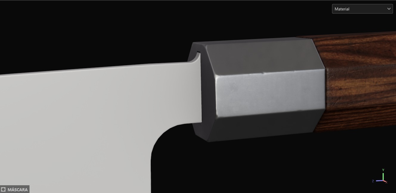


And that’s the grip!
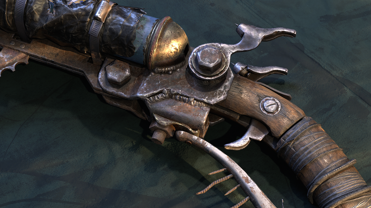
For the blade, I wanted to mix several parts from different blades, starting with the hammering pattern on the top.
I wanted the option to change it along the way to test different patterns and decided that creating a base with the Voronoi fracture pattern and adjusting it with blurs was the way, as shown in this demo:
I created an anchor point for this Voronoi fracture to later call it back for the knife colors and roughness.
To get the blade edge I took two reference images and extracted an alpha in Photoshop by first setting the image to black and white, then playing with levels and finally painting by masking.
Process should look like this:


I repeated this for both sides with different images to have a diverse pattern.
The resolution was not the best, so I used the following trick shown in this clip to clean the alpha resolution:
It consists of blurring the alpha and redefining it with levels. (I added a highpass as I wanted that effect). I added a couple of anchors to reference them later while texturing.
For the colors, roughness and metal I started with a basic metal base with a rough finish to get some cool staining and evolved from there:

I added color variation to the blade. I painted the different gradients mostly by hand to get them exactly where I wanted, mainly because the 3D gradient or the mask editor did not generate the exact gradient I wanted.
The result looked like this:

The edge was filled using the anchor point created earlier when we worked on the alpha.
After adding the color variation, I added some dots variation and highlighted the edges with a blur to make it look cooler:


Some more soft contrast effects were added:

To finish the blade texturing, we refer to the earlier created Voronoi mask anchor points and add the hammering grainy texture detail.
The process was pretty straightforward — mainly playing with subtracts and adjusts. Here’s a breakdown video on how it was achieved:
Once all the base textures were achieved, the next step was adding details that would make the knife stand out a bit more:
And the knife texturing is done! Once the knife is finished, I always feel it is super important to let it rest a bit.
I like resting the project until the next day or a few hours to come back fresh and check if I need to change something I could not see before.
Rendering and Presentation
Rendering and the way you present your artwork are one of the most important parts of showcasing the asset. I wanted to dedicate a big part of this breakdown to this section due to its importance.
When we render and present an asset, environment or character — like with texturing — we are telling the viewer a story.
A really short story that sets their perception of your artwork, so it is really important to be clear with your intentions and vision for the work in order to make it stand out.
Not so long ago I made a small tutorial on how I usually set up my render settings for studio renders, so I’ll be linking that here.
For the knife I wanted to first make it the main focus of the story, and then set a cool scenario with it. We want to use all the resources we have in the rendering program and cool features on portfolio websites to take that vision to the next level.
So, what’s the scheme for this post?
I did five renders and two breakdown posts. One of the renders is the banner and one is a composition. The rest are studio renders.
In most portfolio websites, there is an option when posting render images called “maximize width”.
When setting that on a vertical image it creates a scroll down effect that can help make your prop the main attraction and showcase all the small details.
Due to the large nature of the knife, I wanted to take full advantage of that for at least the first render. This is how the scene looks for this specific render:

As you can see, I also set the logo inside the scene. This was out of pure curiosity. The background is pitch black and I used the Studio Tomoco HDRI to illuminate the render.
This is how the vertical render looks:
For the rest of the renders, I did something I really like to do which is setting all of them inside the same scene, well ordered:
Here are the renders I finally stuck with:
There’s one render that stands out from the rest, which is the artistic render. Here’s a small breakdown.
The render was inspired by one of the promotional images from one of the knife references. What I looked for mainly was the warm lights and the directions of the shadows.
Prop placement was secondary.

The way I replicated the image with my own style was finding similar props in Megascans and replicating that top shadow with a directional light.
The rest was achieved by setting different HDRIs:

After trying different HDRIs and some more lighting effects, prop placement and small tweaks, this was the final result:
Wireframe and Breakdown Video
Using the same knife scene that I used for the vertical image, I took one render with the wireframe.
For the breakdown I went to Substance Painter, enabled/disabled the layers and exported the textures to Marmoset without moving the camera. Once I had the three images, I went to Premiere and assembled the video.
These are the final results:

Setting the ArtStation Post
Once the renders are done, we must make sure we set everything right to get the presentation we want. Here is where I set up the order of the images.
In most cases, I set almost every render in “maximize width” to create the effect I want.

The thumbnail must be one of the most impactful parts of the presentation, as it’s what will gather attention to the post, so I decided to crop one of the most important parts of the knife. I usually set the object logo (if it has any) and my logo on the bottom right.
Here’s the final thumbnail I decided to stick with:
I also put the thumbnail at the end of the post, this time without the maximize width option.
Set up the hashtags, description, and the post is done!!!
Conclusion
It might have been a lot of information to go through, but I really hope that you have learned something and enjoyed reading this article as much as I loved writing it!
If you have any doubts, do not hesitate to contact me via my socials! Good luck with all of your future 3D models!
Thanks to Oriol for allowing us to have such an in-depth look at his process. If you liked this prop breakdown and want to see more like it from other inspiring artists make sure to follow us on:
Read more articles
You might also like these articles.